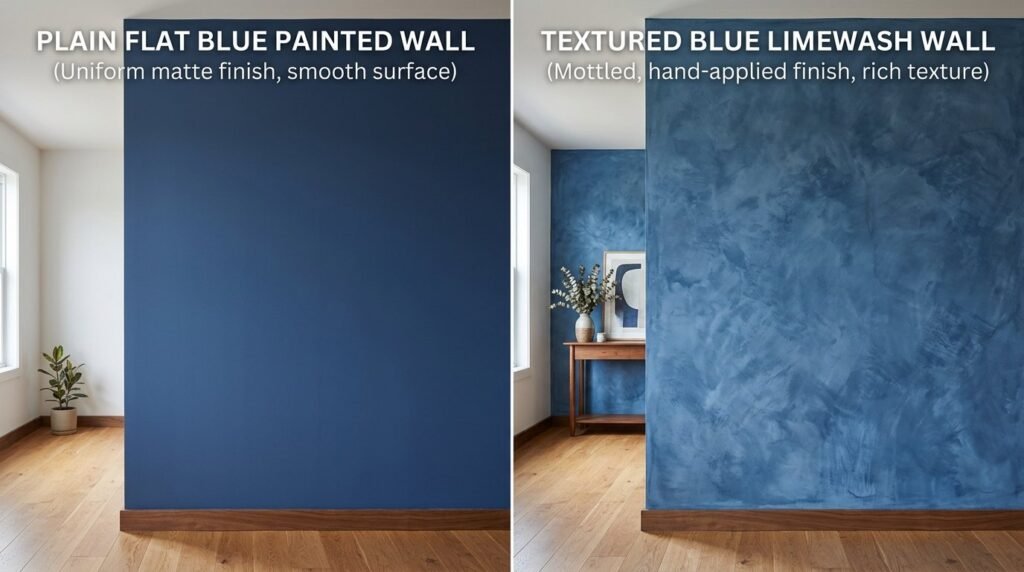
Limewash paint is a ancient finish making a massive comeback in 2026. It offers a chalky, suede-like texture that standard flat latex paint cannot replicate. When you apply blue limewash walls to a room, you aren’t just changing the color. You are adding movement and soul to the surfaces. I first tried limewash in a small guest bedroom three years ago. The depth it created was immediate. It turned a boxy room into a soft, glowing retreat.
This guide provides 23 specific ways to use this medium. You will find inspiration for an accent wall bedroom or full blue bedroom walls. We will look at how beige blue tones balance cool shades. You will learn about the best tools and the mistakes I made so you can avoid them.
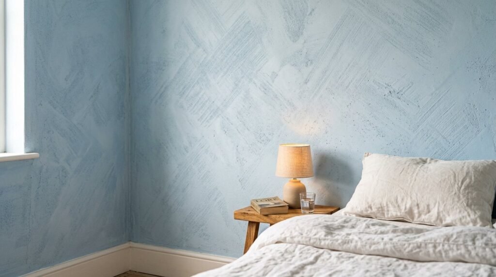
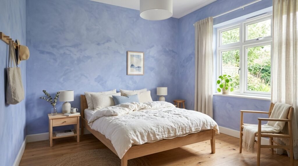
1. Soft Sky Blue Limewash for Small Bedrooms
Small rooms often feel cramped with dark colors. A pale sky blue limewash opens the space. The mineral crystals in the lime reflect light in different directions. This creates a soft blur effect. I noticed that in morning light, the walls seem to breathe. Use a large block brush for this. Apply the paint in random “X” strokes. This ensures the texture looks natural rather than patterned. Sky blue works well with white linen bedding. It creates a weightless feeling perfect for sleep.
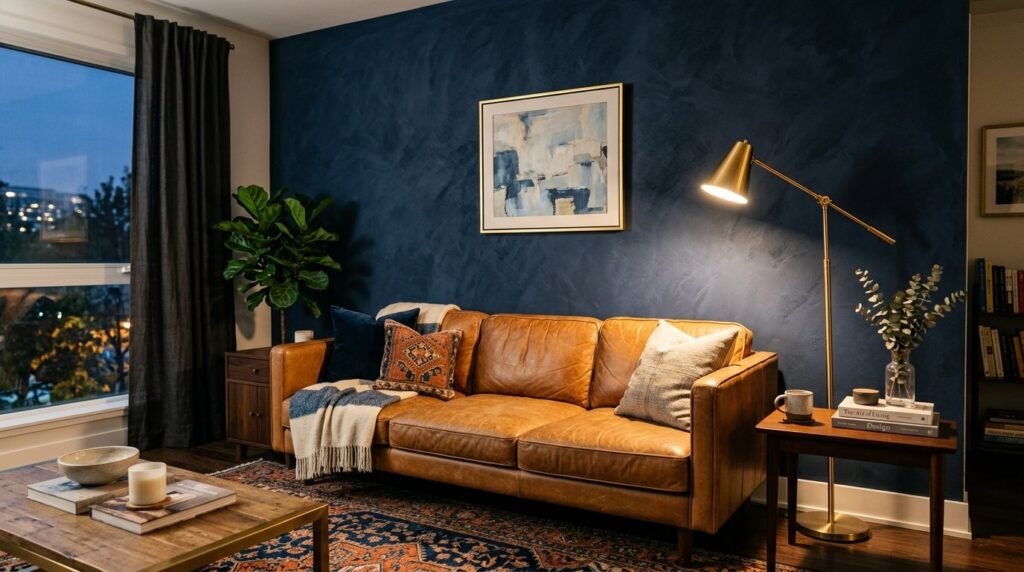
2. Deep Navy Blue Accent Walls in Living Rooms
A navy blue accent wall adds instant drama. Most people fear dark colors will make a room feel small. Limewash is different because it is not a solid block of color. You see highlights and shadows within the navy. I used a shade called Night Sea in a client’s high-ceiling lounge. We paired it with a tan leather sofa. The contrast was striking. This deep blue limewash walls approach works best on the wall behind your main seating. It grounds the room without feeling heavy.
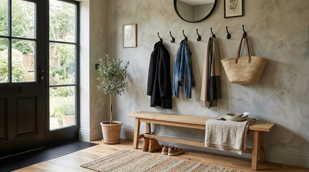
3. The Beige Blue Balance for Entryways
Beige blue is a specific muddy tone that feels sophisticated. It sits between gray and azure. This color is perfect for entryways. It hides scuffs better than pure white. I call this the “denim effect” for interiors. It feels lived-in and comfortable. When applying this, use two thin coats. The first coat will look patchy. Do not panic. The second coat brings the depth. This shade pairs beautifully with oak wood floors and brass hooks.
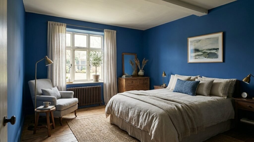
4. Moody Blue Bedroom Walls for Better Sleep
Deep blue bedroom walls signal to your brain that it is time to rest. Limewash is non-toxic and VOC-free. This makes it the healthiest choice for a sleeping area. I noticed my own sleep quality improved after removing synthetic paints. The matte finish absorbs sound slightly better than glossy paint. Choose a mid-tone cobalt for all four walls. It creates a cocoon effect. Keep the ceiling a soft off-white to prevent the room from feeling like a cave.
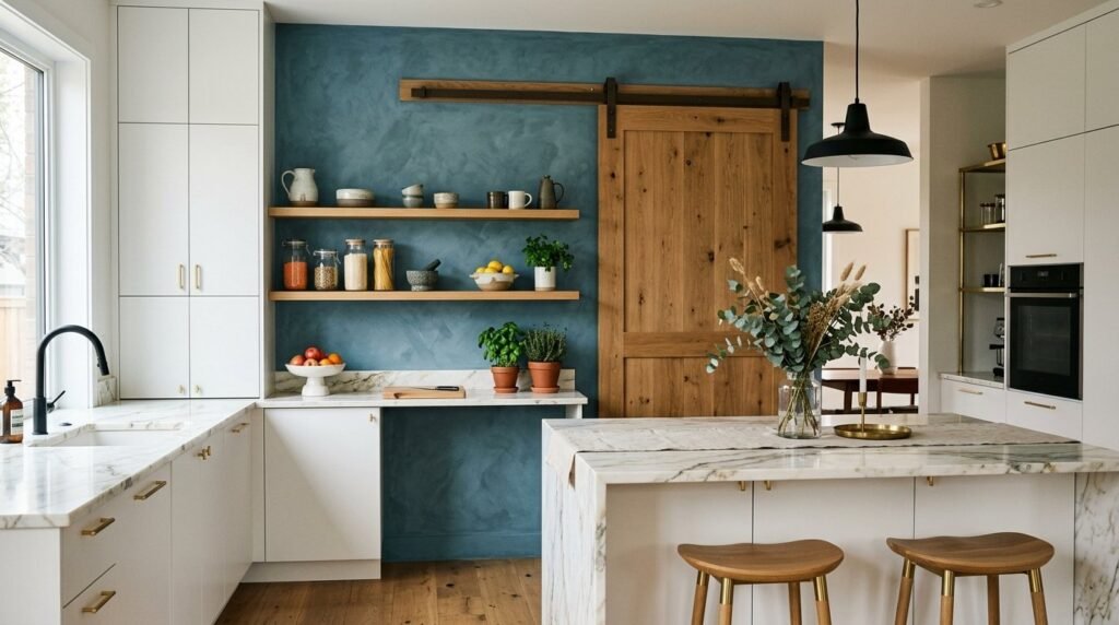
5. Textured Blue Decor Accents in Kitchens
You do not have to paint an entire room. Use limewash on a kitchen island or a pantry wall. Blue decor accents provide a pop of color against white cabinets. Limewash is naturally high in pH. This means it is mold-resistant. It is a smart choice for areas with moisture. I once painted a breakfast nook in a dusty teal limewash. It became the favorite spot in the house. The texture makes the kitchen feel less clinical and more like a Mediterranean villa.
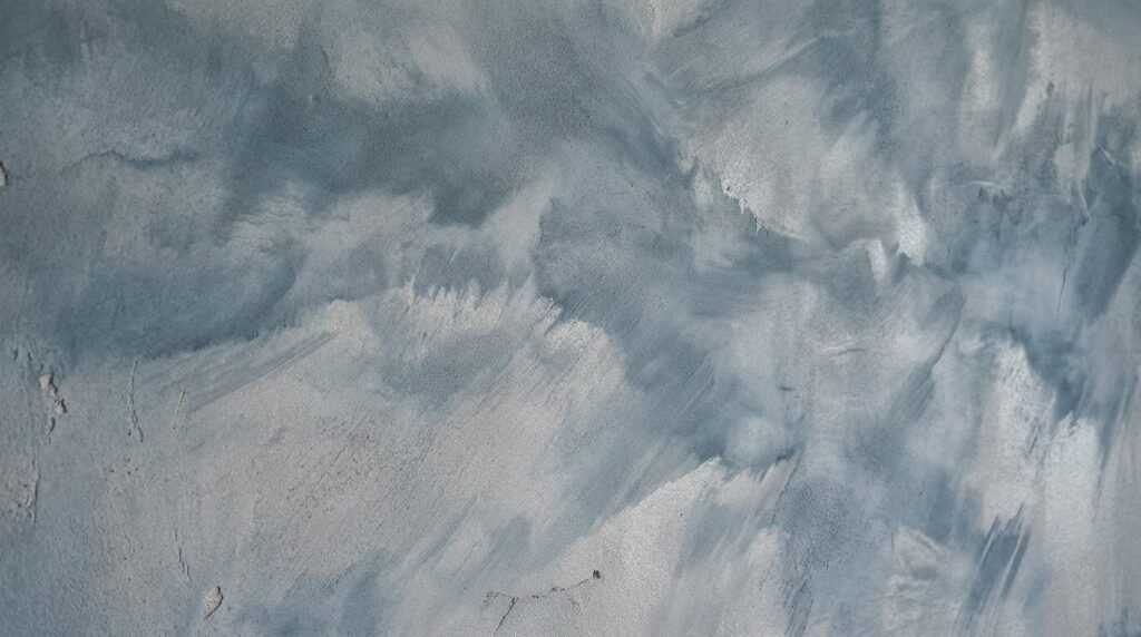
6. Layering Cobalt and Silver Gray
For an advanced look, layer two colors. Apply a base of silver gray limewash. Once dry, apply a very diluted blue limewash over the top. This is called a color wash. It creates a look similar to a stormy sky. I saw this work perfectly in a home office. The shifting colors keep the eyes engaged during long work hours. Use a damp rag to buff back some of the blue. This lets the gray peek through. It adds a professional, custom-designed feel to your space.
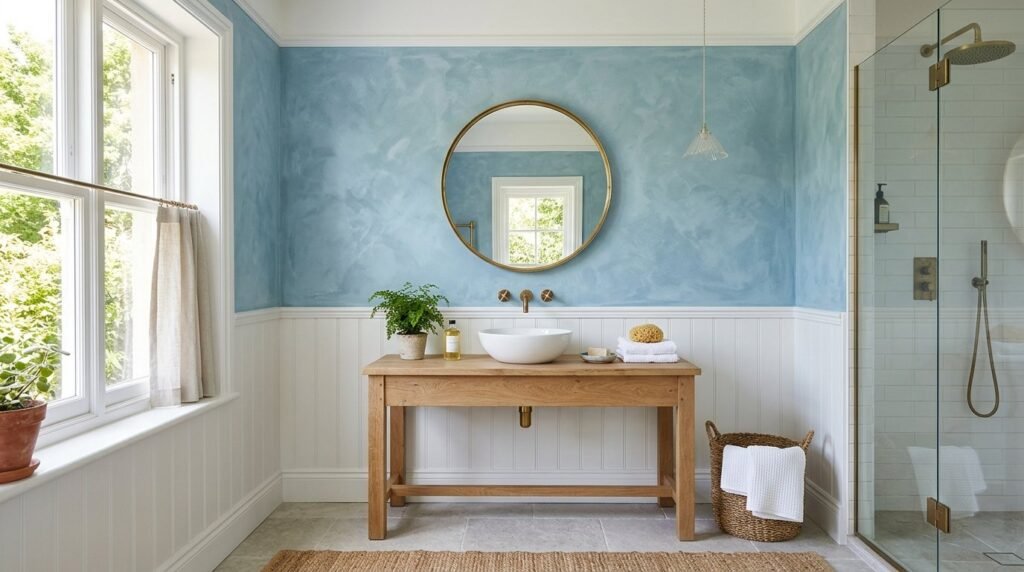
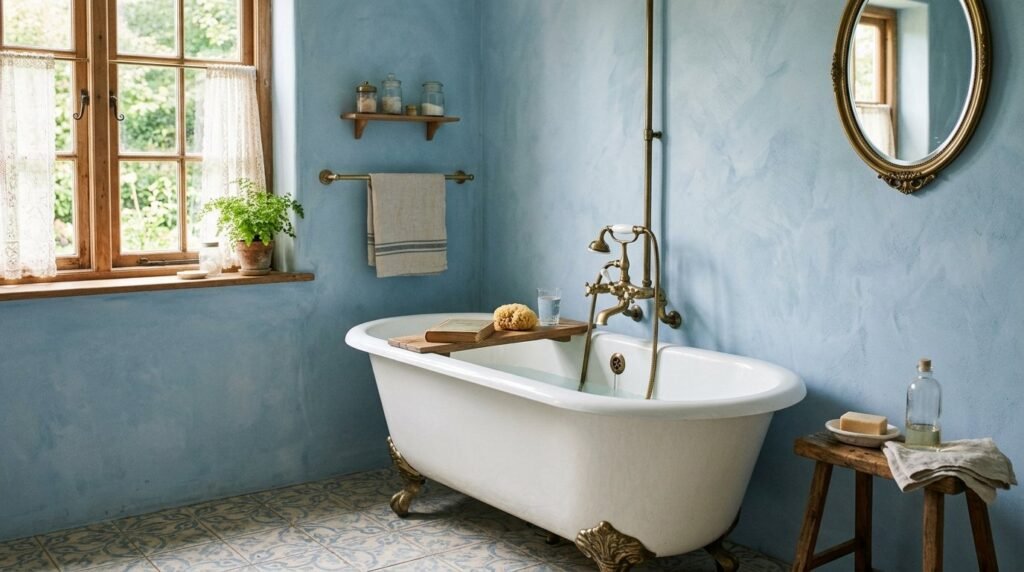
7. Coastal Blue Limewash for Bathrooms
Limewash is breathable. It allows moisture to pass through the stone surface. This makes it ideal for bathrooms without showers or well-ventilated master baths. A coastal blue shade brings the ocean indoors. Avoid using it in direct splash zones like the inside of a shower. I recommend applying a mineral sealer over the blue limewash walls in bathrooms. This protects the color from water spots while keeping the matte look. Pair with wicker baskets and light wood.
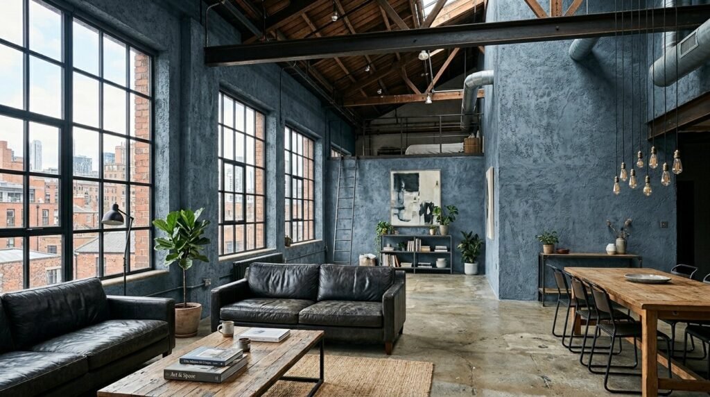
8. Minimalist Slate Blue for Modern Lofts
Modern lofts can feel cold. Slate blue limewash adds warmth through texture. It mimics the look of old concrete or weathered stone. I prefer a “dry brush” technique here. Use very little paint on the tips of your bristles. Swipe quickly across the surface. This creates a rugged, industrial vibe. It looks excellent next to black metal window frames. The blue tone softens the hard edges of modern furniture.
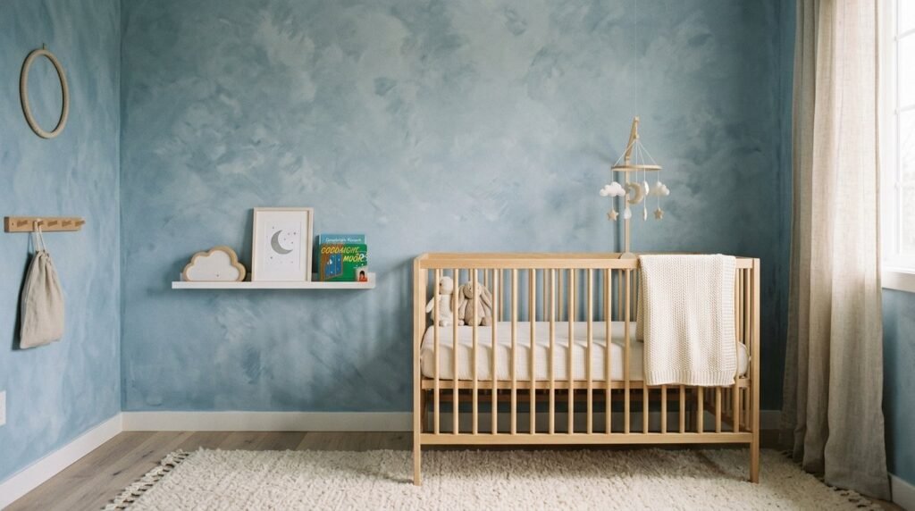
9. Romantic Dusty Blue for Nursery Design
Nurseries should feel calm. A dusty blue limewash is gender-neutral and soothing. Because limewash is made from natural limestone, it is safe for babies. There are no chemical odors after painting. I helped a friend paint her nursery last summer. We finished the room in four hours. The paint dries quickly. By the time we finished the fourth wall, the first was ready for its second coat. It created a soft, cloud-like backdrop for the crib.
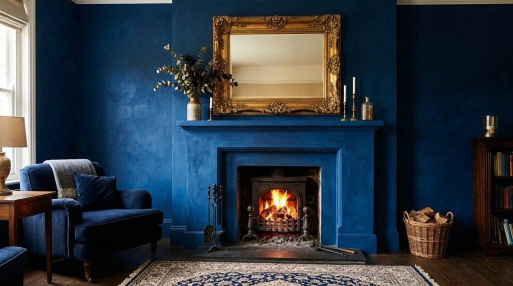
10. Royal Blue Accents for High Contrast
If you love bold interiors, go for royal blue. This color in a limewash finish looks like expensive velvet. Use it on a fireplace surround or an arched niche. This draws the eye to architectural features. I suggest using a smaller brush for these areas. It allows for more precise texture control. Royal blue limewash walls look stunning with gold-framed artwork. The yellow in the gold makes the blue vibrate with energy.
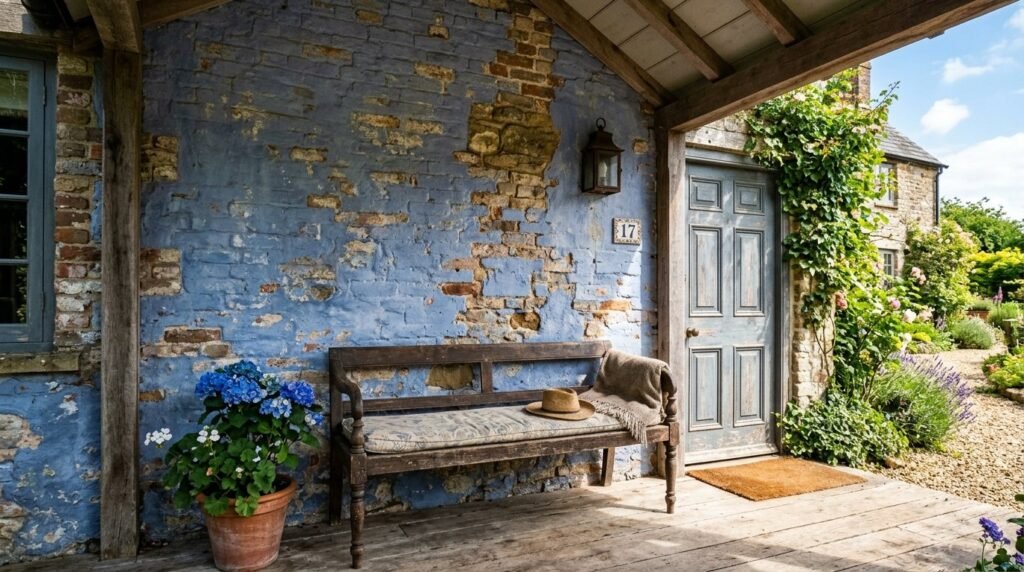
11. Indigo Wash for Exterior Feature Walls
Limewash was originally an exterior finish. You can use indigo blue on a porch wall or a garden fence. It will age gracefully over time. Unlike latex paint, limewash does not peel. It slowly fades and patinas. I have seen indigo walls last years in sun-drenched climates. The sun actually helps the lime carbonate and harden. It creates a durable, stone-like shell. This is a great way to add curb appeal to a white or gray house.
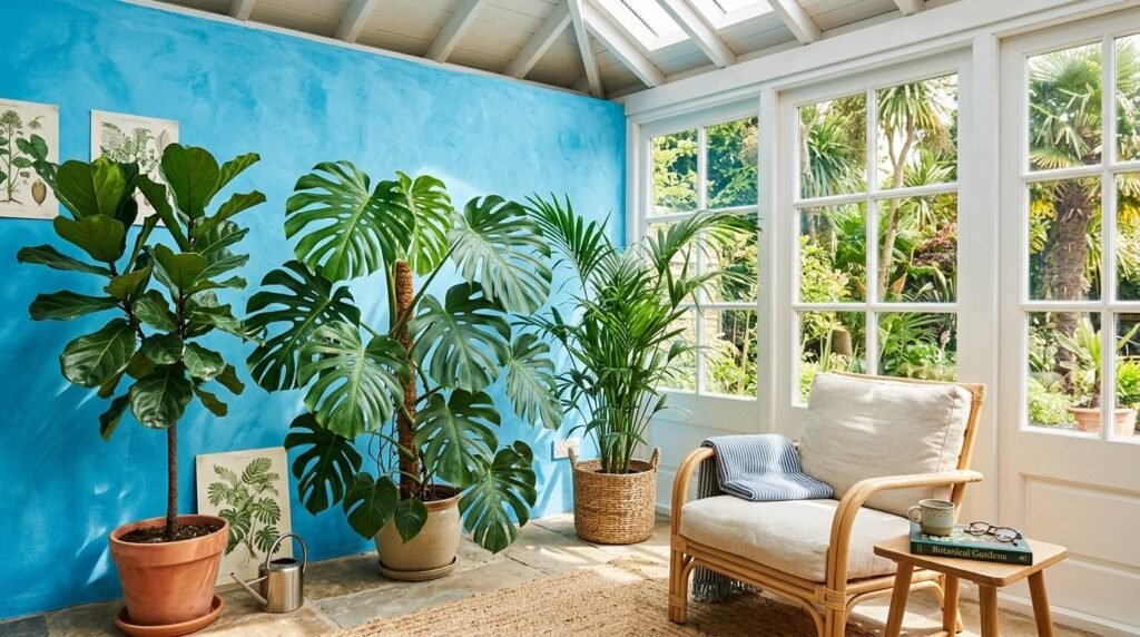
12. Mediterranean Azure for Sunrooms
Sunrooms get a lot of natural light. This is where blue limewash walls truly shine. Azure tones mimic the Greek islands. The bright light hits the lime crystals and creates a shimmering effect. I recommend a medium-to-heavy texture here. Use thicker paint and shorter strokes. This creates more “peaks” in the finish. It makes the wall look like it has been there for centuries. Add large potted plants to complete the vacation vibe.
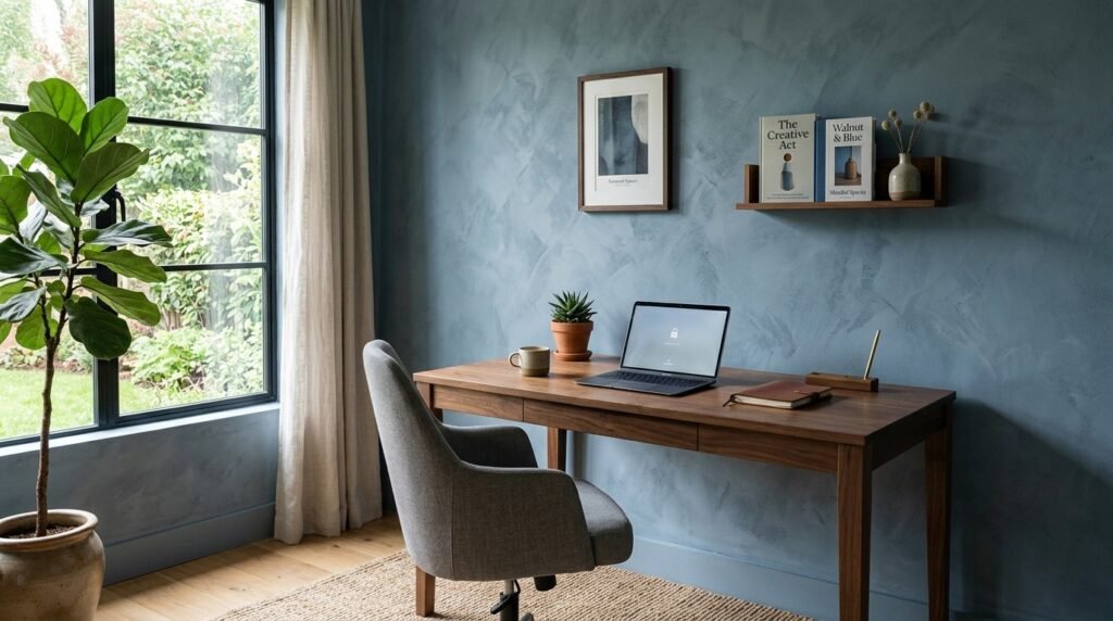
13. Steel Blue for Professional Home Offices
A home office needs to feel focused. Steel blue is a productive color. It is cool enough to keep you alert but dark enough to feel cozy. I used this in my own workspace. I found that the lack of glare from the matte surface reduced eye strain. Standard paint often reflects the light from computer monitors. Limewash diffuses it. This makes the room feel much softer during video calls. It provides a sophisticated background that looks like a high-end studio.
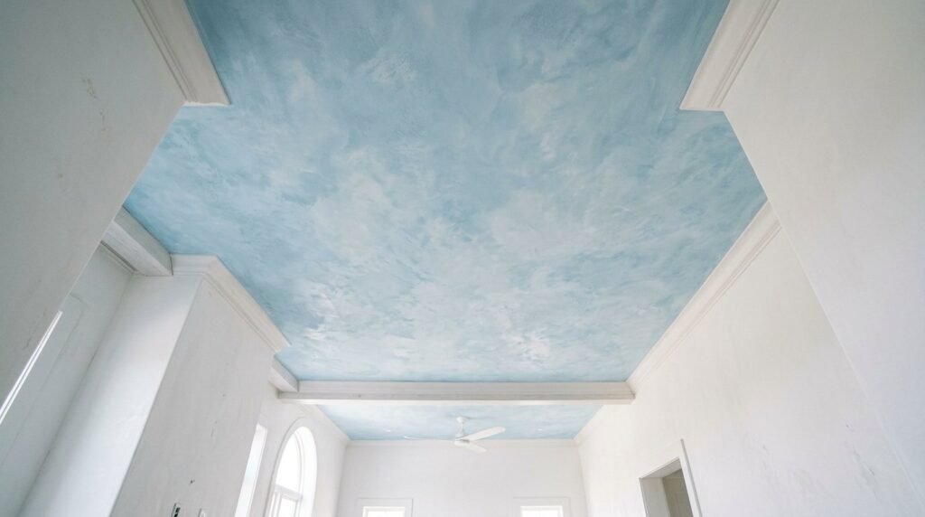
14. Pale Ice Blue for Ceiling Treatments
Do not forget the “fifth wall.” Painting a ceiling in ice blue limewash is a classic design trick. It mimics the sky. This makes the ceiling feel higher than it is. I tried this in a basement renovation. The transformation was incredible. The flat, dull ceiling suddenly had movement. Use an extension pole for your brush. Be prepared for a bit of a mess, as limewash is watery. Wear goggles. The result is a dreamy, ethereal space.
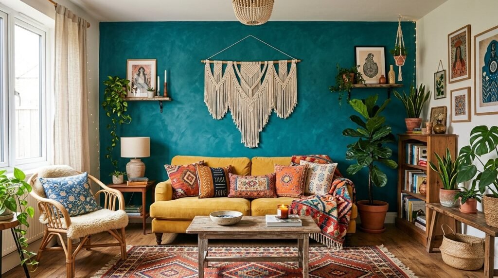
15. Teal Limewash for Boho Living Areas
Teal is a vibrant choice for bohemian styles. The limewash finish prevents teal from looking too “plastic.” It gives the color an earthy, organic quality. I love pairing teal blue accent walls with Persian rugs and velvet pillows. The texture of the wall complements the texture of the fabrics. Use a cross-hatch motion with your brush. This creates a linen-like weave pattern on the wall. It is a simple way to make a room feel curated and collected.
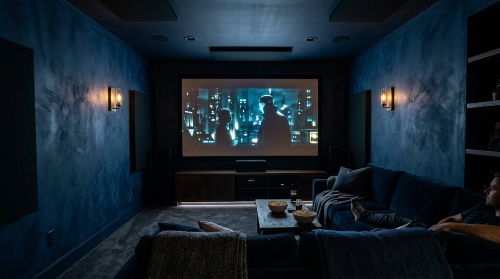
16. Midnight Blue for Theater Rooms
Theater rooms need to be dark. Midnight blue limewash is better than black. It provides the darkness needed for movies but has more character. The texture prevents the room from feeling like a dark box. I noticed that the lime finish helps with light absorption from the screen. This improves the viewing experience. Use three coats for maximum depth. This creates a deep, infinite look that feels luxurious and private.
17. Periwinkle Blue for Playful Guest Rooms
Periwinkle is a fun, purple-toned blue. In a limewash finish, it looks like watercolor paint. This is perfect for a guest room or a creative studio. It feels lighthearted and welcoming. I suggest keeping the furniture simple with this color. Let the blue limewash walls be the star of the show. White oak or light pine wood pairs best with this shade. It keeps the room feeling fresh and bright.
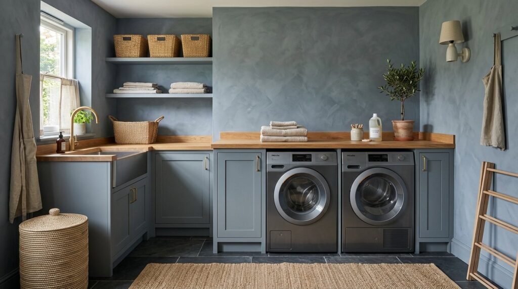
18. Storm Blue for Mudrooms and Laundry
Laundry rooms are often boring. Storm blue limewash adds a sense of utility and style. It is a grey-heavy blue that feels very grounded. I’ve seen this work well with slate tile floors. Because limewash is breathable, it handles the humidity of a laundry room well. It won’t trap moisture behind the paint layer. This prevents bubbling and peeling. It turns a chore-focused room into a beautiful part of the home.
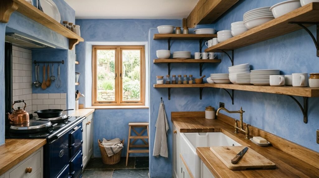
19. Cornflower Blue for Farmhouse Kitchens
Modern farmhouse style loves blue. Cornflower blue limewash feels nostalgic. It looks like old milk paint. I recommend using this on a kitchen accent wall or inside open shelving. It provides a soft backdrop for white dishes and copper pots. In my experience, this color looks best with a very light texture. Keep your strokes long and sweeping. This creates a calm, breezy look that fits the farmhouse aesthetic.
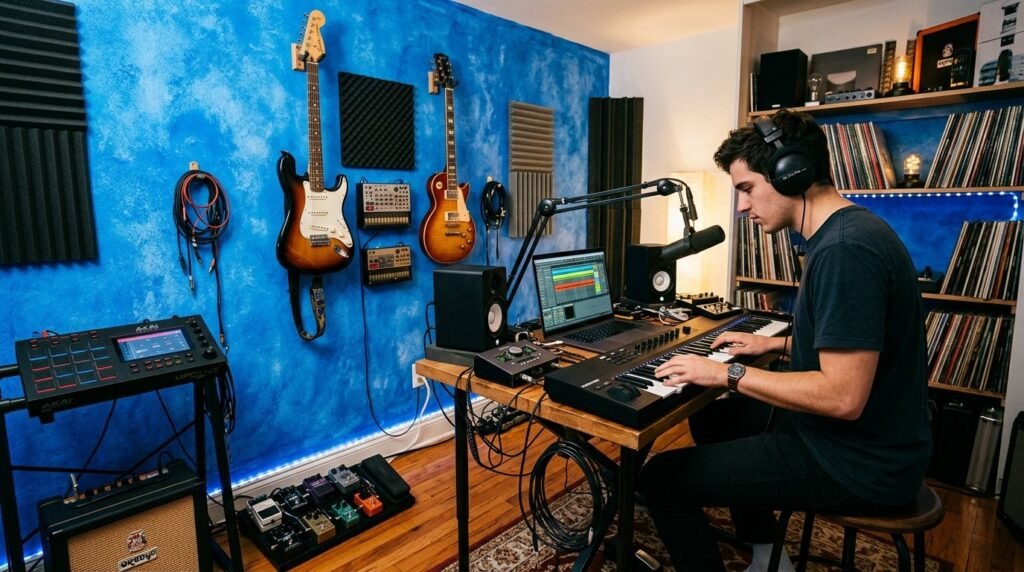
20. Electric Blue for Creative Focus Zones
If you have a craft room or a music studio, go bold. Electric blue limewash is energizing. The texture keeps the bright color from feeling overwhelming. It breaks up the light. I once used this in a small recording booth. It made the small space feel intentional and high-energy. Pair it with neutral grays to balance the intensity. It is a brave choice that pays off in creativity.
21. Powder Blue for Vintage Bathrooms
Powder blue is a classic 1950s color. Using it in a limewash finish brings it into the modern era. It looks sophisticated rather than dated. I love this for bathrooms with clawfoot tubs. The chalky finish of the wall contrasts with the shiny porcelain of the tub. It creates a spa-like atmosphere. Use a soft-bristle brush for a smoother finish. This makes the blue feel more like a delicate wash.
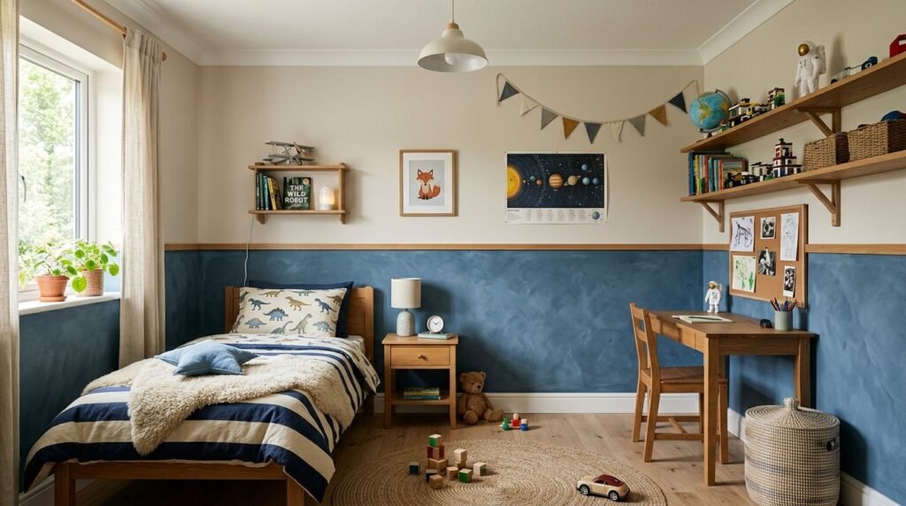
22. Denim Blue for Boys Bedrooms
Denim blue is a practical choice for kids. It hides fingerprints and marks better than lighter shades. Limewash is also very easy to touch up. You can simply brush a little more paint over a scuff. It blends perfectly because of the textured nature of the finish. I helped a neighbor do this for her son’s room. We used a dark denim shade on the lower half of the wall and a light beige on top. It looked like a custom designer space.
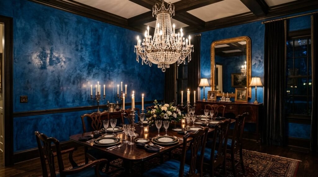
23. Sapphire Blue for Formal Dining Rooms
Sapphire is a jewel tone that feels expensive. In a dining room, it creates a sense of occasion. Under candlelight or dim chandeliers, the limewash texture creates beautiful shadows. I suggest using a “pouncing” technique with the brush here. This creates more concentrated areas of pigment. It looks like hand-applied plaster. Pair with a dark wood dining table and silver accents for a traditional, high-end look.
Summary of Blue Limewash Benefits
Limewash is more than a color choice. It is a functional wall covering. It is eco-friendly, breathable, and naturally beautiful. Blue tones in limewash offer a range from calm to dramatic. Unlike standard paint, limewash ages beautifully. It develops a patina that tells a story. Whether you choose an accent wall bedroom or a full blue bedroom walls transformation, the results are always unique. You cannot get this look with a roller and a bucket of latex.
Essential Tools for Limewash Success
To get the results shown in these ideas, you need the right gear. Do not use a standard roller. Limewash needs to be worked into the surface.
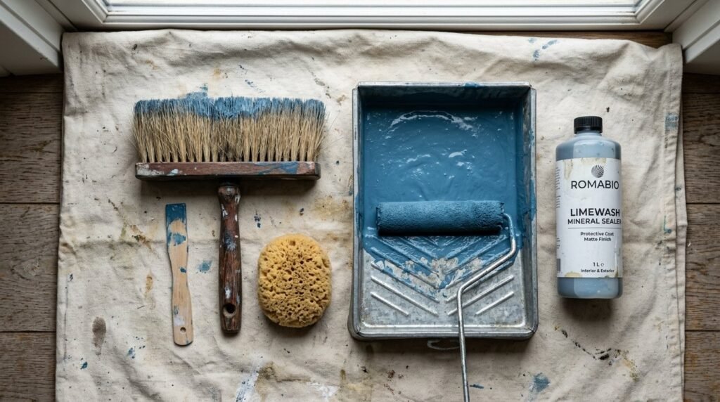
| Tool | Purpose | My Recommendation |
| Block Brush | Application | 5-inch natural bristle brush |
| Mixing Paddle | Consistency | Drill attachment for even pigment |
| Primer | Adhesion | Mineral-based primer for drywall |
| Sealer | Protection | Dead-flat mineral sealer |
| Measuring Cup | Dilution | Keep ratios consistent between batches |

Pros and Cons of Blue Limewash Walls
I have used limewash in dozens of projects. Here is the honest truth about working with it.
The Pros
- Unique Texture: No two walls look the same.
- Health: Zero VOCs and non-toxic.
- Durability: Does not peel or flake over time.
- Mold Resistance: High pH level kills spores naturally.
The Cons
- Learning Curve: It takes practice to get the “X” stroke right.
- Color Shift: The paint dries much lighter than it looks in the bucket.
- Rough Texture: It can be abrasive if you rub against it.
- Removal: You cannot simply paint over it with latex later without a special primer.

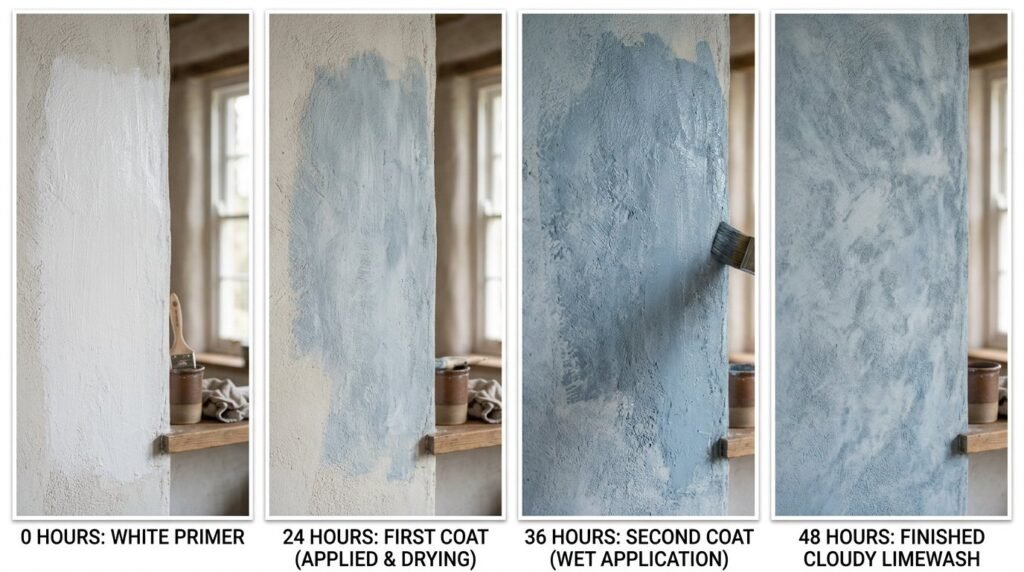
Case Study: The 48-Hour Bedroom Glow Up
I recently helped a client transform a dull gray room into a blue sanctuary.
Day 1: We applied a mineral primer in the morning. By 2 PM, we started the first coat of blue limewash. The room looked terrible at first. It was streaky and uneven. I had to remind the client to trust the process.
Day 2: We applied the second coat. As it dried, the magic happened. The streaks turned into soft clouds of color. We used a shade called Baltic Blue.
Result: The room felt 10 degrees cooler and significantly more expensive. Total cost for paint and brushes was under $200. The value added to the home was much higher.
Frequently Asked Questions
Can I apply blue limewash over normal paint?
Yes, but you must use a mineral-based primer first. Limewash needs a porous surface to “bite” into. Standard latex paint is too slick. The primer creates a bridge that allows the limewash to stick.
Is blue limewash hard to keep clean?
It can be tricky. You cannot scrub limewash like you can semi-gloss paint. If you get a mark, it is best to dab it with a damp cloth. For high-traffic areas, always use a sealer. This makes the surface wipeable.
How many coats of blue limewash do I need?
I always recommend two coats. The first coat provides the base color. The second coat is where you create the texture and depth. Some very dark blues might need a third thin wash to reach full saturation.
Why does my blue limewash look white when I apply it?
Limewash is made of lime and water. When wet, it looks very dark and transparent. As it dries, the lime carbonates and turns opaque. It will lighten by about 50%. Always do a test patch first.
Can I use blue limewash in a bathroom?
Yes, but avoid the shower area. It handles steam well because it is breathable. I suggest a sealer for any wall near a sink to prevent water spotting from soap or toothpaste.
Does blue limewash fade in the sun?
Actually, blue pigments in limewash are quite stable. Because it is a mineral finish, it resists UV damage better than many synthetic paints. It will patina, but it rarely loses its “blue” character.
Conclusion
Blue limewash walls are a timeless way to add character to your home. From soft sky tones to deep indigo, there is a shade for every mood. This finish requires a bit more effort than standard paint, but the reward is a living, breathing piece of art. Start with a small accent wall bedroom to get the hang of the brush strokes. Once you see the depth of blue accent walls in person, you will likely want to do the whole house. It is a sustainable, beautiful, and healthy way to design.
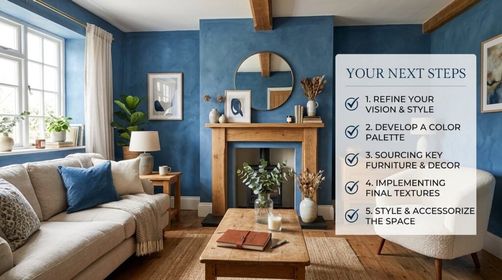
What room are you planning to transform first? Leave a comment below with your color ideas.