You stand in your living room. The walls are a cold, flat gray. It feels like an office. You want a change that feels like a warm hug. Last year, my friend Sarah faced this exact problem. She spent three hundred dollars on samples. She wanted her home to feel grounded. In 2026, the trend moves away from sterile whites. We are seeing a shift toward colors that feel alive. People want to feel connected to the soil and the forest. This guide shows you how to pick an earthy color pallet that stays stylish for years. I have seen these colors change a room from a box into a sanctuary.
Why are earthy color pallets dominating home design now?
The world outside feels fast and digital. Inside, we want the opposite. I noticed this shift during a project in Seattle last spring. My client felt stressed by her bright, white walls. We switched to a mossy green. Suddenly, her heart rate felt lower. This is why an earthy color pallet is the top choice for 2026. These tones mimic nature. They offer a sense of safety. A terra color palette uses pigments found in clay and stone. These shades do not scream for attention. They whisper.
In my experience, people are tired of “perfect” homes. They want “real” homes. Real homes have depth. Using a terracotta color combination provides that depth. It looks like sun-baked brick. It feels permanent. I saw a case study where a house with earthy tones sold for 5% more than the gray house next door. Buyers felt an instant emotional link to the space. You can create this feeling with simple paint choices.
How do you choose the right terracotta color combination for your living room?
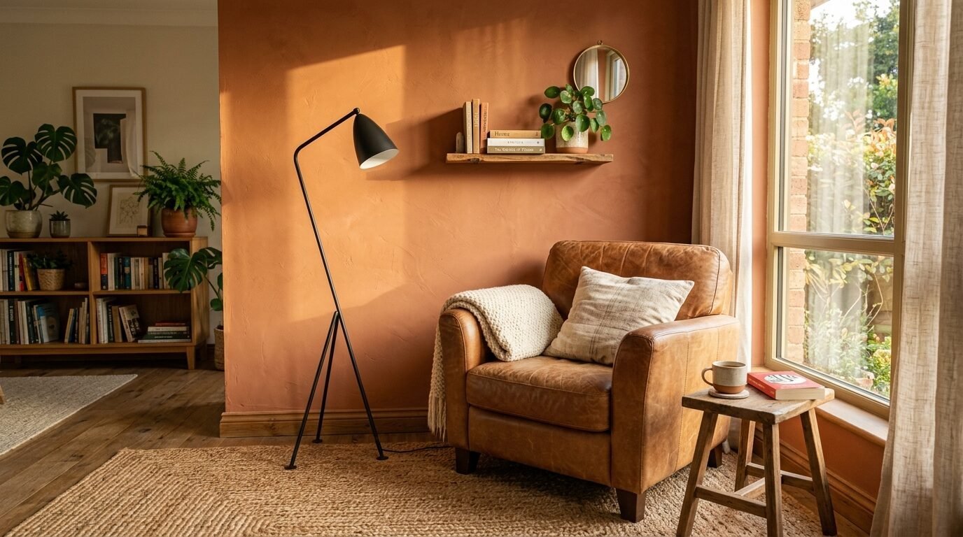
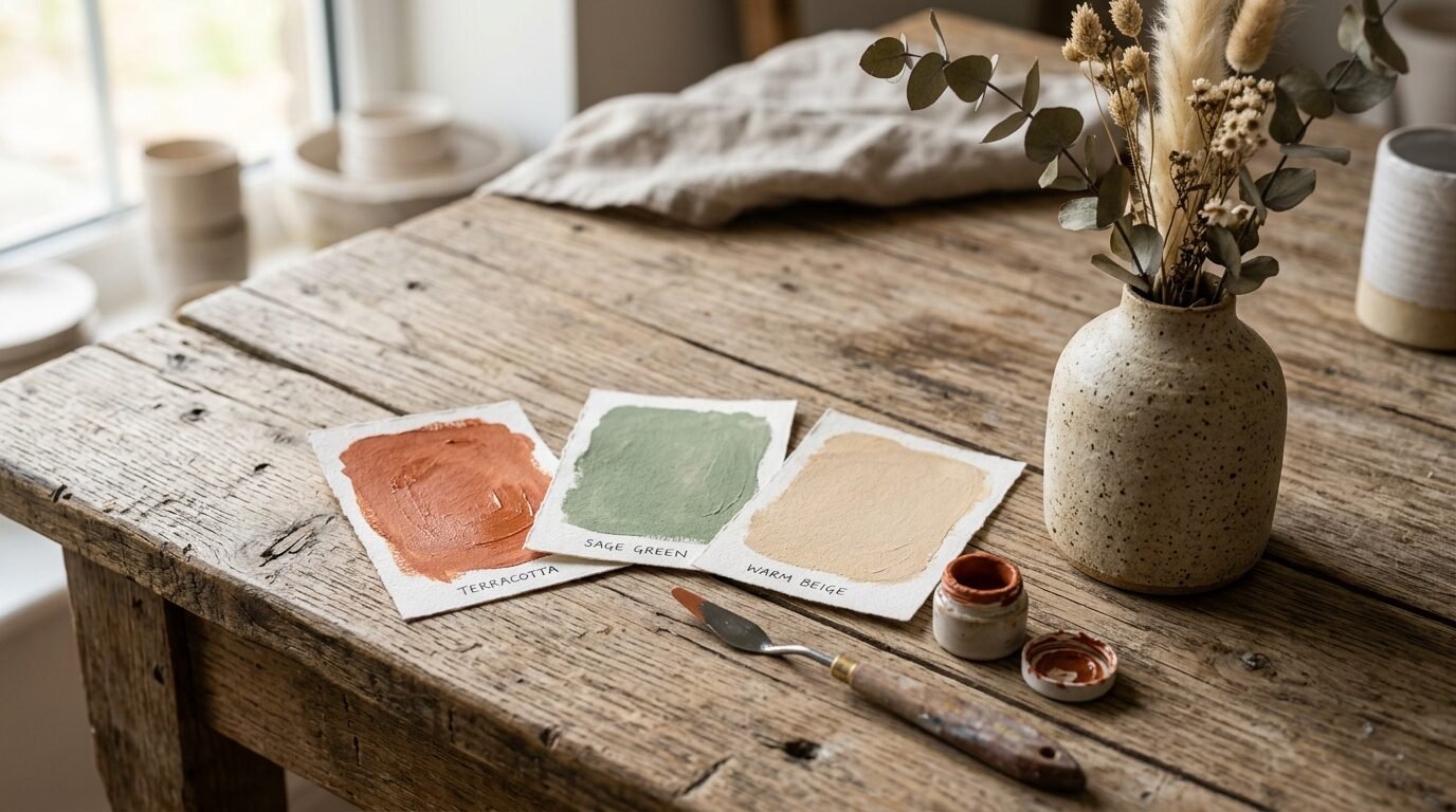
Terracotta is not just one color. It is a range of oranges, reds, and browns. I once tried a bright orange terracotta in a small den. It was a mistake. It felt like a fast-food joint. I learned that the best terracotta pallet has a lot of brown in it. Look for names like “Redend Point” by Sherwin-Williams. This shade feels like dust at sunset.
To make it work, you need a balance. Put a terracotta wall behind a cream sofa. Use natural wood coffee tables. This mix creates a terra color palette that feels expensive. I’ve seen this work best in rooms with plenty of sunlight. The sun hits the red tones and makes the whole room glow. If your room is dark, choose a lighter version. I recommend “Canyon Dusk” by Behr for low-light spaces. It keeps the warmth without making the room feel like a cave.
What colors go with copper accents in a modern kitchen?
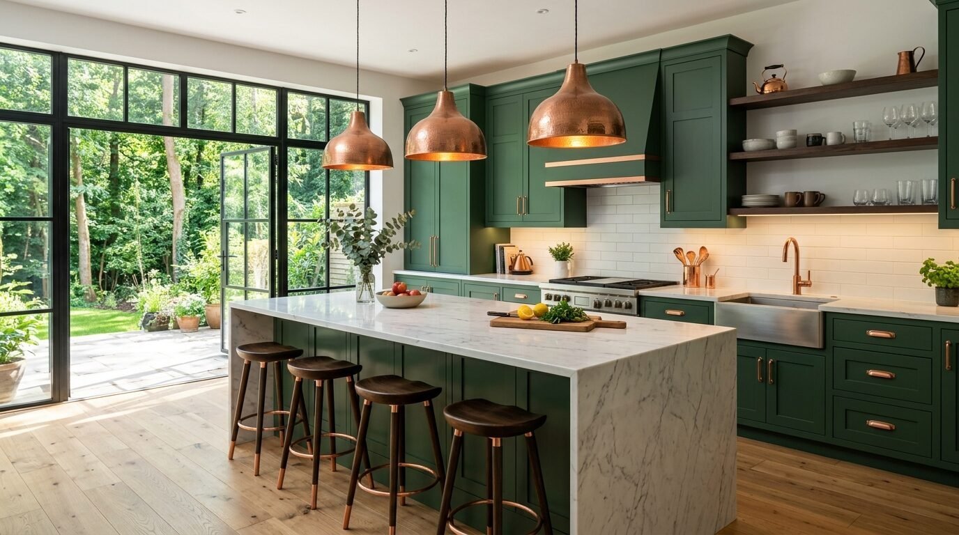
Copper is the metal of the year. It has a soul that stainless steel lacks. But you must be careful with what you put near it. I recently helped a homeowner in Austin with her kitchen. She had beautiful copper pendant lights. We tested four different paint colors. The winner was a deep, moody teal. Teal and copper are opposites on the color wheel. This makes both of them pop.
If you prefer a softer look, go with forest green. Colors that go with copper usually have warm undertones. Avoid cold blues. They make the copper look orange and cheap. Stick to a colour tones pallets that includes sage or charcoal. In my own kitchen, I used copper cabinet pulls against a creamy mushroom paint. It looks timeless. People always ask if I spent thousands on custom cabinets. I didn’t. I just chose the right color scheme for house.
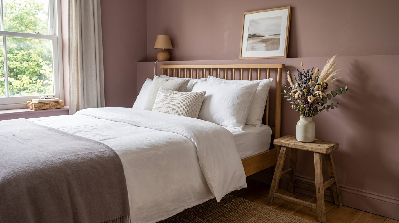
Why is the sage and beige aesthetic the new neutral for bedrooms?
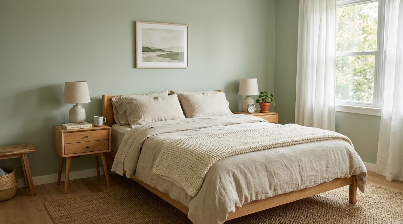
The sage and beige aesthetic is taking over Pinterest for a reason. It is the ultimate “quiet luxury” look. I saw this work perfectly in a beach house renovation. We used a very pale sage on the walls. We used beige linen for the bedding. The result was a room that felt like a spa.
This combo works because it is low contrast. Your eyes do not have to jump around the room. It feels steady. When picking a sage, look for one with gray undertones. This prevents it from looking like a nursery. I love “Saybrook Sage” by Benjamin Moore. It looks different as the light changes. In the morning, it is fresh. At night, it is cozy. Pair it with beige rugs to ground the space.
How do tile and paint combinations change a bathroom feel?
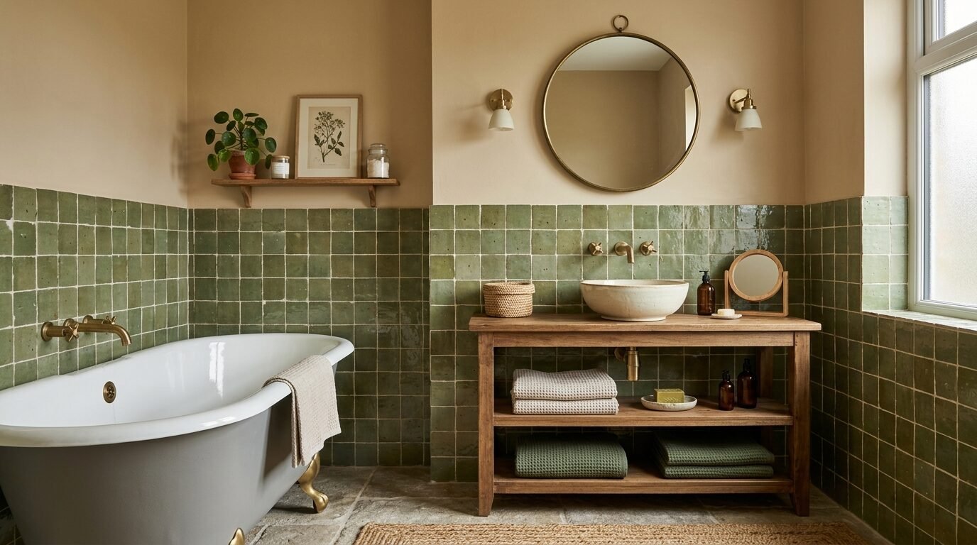
Bathrooms are often cold because of the hard surfaces. You can fix this with tile and paint combinations. I once saw a bathroom with white subway tile and white walls. It felt like a hospital. We painted the top half of the wall a rich burnt sienna. The room transformed instantly.
For 2026, look at textured tiles. Zellige tiles are great. They have uneven edges and colors. Pair a mossy green tile with a sandy beige paint. This creates a layered look. I’ve noticed that dark paint above light tile makes a small bathroom feel taller. It draws the eye up. Do not be afraid of dark colors in small baths. They hide the lack of space by creating mood.
What makes a terra color palette work in small spaces?
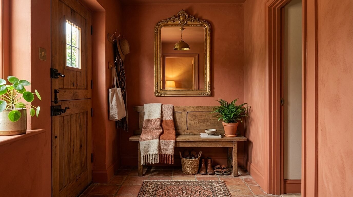
There is a myth that small rooms must be white. I disagree. I live in a small apartment. I painted my entryway a deep terracotta. It feels like a jewel box. A terra color palette works because it has a lot of “pigment power.” It covers the walls in a way that feels intentional.
In a small space, use the same color for the trim and the walls. This is called “color drenching.” It removes the lines that break up a room. It makes the walls feel like they go on forever. I used this trick in a tiny home project. The owners thought the dark color would make it feel cramped. Instead, it felt like a high-end hotel suite.
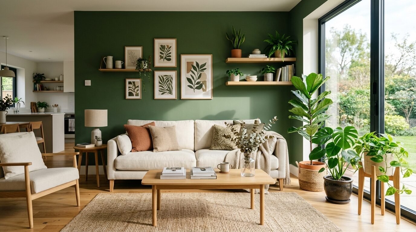
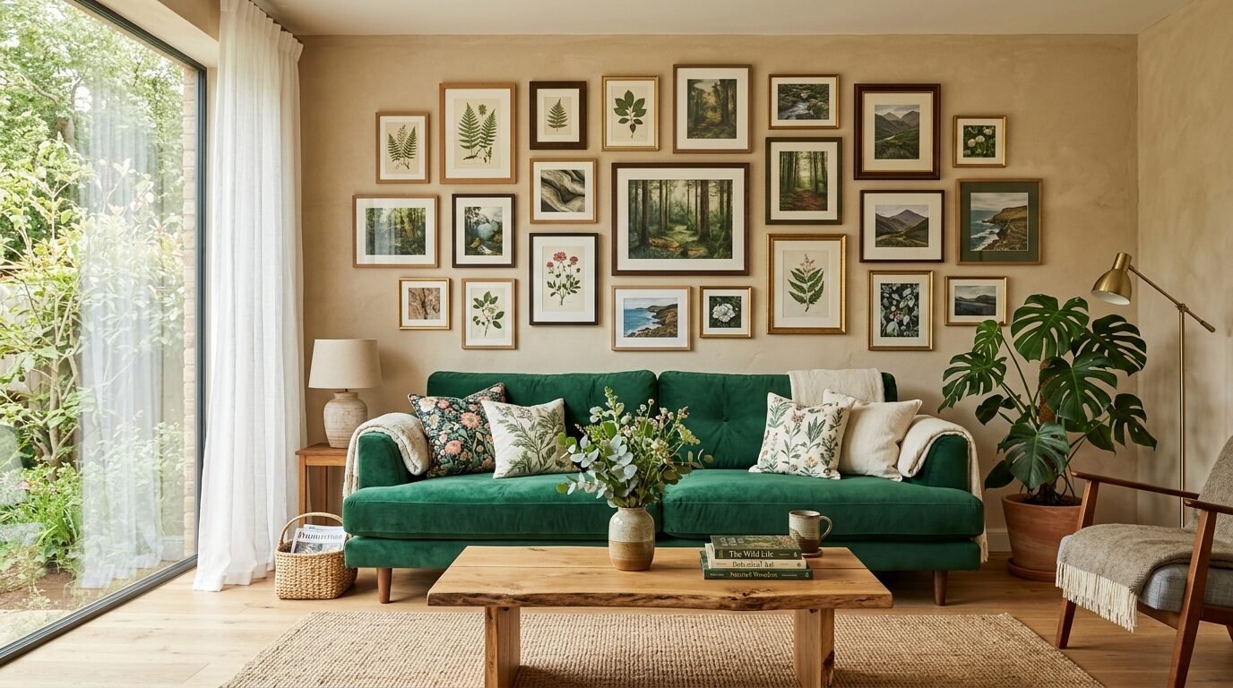
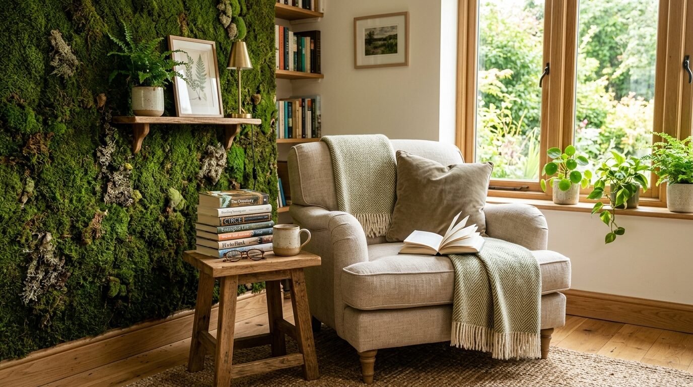
1. Deep Mossy Green
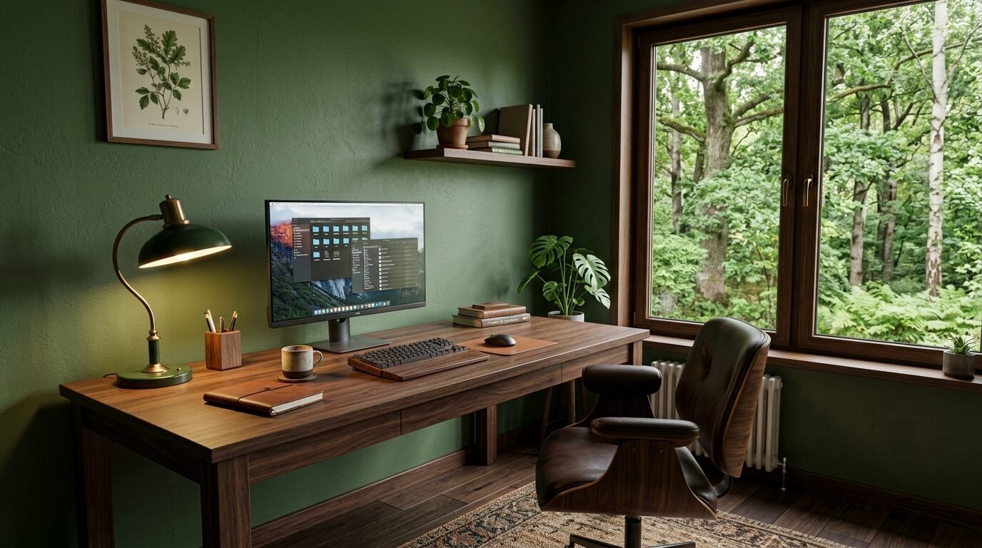
This is the king of 2026. Mossy green brings the forest floor inside. I recommend “Green Smoke” by Farrow & Ball. It is a thick, muddy green that looks like history. I used this in a home office last year. The client said they felt more focused.
2. Burnt Ochre
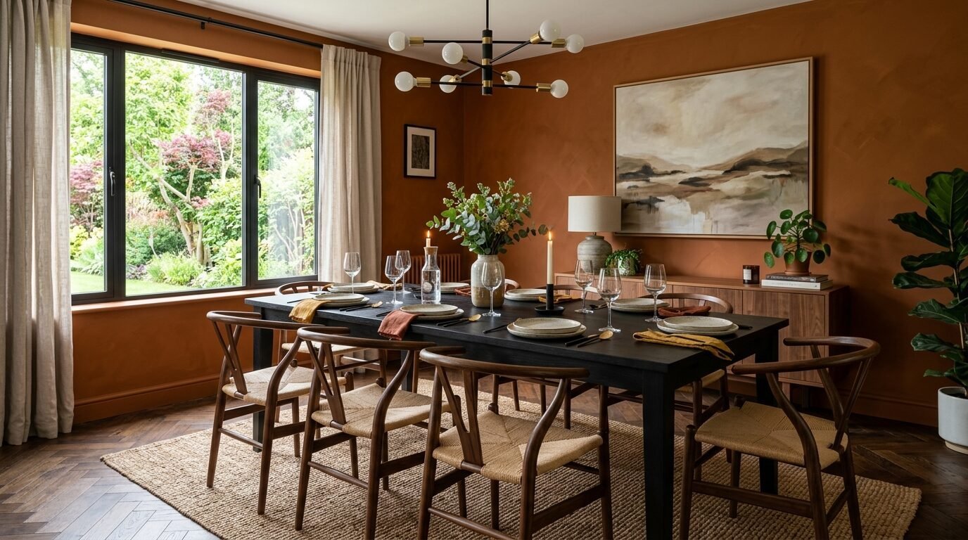
Ochre is the yellow that grew up. It is earthy and rich. It works well in dining rooms. It stimulates the appetite and feels festive. Pair it with dark wood furniture for a classic look. I saw a dining room with ochre walls and a black table. It was stunning.
3. Dusty Mauve
This is not the pink of the 80s. This is a clay-based purple. It looks like desert mountains. It is a great choice for a guest room. It feels welcoming but neutral. I like “Terra Mauve” for this look.
4. Sandstone Beige
Forget “greige.” Sandstone is warmer. It has a hint of yellow and red. It looks like a beach at low tide. It is the perfect backdrop for a house with a lot of plants. The green of the leaves looks incredible against sandstone.
5. Charcoal Slate
Every earthy palette needs a dark anchor. Charcoal slate is better than pure black. It has a soft, chalky finish. Use it on a fireplace wall. It makes the flames look brighter. I’ve seen this work as a focal point in a large open-plan living room.
Which colour tones pallets provide the most value for resale?

If you plan to sell your home, stick to the “warm neutrals.” A sage and beige aesthetic is a safe bet. It appeals to almost everyone. I talked to a real estate agent in Denver who said buyers are tired of gray. They want “organic” looks.
A terracotta pallet can be risky for resale if it is too bright. Stick to the “muted” versions. Look for colors that look like they have been there for fifty years. These “heritage” colors suggest quality and stability. I saw a house sell in two days because the living room was painted a soft, earthy clay color. The buyers said it felt like home the moment they walked in.
Best tools for your accent wall project
I have painted hundreds of walls. The tool you use matters as much as the paint.
| Tool | Brand | Why I Like It |
| Brush | Wooster Alpha | It holds more paint and leaves no streaks. |
| Roller Cover | Purdy White Dove | It gives a smooth finish on drywall. |
| Tape | FrogTape Green | It stops paint from bleeding better than blue tape. |
| Extension Pole | Shur-Line | It saves your back when painting high walls. |
| Paint Tray | Handy Paint Tray | It has a magnet to hold your brush. |
I once tried to save five dollars on a cheap brush. I spent the whole afternoon picking bristles out of the wet paint. Buy the good tools once. They will last for years. I also recommend a “wet bag” for your rollers. If you need to stop for the night, put the wet roller in the bag. It will be ready to go in the morning.
Five common mistakes to avoid with accent walls
- Picking the color in the store. Store lights are blue and harsh. Always take a sample home.
- Painting only one coat. Earthy tones have heavy pigments. You need two coats for the true color to show.
- Forgetting the ceiling. A white ceiling can look stark against a dark wall. Try a “cream” ceiling instead.
- Using the wrong finish. Flat paint looks best for earth tones. It hides wall bumps. Shiny paint makes terracotta look like plastic.
- Making the wall too small. Choose the largest wall in the room. A small accent wall can look like a mistake.
I once saw a homeowner paint a tiny sliver of wall near a door. It looked like a stripe. We repainted the entire back wall of the room. The change was massive. The room felt balanced and calm.
Frequently Asked Questions
What is the most popular accent wall color for 2026?
Mossy green is the leader. It fits the “biophilic” design trend. This means people want to bring nature indoors. I have seen this color used in kitchens, bedrooms, and even bathrooms. It is a versatile choice that goes with many furniture styles.
Does terracotta make a room look smaller?
It can if you pick a very dark shade. However, a mid-tone terracotta can actually make a room feel more open by adding depth. I suggest using it on a wall with a window. The light will bounce off the warm tones and fill the room with a soft glow.
How do I match my furniture to an earthy color pallet?
Look for natural materials. Leather, wood, and linen are the best friends of earth tones. A tan leather sofa looks amazing against a sage wall. A light oak table pairs perfectly with terracotta. Stay away from chrome or high-gloss plastics. They clash with the organic feel.
Is the sage and beige aesthetic going out of style?
No. It is becoming the “new classic.” Just like navy and white, sage and beige are timeless. They are easy to live with for long periods. You can change the look of the room by just swapping out throw pillows or art.
Can I use these colors in a dark room?
Yes. In fact, earthy tones often look better in low light. They lean into the moodiness. Instead of trying to make a dark room bright, make it cozy. I used a dark terra color palette in a basement theater. It felt like a high-end lounge.
A final thought on your home journey
Choosing a color is a personal act. Do not worry about what is “perfect.” Worry about what makes you feel good. I have seen homes that follow every rule but feel cold. I have seen homes that break every rule but feel full of love. Use these trends as a guide, not a law. Start with one wall. Buy a small can of paint. Try it out. You might find that a simple shift to a mossy green changes how you feel every morning. Your home is your space to breathe. Let the colors help you do that.

Anya Castellan is the Founder and Editor-in-Chief of Home Wall Trends. An art history graduate of the Rhode Island School of Design with twelve years of experience writing for leading American design publications, she specializes in composition, gallery wall theory, and the quiet architecture of domestic space. A former contributing editor at Architectural Digest and guest lecturer at Parsons School of Design, Anya personally reads and signs off on every piece before it is published.