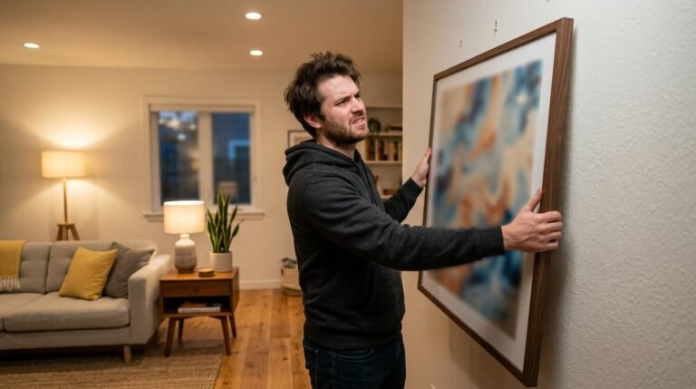
You stand in your living room with a pile of frames on the floor. There is a vintage oil painting you found at a flea market. Next to it sits a bright neon pop art print. You also have black and white family photos and a small sketch from a local artist. They look great alone. Together they feel like a chaotic mess.
I know this feeling well. Last summer I tried to fill a large wall in my hallway. I spent hours moving frames around. I felt frustrated. Nothing seemed to fit. Most people think they need to stick to one style. They buy ten identical black frames and matching botanical prints. It looks safe. It also looks like a hotel room.
A real home should tell a story. Mixing art styles is how you tell that story. It creates a space that feels gathered over time. It feels human. It feels like you. You can combine an 18th century portrait with a modern abstract piece. You just need a plan.
This guide will show you how to blend these styles. We will look at color stories and frame choices. We will talk about the math of spacing. By the end you will have a wall that looks like a curated museum.
Why mixing art styles feels so hard for most people
Most of us fear making a mistake. We worry that a mixed gallery wall will look cluttered. In my experience this happens when there is no common thread. You cannot just throw things at a wall and hope they stick.
The human eye looks for patterns. If there are no patterns the brain gets tired. This leads to that messy feeling. I have seen many people give up and leave their walls blank. They think they lack the “eye” for design.
That is not true. Design is a set of rules you can learn. Once you know the rules you can break them. The secret is finding one or two things that every piece shares. It might be a color. It might be the frame material. It might be the subject matter.
I once helped a friend who had a collection of movie posters and delicate watercolors. They looked terrible together at first. We decided to use a transitional style gallery wall approach. We put everything in thin light wood frames. Suddenly the movie posters felt softer. The watercolors felt more modern. The frames acted as a bridge between the two worlds.
How do you choose a focal point for a mixed gallery wall
Every wall needs a leader. This is your anchor. It is usually the largest piece of art you own. If you have five small prints and one giant canvas the canvas is the anchor.
I like to start by placing the anchor slightly off center. Putting it dead center can feel too formal. When I built my eclectic art gallery wall I chose a large oil painting of a stormy sea. It had deep blues and greens.
Everything else I added had to talk to that painting. I found a small modern print with a tiny splash of seafoam green. I added a black and white photo of a lighthouse. The colors and themes started to link up.
Your anchor does not have to be expensive. It just needs to be bold. It sets the mood. If your anchor is a bright yellow abstract piece the rest of the wall will feel energetic. If it is a moody charcoal sketch the wall will feel quiet and cozy.
Start with your biggest piece. Place it at eye level. Build outward from there. This keeps the weight of the wall balanced. If you put all the heavy items on one side the wall will feel like it is tipping over.
What are the best ways to use stacked art on wall layouts
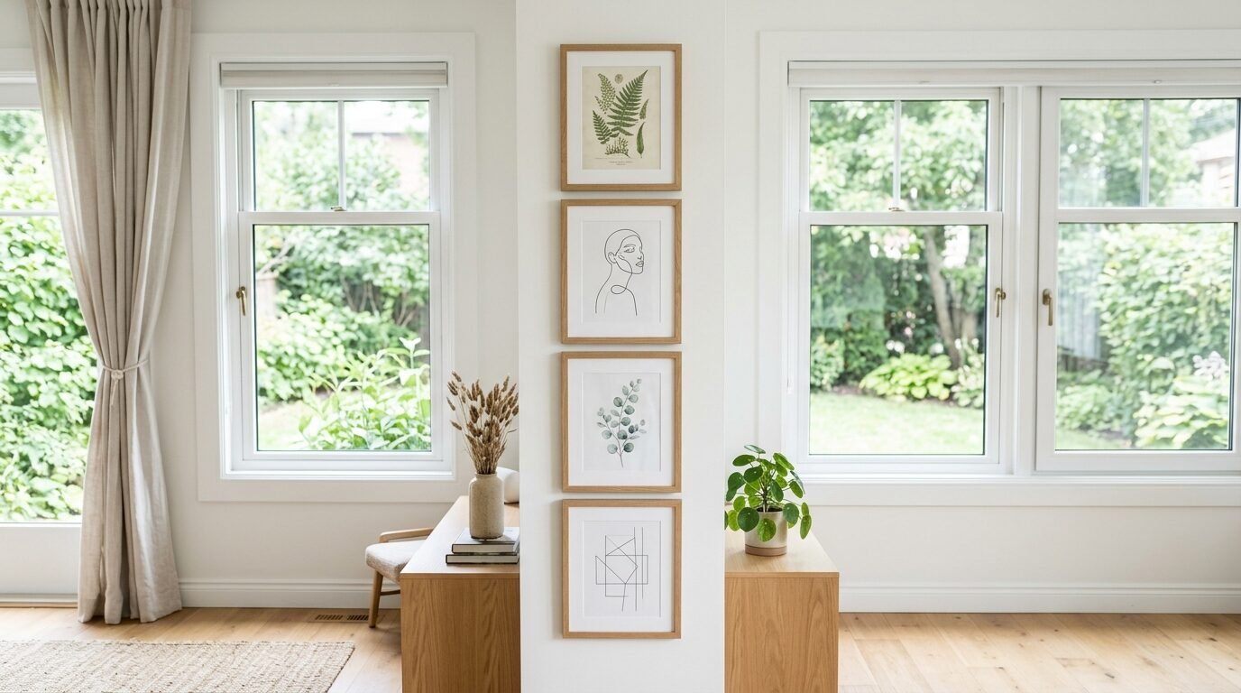
Stacked art on wall arrangements are perfect for narrow spaces. Think about the gaps between windows or the end of a hallway. I often use this method when I have pieces that are the same size but different styles.
I recently tried this in my kitchen. I had two vintage food ads and two modern line drawings of fruit. I stacked them in a vertical column. The vintage ads were colorful. The line drawings were simple black and white.
To make them work I used the same matting for all four. A thick white mat creates a buffer. It lets the art breathe. It also makes the different styles feel like part of a set.
When you stack art keep the distance between frames tight. I recommend two inches. If the gap is too wide the pieces look disconnected. If they are too close they look cramped.
Use a level tool for this. I use the Johnson Magnetic Torpedo Level. It is small and cheap. It ensures your stack is perfectly straight. A crooked stack of art is the first thing people notice when they walk in a room.
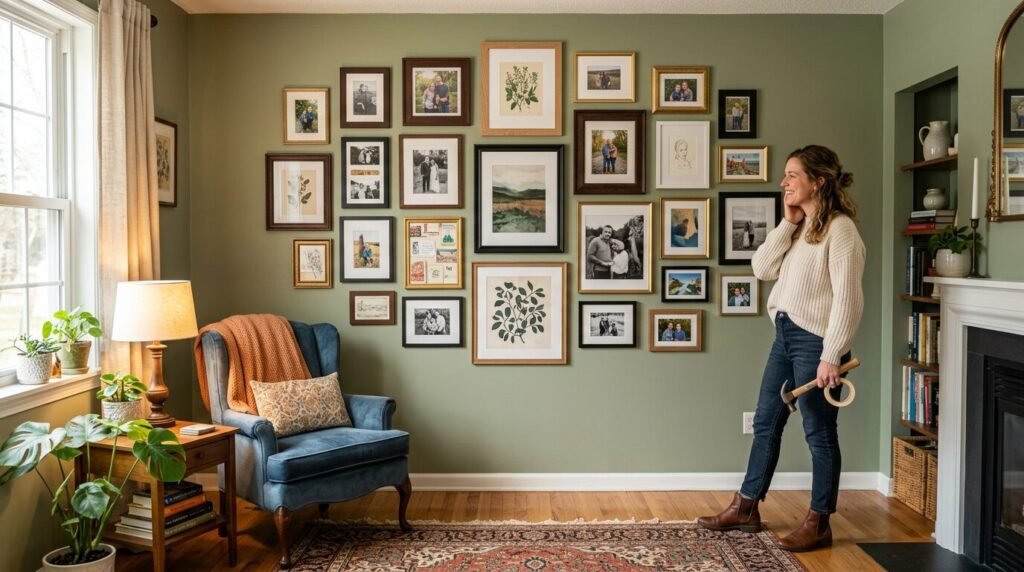
Can you mix photos and art on wall spaces without it looking messy
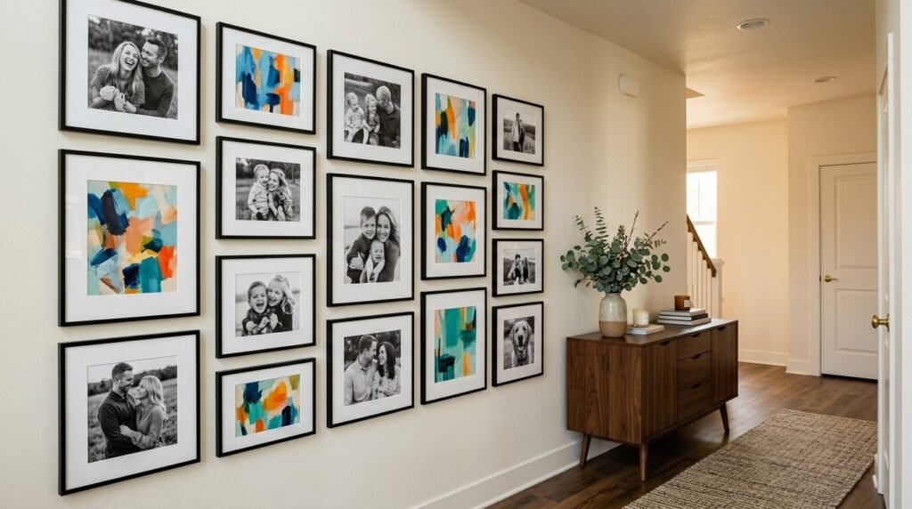
Mixing photos and art on wall surfaces is the best way to make a house feel like a home. Professional art adds style. Personal photos add soul.
I see people struggle with this because photos often have a different “vibe” than paintings. Photos are sharp and realistic. Paintings are textured and expressive.
I have a trick for this. Turn your photos to black and white. This removes the clashing colors of clothing or backgrounds. It makes a photo of your dog look like a piece of high end art.
I once created a gallery wall for a client who had colorful travel photos and classic sketches. We printed the photos in sepia tones. We used gold frames for the sketches and dark wood frames for the photos.
The gold and wood complemented each other. The sepia tones matched the aged paper of the sketches. It looked intentional.
Try to group your photos together in one section of the wall. Or sprinkle them throughout evenly. Do not put all the photos in one corner and all the paintings in another. That creates a visual split that feels jarring.
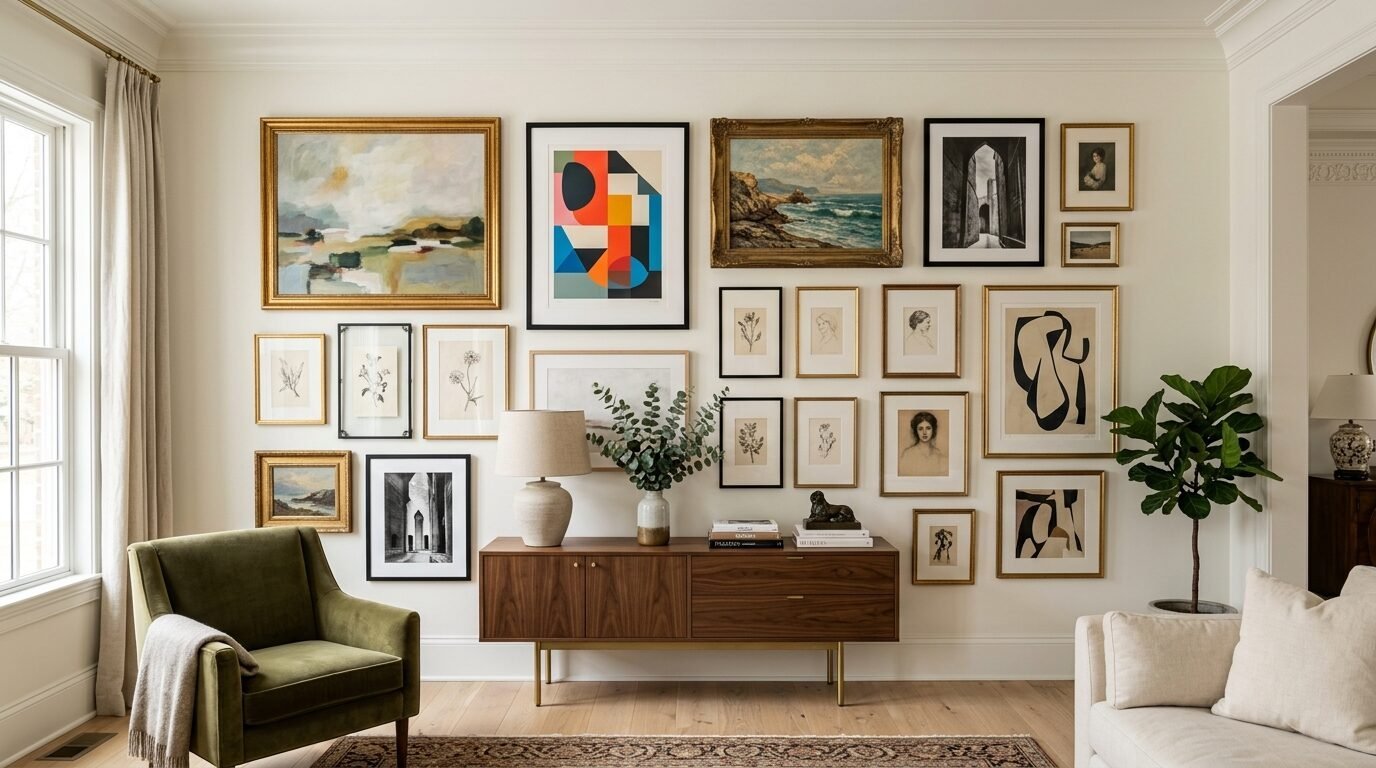
How to pull off an eclectic art gallery wall in five steps
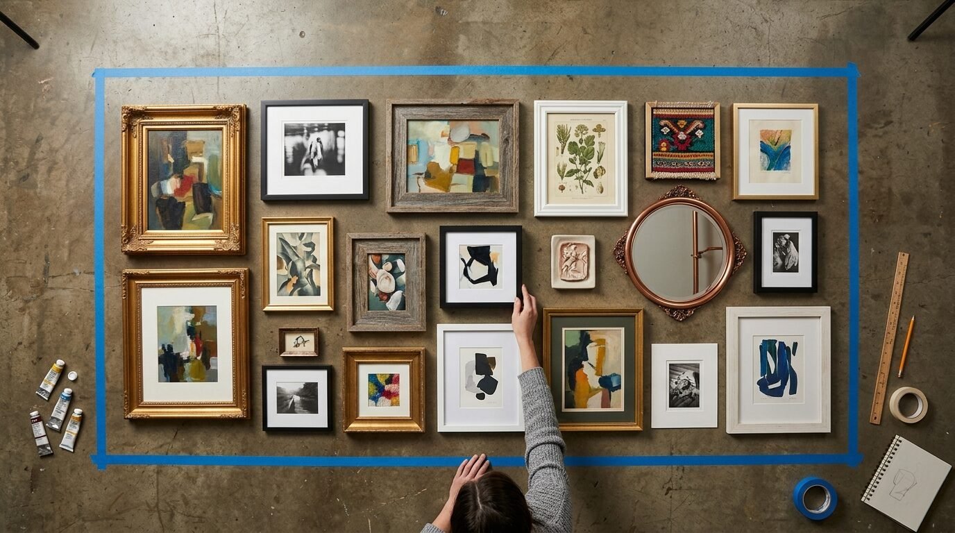
An eclectic art gallery wall is about variety. It is the opposite of a grid. It feels alive. Here is how I do it.
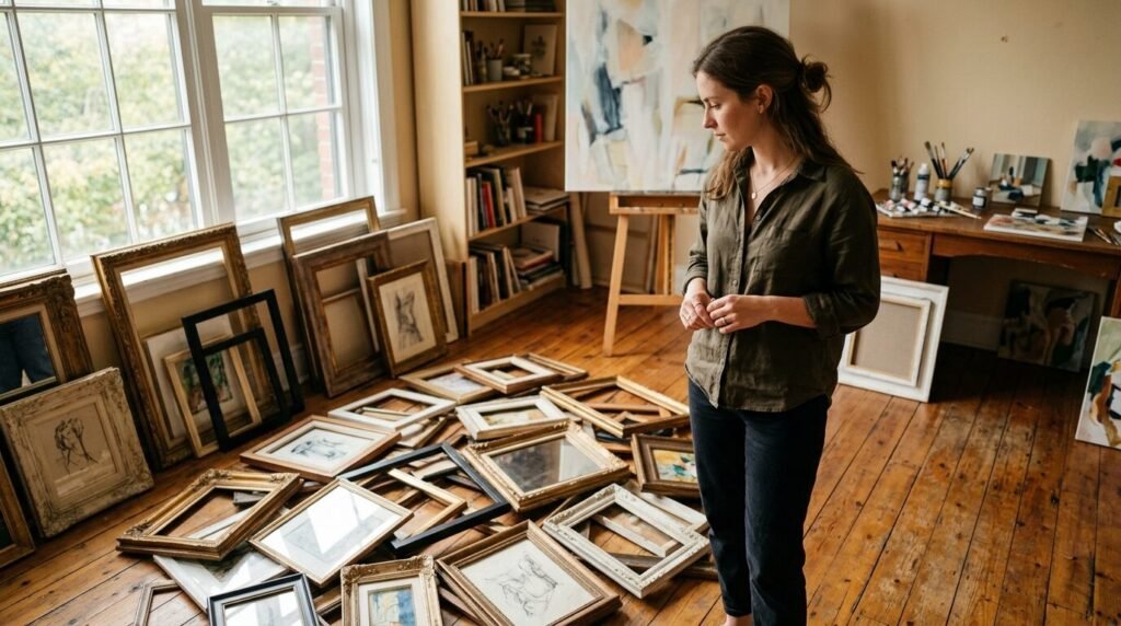
First gather every piece of art you own. Put them all in one room. This includes mirrors and wall sculptures too.
Second find a color link. Look for a color that appears in at least three pieces. Maybe it is a specific shade of red. This will be your “pop” color.
Third lay everything out on the floor. This is a vital step. Do not start with nails in the wall. I use painter’s tape to mark a box on the floor the size of my wall space.
Fourth start in the middle. Place your anchor piece. Surround it with smaller items. Mix the textures. Put a smooth glass frame next to a textured canvas. Put a round mirror next to a square print.
Fifth take a photo of the floor layout. Stand on a chair to get the whole view. Look at the photo. Sometimes you see gaps in a photo that you miss in person. Once it looks perfect on the floor move it to the wall.
I use 3M Command Picture Hanging Strips for this. They allow you to move things if you miss by a half inch. They are a lifesaver for renters or anyone who changes their mind often.
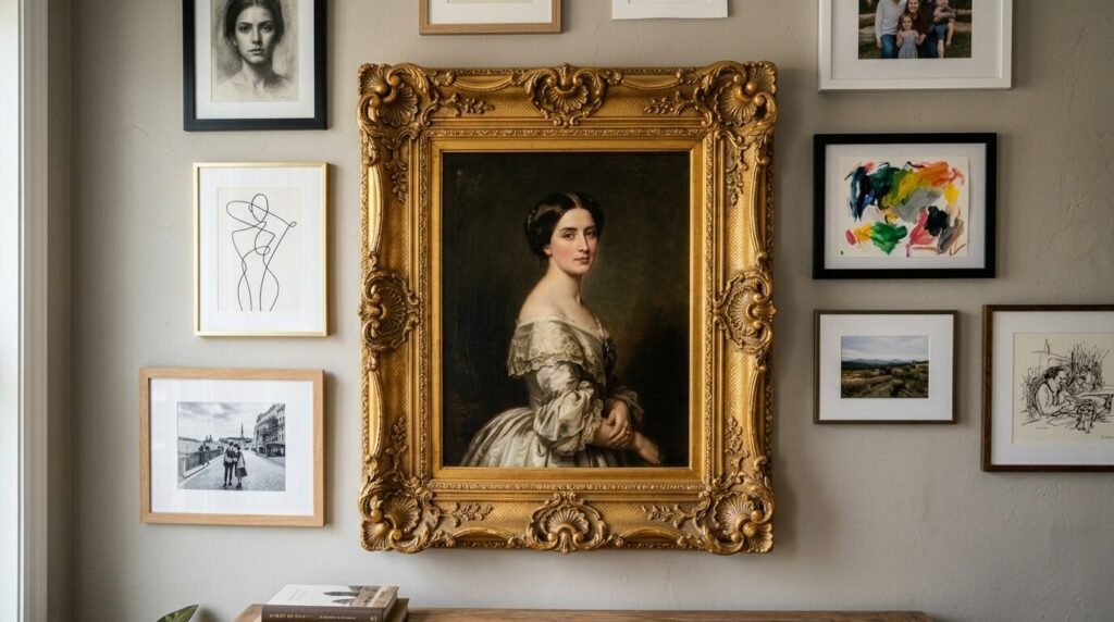
Choosing the right gallery wall with mixed frames
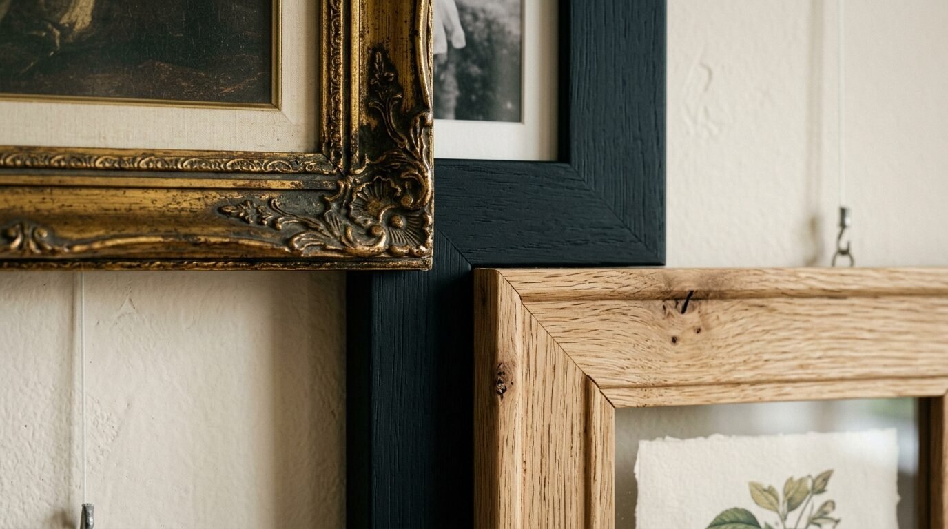
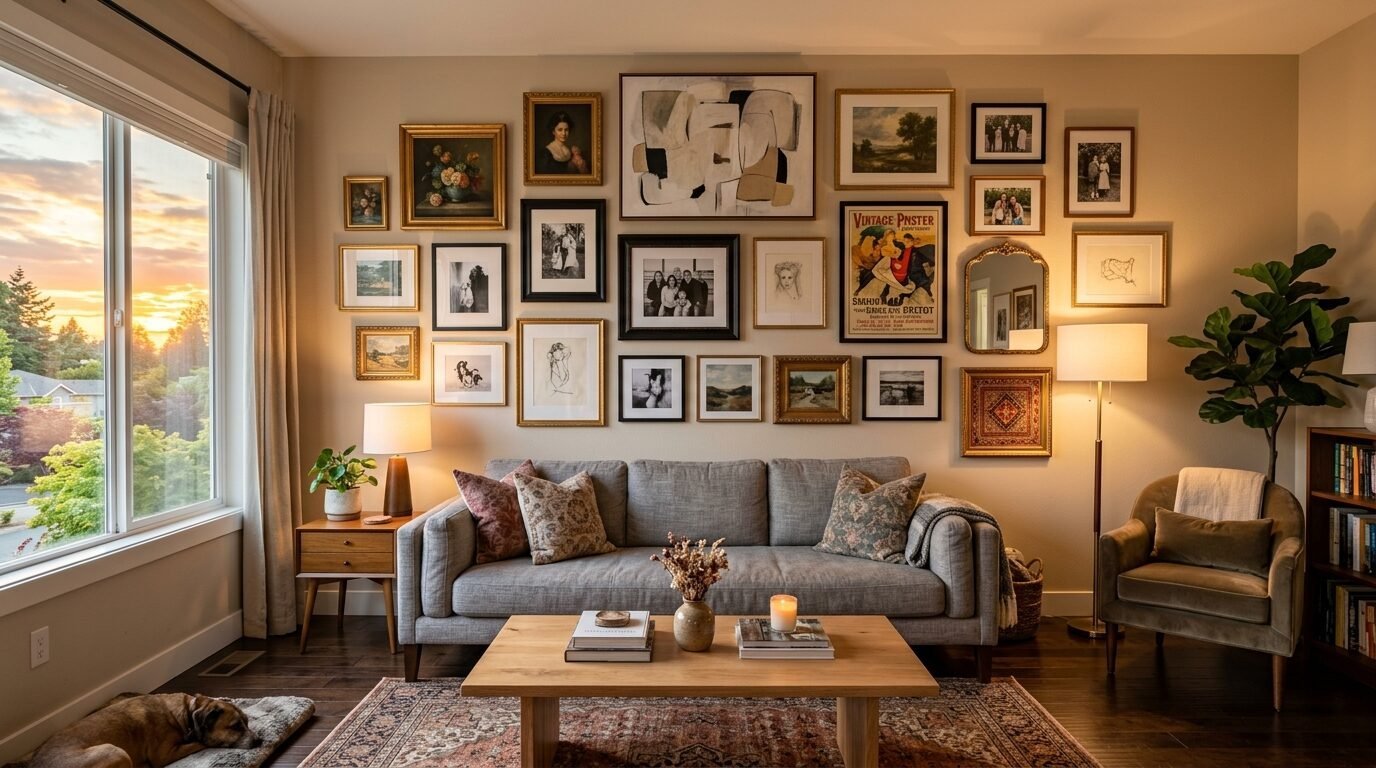
The frames are just as important as the art. A gallery wall with mixed frames looks more interesting than one where everything matches. But you still need some rules.
I like to stick to three finishes. For example I might use black wood, natural oak, and antique gold. This provides enough variety to look eclectic but enough repetition to look cohesive.
In my own office I have a mix of thin black metal frames and chunky ornate gold ones. The black frames hold modern prints. The gold frames hold old maps.
The contrast is what makes it work. The modern frames keep the gold from looking too “dusty.” The gold frames keep the black from looking too cold.
If you have a frame you love but the color is wrong use spray paint. I use Rust-Oleum Painter’s Touch. It covers well and dries fast. I once turned a cheap plastic frame into a high end looking brass piece in ten minutes.
Keep the “weight” of the frames in mind. If all your heavy frames are at the bottom the wall will feel bottom heavy. Spread the thick frames across the entire layout.
How to mix and match artwork using the transitional style gallery wall approach
The transitional style gallery wall is the middle ground. It is not too modern and not too traditional. It is the most popular style for a reason. It feels timeless.
To get this look you want to balance your art. If you have a very modern abstract painting pair it with a traditional landscape. This creates a conversation between the two pieces.
I saw this work perfectly in a home in Seattle. The owner had a large collection of white artwork and charcoal drawings. They mixed in a few very colorful modern pieces.
The white artwork acted as a “reset” for the eyes. It gave the viewer a place to rest before looking at the next bold piece.
I find that using a consistent mat color helps with the transitional look. Use an off-white or cream mat for everything. This softens the edges of modern art and brightens up older pieces.
It makes the whole collection feel like it belongs to the same era. Even if the pieces are hundreds of years apart.
Why white artwork is the secret weapon for cohesion
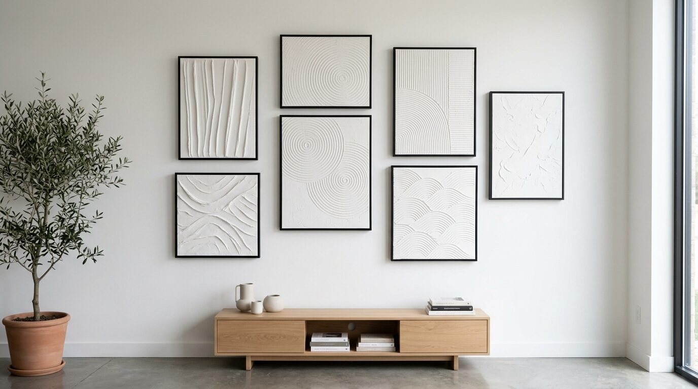
If your wall feels too busy you need white artwork. This does not mean a blank canvas. It means art with a lot of “negative space.”
Think of a simple line drawing on white paper. Or a white plaster relief. These pieces act as a “palate cleanser” for your wall.
When I was building a wall for a client in a small apartment the colors were getting too intense. We added two large pieces of white artwork with simple black frames.
The effect was instant. The wall felt larger. The colors around the white pieces seemed to glow more.
I often look for white artwork at thrift stores. You can find old textured paintings and paint over them with a warm white. The texture remains but the color becomes a neutral anchor.
It is a cheap way to add a high end look to your mixed gallery wall. White art bridges the gap between a dark photo and a bright painting. It is the glue that holds the mismatched pieces together.
Tools I use to hang art perfectly every time
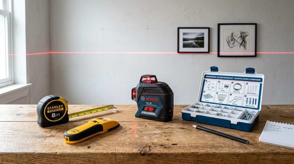
Hanging art is a technical task. If you don’t have the right tools you will end up with a wall full of holes. I have made this mistake many times.
Now I have a kit I use for every project. The first tool is a laser level. The Bosch GLL25 is a great entry level option. It projects a red line across your wall. You can line up the tops of your frames perfectly.
Next is a stud finder. You don’t always need to hit a stud but for heavy mirrors it is a must. I like the Franklin Sensors ProSensor. It is very accurate.
For the actual hanging I use Gorilla Grade Brads for light items. They leave tiny holes that are easy to fill. For heavier pieces I use OOK Professional Picture Hangers. They are rated by weight so you know your art is secure.
I also keep a pack of clear bumper pads. Put these on the bottom corners of your frames. They keep the frames from shifting when people walk by. They also protect your paint from scratches.
Lastly keep a pencil and a tape measure nearby. Measure twice. Mark once. It sounds like a cliché because it is true.
Common mistakes I made when building my first gallery wall
I want to share my failures so you can avoid them. My first gallery wall was a disaster. I started hanging things without a plan.
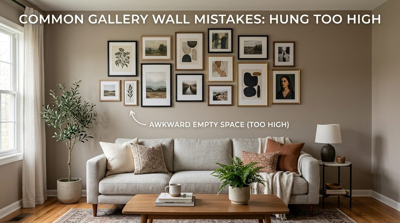
I hung the art too high. This is the most common mistake. People tend to hang art near the ceiling. It should be at eye level. For most people this is about 57 to 60 inches from the floor to the center of the piece.
Another mistake was spacing. I put the frames six inches apart. It looked like the art was trying to escape from each other. Aim for two to three inches of space between frames.
I also ignored the furniture. I hung a small gallery wall over a giant sofa. The wall looked tiny and lost. The gallery should take up about two thirds to three fourths of the width of the furniture below it.
I used to be afraid of mixing metals. I thought if I had a silver lamp I could only use silver frames. I was wrong. Mixing gold, silver, and wood makes the room feel much more expensive.
Don’t be afraid to leave some empty space. You don’t have to cover every inch of the wall. Sometimes the wall itself is part of the design.
Frequently Asked Questions about mixing art styles
How do I know if two art styles clash too much
In my experience almost no two styles clash if the frames are right. A bright 1960s pop art piece can sit next to a dark 17th century portrait. The key is to find one color they share. If the pop art has a tiny bit of dark brown that matches the old portrait they will work.
Should I use the same color frames for everything
You can but you don’t have to. Using the same color frames is a safe way to create cohesion. It works well if your art is very different. If your art is similar you can use different frames to add interest. I usually recommend a mix of two or three frame styles.
How do I hang art on a brick wall
Brick is tricky but not impossible. You need a masonry drill bit and wall anchors. Or you can use “brick clips” that snap onto the edge of the brick. I prefer the clips because they don’t require drilling. They are great for rental homes.
Can I mix horizontal and vertical pieces
Yes. In fact you should. A mix of horizontal and vertical frames makes the wall feel more dynamic. If you only use one orientation the wall can look a bit static and boring.
What if I have a very small piece of art
Small art can get lost on a large wall. I like to “pair” small pieces. Hang two or three small frames close together so they act as one larger unit. Or put a small piece in a very large frame with an extra wide mat. This gives it more importance.
How do I fill a gap in my gallery wall
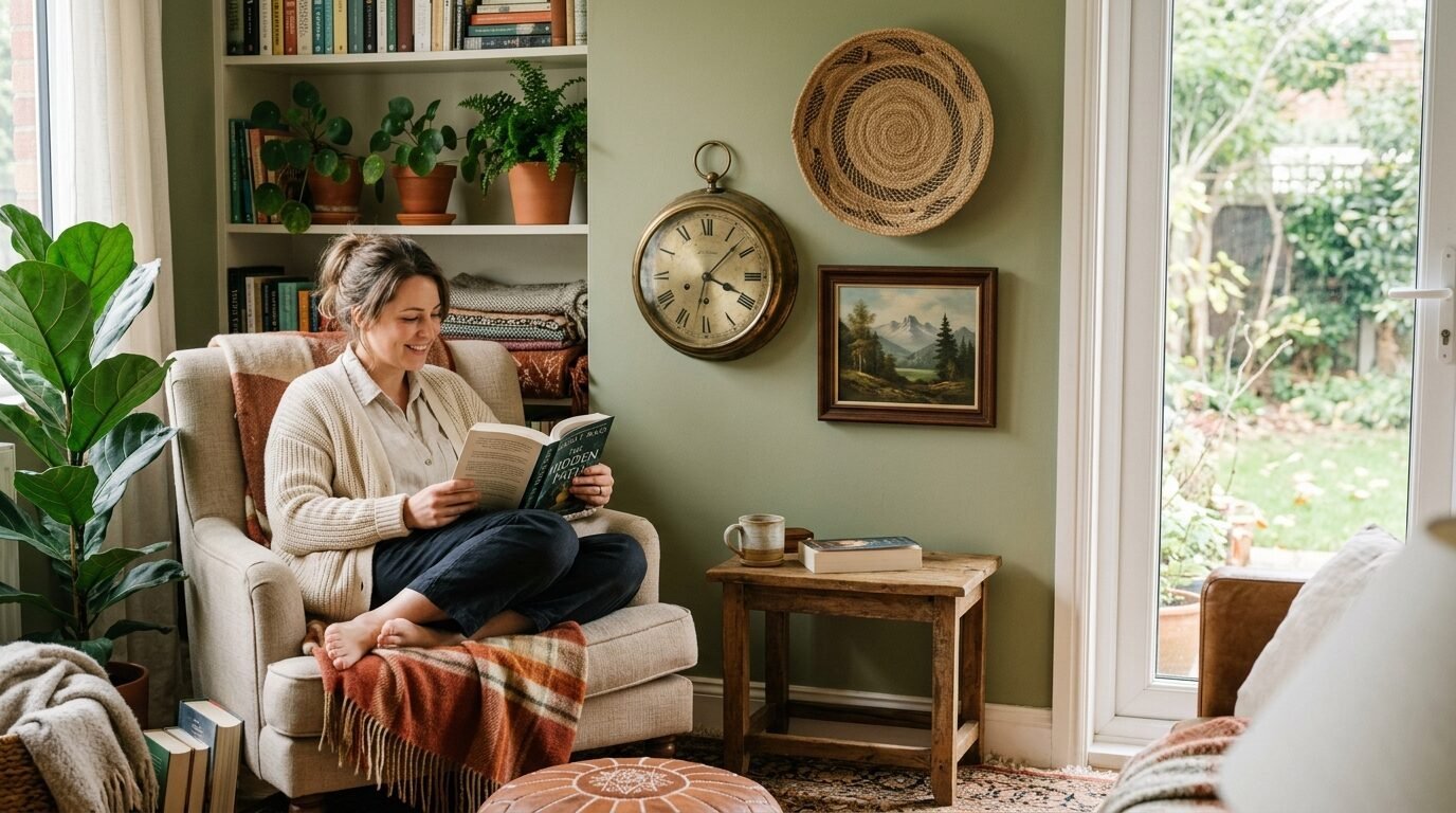
If you have a weird gap don’t try to force a piece of art there. Use an object instead. A small wooden shelf, a brass clock, or a decorative wall basket can fill a gap perfectly. It adds texture and breaks up the flat look of the frames.
Your home is a place for your history. Don’t worry about what the magazines say. If you love a piece of art it has a place on your wall.
Start small. Maybe try stacking two pieces in a corner first. See how it feels. Move them around. The beauty of a gallery wall is that it can grow with you.
You will find new pieces on trips or in local shops. You can swap photos out as your family grows. It is a living part of your home.
Grab your level and your tape. Clear a space on the floor. Start moving those frames. You might be surprised at how well that old painting looks next to your favorite modern print.
Your wall is waiting. It is time to tell your story.

Anya Castellan is the Founder and Editor-in-Chief of Home Wall Trends. An art history graduate of the Rhode Island School of Design with twelve years of experience writing for leading American design publications, she specializes in composition, gallery wall theory, and the quiet architecture of domestic space. A former contributing editor at Architectural Digest and guest lecturer at Parsons School of Design, Anya personally reads and signs off on every piece before it is published.