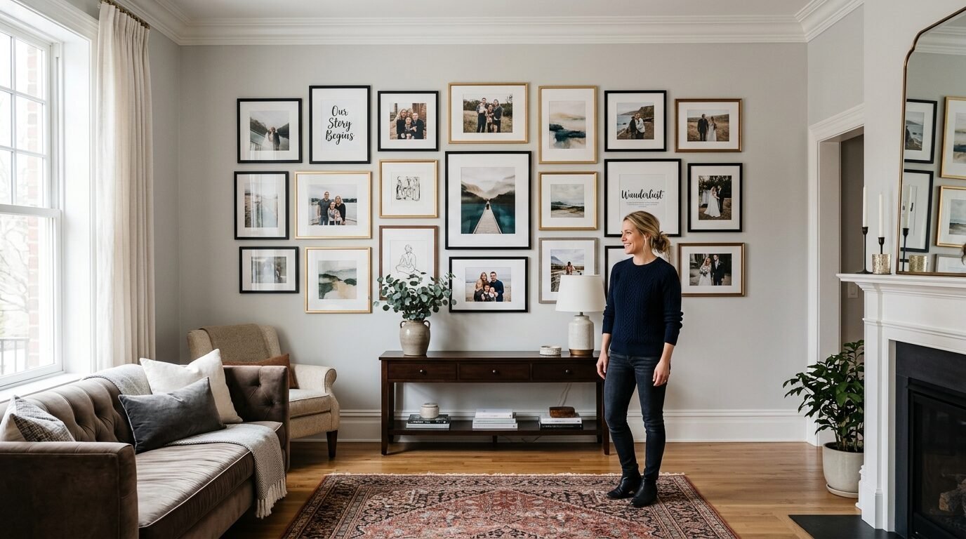
You just found the perfect digital print. It looks stunning on your screen. You feel ready to hang it in your living room. Then you print it on standard printer paper. The colors look dull. The paper curls at the edges. Your beautiful art looks like a grocery store flyer. I have felt that frustration many times. My home office used to be a graveyard of bad prints. I spent months testing different weights and finishes. I wanted my DIY gallery wall to look professional. I learned that the paper matters more than the printer. This guide shows you how to pick the best surface for your art. You will turn a cheap digital file into a high-end masterpiece.
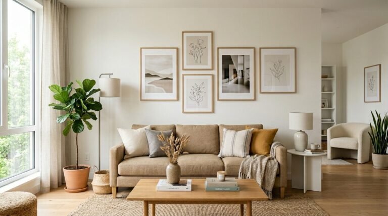
Why Paper Choice Dictates Your Room Atmosphere
The way light hits your wall art changes how a room feels. I noticed this when I decorated my first apartment. I printed a moody landscape on glossy paper. The glare from the window made it impossible to see. It looked cheap and plastic. I swapped it for a heavy matte paper. Suddenly the room felt cozy and expensive. The paper texture absorbs light or reflects it. This choice affects the mood of your home.
In my experience, matte finishes work best for calm spaces. I use them in bedrooms and nurseries. Glossy finishes fit modern or high energy rooms. Your paper choice also tells guests about your style. Heavy cardstock feels intentional. Thin paper feels temporary. I always tell my friends to think of paper as the foundation of the art. You would not build a house on sand. Do not print great art on weak paper.
Understanding Paper Weight and GSM
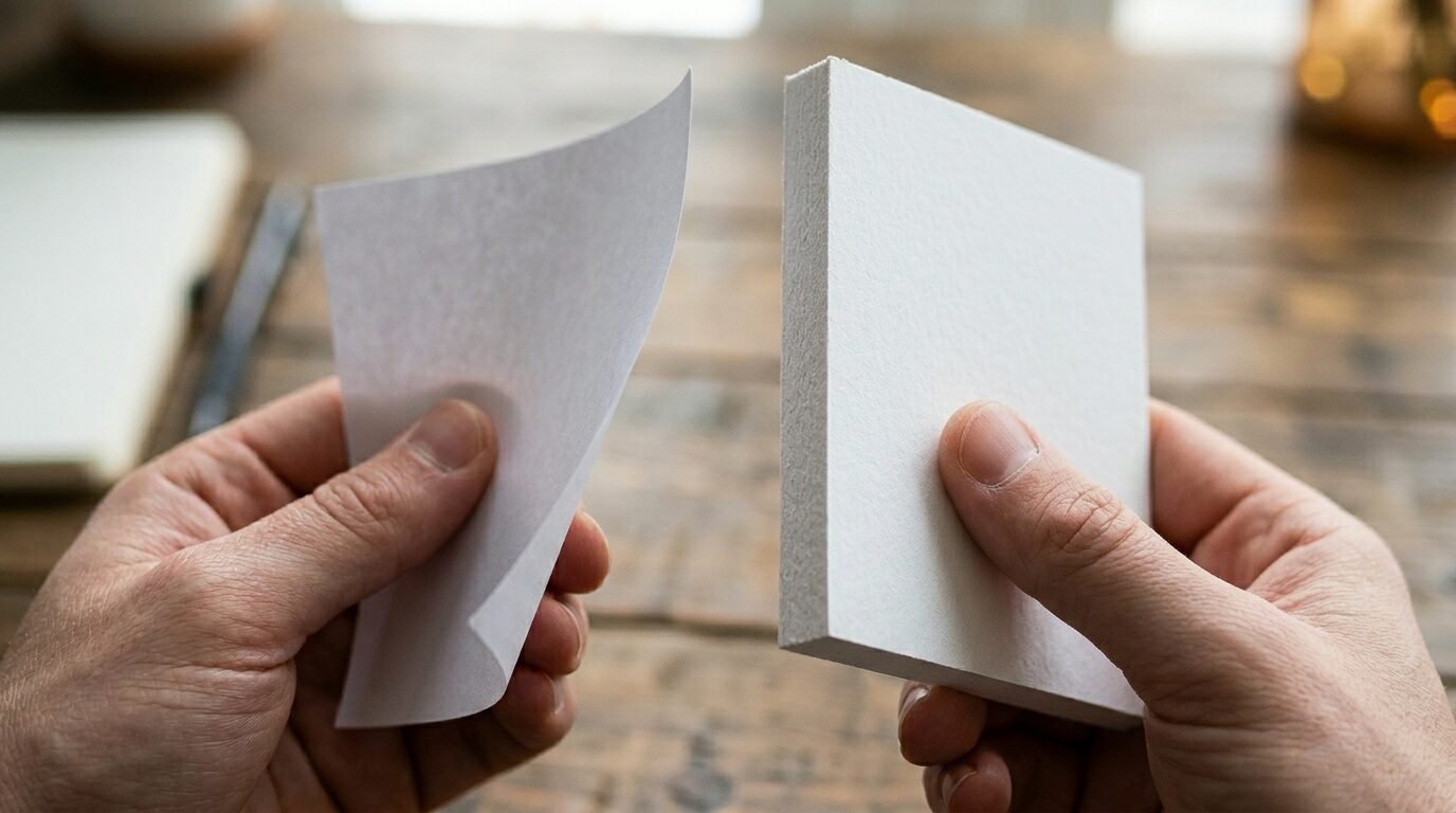
Weight is the most technical part of printing. People often ask me what GSM means. It stands for grams per square meter. It tells you how thick the paper feels in your hand. Standard office paper is usually 80 GSM. This is too thin for wall art. It will wrinkle if you use too much ink. I suggest a minimum of 170 GSM for any wall decor.
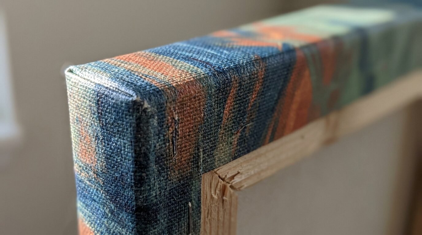
I once tried to save money on a large Etsy download. I used 120 GSM paper from a local shop. The ink saturated the fibers. The paper warped before I could even frame it. Now I strictly use 230 GSM or higher. This weight feels like a postcard. It stays flat in the frame. If you want a luxury feel, look for 300 GSM. This is often called heavy cardstock. It gives your Art Print Download a sturdy presence. It looks like it came from a gallery.
Matte vs Glossy vs Luster Finishes
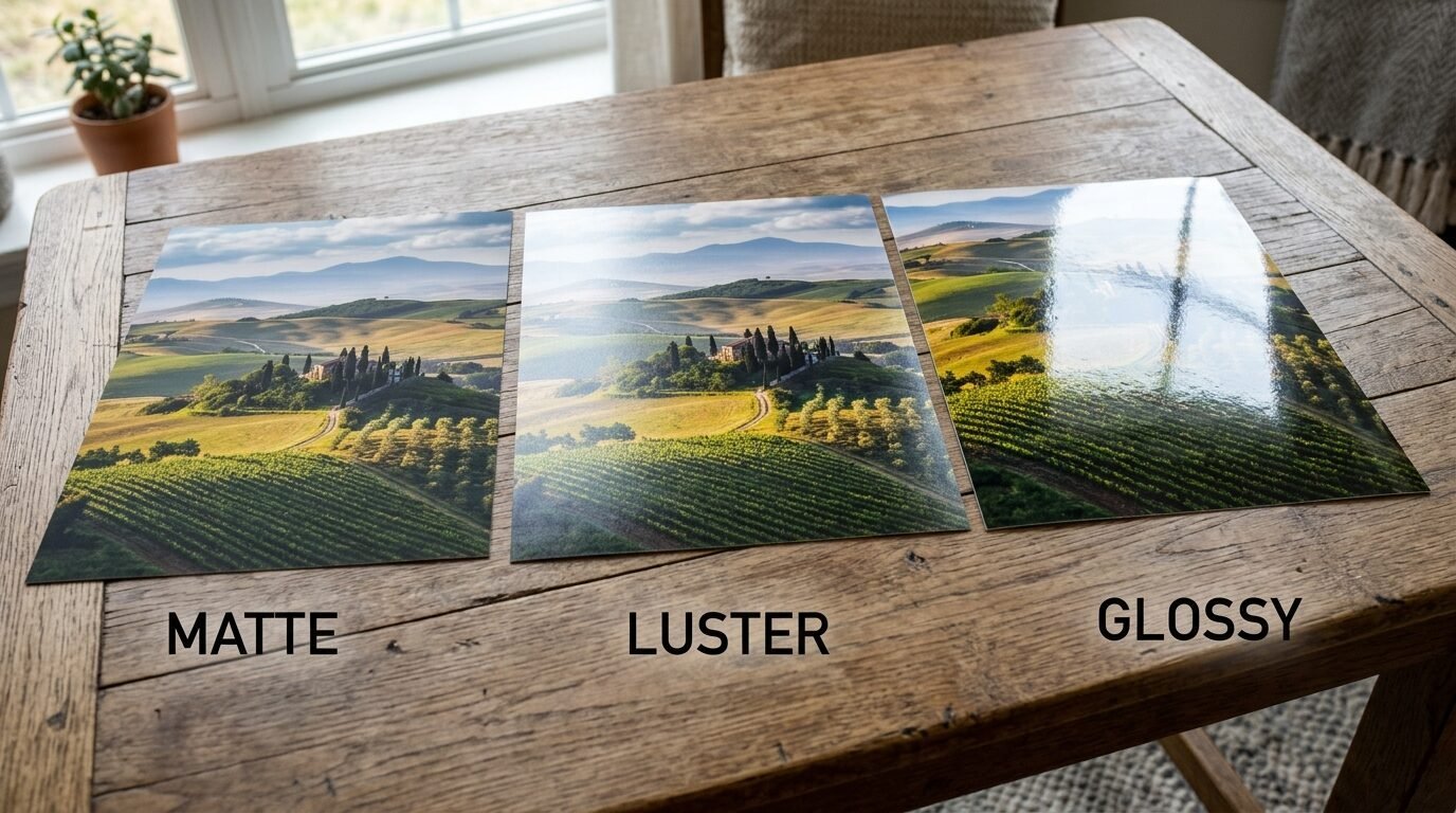
Most people get stuck between these three choices. Each one serves a different purpose for Wall Art Prints Printables.
Matte Paper Matte has no shine. It feels smooth or slightly textured. I love matte for black and white photos. It gives deep blacks and soft whites. It is perfect for areas with lots of natural light. You will not see your own reflection in the glass. I use Epson Ultra Premium Matte for most of my projects. It is affordable and reliable.
Glossy Paper Glossy paper makes colors pop. It has a high shine. I find it works best for bright, colorful art. Think of pop art or neon designs. However, it shows fingerprints easily. I stopped using glossy for large prints because the glare was too distracting.
Luster and Satin Luster is the middle ground. It has a soft sheen but not a full shine. Professionals often choose luster for wedding photos. It handles skin tones beautifully. I’ve seen this work well for Cool Wall Art that features people or detailed textures. It resists fingerprints better than glossy paper.
The Best Paper for Free Downloadable Prints
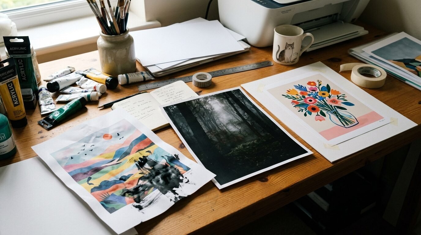
When you find Free Downloadable Prints, you might feel tempted to print them fast. I recommend slowing down. Even a free file deserves a good home. I recently found a vintage botanical set online. I printed one on basic paper and one on linen textured paper. The linen version looked like an antique. The basic one looked like a photocopy.
If you print at home, try HP Premium Plus Photo Paper. It is easy to find at big stores. It works well with most inkjet printers. For a more artistic look, I suggest 100 percent cotton rag paper. This paper is acid free. It will not turn yellow over the years. I have prints from five years ago that still look brand new. They were printed on acid free matte cardstock.
Using Art Print Download Services and Etsy Files
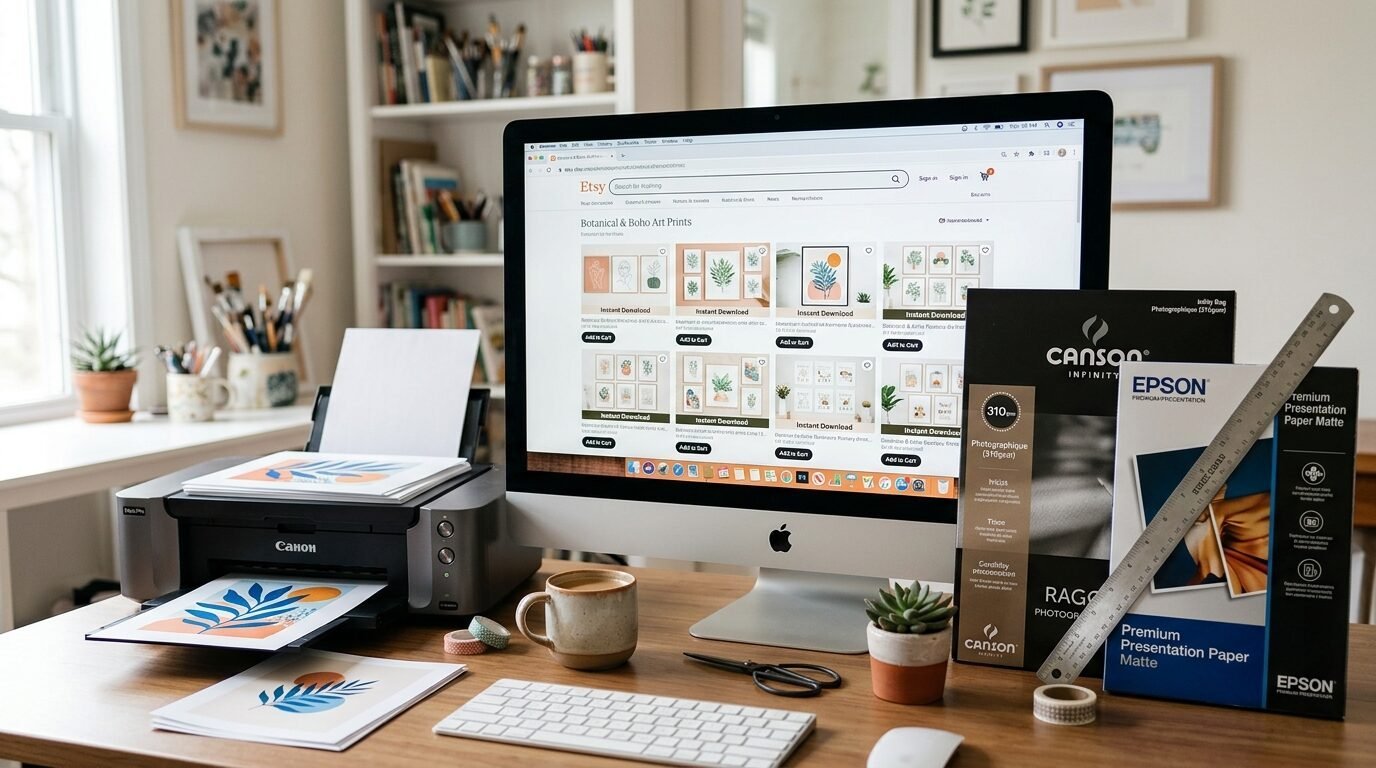
Etsy is a gold mine for decor. I have bought over fifty Etsy Download files for my home. Most sellers give you several sizes. This is great for a gallery wall. But you must match the file resolution to the paper size. If you print a small file on a large sheet, it will look blurry.
I always check the DPI of my files. DPI means dots per inch. You want 300 DPI for a crisp print. I once ignored this and printed a low resolution file on expensive Canson Infinity Rag paper. It was a waste of high quality paper. The art looked pixelated. Now I verify the file size before I buy my paper. If the file is small, I stick to a smaller paper size like 5×7 or 8×10.
Professional Online Printing Services vs Home Printing
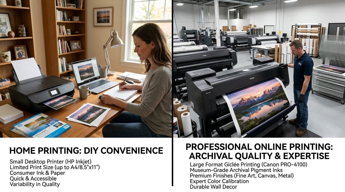
Sometimes your home printer is not enough. I own a decent inkjet, but it struggles with solid dark colors. When I want a deep navy or forest green, I use Online Printing Services.
Mpix I have used Mpix for years. Their giclee prints are top tier. They use archival inks that last a lifetime. The paper is thick and the colors match my screen perfectly.
Artifact Uprising I choose them when I want a minimalist look. Their ultra thick boards are amazing. You do not even need a frame for them. They stand up on their own.
Staples or FedEx Office These are good for a quick fix. I use them for temporary holiday decor. Ask for their 110lb white cardstock. It is the best budget option for Downloadable Prints. It is much better than their standard paper.
Cheap Canvas Prints and Texture Options
You might want the look of a painting without the price tag. Cheap Canvas Prints are a popular choice. You can upload your digital file to sites like Shutterfly or Walgreens. I find that canvas hides low resolution better than flat paper. The texture of the fabric masks small imperfections.
I tried a Cheap Canvas from a local drugstore last year. The colors were a bit dull compared to my screen. However, for a large 24×36 piece, it was a bargain. If you want better quality, look for “gallery wrapped” canvas. This means the art continues around the edges. You do not need a frame. This saves you even more money in the long run.
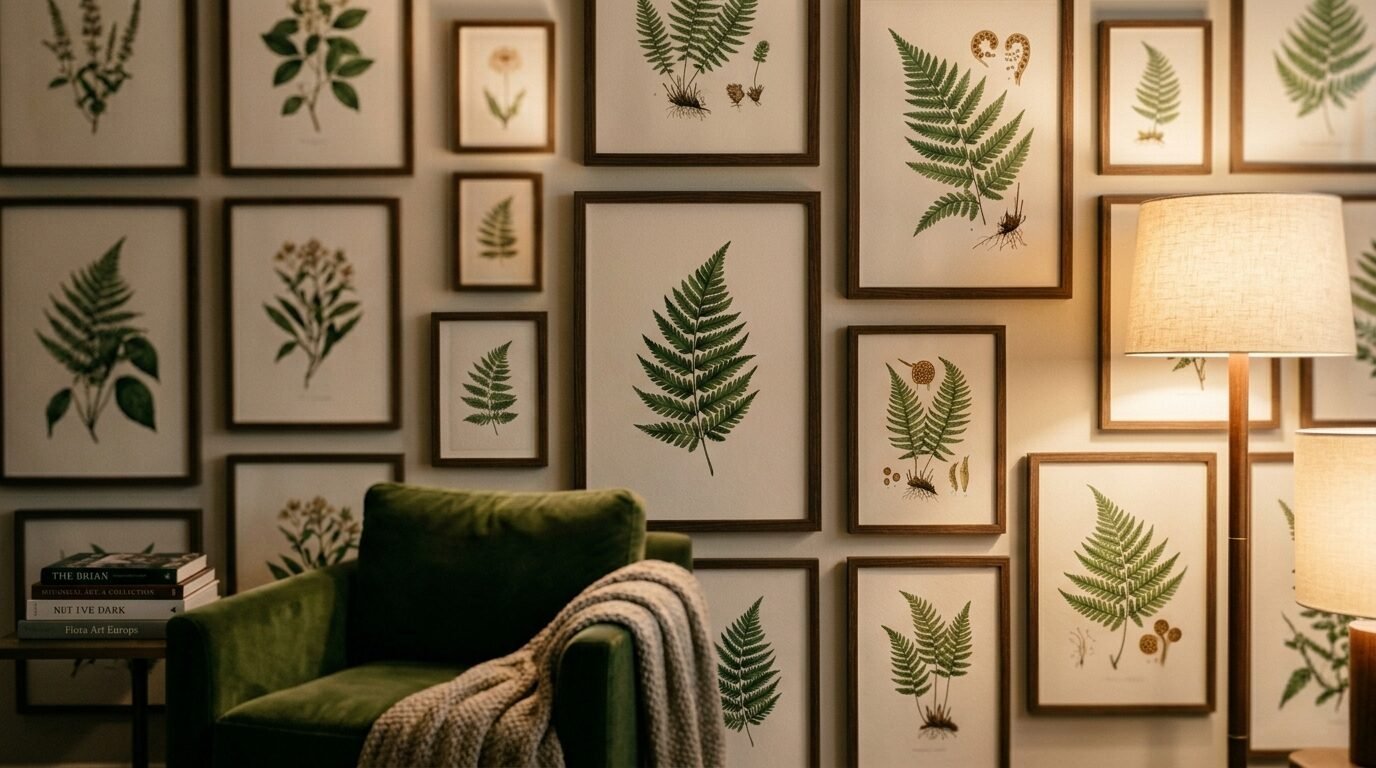
My Top 10 Paper Recommendations for Wall Art
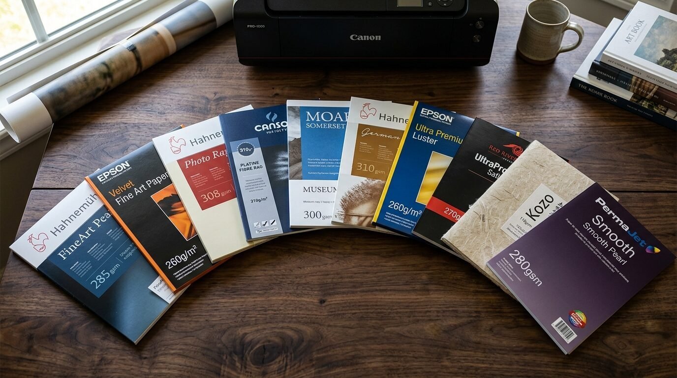
I have tested dozens of brands. These are the ones I keep in my craft closet.
- Epson Ultra Premium Matte. This is my daily driver. It is crisp and white.
- Red River Paper Aurora White. This feels like thick watercolor paper.
- Canon Photo Paper Pro Luster. Best for family portraits.
- Canson Infinity Photogloss. For when you want that mirror shine.
- Strathmore 400 Series Bristol. Great for art that looks hand drawn.
- Staples 110lb Cardstock. The best local budget pick.
- Hahnemuhle Photo Rag. The gold standard for professional artists.
- HP Premium Plus Glossy. Works well with high ink saturation.
- Red River Paper 60lb Polar Matte. Perfect for greeting cards and small art.
- Moab Entrance Rag. A beautiful double sided option.
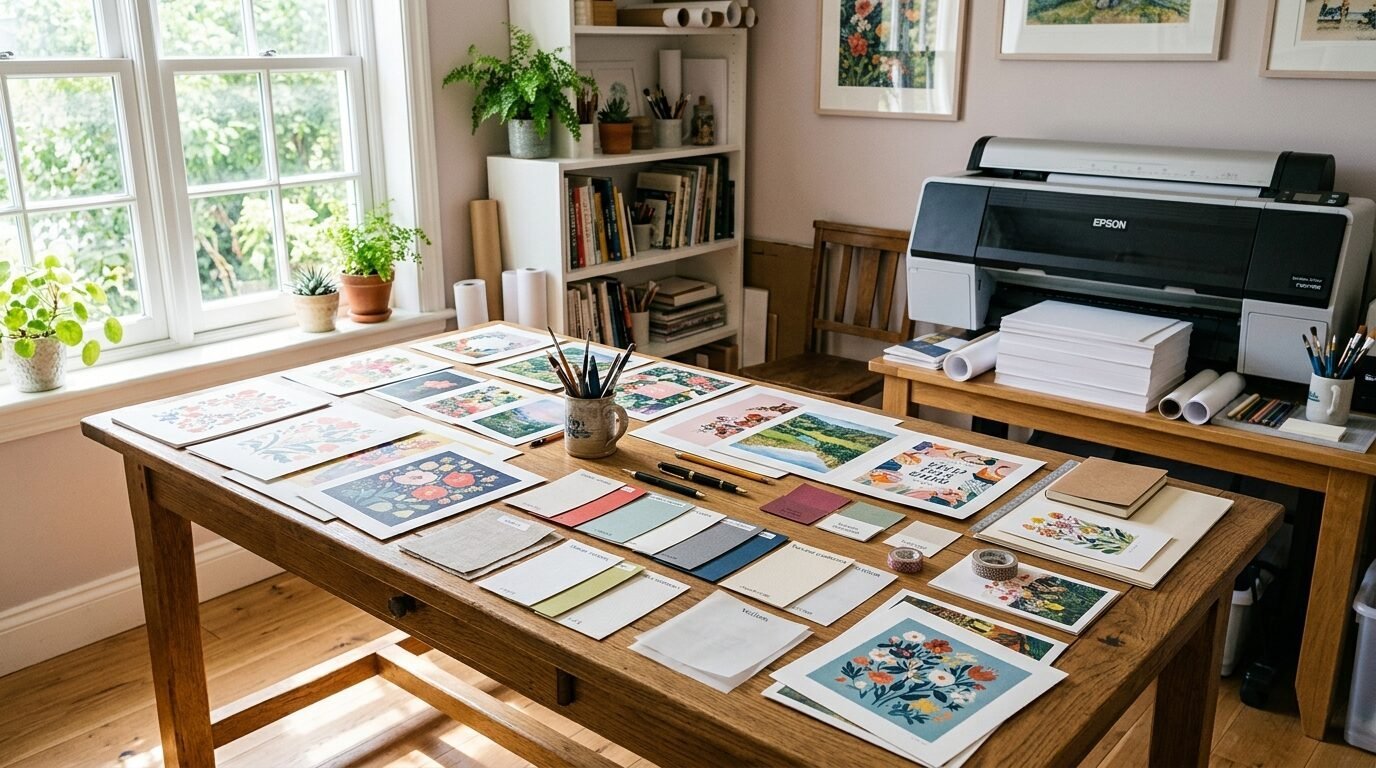
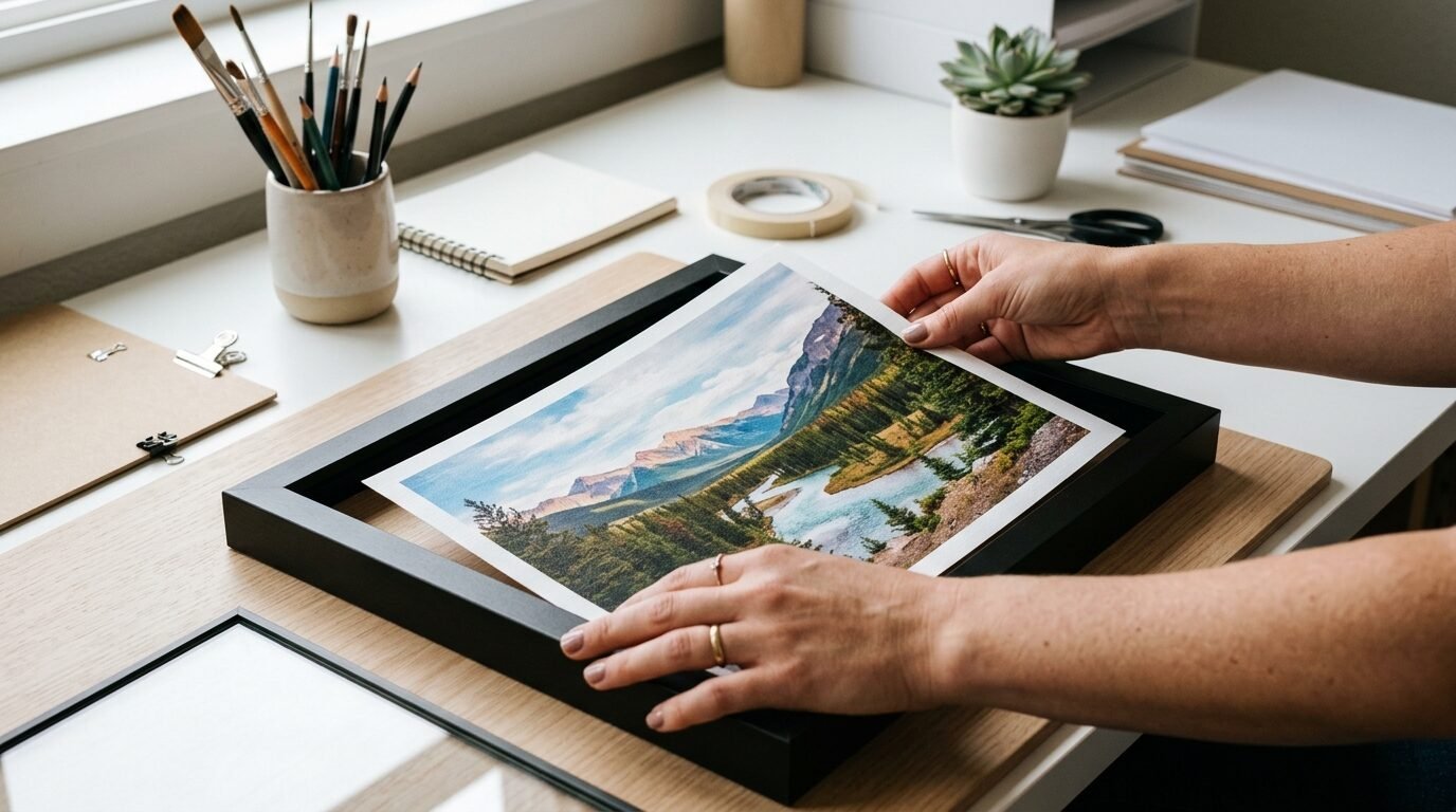
Step by Step Guide to Printing at Home
Printing at home requires a bit of patience. I follow a strict routine to avoid wasting paper.
- Clean your printer heads. I do this every time I switch to expensive paper.
- Check your ink levels. Low ink creates streaks across your art.
- Select the correct paper setting in your print menu. If you use matte paper, tell the printer.
- Set the quality to “High” or “Best”. Never use “Draft” mode for wall art.
- Let the print dry for at least one hour. Inkjet ink stays wet longer than you think.
I once ruined a perfect print by touching it too soon. I left a thumbprint right in the middle of a blue sky. Now I leave my prints on a flat surface overnight before I frame them.
Common Mistakes When Printing Wall Art
I have made every mistake possible. Here is how to avoid them.
Using Auto-Correct Colors Many printers try to “fix” your photo colors. This usually makes them look orange or too bright. Turn off “Auto-Correct” in your settings. You want the art to look like the file you bought.
Printing on the Wrong Side Photo paper usually has one side meant for ink. The other side is plain. If you print on the wrong side, the ink will puddle. I always do a “tap test”. Wet your finger slightly and tap a corner. The sticky side is the print side.
Ignoring Margins Your printer cannot print to the very edge of the paper unless it has a “borderless” setting. I often see people cut off parts of the art because they forgot about margins. I prefer to print with a white border. It makes framing easier.
Frequently Asked Questions
What is the best paper for Etsy prints?
I recommend a matte cardstock around 200 GSM. It is easy to handle and fits in most standard frames. If the art is a photo, go with a luster finish to hide fingerprints.
Can I use regular cardstock for wall art?
Yes, but look for acid free options. Regular craft cardstock might yellow over time. It also might not hold ink as well as dedicated photo paper. I find that dedicated inkjet cardstock stays sharper.
Is glossy paper better for colorful art?
Glossy paper makes colors look very saturated. It is great for kids’ rooms or bold graphics. Just be careful with lighting. The shine can make the art hard to see from certain angles.
Why do my prints look darker than my screen?
Your computer screen has a light behind it. Paper does not. I usually brighten my digital files by ten percent before I print them. This compensates for the lack of a backlight.
Should I use a laser or inkjet printer?
Inkjet printers are better for art. They use liquid ink that blends beautifully. Laser printers use toner which can look flat or waxy on thick paper. Most Online Printing Services use high end inkjet systems for this reason.
Final Thoughts on Your Art Journey
Choosing the right paper is a skill you build over time. Do not be afraid to experiment. I started with one pack of matte paper and grew from there. Your home should reflect what you love. High quality paper makes your favorite digital finds feel permanent. It turns a house into a home.
Start with a small project. Print a single 8×10 on a nice piece of cardstock. See how the light hits it in the afternoon. You will notice the difference immediately. Once you see the quality, you will never go back to basic paper again. Happy printing.

Anya Castellan is the Founder and Editor-in-Chief of Home Wall Trends. An art history graduate of the Rhode Island School of Design with twelve years of experience writing for leading American design publications, she specializes in composition, gallery wall theory, and the quiet architecture of domestic space. A former contributing editor at Architectural Digest and guest lecturer at Parsons School of Design, Anya personally reads and signs off on every piece before it is published.