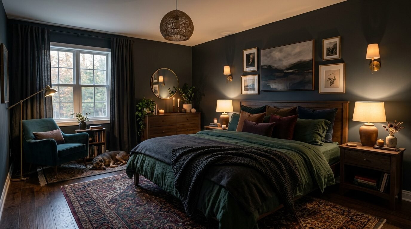
Standard white walls often feel cold and empty. I spent years living in a rental with “eggshell” paint that felt like a hospital room. When I finally painted my room a deep charcoal, my sleep changed immediately. Dark colors provide a sense of safety and quiet. This bedroom makeover guide shows you how to use moody tones to create your own sleep sanctuary.
Modern design often fears dark wall colors. People worry about making a room feel small. In my experience, the opposite happens. Dark colors push the walls back. They create depth. You stop seeing the corners of the room. This effect makes your space feel like a warm hug.
Executive Summary
This guide provides 15 specific ideas for a moody dark bedroom. You will learn how to choose colors that create a calming bedroom environment. We cover everything from deep forest greens to the perfect dark charcoal. Each section includes practical tips for lighting and furniture pairing. You will see how sophisticated style comes from contrast and texture. I include my favorite paint brands like Farrow and Ball and Sherwin Williams. This article helps you avoid common mistakes like choosing the wrong finish or ignoring lighting. By the end, you will have a clear plan for your bedroom makeover.
1. Charcoal Gray Textured Plaster
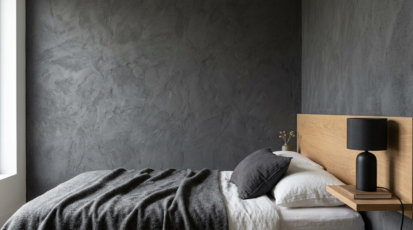
Charcoal gray is the safest entry point for a dark bedroom. It is neutral but heavy. I recently helped a client in a small apartment use this on one wall. We used a Roman clay finish. This creates a soft, suede look. It does not reflect light like standard paint.
Charcoal works best with warm wood furniture. Think oak or walnut bed frames. I noticed that matte charcoal hides wall imperfections well. Use a flat finish to keep the look sophisticated. Avoid high gloss in this color. Gloss makes charcoal look like wet plastic. Stick to earthy textures for a cozy sanctuary feel.
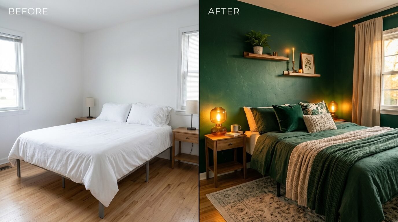
2. Deep Forest Green Envelopment
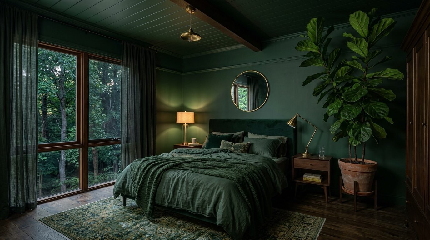
Forest green is my favorite for a calming bedroom. It connects the indoors to nature. I used “Studio Green” in a guest room last year. At night, it looks black. During the day, the green undertones glow. This color lowers the heart rate.
Pair forest green with brass lamps. The gold tones pop against the dark green. Include some indoor plants like a ZZ plant or Snake plant. The green leaves blend into the walls. This creates a lush, jungle feel. I saw this work perfectly in a home with large windows. The natural light keeps the green from feeling too heavy. It creates a sleep sanctuary that feels alive.
3. Matte Midnight Navy
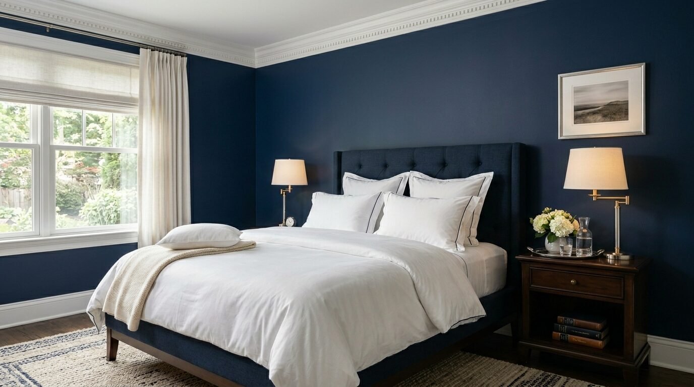
Midnight navy is a classic choice for dramatic walls. It feels like the night sky. Most people pick a navy that is too bright. You want a blue that almost looks black. This creates a sophisticated style without being too bold.
I recommend “Hale Navy” by Benjamin Moore. It has gray undertones. This keeps it from looking like a kid’s room. In my experience, navy looks best with crisp white bedding. The contrast is sharp and clean. Use linen fabrics for your curtains. Navy absorbs light, so you need soft textures to keep it cozy. I have seen this color work in both modern and traditional homes.
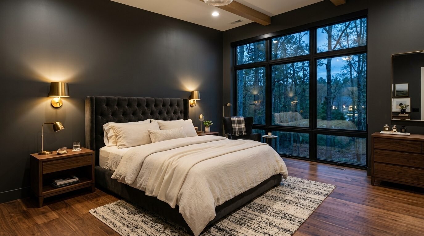
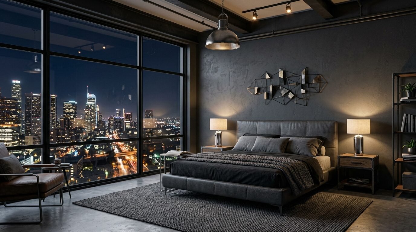
4. Obsidian Black Accent Wall
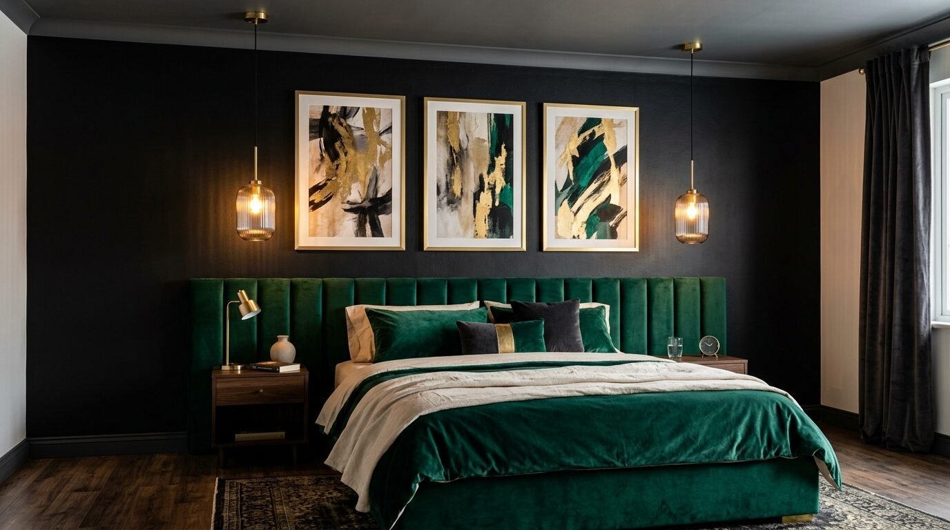
Painting a room black sounds scary. But a black accent wall is a game changer. I once painted a wall “Tricorn Black” behind a velvet headboard. It made the bed look like it was floating. It is the definition of unique decor.
Black walls require good lighting. You need warm bulbs. Cool blue light makes black look cold. Use wall sconces with dimmers. This allows you to control the mood. I noticed that black walls make art look expensive. Even a simple gold frame stands out. Black is the perfect dark background for a professional bedroom makeover. It feels bold and intentional.
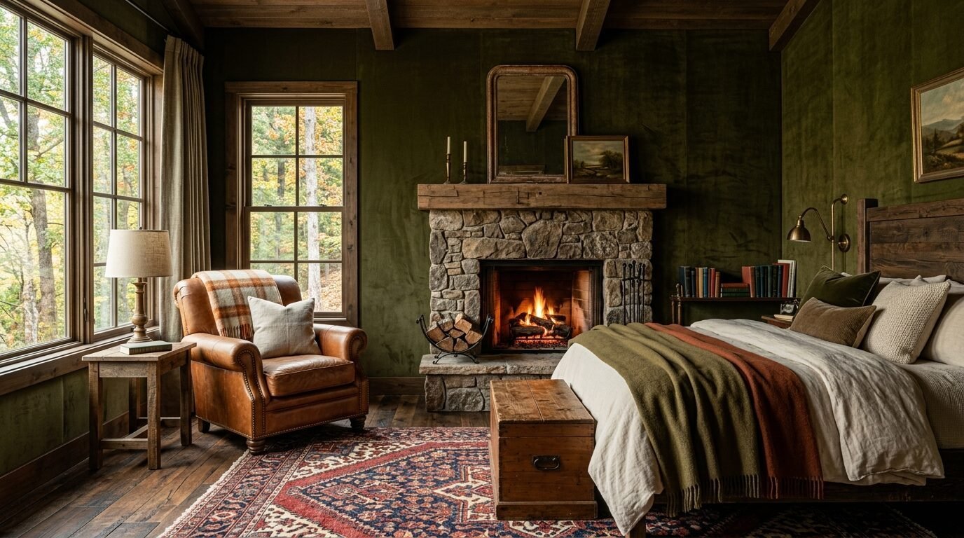
5. Rich Chocolate Brown Limewash
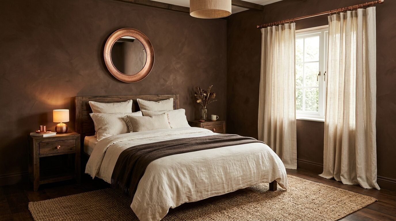
Brown is making a huge comeback in wall colors. Not the tan of the early 2000s. We are talking about deep espresso and dark chocolate. Use a limewash paint for this. Limewash creates a mottled, stone-like appearance. It feels ancient and grounded.
I tried this in a bedroom with tall ceilings. It made the room feel intimate. Pair chocolate brown with cream colored rugs. The mix of brown and white feels like a luxury hotel. I saw a designer use this with copper accents. The warm metal and brown walls looked incredible. It is a great choice for someone who wants warmth without using gray.
6. Deep Plum and Eggplant Tones
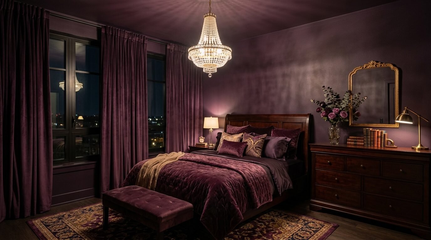
Plum is a daring choice for a moody bedroom. It feels royal and heavy. This color works best in rooms with lots of fabric. Think heavy velvet curtains and plush rugs. It creates a sophisticated style that feels very personal.
I suggest “Brinjal” from Farrow and Ball. It is a deep purple that feels grounded. In my experience, plum needs wood accents to stay cozy. Dark cherry or mahogany furniture looks great here. I have seen this color fail when paired with cheap plastic furniture. Keep the materials high quality. This color is for people who want a unique decor style that stands out.
7. Slate Blue Board and Batten
Slate blue is a mix of blue and gray. It feels like a stormy sea. Adding board and batten trim gives the wall depth. This is a great DIY project for a bedroom makeover. The shadows from the trim make the dark color more interesting.
I noticed that slate blue works well in coastal homes. It feels moody but not oppressive. Use light gray bedding to keep the room airy. Slate blue is very forgiving with different light levels. It looks good in bright morning light and dim evening light. I saw this used in a master suite with white oak floors. The combination felt very high end and calm.
8. Dark Terracotta Clay
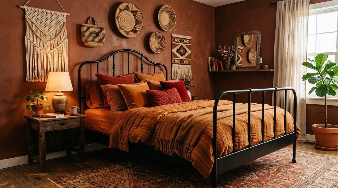
Terracotta usually feels bright and orange. But a dark, burnt terracotta is very moody. It feels like an old Mediterranean villa. Use a clay based paint to get a natural finish. This color provides a lot of physical warmth to a room.
I used this in a bedroom that faced north. North rooms get cold blue light. The terracotta balanced the coldness. Pair this with black metal bed frames. The contrast is modern and sharp. I saw this work well with woven baskets and jute rugs. It creates a cozy sanctuary that feels like a desert retreat. It is a great alternative to standard dark colors.
9. Emerald Green Silk Wallpaper
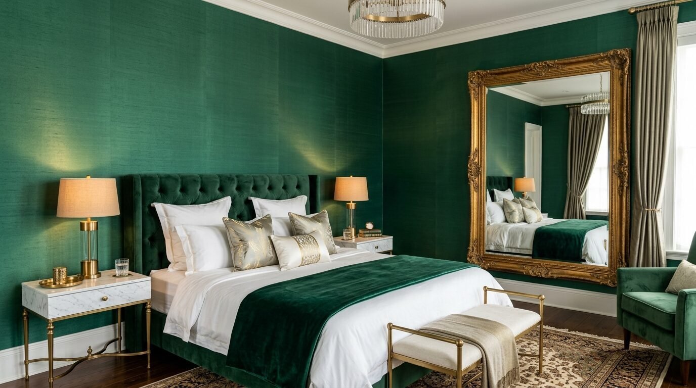
If paint feels too simple, try dark green wallpaper. A silk or grasscloth texture adds a luxury feel. Emerald green is vibrant but dark. It reflects a little bit of light, which helps in very small rooms.
I saw a bedroom makeover using emerald silk panels. It looked like a jewelry box. This style is for those who love sophisticated style. Use crystal lamps or mirrors to bounce light around. In my experience, emerald green looks best with dark wood floors. It creates a dramatic wall that people will remember. It feels like a high end sleep sanctuary.
10. Graphite Gray with Metallic Accents
Graphite is darker than charcoal. It is almost black but has a softer edge. This is the perfect dark color for a modern bedroom. Use matte graphite paint on all four walls. This “color drenching” technique is very popular right now.
I noticed that graphite needs metallic pops. Use silver or chrome hardware. This keeps the room from looking flat. I saw this work in a city loft with concrete floors. The gray walls made the space feel warm and enclosed. It is a very industrial but cozy look. Graphite is a great choice if you want a neutral but moody space.
11. Dark Olive Green Velvet Walls
Olive green is earthy and calm. Using a velvet wall covering or a very flat paint creates a soft look. Olive has yellow undertones. This makes it feel warmer than forest green. It is perfect for a calming bedroom.
I recommend “Olive” by Sherwin Williams. It looks great with leather furniture. Think of a cognac leather chair in the corner. In my experience, olive green needs natural textures. Use linen sheets and wool blankets. This creates a layered, cozy sanctuary feel. I have seen this work in older homes with original wood trim. The green and wood look timeless together.
12. Deep Burgundy Wine
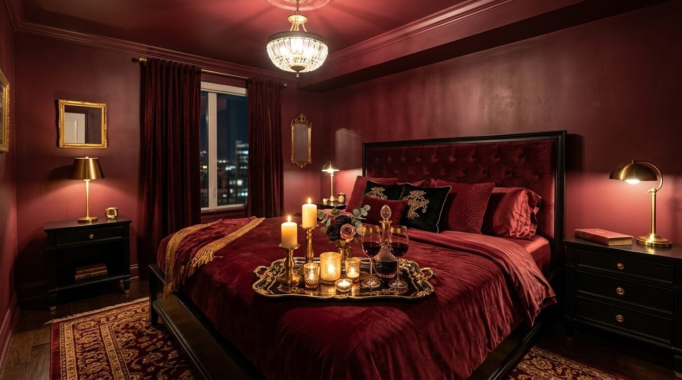
Burgundy is a classic moody color. It feels romantic and intense. This is a great choice for a primary bedroom. It creates a sense of luxury and comfort. Burgundy works best in rooms with warm lighting.
I saw a bedroom makeover where they painted the ceiling the same burgundy. It was a bold move that paid off. The room felt like a cozy cave. Pair burgundy with gold or brass. Avoid white furniture here. It looks too stark. Use dark woods or black pieces. This maintains the sophisticated style. Burgundy is a high energy color that still feels cozy at night.
13. Espresso Wood Slat Walls
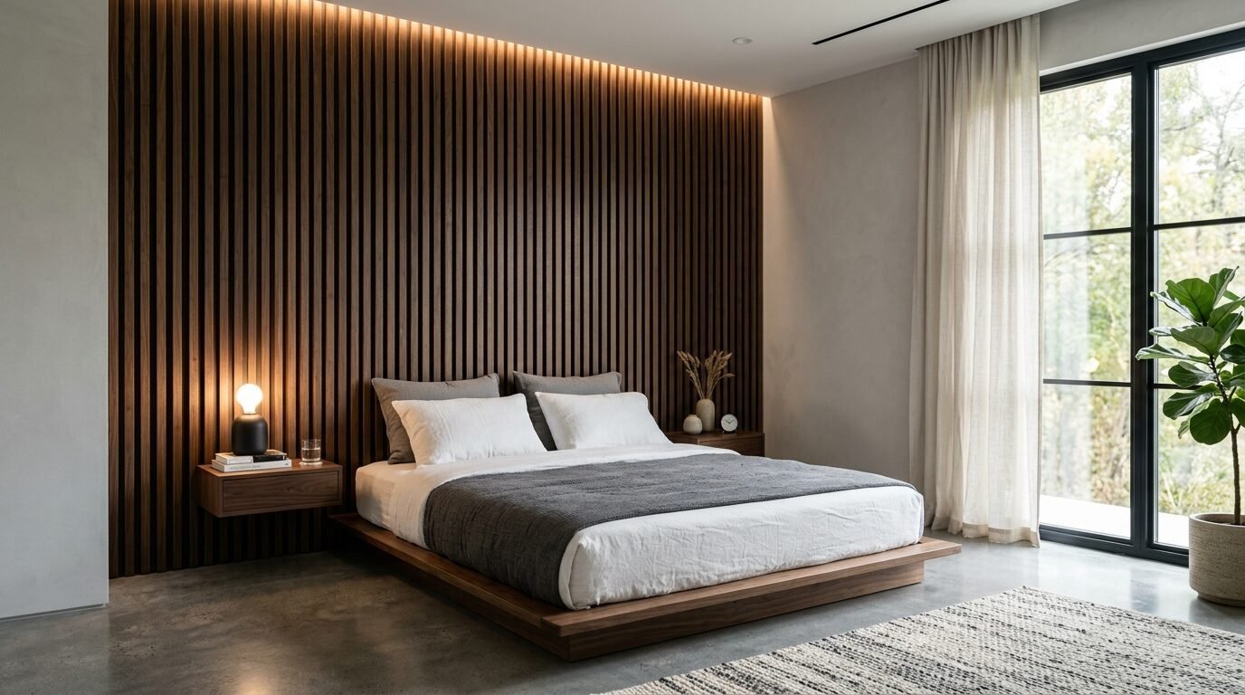
Instead of paint, use dark wood slats. Espresso stained oak or walnut looks very modern. The gaps between the slats create dark shadows. This adds a dramatic wall element without needing a brush.
I noticed this is great for soundproofing too. It makes the bedroom very quiet. A quiet room is a better sleep sanctuary. Pair wood slats with a low platform bed. This creates a zen, minimal look. I saw this in a mountain cabin. It felt very connected to the forest outside. Wood slats are a great way to get a unique decor look.
14. Midnight Teal and Brass
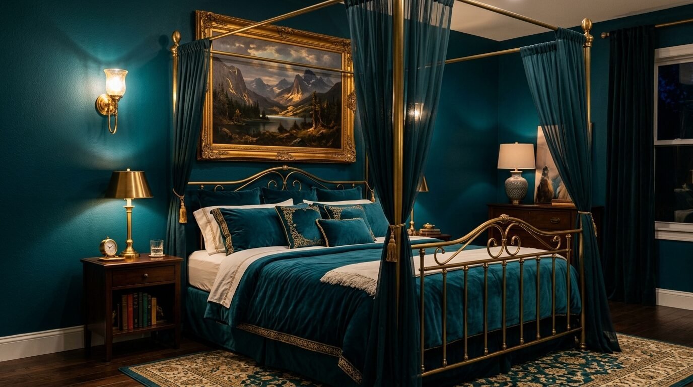
Teal is a mix of green and blue. A dark teal feels like the deep ocean. It is a very calming bedroom color. I love using this in rooms that get a lot of afternoon sun. The light brings out the blue tones.
I suggest “Marine Blue” by Little Greene. It is deep and rich. Pair this with brass picture frames. The blue and gold combo is a classic for a reason. I saw this in a guest room with velvet pillows. It looked very inviting. Teal is a good choice if you find navy too boring and green too earthy. It is a perfect middle ground for a sophisticated style.
15. Deep Mauve and Smoked Lavender
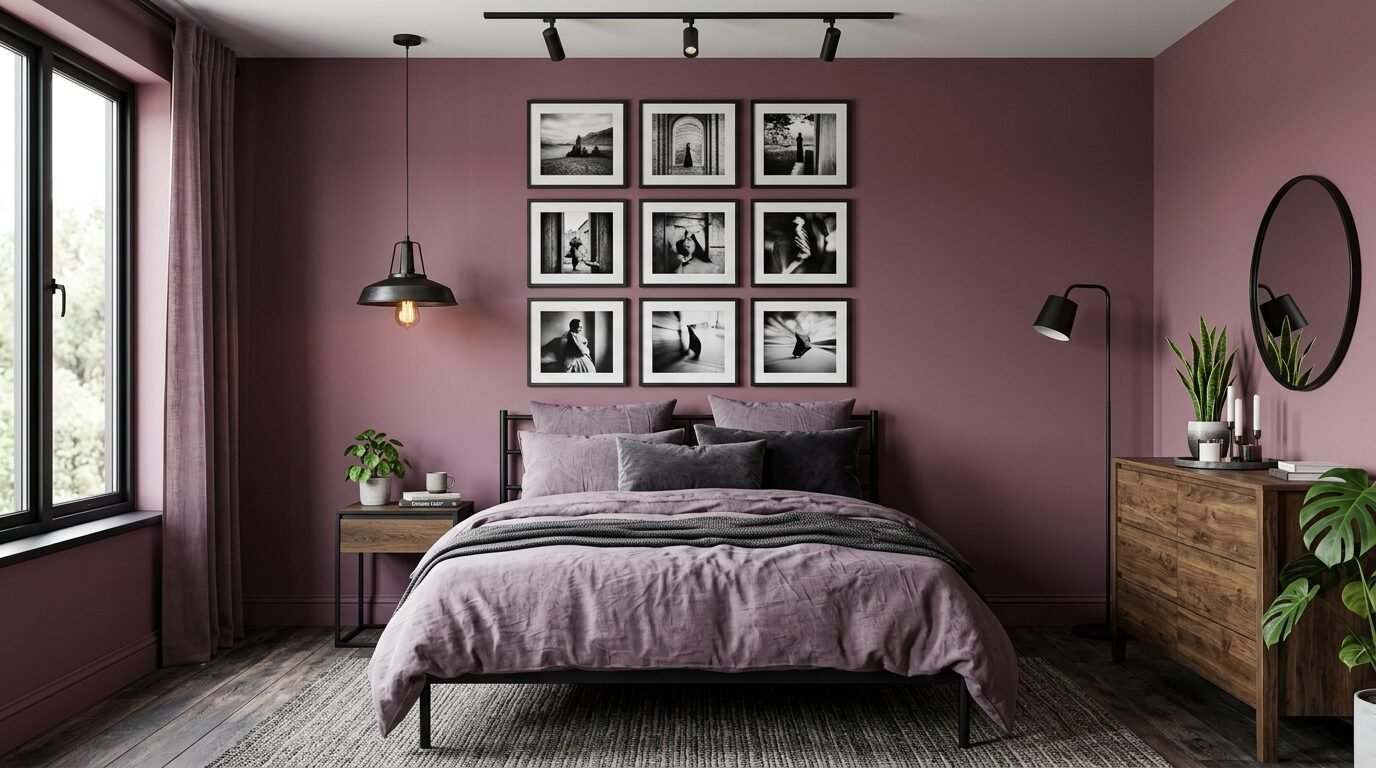
Mauve is often seen as a light color. But a deep, muddy mauve is very moody. It has gray and purple tones. This color is very trendy right now. It feels soft and feminine but still dark and cozy.
I used a color called “Setting Plaster” in a darker shade for a client. It looked amazing with dark gray bedding. In my experience, this color needs black accents to stay modern. Without black, it can look a bit dated. Use black metal lamps or a black bed frame. This creates a sophisticated style that feels fresh. It is a unique decor choice for a modern home.
Top Paint Brands for Dark Moody Bedrooms
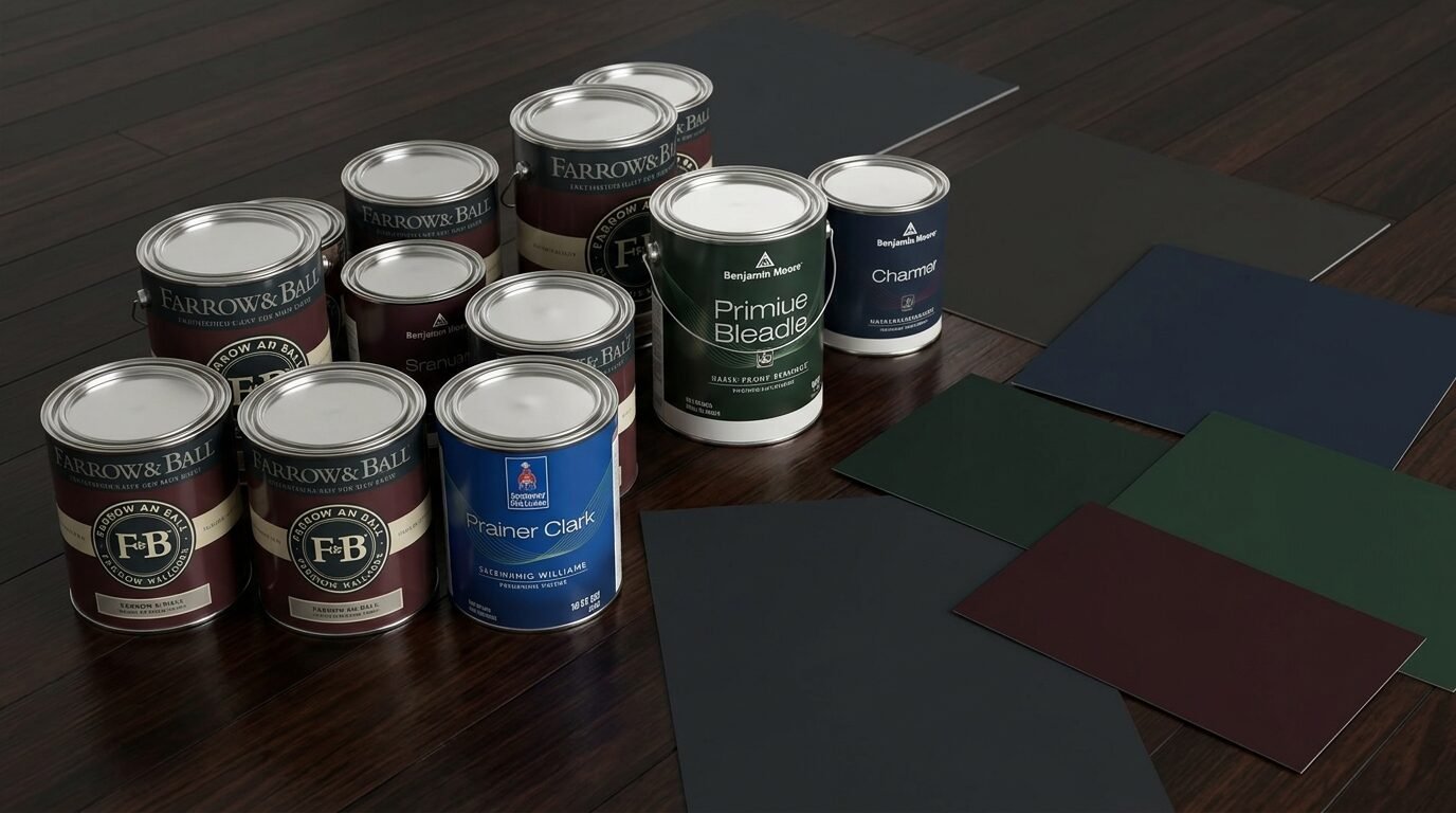
Choosing the right paint brand is vital. Not all dark paints are the same. Cheap paint often has a lot of gray filler. This makes the color look muddy or “dirty” on the wall. I have tested many brands over the years. Here are my top picks for a bedroom makeover.
Farrow and Ball is the gold standard for moody colors. Their pigments are very rich. “Railings” is a perfect soft black. “Studio Green” is a deep, magical green. These paints look different as the light changes during the day. They are expensive but worth it for a sleep sanctuary.
Sherwin Williams is a great mid range option. “Tricorn Black” is the truest black I have found. It has no blue or brown undertones. “Iron Ore” is a beautiful soft charcoal gray. Their Emerald line has a great matte finish that is still washable. I use this brand for most of my professional projects.
Benjamin Moore is known for “Hale Navy” and “Old Navy”. These are the best blues on the market. Their Aura line covers dark colors in fewer coats. This saves time and money. I also like “Black Beauty” for a warm, soft black.
Behr is a good budget choice. You can find it at Home Depot. “Beluga” is a solid dark gray. “Night Watch” is a nice deep green. In my experience, you might need three coats with Behr for very dark colors. But it is a good way to save money on a bedroom makeover.
Frequently Asked Questions
Does a dark bedroom make the room look smaller?
In my experience, dark colors actually hide the boundaries of a room. When you paint a room a dark color like charcoal or navy, the corners disappear. This can make a small room feel infinite. I have seen tiny bedrooms look much larger after a dark paint job. The key is to use a matte finish. Glossy paint reflects the corners and makes the room feel tight.
What is the best finish for dark bedroom walls?
Always choose a matte or flat finish. Dark colors show every bump and scratch on a wall. A glossy or satin finish reflects light off these bumps. This looks messy. A matte finish absorbs light. It creates a smooth, velvet look. I noticed that flat paint makes the color look much deeper and richer. If you are worried about cleaning, many brands now offer “washable matte” options.
Do I need to paint the ceiling dark too?
Painting the ceiling dark is called color drenching. It is a bold choice for a sleep sanctuary. If you have tall ceilings, a dark ceiling makes the room feel cozy. If your ceilings are low, a dark ceiling might feel heavy. I usually suggest painting the ceiling the same color as the walls for the ultimate moody feel. It removes the “lid” effect of a white ceiling.
How do I light a dark bedroom?
Lighting is the most important part of a dark bedroom. You cannot rely on one big ceiling light. You need layers. Use warm bedside lamps. Add a floor lamp in the corner. Use LED strips behind the headboard for a soft glow. I saw a huge difference when I switched to dimmable bulbs. This allows you to set the mood for sleep. Aim for “warm white” bulbs around 2700K.
What colors go best with dark walls?
Contrast is your friend. If you have dark navy walls, use white or light gray bedding. If you have forest green walls, use brass or gold accents. Wood tones like oak and walnut look great with almost any dark color. In my experience, adding a few light elements keeps the room from feeling like a cave. Think of it like a dark suit with a crisp white shirt.
Conclusion
Creating a moody dark bedroom is about more than just paint. It is about building a space where you feel safe and relaxed. Whether you choose a deep forest green or a matte black, the goal is comfort. I have seen these dark tones transform restless sleepers into deep sleepers. Start with one accent wall if you are nervous. You will likely end up painting the whole room once you see the result.
Remember to focus on texture. Use linen, velvet, and wood to balance the dark walls. Invest in good lighting to bring the colors to life. A dark bedroom is a sophisticated choice that never goes out of style. It is the ultimate way to create a cozy sanctuary in your home. I predict we will see even more people moving away from white walls this year. People want their homes to feel like an escape. A moody bedroom is the perfect place to start.

Anya Castellan is the Founder and Editor-in-Chief of Home Wall Trends. An art history graduate of the Rhode Island School of Design with twelve years of experience writing for leading American design publications, she specializes in composition, gallery wall theory, and the quiet architecture of domestic space. A former contributing editor at Architectural Digest and guest lecturer at Parsons School of Design, Anya personally reads and signs off on every piece before it is published.