The living room wall looked like a battlefield. I stood there with a hammer in one hand and a level in the other. Twelve small holes peered back at me from the drywall. My attempt at a Mixed Gallery Wall was failing fast. Every frame hung at a different, awkward angle. The space felt cluttered instead of curated.
This is the reality for many people starting their first home project. You see a beautiful Eclectic Art Gallery Wall on Pinterest and think it looks easy. Then you try to replicate it. You realize that “random” actually requires a lot of planning.
In my experience, the difference between a professional look and a DIY disaster is strategy. I have spent years helping friends fix their living rooms. I have seen the same errors happen again and again. You want a home that feels like you. You want a wall that tells a story.
I will show you how to skip the frustration. We will look at why standard layouts fail. I will share the exact steps to create a Transitional Style Gallery Wall that stays timeless. We will move from messy holes to a masterpiece that your guests will actually notice.
1. Choosing Pieces That Do Not Talk to Each Other
The biggest error I see is the “random grab” approach. People buy art they like individually. They forget to see how those pieces sit together. If you have a neon pop art piece next to a soft watercolor, your brain gets confused. This ruins the flow of a Mixed Gallery Wall.
When you look at How To Mix And Match Artwork, you need a “thread.” This thread is usually a color or a theme. I once tried to build a wall with every souvenir I ever bought. It looked like a thrift store exploded. I fixed it by pulling out three main colors. I kept only the items that matched those tones.
The Secret of the Color Anchor
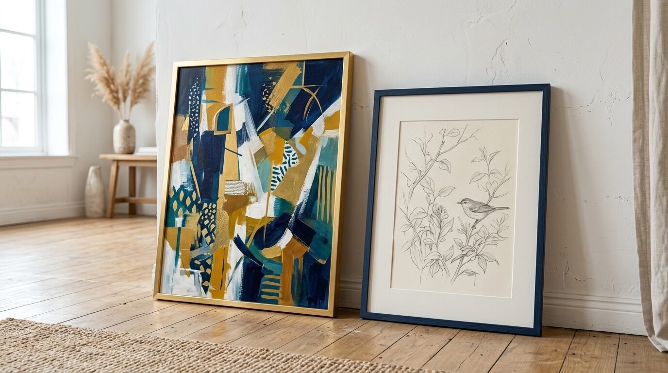
Use one dominant color to tie the room together. If your sofa is navy, ensure three or four pieces have navy accents. This creates a visual bridge. You can still use different styles. A photo can sit next to a sketch if they share a blue sky or a blue frame.
Understanding Visual Weight
Heavy frames belong at the bottom or the center. Small, light sketches can float around the edges. If you put all the heavy items on one side, the wall feels like it is leaning. Balance is about the eyes. You want the viewer to move across the entire space.
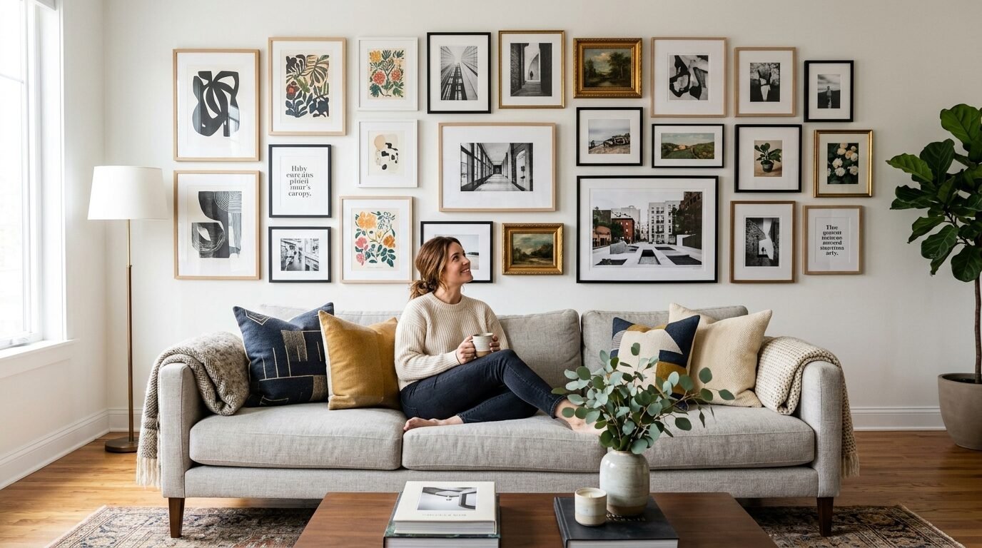
2. Ignoring the Standard Eye Level Rule
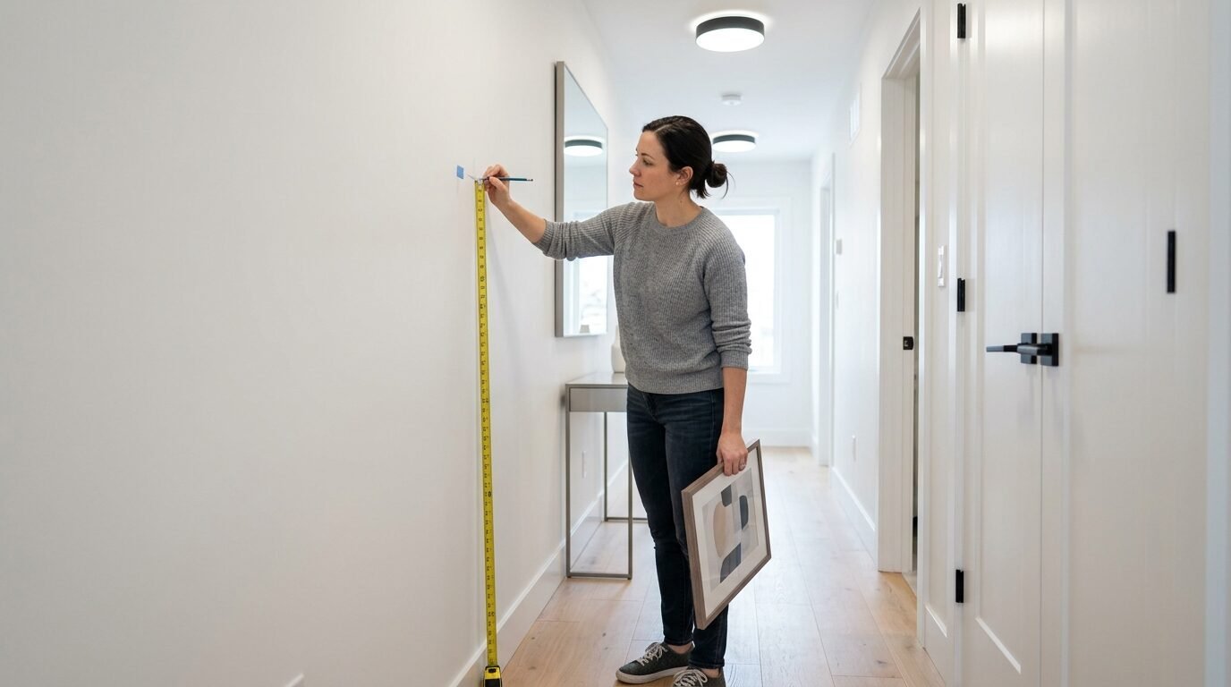
I see art hung way too high in almost every home I visit. People think they need to fill the top of the wall. This leads to “neck strain decor.” Your art should sit at eye level. For most rooms, the center of the gallery should be 57 to 60 inches from the floor.
If you are doing a Stacked Art On Wall layout, the middle of the stack is your anchor. I remember helping a neighbor who hung her gallery just six inches below the ceiling. The room felt tiny and cramped. We lowered everything by two feet. Suddenly, the ceiling looked higher. The room felt open.
Spacing Between Frames
Keep your frames close. A gap of 2 to 3 inches is usually perfect. If the gaps are too wide, the pieces look like they are floating away from each other. They stop being a “gallery” and start being individual items. This is a common hurdle in Artwork Wall Ideas.
The Couch Connection
If your wall is behind a sofa, leave 6 to 8 inches of space above the back of the couch. This prevents people from hitting their heads. It also makes the furniture and the art look like one cohesive unit.
3. Using the Wrong Frame Style for Your Space
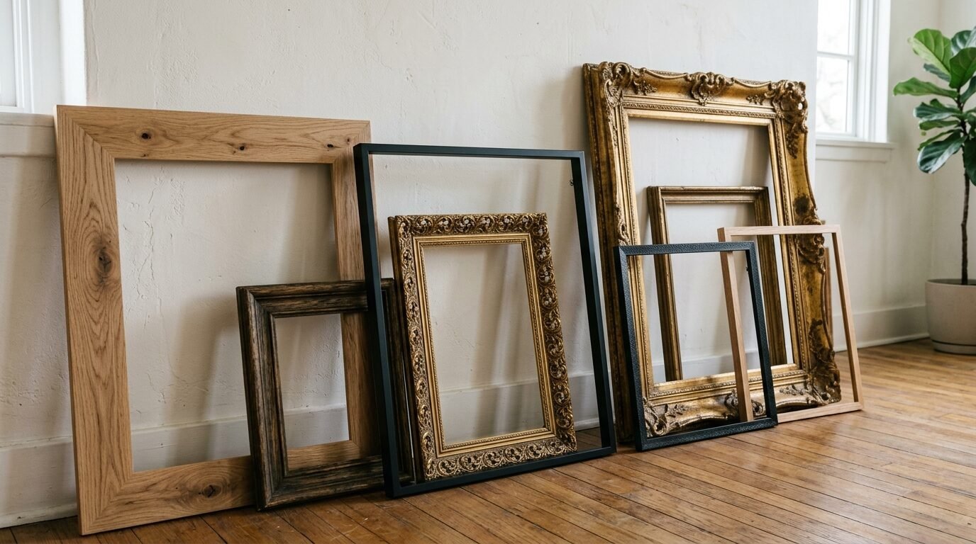
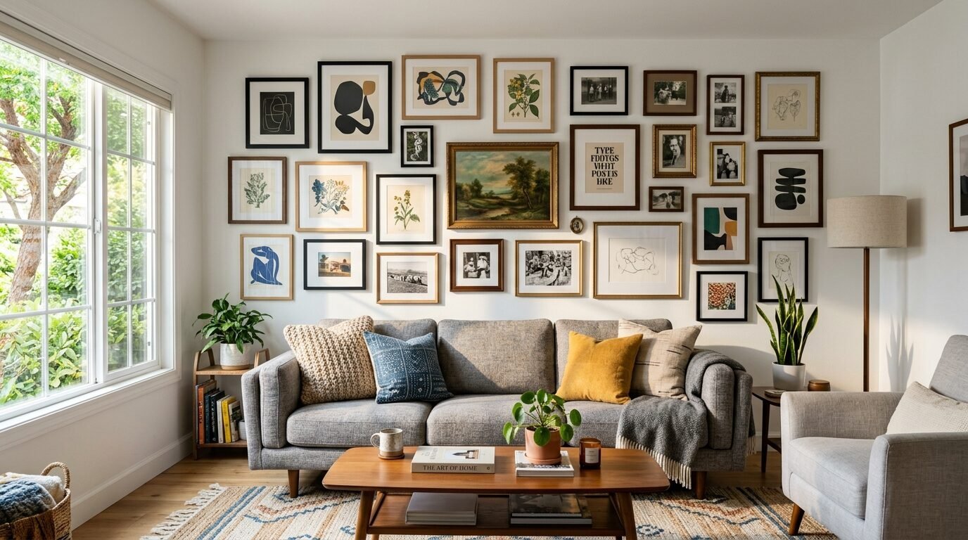
Many first-timers stick to one frame type. They buy ten identical black frames. While this works for modern grids, it often feels stiff. A Gallery Wall With Mixed Frames adds character. However, there is a catch. The frames still need a common language.
I have seen people mix thick gold ornate frames with thin plastic neon ones. It rarely works. In my experience, a Transitional Style Gallery Wall works best with two or three frame styles. You might mix natural wood, matte black, and maybe one metal accent.
Material Matters
Wood frames add warmth. Metal frames add a modern edge. If your room has a lot of wood furniture, try to match the stain. If you have a glass coffee table, metal frames might be the better choice. I always recommend avoiding cheap plastic frames. They warp over time and look dated quickly.
When to Use White Artwork
White Artwork needs a frame that provides contrast. Putting a white print in a white frame on a white wall makes it disappear. I love using thin black frames for white minimalist art. It creates a crisp, professional look that stands out.
4. Creating Layouts Without a Center Anchor
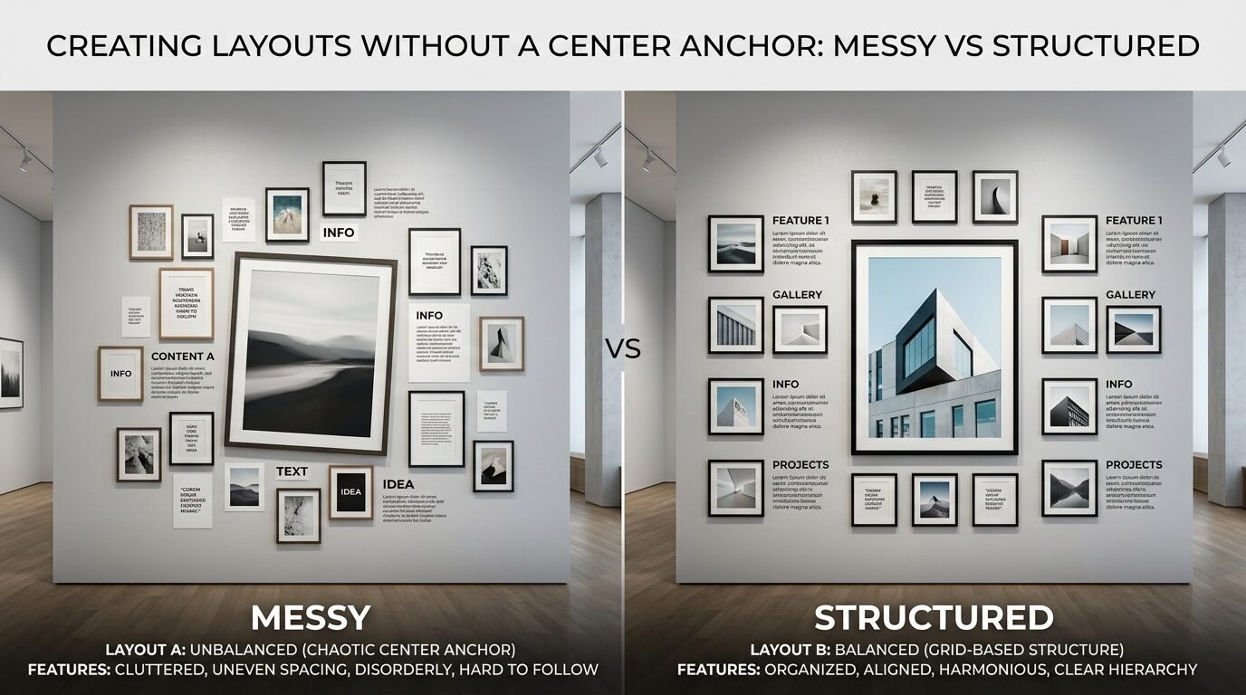
A common mistake is starting from a corner and working across. This almost always leads to a lopsided wall. You run out of space or the pieces drift upward. For an Eclectic Art Gallery Wall, you must start in the middle.
Identify your “hero” piece. This is usually the largest or most colorful item. Place it slightly off-center. Then, build the rest of the gallery around it. This creates a natural weight that feels grounded.
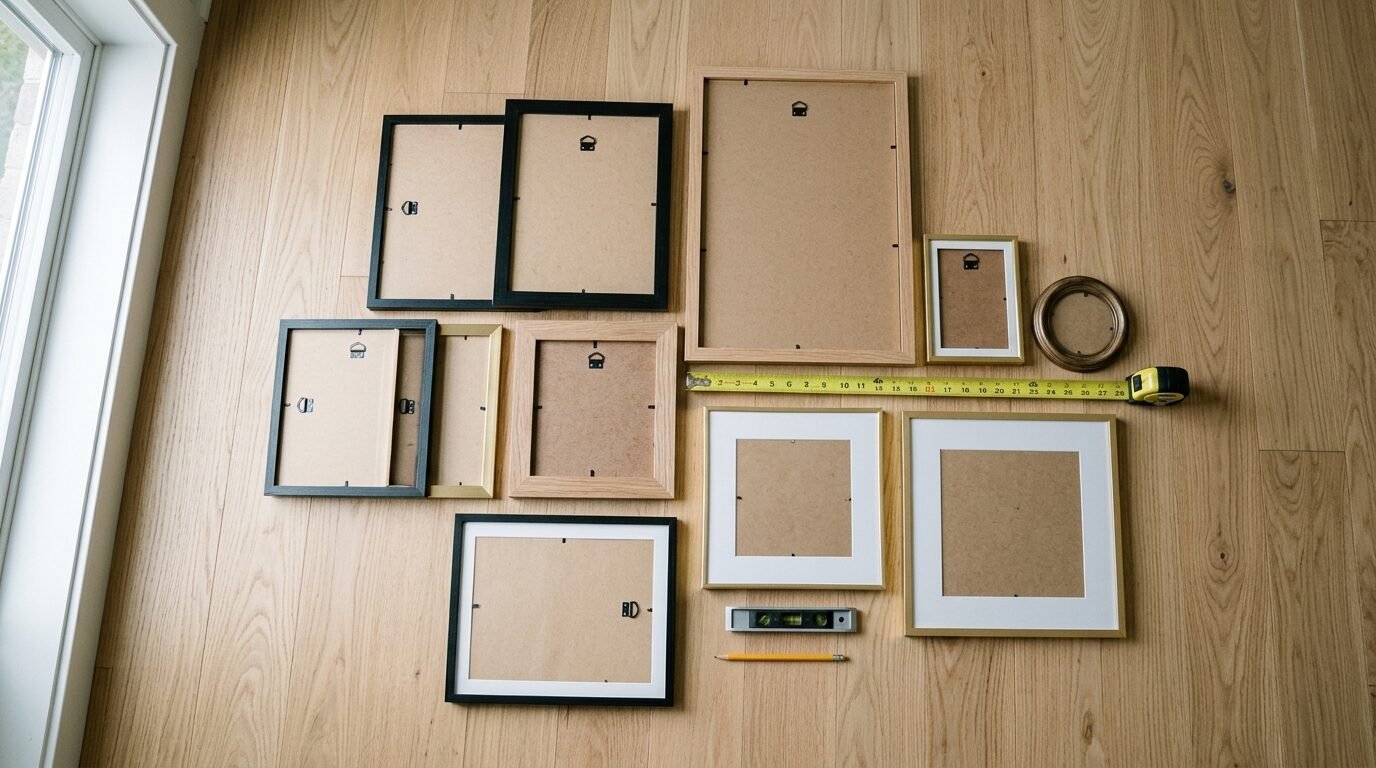
Use the Paper Template Trick
Before you pick up a hammer, grab some butcher paper. Trace every frame you have. Cut out the shapes and tape them to the wall. This lets you move things around without making holes. I do this for every project. It saves hours of patching and painting later.
The Perimeter Strategy
If you want a clean look, keep the outer edges of your gallery in a rough square or rectangle. The inside can be as messy as you want. As long as the “boundary” is straight, the gallery will feel organized.
5. Fearing the Blend of Photos and Art
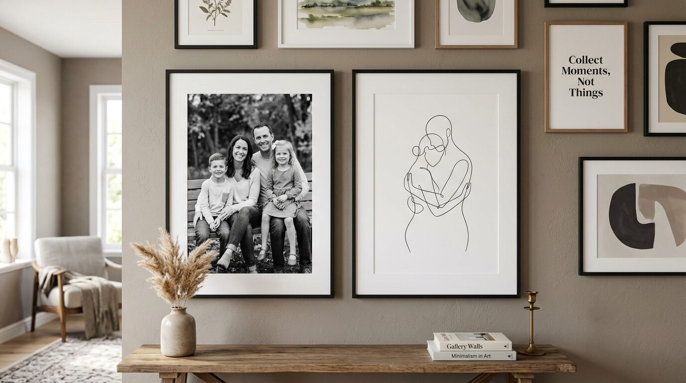
People often think they have to choose between a “photo wall” and an “art wall.” This is a mistake. Mixing Photos And Art On Wall is the best way to make a house feel like a home. It adds layers of personality.
I once saw a stunning wall that paired high-end oil paintings with black and white family snapshots. The trick was the color palette. By making the photos black and white, they matched the classic feel of the paintings. It felt expensive but personal.
Consistency in Photography
If you use personal photos, try to keep the editing similar. Use the same filter or print them all in the same finish. Matte prints usually look better under gallery lights than glossy ones. Glossy prints reflect too much light and make the art hard to see.
Adding Three-Dimensional Items
Do not stop at flat frames. Add a small wall clock, a brass sconce, or a wooden mask. These items break up the flat surface. They give the eye something different to look at. This is a core part of How To Mix And Match Artwork.
6. Neglecting the Overall Color Balance
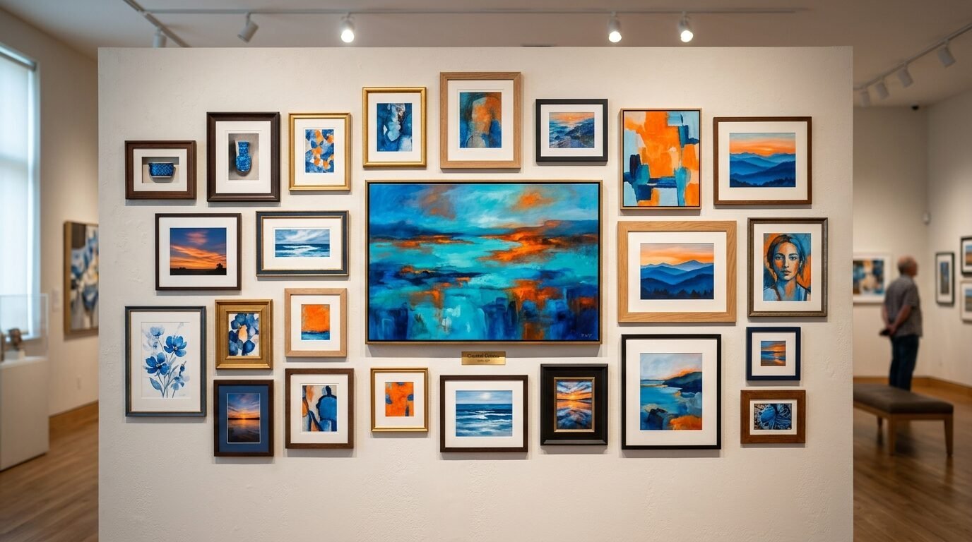
A wall can look “heavy” if all the dark pieces are on one side. This is a subtle mistake that ruins the mood. You want to distribute colors evenly. If you have a piece with bright red, try to have something with a hint of red on the opposite side of the gallery.
I noticed this in a client’s home recently. They had three pieces of White Artwork all clustered in the top left corner. It looked like the wall was fading away. We moved them to different spots. The whole display immediately felt more intentional.
The Rule of Thirds
Think of your wall in a grid. Try to place your most interesting pieces where the grid lines intersect. This is an old photography trick that works perfectly for interior design. It keeps the viewer engaged without overwhelming them.
Lighting Your Gallery
Even the best art looks bad in the dark. Use picture lights or directional ceiling lights. Light should hit the art at a 30-degree angle to avoid glare. If you are a renter, battery-operated LED sconces are a life-saver. I use them in my own hallway and they changed the entire vibe.
7. Skipping the Necessary Dry Run
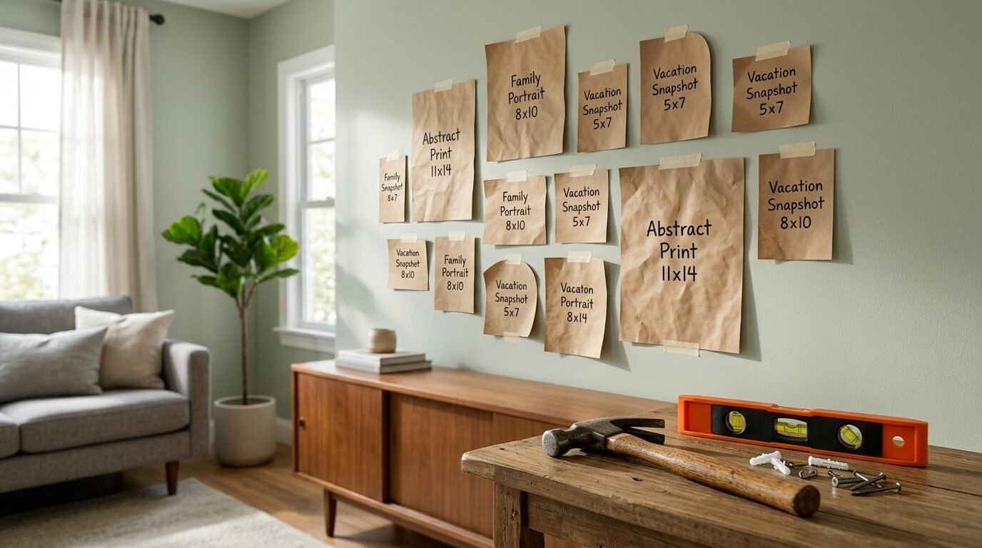
Most people are too eager to see the finished result. They start nailing frames as soon as they get home from the store. This is how you end up with a wall full of holes and a crooked layout. A “dry run” is the most important step in Artwork Wall Ideas.
I always lay my frames out on the floor first. I walk around them. I take a photo of the layout from above. Sometimes what looks good on the floor looks different on the wall. The photo helps you see the balance clearly.
The Spacing Tool
Use a piece of wood or a ruler as a spacer. This ensures the gap between every frame is identical. Consistency in spacing is what makes a DIY project look like it was done by a professional. I use a simple 2-inch block of wood. I hold it between frames as I mark the nail spots.
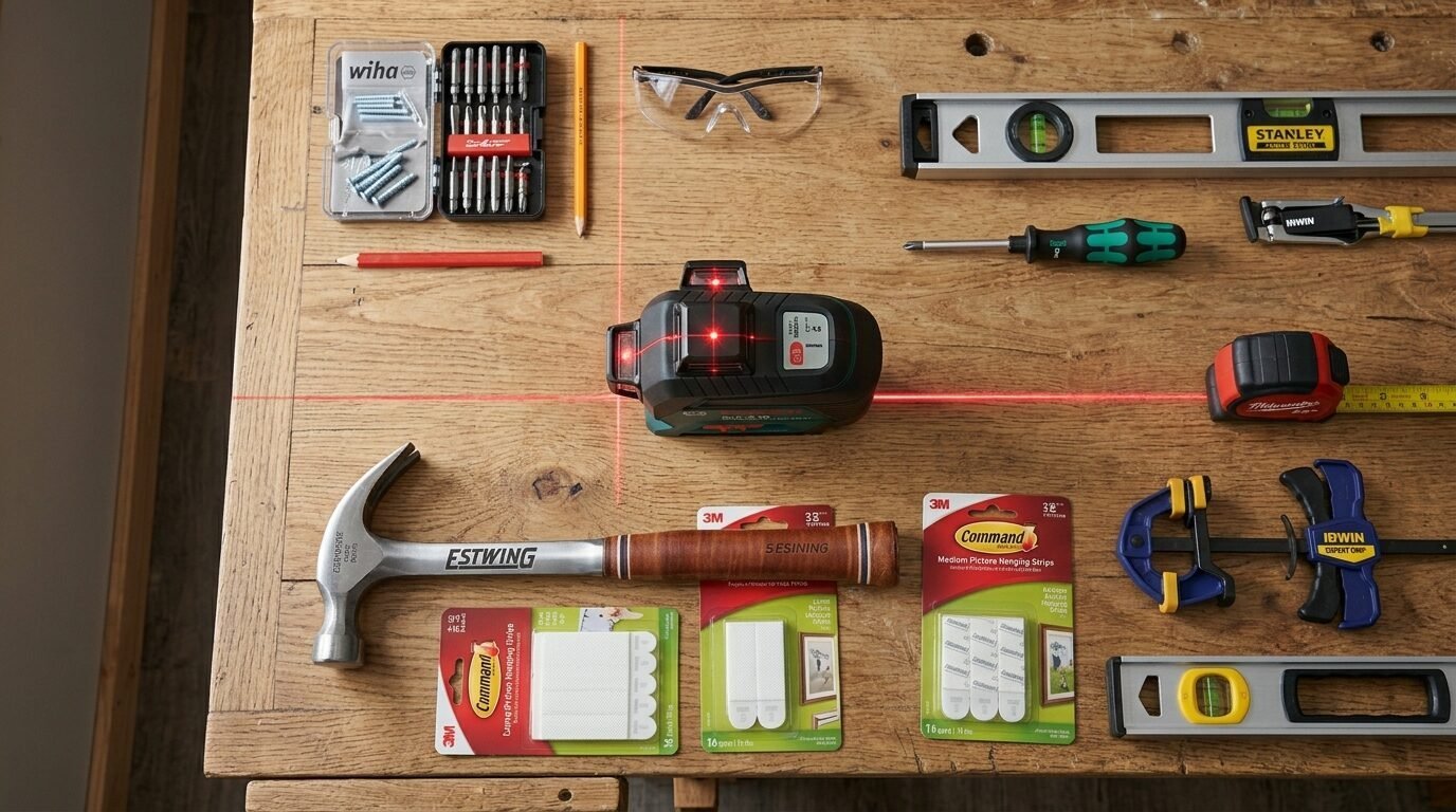
Check Your Hardware
Do not use cheap nails for heavy frames. Use proper picture hangers. I am a huge fan of Command Strips for light frames. They are perfect for people who change their minds often. For heavy mirrors or large art, always find a stud or use a heavy-duty anchor.
Tools and Brands for Success
I have tried dozens of products over the years. Here are the ones that actually make the job easier.
| Tool Type | Brand Recommendation | Why I Like It |
| Hanging Strips | Command Large Picture Strips | No holes, easy to level, great for renters. |
| Level | Bosch GLL25-10 Laser Level | Projects a perfect crosshair on the wall. |
| Frames | Framebridge | Custom look without the custom price tag. |
| Affordable Art | Art.com | Huge selection of prints in various sizes. |
| Basic Frames | Target (Project 62) | Modern, clean lines, and very budget-friendly. |
| Heavy Hangers | OOK Professional Hangers | They do not damage the wall as much as standard nails. |
Comparison: Minimalist vs. Eclectic Layouts
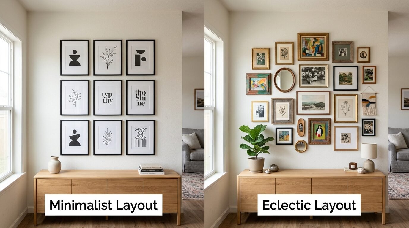
Choosing a style is the first step. Here is how the two most popular styles compare.
| Feature | Minimalist Grid | Eclectic Gallery |
| Frame Type | Identical frames and mats. | Mixed materials and sizes. |
| Spacing | Perfect, uniform gaps. | Varied but balanced gaps. |
| Content | Often a series or set. | Mix of photos, art, and objects. |
| Difficulty | High (requires perfect alignment). | Medium (requires good “eye” for balance). |
| Vibe | Modern, clean, formal. | Cozy, personal, creative. |
Transitional Style Gallery Wall Guide
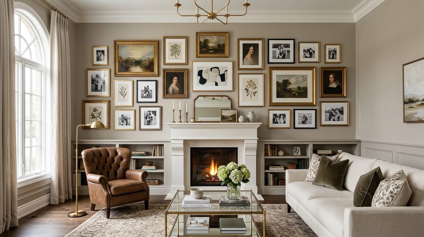
A Transitional Style Gallery Wall is the perfect middle ground. It blends traditional elegance with modern simplicity. To get this look, use frames with simple profiles but mix the finishes. Pair a classic landscape with a modern abstract piece.
In my experience, this style lasts the longest. You will not get tired of it in a year. It grows with your home. When I moved into my current house, I started with a transitional wall. Five years later, I have only changed two pieces. It still looks fresh.
Frequently Asked Questions
How do I choose the right size for a gallery wall?
Start with your wall space. A gallery should cover about 60% to 75% of the available wall area. If it is too small, it looks lost. If it is too large, it feels like the walls are closing in. Measure your sofa or console table first. Your gallery should be narrower than the furniture below it.
Can I mix black and gold frames?
Yes. Mixing black and gold is a classic move for a Gallery Wall With Mixed Frames. The black provides a modern anchor. The gold adds a touch of warmth and luxury. Just make sure the gold frames are distributed throughout the layout. Do not put them all in one spot.
What is the best way to hang art without making holes?
Command Strips are the gold standard. I use them for almost everything under 10 pounds. Make sure you clean the wall with rubbing alcohol first. This helps the adhesive stick. If your wall has a heavy texture, strips might not work. In that case, look for “monkey hooks” which leave only a tiny pinhole.
How do I mix photos and art on one wall?
Keep the color palette consistent. If your art has a lot of green, choose photos with green backgrounds. Another trick is to use matching mats. If every piece has a 2-inch white mat, they will look like a set regardless of what is inside the frame.
What should I do if my wall feels cluttered?
Remove one or two pieces. Often, we try to pack too much into a small space. Give your art room to breathe. Increase the spacing between frames to 4 inches. Sometimes, less really is more.
How high should I hang art in a hallway?
Hallways are narrow, so art is viewed from a closer distance. Stick strictly to the 57-inch rule. Since people are walking past, ensure the frames are secured at the bottom with a bit of museum putty. This prevents them from tilting when someone walks by quickly.
Is white artwork boring?
Never. White Artwork is about texture and light. It looks amazing on dark or colorful walls. It provides a “rest” for the eyes. If you have a busy gallery, a white minimalist piece can act as a palate cleanser.
Final Thoughts on Your Wall Project
Creating a gallery wall is a journey. It is okay if it does not look perfect on day one. I have moved frames in my house dozens of times. Each shift makes the space feel more like “me.”
Avoid the common traps. Don’t hang things too high. Don’t be afraid to mix your personal photos with professional prints. Most importantly, do that dry run on the floor. Your walls will thank you.
Start with one piece you love. Build from there. A home is a reflection of the people inside it. Your wall should tell your story. Now, go grab that butcher paper and start planning. You have got this.

Anya Castellan is the Founder and Editor-in-Chief of Home Wall Trends. An art history graduate of the Rhode Island School of Design with twelve years of experience writing for leading American design publications, she specializes in composition, gallery wall theory, and the quiet architecture of domestic space. A former contributing editor at Architectural Digest and guest lecturer at Parsons School of Design, Anya personally reads and signs off on every piece before it is published.