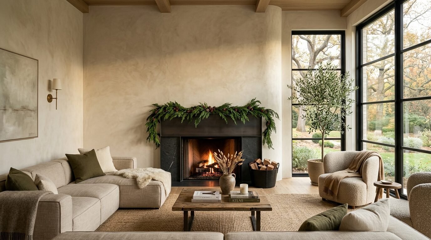
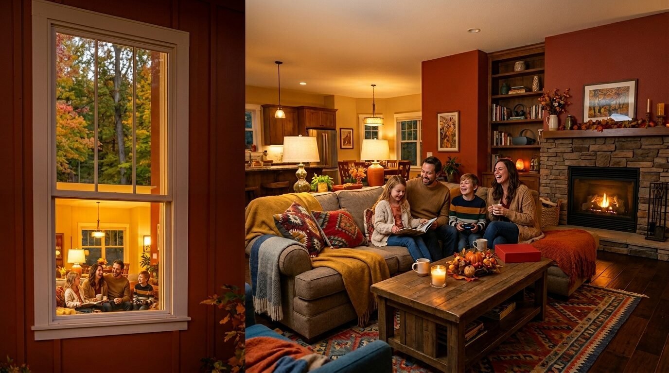
Last year I sat in a cold gray living room. The wind rattled the glass. I felt restless. My space felt like a sterile office. I grabbed a brush. I picked a deep clay shade. Everything changed. The room felt like a warm hug. This is the power of a fall accent wall. Choosing the right shade makes your home feel alive. 2026 is moving toward peace and earth tones. You want a home that feels like a retreat.
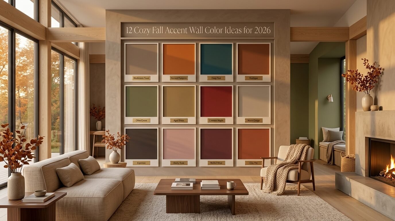
I see people struggle with paint choices every day. Most people fear dark colors. They worry a room will feel small. In my time as a designer I found the opposite. Dark walls create depth. They make furniture pop. Light walls can feel empty. This guide shows you how to pick the best tones for your space. We will look at the top picks for the year. You will see how to pair them. Your home will turn into a cozy sanctuary for the 2026 fall season.
1. Cloud Dancer White
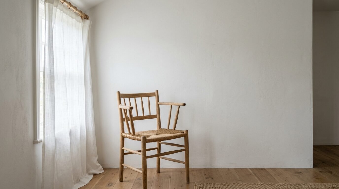
The Pantone Color Of The Year 2026 is Cloud Dancer. It is a soft and airy white. It feels like a morning mist. This is not a cold or blue white. It has a tiny hint of warmth. I call it a whisper of calm. It is the best choice for a minimal home. I used this in a sunroom last month. The light bounced off the walls in a soft way. It made the small space feel massive.
Cloud Dancer works as a perfect White Color Combo. You can pair it with light oak wood. It looks great with linen curtains. This shade is for people who want a fresh start. It feels clean but not like a hospital. If you love the quiet luxury look this is your color. Use it on a large wall behind your bed. It makes the room feel airy and bright.
2. Hidden Gem Jade
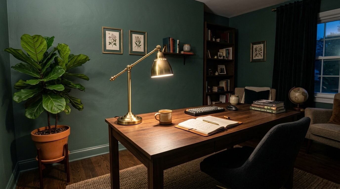
Hidden Gem is a smoky jade green. It is one of the top Trendy Colors 2026. This color carries the forest into your home. It feels rich and deep. I saw a client use this in their home office. They said it helped them focus. Green is known to calm the mind. This jade shade has a gray undertone. It does not look like a bright crayon green.
I suggest pairing this with gold lamps. Dark wood floors make it look expensive. Use a matte finish for the best look. Matte paint hides small bumps on your wall. In my view this is the most professional green for 2026. It looks great in a living room behind a tan sofa. Your guests will notice it as soon as they walk in.
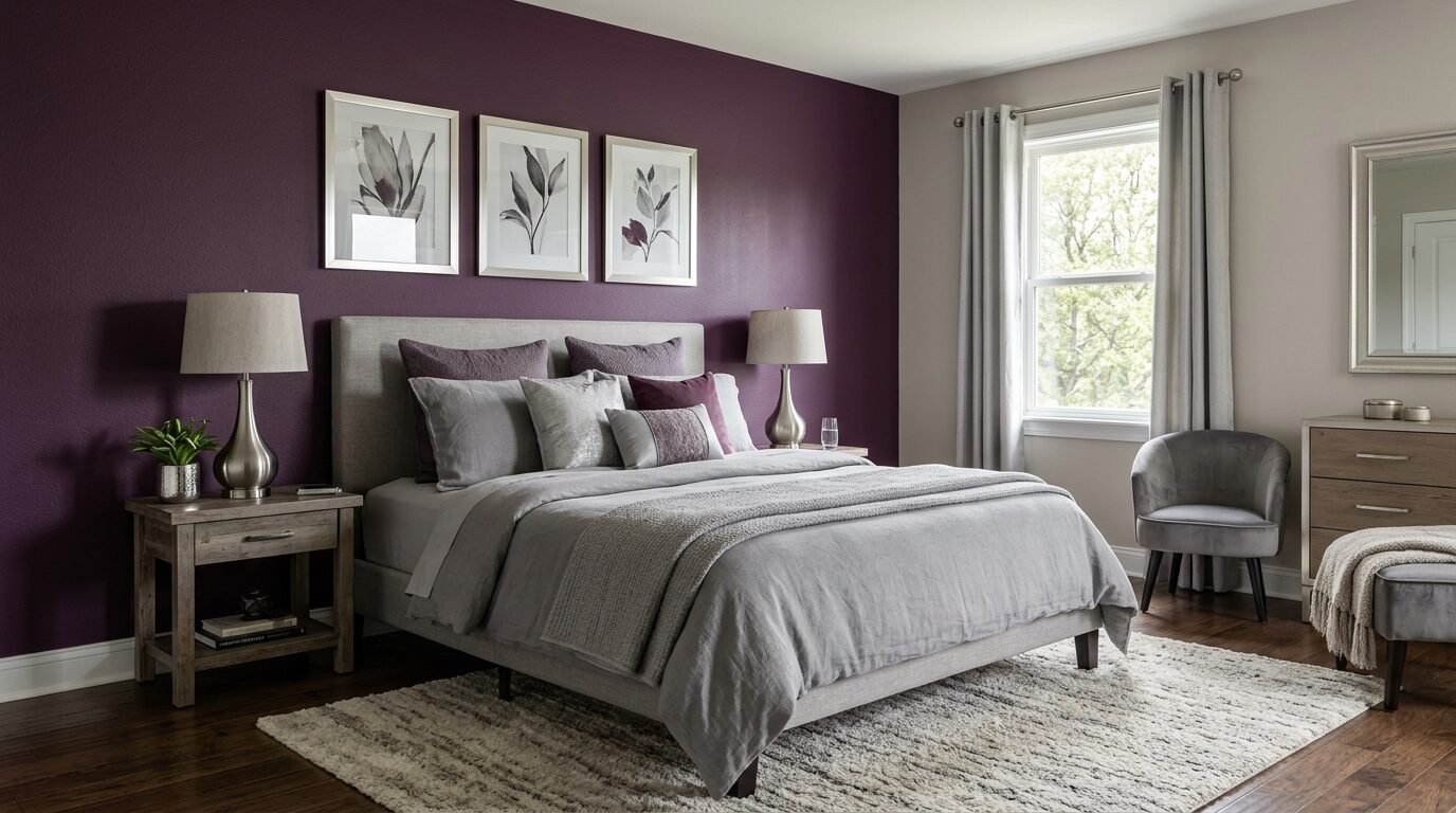
3. Divine Damson Purple
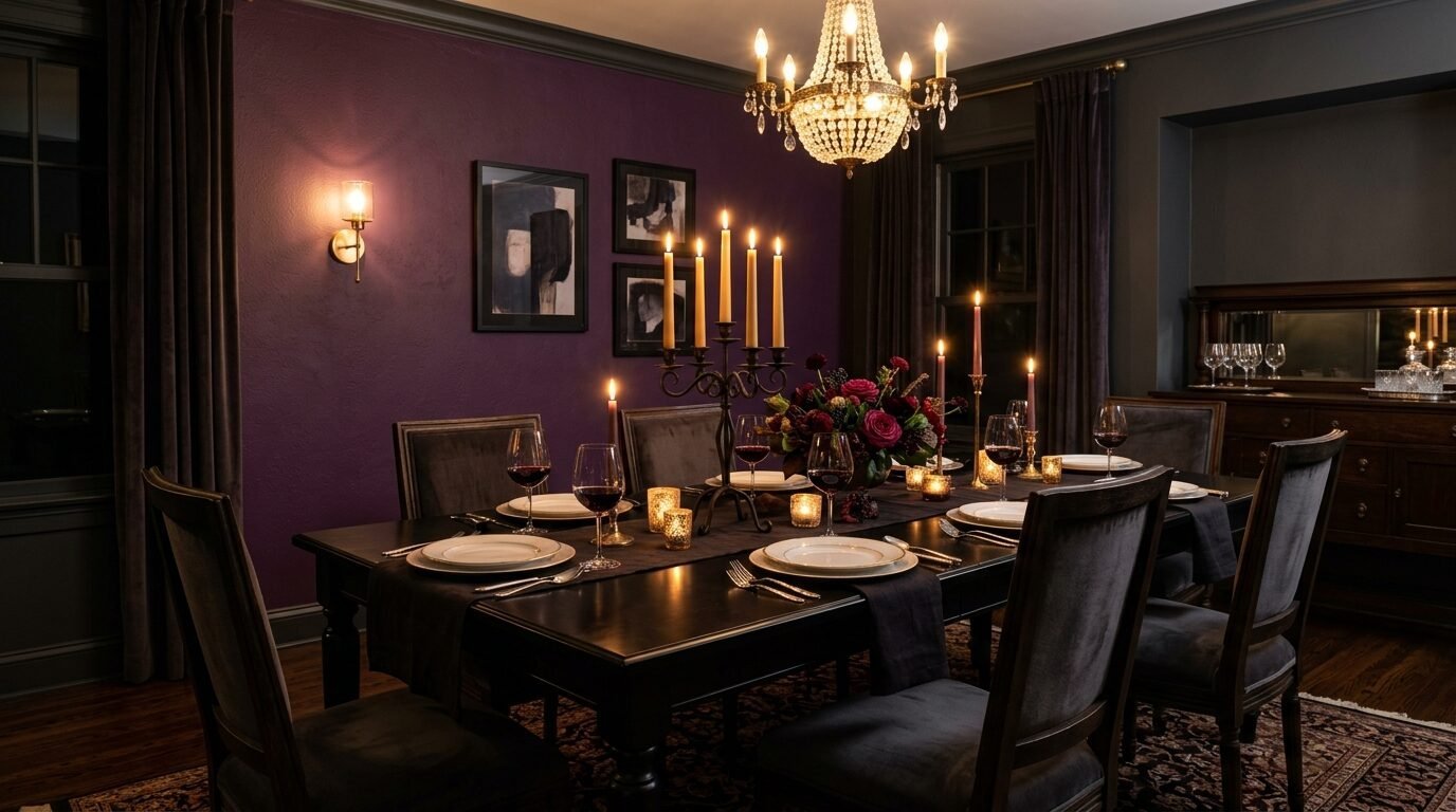
Divine Damson is a mix of deep purple and red. It looks like a ripe fig. This is a bold choice for a dining room. It creates a moody vibe for late night dinners. I love how it looks under warm yellow lights. It feels very high end. This color is a big part of the Interior Color Ideas for the coming year.
Pair this with dark gray or black furniture. It feels very cozy in the winter months. I tried this in a small powder room once. The dark color made the tiny room feel like a secret jewel box. Do not fear the dark pigment. Just make sure you have good lighting. This shade is a winner for people who love drama and comfort.
4. Warm Mahogany Red
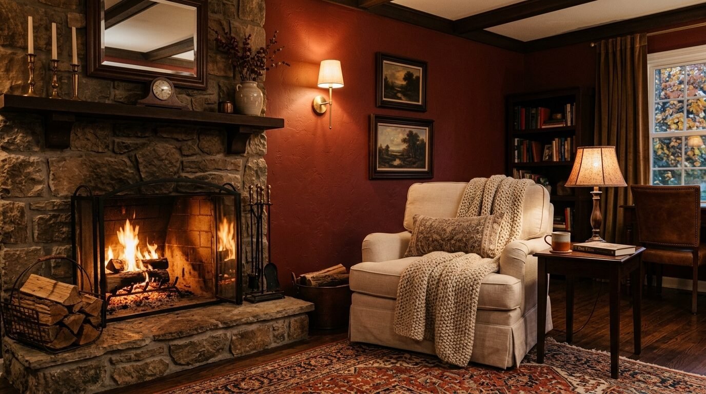
Warm Mahogany is a rich earth red. It sits between terracotta and brown. It is a key part of the Wall Colors 2026 palette. This color gives off a natural heat. It reminds me of a brick fireplace. I see this working well in a cozy den. It feels grounded and real.
I noticed this color works best with creamy textiles. Use wool blankets and cotton pillows nearby. It softens the red tone. You can use this for Color Blocking Interior projects. Paint the bottom half of a wall in Mahogany. Paint the top in a soft cream. It creates a vintage look that feels modern. This is a safe way to try a bold red without it taking over the room.
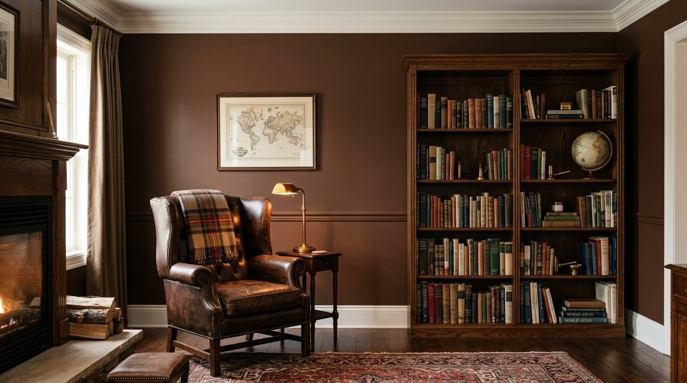
5. Silhouette Espresso Brown
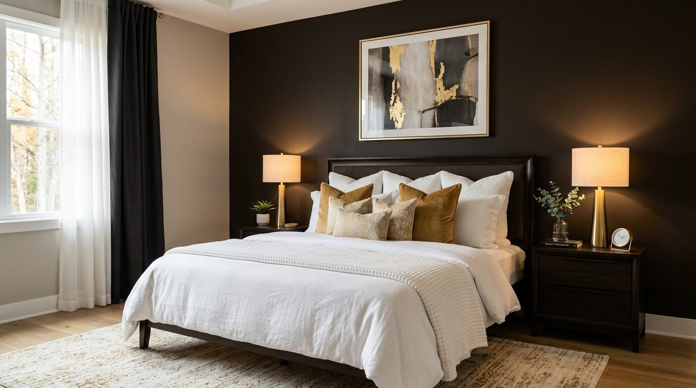
Silhouette is a deep espresso brown with charcoal hints. It is much softer than black. It feels like a cup of dark coffee. This is a great choice for a bedroom accent wall. It makes the walls recede. This helps you fall asleep faster. I used this color in a master suite last year. The owners said it felt like a five star hotel.
Pair Silhouette with brass or copper details. It needs a bit of shine to balance the dark tone. This is also one of the best Lobby Colour Ideas. It looks steady and strong in an entrance. It hides scuffs and marks very well. If you have kids or pets this is a smart choice for a busy area.
6. Freckle Muted Orange
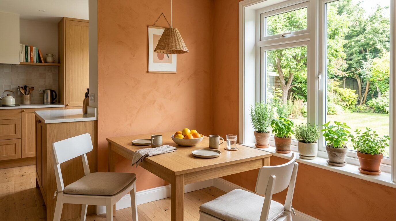
Freckle is a subdued orange with ochre and clay roots. It feels like an autumn leaf. This is a very friendly and happy color. It is not a neon orange. It is much more muted and natural. I love this for a kitchen or a breakfast nook. It makes the space feel sunny even on rainy days.
In my experience people love this color in north facing rooms. Those rooms often feel cold and blue. Freckle gives them a warm glow. Pair it with light gray or sage green. It looks very fresh. This is a top pick for the Colour Of 2026 list. It feels like a hug for your house.
7. Mellow Flow Indigo
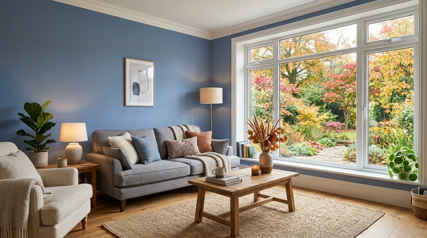
Mellow Flow is a soft indigo blue. It is part of the Rhythm of Blues collection. This is a calm and steady shade. It feels like the sky at dusk. Blue is always a safe choice for a home. But this indigo has a bit of soul. It does not feel boring.
I recommend this for a living room where you watch TV. It is easy on the eyes. It looks great with white trim and dark wood furniture. I saw this used in a beach house for a fall update. It kept the coastal feel but added the cozy warmth needed for the cooler months. It is a very versatile blue.
8. Green Glow Lime
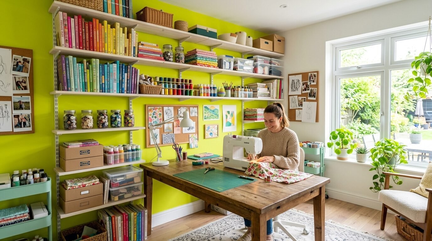
Green Glow is a bright and airy chartreuse. This is for the brave home owner. It is a very modern and fresh choice. It works well for a small accent area. Maybe use it in a craft room or a kids room. It brings a lot of energy to the space.
To keep it from being too much use a White Color Combo. Paint three walls in a soft white. Use Green Glow on the wall with the most light. I have seen this work in very modern apartments. It breaks the boring white wall trend. It shows you have a fun personality.
9. Cacao Powder Brown
Cacao Powder is a rich and earthy brown. It is lighter than Silhouette. It feels like milk chocolate. This is a very classic fall color. It will never go out of style. I find it looks best in rooms with a lot of wood furniture. It creates a tone on tone look.
This is a great option for an accent wall behind a TV. It helps the screen blend into the room. I noticed it also works well as one of the Lobby Colour Ideas. It feels welcoming and warm for guests. Pair it with green plants for a natural and leafy vibe.
10. Fresh Purple Plum
Fresh Purple is a deep lavender or plum shade. It is a sophisticated choice for 2026. It feels regal but still cozy. I love this for a guest bedroom. It makes the room feel special. I once used a similar plum in a library. It made the books look like art.
Pair this with silver or gray accents. It keeps the purple from looking too sweet. It feels mature and calm. This is a great way to include color if you usually stick to gray. It is a small step into the world of rich tones.
11. Silver Satin Neutral
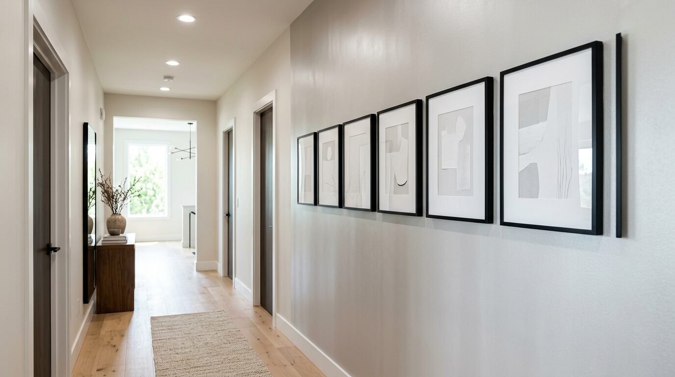
Silver Satin is a cool off-white. It is not a true white. It has a tiny bit of gray and warmth. This is the best choice for people who want a very subtle accent wall. It looks different than the other walls without being a big jump.
I use this when a client wants a clean look but finds pure white too harsh. It looks great with black frames and white mats. It creates a gallery look. This is a staple for Interior Color Ideas. It is a very safe and professional choice for any room in your house.
12. Wax Paper Cream
Wax Paper is a warm and creamy off-white. It feels like an old book page. This is the ultimate cozy neutral for 2026. It works perfectly with all the other colors on this list. I often use it on the ceiling to match a dark accent wall. It makes the room feel whole.
Pair Wax Paper with gold and warm wood. It feels very high end and classic. If you are doing a Color Blocking Interior this is your best base color. It is soft and kind to the eyes. It makes every other color look better.
Paint Comparison For Your Fall Project
The table below shows how these colors compare in feel and use.
| Color Name | Main Tone | Best Room | Vibe |
| Cloud Dancer | Warm White | Bedroom | Calm and Airy |
| Hidden Gem | Smoky Jade | Office | Focused and Rich |
| Divine Damson | Dark Fig | Dining Room | Bold and Moody |
| Silhouette | Dark Coffee | Master Suite | Luxe and Quiet |
| Freckle | Earthy Orange | Kitchen | Warm and Happy |
| Mellow Flow | Soft Indigo | Living Room | Steady and Calm |
| Green Glow | Chartreuse | Craft Room | Fun and Modern |
| Cacao Powder | Milk Chocolate | Den | Classic and Cozy |
| Silver Satin | Cool Gray White | Hallway | Clean and Sharp |
Two Case Stories From My Work
The Dark Brown Living Room
A client in Seattle had a white living room. It felt cold and grey during the winter. We picked a deep espresso brown for one wall. We added a gold floor lamp and a cream rug. The room felt ten degrees warmer. They spent more time in that room than ever before. The dark wall gave the space a heart.
The Tiny Orange Nook
I worked with a student who had a tiny studio. We painted a small wall in a soft ochre orange. We used white shelves over it. It turned a boring corner into a sunny reading spot. It proved that you do not need a big room for a bold color. You just need the right placement.
Frequently Asked Questions
What is the Pantone Color Of The Year 2026?
The color is Cloud Dancer. It is a very soft and airy white. It carries a calm and peaceful energy. It is a great base for any room.
How do I pick a color for a dark room?
For dark rooms look at warm tones like Freckle or Wax Paper. They reflect what little light you have. If you want a dark color use good lamps.
Can I use more than one color on a wall?
Yes. You can try Color Blocking Interior styles. Use a dark tone on the bottom and a light tone on top. It makes the wall look like a piece of art.
What finish is best for a fall accent wall?
Matte or eggshell finishes are best for cozy vibes. They do not shine too much. They make the color look deep and soft.
Is gray still popular for 2026?
Gray is moving toward warmer tones. Look at Silver Satin or taupe. Cold grays are being replaced by earthy and natural shades.
How do I make an accent wall look professional?
Use painter tape for clean lines. Apply two thin coats of paint. Always use a primer if you are painting a light color over a dark one.
The fall of 2026 is all about feeling safe and calm. Your home is your world. Picking a new color is a fast way to change your mood. I have seen a simple can of paint save a boring room. Start with a small wall if you are nervous. You will love the change. I hope this list helps you find your perfect shade. Which color will you try first?

Anya Castellan is the Founder and Editor-in-Chief of Home Wall Trends. An art history graduate of the Rhode Island School of Design with twelve years of experience writing for leading American design publications, she specializes in composition, gallery wall theory, and the quiet architecture of domestic space. A former contributing editor at Architectural Digest and guest lecturer at Parsons School of Design, Anya personally reads and signs off on every piece before it is published.