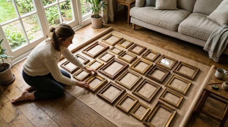
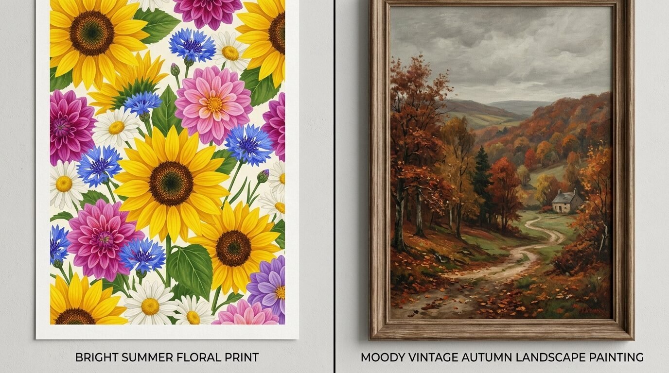
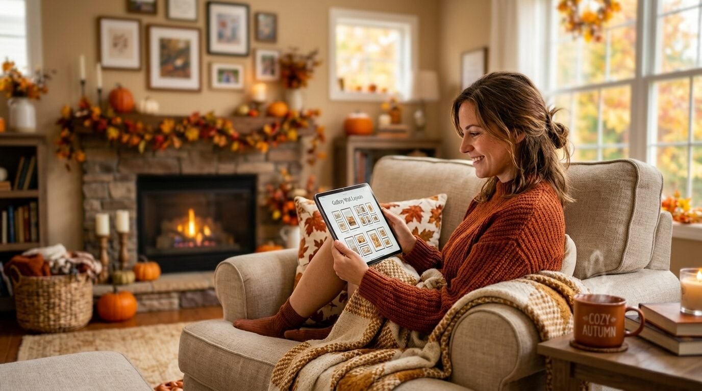
The air turns crisp. You grab your favorite sweater. Your home should feel just as cozy as you do. Last year I looked at my living room wall and felt a disconnect. The bright summer prints looked out of place against the orange leaves outside. I realized that a gallery wall refresh is the fastest way to change how a room feels. You do not need a full renovation. You only need a few smart swaps.
This guide helps you transition your space using fall posters autumn lovers will adore. I have spent years testing different layouts and print styles. In my experience a few focused changes create more impact than buying all new decor. We will look at color palettes and frame textures. You will see how vintage autumn poster styles can ground a modern room.
Why Should You Update Your Wall Decor For The Fall Season?
Changing your wall art is about more than just looks. It is about how your home makes you feel. Visual cues tell your brain it is time to slow down. I noticed that when I added fall posters aesthetic for room vibes in my office my productivity actually went up. The warm tones felt grounding.
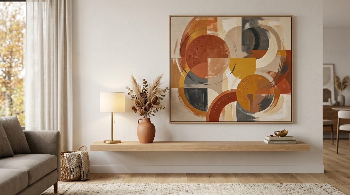
Seasonal decor creates a sense of rhythm in your life. Most people focus on pumpkins and blankets. Those are great. But your eyes spend a lot of time on your walls. A large autumn aesthetic poster acts as a focal point for the entire room. It sets the tone for your other decorations.
When you use fall prints for wall spaces you bridge the gap between inside and outside. It makes your home feel intentional. I have seen many friends try to force summer colors to work with fall candles. It never quite fits. Swapping out even two or three prints makes the whole space feel cohesive. It is an affordable way to stay current with home trends without overspending.
How Do You Choose The Perfect Fall Aesthetic Poster?
Finding the right print involves looking at your current furniture. You want pieces that complement your existing colors. I suggest starting with one “hero” print. This is usually the largest piece in your gallery.
Look for images that evoke a feeling. This could be a misty forest or a close up of a golden leaf. Vintage autumn poster designs are very popular right now because they add history and soul to a room. They feel lived in.
I recommend checking sites like Etsy or Society6 for unique finds. I once found a digital download of a 19th century landscape for five dollars. I printed it at a local shop and it looked like a museum piece.
Pay attention to the paper quality. Matte paper works best for fall wall pictures. Glossy paper can create too much glare from your cozy indoor lighting. You want the art to look soft and inviting.
Which Fall Color Palettes Create The Best Mood?
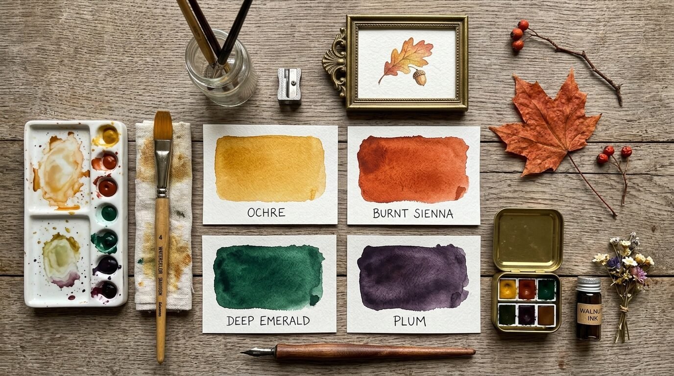
The right colors change your mood instantly. Many people think fall is only orange and brown. In my experience the best fall wall prints aesthetic choices include unexpected shades. Think about deep plums or forest greens.
| Mood | Primary Colors | Accent Colors | Best For |
| Cozy Vintage | Ochre, Burnt Sienna | Cream, Brass | Living Rooms |
| Moody Modern | Charcoal, Deep Emerald | Gold, Rust | Bedrooms |
| Bright Autumn | Soft Gold, Terracotta | Sage Green, Tan | Kitchens |
| Minimalist Fall | Greige, Soft Brown | Black, White | Entryways |
I tried a moody modern palette in my guest room last year. I used an autumn aesthetic poster with a dark background. It made the small room feel like a high end hotel suite. Colors like mustard yellow and olive green work well together because they appear in nature. They feel balanced.
Avoid neon or very bright primary colors. They clash with the natural softening of light that happens in October and November. Stick to tones that look like they have been filtered by a late afternoon sun.
Where Can You Find High Quality Fall Posters For Rooms?
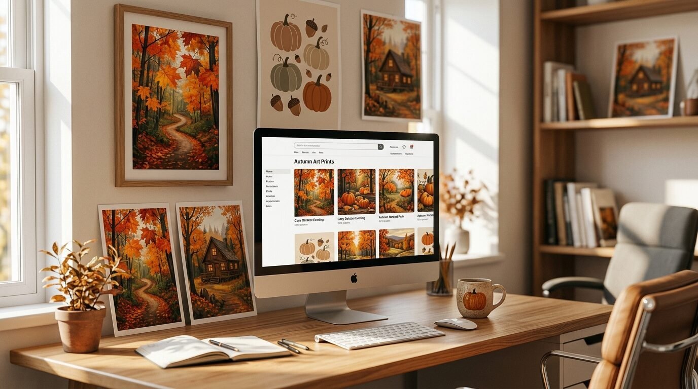
You have many options for finding art. Your choice depends on your budget and how fast you want the refresh done.
Etsy is my top choice for fall posters autumn styles. You can buy digital files and print them yourself. This is great for last minute decorating. You also support independent artists.
Juniper Print Shop offers curated sets. Their prints look very high end. I have used their oversized landscapes to anchor large walls. The colors are always rich and true to the photos.
Society6 is excellent for fall posters aesthetic for room designs that feel more modern. They have a huge variety of abstract fall art. I like their framed options because they arrive ready to hang.
Minted is where I go for unique photography. Their fall season poster selection includes beautiful shots of New England and the Pacific Northwest.
Artfully Walls has a great tool that helps you visualize a whole gallery. If you are nervous about mixing prints this is a life saver. I used this when I was redesigning my dining room wall and it saved me from making three bad purchases.
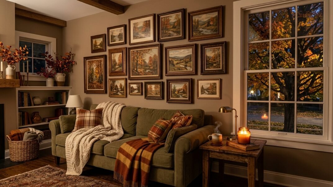
1. Swap Bright Florals For Moody Landscapes
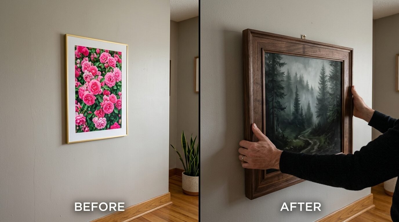
Summer is for bright flowers. Fall is for the earth. I recommend taking down those pink and blue floral prints. Replace them with a vintage autumn poster showing a mountain range or a quiet forest path.
The depth in these paintings creates a sense of calm. Look for landscapes that use heavy brushstrokes. They add a tactile feeling to the wall. I saw a huge difference in my hallway when I swapped a watercolor flower for an oil painting print of a stormy sky. It felt more sophisticated immediately.
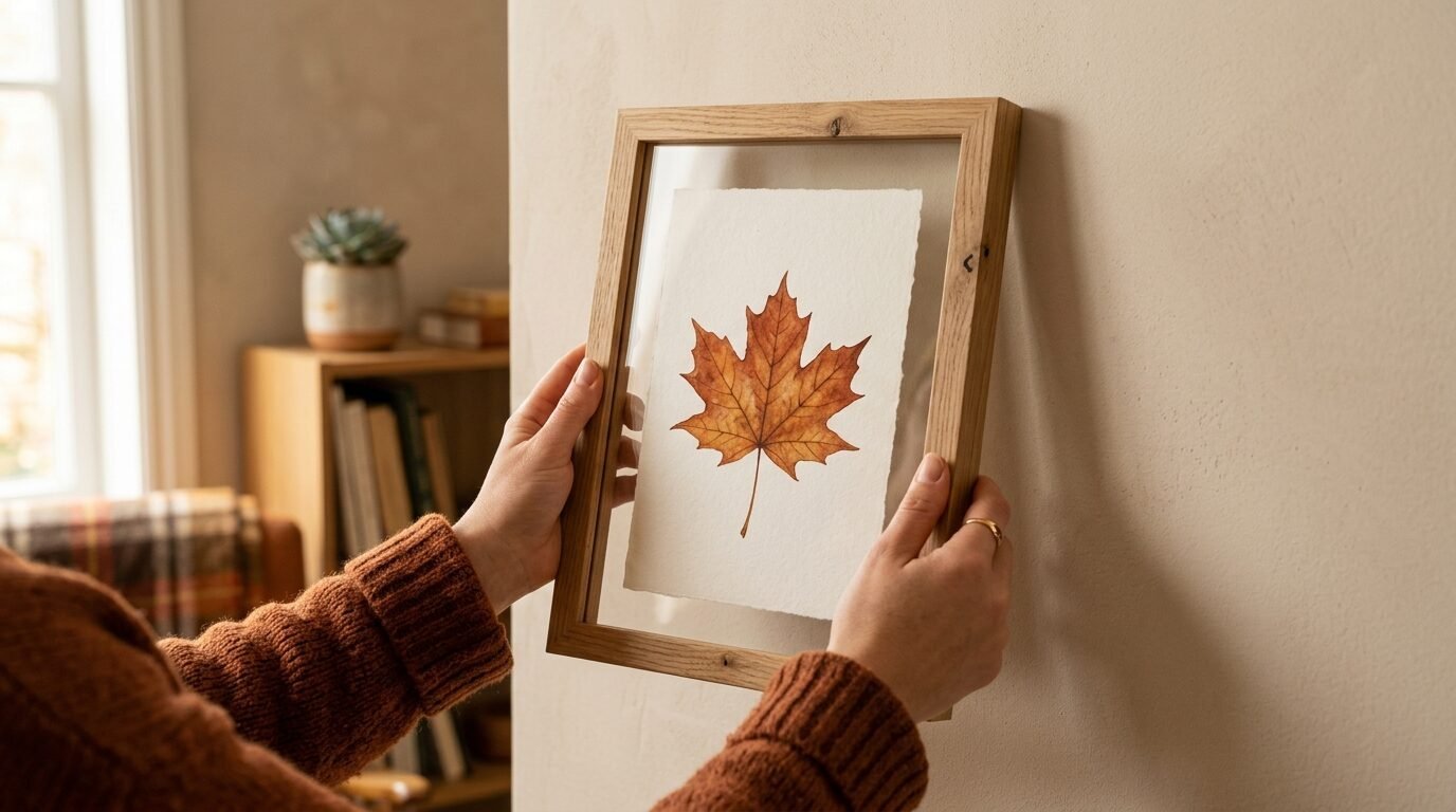
2. Introduce Textural Elements Like Pressed Leaves
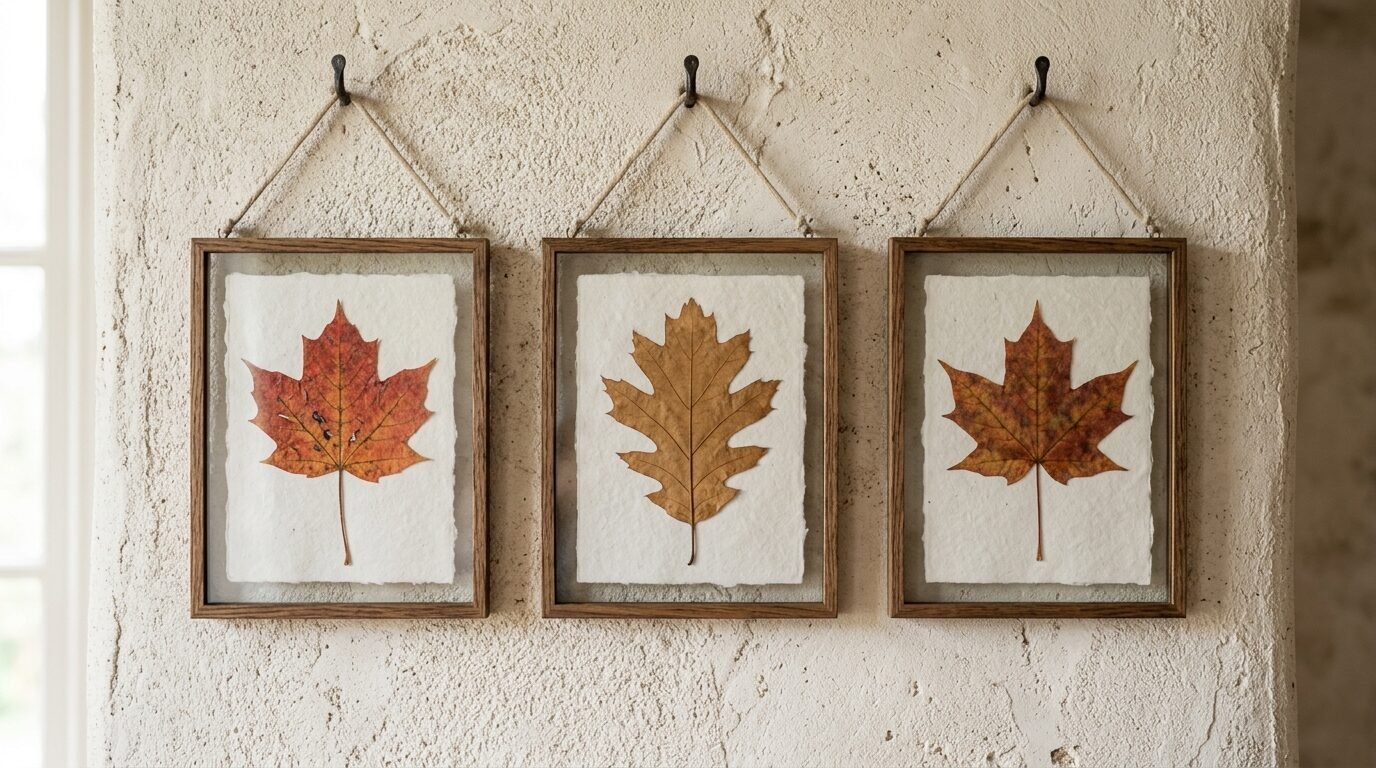
Art does not always have to be a paper print. I love adding a few frames with real pressed leaves. This adds an organic element to your fall wall pictures collection.
You can do this yourself for free. Find a beautiful maple leaf during a walk. Dry it between heavy books for a week. Place it in a simple glass frame from IKEA. It adds a 3D effect that printed art cannot match. I have seen this work wonders in small gallery walls where everything else is flat.
3. Change Your Matting To A Warmer Tone
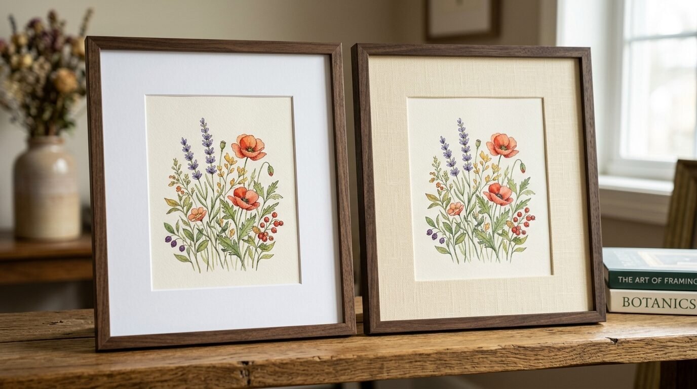
Most frames come with bright white mats. In the fall these can look too harsh. I have noticed that switching to a cream or oatmeal colored mat makes the art feel more expensive.
It softens the transition between the frame and the art. You can buy pre cut mats at Michaels or Hobby Lobby. I tried this with a set of autumn wall prints aesthetic style last year. The warmer mats made the colors in the prints pop without looking clinical. It is a small detail that makes a big impact.
4. Use Vintage Botanical Prints
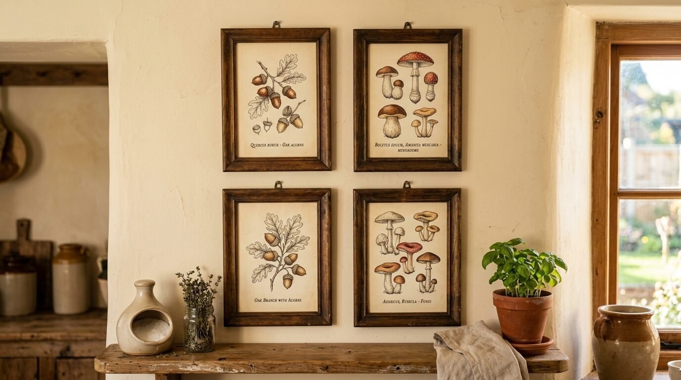
Botanical illustrations are timeless. For fall look for sketches of acorns or mushrooms. A vintage autumn poster featuring grain or wheat also works well.
These prints have a scientific yet artistic feel. They work perfectly in kitchens or dining areas. I suggest grouping three or four smaller botanical prints together. Use dark wood frames to give them a classic look. I found a set of four vintage mushroom prints on Etsy that completely changed my breakfast nook.
5. Mix In Some Abstract Fall Shapes
If you prefer a modern look you do not need literal pictures of trees. Look for abstract art that uses fall colors. An autumn aesthetic poster with simple rust circles or ochre lines can be very effective.
Abstract art allows the viewer to interpret the season. It keeps the room feeling fresh and not too themed. I often mix one abstract piece with two realistic landscapes. This keeps the gallery wall from looking like a gift shop display. It feels like a curated collection.
6. Update Your Frames To Darker Woods
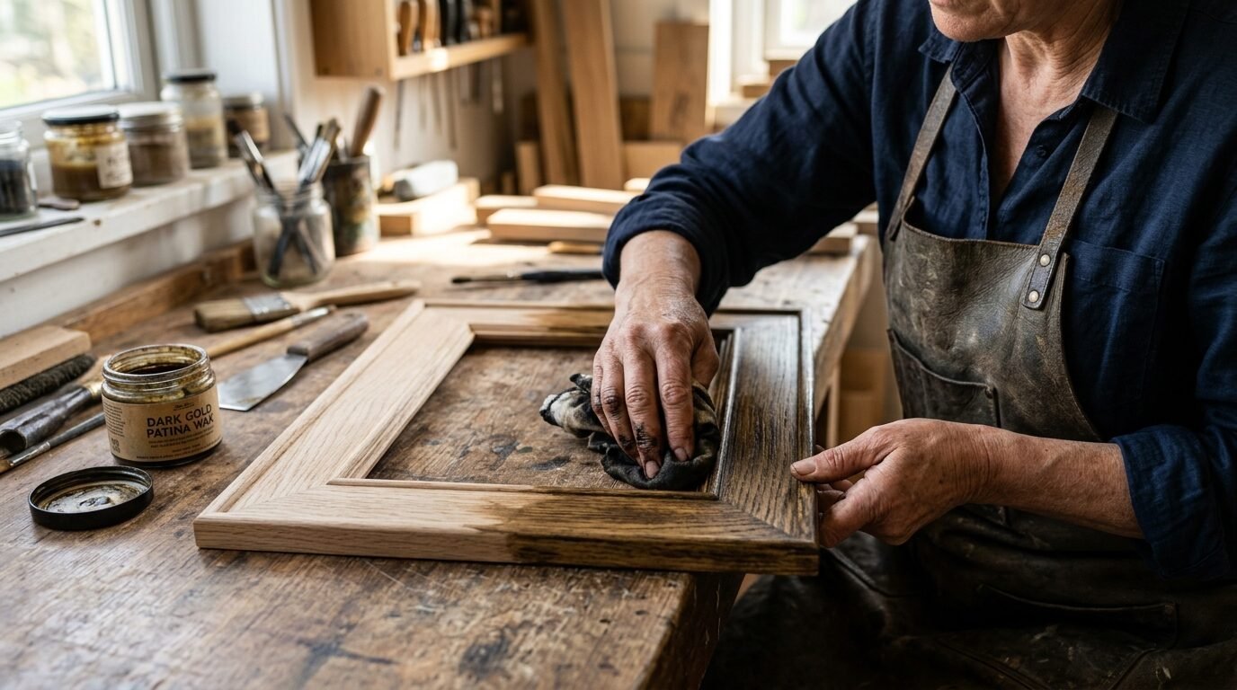
The frame is the house for your art. In summer light oak or white frames look great. For a fall gallery wall refresh I suggest moving toward walnut or mahogany tones.
Darker wood frames ground the images. They feel heavier and more permanent. If you do not want to buy new frames you can use a rub on wax finish. I have used Rub ‘n Buff in European Gold or Autumn Gold to transform cheap frames. It takes ten minutes and looks like real metal or aged wood.
7. Incorporate Seasonal Quotes With Style
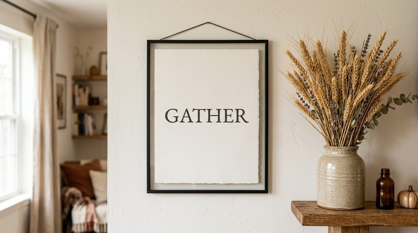
I am usually cautious with word art. It can look cheesy if not done right. However a simple fall season poster with a single meaningful word can work.
Think of words like “Gather” or “Dwell” in a beautiful serif font. Avoid script fonts that are hard to read. Place this print off center in your gallery. It acts as a breath of air between busy images. I used a simple “Autumn” print in my entryway and it feels like a warm greeting every time I come home.
8. Layer Your Art On Shelves
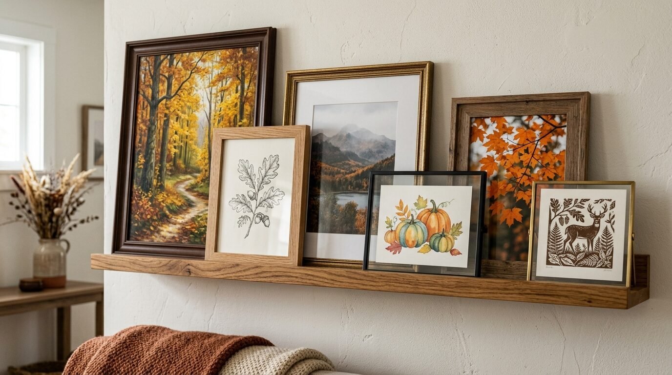
You do not have to hang everything. If you have a mantel or a picture ledge try layering your fall prints for wall display.
Place the largest autumn aesthetic poster in the back. Lean smaller vintage autumn poster frames in front. This creates depth and shadows. It feels more casual and lived in. I do this on my living room shelves every October. It allows me to swap prints easily without making more holes in the wall.
9. Add A Mirror To Reflect Warm Light
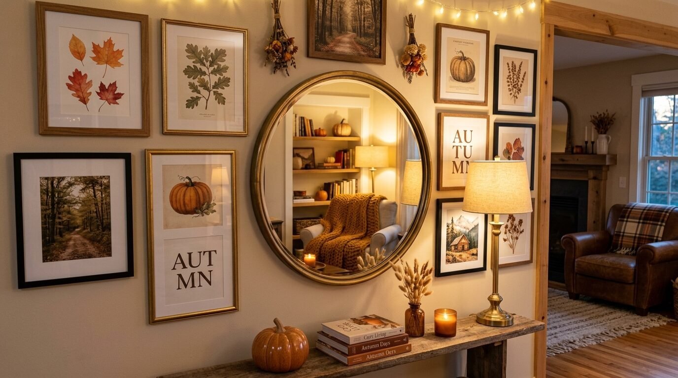
Fall is a time when we lose daylight. Including a mirror in your gallery wall helps bounce light around the room.
I like to find mirrors with interesting frames. A round brass mirror looks beautiful next to square fall wall pictures. It reflects the glow of your candles or lamps. I noticed that my living room felt much brighter once I added a small antique mirror to my fall layout. It also breaks up the square lines of the art frames.
10. Focus On Macrophotography Of Nature
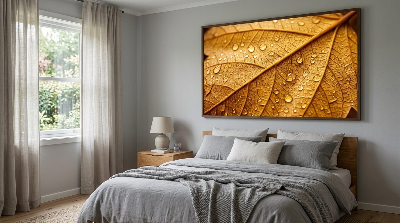
A close up of a pinecone or the veins of a leaf can be stunning. These fall posters autumn collections often feature high contrast.
Macrophotography brings a sense of wonder. It forces you to look at the small details of the season. I recommend using these in a bedroom or a quiet reading corner. They are very calming to look at. I have a large print of a single golden leaf in my bedroom and it is the first thing I see in the morning. It feels peaceful.
11. Switch To Brass Or Gold Hardware
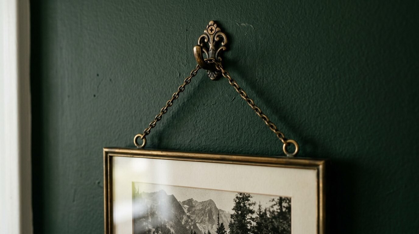
If you have metal frames or hanging clips consider switching to warm metals. Silver can feel cold during the autumn months.
Brass and gold tones mimic the color of the sun. They add a touch of luxury to your fall posters aesthetic for room decor. I changed my hanging wire to brass chain for one of my larger pieces and it looked like a custom installation. You can find cheap brass frames at Target or HomeGoods.
12. Create A Theme Based On A Specific Memory
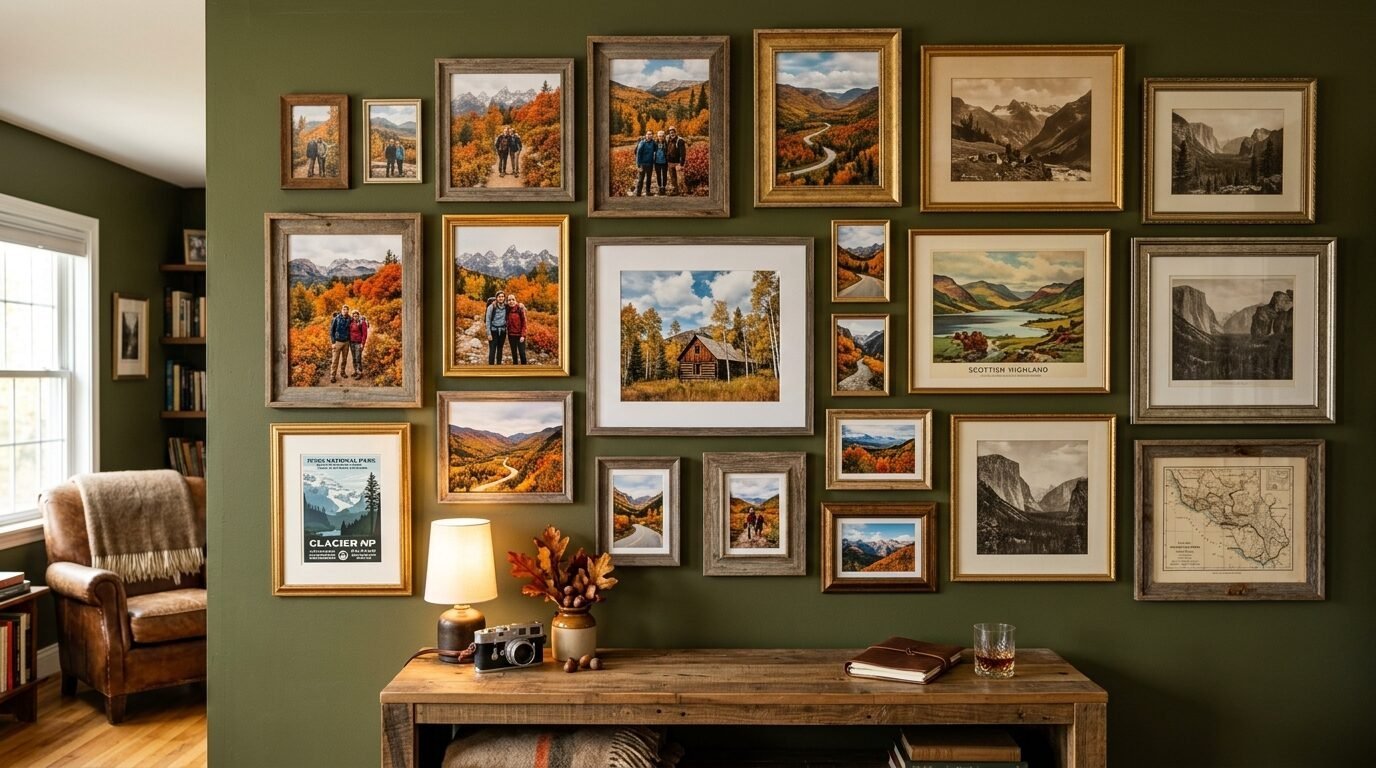
The most successful gallery walls tell a story. Maybe you have a favorite fall vacation spot. Find fall wall pictures that remind you of that place.
If you love the mountains find mountain art. If you love the coast look for moody beach prints with gray skies. I once built a gallery wall around photos I took on a trip to Vermont. I mixed my own photos with professional fall prints for wall spaces. It made the decor feel personal and meaningful.
Case Study 1: The $60 Living Room Transformation
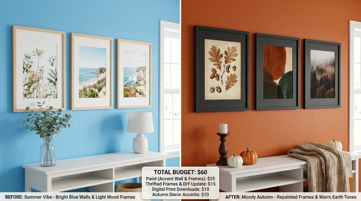
My friend Sarah wanted a new look for her living room but had a tight budget. She had five large frames already on her wall. They were filled with bright summer beach photos.
We spent $30 on digital downloads from an artist on Etsy specializing in vintage autumn poster styles. We spent another $20 on printing at a local office supply store. Finally we spent $10 on a can of dark walnut spray paint for her white frames.
The result was a completely different room. The space went from feeling airy and cool to feeling warm and anchored. Her guests actually asked if she had repainted the room. It shows that you do not need a huge budget to see big results.
Case Study 2: Solving The “Too Much Orange” Problem
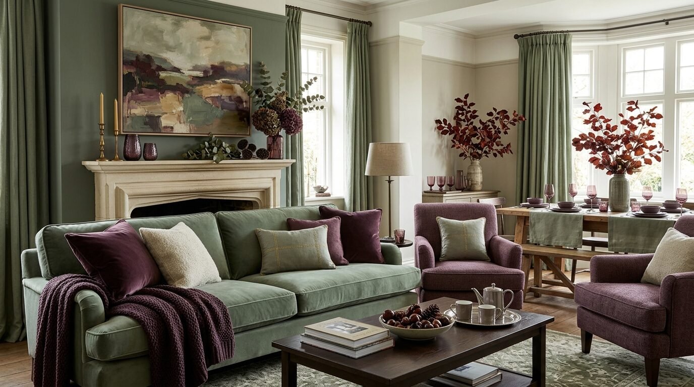
A client of mine felt her fall decor looked like a cartoon. She had orange pumpkins and orange art everywhere. It felt overwhelming.
We did a fall gallery wall refresh using a palette of sage green and deep plum. We kept only one autumn aesthetic poster that had small hints of copper. We swapped her bright orange prints for moody landscapes and black and white photography of fall forests.
The room immediately felt more grown up. It still felt like fall but in a sophisticated way. The green in the art complemented the natural wood of her furniture. It was a lesson in using color as an accent rather than a theme.
Case Study 3: The Entryway Impact
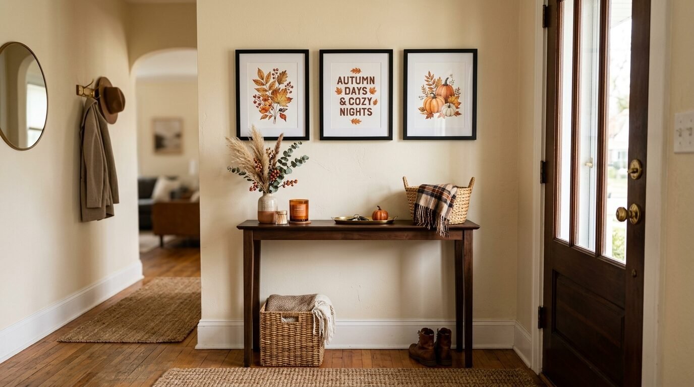
I tried a mini gallery wall in my small entryway. I used three frames of different sizes. I chose a fall season poster for the largest frame. I added a vintage botanical print of a wheat stalk and a small abstract rust piece.
Because it was a small space the impact was huge. Everyone who entered my home commented on it. It took less than an hour to set up. It proved to me that you do not need a giant wall to make a seasonal statement. Small corners are perfect for testing new fall posters autumn trends.
Tools You Need For A Damage Free Refresh
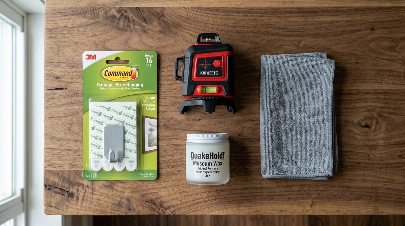
You want to change your art without destroying your walls. I have tried every method and these are the ones that actually work.
- Command Picture Hanging Strips: These are essential. I have used them for years and they never leave a mark. They allow you to swap frames easily.
- Laser Level: This saves so much time. I used to spend hours measuring. Now I just follow the red line. The Black and Decker laser level is a great affordable choice.
- Museum Wax: If your frames lean or move when you walk by use a tiny dot of this wax on the bottom corners. It keeps everything straight.
- Microfiber Cloth: Always wipe your glass before putting it back in the frame. Dust shows up more in the low light of fall.
- Framebridge: If you have a special piece of art you want professionally framed this service is amazing. I have used them for two of my favorite vintage autumn poster finds.
Frequently Asked Questions
What is the most popular fall wall decor trend this year?
Vintage oil painting reproductions are the top trend right now. People want art that feels historical and soulful. Look for landscapes with dark moody skies or golden fields.
Can I mix different frame colors in one gallery?
Yes you can. In fact it often looks better. I recommend sticking to two or three tones. For example mix dark wood with brass. This makes the wall look like it grew over time rather than being a store set.
How high should I hang my gallery wall?
The center of your gallery should be at eye level. This is usually about 57 to 60 inches from the floor. If you are hanging it above a sofa leave about 6 to 8 inches of space between the sofa back and the bottom frames.
Where can I get cheap prints for my fall posters?
Local print shops or big box stores like Staples are great. You can also use Walgreens for quick photo prints. For higher quality I like Mpix. Their colors are very accurate for fall wall prints aesthetic styles.
How many prints do I need for a good gallery wall?
There is no set rule. However an odd number like three or five often feels more balanced. If you have a very large wall you might need seven or nine pieces.
Can I use my own photos for a fall gallery?
Absolutely. Edit your photos with a warm filter to make them match the season. Increase the contrast and lower the saturation slightly. This gives them a professional fall aesthetic poster look.
What should I do with my summer prints?
Store them flat in a cool dry place. I use a large plastic bin under my bed. Make sure they are separated by acid free paper so the ink does not stick.
How do I choose art that will not go out of style?
Stick to classic subjects like landscapes and botanicals. Avoid overly trendy phrases or neon colors. A vintage autumn poster of a forest will look good for many years.
Is it okay to have empty space in my gallery wall?
Yes. Negative space allows the eye to rest. Do not feel like you have to cover every inch of the wall. Sometimes three well placed prints are better than ten crowded ones.
What if I have a small apartment?
Focus on one or two larger fall wall pictures. Too many small frames can make a small room feel cluttered. One large autumn aesthetic poster can make a room feel bigger.
How do I handle lighting for my wall art?
As the days get shorter use small spotlights or picture lights. Battery operated LED picture lights are easy to install. They make your fall posters autumn collection look like a professional gallery at night.
What are the best colors for a moody fall vibe?
Look for navy blue charcoal and forest green. These dark colors create a cozy cave like feeling that is perfect for autumn evenings.
Final Thoughts On Your Fall Decor Journey
A fall gallery wall refresh is a gift to yourself. It makes your home a sanctuary as the weather cools. I have found that the act of choosing art and arranging frames is therapeutic. It marks the start of a new season.
Do not be afraid to experiment. If a print does not look right you can always swap it out. Art is subjective and your home should reflect what you love. Start with one vintage autumn poster and see where it leads you.
I have noticed that once people start seasonal art swapping they never go back to static walls. It is a simple habit that keeps your home feeling fresh and alive. Enjoy the process of finding new fall posters aesthetic for room styles. Your perfect autumn sanctuary is only a few frames away.

Anya Castellan is the Founder and Editor-in-Chief of Home Wall Trends. An art history graduate of the Rhode Island School of Design with twelve years of experience writing for leading American design publications, she specializes in composition, gallery wall theory, and the quiet architecture of domestic space. A former contributing editor at Architectural Digest and guest lecturer at Parsons School of Design, Anya personally reads and signs off on every piece before it is published.