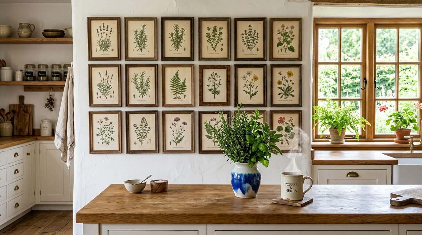
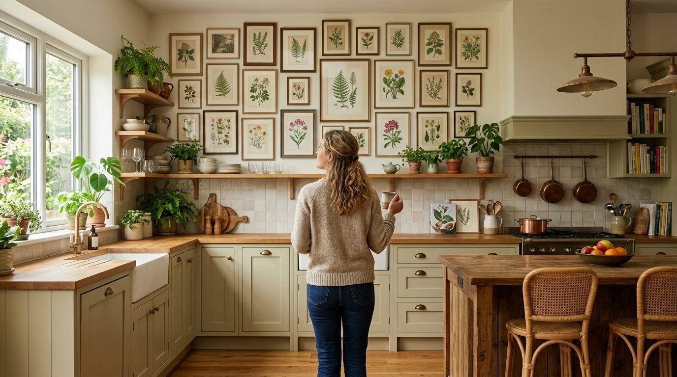
Imagine walking into your kitchen on a Tuesday morning. The sun hits the counter where your coffee sits. You look up and see a wall that used to be blank and cold. Now it feels like a cozy cottage in the French countryside. Your walls tell a story of nature and history. I have seen how a simple set of vintage botanical printable art ideas for your kitchen can change a mood. You do not need a big budget for this change. You only need a printer and a bit of inspiration. In my experience, the kitchen is the heart of the home. It deserves art that feels alive. These 22 ideas will help you create a space that guests never want to leave.
Executive Summary
You want a kitchen that feels curated and personal without spending thousands of dollars. This guide offers 22 specific vintage botanical printable art ideas for your kitchen to help you reach that goal. You will find styles ranging from scientific illustration botanical to soft vintage florals. I include practical tips on paper choice and framing that I learned through my own trial and error. We cover 12 essential tools like Public Domain Review and Frameite to make your project easy. Expect to learn how to choose the right art for small spaces and large gallery walls. This deep dive ensures your kitchen art looks professional and authentic.
1. Scientific Illustration Botanical Studies
Scientific illustration botanical prints bring a sense of order and curiosity to your kitchen walls. These prints usually feature a single plant against a clean white or aged cream background. You see the roots and the stems and the tiny seeds. I noticed these work best when you hang them in a grid of four or six. It creates a focal point that looks like a museum display. I once used these in a rental kitchen with dark cabinets. The bright white backgrounds of the paper made the whole room feel larger. Look for high resolution files from sources like the Biodiversity Heritage Library. Use a heavy matte paper to give them a premium feel.
2. Classic Botany Illustration Herb Sets
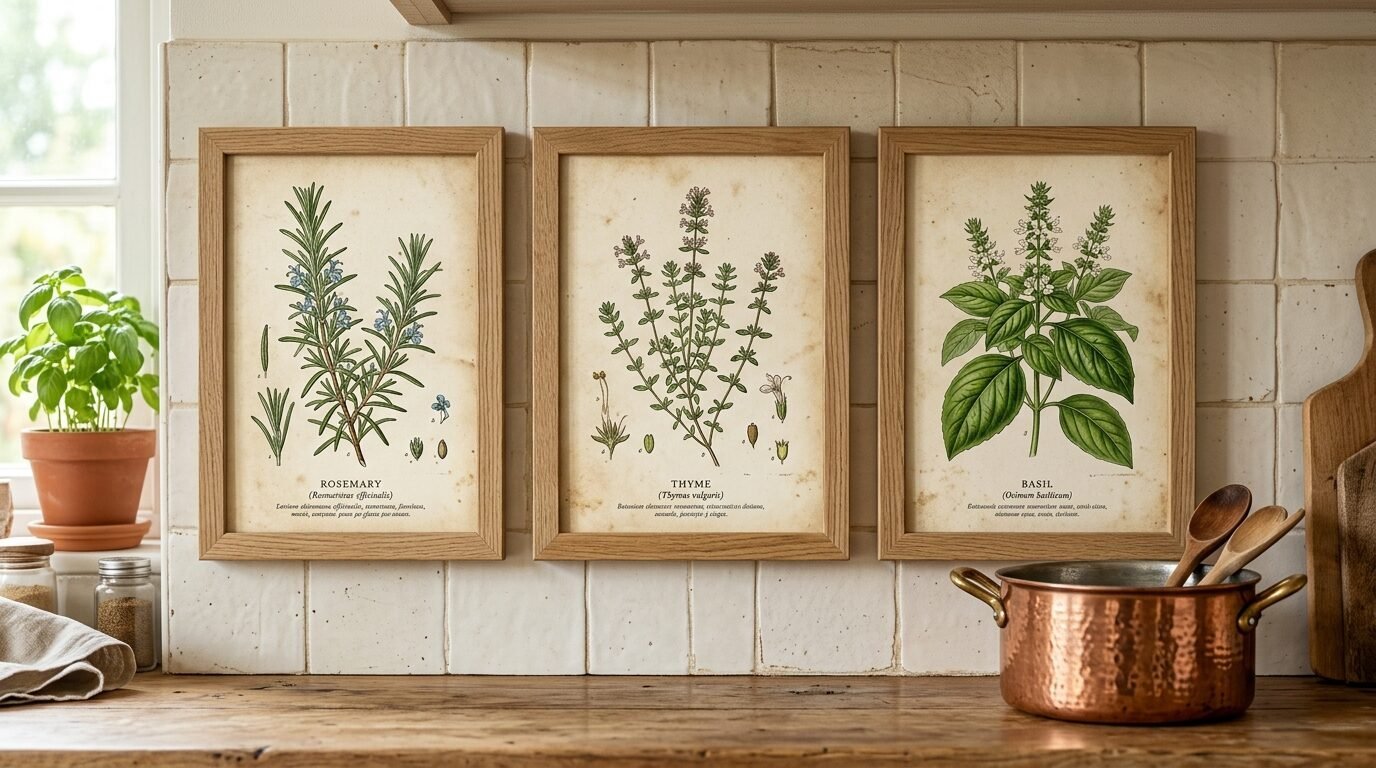
Botany illustration sets focusing on herbs are a staple for any cooking space. You can find prints of rosemary and thyme or sage and basil. These prints remind you of fresh ingredients and garden growth. In my experience, placing these near your spice rack or stove builds a nice connection to your cooking. I recommend looking for illustrations from the 18th century for the most authentic look. They often have Latin names written in beautiful cursive at the bottom. I tried using glossy paper for these once but it reflected the stove lights too much. Stick to a flat finish to keep the vintage vibe.
3. Moody Vintage Florals on Dark Backgrounds
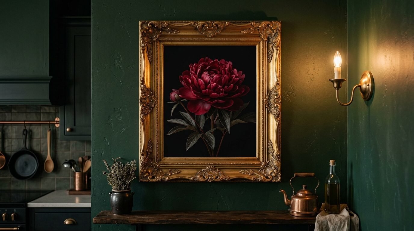
Vintage florals do not always have to be bright and airy. Dark botanical prints with deep greens and rich burgundies add drama to a modern kitchen. I have seen this style work wonders in kitchens with white subway tiles. The contrast is sharp and sophisticated. It feels like an old Dutch painting. I suggest printing these on a slightly textured canvas paper. This adds depth to the dark colors. I once helped a friend frame a large dark peony print for her breakfast nook. It became the only thing people talked about during dinner parties.
4. Free Botanical Printables from Public Archives
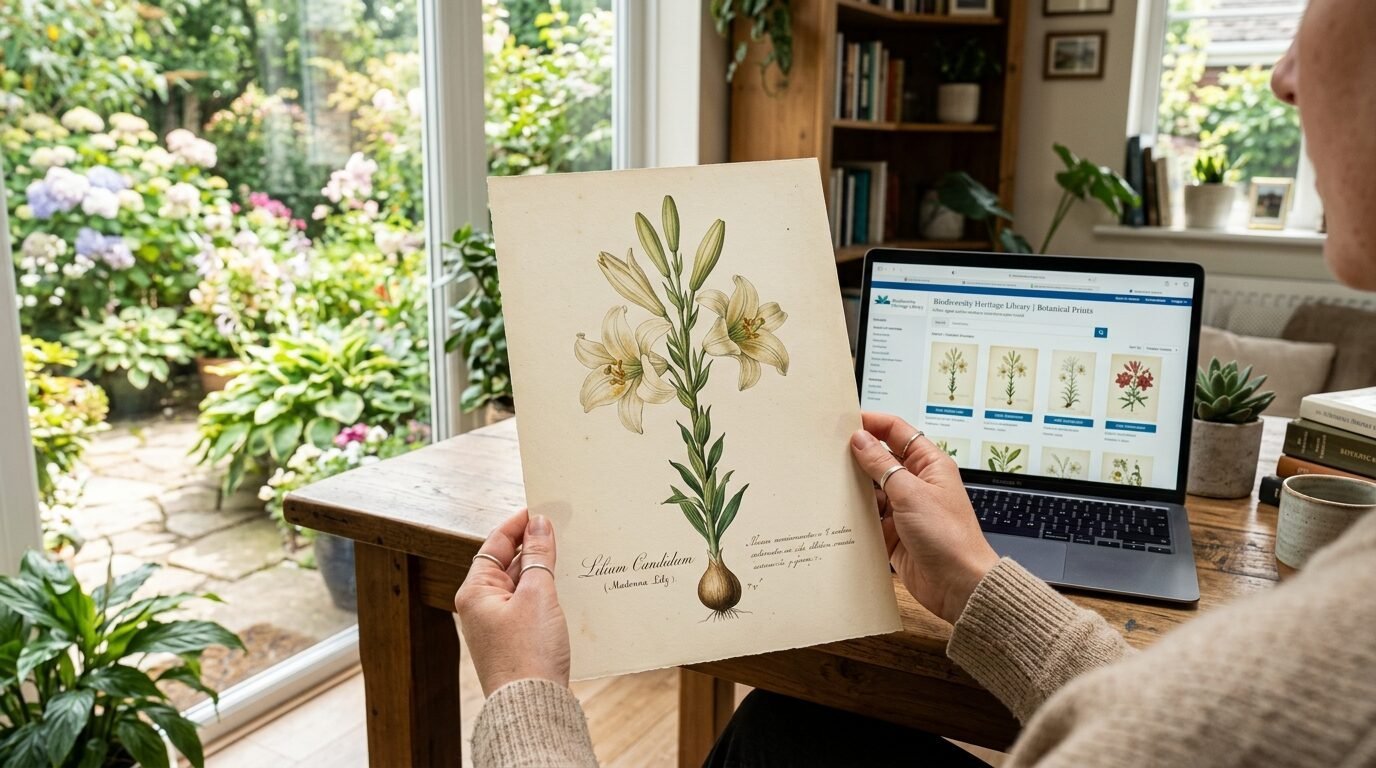
You can find incredible free botanical printables if you know where to look. Websites like the New York Public Library Digital Collections offer thousands of images. You can search for specific plants or time periods. I have spent hours browsing these archives to find unique pieces. It is a great way to get high quality art without a price tag. I’ve noticed that many people overlook these free resources because they think the quality is low. But these are professional scans of historical books. Just make sure you download the highest resolution available for a sharp print.
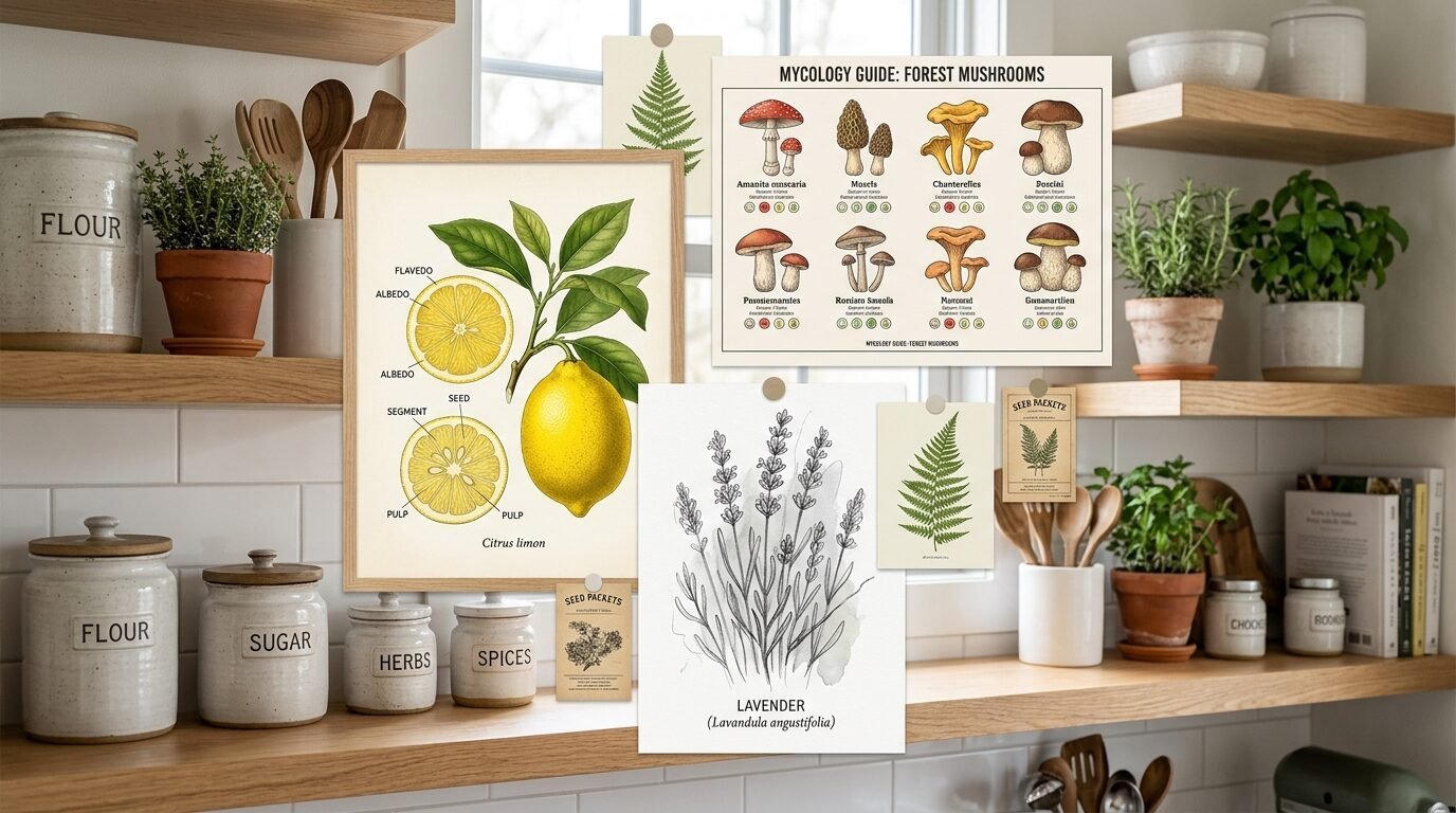
5. Botanical Art Vintage Fruit Diagrams
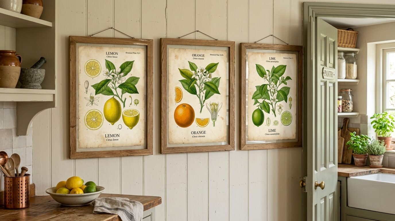
Botanical art vintage fruit prints are perfect for a dining area or near a pantry. Think of sliced citrus or hanging bunches of grapes. These images feel juicy and vibrant. I love the way an orange or lemon print adds a pop of color to a neutral kitchen. In my experience, these prints look best in natural wood frames. It leans into the organic feel of the subject matter. I recently saw a kitchen that used three different apple variety prints in a vertical row. It made a narrow wall look intentional and stylish.
6. Vintage Botanical Prints Flowers and Pollinators
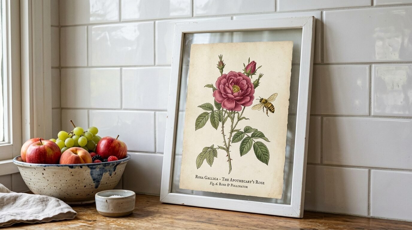
Some of the best vintage botanical prints flowers include bees or butterflies in the frame. This adds a layer of movement and life to the art. It feels like a snapshot of a garden in summer. I’ve seen this style used in farmhouse kitchens to add a touch of whimsy. It keeps the room from feeling too stiff or formal. I suggest looking for Pierre-Joseph Redouté prints for this look. His work is world famous for a reason. The colors are soft and the details are incredible.
7. Printable Botanical Prints Free Herbarium Sheets
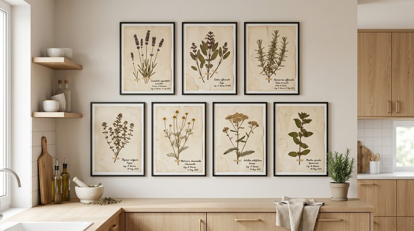
Printable botanical prints free herbarium sheets look like pressed plants taped to paper. They often include handwritten notes and dates from the collector. This style feels very personal and storied. It is like you found a scientist’s old notebook in an attic. I love using these in minimalist kitchens. They provide texture without being too colorful. I once made a gallery wall using ten of these prints in thin black frames. The repetition of the beige paper looked very calming.
8. French Country Lavender and Field Sketches
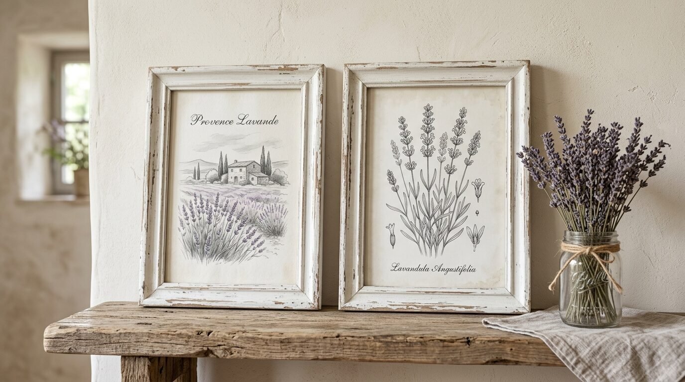
Lavender prints bring a sense of peace to a busy kitchen. The soft purples and greens are easy on the eyes. I have noticed that French country style botanical art often uses lighter lines and pastel washes. These work well in kitchens with lots of natural light. I suggest grouping lavender prints with sketches of wheat or wild grasses. It creates a cohesive meadow theme. In my experience, these prints look lovely when leaning on a shelf rather than hanging. It keeps the vibe casual and lived in.
9. Heirloom Vegetable Varieties for a Chef Kitchen
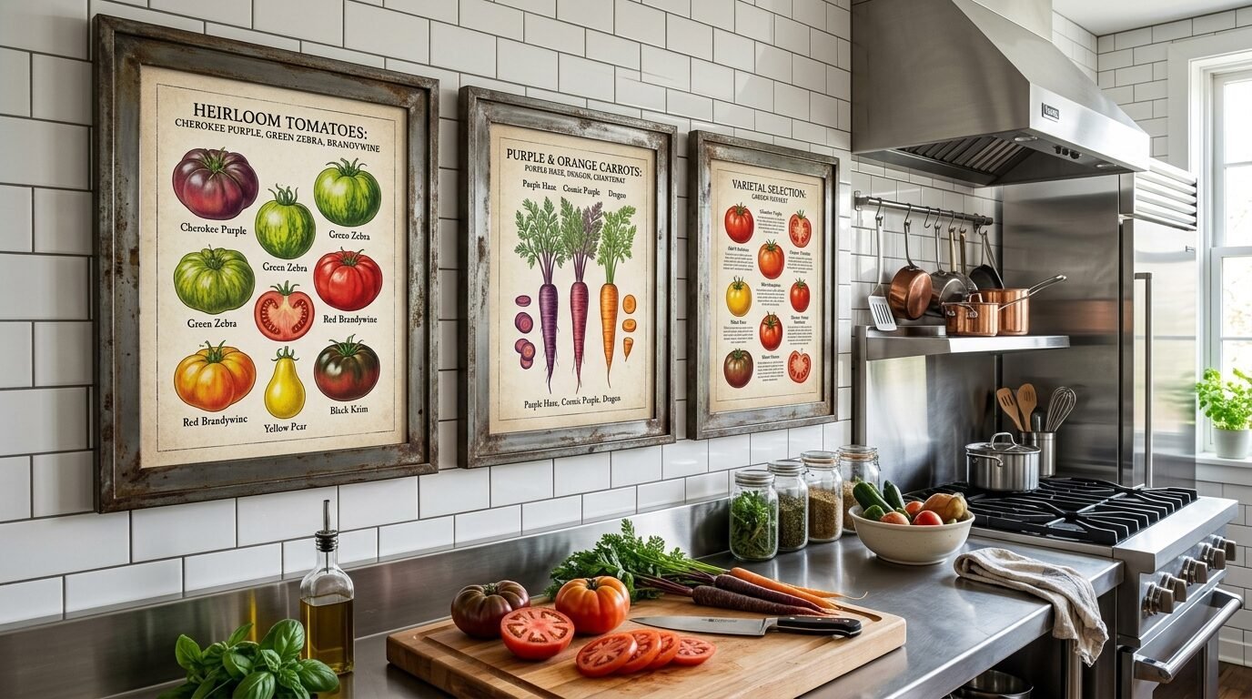
If you love to cook, consider heirloom vegetable prints. Think of purple carrots or striped tomatoes. These prints celebrate the diversity of food. They feel grounded and earthy. I’ve seen these used in professional kitchen spaces to show a love for quality ingredients. They look great in dark metal frames. I once used a set of root vegetable prints in a basement kitchen. The earthy tones made the space feel warm and less like a cellar.
10. Wildflower Field Studies for a Cottage Look
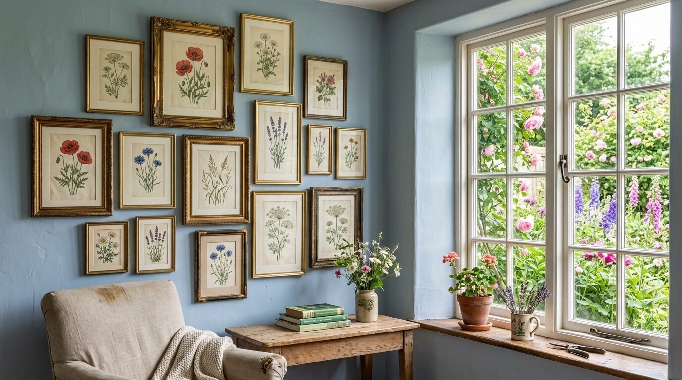
Wildflowers are less formal than garden roses or lilies. They have a messy and beautiful energy. Printing a set of wildflower studies can make your kitchen feel like a summer cottage. I recommend using frames with a bit of gold or ornate detail for these. It balances the simple flowers with a bit of elegance. I’ve noticed that children often respond well to these prints because they recognize the flowers from the yard. It makes the kitchen feel like a family space.
11. Antique Fern Collections in Green Tones
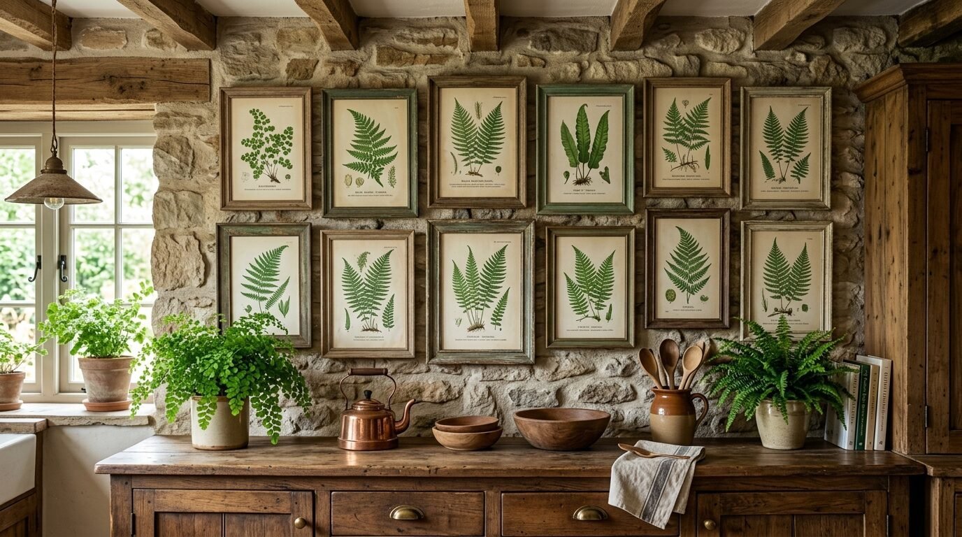
Ferns are a classic choice for vintage botanical art. The different shapes of the fronds are visually interesting even without bright colors. Green is a very soothing color for a kitchen. It represents freshness and health. I have seen fern prints used to fill large empty walls above kitchen cabinets. They bring the outdoors in. I suggest using different shades of green in your frames to keep it interesting. I once saw a kitchen where the owner used old window frames to hold her fern prints. It was a brilliant way to recycle and decorate.
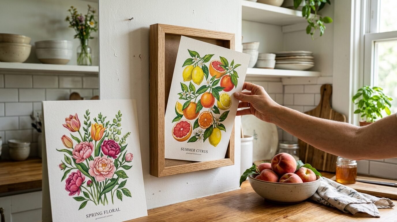
12. Citrus Grove Watercolors for Bright Spaces
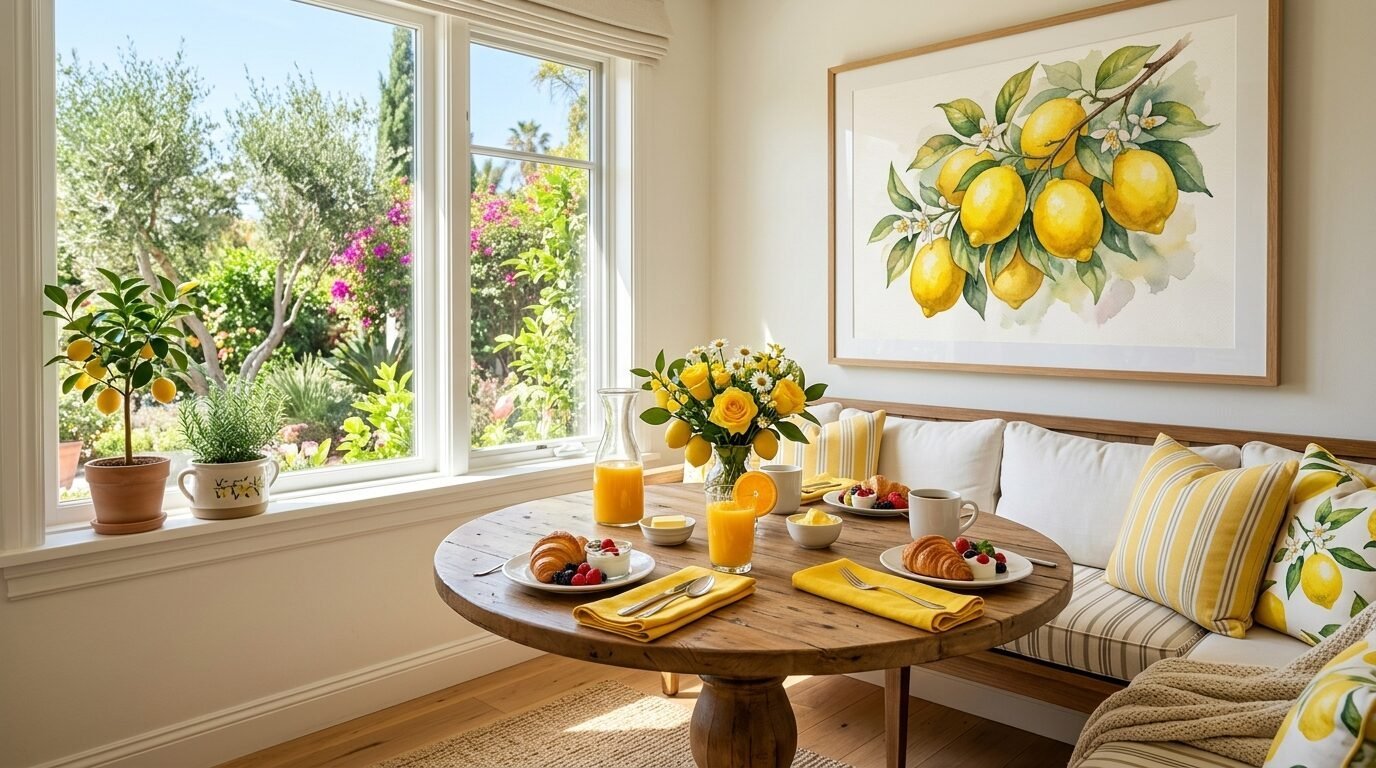
Citrus prints are like a shot of energy for your walls. The bright yellows and oranges are cheerful. I love using these in a breakfast nook where you start your day. I’ve seen these work best when printed on watercolor paper. The texture of the paper makes the digital print look like an original painting. I once used a large lemon print to hide an ugly electrical box in a kitchen. It worked perfectly and looked like a deliberate design choice.
13. Forest Mushroom Identification Guides
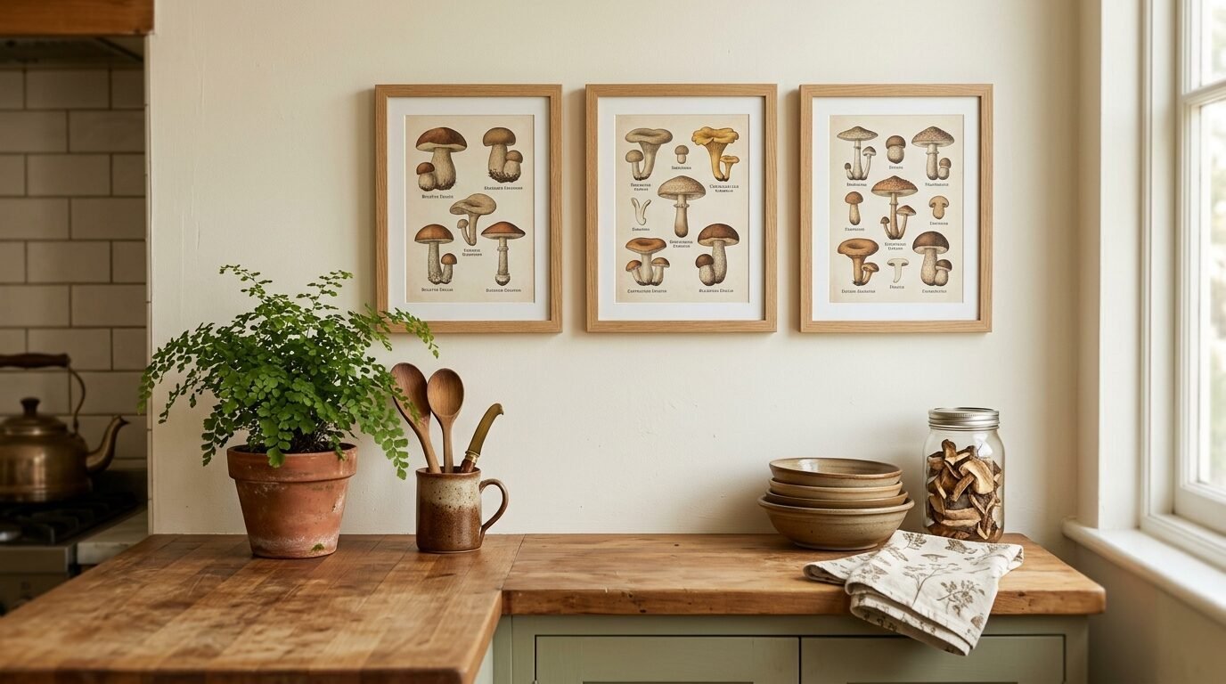
Mushroom prints have become very popular for a cottagecore kitchen style. They have a mysterious and organic feel. The muted browns and tans fit well with wooden countertops. I’ve noticed that these prints often have a lot of small text. This encourages people to step closer and look at the details. I recommend using a simple oak frame for mushroom art. It stays true to the forest theme. In my experience, these look great paired with a small potted plant on the counter below them.
14. Victorian Greenhouse Palm Sketches
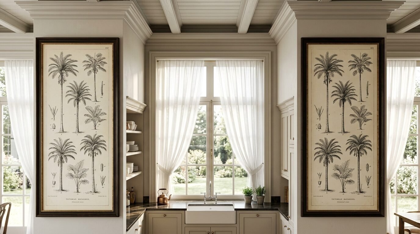
Palm sketches feel a bit more exotic and grand. They remind me of old Victorian glass houses. These prints often have tall and elegant lines. They work well in kitchens with high ceilings. I’ve seen these used to create a tropical but sophisticated vibe. I suggest using a large scale for these prints. A small palm print can get lost on a wall. Go big and let the leaves make a statement. I once used two large palm prints on either side of a kitchen window. It framed the view perfectly.
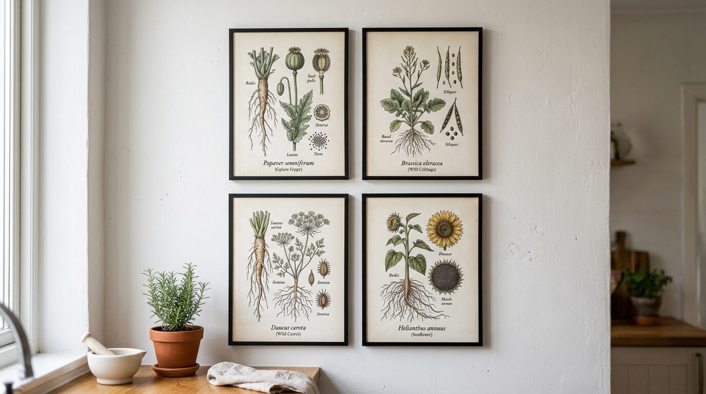
15. Root Vegetable Botanical Diagrams
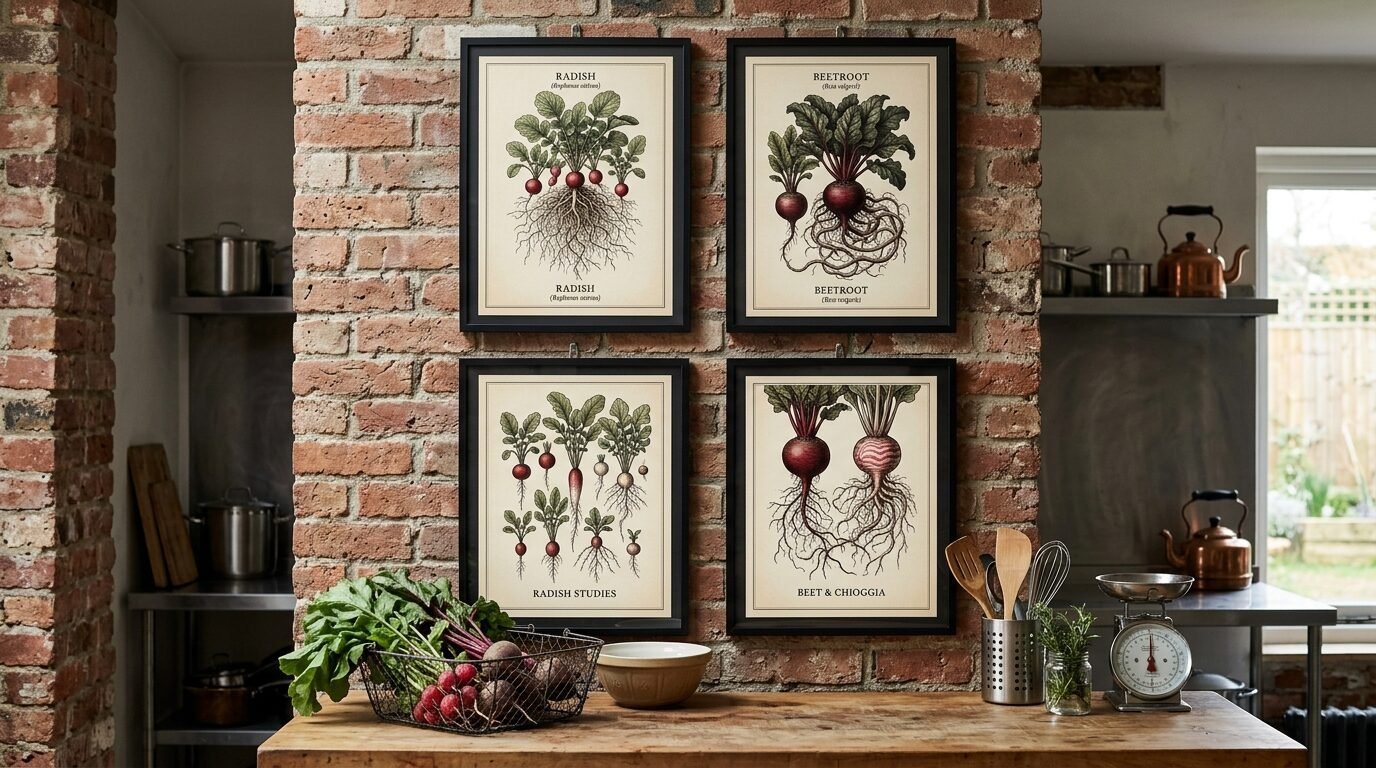
These are different from standard vegetable prints because they show what happens underground. You see the bulbs and the long roots. It is a very raw and honest look at nature. I love the tangles of roots in these illustrations. They add a lot of visual texture. I’ve seen these used in kitchens that have an industrial or rustic feel. They look great in simple black frames. I once saw a set of these in a kitchen with exposed brick walls. The combination was stunning.
16. Tea Leaf and Coffee Bean Sketches
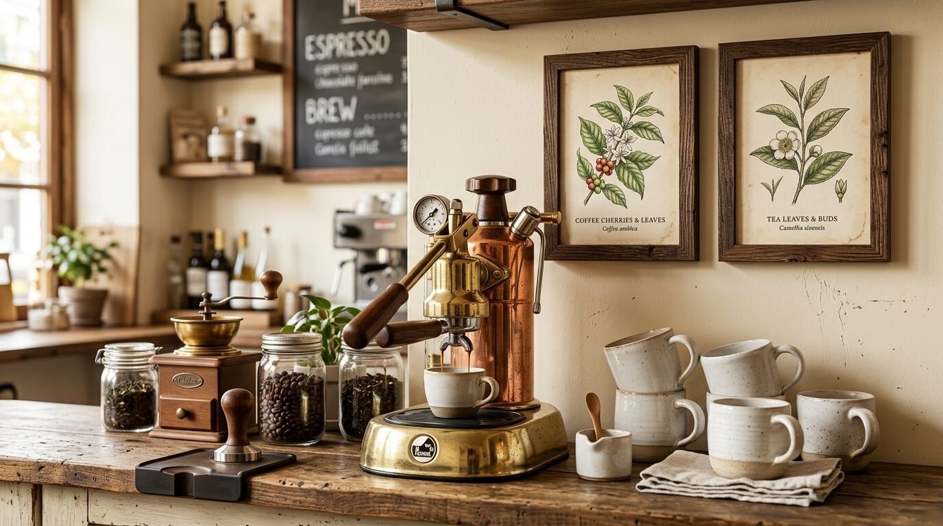
If you have a dedicated coffee or tea station, these prints are a must. They show the botanical side of your favorite drinks. You can find beautiful sketches of the Camellia sinensis plant or coffee cherries. These prints make your coffee corner feel like a high end cafe. I’ve noticed that these prints look best in small frames. It keeps the area feeling cozy and focused. I recently helped a client set up a tea bar with three small botanical sketches of tea leaves. It made the whole corner feel special.
17. Edible Flower Identification Charts
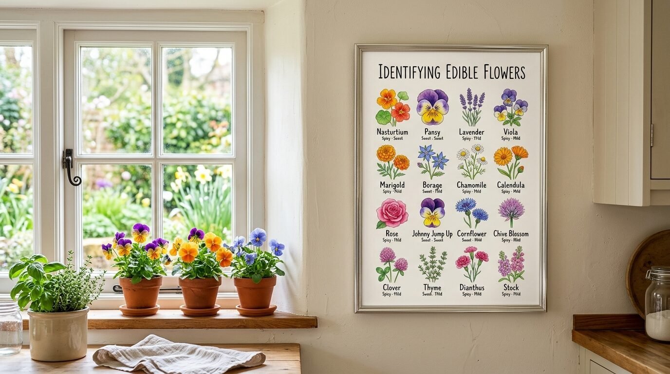
Edible flowers like nasturtiums or pansies are beautiful and functional. A chart showing these flowers is both art and a reference guide. It fits the kitchen theme perfectly. I love the bright colors often found in these prints. They feel very spring-like and fresh. I suggest hanging these near a window where you might grow your own herbs. I once used an edible flower chart in a kitchen makeover for a baker. She loved the inspiration for her cake decorating.
18. Medicinal Garden Herb Prints
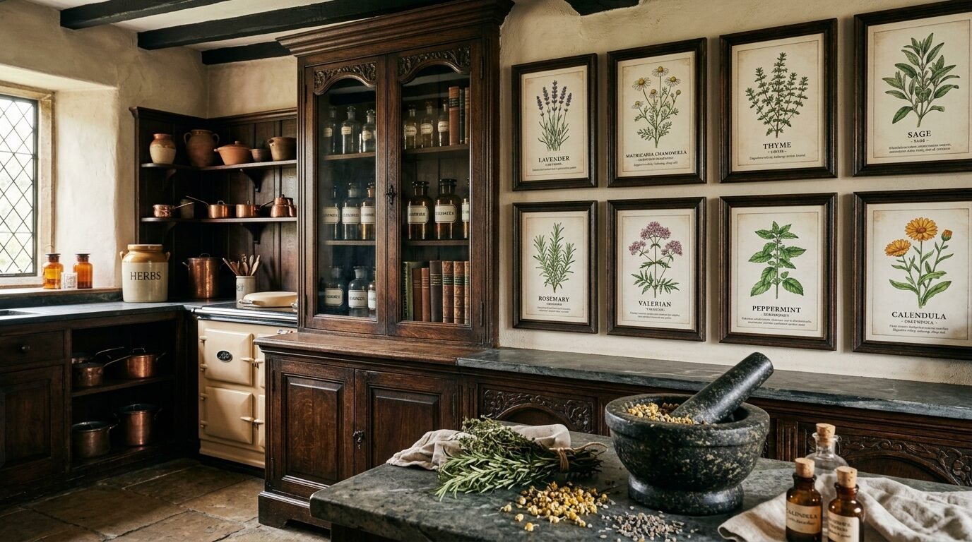
These prints often look very old and have a lot of history. They might include notes on how the plants were used in the past. It adds a layer of depth to your kitchen art. I’ve seen these used to create a very traditional and academic feel. They look wonderful in dark wood frames with a mat board. I recommend choosing plants like chamomile or mint for a calming effect. I once found a set of medicinal prints at a yard sale and they inspired me to start my own herb garden.
19. Seed Packet Collage Art
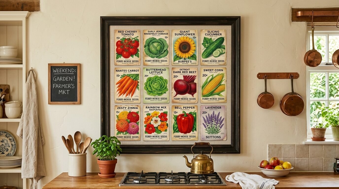
You can find vintage seed packet designs that are botanical works of art. Instead of one large print, you can create a collage of several small designs. This adds a lot of color and variety to your wall. I’ve seen people use a large frame to hold nine or twelve different seed packet prints. It looks like a collection from an old garden shop. I suggest looking for designs from the early 1900s for the best typography and colors. This is a very budget friendly way to fill a large wall space.
20. Seasonal Botanical Sets for Rotating Art
One of my favorite tips is to have a set of botanical prints for each season. You can have bright flowers for spring and citrus for summer. Then switch to mushrooms for autumn and pines for winter. This keeps your kitchen feeling fresh and in sync with the world outside. I’ve noticed that this makes the kitchen feel more dynamic. You only need one set of frames. You just swap the paper inside. I do this in my own kitchen and it always makes me smile when a new season starts.
21. Botanical Butterfly and Moth Pairings
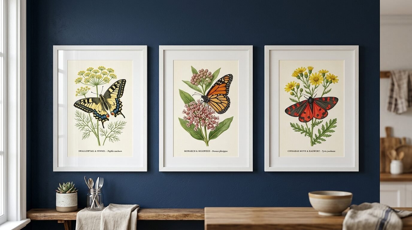
Pairing plants with insects is a classic botanical tradition. It shows the connection between different parts of nature. These prints often have a lot of fine detail in the wings and the petals. I love the symmetry found in these illustrations. They feel very balanced and professional. I’ve seen these used in very modern kitchens to add a touch of organic shape. I suggest using a white frame to let the colors of the insects stand out. I once used a set of moth and fern prints in a kitchen with navy blue walls. It was a very bold and beautiful look.
22. Winter Pine and Cone Botanical Studies
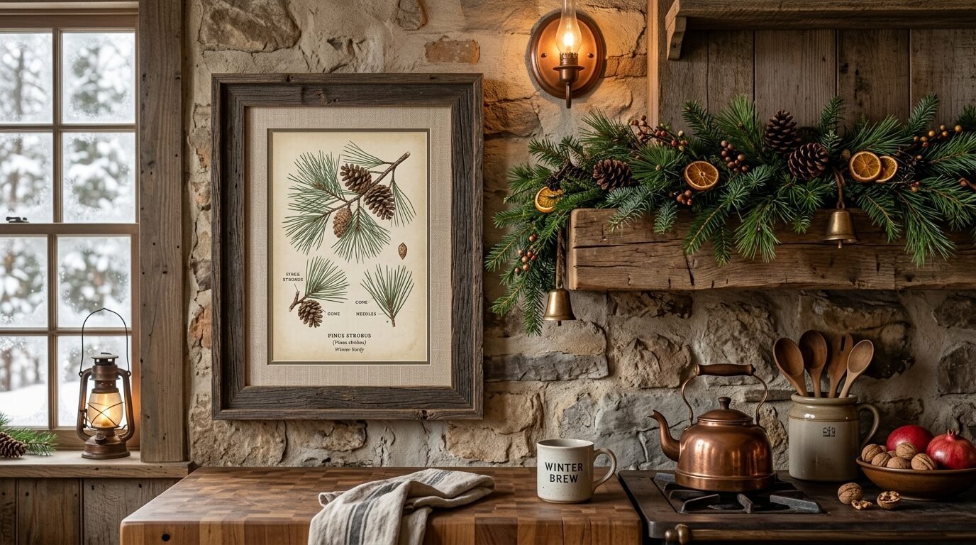
Do not forget about the beauty of evergreens. Pine cones and needles are very architectural and interesting. These prints are perfect for making a kitchen feel cozy during the colder months. They have a very quiet and still energy. I’ve seen these used in kitchens with a lot of wood elements. They blend in perfectly. I suggest using a rustic or reclaimed wood frame for these. I once used a large pine study in a kitchen with a fireplace. It felt like being in a mountain cabin.
Comparison of Paper Types for Botanical Prints
| Paper Type | Finish | Best For | My Take |
| Heavy Cardstock | Matte | General Prints | Good for budget projects. |
| Watercolor Paper | Textured | Illustrations | Makes prints look like real art. |
| Canvas Paper | Fabric-like | Dark Florals | Great for adding deep texture. |
| Photo Paper | Luster | Modern Sketches | Avoid high gloss in kitchens. |
Tools for Creating Your Botanical Wall
I have tried many tools to get the perfect print. Here are the ones I trust for vintage botanical printable art ideas for your kitchen:
- Public Domain Review: My top choice for finding high quality historical images for free.
- Etsy: Great for buying curated sets that someone else has already restored.
- Canva: I use this to resize my prints or add a custom border.
- Frameite: A fantastic online service for custom framing that ships to your door.
- MPix: The best print quality for the price I have found online.
- Staples/FedEx Office: Good for quick same day printing on cardstock.
- Thrift Stores: My secret weapon for finding cheap vintage frames.
- Ikea: The Ribba frames are a classic choice for botanical sets.
- Creative Market: Good for finding unique botanical illustrations from modern artists.
- Unsplash: Sometimes has great high res photos of dried flowers.
- Pixabay: A decent source for vector versions of botanical art.
- Shutterfly: Good for creating large scale prints on canvas.
Frequently Asked Questions
Where can I find high quality vintage botanical prints for free?
You can find them at the Biodiversity Heritage Library and the New York Public Library Digital Collections. These sites offer professional scans of antique books. Always look for the high resolution download option. In my experience, these are better than most paid sites.
What is the best paper for printing botanical art at home?
I recommend using a 60lb matte cardstock or a dedicated watercolor paper. The texture of watercolor paper makes the art look more authentic. Avoid glossy paper as it creates too much glare under kitchen lights. I have seen that matte finishes look much more expensive.
How do I choose the right frame for a vintage look?
Natural wood or thin black frames are classic choices. For a more aged look, try to find vintage frames at thrift stores. I often spray paint old frames with a matte gold for a high end feel. Make sure the frame does not overwhelm the delicate lines of the botanical art.
Can I hang art in a kitchen with high humidity?
Yes but you must protect the paper. Use a frame with glass or acrylic to keep steam away from the print. I’ve noticed that hanging art away from the stove and sink helps them last longer. I also suggest sealing the back of the frame with tape to keep moisture out.
How do I arrange a botanical gallery wall?
Start by laying your frames on the floor. Play with the arrangement until it feels balanced. A grid of four or six is the easiest way to get a professional look. I personally like a more organic layout with different frame sizes for a collected feel.
What size should my kitchen art be?
For a small wall, 5×7 or 8×10 prints work well. If you have a large empty wall, go for 16×20 or even 24×36. I have seen that one large piece can be more impactful than many small ones. Measure your space before you print to be sure.
Should I use mat boards for my botanical prints?
Yes, mat boards add a professional touch. They also create a visual break between the art and the frame. I prefer an off white or cream mat for vintage prints. It makes the paper look older and more valuable.
How can I make my digital prints look like real paintings?
Use textured paper and a frame without glass. This allows the texture of the paper to show through. You can also apply a thin layer of clear matte gel medium over the print. This creates a brushstroke effect that I have used many times with great results.
Conclusion
Your kitchen is more than just a place to cook. It is where you spend your time and make memories. Adding vintage botanical printable art ideas for your kitchen is a simple way to make it feel special. I have seen how these prints can bring warmth and personality to even the plainest rooms. Whether you choose a scientific illustration botanical or a simple herb sketch, you are bringing nature inside. Start with one or two prints and see how they change the space. You might find that you want to fill every wall. Remember to enjoy the process of hunting for the perfect image and the right frame. Your kitchen will thank you for the extra love.

Anya Castellan is the Founder and Editor-in-Chief of Home Wall Trends. An art history graduate of the Rhode Island School of Design with twelve years of experience writing for leading American design publications, she specializes in composition, gallery wall theory, and the quiet architecture of domestic space. A former contributing editor at Architectural Digest and guest lecturer at Parsons School of Design, Anya personally reads and signs off on every piece before it is published.