You find the perfect piece of art online. It looks amazing on your screen. You pay for the file. You download it. You print it at home or a local shop. Then you look at it. The lines are blurry. The colors look muddy. The size feels wrong. This happens to so many people every single day. I see this a lot when friends try to style their homes on a budget. They want that high-end look without the huge price tag. Printable wall art is a great way to do that. It lets you support artists while saving money. But if you miss a few small steps the outcome is a waste of cash. I have spent years in the artist business. I have seen every error in the book. My goal is to help you get the best look for your home wall. If you follow these tips you will save time. You will get art that looks like it came from a gallery. Let us dive into the traps people fall into most often.
1. Choosing Files With Poor Resolution
The biggest mistake is ignoring the DPI of the file. DPI stands for dots per inch. For a crisp look you need 300 DPI at the size you want to print. Many people buy a small file and try to print it as large art prints. This makes the art look pixelated. It looks like a low quality photo from an old phone. In my experience people often grab the preview image by mistake. They think it is the actual file. It is not. It is just a tiny thumbnail. I once saw a friend print a web preview on a giant canvas. It was a blurry mess. You could see every single square pixel.
Always check the listing for the actual pixel dimensions. A 3000 by 4200 pixel file is great for a 10 by 14 inch print. If you want something bigger you need more pixels. Look for sellers who offer high resolution JPG or PDF files. I prefer PDF for sharp lines in modern art. If the seller does not list the DPI ask them first. High quality artist business owners will always tell you. They want their work to look good in your home. Do not settle for 72 DPI. That is for screens only. It will never look sharp on paper. Sharpness is the first sign of a professional home.
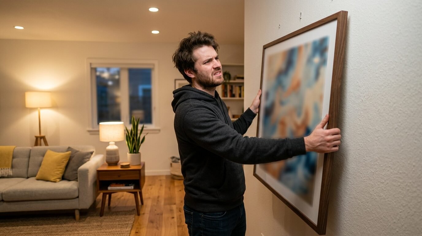
2. Picking The Wrong Aspect Ratio For Your Frame
You bought a 24 by 36 inch frame. You bought a square art file. Now you have a problem.
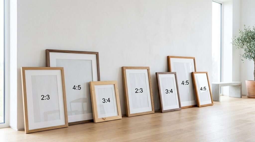
You have to either stretch the art or crop it. Both choices ruin the look. Stretching makes people look tall and thin or short and wide. Cropping might cut off the best part of the art. I have noticed this mistake in many DIY home decor groups. People get so happy about the image they forget the math. Aspect ratio is just the relationship between the width and the height. Common ratios are 2 to 3 or 3 to 4.
Most popular art sellers provide files in four or five different ratios. This gives you many options. You can print small art prints or huge posters. Before you click buy check the ratio guide in the listing. If you already have a frame measure it first. If you want a 16 by 20 inch print you need a 4 to 5 ratio file. In my years of selling prints I find that people appreciate a clear size chart. If a seller only gives you one file size move on. You deserve more options for your money. It makes the framing step so much easier when the file fits the frame perfectly.
3. Selecting Thin Or Glossy Paper Stocks
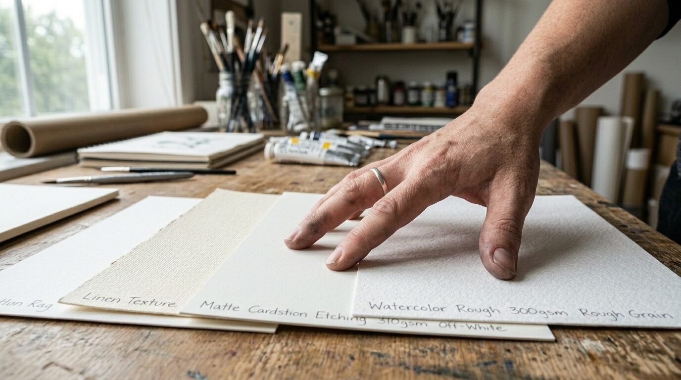
Standard printer paper is for homework and office memos. It is not for art. If you use thin paper the ink will soak through. The paper will wrinkle or wave. It looks cheap and flimsy. I see this when people try free printable crafts for the first time. They use what they have in the printer tray. The results are always disappointing. You need heavy cardstock or fine art paper. Look for paper that is at least 200 GSM or 80 pound cover weight. This thickness holds the ink well. It stays flat in the frame.
Glossy paper is another trap. It reflects every light in the room. You will see the glare from your windows or lamps instead of the art. I always suggest matte or satin finishes. Matte paper has a soft feel. It looks like real museum art. I once tried a high gloss paper for a moody landscape. I could not even see the mountains because of the light glare. I had to reprint it on matte cardstock. The change was huge. If you print at a shop like Staples or FedEx ask for their premium matte cardstock. It costs a few cents more but the look is worth ten times that.
4. Failing To Check Color Profiles For Accuracy
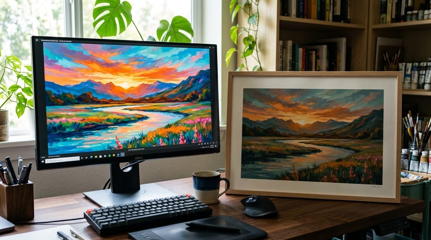
Your screen shows a bright neon pink. Your printer gives you a dull mauve. This is because screens use light to make color while printers use ink. Screens are RGB and printers are CMYK. This shift is a common point of frustration. I have seen this work best when you do a test print. Before you print the large version print a tiny 4 by 6 version. This lets you see the real colors without wasting ink or expensive paper.
Some sellers include a color profile in the file. Professional artist business sellers do this to help you. If the colors look very different it might be your printer settings. Check if your printer is set to high quality. Do not use the ink saver mode for art. It will make the colors look thin and gray. I have noticed that professional print shops have better color machines than home printers. If color is the most vital part of the piece take it to a pro. They can match the screen colors much better. It saves you the headache of muddy tones on your walls.
5. Disregarding Artist Business Licensing Rules
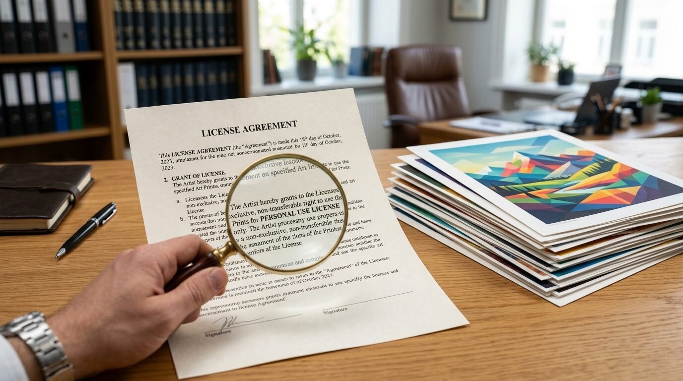
Most printable art is for personal use only. This means you can print it for your bedroom or give it as a gift. You cannot print it and sell it at a local craft fair. You cannot use it for your business logo. I have seen people get into legal trouble for this. They think because they bought the file they own the rights. You only own a license to print it for yourself. If you want to sell art prints you need a commercial license.
Artists work hard on these designs. When people steal their work it hurts the whole community. I always read the fine print in the description. It usually says for personal use or for home decor only. If you want to use the art for a blog or a shop ask the artist. They might sell you a special license. This builds trust in the artist business world. It also ensures you are not breaking any laws. Respect the work that goes into the most popular art pieces. It keeps the creative world alive and well.
6. Trusting Scammers On Unverified Marketplaces

The internet is full of stolen art. Scammers take a low quality screenshot of a famous artist and sell it for a dollar. You think you are getting a deal. You are actually getting a stolen low resolution file. These sellers often have no reviews. Their shop names are usually a string of random numbers. I have seen this happen on big sites like Etsy and eBay. In my experience it is better to buy from the artist directly. Look for their official website or a verified shop with thousands of reviews.
Check the file details one last time before you pay. If the price is too good to be true it probably is. Real art takes time to make. Real files are large and high quality. If a seller offers a hundred files for five dollars they are likely stolen. You want to support the people who actually make the art. This helps you get the best files too. High quality sellers offer help if you have a printing problem. They care about the final look in your home. A scammer will just take your money and vanish.
Best Paper Options For Different Art Styles
| Art Style | Recommended Paper Type | Weight (GSM) | Why It Works |
| Photography | Luster or Semi-Gloss | 250+ | Provides depth and rich blacks without too much glare. |
| Watercolor | Textured Cold Press | 300+ | Mimics the feel of original paint on paper. |
| Modern Line Art | Smooth Matte Cardstock | 200+ | Keeps lines crisp and clean for a minimalist look. |
| Vintage Prints | Cream Toned Archival Paper | 180+ | Gives an aged feel that fits antique styles. |
| Abstract Art | Heavy Weight Matte | 250+ | Allows colors to pop without reflections. |
The Essential Printing Tool Kit
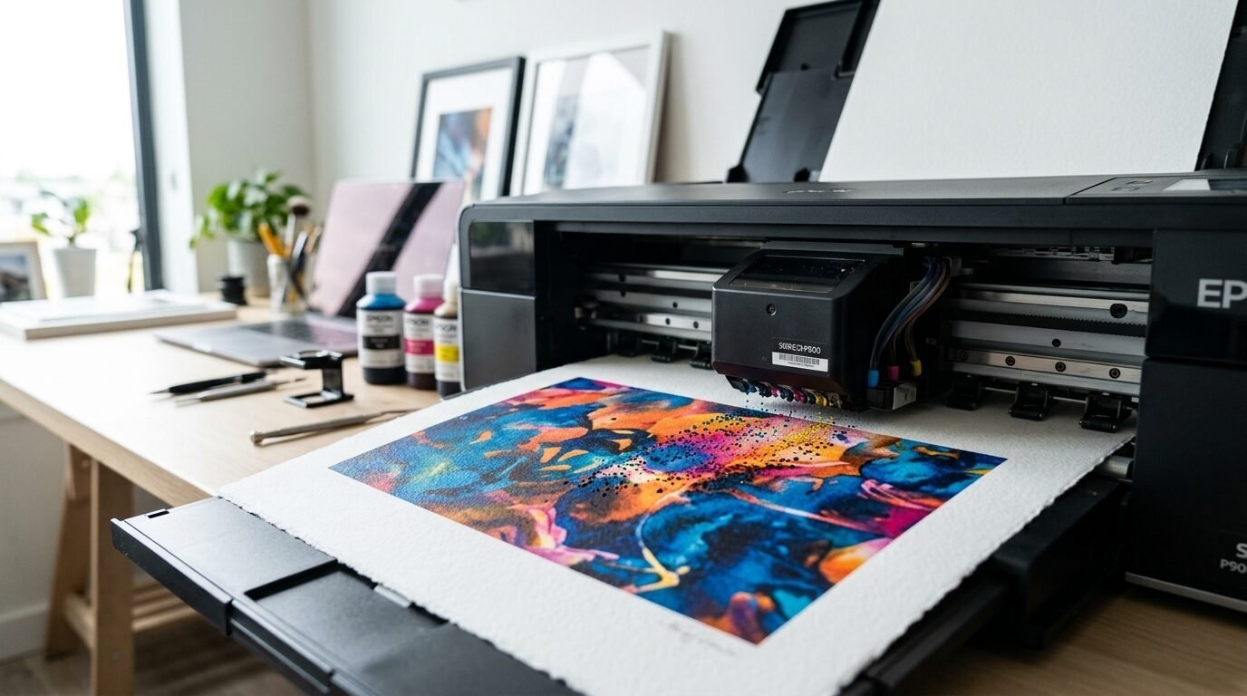
If you want to print at home you need the right gear. A cheap office printer will not give you gallery results. I use a dedicated photo printer for my own wall. Here are the tools I trust for the job.
- Canon Pixma Series: These printers have more ink tanks for better color blending.
- Epson EcoTank Photo: Great for printing many files without running out of ink fast.
- Rotary Paper Trimmer: This gives you a perfectly straight edge every time. Scissors often leave jagged lines.
- Premium Cardstock: I like brands like Neenah or Hammermill for a professional feel.
- Archival Ink: This ink does not fade in the sun over time.
In my years of trying different setups I found that the paper matters more than the printer. Even a mid-range printer looks great on high quality matte paper. If you are on a budget spend your money on the paper first. You can always use a shop for the printing part if your home machine is too old.
Pros and Cons of Home Printing vs Professional Services
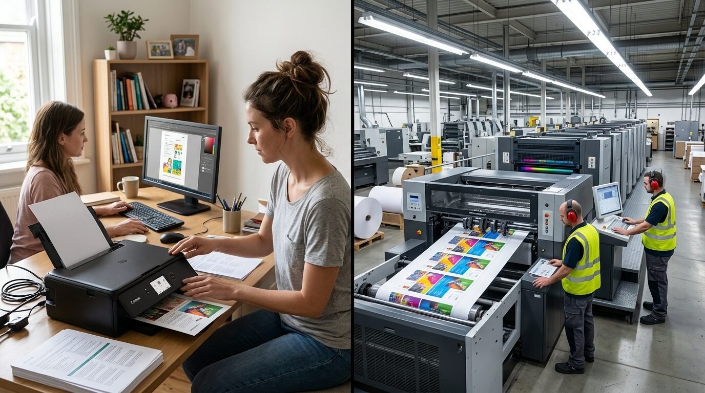
Home Printing Pros
- You get the art instantly.
- You can test different paper types easily.
- It is cheaper for small art prints.
- You have full control over the settings.
Home Printing Cons
- Ink is expensive and runs out fast.
- Cheaper printers struggle with large dark areas.
- Size is usually limited to 8.5 by 11 inches.
- Colors might need constant tweaking.
Professional Printing Pros
- They can print large art prints up to 40 inches or more.
- They use high end industrial machines for perfect color.
- They offer many more paper and canvas options.
- The prints usually last longer without fading.
Professional Printing Cons
- You have to wait for shipping or drive to the shop.
- It costs more per print.
- You cannot easily do small test prints for free.
- Some shops have strict file requirements.
Frequently Asked Questions About Printable Wall Art
What is the best file format for printing?
I always look for PDF files first. They are vector based which means they stay sharp at any size. JPG is also good if the resolution is high. Always avoid PNG for large prints as they are meant for web use. In my experience a high quality JPG at 300 DPI is the standard for most homes.
Can I print art from my phone?
Yes you can but be careful. Many phones compress files when you download them. This lowers the quality. It is better to download the file on a computer. Then send it to your printer or upload it to a shop site. I have seen files lose half their size just by being saved on a phone gallery.
How do I print large art prints on a budget?
The best way is to use engineering prints at places like Staples. These are meant for blueprints. They are thin paper and black and white usually. Some shops do color versions too. They are very cheap for huge sizes. They look great for vintage maps or line art. Just know the paper is thin so handle it with care.
Why does my art look dark after printing?
Screens are backlit so everything looks brighter than it is. Most art files need a little bit of brightening before they hit the paper. I often lift the exposure by ten percent in a basic editor. This makes the final print look like it did on the screen.
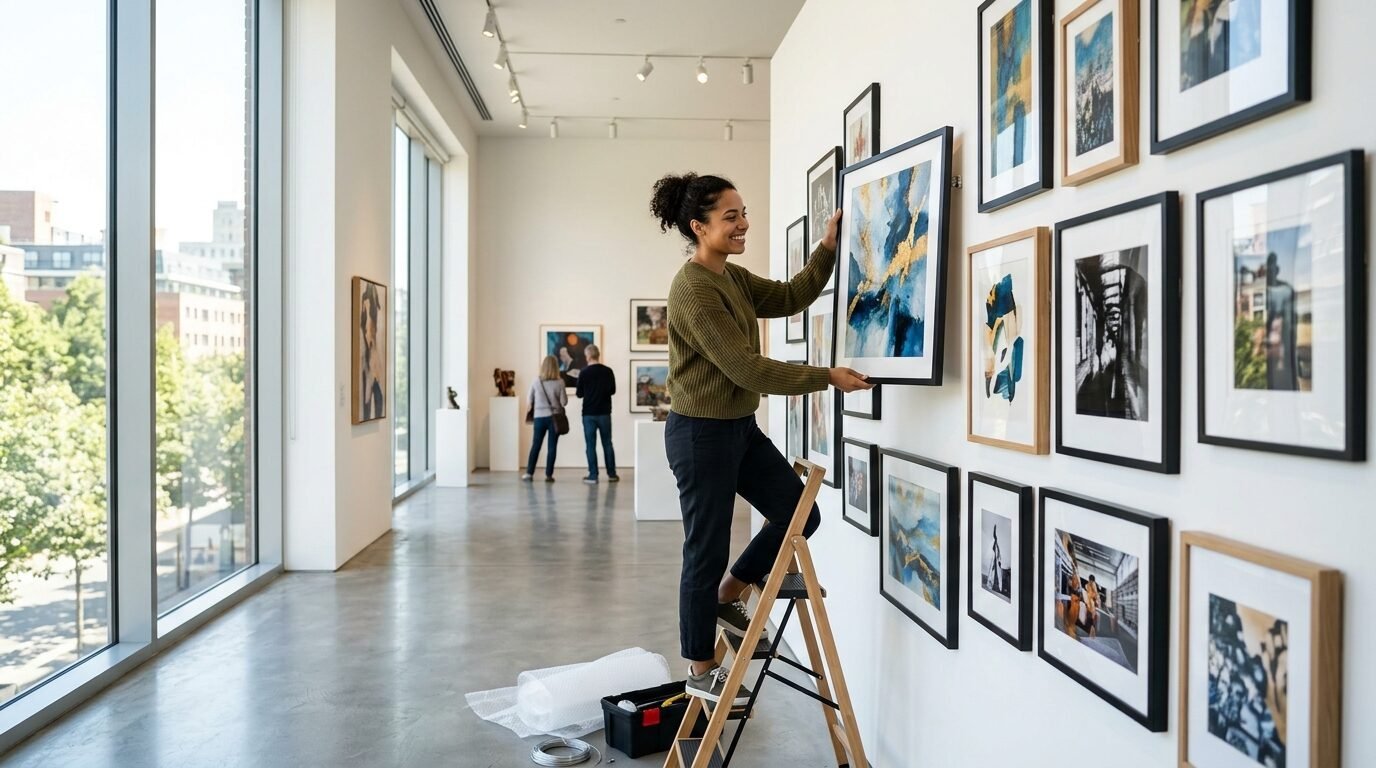
Do I need a special frame for printables?
No you can use any frame that fits the size. I like to use frames with mats. A mat makes a small print look much bigger and more expensive. It also keeps the paper from touching the glass. This protects the ink from sticking to the glass over time.
Where can I find free printable crafts?
Many artists offer free samples on their blogs. Look for a freebies section. These are usually for personal use only. They are a great way to test your printer and paper before you buy a full set. Just remember to check the resolution before you print.
How do I resize a file?
You should not resize a small file to make it bigger. This creates blur. You can only resize a large file to make it smaller. Use a site like Canva or a basic photo tool on your computer. Keep the proportions the same so the art does not stretch.
The Bottom Line On Buying Art Prints Online
Buying art online should be a fun and easy way to dress up your home. It allows you to change your style every season without spending a fortune. If you avoid the resolution and paper traps you will love the results. I have found that taking that extra five minutes to check the file details saves hours of frustration. Always trust your gut when looking at sellers. If their shop looks messy their files might be too. Stick to high quality paper and always check your sizes. Your walls are the first thing people see when they enter your home. Make them look professional and intentional. You do not need a gallery budget to have gallery walls. You just need a little bit of knowledge and the right tools. Now go find some art that makes you smile and get printing.

Anya Castellan is the Founder and Editor-in-Chief of Home Wall Trends. An art history graduate of the Rhode Island School of Design with twelve years of experience writing for leading American design publications, she specializes in composition, gallery wall theory, and the quiet architecture of domestic space. A former contributing editor at Architectural Digest and guest lecturer at Parsons School of Design, Anya personally reads and signs off on every piece before it is published.