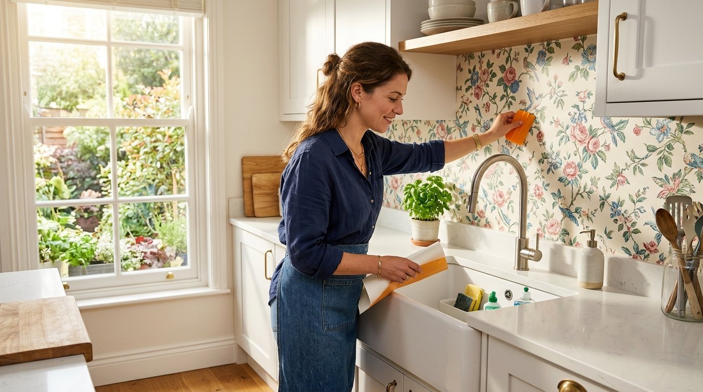
Many homeowners want a fresh kitchen look without spending thousands on permanent tiles. Renters face strict rules against permanent changes to their living spaces. A removable wallpaper backsplash gives you complete control over your room styling. I renovated three different rental apartments using peel and stick products. The right pattern changes the entire feeling of your cooking space immediately. We will look at specific design choices you can make right now.
You will find 23 specific ways to style your kitchen using removable wallpaper. We cover everything from classic vintage prints to modern geometric shapes. This guide features exact styling choices and layout ideas for your next weekend project. You get real pricing expectations and installation advice from my personal renovations. These Kitchen Wallpaper Ideas will save you money while giving your walls a fresh surface.
1. Classic Subway Tile Illusions
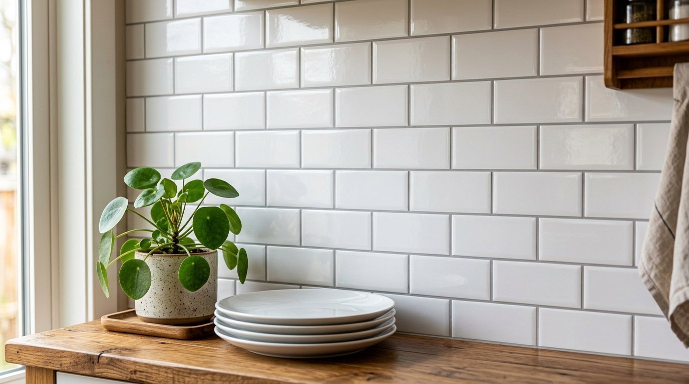
Subway tiles cost a lot of money and require messy grout lines. You can buy removable wallpaper that mimics exact tile measurements perfectly. I used a white subway tile print in a dark basement kitchen last year. The room looked much brighter instantly. You wipe away cooking splashes with a simple damp cloth. Choose a high gloss finish to make the illusion believable. Many brands sell rolls for under thirty dollars. You get the classic Kitchen Wall Tile look without hiring a contractor. Paste this directly over your existing flat backsplash for a quick weekend update.
Materials needed for this job:
- White subway tile vinyl paper
- Plastic smoothing edge tool
- Sharp razor utility knife
- Metal straight edge ruler
You must overlap the grout line edges precisely. The finished wall looks completely authentic. This remains my favorite beginner styling choice.
2. Dark Moody Botanical Prints
A moody aesthetic makes a stark white kitchen feel cozy and warm. Large dark leaves and rich background colors create immediate drama. I love placing dark floral prints behind open wooden shelving units. The wood tones pop beautifully against deep navy or black backgrounds. You only need two rolls to cover a standard area. This creates a striking focal point above your stove. Make sure your lighting matches the mood perfectly. Warm under cabinet lighting works best with dark colors. It gives your space an upscale restaurant vibe for very little money.
Why this pattern works well:
- Hides wall dents easily
- Creates immediate visual depth
- Pairs perfectly with natural wood
- Does not show grease spots
I bought a thick matte vinyl for my last client. The heavy material feels like luxury fabric.
3. Fresh Citrus Fruit Patterns
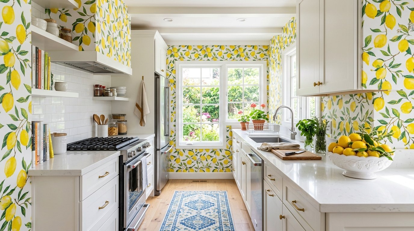
Bright lemons or oranges on a white background wake up a sleepy room. I applied a lemon print in a tiny galley kitchen recently. The space felt sunny even on cloudy winter days. You can match your dish towels to the fruit colors. This creates a cohesive Kitchen Wallpaper Design plan easily. Keep your countertops completely clear to let the pattern shine. White cabinets frame these bright patterns beautifully.
Best places for fruit prints:
- Small galley cooking areas
- Breakfast sitting nooks
- Open coffee stations
- Behind open floating shelving
Buy paper with a slight vinyl coating. The coating protects the bright yellow ink from fading. You wipe it clean with a wet rag daily. Your room will always feel fresh and happy.
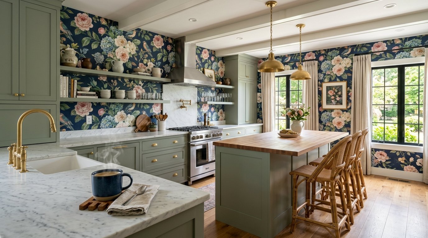
4. Vintage Floral Wallpapers
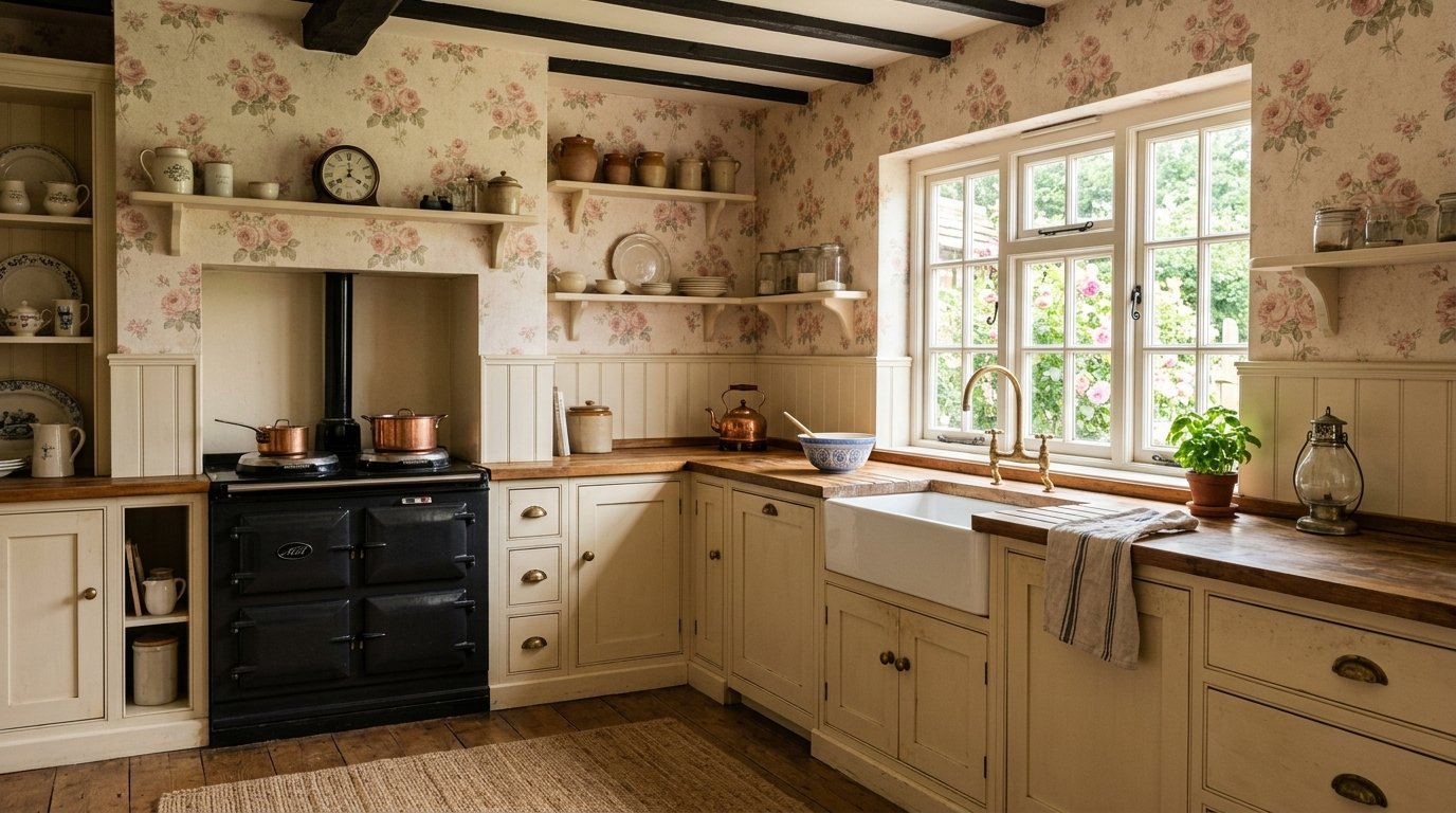
Old fashioned prints give warmth to stark modern houses. Small flower patterns give a farmhouse feel instantly. Vintage Floral Wallpapers remind people of cozy country cottages. I sourced a beautiful muted pink rose pattern for a client last spring. We paired it with brass hardware and cream painted cabinets. The space felt completely different within three hours. You can find authentic reproduction prints online easily. Pick matte finishes for vintage patterns always. Glossy finishes make old patterns look fake and cheap.
Tips for vintage styling:
- Mix with antique brass knobs
- Use cream instead of bright white
- Display ceramic bowls nearby
- Keep patterns small scale
The final room feels like a historic European home. You spend fifty dollars instead of five thousand.
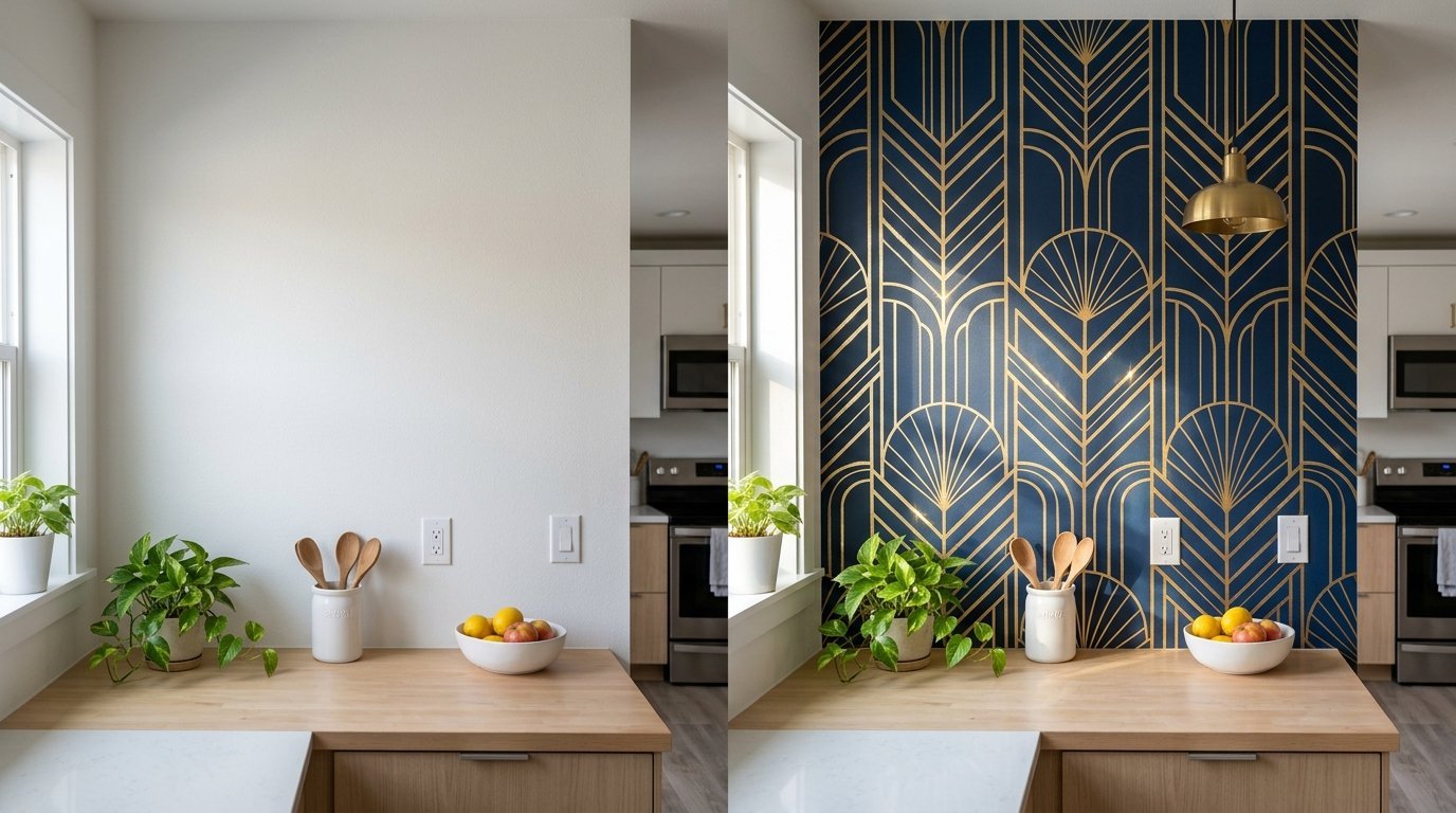
5. Geometric Art Deco Lines
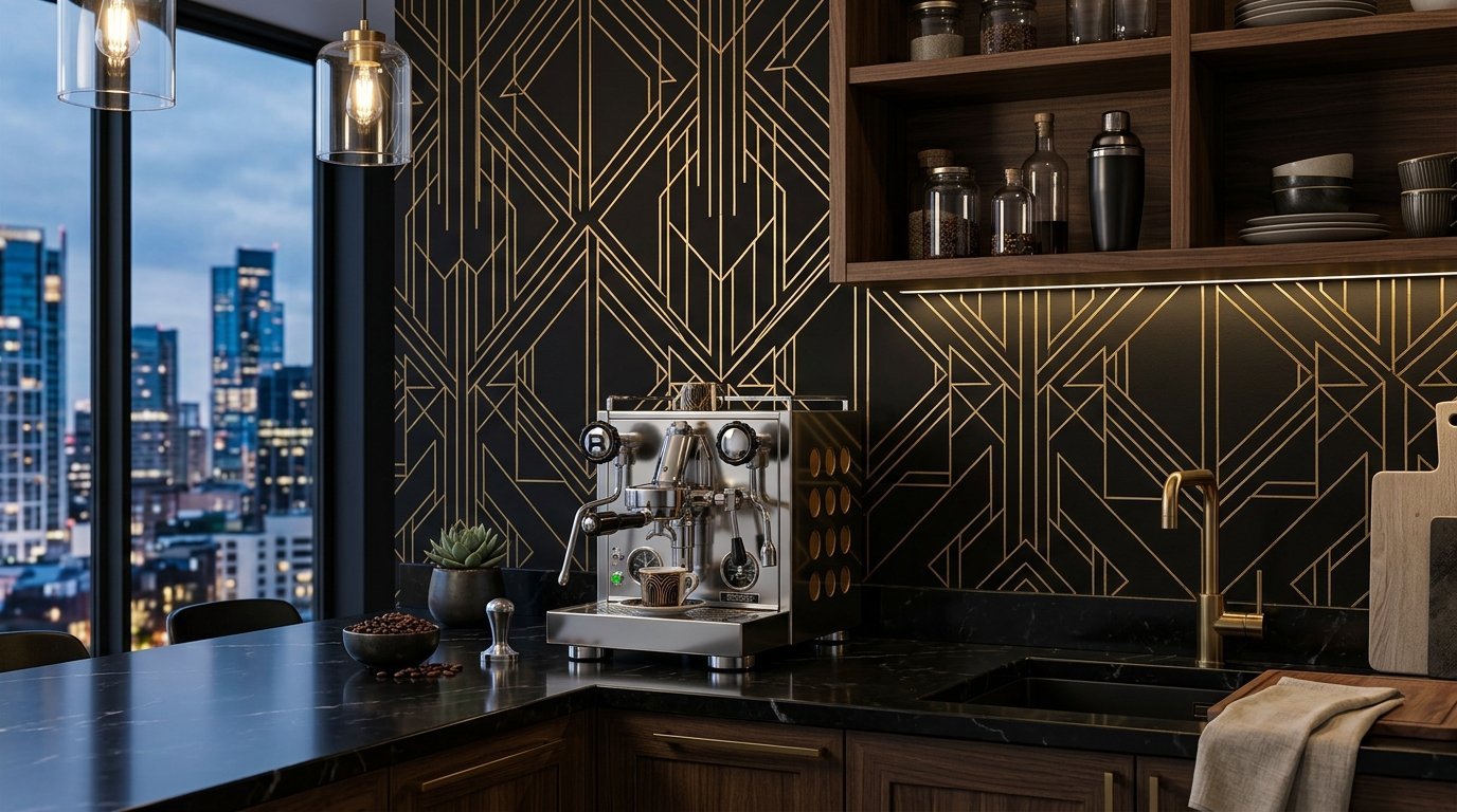
Clean gold lines on dark backgrounds create a luxurious feeling immediately. Art Deco patterns work beautifully behind stainless steel appliances. I often use these designs in modern city apartments. You must line up the geometric edges perfectly during installation. Take your time matching the seams correctly. A mismatched geometric pattern ruins the entire visual effect. A smoothing tool helps remove air bubbles quickly. This style pairs perfectly with matte black fixtures.
Necessary installation steps:
- Measure the wall twice
- Draw a straight vertical plumb line
- Overlap the seams by one millimeter
- Press the gold foil gently
Your space will look expensive and professionally styled. It looks incredible behind a modern espresso machine.
6. Rustic Faux Wood Planks
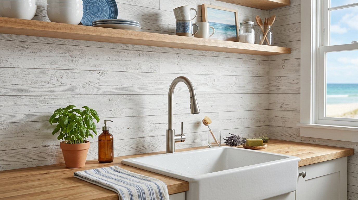
Installing real wood behind a sink invites water damage and mold. Removable faux wood vinyl gives you the texture visually without the risk. I installed a whitewashed wood print in a coastal property last month. Visitors thought it was real shiplap until they touched it. Run the planks horizontally to make a small kitchen look wider. Run them vertically if you have low ceilings. This material wipes clean after frying foods. You get rustic charm while maintaining complete water resistance.
Styles of fake wood available:
- Distressed white barn wood
- Dark walnut panels
- Gray weathered oak
- Thin cedar strips
Press the vinyl firmly into the corners using a plastic scraper. The tight corners make the fake boards look real.
7. French Cafe Awnings and Stripes
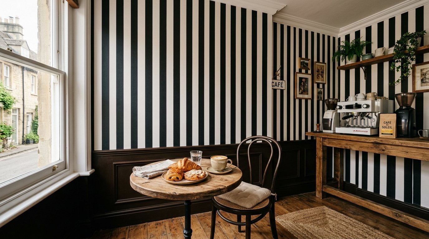
Stripes give a European bakery feeling right into your home. Thin black and white stripes always look classic. This style fits perfectly into Cafe Wall Design Ideas Interiors. I styled a coffee bar area using thick vertical stripes. We placed a small espresso machine directly in front of it. The vertical lines draw the eye upward immediately. This makes the ceiling feel taller than it actually is. Keep your accessories simple when using bold stripes. Let the wall be the star of the show.
Stripe placement ideas:
- Above a small cafe table
- Inside a glass front cabinet
- Behind open floating shelves
- Around a small window
Buy a laser level for this specific project. Crooked vertical stripes look terrible and make you dizzy.
8. Faux Marble Luxury Slabs
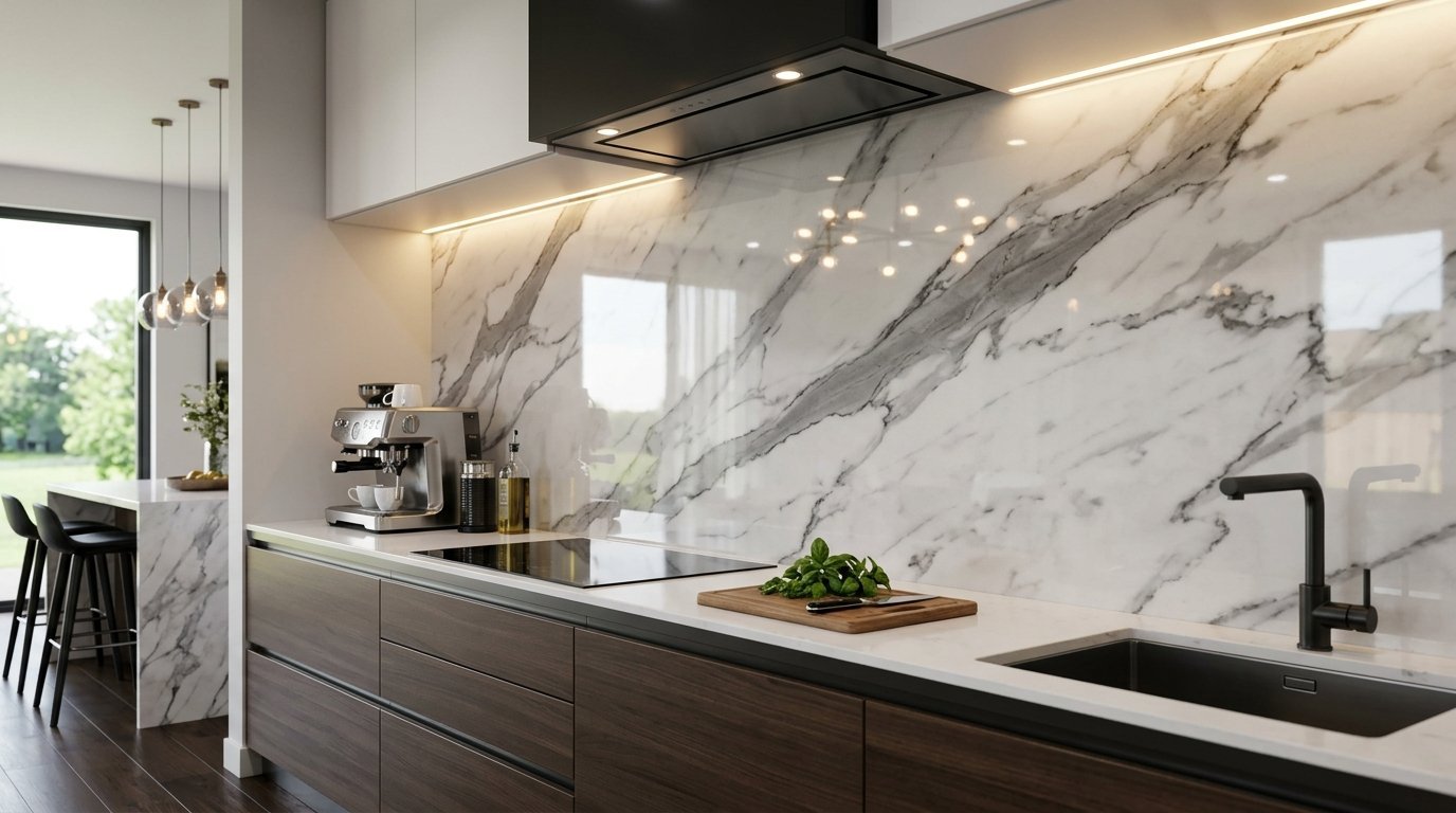
Real marble costs thousands of dollars and stains very easily. Marble contact paper creates an identical look for forty dollars. I covered cheap laminate panels with glossy faux marble last year. The veining pattern hid all the minor wall imperfections. Choose patterns with large gray veins for a realistic look. Wrap the edges carefully around your corners. Use a hairdryer to slightly warm the vinyl around sharp edges. The heat makes the material bend perfectly. Your friends will never know it is paper.
Benefits of fake marble:
- Zero risk of red wine stains
- Costs pennies compared to stone
- Peels off when you move out
- Weighs absolutely nothing
Wipe the glossy surface with glass cleaner daily. The shine tricks the eye perfectly.
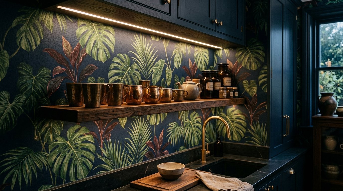
9. Bold Tropical Palm Leaves
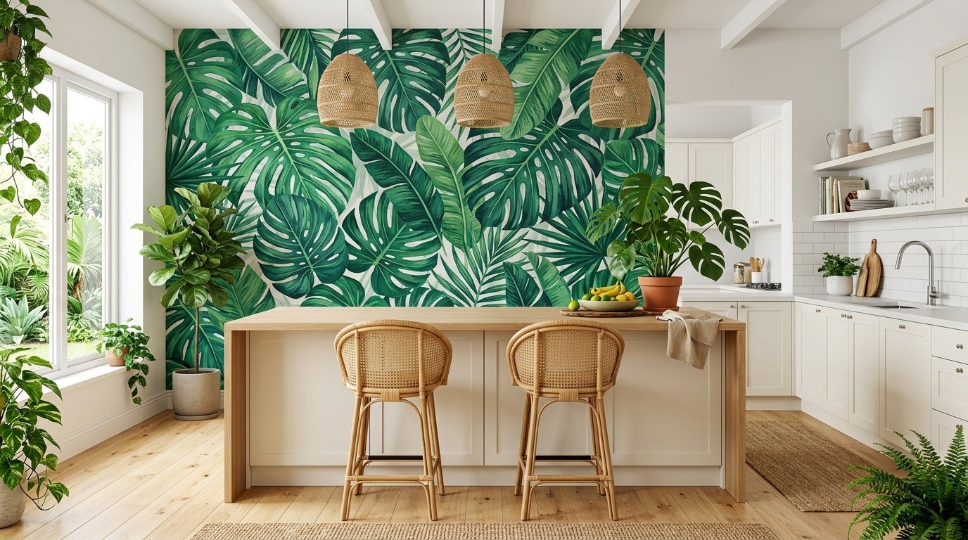
Put vacation vibes into your house with oversized green leaves. This style works best on a single accent wall. I avoid putting huge patterns between tight cabinet spaces. The pattern gets cut off and looks too busy. Place it on the largest open wall near your dining table. Pair it with natural rattan bar stools. Real indoor plants complement the printed leaves nicely. Your cooking area becomes a lush indoor jungle. It makes cooking dinner feel like a tropical escape.
Good pairings for palm prints:
- Bamboo window blinds
- Natural woven floor rugs
- Solid white dinner plates
- Light oak wood floors
Wash the wall thoroughly before pasting heavy vinyl. Heavy paper requires a perfectly clean surface to stick.
10. Classic Gingham and Plaid
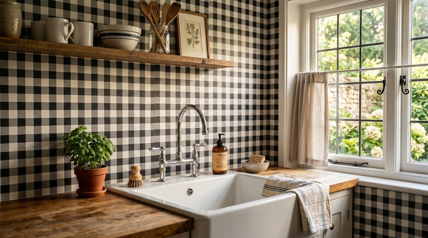
Plaid patterns create a welcoming and familiar environment immediately. Black and white buffalo check remains incredibly popular right now. I put a small gingham print behind a farmhouse sink recently. It looks like a tailored men’s shirt on the wall. You must use a level when hanging straight lines. Crooked plaid becomes painfully obvious across a long room. Buy an extra roll to ensure your horizontal lines match perfectly. It pairs excellently with simple open shelving.
Where to use plaid:
- Inside a walk in pantry
- Behind a white ceramic sink
- Above a rustic dining bench
- Inside a glass cabinet back
Smooth the squares slowly to avoid stretching the vinyl. A stretched square ruins the entire grid pattern quickly.
11. Subtle Watercolor Washes
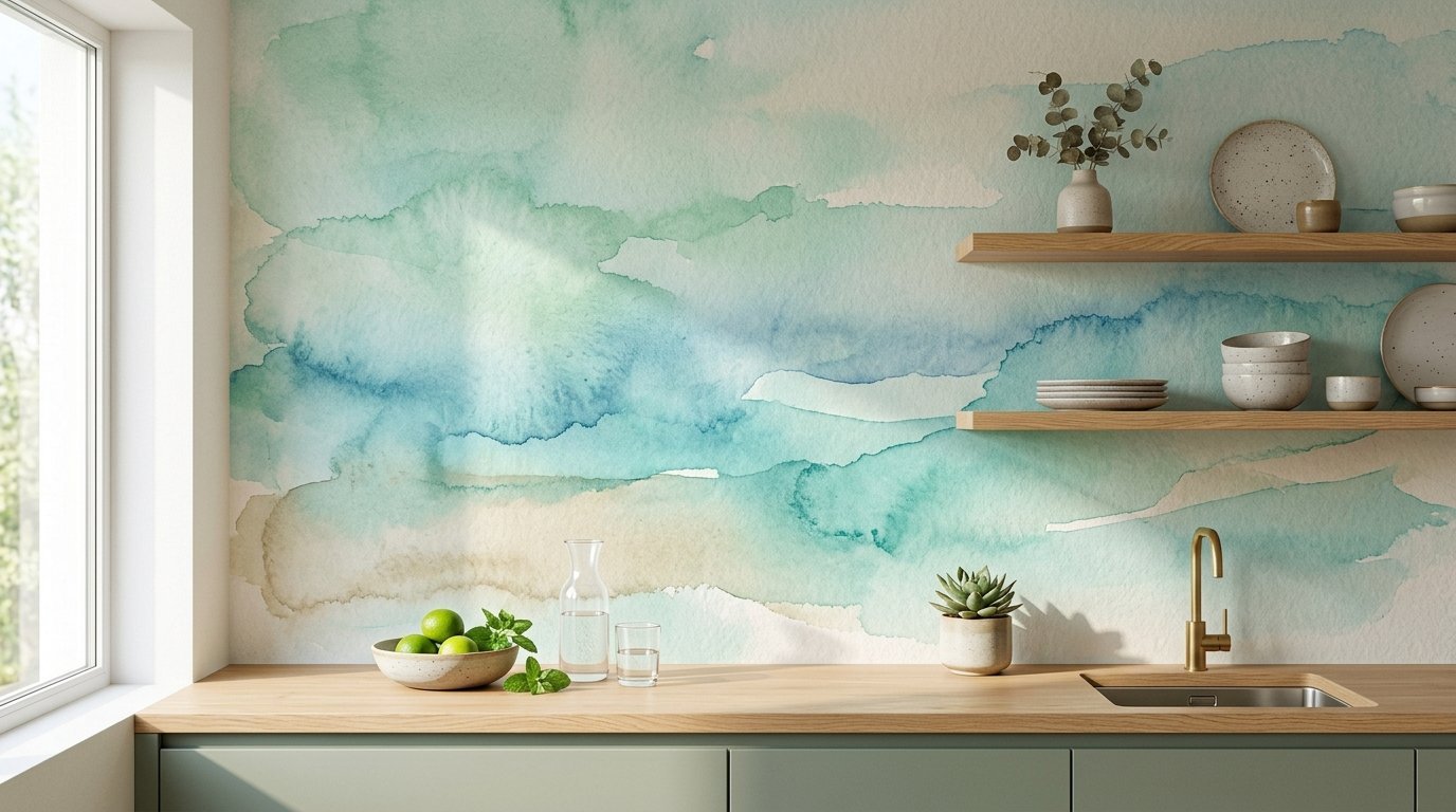
Sometimes you want color without a distinct repeating pattern. Watercolor designs offer soft blending of blues or greens. I used an ocean blue wash in a bathroom and kitchen combo. The lack of hard lines makes installation incredibly forgiving. You do not have to match edges perfectly. The abstract nature hides small mistakes easily. This is perfect for first time wallpaper installers. It reflects morning light softly and beautifully. Your walls will look like a custom painted mural.
Colors that work best:
- Soft seafoam green
- Pale sky blue
- Very light blush pink
- Warm sandy beige
You can finish a whole wall in under two hours. The overlapping seams disappear into the abstract watery design.
12. Metallic Accent Textures
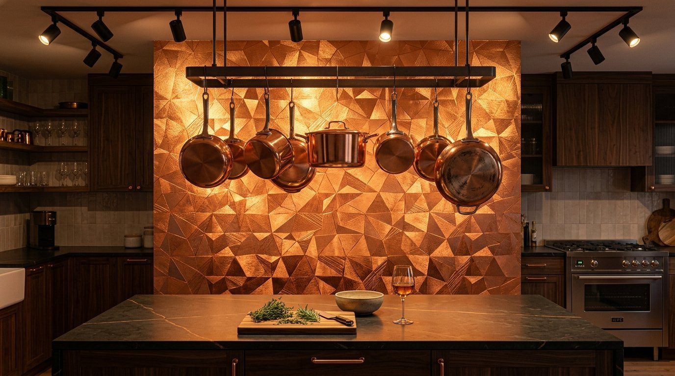
Gold or copper foil accents catch the sunlight beautifully. Metallic prints bounce light around small dark spaces. I applied a copper geometric print behind a kitchen island recently. The metallic shine matched the copper pots hanging above. Wipe these carefully with non abrasive cloths only. Harsh scrubbing ruins the metallic finish quickly. Focus lighting directly onto these walls to maximize the shine. It gives your space a glamorous and rich feeling instantly.
Lighting tips for metallics:
- Use warm white led strips
- Angle track lights downward
- Place near natural sunlight
- Avoid harsh fluorescent tubes
The foil material feels thinner than standard vinyl paper. Handle it very gently to avoid permanent wrinkles.
13. Minimalist Terrazzo Patterns
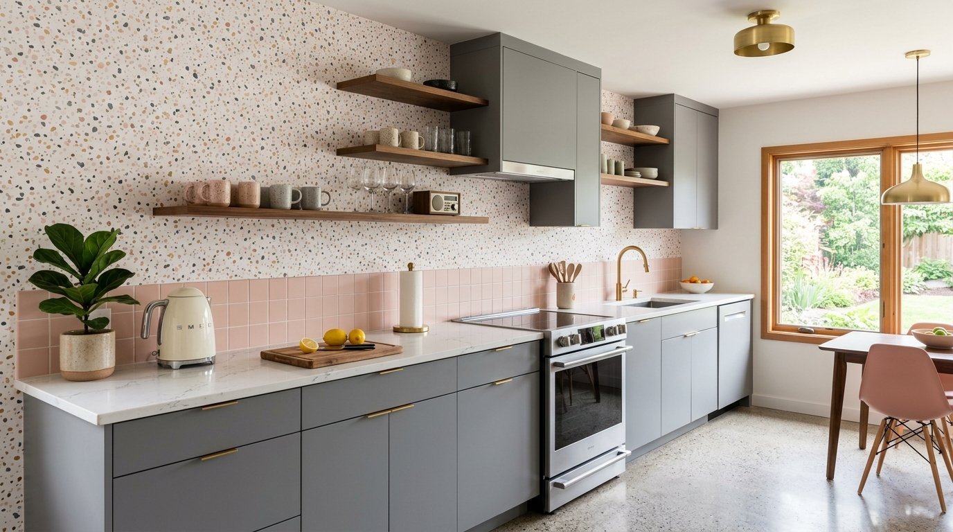
Terrazzo gives a mid century modern vibe without heavy commitment. Little specks of color on a neutral background hide dirt perfectly. I installed a blush pink and gray terrazzo print last week. The subtle flecks of color tied the whole room together. It looks playful but still grown up. This pattern is very easy to match at the seams. Cut it easily around electrical outlets and light switches. You get a trendy look that pulls off easily when you move.
Why terrazzo is great:
- Matches multiple paint colors
- Hides small installation bumps
- Looks like real poured stone
- Fits modern cabinet styles
Use a soft cloth to press down the edges. The busy pattern forgives almost all beginner measuring mistakes.
14. Moroccan Tile Replicas
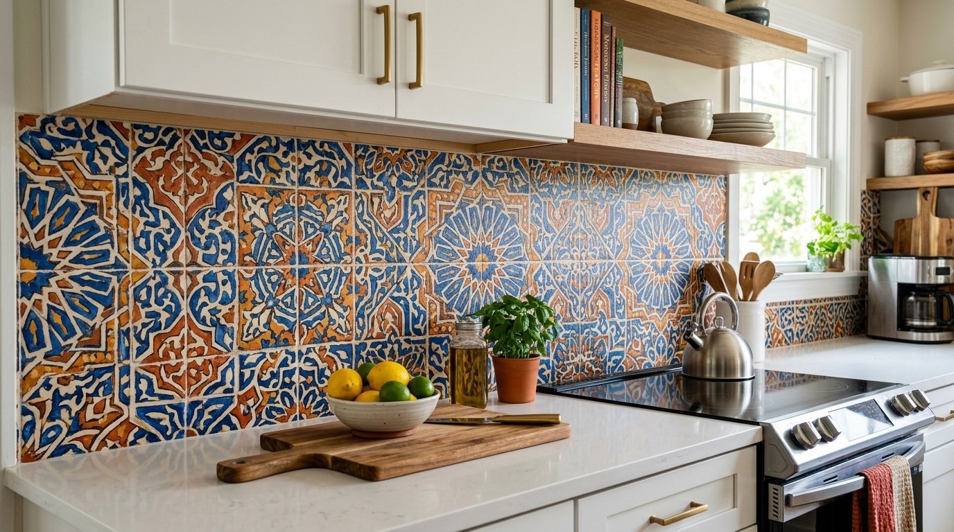
Brightly colored Moroccan tiles cost a fortune to import and install. Heavy vinyl paper copies these intricate designs flawlessly. I updated a boring white rental with bold blue and orange prints. The intricate details distract the eye from old cabinets. It covers up ugly 1990s square tiles perfectly. Push the paper firmly into the old grout lines. This makes the fake tile look exactly like real Kitchen Wall Tile. The bright colors make a huge statement for twenty bucks.
Application tips over old tile:
- Clean with a strong degreaser
- Let the wall dry completely
- Align the fake grout lines
- Press into the grooves hard
This updates a tired cooking space faster than paint.
15. Realistic Exposed Brick
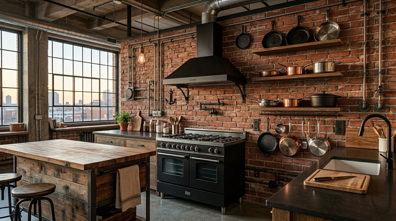
Exposed brick gives an industrial loft feeling to any room. Red brick wallpaper warms up cold modern spaces immediately. I put brick paper behind a freestanding stove in an apartment. We textured the wall slightly before applying the paper. The bumps made the fake brick feel authentic. Make sure you align the mortar lines perfectly. Mismatched bricks ruin the illusion completely. Hang some floating shelves with black iron pipes over it. You create an instant city loft aesthetic.
Accessories for brick walls:
- Black iron pipe shelving
- Edison bulb light fixtures
- Stainless steel metal pans
- Dark wood butcher blocks
Step back five feet to check your work frequently. The pattern must look straight from across the room.
16. Chinoiserie Birds and Branches
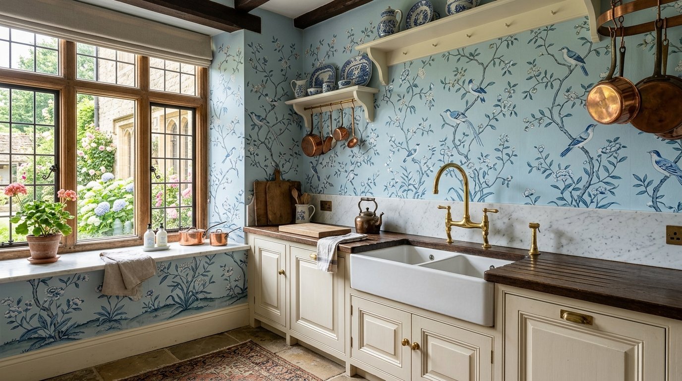
Delicate birds on thin branches give elegance to your home. This traditional style looks incredibly expensive and sophisticated. I installed a light blue Chinoiserie print in a historic home. The delicate details matched the old architecture perfectly. These intricate patterns require careful seam matching. Buy high quality vinyl for these specific Kitchen Wallpaper Ideas. Cheaper papers tear easily while you match the delicate branches. Pair this with brass faucets and crystal light fixtures.
Styling traditional prints:
- Use polished brass hardware
- Hang crystal glass pendants
- Keep counters completely bare
- Match colors to your dishes
This pattern turns a normal house into a luxury estate. Take your time aligning the bird wings exactly right.
17. Matte Black and White Abstract
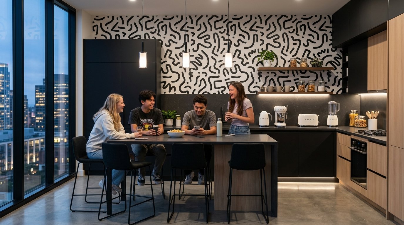
Abstract shapes in monochrome colors fit ultra modern houses perfectly. You get visual interest without introducing chaotic colors. I used a squiggly line pattern in a teenager’s hangout space. It felt artistic and young but still clean. Black and white hides grease spots surprisingly well. Keep your small appliances in matching black or white. This creates a highly styled magazine look easily. The eye travels along the shapes endlessly.
Rules for black and white:
- Stick to two colors only
- Buy matching small appliances
- Keep hardware very simple
- Use bright white light bulbs
The matte finish prevents glare from your ceiling lights. The wall looks like a modern art museum piece.
18. Whimsical Toile Storytelling
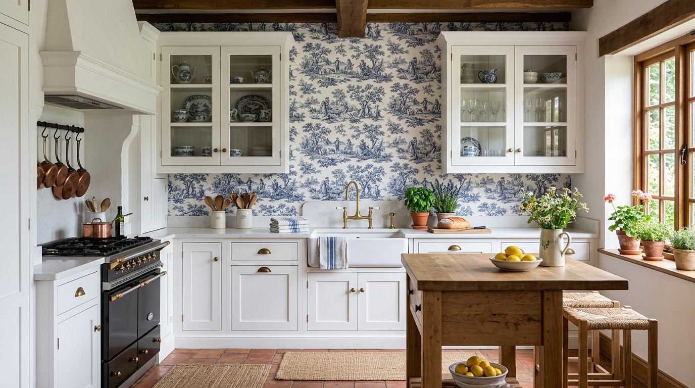
Toile prints feature small scenes of country life repeated throughout. These tell a story right on your wall. I love classic blue toile against crisp white cabinets. It gives a French country estate feeling instantly. You must look closely to see the little people and animals. This makes waiting for water to boil much more entertaining. Match your window treatments to the primary color in the toile. The room will look incredibly custom and expensive.
Popular toile color choices:
- Navy blue on crisp white
- Cherry red on soft cream
- Charcoal gray on pure white
- Forest green on light beige
Align the little scenes perfectly straight across the wall.
19. Solid Color Heavy Textures
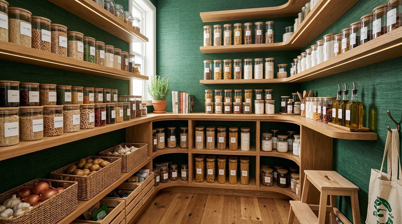
Sometimes you do not want a pattern at all. Textured grasscloth vinyl gives depth without busyness. I used a deep green grasscloth look in a small pantry. The texture hid all the drywall bumps perfectly. It provides a rich background for your food storage containers. Genuine grasscloth ruins easily when wet. The vinyl version wipes dry with one paper towel. You get the luxury texture with zero maintenance stress.
Great places for grasscloth:
- Inside a walk in pantry
- On the kitchen island back
- Behind a small home bar
- Covering a boring side door
The thick vinyl makes installation incredibly smooth and simple. You cannot tear this heavy material easily by accident.
20. Retro 1970s Flower Power
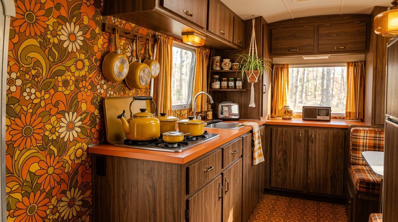
Big bold orange and brown flowers give fun nostalgic energy. Mid century styles remain heavily requested right now. I applied a huge orange floral print in a retro camper kitchen. It fit the vintage vibe perfectly. Keep everything else simple when using loud retro prints. Wood cabinets pair very naturally with these earth tones. Use flat finish paper to maintain the authentic 1970s feel. It creates a space where people love to hang out.
How to style retro prints:
- Use flat front wood cabinets
- Buy orange or yellow pots
- Lay checkered floor tiles
- Install globe light fixtures
Match the flower petals precisely at the paper edges. The massive shapes hide dirty wall marks incredibly well.
21. Delicate Pastel Scallops
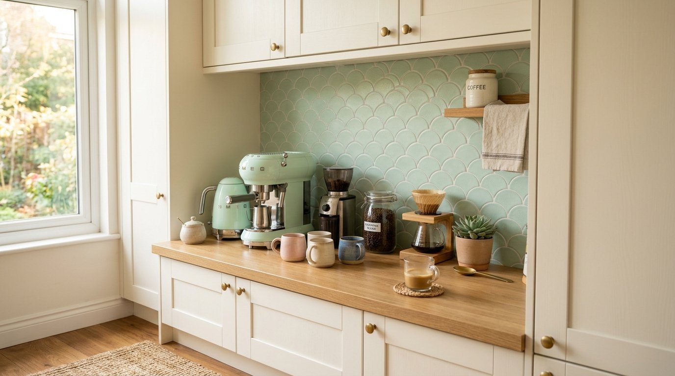
Scalloped edges give a soft mermaid or fish scale illusion. Light pink or mint green scallops look fresh and clean. I placed a mint scallop design behind a coffee station recently. The curved lines soften square cabinets and rigid appliances. This pattern mimics expensive custom tile cutting. It requires patience to align the curves properly. Smooth it down slowly from the top to the bottom. The finished look feels incredibly sweet and customized.
Best pastel colors:
- Soft mint green
- Pale blush pink
- Light butter yellow
- Soft powder blue
Overlap the edges closely so the curves match perfectly. The vinyl wipes clean with plain water and soap.
22. Chalkboard Menu Walls
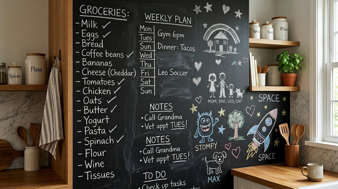
Black contact paper acts exactly like a real chalkboard. You can write your grocery lists directly on the wall. I put this on the side of a tall refrigerator cabinet. Kids love drawing on it while parents cook dinner. Use a wet rag to erase the chalk completely. It provides a functional and interactive Kitchen Wallpaper Design. You do not need to match any patterns. Simply roll it down straight and trim the bottom edge.
Fun uses for chalkboard walls:
- Writing weekly dinner menus
- Keeping a running grocery list
- Leaving notes for your family
- Letting kids draw freely
Use regular soft chalk instead of liquid chalk pens. Liquid pens stain the vinyl material permanently over time.
23. Stained Glass Window Illusions
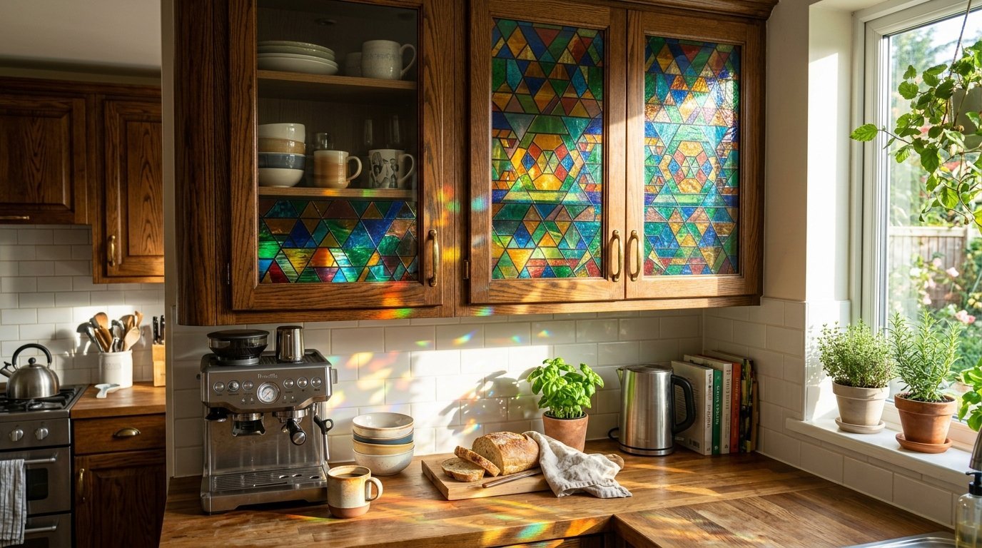
Translucent geometric films cover boring windows or glass cabinet doors. This puts color on the glass without blocking the natural sunlight. I covered clear glass cabinet doors with a faux stained glass film. It hid the messy mismatched plates inside completely. Light shines through it beautifully during the morning hours. You use soapy water to slide the film into place. It peels off in one single sheet when you move out.
Tips for window films:
- Spray water mixed with soap
- Squeegee out all the bubbles
- Cut edges with a razor
- Wipe dry with paper towels
This cheap film makes cheap glass doors look expensive. You hide your clutter while placing a beautiful pattern on the glass.
Frequently Asked Questions
How long does removable wallpaper last behind a stove?
Peel and stick paper lasts three to five years generally. Heat from the stove can melt cheap adhesives quickly. I strictly use heat resistant vinyl for stove areas. You must check the manufacturer specifications before buying. A glass splash guard placed over the paper extends its life. The adhesive gets brittle if it gets too hot constantly. Place a metal sheet behind your burners for extra safety. You can wipe grease directly off the glass guard easily.
Can you put peel and stick over existing ceramic tile?
You can place it over smooth ceramic tiles easily. Deep grout lines will show through thin paper. I fill deep grout lines with spackle before applying wallpaper. Thick textured vinyl hides shallow grout lines perfectly. Clean the tiles with heavy degreaser first. Any leftover grease stops the glue from sticking completely. Wait twenty four hours after cleaning before you start pasting. Press the paper firmly onto every single tile face.
Does the adhesive damage drywall when removed?
High quality removable paper leaves drywall completely unharmed. Cheap brands sometimes pull off the top layer of paint. I always use a hairdryer to warm the paper before pulling. The heat softens the glue instantly. Pull it off slowly at a sharp angle. Never rip it off the wall like a bandage. Use a wet rag to wash away any tiny glue spots left behind. Your landlord will never know you changed the walls.
How do you clean wallpaper backsplashes safely?
Use mild dish soap and a soft damp cloth. Harsh chemicals eat through the printed ink quickly. I wipe my walls down every single evening after cooking. Do not use scratchy sponges or abrasive powders. Dry the wall completely with a microfiber towel. Leaving water sitting on the seams causes peeling over time. Treat the vinyl surface gently like a painted wall. The colors stay bright for years with gentle daily cleaning.
Are these wallpapers waterproof or just water resistant?
Most vinyl options resist water very well. They are not fully waterproof for showers or sinks. I seal the bottom edge with clear silicone caulk. This stops water from seeping under the paper. Wipe up large splashes immediately to prevent peeling edges. Do not let standing water rest near the bottom seams. You can place these behind a sink safely with care. Just apply a thin bead of clear silicone at the counter line.
How much does it cost to do an average backsplash?
An average area requires two standard rolls of paper. Good quality vinyl costs about forty dollars per roll. You will spend roughly eighty dollars total. I buy one extra roll for matching mistakes always. This costs hundreds less than real glass or ceramic. You save hundreds of dollars on professional labor costs too. Return the unopened extra roll if you do not use it. It remains the cheapest room update you can buy.
Can I use regular wallpaper paste instead?
Never use regular paste on peel and stick products. The chemicals react poorly and ruin the material. I rely entirely on the factory adhesive backing. If a corner lifts, use a tiny drop of superglue. Traditional paste makes the removal process extremely difficult. The factory glue holds perfectly on clean flat surfaces. Do not mix application styles during your weekend project. Trust the peel and stick technology completely.
How do you cut around electrical outlets?
Turn off the power to the kitchen completely first. I remove the plastic outlet covers before hanging the paper. Smooth the paper right over the empty hole. Use a sharp craft knife to cut an X over the box. Fold the edges inside and replace the cover. The plastic cover hides all the messy cut edges beautifully. Take your time holding the sharp knife steady. Your wall looks perfectly seamless when the plates go back on.
Will dark patterns make my space look smaller?
Dark colors absorb light and can shrink a room visually. You should only use dark prints in well lit areas. I put dark vintage floral wallpapers near large windows. White cabinets balance out heavy dark walls beautifully. Place bright under cabinet lights to keep the space open. Glossy dark paper reflects light better than matte dark paper. Keep your ceilings painted flat white to maintain height. A dark accent wall pushes the room back visually.
What happens if I make a mistake hanging it?
You simply peel it off and try again. The glue stays sticky for several attempts. I pull it off gently to avoid stretching the vinyl. Stretched vinyl will never match the next panel correctly. Take your time and keep your hands very clean. Wash your hands frequently so dirt does not transfer. If you ruin a piece completely, just cut a new one. The extra roll gives you peace of mind during installation.
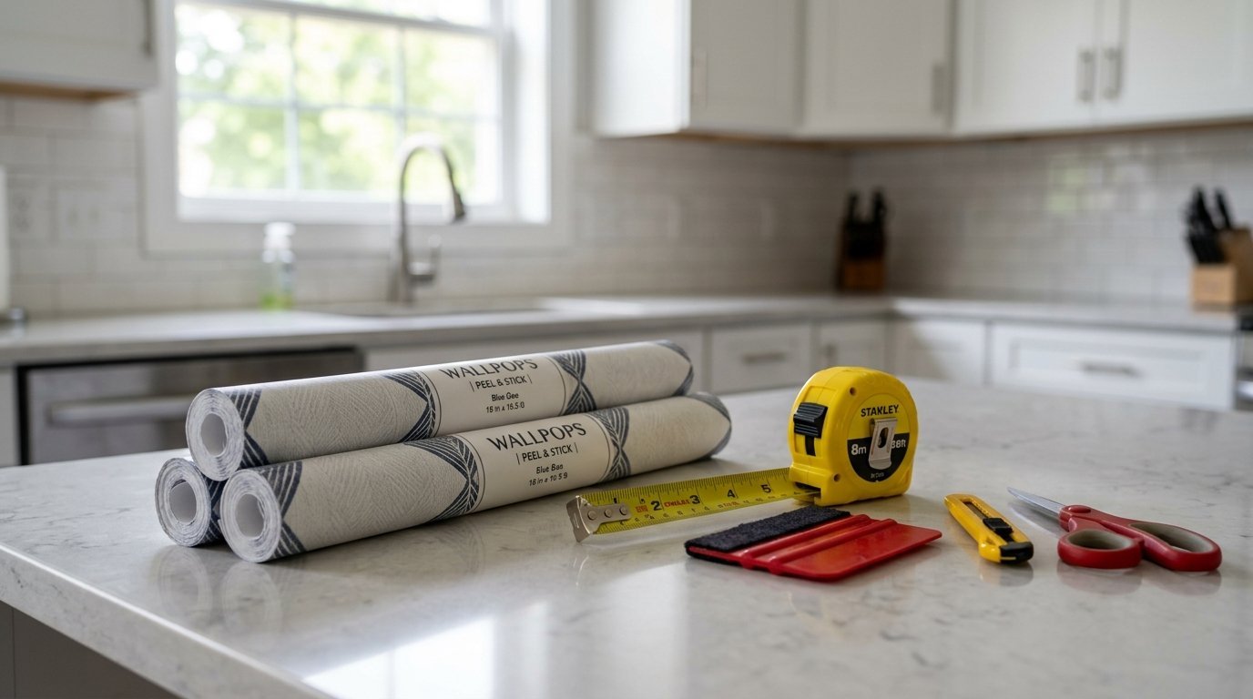
Do I need special tools for installation?
You need a tape measure, scissors, and a sharp craft knife. A plastic smoothing tool removes air bubbles easily. I use a clean dry sponge to press the edges down. A metal ruler helps you make perfectly straight cuts. You likely have these items at home already. Buy plenty of extra razor blades for your knife. A dull blade tears the wet vinyl instead of cutting it. Sharp tools make the job move twice as fast.
Can you put wallpaper on kitchen cabinets?
You can absolutely wrap flat cabinet doors in wallpaper. It gives ugly brown wood a completely new face. I covered flat laminate doors in a white wood grain last year. Wrap the edges tightly just like a Christmas present. Use a hairdryer to mold the corners perfectly. Smooth out all the bubbles working from the center outward. Screw the hinges right back through the vinyl paper. It costs twenty dollars to wrap a whole door.
Final Thoughts
Removable wallpaper gives you total control over your home environment. You change your walls without angering landlords or spending huge budgets. The twenty three options listed above fit every possible design taste. I see people changing dreary rooms into bright spaces every day. Pick a pattern that makes you happy when you brew morning coffee. Buy your rolls today and start pasting this weekend. Share your newly wrapped walls with friends and family.

Anya Castellan is the Founder and Editor-in-Chief of Home Wall Trends. An art history graduate of the Rhode Island School of Design with twelve years of experience writing for leading American design publications, she specializes in composition, gallery wall theory, and the quiet architecture of domestic space. A former contributing editor at Architectural Digest and guest lecturer at Parsons School of Design, Anya personally reads and signs off on every piece before it is published.