Three months ago I threw a fresh piece of pine right into the trash. I tried to craft a farmhouse welcome sign for my minimalist hallway. The wood warped badly overnight. The raw color clashed violently with my white walls. I realized right then that picking wall decor is incredibly hard. Many people ask me about styling art in their homes. They want a clean look without feeling cold. They usually stress over picking dark edges or light grain. I have made every styling mistake possible over the years. I want to share exactly what works right now for beautiful walls.
You will get a complete guide on picking border styles for your home. I will show you exact styling rules for a quiet space. We will look at bordering a house sketch properly. I will show you how to display landscape photos on blank walls. I share my exact cleaning routine using Norwex cloths and distilled water. You will see exact price comparisons between major stores like IKEA and Framebridge. I will guide you through picking dark wood or white wood for specific rooms. By the end you will know exactly what to buy for your space.
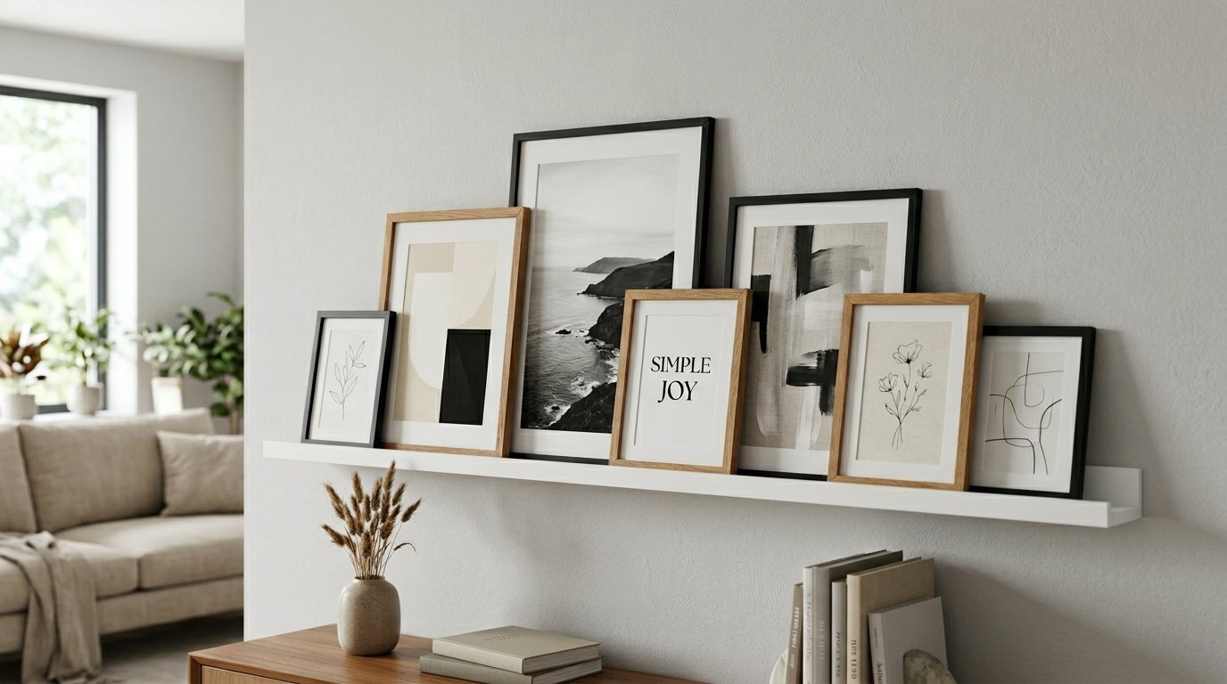
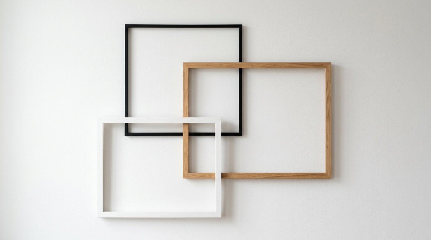
The Visual Power of Black Borders in a Room
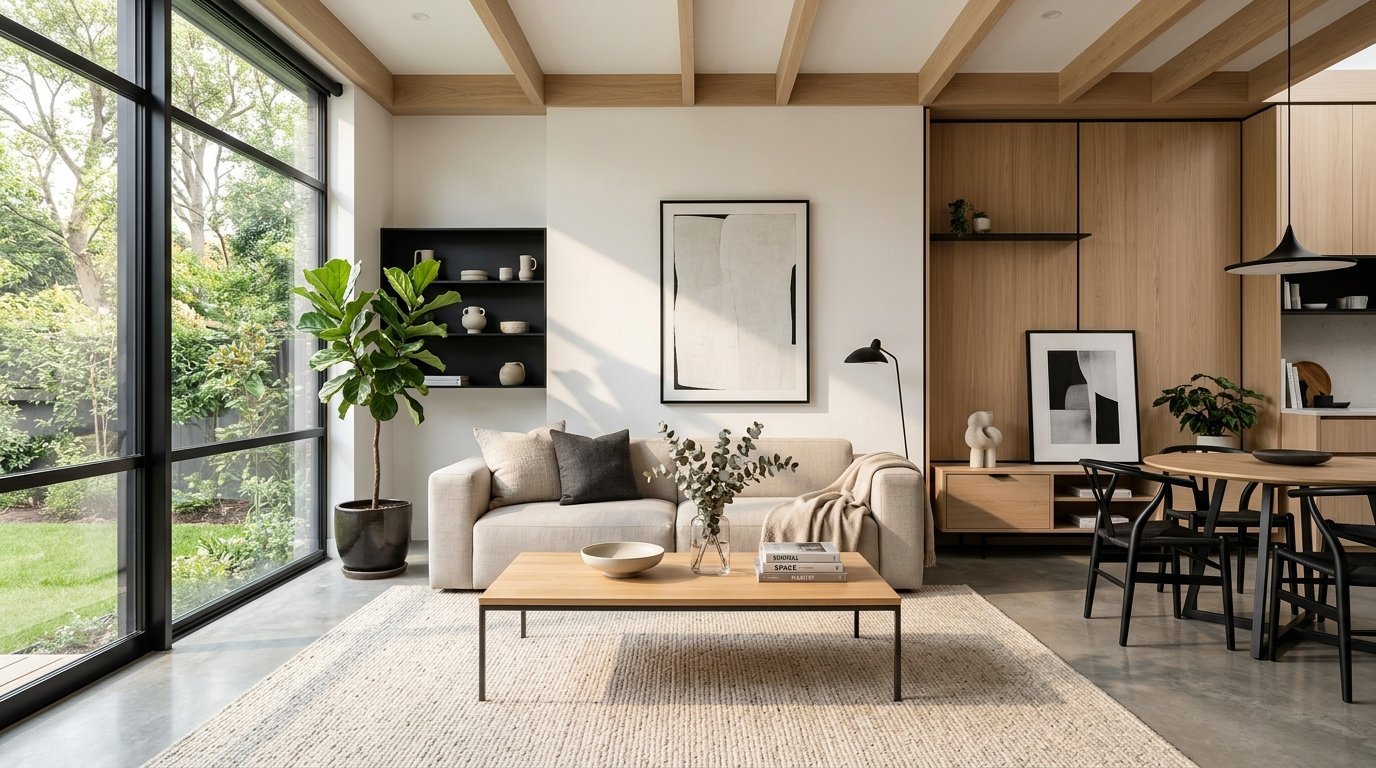
A dark border acts like a sharp punctuation mark on a wall. It forces your eyes to stop and look at the art. Modern spaces rely heavily on this strong visual contrast. You see this everywhere in expensive city apartments and sleek homes. The sharp lines create a very organized feeling in the room. A white wall needs this grounding anchor to stop looking empty.
I love using these borders in rooms with lots of natural light. The sunlight hits the glass and makes the dark edge pop beautifully. You can buy amazing options from Target or IKEA right now. The IKEA Ribba line is very cheap but looks incredibly premium. I put three of them above my living room sofa last year. They completely changed the feeling of the entire sitting area.
You must be careful not to use too many dark edges. A room can feel heavy and dark very quickly. I once filled a small guest bedroom with thick dark borders. The walls felt like they were closing in on the bed. You should leave plenty of blank space between each piece of art. This breathing room is the secret to a true minimalist aesthetic.
The Warmth of Natural Grain in Minimalist Spaces
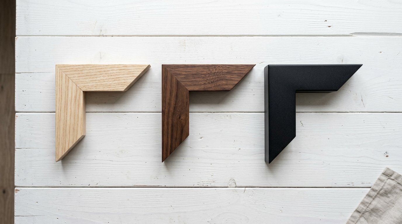
Light timber borders completely change the mood of a living space. They make a cold room feel cozy and lived in instantly. I lean towards ash or maple finishes for a modern vibe. These lighter tones blend perfectly into soft white or cream walls. You get a beautiful gallery look without the harsh contrast.
I often mix bohemian touches into my minimalist rooms. A raw timber edge is perfect for this specific design goal. It brings a piece of nature directly into your living space. I bought beautiful oak pieces from West Elm a few years ago. They hold up beautifully and the color never fades in the sun. The grain texture adds quiet character to a completely flat wall.
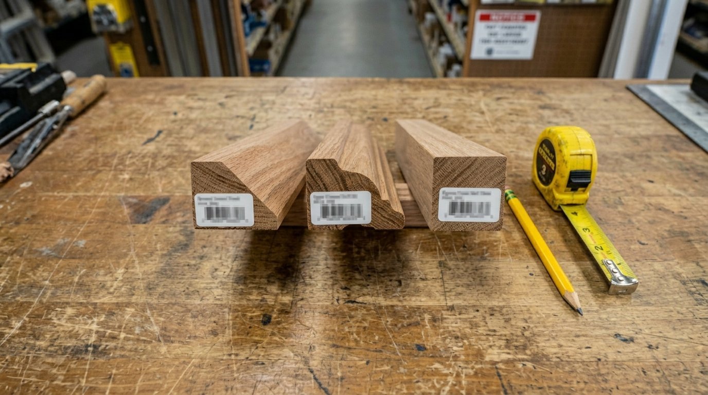
You should match the timber tone to your existing furniture carefully. Do not mix red oak with yellow pine in the same room. The colors will fight each other and look incredibly messy. I always take a small piece of my furniture wood to the store. This trick saves me from buying the wrong shade of timber.
Introducing Dark Wood to Minimalist Rooms
Many people think a dark wood edge belongs in an old library. You can absolutely use mahogany or walnut in a modern space. The secret is keeping the profile of the border very thin. A thick walnut edge looks heavy and dated on a modern wall. A thin walnut edge looks rich and incredibly sophisticated.
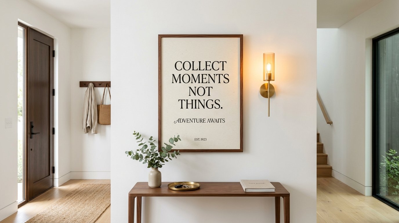
I found an amazing walnut piece at a thrift store last year. I placed it in my entirely white minimalist entryway. The rich brown color warmed up the cold white paint perfectly. You can recreate this look with new pieces from Crate and Barrel. They sell beautiful thin walnut options that look custom made.
You should pair these rich timber pieces with warm lighting. Harsh white LED bulbs make rich timber look dull and flat. I use soft warm bulbs in my hallway sconces. The warm light makes the walnut grain glow beautifully at night. This small detail makes a massive difference in the overall feeling.
When to Use White Wood Frames
A white wood border is a secret weapon for minimalist decorators. It blends directly into a white wall and almost disappears completely. This trick forces you to look only at the art itself. The border acts as a subtle texture rather than a heavy line. I use this trick often in very small or dark rooms.
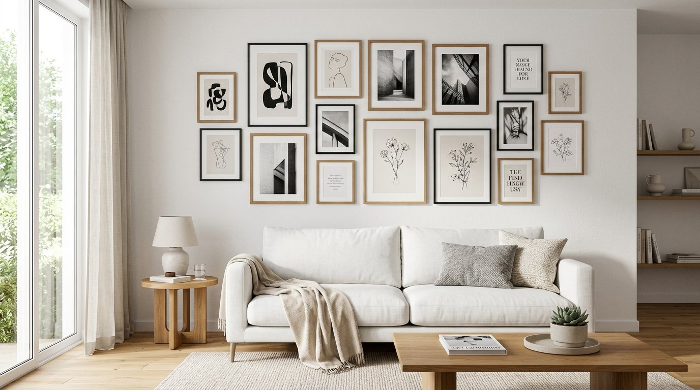
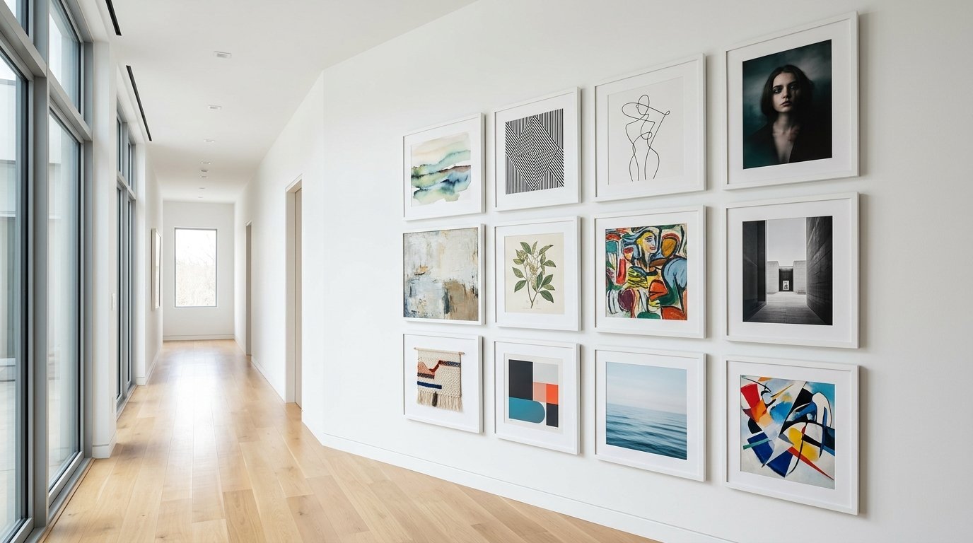
You can create a massive gallery wall without cluttering the space. I used twelve matching white borders from Michaels for my bedroom. The wall looks completely covered in beautiful art. The room still feels airy and light because the borders disappear. A dark border would have ruined the peaceful feeling in there.
Always check the paint color of your white borders. Some whites look yellow and some look blue under home lighting. I match my borders directly to my Sherwin Williams Alabaster wall paint. This exact match makes the gallery look like custom architecture.
Framing a Detailed House Sketch
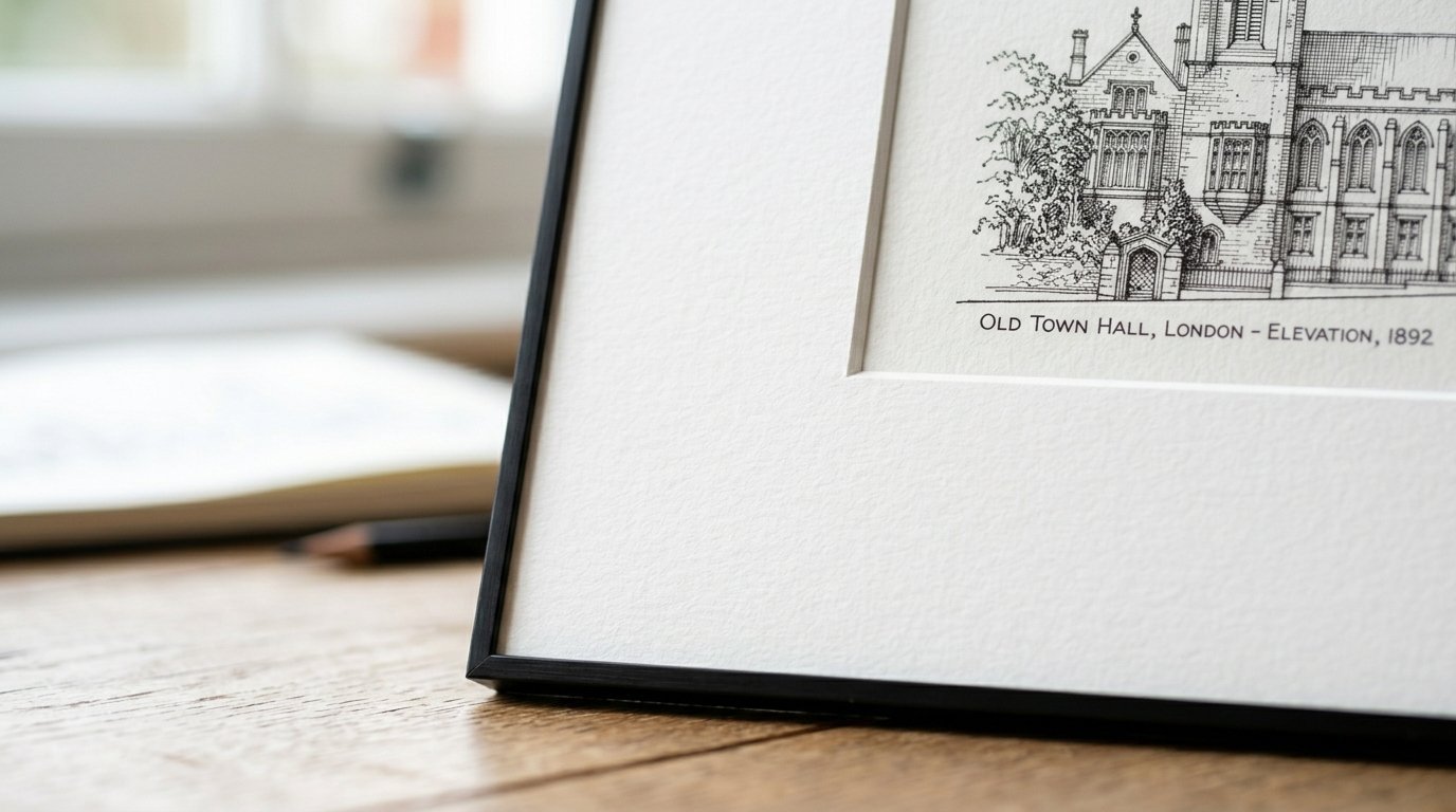
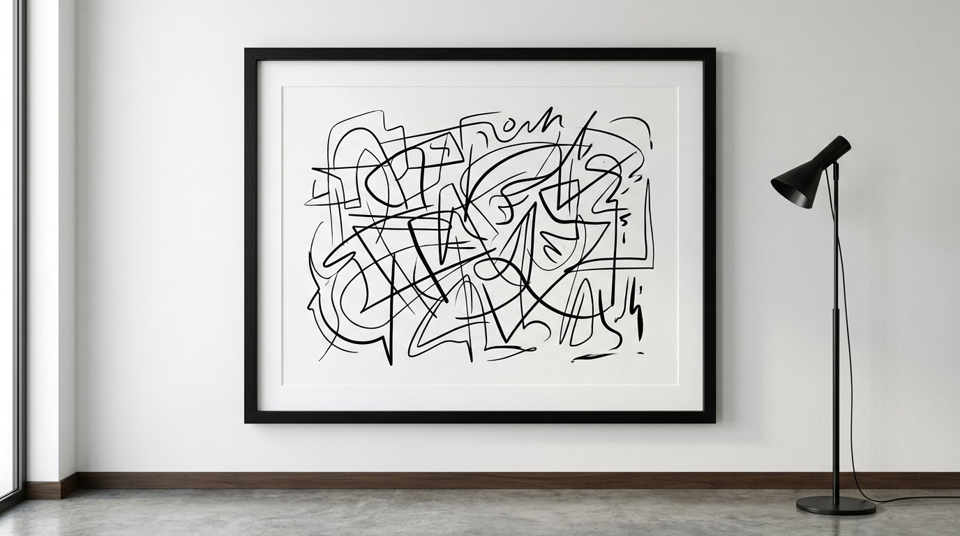
A custom house sketch is a beautiful piece of personal art. You want to display it perfectly without distracting from the fine lines. I always use a thin black border for pencil or ink sketches. The dark edge makes the delicate pencil lines look much sharper. It creates a crisp boundary for the chaotic sketchy lines inside.
I tried placing an ink drawing in a yellow pine border once. The yellow tones completely overpowered the delicate black ink lines. The whole piece looked washed out and very cheap. I swapped it for a matte black metal border from Framebridge. The drawing instantly looked like expensive gallery artwork.
You should use a very wide white paper mat around the sketch. A house sketch usually has a lot of white space already. The wide mat extends that clean space out to the dark edge. This makes the art look much larger and more expensive.
Showcasing Beautiful Landscape Photos
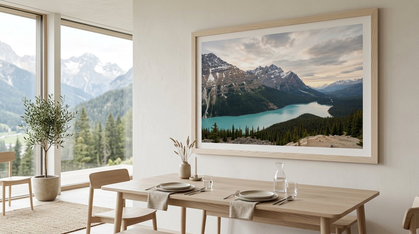
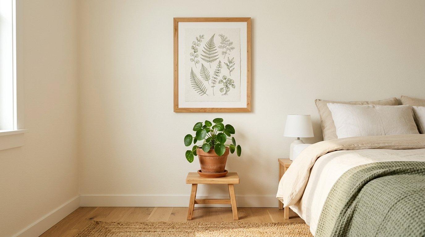
Landscape photos need careful handling in a minimalist space. You want the colors of nature to shine without competing with the border. I strongly prefer light timber for any outdoor photography. A maple or ash edge extends the natural feeling of the photograph. It acts like a real window looking out into the wild.
I have three large mountain photographs hanging in my dining room. I used custom oak borders from Artifact Uprising for these pieces. The wood grain mimics the trees visible in the photographs. A dark border would have cut the scene off too abruptly. The timber lets the photo breathe and expand into the room.
If your photo has heavy shadows or dark water you can go dark. A thin black edge works well for moody or stormy photography. You just have to look at the darkest color in the picture. Match your border to that specific shadow for a cohesive look.
Creative Framing Ideas for Bare Walls
You do not have to stick to one single style everywhere. You can mix dark edges and light timber in the same house. I keep all the borders matching within a single sightline. My living room uses only light timber. My connecting hallway uses only matte black. This keeps things organized but never boring.
You can also mix styles on a single large gallery wall. This requires a very careful and deliberate layout plan. I lay everything out on my living room floor first. I make sure the dark edges are spread out evenly. If you bunch them together the wall will look incredibly lopsided.
Try leaning your art on a floating shelf instead of hanging it. I bought a white picture ledge from IKEA for my office. I lean different sized borders against the wall on the shelf. This lets me swap art easily without putting holes in drywall. It looks very relaxed and perfectly fits the minimalist vibe.
Cost Comparison Between Major Brands
You can spend ten dollars or three hundred dollars on a border. Target Room Essentials offers great basic pieces for under fifteen dollars. They look fine from far away but feel very cheap up close. The plastic covers scratch easily and the corners often gap slightly.
IKEA is my favorite budget option for large wall projects. Their Ribba and Hovsta lines cost between fifteen and thirty dollars. The quality is much better than Target for almost the same price. I use IKEA whenever I need to build a massive gallery wall. The glass is real and the corners are usually tight.
If you want absolute perfection you should use Framebridge. You mail them your art and they do everything in their shop. You will pay between one hundred and two hundred dollars per piece. The quality is flawless and the paper mats never turn yellow. I save this option for original art or very special family photographs.
Proper Wall Hanging Techniques
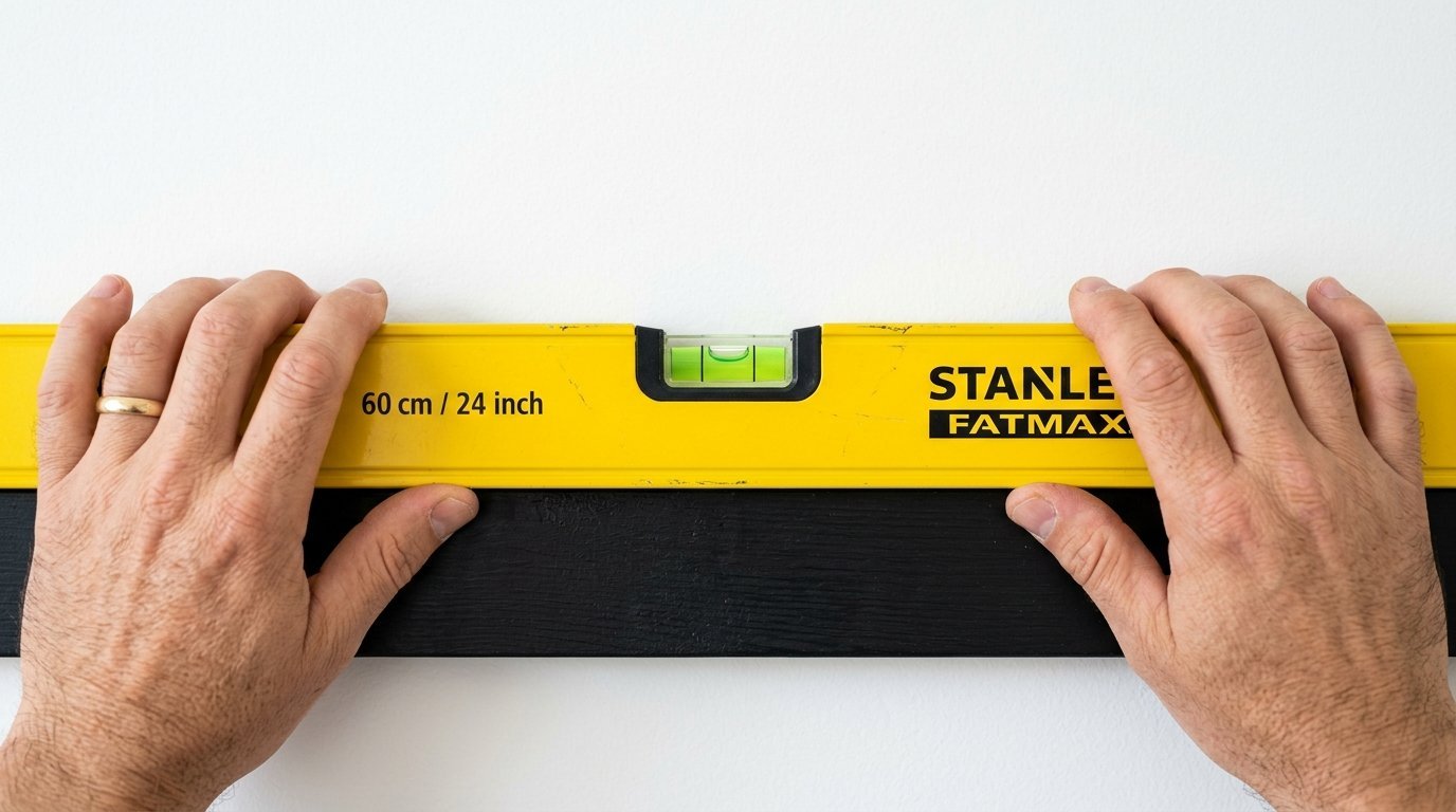
Hanging art perfectly level is the hardest part of the job. I rely heavily on 3M Command Strips for almost everything now. They save your drywall and let you make tiny leveling adjustments easily. You must follow the weight limits printed on the package exactly. I had a heavy mirror shatter because I used too few strips.
If you must use nails you need a proper Stanley Tape Measure. You also need a long bubble level to keep things straight. Do not trust your eyes to level a large piece of art. Your ceiling or floor might actually be slanted slightly. Always use the bubble level on the top edge of the border.
I always hang single pieces with the center at eye level. This is usually fifty seven inches from the floor for most people. Many people hang their art way too high near the ceiling. This makes the room look completely disjointed and very strange.
Cleaning and Caring for Your Frames
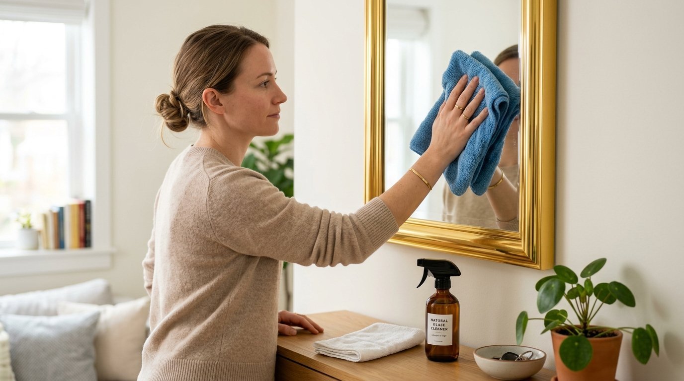
You must keep your glass and borders perfectly clean. A dusty edge ruins the minimalist aesthetic instantly. I use a dry Norwex microfiber cloth for my weekly dusting routine. The cloth grabs all the dust without needing any chemical sprays. I wipe down the top edge and the glass very gently.
You have to be careful with moisture around your wall decor. I noticed this issue with a gold piece in my bedroom last summer. Every time I wiped the glass water gathered at the absolute bottom curve. The water eventually ruined the finish and warped the backing board. I saw this destroy a beautiful piece in my hallway three years ago. The damp air got behind the edge and caused ugly black spots.
I now use distilled water and a tiny bit of isopropyl alcohol. I spray the mixture onto the cloth first. I never spray liquid directly onto the glass or the border. This stops liquid from running down into the bottom corner seams. Your art will stay dry and the glass will look invisible.
Frequently Asked Questions
Which option makes a room look larger?
Light timber or white borders make a room feel much larger. They blend into light walls and reduce visual clutter. Dark edges create visual stops that can make a small room feel boxed in.
Can I mix dark edges with light timber furniture?
Yes you can absolutely mix them. A dark edge actually looks great above a light oak dresser. The contrast keeps the room from looking too perfectly matched and boring.
What is the best border for a dark painted wall?
Light timber looks incredible against navy blue or forest green walls. The timber pops beautifully against the dark paint. A dark edge will completely disappear into a dark wall.
How wide should the paper mat be?
I always prefer a very wide paper mat. A mat should be at least two inches wide on all sides. A three or four inch mat makes cheap art look very expensive.
Are metal borders better than wood?
Metal offers a much thinner profile than most timber options. Matte black metal looks very sleek in ultra modern homes. Timber adds more texture and warmth than cold metal.
Should all gallery wall borders match exactly?
They do not have to match exactly. A matched set looks very formal and perfectly organized. A mixed set looks more collected and slightly bohemian.
How do I stop glare on the glass?
You can buy anti reflective glass for your pieces. Framebridge offers this option for a small extra fee. It makes a massive difference in rooms with lots of bright windows.
Do I really need a paper mat?
You do not strictly need one. A paper mat keeps the glass off the actual artwork. This stops moisture from trapping and ruining your special prints over time.
How do I fix a scratched wooden edge?
You can buy a timber stain marker from any hardware store. Match the marker color to your border finish. Gently color in the scratch and wipe it quickly with a rag.
Why do cheap borders look bad?
Cheap options usually have plastic covers instead of real glass. Plastic creates wavy reflections that look very messy. The corner joints on cheap borders also tend to pull apart over time.
What is the best way to clean acrylic covers?
Never use paper towels on acrylic covers. Paper towels will leave tiny permanent scratches all over the surface. Always use a clean microfiber cloth and plain distilled water.
Where should I buy custom sized borders?
I highly recommend Framebridge or Artifact Uprising for custom sizes. Local craft stores like Michaels also do custom work. Wait for a sale at Michaels because their retail prices are very high.
My Final Thoughts on Minimalist Framing
Choosing the right wall decor completely changes your home. You now know exactly how dark edges create sharp and modern contrast. You also know how light timber gives quiet warmth to cold spaces. You can mix these styles thoughtfully using the rules I shared today.
Take a hard look at your own walls right now. Grab a tape measure and start planning your next gallery layout. Use my cleaning tips to keep your glass perfectly clear for years. Your home will feel peaceful and incredibly beautiful very soon.

Anya Castellan is the Founder and Editor-in-Chief of Home Wall Trends. An art history graduate of the Rhode Island School of Design with twelve years of experience writing for leading American design publications, she specializes in composition, gallery wall theory, and the quiet architecture of domestic space. A former contributing editor at Architectural Digest and guest lecturer at Parsons School of Design, Anya personally reads and signs off on every piece before it is published.