Staring at a big empty wall feels heavy. I know that feeling well. You want your home to look like a magazine. You want it to feel like you. Right now it just looks blank. You have piles of frames on the floor. You have art from your travels. You have family photos in boxes. The big question remains. Should you go for a clean grid? Or should you go for a wild salon mix? This choice changes everything about your room. It changes how you feel when you sit on your sofa. It changes how guests see your personality. I have spent years helping people fix their Wall Spaces. I have seen how a simple change in Wall Art Placement turns a cold room into a warm home.
This guide helps you decide which path to take. We will look at your furniture. We will look at your art collection. We will even talk about those tricky Stair Walls. By the end of this page you will have a plan. You will know exactly where to hammer that first nail. Your home is a canvas. Let us make it look great.
Quick Look at Your Wall Options
Choosing between these two styles depends on your personality. If you love straight lines you will love a symmetrical grid. If you love stories and collections you will love the salon style. I once worked with a couple in a Classic Interior home. They were torn. He wanted perfect rows. She wanted a messy artistic look. We found a way to bridge that gap.
In this article you will see how to measure your space. You will see which frames work best for each style. We will cover the best Wall Accents Decor to mix in. I will share my list of top tools like Command Strips and IKEA Ribba frames. You will also get my secret for dealing with a Textured Wall. Sometimes a Textured Wall Panels setup needs a different approach. We will look at costs. We will look at time. You will get the full picture.
What Is a Symmetrical Gallery Wall?
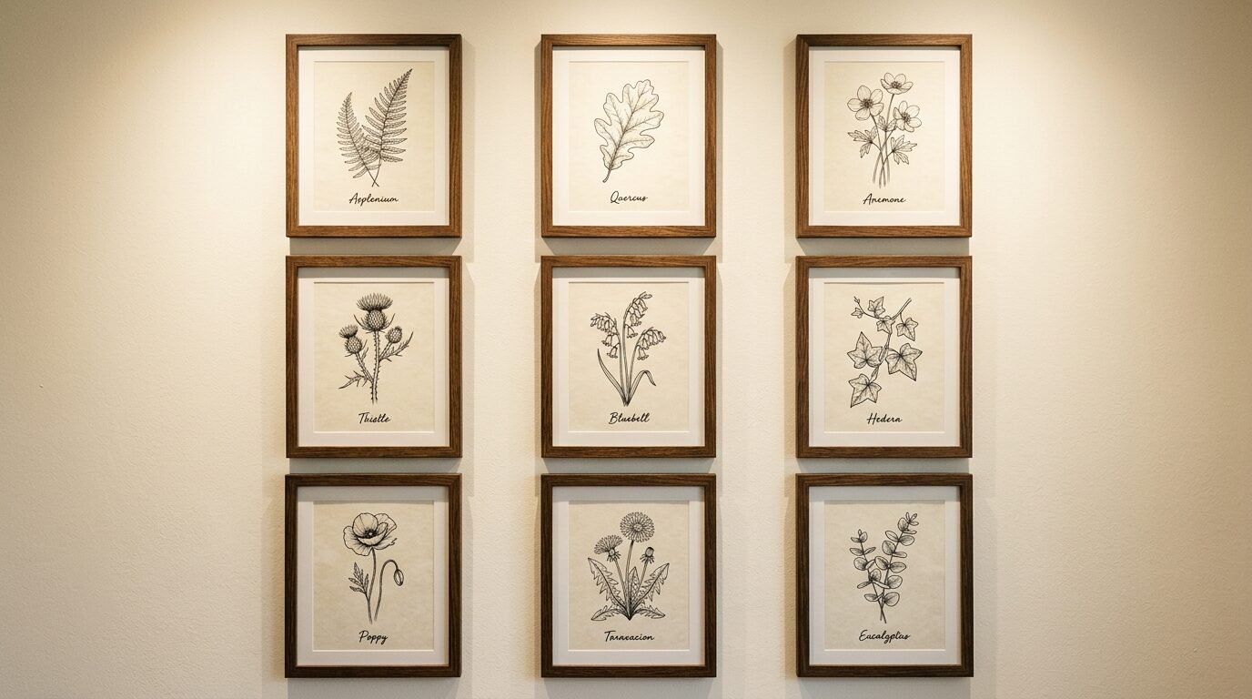
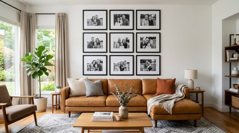
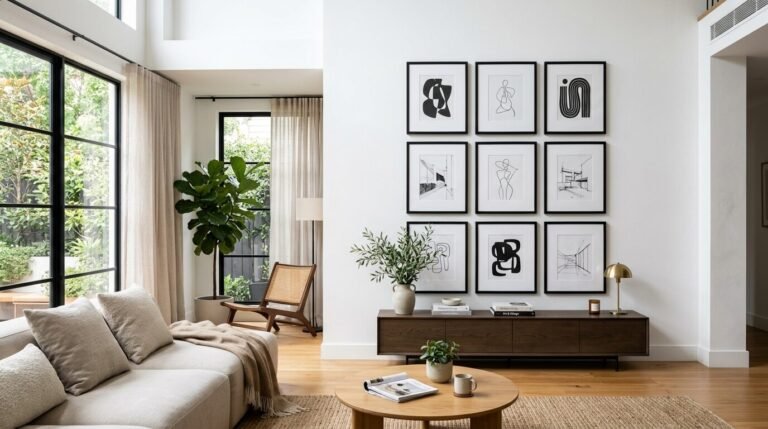
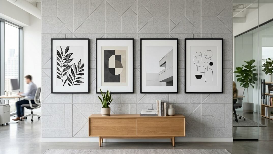
A symmetrical wall is all about balance. Think of it as a perfect grid. You use the same frames. You use the same sizes. The spacing between each frame is exactly the same. This style creates a strong Room Focal Point. It feels calm. It feels organized. It works perfectly in a Classic Interior.
I used this style in my own dining room. I used nine black frames in a three by three grid. The art was simple black and white botanicals. Every time I walk in I feel a sense of peace. The lines lead the eye across the room. It makes the ceiling feel higher. If you have a formal space this is your best bet.
Why Symmetrical Walls Work
Symmetrical walls work because our brains love patterns. Humans look for order. When we see a perfect grid we feel safe. This style is great for a series of photos. Maybe you have six photos from a beach trip. Or maybe you have four vintage maps. Putting them in matching frames makes them look like one big piece of art.
You need to be very careful with your tape measure here. If one frame is off by half an inch you will notice it. I suggest using a laser level. Bosch makes a great one for home projects. It projects a red line on your wall. This keeps your rows straight.
Best Frames for Symmetrical Layouts
Stick to one brand and one color. IKEA Ribba frames are a classic choice. They are cheap and look clean. West Elm also has a Gallery Frame set that works well. Pottery Barn offers wood frames that feel a bit more high end.
Make sure the mats are the same color too. Pure white mats look modern. Cream mats look better in a Casual Home. I prefer the look of a thick white mat. It gives the art room to breathe.
Understanding Salon Style Gallery Walls
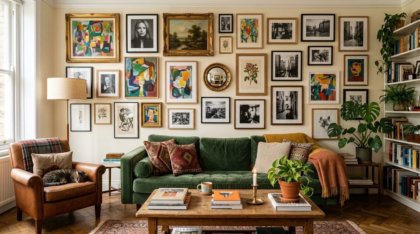
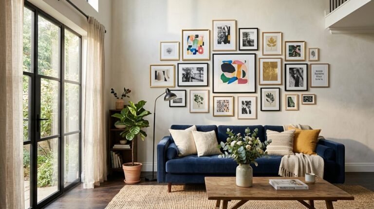
Salon style is the opposite of a grid. It is a mix of sizes. It is a mix of frame colors. It often includes objects like clocks or mirrors. This style comes from 17th century Paris. Art was hung from floor to ceiling. It feels lived in. It feels collected over time.
In my experience this style is harder to get right. It requires a good eye for balance. You are not looking for symmetry. You are looking for weight. A large dark frame on the left needs a few smaller light frames on the right. It should feel organic.
When to Choose Salon Style
Pick this if you have a Casual Home. It is perfect for a living room where you spend your time. It tells a story. You can include your kids’ drawings. You can include a vintage key you found at a flea market.
I saw this work beautifully on a large Textured Wall in a loft. The owner mixed oil paintings with modern prints. It hid the bumps in the wall. The varied heights of the art made the whole room feel more interesting.
Mixing Your Wall Accents Decor
Do not just use frames. Add some Wall Accents Decor to the mix. A small brass mirror adds light. A wooden bowl or a flat basket adds texture. These pieces break up the straight edges of the frames.
I love using small shelves within a salon wall. You can place a tiny plant on the shelf. This brings life to the wall. Target has a line called Threshold that makes great small shelves. They are easy to install and very sturdy.
Finding Your Room Focal Point
Every room needs a center. We call this the Room Focal Point. It is the first place your eyes land. Usually this is above a sofa or a fireplace. Your gallery wall should be that center.
If your wall is the first thing people see when they walk in you want it to be bold. A symmetrical grid over a sofa looks very professional. A salon wall in a hallway feels like an invitation to stop and look.
Height Matters Most
The biggest mistake I see is hanging art too high. I call it the “floating art” problem. You want the center of the gallery to be at eye level. This is usually 57 to 60 inches from the floor.
If you are hanging art over a sofa leave 6 to 8 inches of space between the bottom frame and the top of the sofa. This connects the art to the furniture. It makes the room feel like one unit.
Scaling Your Art to the Room
A tiny gallery on a giant wall looks lost. A giant gallery in a tiny room feels cramped. You need to find the right scale. I recommend filling about two thirds to three fourths of the space above your furniture.
If you have a very long wall try a horizontal salon layout. It mimics the line of the floor. If you have high ceilings use a tall symmetrical grid. This uses the Wall Spaces effectively.
Dealing with Specialized Wall Spaces
Some parts of the house are harder to decorate. Stair Walls are a prime example. The floor is slanted. The ceiling height changes. It can be a nightmare to plan.
Mastering Stair Walls
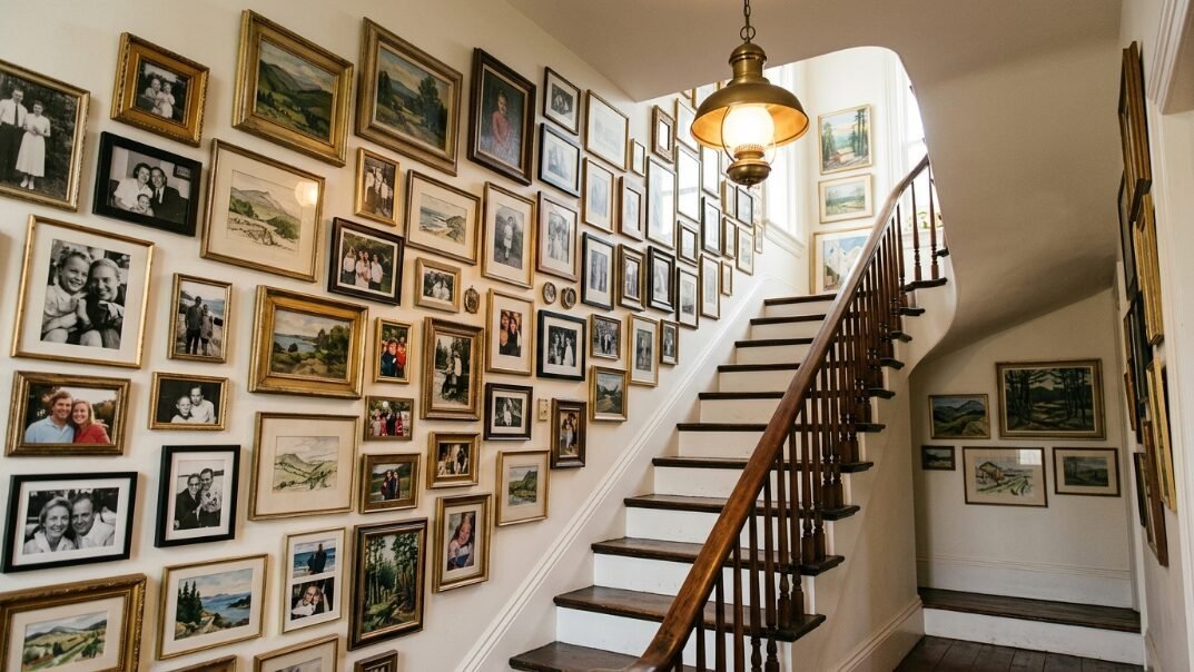
For Stair Walls I always suggest a salon style. Trying to do a grid on a staircase is very difficult. Instead follow the angle of the stairs. Pick a line that is 5 feet above each step. Use that as your imaginary center line.
I once helped a friend with her stairs. We used all black and white photos but in different sized frames. We started at the bottom and worked our way up. It turned a boring transition space into a walk through memory lane.
Working with Textured Walls
A Textured Wall can be tricky. Standard sticky hooks often fail on bumps. You might need to use nails or screws. If the texture is very heavy consider using Textured Wall Panels.
These panels can create a smooth surface for your art. Or they can be the art itself. Some people use 3D panels to create a grid pattern. Then they hang art inside the panels. It looks very high end.
Essential Tools and Brands for Success
You need the right gear to do this right. Do not just use a hammer and hope for the best. I have a kit I bring to every job.
My Top Tool Recommendations
- Command Strips: These are a life saver for renters. They leave no holes. Get the “Picture Hanging” versions. They work like Velcro. I use them for almost every Casual Home project.
- Bosch Laser Level: This keeps your lines perfect. It is worth the money if you are doing a symmetrical grid.
- Hangman Picture Hanging Kit: These use a bracket system. They are great for heavy mirrors or large frames. They ensure the art stays level forever.
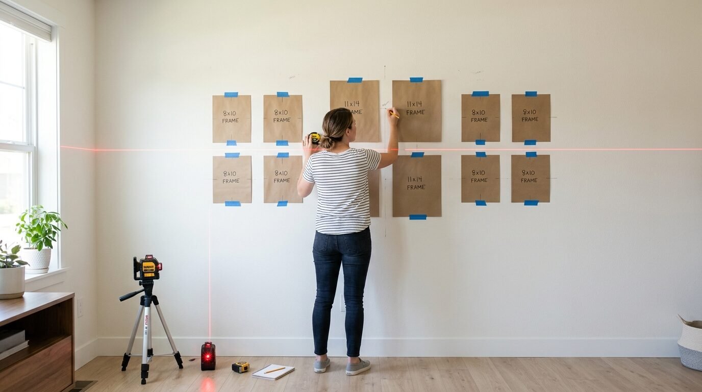
- Kraft Paper: Buy a roll of brown paper. Trace your frames on it. Cut them out. Tape them to the wall first. This lets you see the layout before you make a hole.
Brand Review: Where to Buy
- Framebridge: They are pricey but amazing. You send them your art and they frame it perfectly. Their “Gallery Wall” sets are great for beginners.
- Minted: This is the best place for unique art. It supports independent artists. Their frames are high quality.
- Art.com: Good for classic prints. Their framing service is fast.
- Society6: Great for modern and trendy art. Their prices are very fair for a Casual Home budget.
- Michaels: Go here for basic frames. They always have coupons. Their “Belmont” line is a solid choice for a salon wall.
Step by Step Guide to Your Layout
I have a process that works every time. I call it the “Floor First” method. It saves your walls from extra holes.
Planning the Symmetrical Grid
- Measure your wall space. Write down the width and height.
- Mark the center point. This is your anchor.
- Lay your frames on the floor. Use a measuring tape to ensure the gaps are even. Two inches between frames is usually best.
- Transfer to paper. Trace each frame on kraft paper.
- Tape paper to the wall. Use a level. Adjust until it looks perfect.
- Hammer through the paper. This marks the exact spot for your nail.
Planning the Salon Style
- Start with your largest piece. This is your “anchor.” Place it slightly off center.
- Add your second largest piece. Put it on the opposite side to balance the weight.
- Fill in the gaps. Use smaller frames and Wall Accents Decor.
- Keep spacing consistent. Even in a messy layout keep about 2 to 3 inches between everything. This makes the “mess” look intentional.
- Take a photo. Look at the photo on your phone. It is easier to see balance issues in a photo than in person.
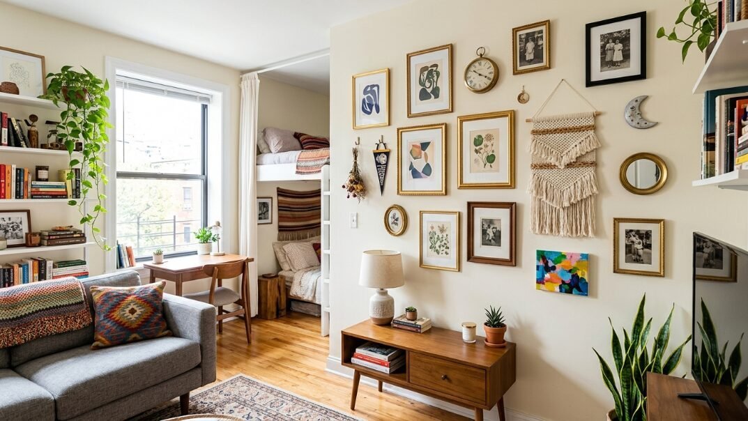
Case Study: The Small Apartment Win

I helped a client named Sarah in her tiny studio. She had one wall that had to do everything. It was her living room and her office. We used a salon style gallery wall to define the space.
We used light wood frames to keep it airy. We mixed in a few small mirrors. This made the small room feel much bigger. We used a large map as the Room Focal Point. It gave the wall a purpose. Sarah told me later that her friends always comment on that wall first. It turned a plain white box into a personal sanctuary.
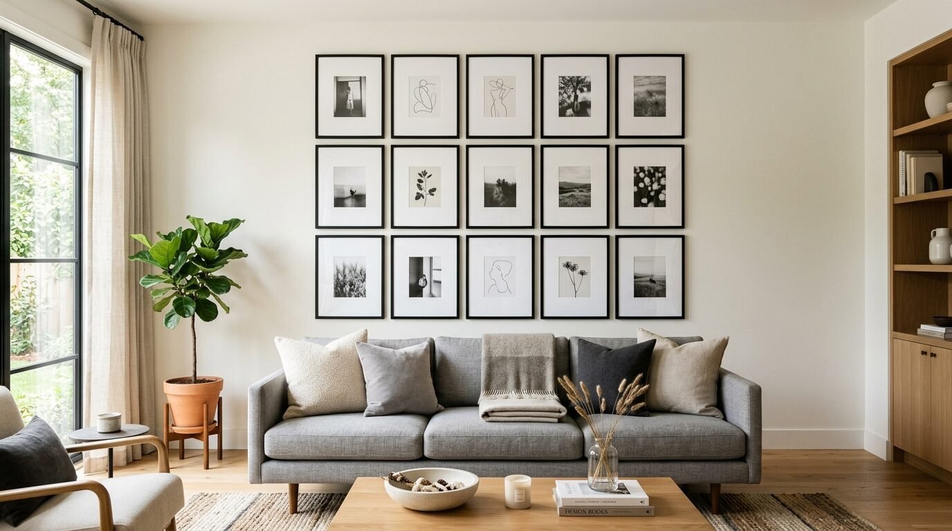
Case Study: The Classic Dining Room
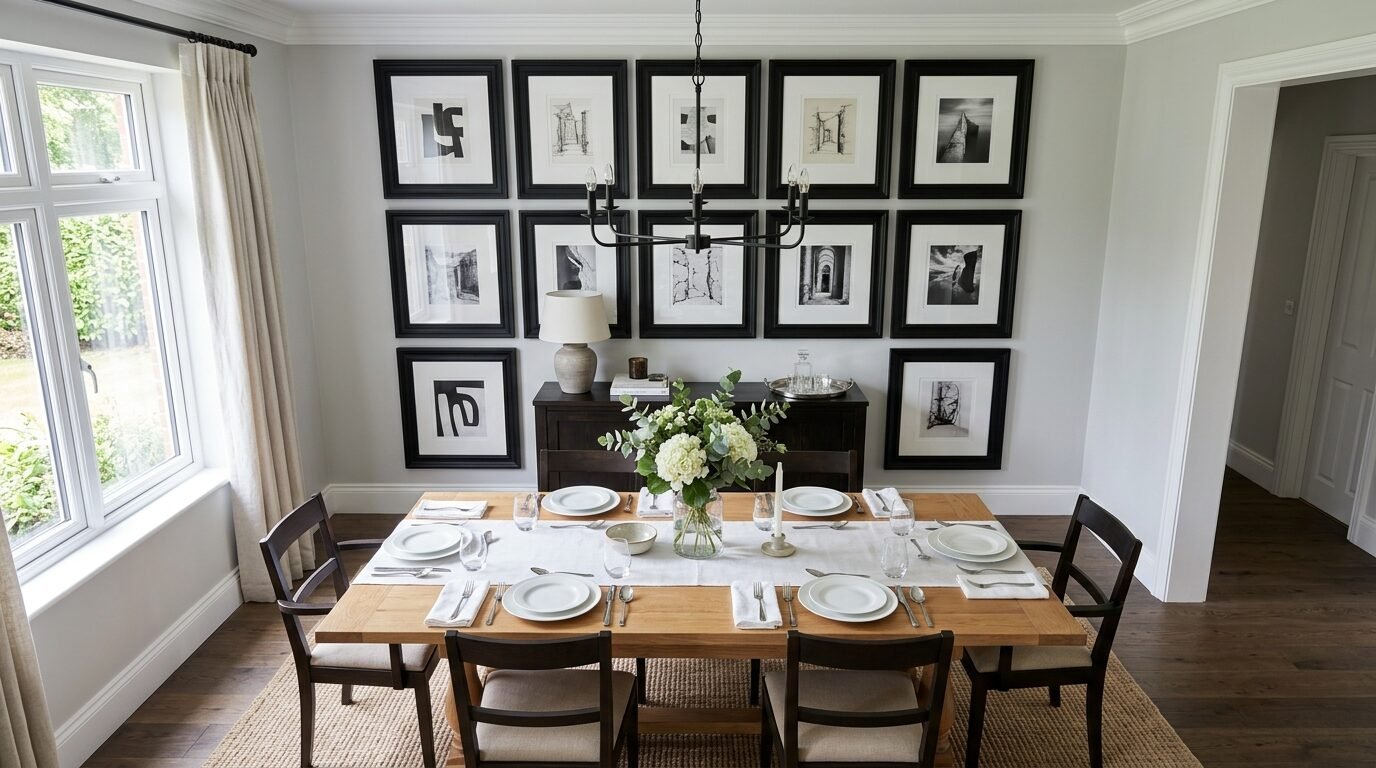
A local business owner wanted a Classic Interior feel for his home office. He had a collection of architectural drawings. We went with a strict symmetrical grid.
We used twelve black frames in two rows of six. The wall was painted a dark navy. The white mats popped against the dark paint. It looked like a high end gallery. The order and precision reflected his personality. It gave the room a sense of authority and calm.
Frequently Asked Questions
How do I hang art on a brick wall?
You will need a masonry drill bit and wall anchors. Do not try to nail directly into the brick. It will crack. Or you can use special “brick clips” that grab onto the edges of the bricks. These are great because they do not require drilling.
Can I mix gold and silver frames?
Yes. Mixing metals is a great way to add interest to a salon wall. I suggest having at least two of each. If you only have one gold frame it might look like a mistake. If you have three it looks like a choice.
What if my wall is huge?
For very large Wall Spaces think big. Use larger frames. Small frames will look like polka dots from a distance. You can also use a large piece of furniture like a sideboard to “ground” the gallery.
How do I handle a Textured Wall?
If your wall has a heavy “popcorn” or “knockdown” texture Command Strips might not stick well. In this case use traditional nails. If you are worried about the look consider adding Textured Wall Panels first. They can create a flat surface for your art while adding a new design layer to the room.
Is salon style still in trend?
Yes. Salon walls are timeless because they are personal. Trends change but your memories do not. People are moving away from sterile homes. They want homes that feel cozy and “lived in.” A salon wall is the best way to get that look.
How often should I update my gallery wall?
A salon wall is easy to update. You can swap one photo for another. You can add a new piece to the edge. A symmetrical grid is harder to change. If you change one frame you usually have to change them all. If you like to change things often go with the salon style.
What is the best gap between frames?
For a grid I suggest 2 inches. For a salon wall you can go up to 3 or 4 inches. Just keep the gaps somewhat consistent. If one gap is 1 inch and another is 6 inches it will look disjointed.
Should I use glass or acrylic?
Glass is cheaper but heavy. It can also break. Acrylic is light and safe for Stair Walls where people might bump into it. However acrylic can scratch easily. I prefer glass for formal rooms and acrylic for high traffic areas.
The Bottom Line
Your home should make you happy. Whether you choose a perfect grid or a wild mix does not matter as much as the content. Use photos that make you smile. Use art that inspires you.
Start small. You do not have to fill the whole wall today. Buy a few frames. Test some layouts on the floor. Use the tools I mentioned. Soon you will have a wall that looks like it belongs on Pinterest. You will have a Room Focal Point that tells your story.
I have seen people wait years to hang their art because they are afraid of making a mistake. Do not wait. A hole in the wall is easy to fix. A blank life is much harder. Grab your tape measure and get started.

Anya Castellan is the Founder and Editor-in-Chief of Home Wall Trends. An art history graduate of the Rhode Island School of Design with twelve years of experience writing for leading American design publications, she specializes in composition, gallery wall theory, and the quiet architecture of domestic space. A former contributing editor at Architectural Digest and guest lecturer at Parsons School of Design, Anya personally reads and signs off on every piece before it is published.