Your living room looks empty. You have boxes of old photos and art sitting in the closet. Last year, I stood in my hallway with a hammer and a single nail, feeling stuck. I wanted that high-end look I saw on Pinterest. My first attempt was a total mess. I put ten holes in the wall before I realized I had no plan. It took me a full Saturday of patching and painting to fix it. That mistake taught me the right way to work. Now, my home feels like a personal museum. You can transform your space in just two days without the stress I felt. This guide shows you exactly how to do it.
Building a display of art and memories should feel fun. It is about your story. You do not need a degree in design. You only need a few tools and a clear path. This weekend, you will turn a blank surface into the soul of your home. We will cover everything from picking the right wall to the final nail. You will avoid the crooked frames and messy layouts that ruin the look. Let us start this project together.
1. Pick the Best Wall Space for Your Project
The first step is choosing where your art will live. Not every wall is a good candidate for a large display. In my experience, a focal point works best. Look for the wall that your eyes hit first when you walk into a room. This is often the space above a sofa or a bed. I once tried to put a large display in a narrow, dark hallway. It felt cramped and hard to see. Now, I suggest choosing a spot with good natural light. Light makes your photos pop.
Check the surface of your wall. Drywall is easy to work with. Brick or plaster requires special drill bits. If you are a renter, you might want a wall where you can use sticky strips. I saw a friend try to nail into a concrete wall without a masonry bit. The nail bent and the art fell within an hour. Avoid that frustration. Measure your space twice. Write the numbers down on a piece of paper. You need to know if you have five feet of width or ten.
Think about the furniture nearby. Your display should feel connected to the items around it. A gallery wall should not float too high or too low. It needs to sit about six to ten inches above your furniture. This creates a balanced look. If the wall is too large, the art might look lost. If the art is too large, the room feels small. Finding the middle ground is the secret to a great home.
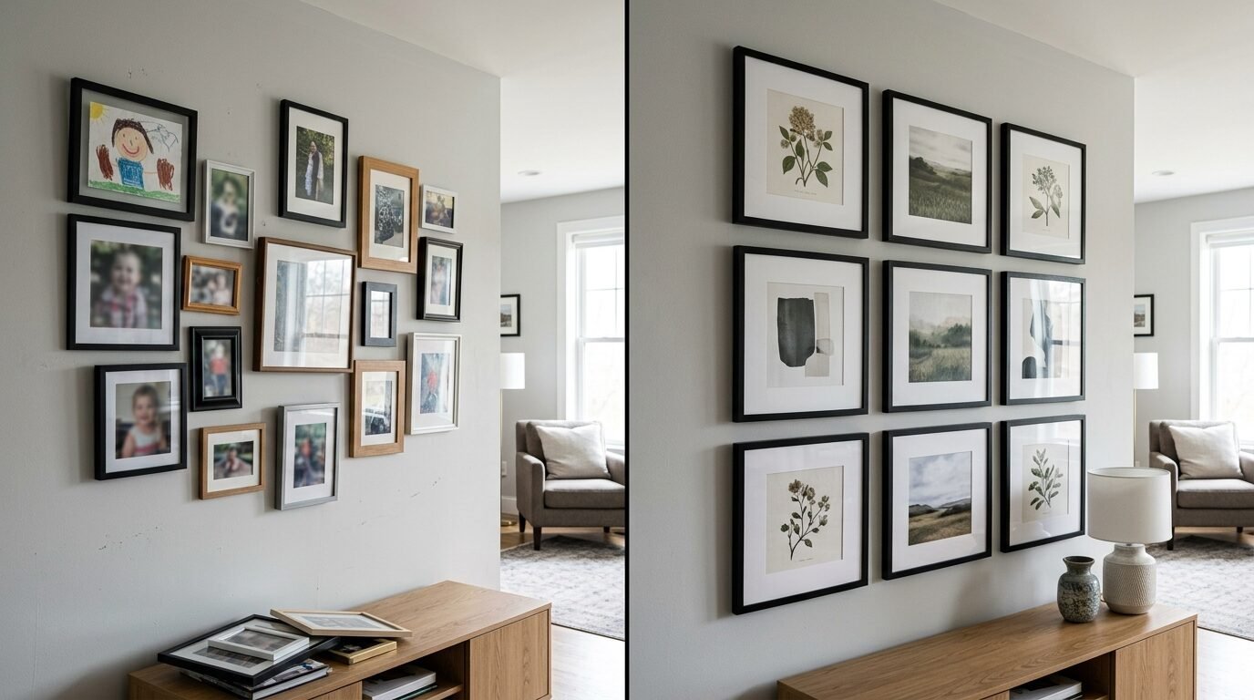
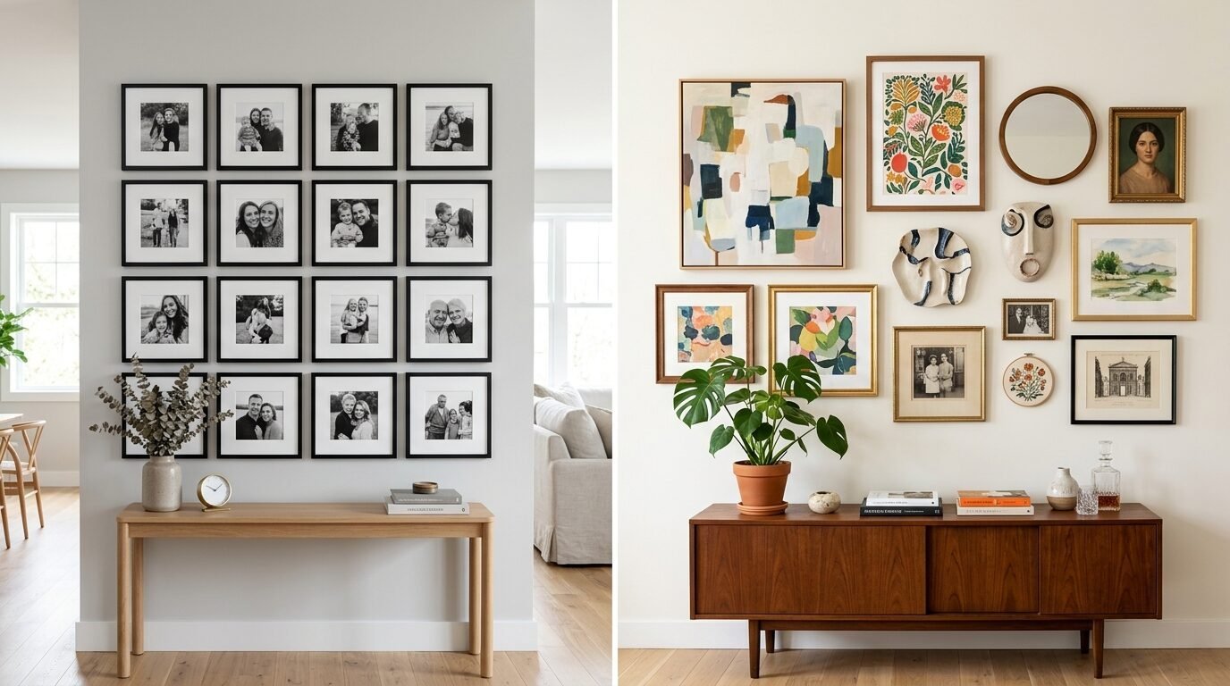
2. Group Your Art and Photos by a Common Theme
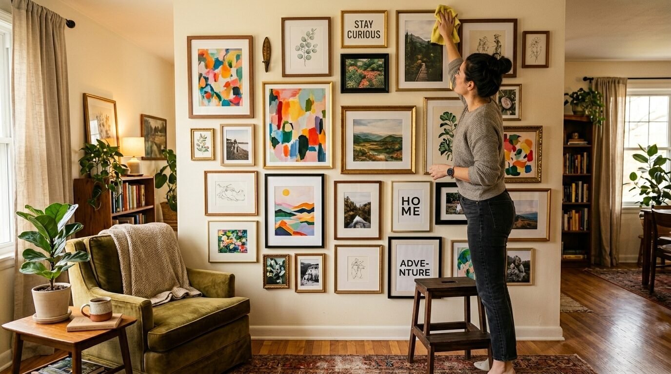
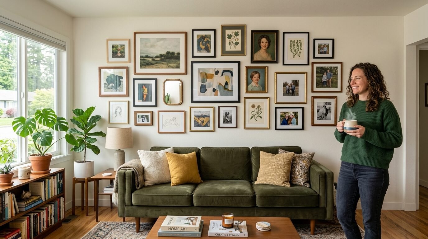
A random pile of pictures often looks messy. You need a thread that ties everything together. I have noticed that the most successful walls use a theme. You might choose black and white family photos. Perhaps you love colorful travel prints from your trips. In my home, I mixed old sketches with modern paintings. This creates a look that feels curated over time. It tells a story of who you are.
Start by laying all your pieces on the floor. Look for colors that match. If you have a bright blue print, try to find another piece with a hint of blue. You can also tie items together using the same color of mats. White mats are a safe choice for a clean look. I once used black mats for every photo, and it gave the room a bold, moody vibe. It changed the entire mood of my study.
Do not be afraid to mix sizes. A wall of only small frames can look cluttered. A wall of only huge frames can feel heavy. I like to have one or two large anchor pieces. These are the stars of the show. Then, I fill in the gaps with smaller items. You can even include objects that are not flat. I once hung a vintage brass key next to a photo of my first apartment. It added texture and a personal touch that guests always notice.
3. Buy Your Picture Frames Early
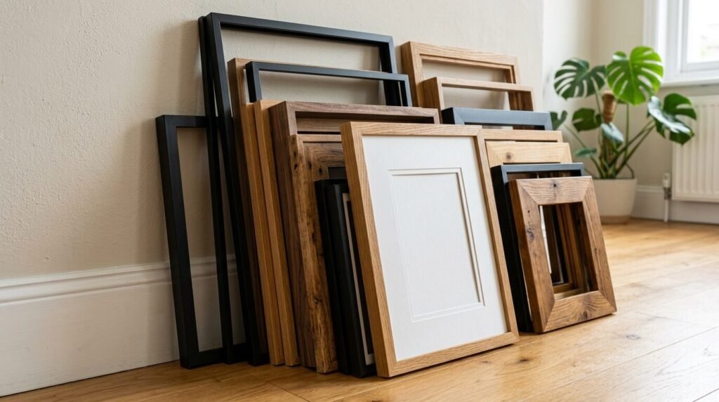
Frames are the bones of your display. You should have them all ready before you start. I often see people buy art and then wait months to find frames. This kills the momentum of your weekend project. You can find affordable options at stores like IKEA or Target. The IKEA Ribba line is a classic choice for many. It is cheap and looks modern. If you want something more classic, Target has the Threshold brand which often features wood tones.
If you want a polished look, consider custom framing for your most prized pieces. Stores like Framebridge allow you to mail in your art. They send it back ready to hang. It costs more but the quality is high. For the rest of your wall, mix in thrift store finds. I love hunting for vintage frames at local garage sales. I usually spray paint them a single color like matte black or gold. This makes mismatched frames look like a matched set.
Check the back of each frame. Some have wires and some have hooks. This matters when you start hanging. In my experience, using the same type of hanging hardware makes the job faster. I prefer frames with sturdy wires. They are easier to level. If you buy cheap frames, make sure the glass is clean. I once hung a whole wall only to see fingerprints on the inside of the glass. I had to take every single one down. Clean them first.
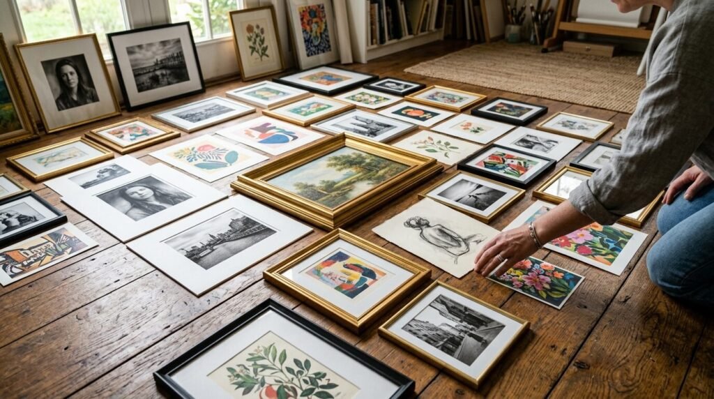
4. Use Your Flooring as a Draft Space
Never start by putting nails in the wall. This is a rule I live by now. Use your flooring to plan your layout first. Clear a space on the ground that is the same size as your wall. I use blue painter’s tape to mark the boundaries on the carpet or hardwood. This gives you a safe place to play with ideas. You can move pieces around without making any permanent mistakes.
Start with your largest piece in the center. I usually place it slightly off-center for a more organic feel. Then, build outward. Keep the gaps between frames consistent. I suggest a gap of two to three inches. If the gaps are too wide, the wall looks disconnected. If they are too tight, it looks cramped. I use a small block of wood as a spacer to keep every frame even. This creates a very tidy and professional result.
Take a photo of your layout on the floor. Look at the photo on your phone screen. Sometimes, seeing it in a small picture helps you spot weird gaps or clashing colors. I did this during my last project and noticed two red photos were right next to each other. I swapped one out for a green print, and the whole balance felt better. Spend time here. This is where the magic happens. Your flooring is your best friend in this process.
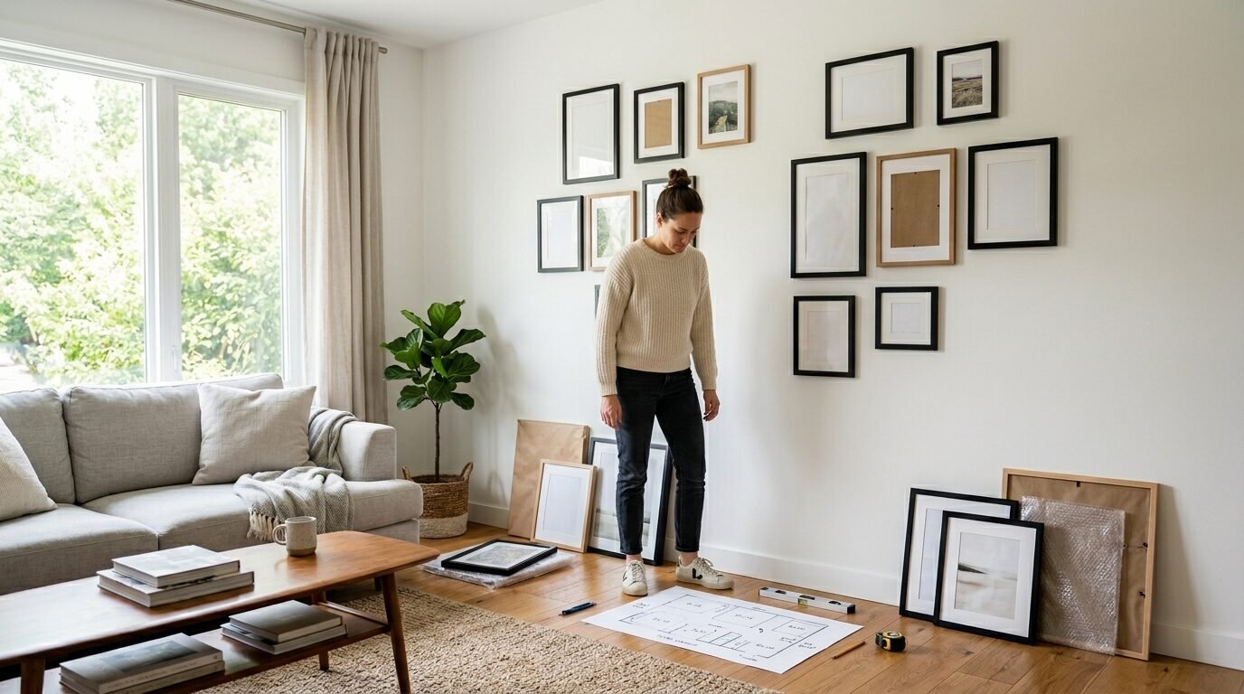
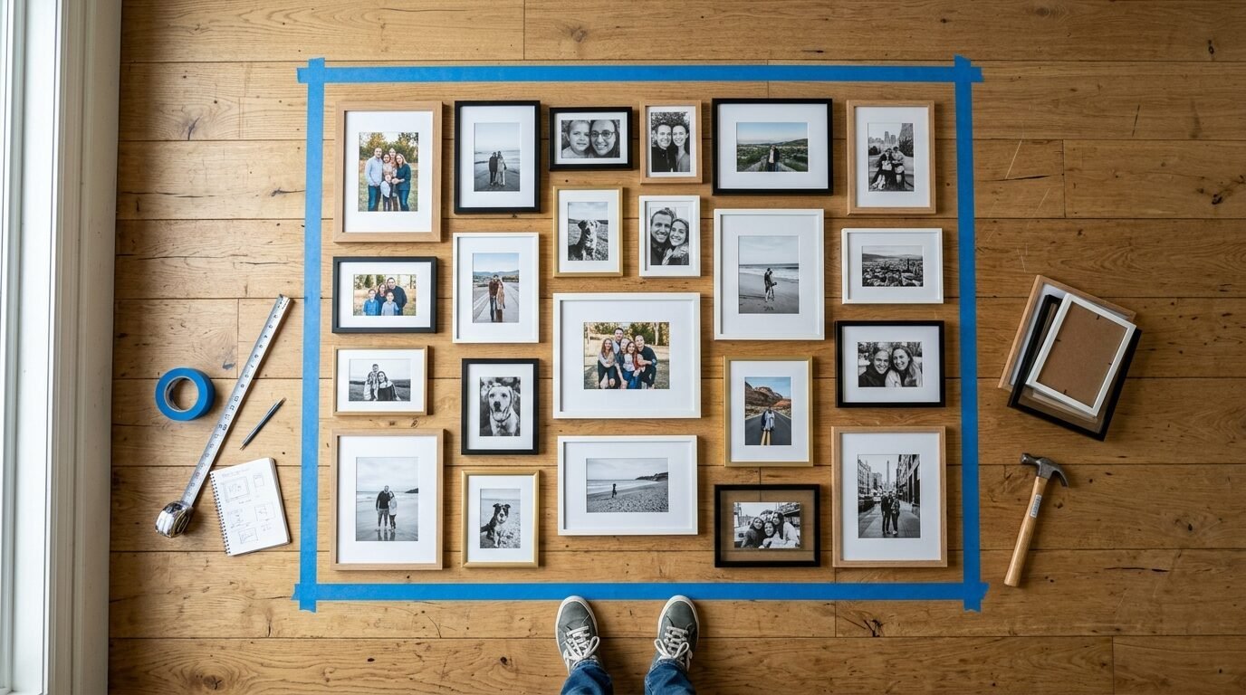
5. Map Out Your Layout with Paper Templates
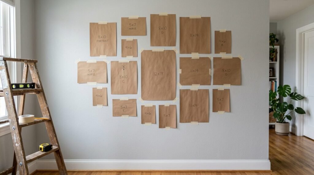
Once you love your floor layout, move it to the wall using paper. I use rolls of brown kraft paper or even old newspapers. Trace every frame onto the paper and cut it out. Mark the spot where the nail goes on each paper template. This step takes about an hour but it saves you hours of repair work later. I have seen many people skip this and regret it. It is the most important part of how to plan your wall.
Tape these paper templates to your wall using painter’s tape. This tape will not peel your paint. Now you can see exactly how the art will look in your space. Walk around the room. Sit on your sofa. See if the height feels right. I once realized my layout was six inches too high after seeing the paper. I moved the templates down easily. If I had used nails, I would have been very upset.
This is the time to be picky. Move the papers until the arrangement feels perfect. You can leave them up for a few hours to see how the light hits them. In my experience, the paper method is the only way to get a perfectly straight and balanced display. It gives you total confidence before you pick up the hammer. You are now ready for the actual work of hanging your memories.
6. Gather the Right Hanging Tools
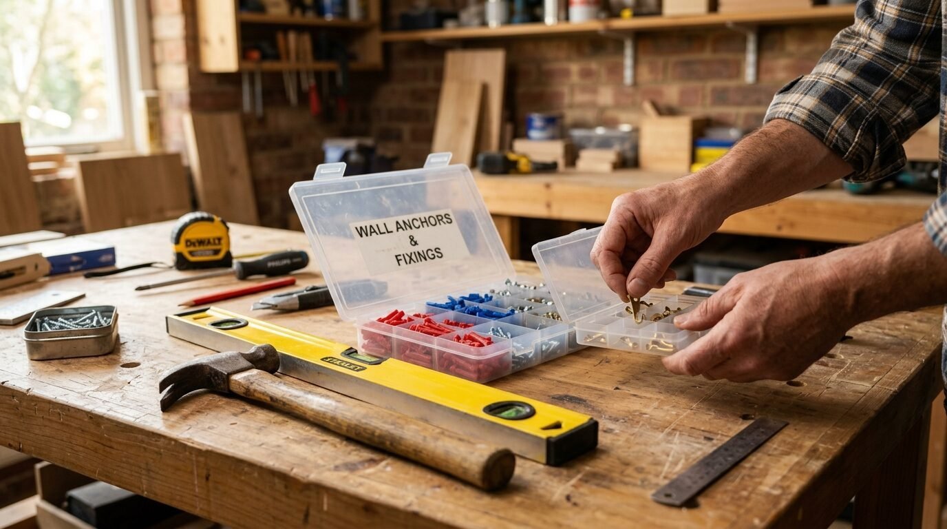
A good project needs the right gear. You do not need a massive toolbox. You need a hammer, a level, and a pencil. I also highly suggest a stud finder. If you are hanging a heavy frame, you must hit a stud or use a wall anchor. I once had a heavy mirror fall because I just used a small nail in the drywall. It shattered and left a huge hole. Now, I always use anchors for anything over five pounds.
Command strips are a great option for light frames. They are perfect for renters or people who change their minds often. I use the velcro style strips. They allow you to adjust the frame slightly if it is crooked. For heavier items, use picture hanging hooks. They are designed to hold weight at an angle. This keeps the nail from pulling out of the wall. I keep a small kit of various hooks in my drawer at all times.
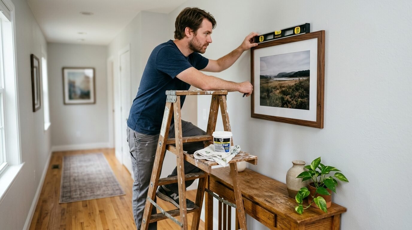
A level is your most used tool. Do not guess. Even a tiny tilt will drive you crazy over time. I use a long physical level, but you can also use an app on your phone. If you are working alone, a laser level is a great investment. It shoots a straight line across the wall. I used one for a grid layout last month and it made the job ten times faster. It ensures a polished look that looks like a pro did it.
7. Start Hanging from the Center Outward
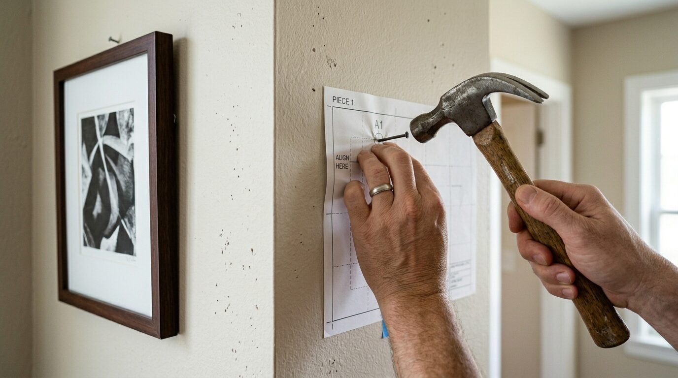
The big moment is here. Start with the center piece of your paper layout. Poke the nail right through the paper where you marked the hanging point. Once the nail is in, pull the paper off the wall. This leaves the nail in the perfect spot. Hang your first frame and check it with your level. If the first one is straight, the rest will follow. This is the anchor for your entire gallery wall.
Work your way out to the sides. I usually hang the top row first, then the bottom. This helps me keep the horizontal lines straight. If you are mixing many sizes, just go one by one from the middle. Stop after every three frames and step back. Look at the wall from across the room. Sometimes things look different when they are actually hanging. I have noticed that frames can shift slightly as you work.
If you are using wires, the frame might tilt forward. You can fix this by putting small rubber bumpers on the bottom corners of the frame. This also prevents the frame from marking your wall. I buy these in bulk at the hardware store. They keep the art stable and straight. Take your time with each nail. Speed leads to mistakes. A calm pace ensures your weekend project ends with a smile rather than a headache.
8. Fix Common Mistakes Without Stress
Mistakes happen to everyone. I have done this many times and I still get things wrong. If a frame is crooked, check the wire. Sometimes the wire is not centered on the back. You can move the hook on the back of the frame slightly to fix it. If you have an extra hole in the wall, do not panic. A tiny bit of spackle and a dab of paint will hide it. I keep a small jar of my wall paint in the garage just for these moments.
If the wall feels too busy, try removing one or two pieces. Sometimes less is more. I once had fifteen items on a small wall and it felt like the walls were closing in. I took out three small frames and the whole room breathed better. If the colors feel off, consider changing one print to a black and white version. This often calms down a chaotic display. Balance is about how your eyes move across the wall.
Check the spacing again. If one gap is four inches and the rest are two, your brain will notice. Use your spacer block to check the distance between frames. If one is off, move the nail. It is worth the extra five minutes to get it right. I have seen people live with crooked art for years because they were too tired to move a nail. Fix it now so you can enjoy it later. Your future self will thank you.
9. Keep Your Wall Looking Great Long Term
A gallery wall is a living thing. You can update it as your life changes. I like to swap out photos every year. I keep the frames in the same spot but put in new memories. This keeps the home feeling fresh. If you use a standard size for your picture frames, swapping art is easy. I stick to common sizes like 8×10 or 11×14 for this reason. Custom framing is beautiful but hard to change.
Dust your frames every month. Dust builds up on the top edges and makes the art look dull. I use a soft microfiber cloth to keep the glass clear. Avoid spraying cleaner directly on the glass. The liquid can seep into the edges and ruin your art. Spray the cloth first, then wipe. I learned this the hard way with a vintage map that got a water stain. It was a sad day for my decor.
Check the levels every few months. Doors slamming or kids running can cause frames to shift. If you used the rubber bumpers I mentioned, they should stay put. If not, just give them a quick nudge. A gallery wall should always look intentional. When guests come over, they will see a wall that is cared for. It shows that you value your home and the stories on your walls. This project is a long term investment in your happiness.
10. Frequently Asked Questions
How do I choose the right height for my art?
Most people hang art too high. You want the center of the display to be at eye level. For most adults, this is about 57 to 60 inches from the flooring. If you are hanging it above a sofa, leave about six to eight inches of space above the back of the couch. This keeps the art connected to the furniture. I once hung a wall way too high in my dining room. It felt like the art was trying to escape to the ceiling.
Can I mix different colors of frames?
Yes, you can. Mixing wood, black, and gold frames creates a collected look. I suggest keeping the style of the frames similar if the colors are different. For example, use all thin modern frames even if some are oak and some are black. This creates a cohesive feel without being too matching. I have seen this work well in eclectic homes where personality is the main goal. It feels more human and less like a store display.
What if I have a small budget for art?
You do not need expensive paintings. I use postcards, fabric scraps, and even cool wrapping paper. I once framed a set of vintage botanical illustrations I found in a cheap book. They look amazing and cost almost nothing. You can also print high-resolution photos from your phone at a local shop. Digital art files are also available online for a low price. You can print them at home or at a print shop.
How do I handle a staircase wall?
Staircases are tricky because the floor is slanted. The best way is to follow the angle of the stairs. Keep the bottom of the frames at a consistent height from each step. This creates a diagonal line that feels natural. I used the paper template method on my stairs last summer. It was the only way to make sure the art didn’t look like it was sliding down the wall. It takes more time but the result is stunning.
Is it okay to use only one size of frame?
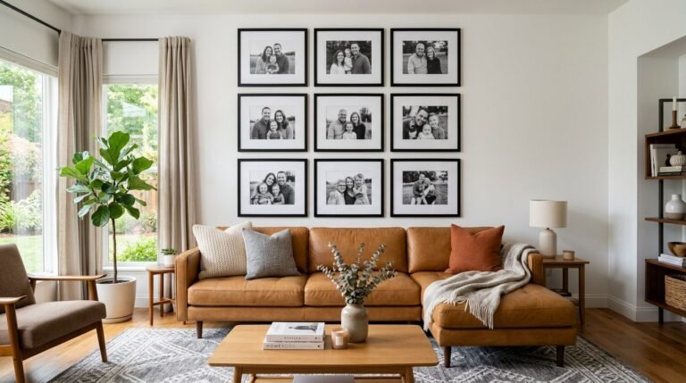
A grid layout uses only one size and it looks very clean. This is great for a more formal room like a dining area or an office. I love a grid of nine frames in a three by three square. It looks very organized and professional. If you do this, your measurements must be exact. Even a quarter inch off will be visible. Use a ruler and a level for every single nail in a grid.
What tools are best for heavy frames?
For heavy items, use toggle bolts or heavy-duty anchors. These spread the weight behind the drywall. If you can find a stud, a long screw is your best bet. I always weigh my frames before I hang them. Anything over ten pounds gets a serious anchor. I never trust a single small nail with a heavy piece of glass. Safety is just as important as style when you are working on your home.
How do I plan a wall that can grow?
If you want to add more pieces later, use an organic layout. This means you do not have a hard border around the art. You can just add new pieces to the edges as you get them. I started my bedroom wall with five photos. Over two years, it grew to twelve. Because the layout was not a strict square, the new pieces fit right in. It feels like a growing history of my life.
Final Thoughts
You have reached the end of the steps. By now, you should feel ready to tackle your wall. This weekend is the perfect time to stop looking at those empty spaces and start creating. Remember to take your time and trust the paper templates. Your home is a reflection of you. Every photo and every frame tells a part of your journey. I have seen how a simple gallery wall can change the way a person feels about their house. It turns a building into a home.
I am excited for you to see the result. When you finish, step back and take a breath. You did the work. You followed the plan. Now you get to enjoy the view every single day. If you found this guide helpful, share it with a friend who is also staring at a blank wall. Let us fill our homes with beauty and memories. Happy hanging.

Anya Castellan is the Founder and Editor-in-Chief of Home Wall Trends. An art history graduate of the Rhode Island School of Design with twelve years of experience writing for leading American design publications, she specializes in composition, gallery wall theory, and the quiet architecture of domestic space. A former contributing editor at Architectural Digest and guest lecturer at Parsons School of Design, Anya personally reads and signs off on every piece before it is published.