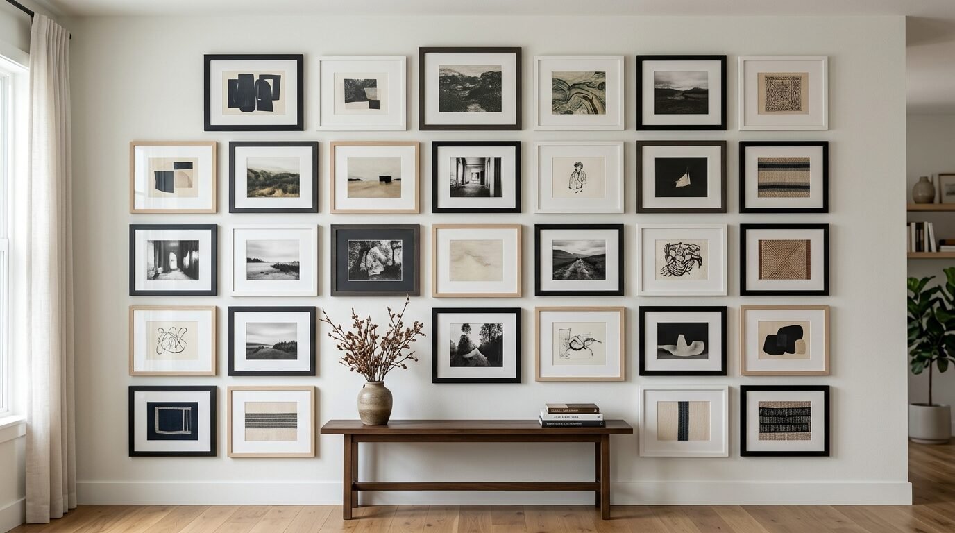
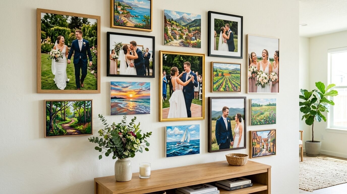
Last Tuesday I stood in my living room surrounded by twenty mismatched frames. Some were sleek black metal from a modern shop. Others were ornate gold pieces I found at a local estate sale. My floor was a sea of glass and wood. I felt that familiar wave of panic. Every Pinterest board makes this look easy. In reality, it feels like a high stakes puzzle where the prize is a wall that doesn’t make you dizzy.
In my experience, the biggest mistake people make is trying to be too perfect. We think every frame needs to match. We think the spacing needs to be calculated by a mathematician. I have tried that approach. It usually looks cold and stiff. The secret to a gallery wall that feels like a home and not a museum is a balance of variety and repetition. You want your eyes to move across the wall without getting stuck on one weird spot.
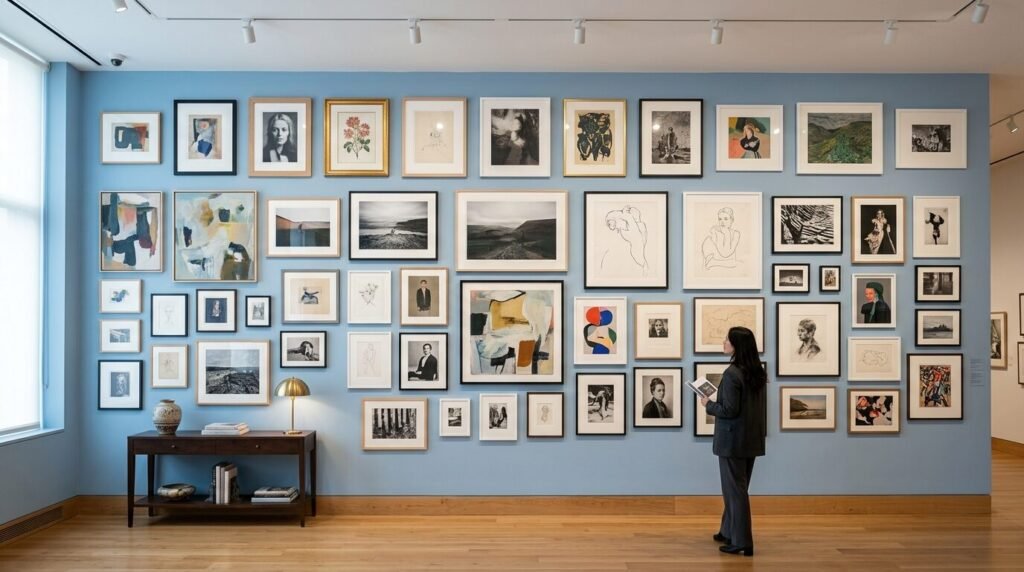
How to mix frame sizes and colors without looking cluttered is the most common question I get from friends moving into new homes. I have seen beautiful collections of thrift store art gallery wall finds ruined by poor spacing. I have also seen cheap plastic frames look like a million dollars because the layout was smart. This guide covers everything I have learned about gallery wall styling over ten years of decorating.
15 Ideas for Perfect Gallery Wall Styling
1. Start With a Large Anchor Piece
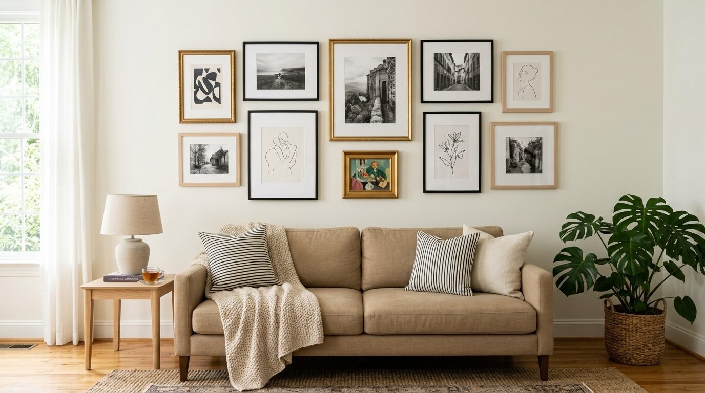
Every successful wall needs a leader. I call this the anchor piece. In my experience, choosing one large frame to act as the focal point prevents the wall from feeling like a swarm of bees. This piece should be at least twenty percent larger than the others. I usually place it slightly off center to create a more natural look.
When you have an anchor, the smaller frames have a job. Their job is to support the main star. This creates an immediate sense of order. I once tried a wall with ten small frames of the exact same size. It felt chaotic. The eye did not know where to land. By swapping one small frame for a large landscape print, the whole wall settled down instantly. This is the first step in how to do gallery wall projects that actually work.
2. Use a Consistent Matte Color
If you want to mix wild frame colors, you need a common thread. The matte is that thread. I always recommend using the same color matte for every single piece of art. High quality white or off white mattes create a clean border. This border acts as a visual break between the art and the frame.
I have seen this work with thrifted art gallery wall finds that have different wood tones. The white matte ties the dark mahogany to the light pine. It provides a professional look that mimics a high end gallery. If you use different colored mattes, the wall starts to look like a scrapbook. Stick to one matte color to keep things sophisticated.
3. Limit Your Color Palette to Three Tones
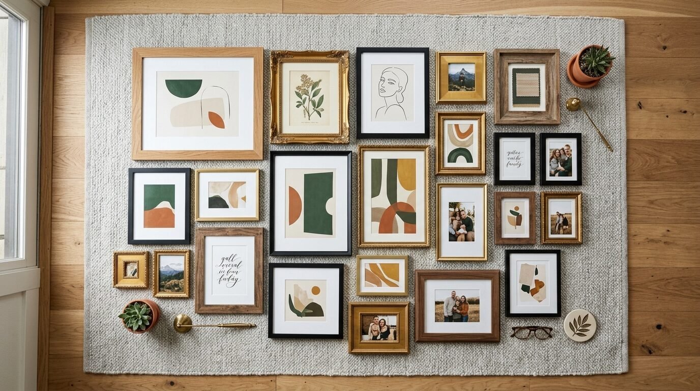
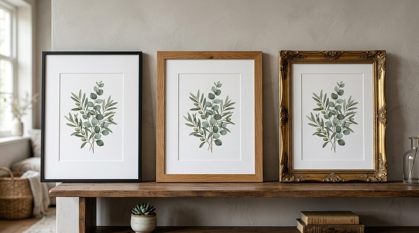
Mixing every color in the rainbow is a recipe for clutter. I follow a simple rule of three. Pick three frame finishes and stick to them. For example, I love mixing matte black, warm wood, and brushed gold. These three work together because they offer contrast without clashing.
In my experience, black frames provide the structure. Wood frames provide the warmth. Gold frames provide the sparkle. If you add a red frame and a blue frame, the balance breaks. I’ve noticed that when I stick to three tones, the different sizes feel intentional. It looks like a curated collection rather than a random pile of stuff.
4. Maintain Two Inch Spacing
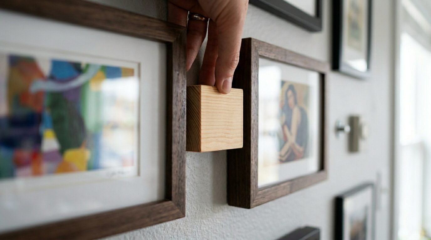
Spacing is where most people lose the battle. If your frames are too far apart, they look like islands. If they are too close, they look like a mess. I found that a strict two inch gap between every frame is the sweet spot. It is wide enough to see the wall behind it but tight enough to feel like one unit.
I use a simple trick for this. I cut a piece of cardboard into a two inch square. I use that square as a physical spacer while I am hanging the art. This ensures the distance is the same horizontally and vertically. Consistent spacing is the most effective way to mix frame sizes and colors without looking cluttered.
5. Mix Your Frame Thicknesses
Size is not just about height and width. It is also about depth and width of the frame itself. I love putting a very thick, chunky wooden frame next to a thin, wire like black metal frame. This adds a layer of texture that flat walls lack.
I’ve seen this work best when the largest piece has a medium thickness. If the biggest frame is too thick, it feels heavy. If it is too thin, it feels flimsy. Mixing the profile of the frames makes the wall look like it grew over time. It suggests that you collected these pieces over years. That is the essence of good gallery wall styling.
6. Align the Bottom Edges of the Top Row
You do not need a perfect grid. However, you do need some straight lines. I usually try to keep the top edges of my highest frames aligned. Alternatively, I align the bottom edges of the lowest frames. This creates a “container” for the rest of the art.
Think of it like a box. The outer edges of your gallery wall should form a rough rectangle or square. Inside that box, the frames can be any size or color. This boundary prevents the art from looking like it is floating away. I once helped a friend who had frames scattered like stars. We just aligned the top row, and the room felt five times more organized.
7. Group by Art Style Rather Than Frame Style
If you have a very diverse set of frames, try to keep the art inside them similar. Maybe all the art is black and white photography. Maybe everything is a colorful abstract painting. When the art speaks the same language, the frames can be as loud as they want.
I’ve seen beautiful walls where the frames were all different sizes and colors, but every piece was a botanical sketch. The green and brown tones in the art unified the mismatched frames. This is a great tip for anyone working with a thrift store art gallery wall. The art provides the harmony that the frames lack.
8. Balance the Weight of Colors
Don’t put all your heavy black frames on one side. This makes the wall look like it is tipping over. I like to distribute my frame colors evenly across the layout. If I have three gold frames, I place them in a loose triangle pattern.
This visual weight is crucial. Light wood frames feel airy. Black frames feel heavy. By spreading the “heavy” colors around, the wall feels stable. I usually step back every few minutes during the layout phase to see if one side feels “louder” than the other. If it does, I swap a black frame for a wood one.
9. Include One Non-Art Element
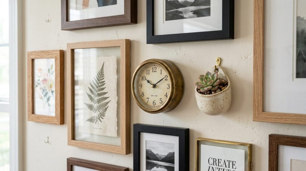
To break up the sea of rectangles, I often add a 3D object. This could be a small wooden clock, a brass sconce, or a ceramic wall planter. These items act as a “pattern interrupt” for the eye. They stop the grid from feeling too clinical.
In my experience, a round object works wonders. Most frames are square or rectangular. A round mirror or a woven basket softens the sharp corners. It makes the wall feel more like home decor and less like a retail display. Just make sure the object fits within your three color palette.
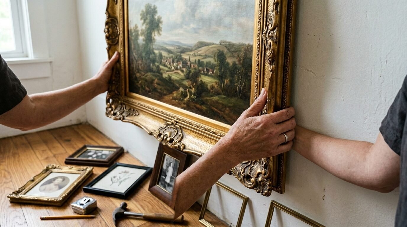
10. Use the Floor Test Method
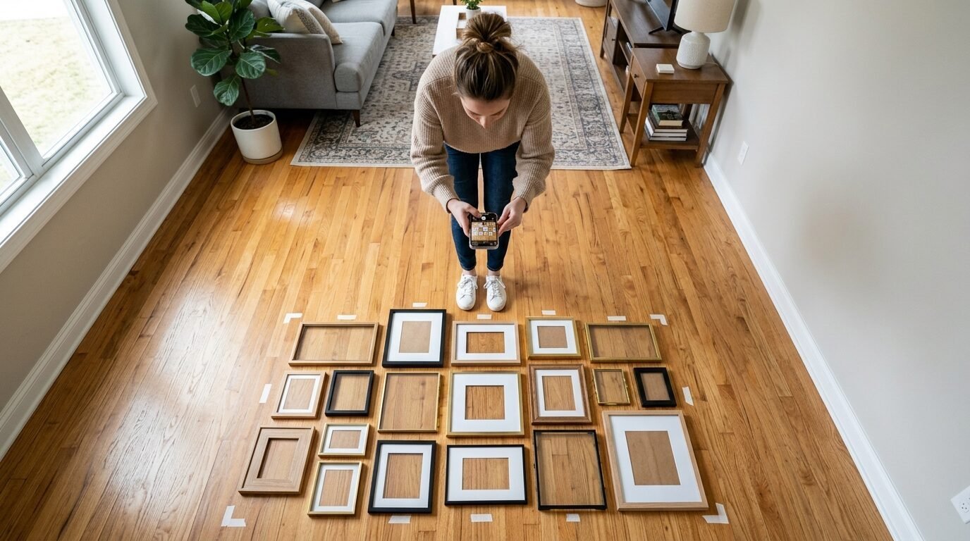
Never start with a nail. I always lay my entire gallery out on the floor first. I move pieces around like a game of Tetris until I am happy. I take a photo of the floor layout from a high angle. This photo becomes my map.
The floor test allows you to see how frame sizes and colors interact without damaging your drywall. I’ve noticed that what looks good in my head often looks crowded on the floor. It is much easier to swap a frame on the carpet than it is to patch a hole in the wall. This is a vital part of wall art arrangement tips for beginners.
11. Scale the Art to the Furniture
A tiny gallery wall over a huge sofa looks lost. A massive gallery wall over a small chair looks aggressive. I follow the two thirds rule. The total width of your gallery wall should be about two thirds the width of the furniture below it.
This creates a sense of proportion. If you are mixing frame sizes, the overall shape should still respect the furniture. I once saw a gallery wall that was wider than the sofa. It made the room feel cramped and the sofa look like a toy. Keep the art “held” by the furniture below it for a professional look.
12. Mix Horizontal and Vertical Orientations
Nothing looks more like a boring office than a row of identical vertical frames. To keep it fresh, I always mix landscape and portrait orientations. I like to tuck a small horizontal frame under the corner of a large vertical one.
This variation creates interesting “negative space” between the frames. It makes the arrangement feel more dynamic and less like a list. I’ve seen this work exceptionally well with thrifted art gallery wall finds. Often, you are stuck with whatever orientation you find. Embracing the mix is better than trying to force everything to be the same.
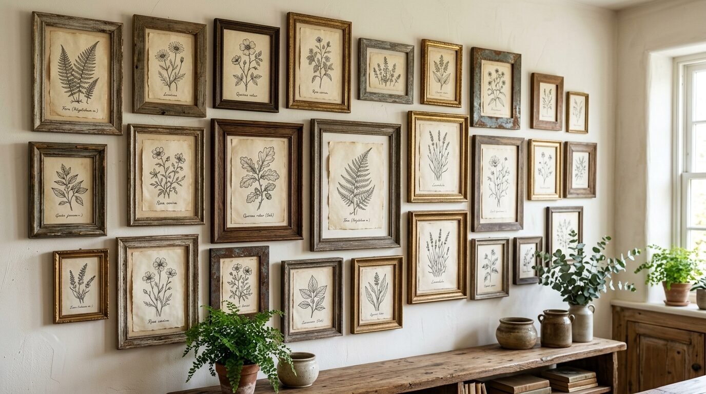
13. Incorporate Different Textures
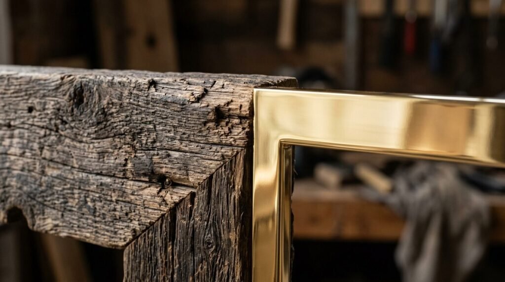
Color is one thing, but texture is another. A shiny lacquered frame looks very different from a rough, reclaimed wood frame. I love mixing these. The contrast between a smooth gold finish and a grainy oak finish adds depth.
Texture helps the wall feel “collected” over time. If every frame has the same high gloss finish, they can look cheap. By adding some matte or textured finishes, you elevate the whole look. I often look for frames with interesting ridges or carved details at thrift stores to add this variety.
14. Pay Attention to the Subject Matter Scale
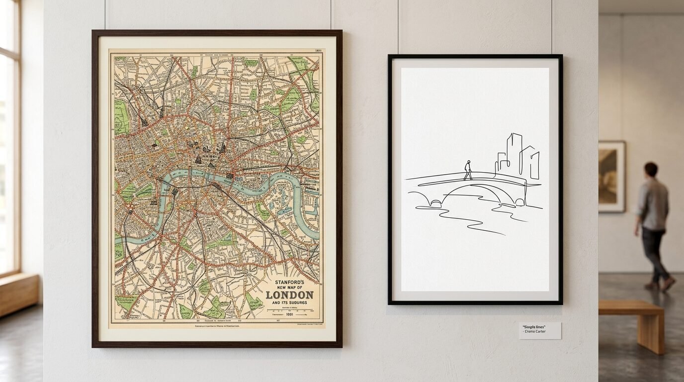
If you have a frame with a very busy, detailed drawing, put a frame with a simple, minimalist print next to it. This gives the eye a place to rest. If every piece of art is busy, the wall will look cluttered regardless of the frames.
I have seen this work in my own home. I had a wall of family photos that felt overwhelming. I swapped two photos for simple line drawings. The whole wall felt lighter immediately. The frames stayed the same, but the visual “noise” went down. Balance the complexity of the art to keep the wall peaceful.
15. Use Painter’s Tape Templates
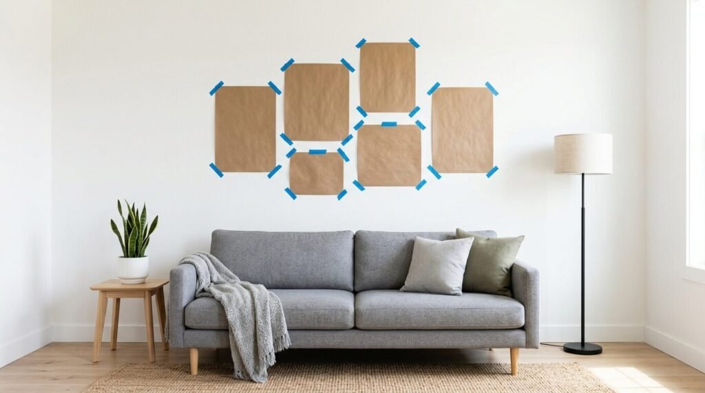
Once the floor layout is done, I trace each frame onto brown craft paper and cut it out. I tape these paper templates to the wall using blue painter’s tape. This allows me to see the exact gallery wall placement ideas in real life.
I can walk around the room and see if the heights feel right. I can check if the colors of the frames (which I write on the paper) feel balanced. This step takes an extra thirty minutes, but it prevents the “cluttered” feeling 100% of the time. You can adjust the paper templates until the flow is perfect.
Why Traditional Wall Art Arrangement Tips Often Fail
Many people follow old rules that say all art must be at eye level. This works for one piece of art. It does not work for a gallery. If you put the center of every frame at eye level, you get a wavy line that looks like a heartbeat monitor. It is distracting and messy.
Another common failure is ignoring the “weight” of the frames. Traditional tips often forget that a thick black frame carries more visual weight than a thin silver one. If you place a heavy frame on the outer edge, it pulls the eye away from the center. You need to build from the inside out. Start with your anchor and grow the wall organically.
Essential Tools for How To Do Gallery Wall Projects
Before you start, gather your supplies. You do not want to be halfway through a project and realize you are missing a level.
| Tool | Purpose | My Recommendation |
| Command Strips | Hanging without holes | Great for renters or light frames |
| Laser Level | Keeping lines straight | Essential for the top row alignment |
| Painter’s Tape | Mapping the wall | Use the blue kind to save your paint |
| Hammer and Nails | Permanent hanging | Use small finishing nails for less damage |
| Measuring Tape | Ensuring 2 inch gaps | I prefer a metal tape for accuracy |
| Blue Tack | Keeping frames level | Put a tiny bit on the bottom corners |
In my experience, the laser level is the best investment you can make. It projects a straight line across the whole wall. It makes the “aligning the top row” step much easier. I also swear by Command Strips for thrift store art gallery wall pieces. Often, those old frames are light enough that you don’t need a nail.
Gallery Wall Placement Ideas for Different Rooms
The room dictates the style. A bedroom gallery should feel calm. A hallway gallery can be more energetic.
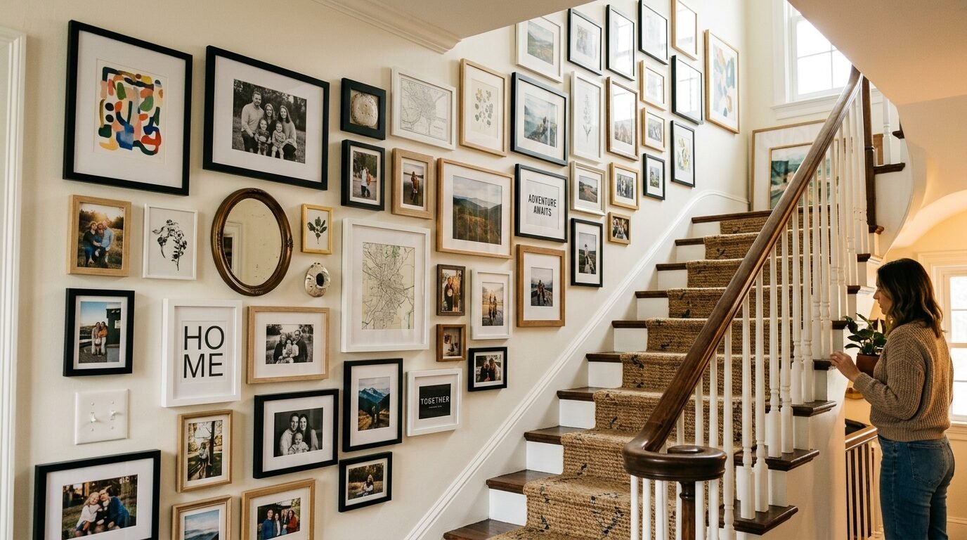
The Staircase Gallery
Staircases are tricky because the floor is slanted. I follow the “stair step” method here. I align the bottom of the frames with the angle of the stairs. I keep the frames about 60 inches above each individual step. This creates a diagonal line that feels natural as you walk up.
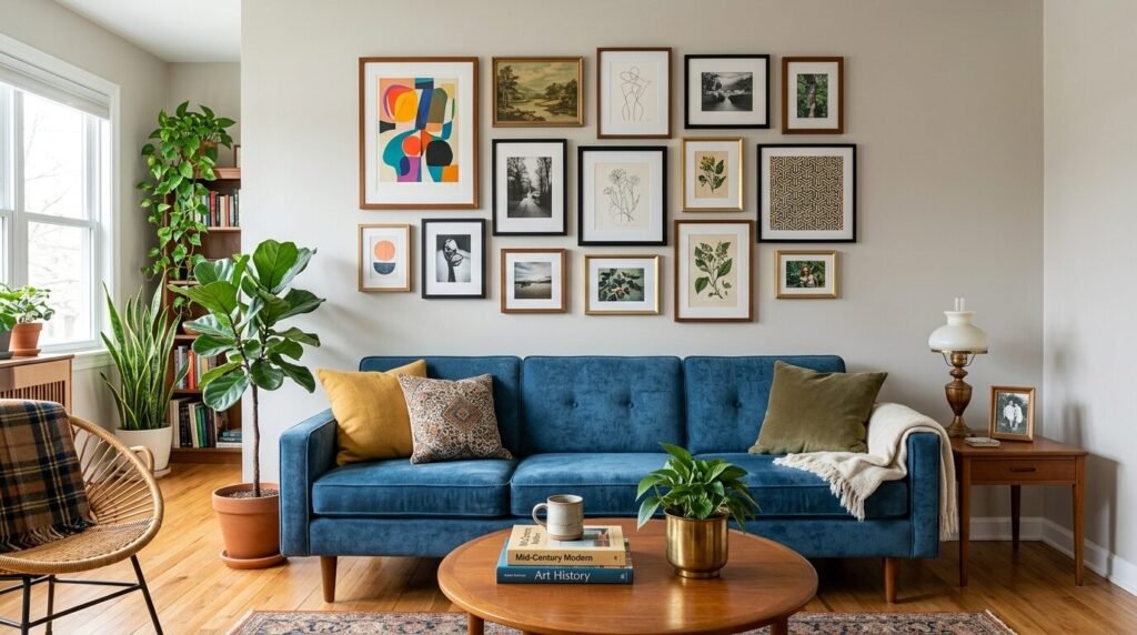
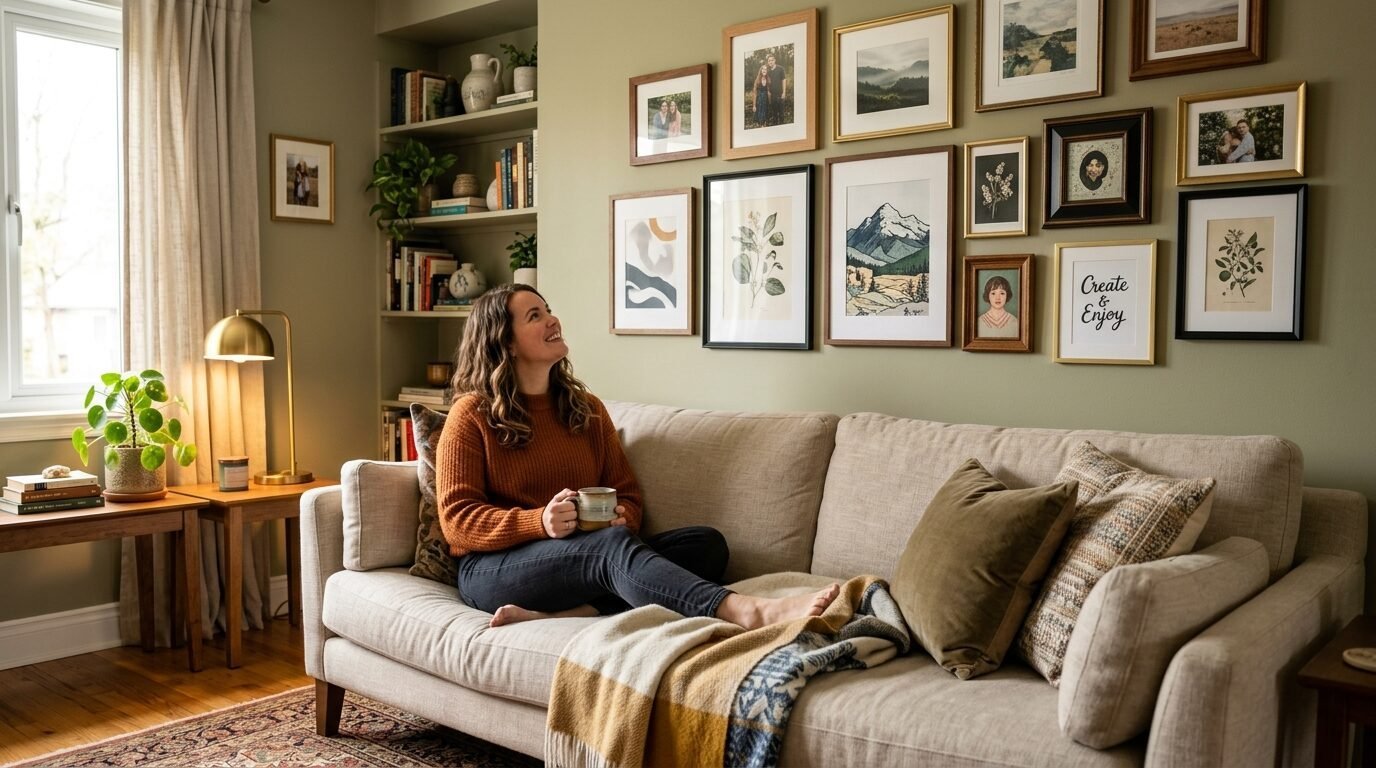
The Living Room Sofa
This is the most popular spot. I’ve seen this work best when the bottom of the lowest frame is 8 to 10 inches above the back of the sofa. This is high enough that people won’t hit their heads but low enough to feel connected to the furniture.
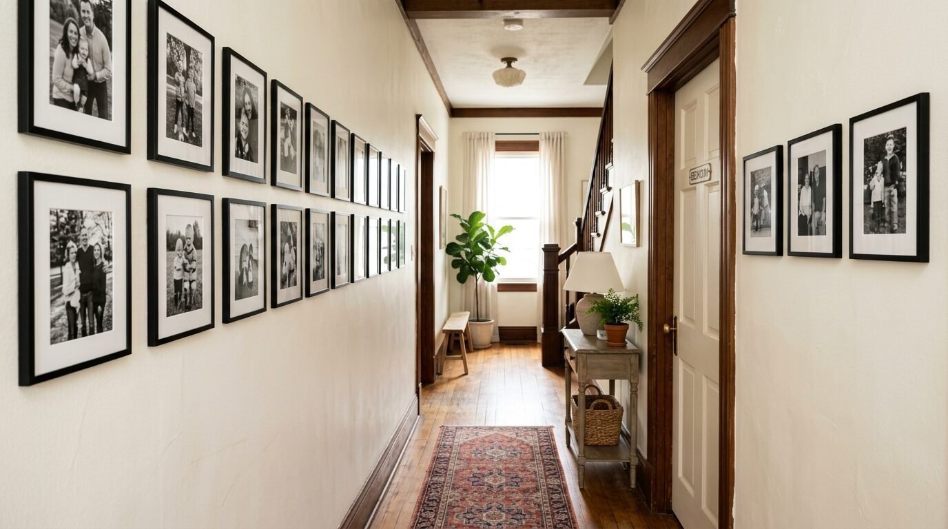
The Narrow Hallway
In a hallway, you are viewing the art from a close distance. Use smaller frames and more detailed art here. I avoid thick, chunky frames in narrow halls because they can feel like they are “closing in” on you. Stick to thinner profiles and light colors to keep the space open.
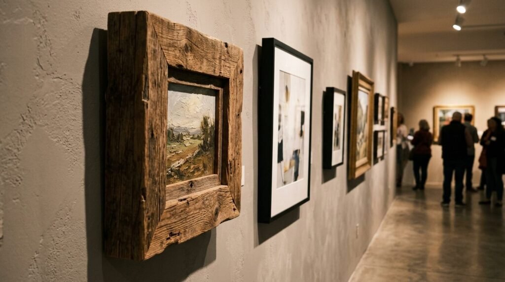
Comparing High-End Frames vs Thrift Store Art Gallery Wall Options
You do not need to spend thousands of dollars on custom framing. I have mixed IKEA frames with $2 finds from Goodwill, and nobody could tell the difference.
- Custom Framing: This is great for “forever” pieces. The glass is usually better and the mattes are acid free. I use this for my one anchor piece.
- Big Box Store Frames: Brands like Target or IKEA offer great consistency. If you want five identical black frames, this is the way to go.
- Thrifted Frames: This is where the character comes from. I look for unique shapes and real wood. I often toss the art inside and keep the frame. Just make sure the glass isn’t scratched.
In my experience, the best walls are a 50/50 mix. Use new frames for a clean foundation and thrifted frames for personality. This is how to mix frame sizes and colors without looking cluttered while staying on a budget.
Troubleshooting Common Gallery Wall Mistakes
The Wall Looks Too Small
If your gallery wall looks like a tiny postage stamp on a big wall, add more pieces. You can also increase the spacing to three inches. Another trick is to add a larger matte to your existing frames. This makes the overall footprint bigger.
The Colors Feel Chaotic
If you realized you used too many colors, don’t panic. You don’t have to buy new frames. I’ve seen great results from spray painting a few frames. If you have a random silver frame that doesn’t fit, spray it matte black. This instantly brings it back into your three color palette.
Frames Keep Shifting
It is frustrating when frames go crooked every time someone shuts a door. I use a tiny piece of museum wax or Blue Tack on the bottom corners of every frame. This “locks” them into place. It keeps your two inch gaps perfect forever.
Frequently Asked Questions about Gallery Wall Styling
How many frames should I start with?
I recommend starting with at least five to seven pieces. Anything less feels like a small cluster rather than a gallery. You can always add more over time, but five gives you enough variety to create a “shape” on the wall.
Can I mix black and white photos with color art?
Yes. In my experience, this works best if you keep the frames consistent. If the art is a mix of color and black and white, try using all black frames. This provides a uniform border that lets the different art styles live together peacefully.
Should I use glass or acrylic?
Glass is cheaper and doesn’t scratch as easily, but it is heavy. Acrylic is lightweight and safer for high traffic areas like hallways or kids’ rooms. I’ve noticed that acrylic can have a static charge that attracts dust, so keep a microfiber cloth handy.
How do I hang a gallery wall in a rental?
Command Strips are your best friend. I have used them for years in apartments. Just make sure to check the weight limit on the package. For very heavy frames, you might need a small nail, but most gallery wall pieces are light enough for adhesive.
What is the best height for a gallery wall?
The “center” of the whole gallery should be around 57 to 60 inches from the floor. This is standard eye level. However, if the gallery is over a sofa or table, prioritize the relationship with the furniture over the floor measurement.
Summary of Gallery Wall Placement Strategies
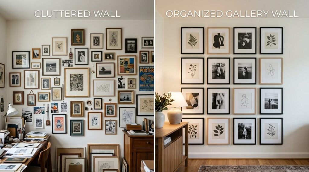
Creating a gallery wall is about managing the “visual noise.” You want enough variety to be interesting but enough repetition to be calm. Start with your anchor piece. Use a consistent matte color. Limit yourself to three frame finishes. Stick to two inch spacing.
I have seen people transform their homes just by organizing their art. It is the most cost effective way to add personality to a room. Whether you are using high end art or a thrift store art gallery wall, the rules are the same. Balance the weight, align the edges, and trust the floor test.
Conclusion
Mixing frame sizes and colors does not have to be stressful. I have spent many afternoons measuring and re-measuring, and I can tell you that the mistakes are part of the process. Your home should reflect your life, and lives are often a bit mismatched. By using a few structural rules, you can turn that mismatch into a masterpiece.
If you are feeling overwhelmed, just start with three frames. Hang them, live with them, and add more next month. There is no rule saying a gallery wall must be finished in one day. My favorite wall in my house took two years to complete. I found the perfect gold frame at a flea market in Maine and the final black frame at a shop down the street. That history is what makes it special. Now, go grab some painter’s tape and start mapping out your space. You’ve got this.

Anya Castellan is the Founder and Editor-in-Chief of Home Wall Trends. An art history graduate of the Rhode Island School of Design with twelve years of experience writing for leading American design publications, she specializes in composition, gallery wall theory, and the quiet architecture of domestic space. A former contributing editor at Architectural Digest and guest lecturer at Parsons School of Design, Anya personally reads and signs off on every piece before it is published.