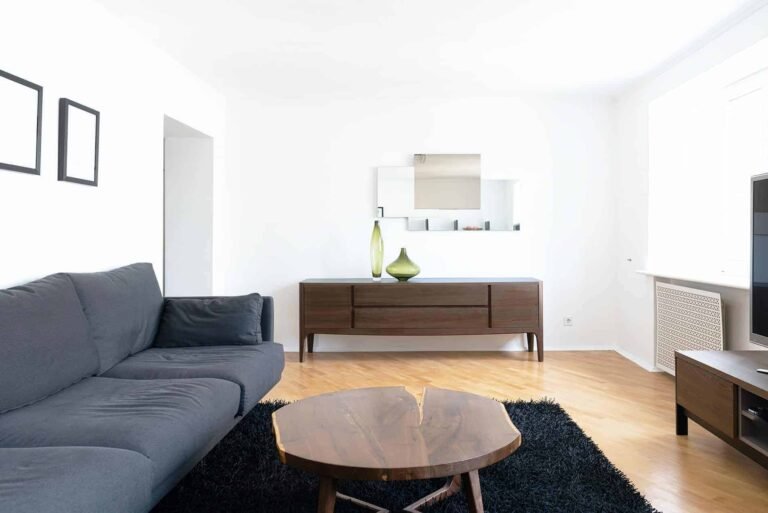
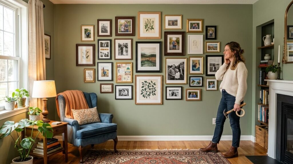
Staring at a blank white wall feels like looking at a math problem you cannot solve. I remember standing in my first apartment back in 2018 with a box of random photos and a hammer. I was terrified of making the first hole. I spent three hours moving frames around on the floor until my back ached. Most people feel this exact pressure. You want your living room to look like a Pinterest dream but you fear it will look like a messy accident. A mixed frame gallery wall is the answer to that fear. It thrives on imperfection. In my experience the best walls are the ones that grow over time. They tell a story of where you have been and what you love. You do not need a massive budget or a degree in interior design. You just need a few tricks to make different styles look cohesive. This guide breaks down twenty two real world ideas that work in actual homes. We will look at layouts that stay balanced without being boring. We will talk about mixing metals and woods. We will even cover how to add mirrors to create depth. By the time you finish reading you will feel ready to pick up that hammer.
1. The Thrift Store Gold Rush
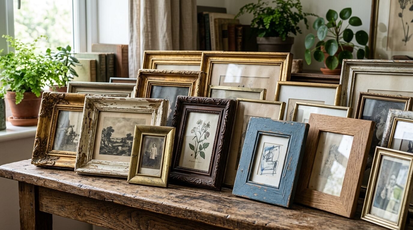
Thrifting is the secret weapon for a mixed frame gallery wall. I once found a solid wood frame for two dollars at a local yard sale. It was ugly and orange but a quick coat of black paint changed everything. When you shop at thrift stores look for shapes rather than colors. You might find an oval frame next to a thick rectangular one. This variety creates instant visual interest in a living room. Mix ornate heavy frames with thin modern ones. I suggest keeping the art inside similar if the frames are very different. For example use only black and white sketches. This keeps the look intentional rather than chaotic. I have seen this work best when you group five or six small finds around one large anchor piece. It makes your wall feel collected over years instead of bought in a single afternoon.
2. Blue and White Coastal Layers
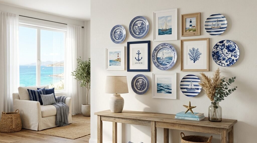
A blue and white gallery wall feels fresh and timeless. I noticed this trend exploding in coastal homes recently. You can mix navy blue frames with crisp white mats. This look works perfectly if you have travel gallery wall ideas involving beach trips or sailing. Try adding a few pieces of actual blue and white pottery like small plates or flat backed vases. In my experience white frames help the blue tones pop without making the room feel dark. I once helped a friend arrange a wall using old postcards from Greece and cyanotype prints. The result was calming and looked expensive. Use different textures like glossy ceramic and matte wood. This prevents the blue and white theme from feeling too flat.
3. Travel Gallery Wall Ideas with Maps
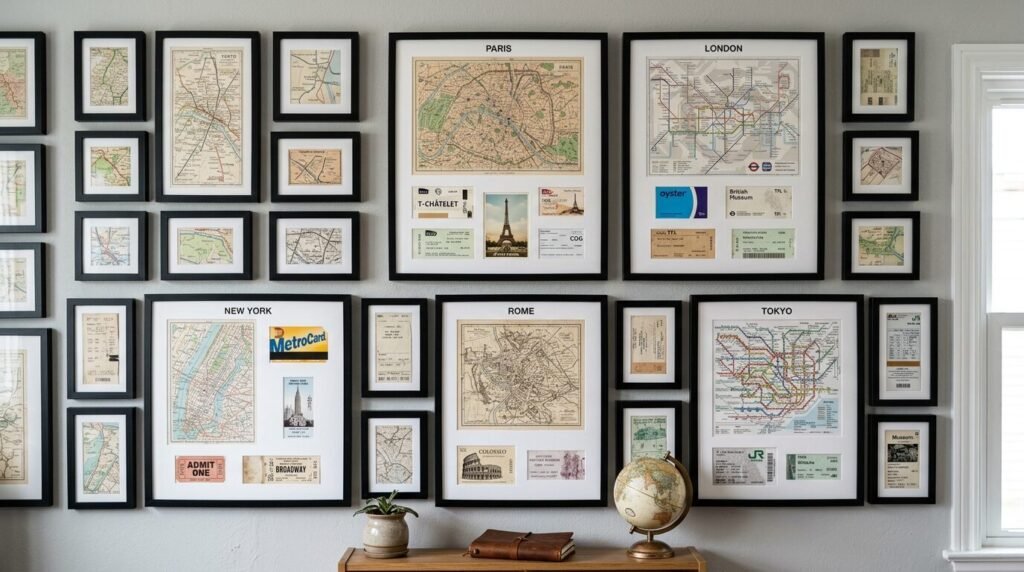
Your travel memories deserve more than a folder on your phone. I love using a mix of frames to display maps and ticket stubs. Use a large long picture frame for a panoramic map of your favorite city. Surround it with smaller square frames for candid photos. I’ve tried using shadow boxes for physical items like seashells or vintage keys. This adds a three dimensional element that catches the light. One of my favorite tricks is to use different frame materials for different continents. Use dark mahogany for European memories and light oak for tropical trips. It acts as a subtle visual cue for your stories. People will naturally gravitate toward these walls to ask about your adventures.
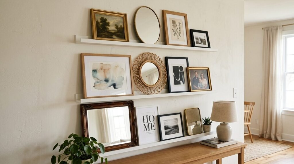
4. The Mirror and Photo Gallery Wall

Adding mirrors is the easiest way to make a small living room feel twice as large. A mirror and photo gallery wall reflects light into dark corners. I recommend choosing one medium sized ornate mirror as your focal point. Place it slightly off center to keep the layout feeling modern. Surround it with smaller wooden frames and thin metal ones. I noticed that round mirrors break up the harsh lines of rectangular frames. If you have a narrow hallway this setup works wonders. I once used three small gold mirrors mixed with family photos in a dark entry way. The change in brightness was immediate. It turned a boring transition space into a high end feature.
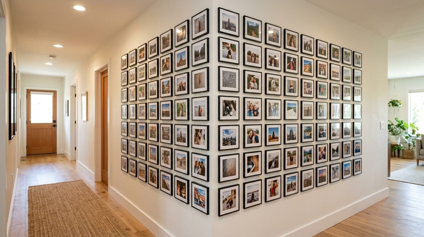
5. Modern Black and White Grids
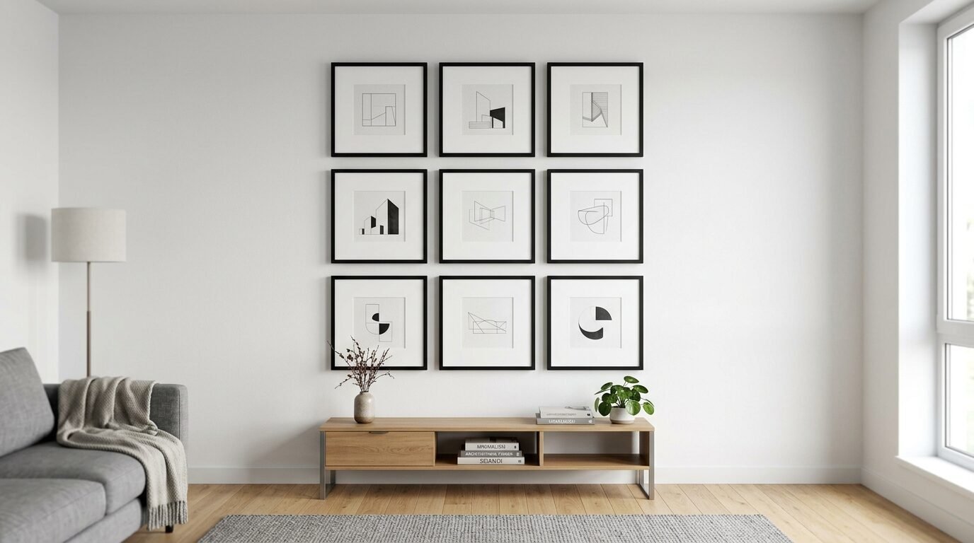
If you love a clean look try a modified grid. Use identical black frames but vary the sizes of the mats inside. This gives you the structure of a grid with the soul of a mixed gallery. I have seen this work well with architectural photography or botanical line drawings. Place the frames exactly two inches apart to maintain a professional look. I recommend using a laser level for this specific style. Even a small tilt will stand out in a grid. This layout is perfect for a wall gallery ideas living room project because it feels sophisticated. It anchors the room without competing with your furniture colors.
6. The Floor to Ceiling Library Look
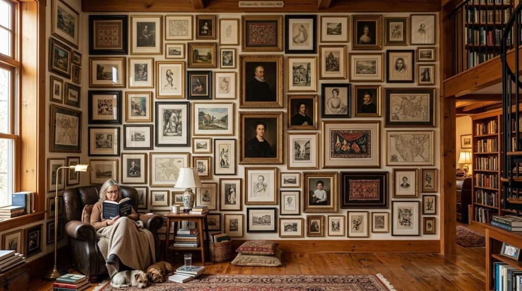
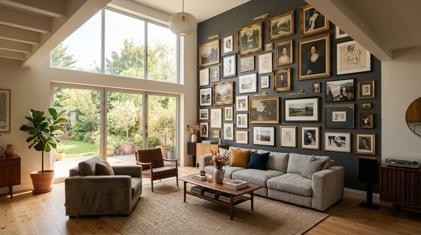
Some people call this a maximalist dream. I call it a cozy hug for your room. A floor to ceiling mixed frame gallery wall makes a statement. I’ve seen this work best in rooms with high ceilings. Start your largest frames at eye level then work your way up and down. Mix in long picture frame ideas wall decor to fill narrow vertical gaps. In my experience you should use command strips for the lower frames if you have kids or pets. It prevents them from knocking things crooked. This style allows you to display hundreds of small memories. It turns an entire wall into a conversation piece. Do not worry about matching every frame. The sheer volume creates its own sense of harmony.
7. Natural Wood and Dried Florals
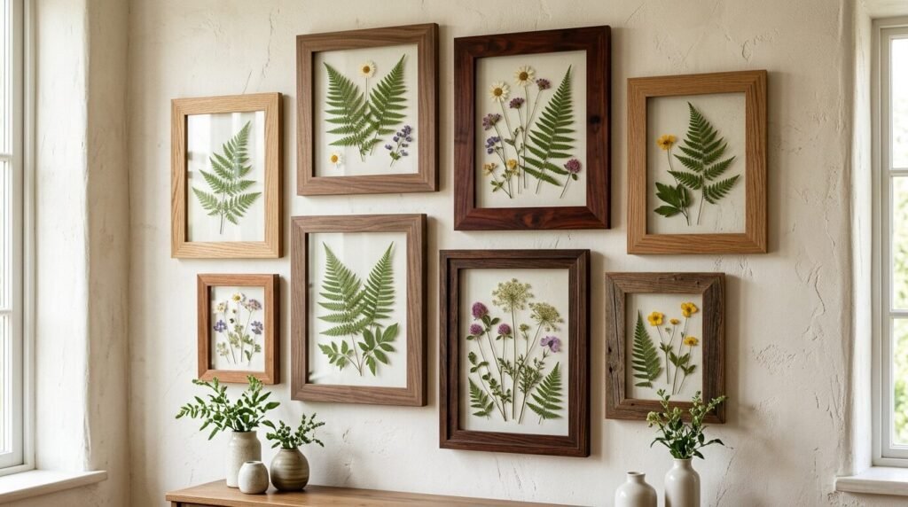
There is something grounding about raw oak and walnut frames. I love mixing these with pressed flowers or dried eucalyptus. This creates a soft organic feeling in your home. Use frames with different wood grains to add depth. I noticed that mixing light maple with dark walnut creates a high contrast look that feels very current. I once made a gallery wall using only frames I found at a woodshop scrap pile. Each piece had a different texture. This is a great way to bring the outdoors inside. It works particularly well in bedrooms or reading nooks where you want a peaceful vibe.
8. Gallery Wall Layouts for Corners
Do not let your corners go to waste. Wrapping a gallery wall around a ninety degree angle is a brilliant design move. It leads the eye from one part of the room to another. I recommend using a mix of thin metal frames for this. They do not feel too heavy in a tight space. I’ve tried this in my own home and it made the corner feel like an intentional nook rather than an empty spot. Keep the spacing consistent across the corner seam. This helps the two walls feel like one continuous piece of art. Use a long picture frame on one side to balance out a cluster of small squares on the other.
9. Metallic Shine with Brass and Copper
Mixing metals used to be a design crime. Now it is a sign of a curated home. I love seeing brass frames next to brushed copper or silver. It adds a layer of luxury to a mixed frame gallery wall. The key is to have at least two items of each metal type. This makes the mix look purposeful. I’ve seen this work beautifully in living rooms with velvet furniture. The metal catches the lamp light in the evening. I once used vintage silver platters mixed with modern gold frames. It felt like a museum display. Keep the art simple when the frames are this shiny. Let the metallic textures do the heavy lifting.
10. The Staircase Lean In
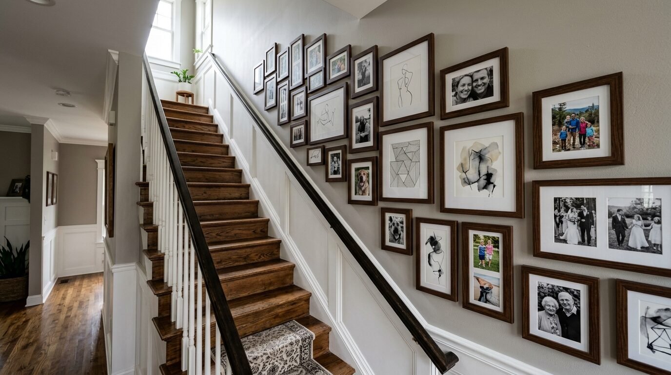
Staircases are notoriously difficult to decorate. A mixed frame gallery wall is the perfect solution. Follow the angle of the stairs with your layout. I noticed that people often hang art too high on stairs. Keep the center of the gallery about five feet from each step. Mix in long picture frames to mirror the length of the railing. I’ve seen this look great when you mix family portraits with abstract art. It makes the walk upstairs feel like a journey through your life. Use sturdy hangers here because the vibration of footsteps can shift frames over time.
11. Oversized Anchors and Small Accents
A common mistake is using only small frames. This can look cluttered and messy. Start with one very large frame maybe twenty four by thirty six inches. This is your anchor. Build the rest of your mixed frame gallery wall around it. I have noticed that this gives the eye a place to rest. Surround the big piece with tiny three by five frames or circular mirrors. I once used an old window frame as my anchor. I filled the panes with photos and then added smaller frames around the outside. It gave the wall a sense of scale that smaller pieces alone could not provide.
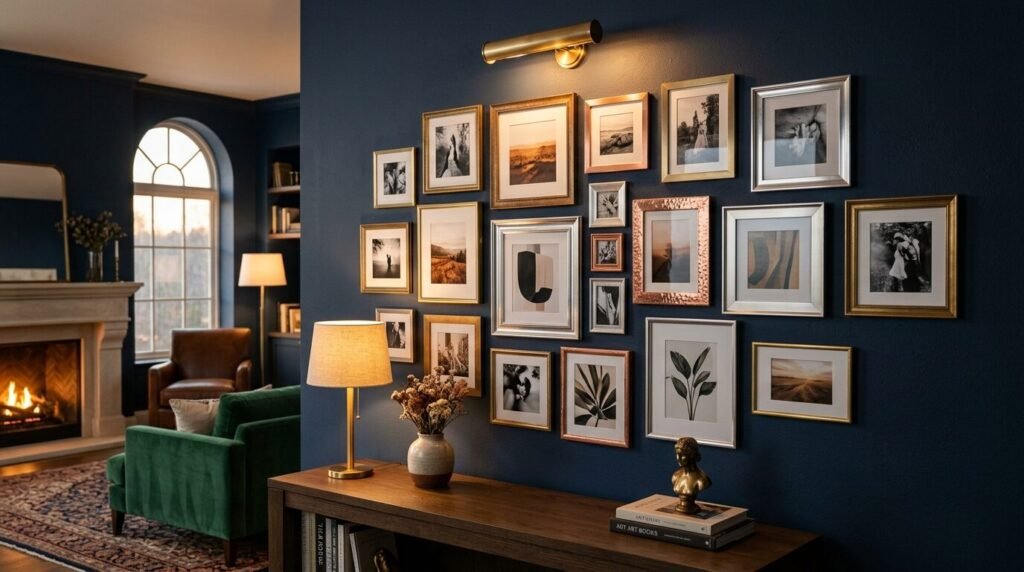
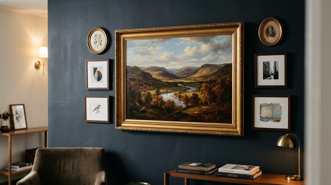
12. Gallery Wall With Mirrors and Pictures in Gold
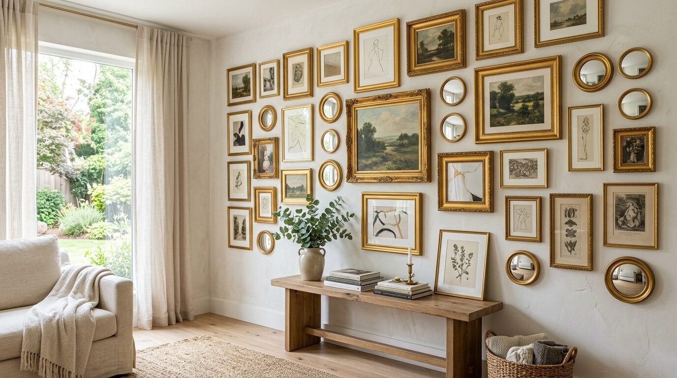
Gold is a classic for a reason. An all gold mixed frame gallery wall feels regal yet warm. You can mix shiny new gold frames with chipped vintage ones. Add a few gold rimmed mirrors to the mix to keep it bright. I’ve seen this work incredibly well against dark moody paint colors like forest green or navy. In my experience gold looks best when the frames have different widths. Some should be thin and delicate while others are chunky and ornate. This variety prevents the gold from looking like a flat yellow block. It creates a shimmering texture on your wall that changes throughout the day.
13. The Minimalist Mixed Frame Approach
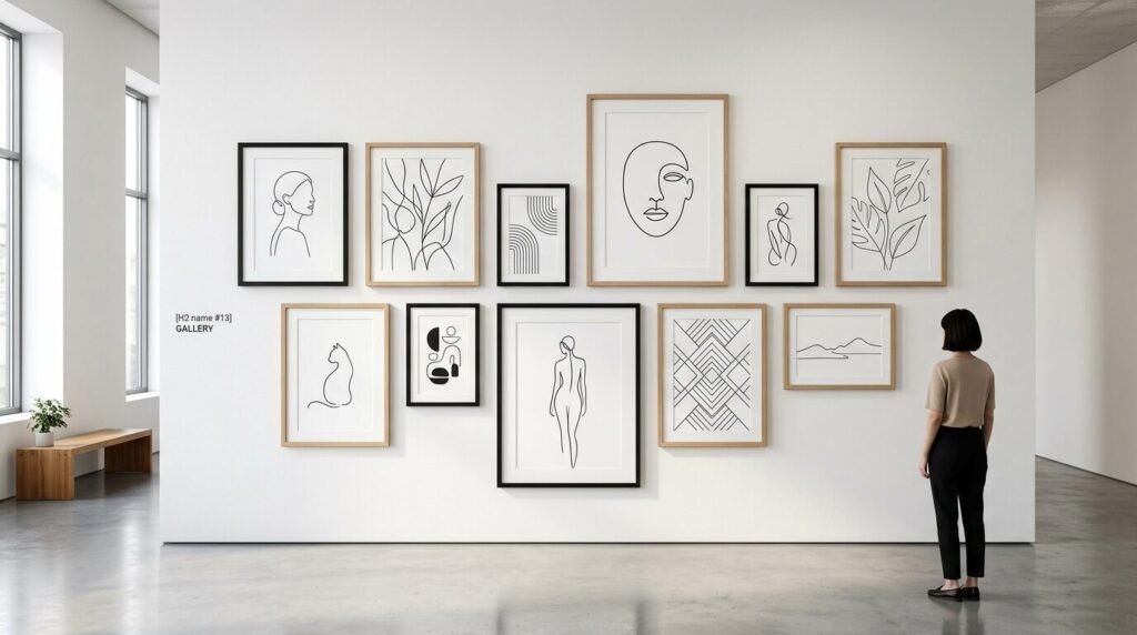
You can have a mixed gallery wall without it being overwhelming. Stick to two frame colors like black and light wood. Use simple white mats for every piece. This creates a cohesive look while still allowing for different frame shapes. I have seen this work best in modern Scandinavian style homes. I once helped a client do this with black and white nature photography. We used five different frame styles but the consistent colors kept it calm. It proves that you do not need every color in the rainbow to have an interesting wall.
14. Long Picture Frame Ideas Wall Decor
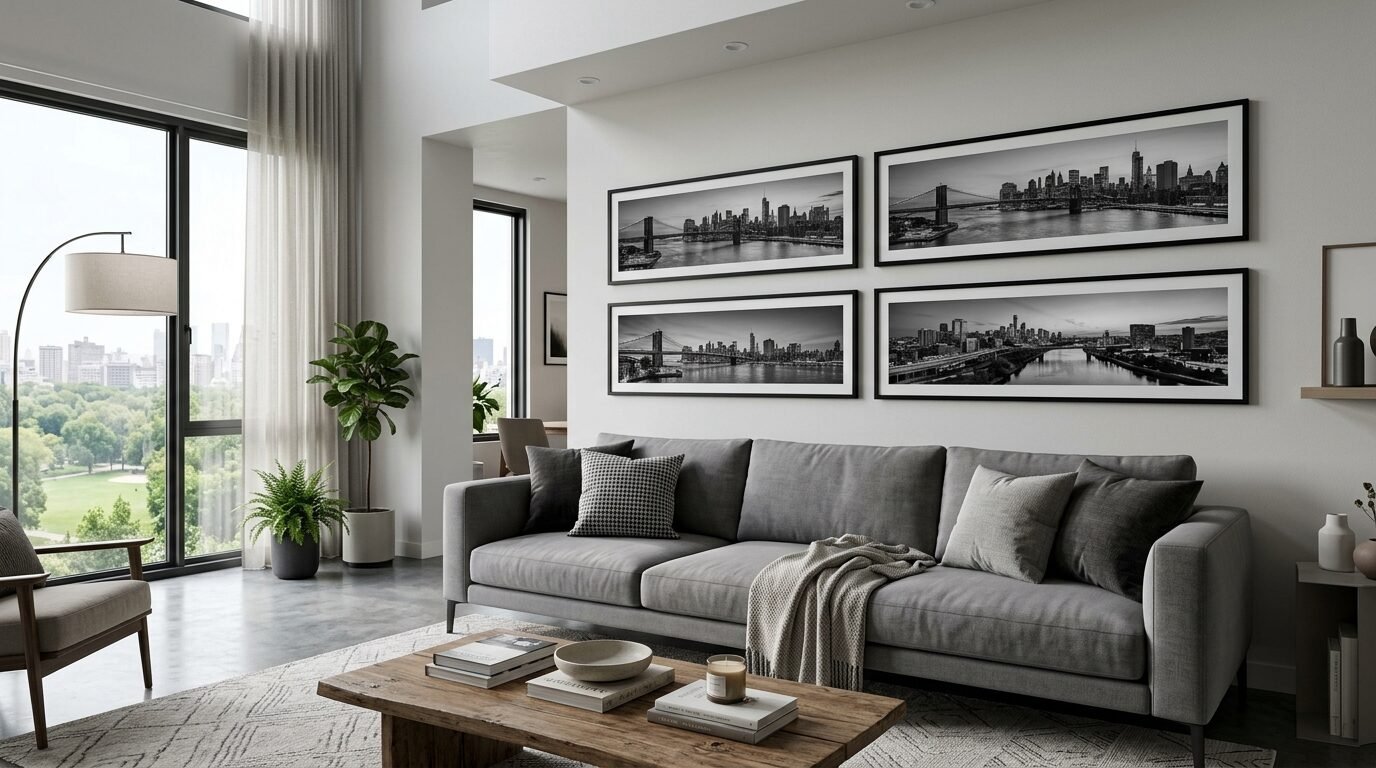
Long horizontal frames are often overlooked. They are perfect for panoramas or architectural sketches. I love using them at the very bottom or very top of a gallery wall. It acts like a border that frames the rest of the collection. I have also seen people use long frames to hold three or four smaller photos in a row. This is a great way to tell a chronological story like a child growing up. I once used a long reclaimed wood frame to hold a series of mountain peak sketches. It gave the whole wall a sense of direction and flow.
15. The “No Tool” Shelf Gallery
If you are a renter or hate holes in the wall use picture ledges. You can lean different frames on a thin shelf. This allows you to overlap frames easily. I love this because you can swap photos in seconds. I’ve noticed that leaning mirrors against the wall behind frames adds a lot of depth. Use a mix of tall and short frames to create a mountain range silhouette. I once filled three long shelves with a mix of black and white family photos and colorful art. It looked like a professional studio. It is the most flexible way to manage a mixed frame gallery wall.
16. Heritage Walls with Sepia Tones
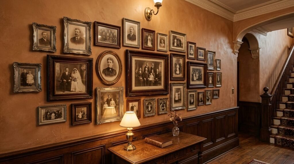
Do you have old family photos tucked away in boxes? A sepia toned gallery wall honors your history. Mix vintage wooden frames with tarnished silver ones. The old world feel of the photos matches the aged look of the frames. I’ve seen this work best when you add non photo items like a grandfather’s old watch in a shadow box or a hand written letter. In my experience these walls become the heartbeat of a home. Every guest will stop to look at the faces. Use frames that look like they have a story to tell.
17. The Kid’s Art Masterpiece Wall
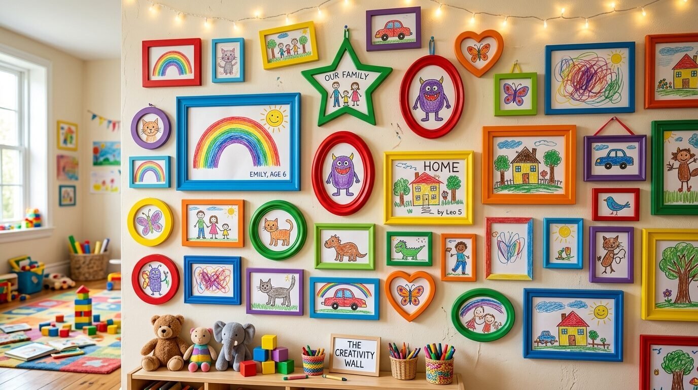
Children produce a lot of art. Instead of cluttering the fridge give them a dedicated gallery wall. Use a mix of colorful plastic frames and simple wooden ones. I recommend using frames that open from the front so you can swap art easily. I’ve seen this turn a playroom into a vibrant creative hub. Mix in a few photos of the kids creating the art. It shows that you value their creativity. I once used bright primary colored frames for a gallery wall in a kitchen. It brought so much joy to the space every morning.
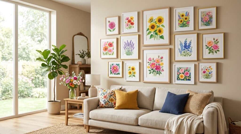
18. Botanical Print Explosions
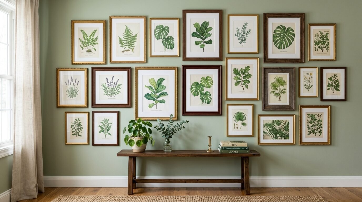
Botanical prints are a staple for a reason. They bring a bit of nature into the living room. Use a mix of dark green and gold frames to enhance the leafy vibes. I love seeing a variety of sizes from tiny herb sketches to large palm leaf prints. I’ve noticed that this style works best when you keep the mats white or cream. It keeps the focus on the intricate details of the plants. I once saw a gallery wall made entirely of vintage seed packets in mixed frames. It was charming and cost almost nothing to put together.
19. Mixed Textures with Woven Elements
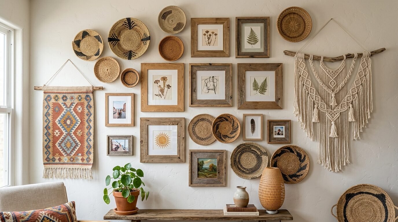
A gallery wall does not have to be just frames. Mix in woven baskets or macramé hangings. This adds a soft texture that contrasts with the hard edges of frames. I have seen this work beautifully in bohemian style living rooms. Use light wood frames and white mirrors to keep the vibe airy. I once added a flat wicker tray to a gallery wall of desert photos. It added a 3D element that made the whole arrangement feel more professional. It is about balancing the visual weight of the different objects.
20. The Seasonal Rotation Wall
Some people change their pillows every season. Why not your gallery wall? Use a base of neutral mixed frames. Then swap out the art for the time of year. Use bright florals in spring and moody landscapes in winter. I’ve tried this and it makes the room feel brand new every few months. Keep a few consistent pieces like mirrors or family portraits so the layout stays familiar. This is a great way to keep your home feeling fresh without a full renovation.
21. Monochrome Textures and Fabric
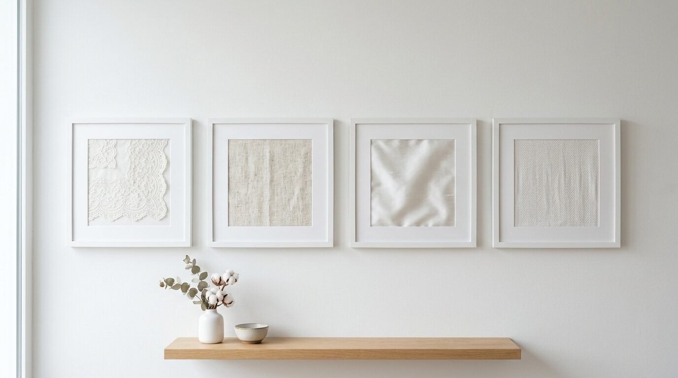
If you want something truly unique try framing fabric. Old quilts or pieces of lace look stunning in mixed frames. I love using this to add a cozy feel to a room. Mix these fabric frames with simple line drawings. I’ve seen this work well when all the frames are the same color but different shapes. For example use all white frames with different white textures inside. It is subtle and sophisticated. I once used a piece of my grandmother’s wedding dress lace in a small gold frame. It was a beautiful way to keep a memory visible.
22. Blue and White Gallery Wall with Modern Art
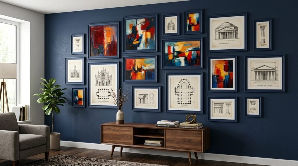
Mixing classic colors with modern abstract art is a bold move. Use navy blue frames for traditional sketches and white frames for bold abstract splashes. This creates a bridge between old and new styles. I’ve noticed that this works best in homes with a mix of antique and modern furniture. Use a long picture frame for a large abstract piece and surround it with smaller blue and white ginger jar prints. It feels curated and high end. This approach shows that you aren’t afraid to take risks with your decor.
Common Gallery Wall Layout Questions
How do I start a gallery wall without making a mess?
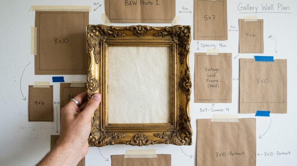
I always recommend the paper template method. Trace your frames onto brown packing paper and cut them out. Tape these shapes to the wall using painter’s tape. This allows you to move them around until the layout is perfect. I have seen many people skip this step and end up with a wall full of extra holes. Once the paper layout looks right you can hammer the nail directly through the paper. Then just rip the paper away. It is the most stress free way to get a professional result.
What is the best spacing between frames?
The general rule is two to three inches between frames. If you go much wider the pieces start to look disconnected. If you go closer they can look cramped. In my experience staying consistent with the spacing is more important than the exact number. Use a small block of wood as a spacer to keep every gap the same. This trick makes even a chaotic mix of frames look like they belong together.
Can I mix different types of art on one wall?
Yes you absolutely should. A mix of photos and paintings and mirrors makes a wall feel alive. I’ve noticed that if everything is the same it can feel like a hotel lobby. I once mixed a neon sign with vintage oil paintings and family snapshots. The contrast was the best part of the whole room. Just try to find one common thread. Maybe every piece has a hint of blue or every frame is made of wood. That single thread will pull the whole look together.
How high should a gallery wall be?
The center of the entire gallery should be at eye level. This is usually about fifty seven to sixty inches from the floor. If you are hanging it over a sofa leave about six to eight inches of space between the top of the sofa and the bottom of the frames. I have seen people hang art way too high which makes the room feel disconnected. Keeping it lower creates a more intimate and cozy feeling in the living room.
Should I use glass or acrylic in my frames?
If your wall gets a lot of direct sunlight acrylic is a safer bet. It is lighter and won’t shatter if a frame falls. However glass usually looks clearer and does not scratch as easily. I’ve used both and honestly once they are on the wall most people cannot tell the difference. If you have very large frames I suggest acrylic just to keep the weight down. It makes it much easier to hang with standard nails or command strips.
Creating a mixed frame gallery wall is a journey. It is not about perfection on day one. It is about finding pieces that make you smile every time you walk into the room. I’ve seen these walls change lives by making people feel truly at home. You do not need to buy twenty frames at once. Start with three and let the collection find its way. Your living room is a canvas and these frames are your paint. Take your time and enjoy the process of building something beautiful. I have noticed that the most loved walls are the ones that are never truly finished. They just keep getting better.

Anya Castellan is the Founder and Editor-in-Chief of Home Wall Trends. An art history graduate of the Rhode Island School of Design with twelve years of experience writing for leading American design publications, she specializes in composition, gallery wall theory, and the quiet architecture of domestic space. A former contributing editor at Architectural Digest and guest lecturer at Parsons School of Design, Anya personally reads and signs off on every piece before it is published.