Empty walls often feel like a missed chance. You might look at a blank space in your living room and feel stuck. Custom art costs hundreds of dollars. Hiring a designer takes weeks of back and forth. I spent years trying to find decor that felt calm but personal. Most store bought options look generic. They lack the soul your home needs.
Printable wall art changed my perspective on home styling. You get high quality files instantly. You print them at home or a local shop. It saves money and time. Last summer I refreshed my entire living room office for less than fifty dollars. The result felt professional and clean.
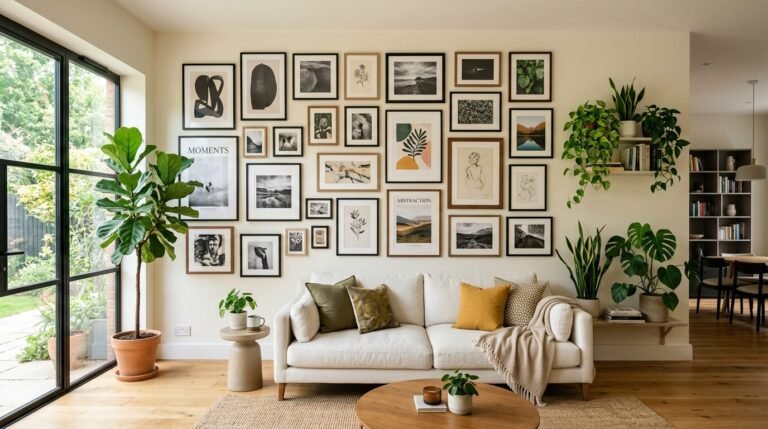
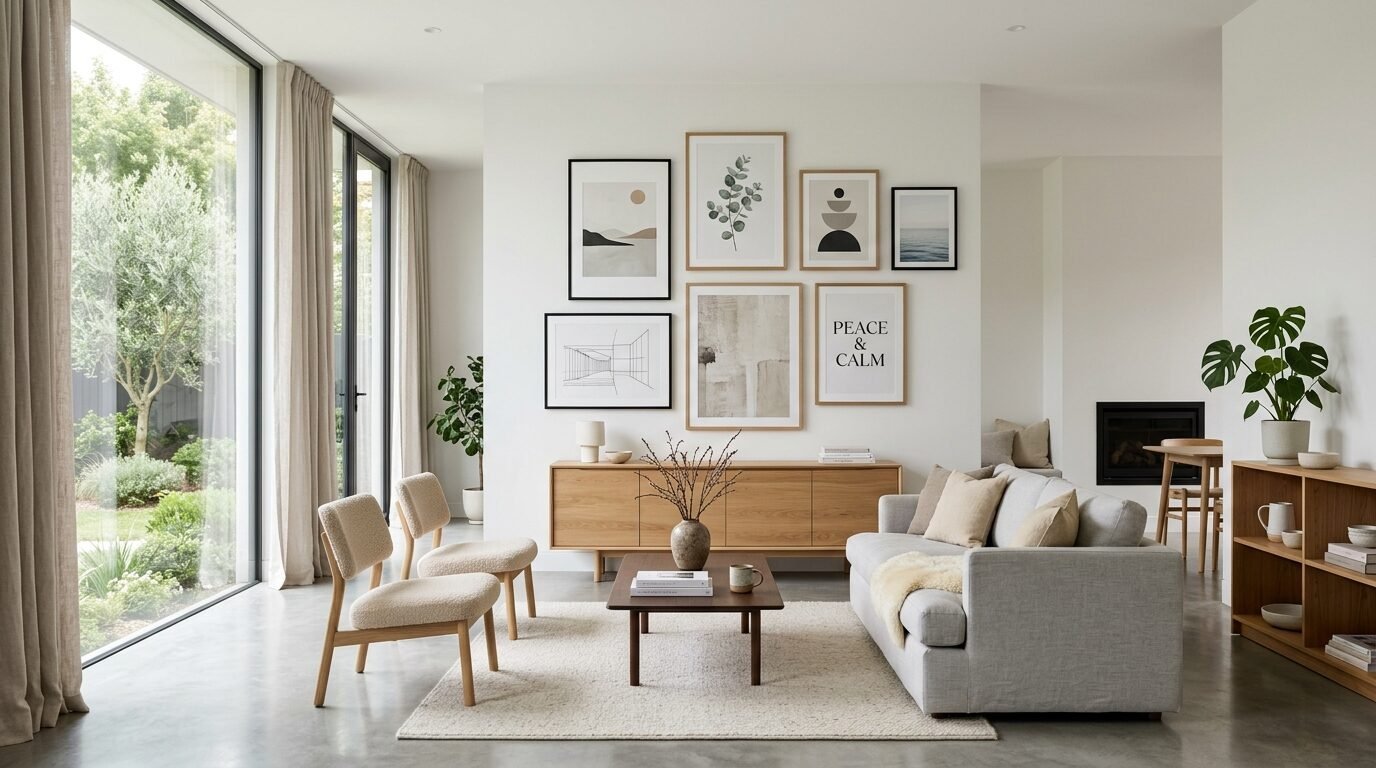
This guide provides 21 specific designs for your minimalist interior. These options fit every room from your bedroom meditation space to a busy focus wall. You will find practical ways to style these prints. I will share the exact tools I use for the best results.
Executive Summary of Modern Wall Decor
Minimalist art focuses on what matters. It uses clean lines and neutral colors. This style creates a sense of peace in your home. Printable art is the most affordable way to get this look. You can swap designs whenever you want a change. This article lists 21 distinct categories of prints.
Each design serves a purpose. Some provide simple reminders during a long workday. Others create a quiet mood for a meditation space. In my experience heavy frames work best for minimalist prints. They give thin lines more weight and presence.
I have tested dozens of paper types for these designs. Heavy matte cardstock always looks the best. It prevents glare from windows. It makes digital files look like expensive gallery pieces. You will find tips on sizing and layout in the sections below.
Essential Tools for High Quality Wall Art Printables
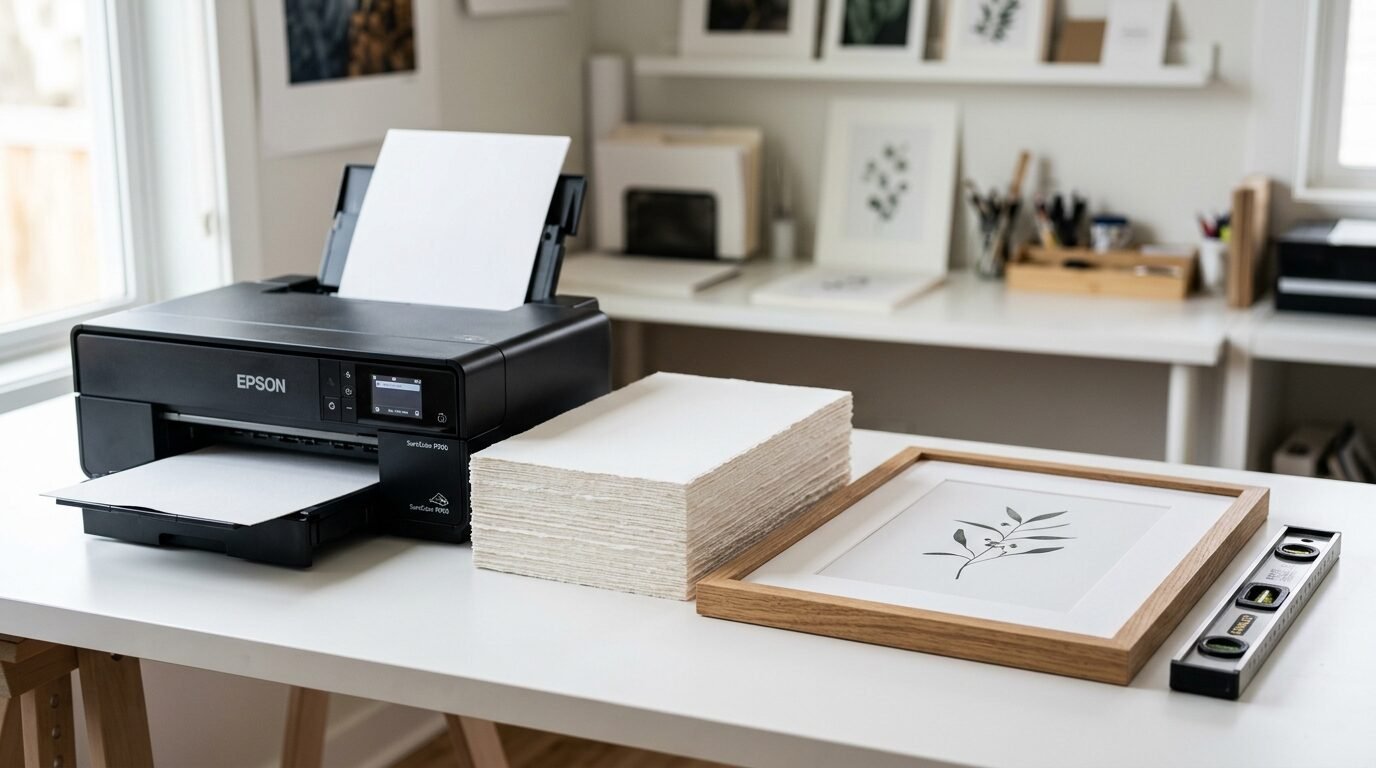
You need the right gear for professional results. I started with a basic office printer. The colors looked dull and the paper felt thin. Now I use specific tools that ensure gallery quality.
- High GSM Matte Paper. Use paper that is at least 200 GSM. This thickness prevents curling. Matte finishes look better under glass.
- Heavy Wood Frames. I buy frames from IKEA or Target. Look for the Ribba or Hovsta series. They have deep edges that add a premium feel.
- Inkjet Printers. Canon and Epson make great photo printers. I use an Epson EcoTank. It saves money on ink while keeping colors sharp.
- Digital File Converters. Most printables come as PDF or JPG. Use free sites like SmallPDF if you need to change sizes.
- Level and Tape. A laser level is worth the ten dollar investment. It keeps your focus wall perfectly straight.
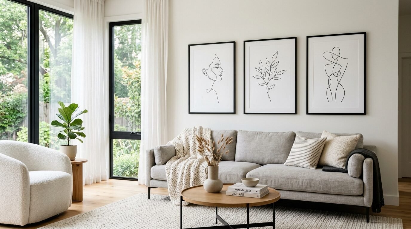
1. Single Line Human Silhouettes
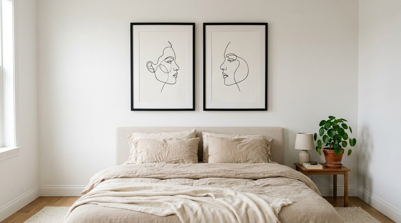
Single line art is the peak of minimalist interior design. These drawings use one continuous stroke to form a face or body. I noticed these prints work perfectly in a bedroom meditation space. They feel fluid and calm.
You can find these in black ink on white backgrounds. They suggest movement without cluttering the eye. I tried a pair of these above my headboard last year. The room felt taller and more open. Stick to thin black frames for these. It keeps the focus on the line itself.
2. Terracotta Geometric Arcs
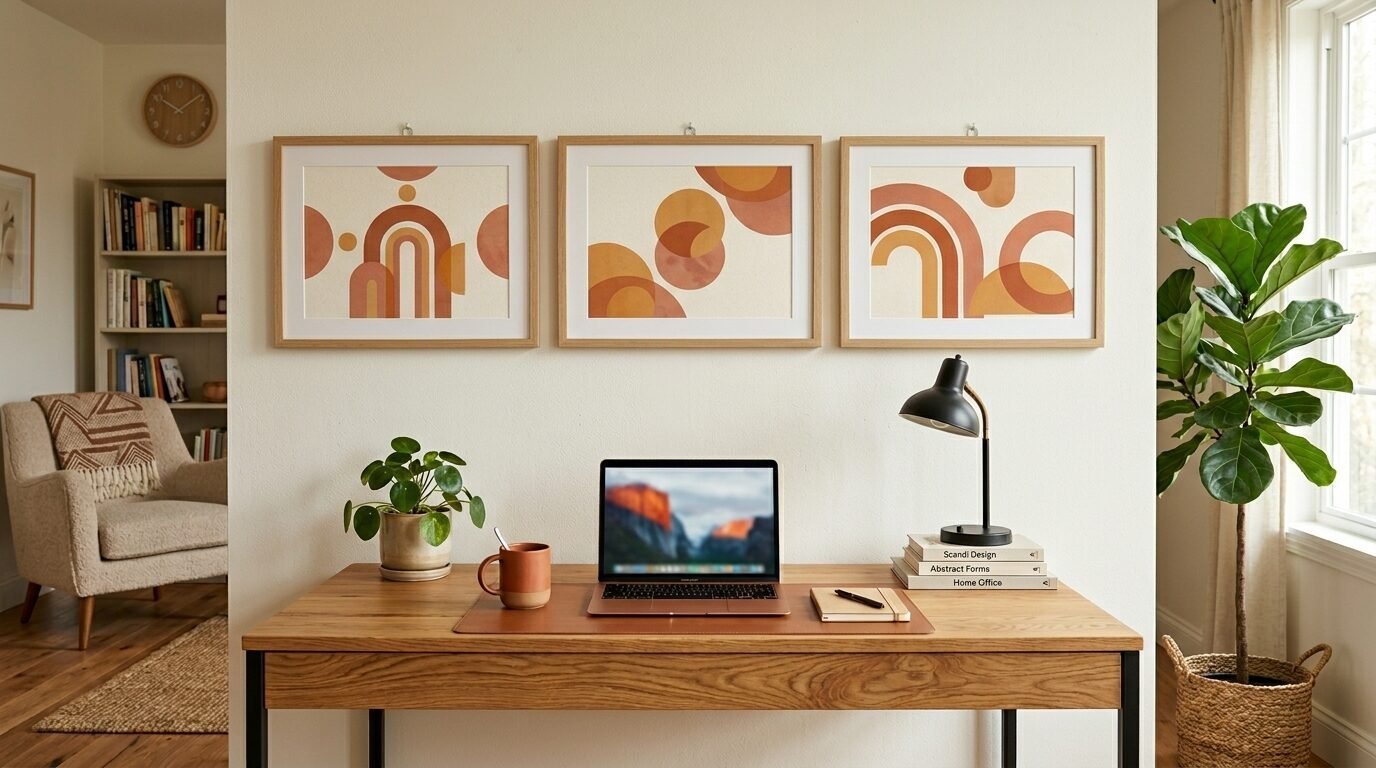
Warm tones are popular right now. Terracotta and clay colors ground a room. These prints often feature overlapping half circles or arches. They look great in a living room office. They provide a soft pop of color against white walls.
In my experience these designs look best in sets of three. Align them horizontally. Use natural wood frames to match the earthy vibe. The curves break up the hard lines of desks and monitors.
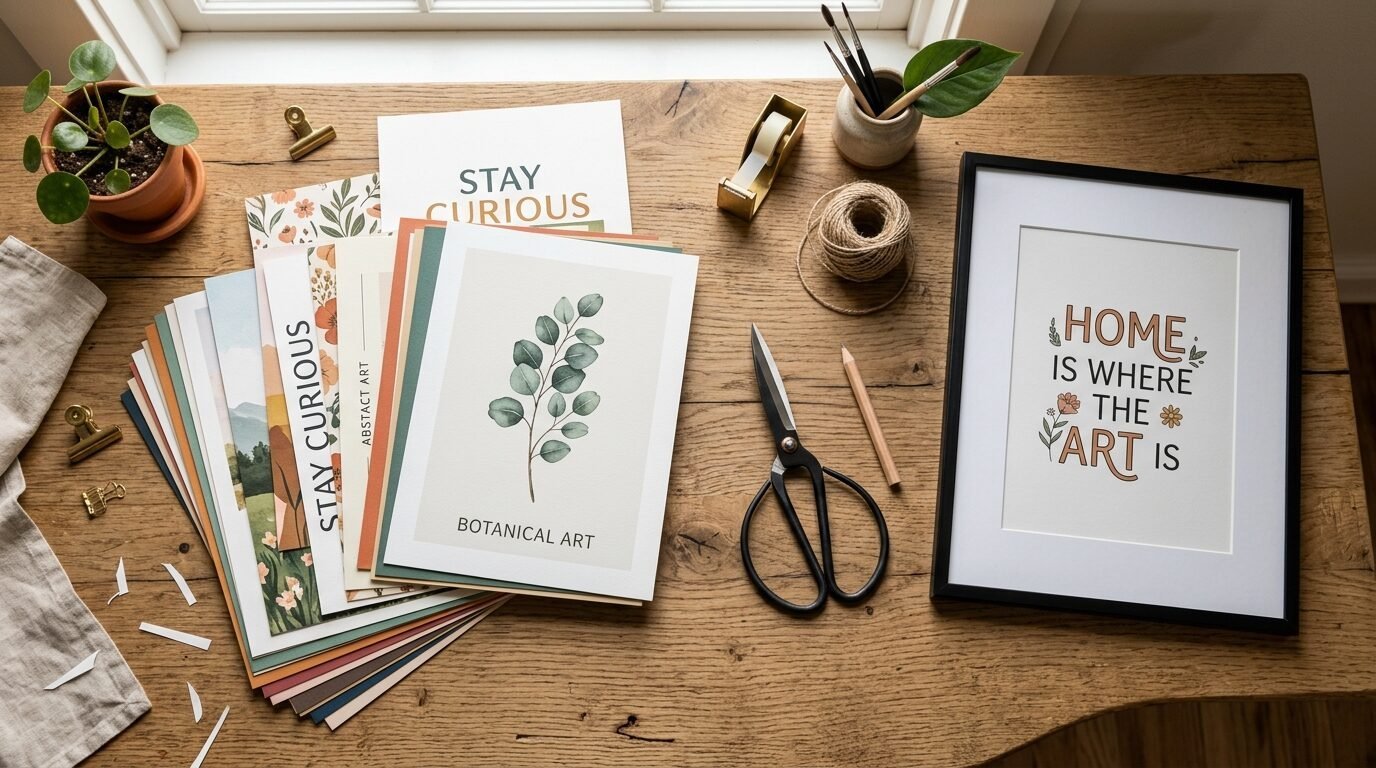
3. Botanical Eucalyptus Sprigs
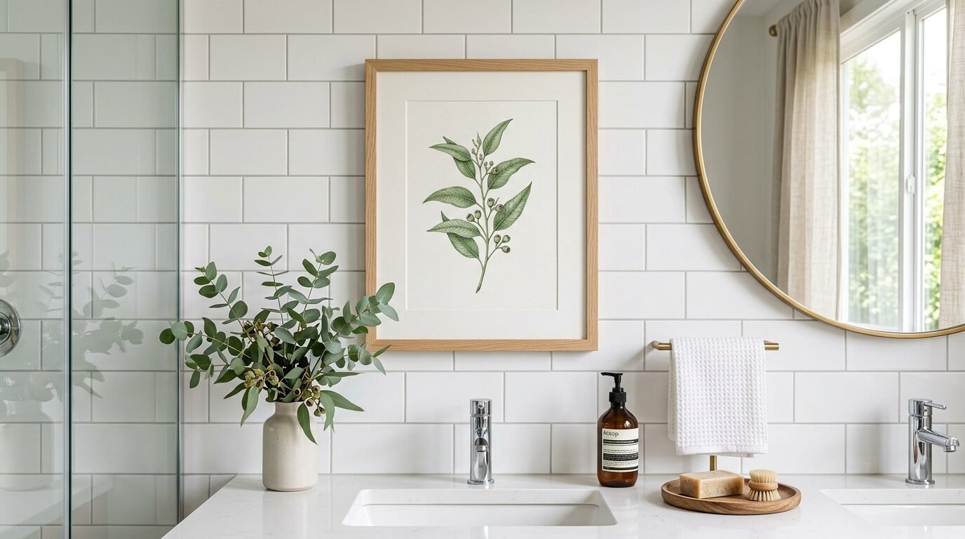
Nature prints do not have to be busy. A single eucalyptus leaf or stem looks very clean. These designs usually feature muted greens and greys. They bring a bit of the outside in without the mess of real plants.
I put a set of these in my bathroom. The green tones felt fresh. Digital botanical prints are great because they never wilt. Use a white mat board inside the frame. It adds breathing room around the art.
4. Serif Typography Quotes
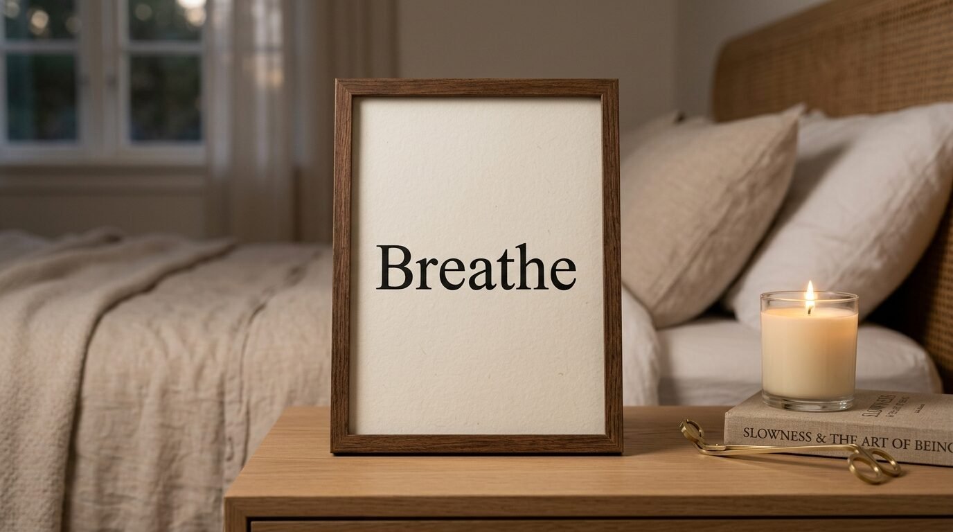
Words have power. Simple quote prints use classic fonts to share a message. Choose one word like Peace or Breathe for a meditation space. These prints rely on white space.
I suggest avoiding long paragraphs. One or two words look more modern. Black text on a cream background feels warmer than pure white. I use these as simple reminders near my light switches. They catch your eye every time you leave the room.
5. Mid Century Modern Sunsets
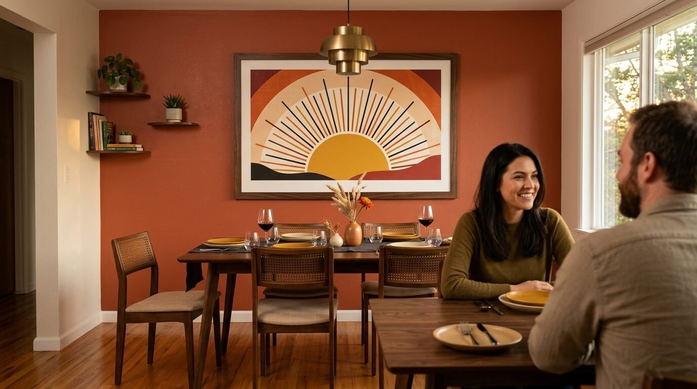
The mid century style uses bold shapes and muted palettes. Think mustard yellow and burnt orange. A minimalist sun design uses a simple circle and a few lines for rays.
These prints add a retro feel to a modern home. They look striking on a dark focus wall. I saw a large version of this in a friend’s dining room. It became the center of the whole space. Use a gold or brass frame to highlight the warm colors.
6. Japanese Zen Enso Circles
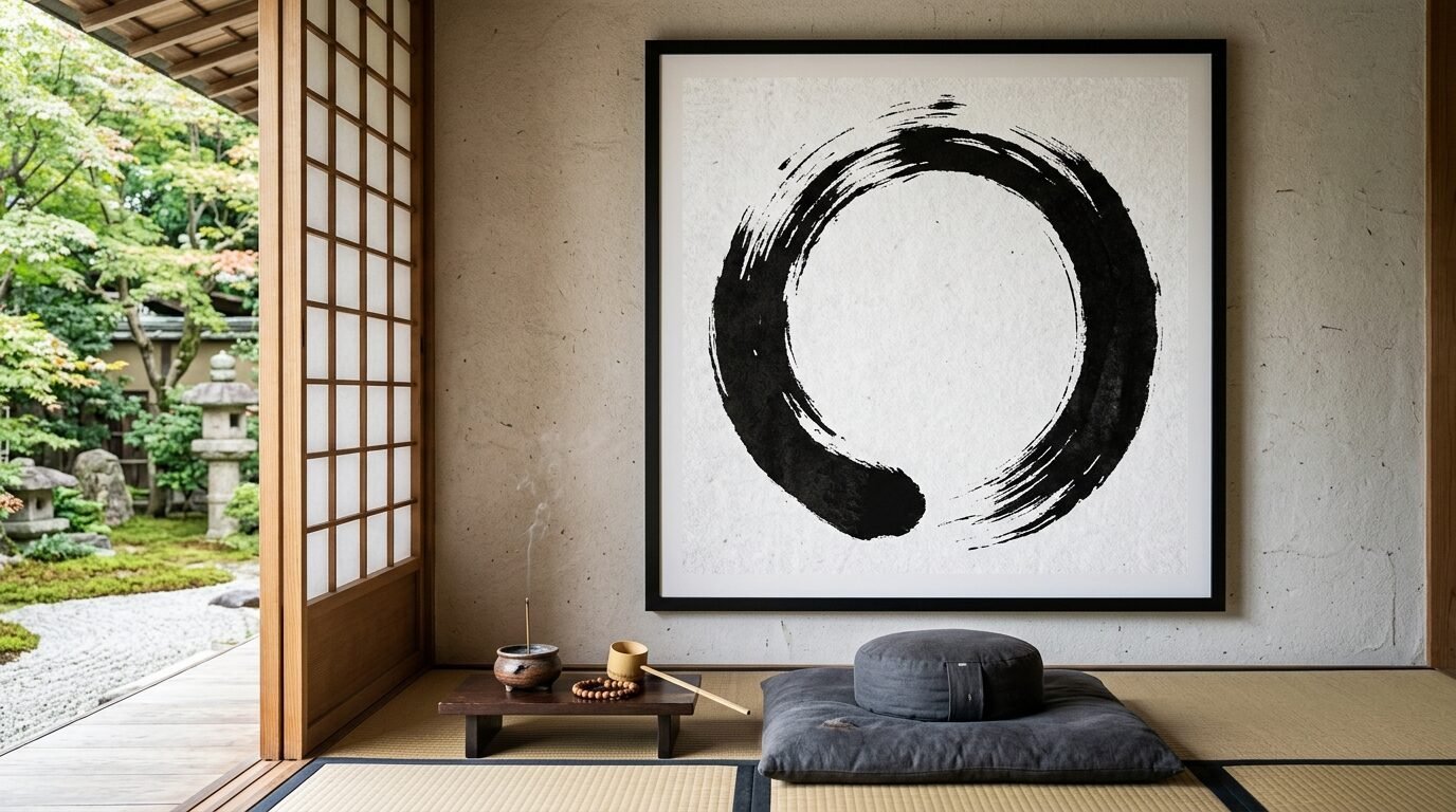
An Enso is a hand drawn circle. It represents a moment when the mind is free to let the body create. These prints look like thick black brushstrokes. They are perfect for a meditation space.
The imperfection of the circle is the beauty. It reminds you that things do not have to be perfect to be good. I keep an Enso print on my desk. It helps me stay calm during stressful projects. Use a thick black frame to match the ink.
7. Abstract Ink Blots
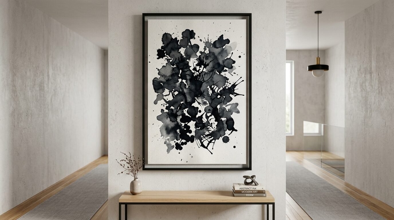
Ink blot prints look like modern gallery art. They feature organic shapes and varying shades of black and grey. No two are exactly alike. They feel very personal and high end.
These work well in a large format. Print one at 24 by 36 inches. It makes a bold statement in a minimalist interior. I recommend a floating frame for ink blots. It makes the paper look like it is hovering inside the glass.
8. Minimalist Mountain Peaks
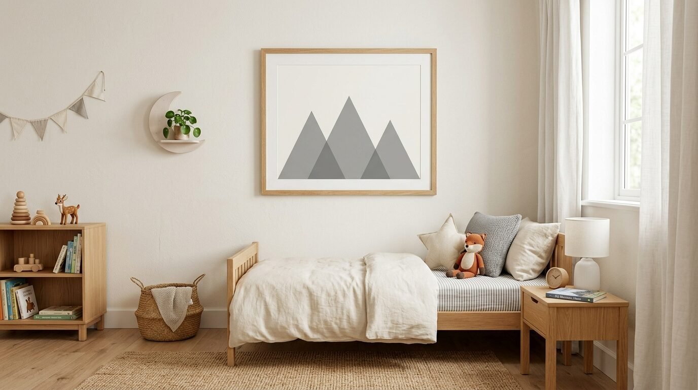
If you love the outdoors these are for you. These designs use three or four triangles to show a mountain range. They often use shades of blue or grey.
I put a mountain print in my son’s room. It looked mature but still fun. These prints represent stability and strength. They fit well in a living room office where you need to stay grounded. Choose a light oak frame for a Scandi look.
9. Neutral Color Blocks
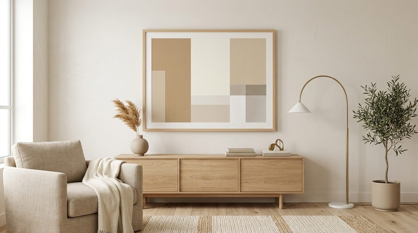
Color block art uses large squares or rectangles of color. For a minimalist look choose beige, tan, and white. These designs are about balance and proportion.
I like to use these to tie a room together. If your rug is tan and your couch is white these prints bridge the gap. They are very easy to print at home because they don’t have fine details. Use a frame that matches your wall color for a seamless look.
10. Architectural Floor Plans
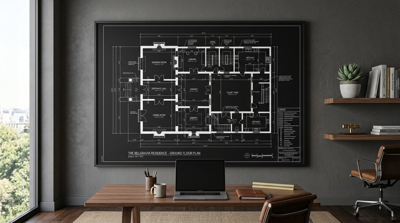
Floor plans of famous buildings look very smart. They use thin lines and small text. This is a great choice for someone who likes a more technical look.
I have a floor plan of a classic Parisian apartment. It adds a sense of travel and history to my walls. These work best in black and white. Use a thin metal frame to keep it looking professional. It adds a layer of depth to a focus wall.
11. Constellation Star Maps
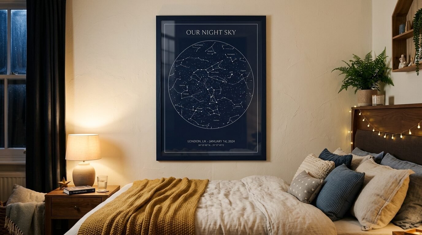
Star maps show the sky on a specific date. You can find minimalist versions that just use dots and thin lines. They are very sentimental.
I printed one for my wedding anniversary. It shows the stars over the city where we met. It is a subtle way to show a personal story. These prints look best on a navy blue or black background. Use a white frame to make the stars pop.
12. Macro Nature Textures
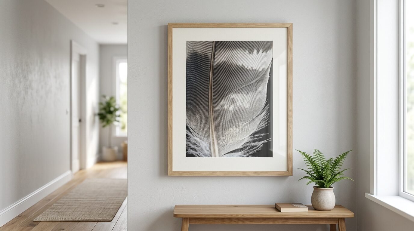
Instead of a whole tree choose a print of bark or a single feather. Macro photography focuses on the tiny details. In minimalist art these become abstract patterns.
I noticed these work well in hallways. They invite people to stop and look closer. The neutral tones of sand or stone fit a minimalist interior perfectly. High resolution files are key here. You want to see every tiny detail in the print.
13. Boho Sun and Moon Phases
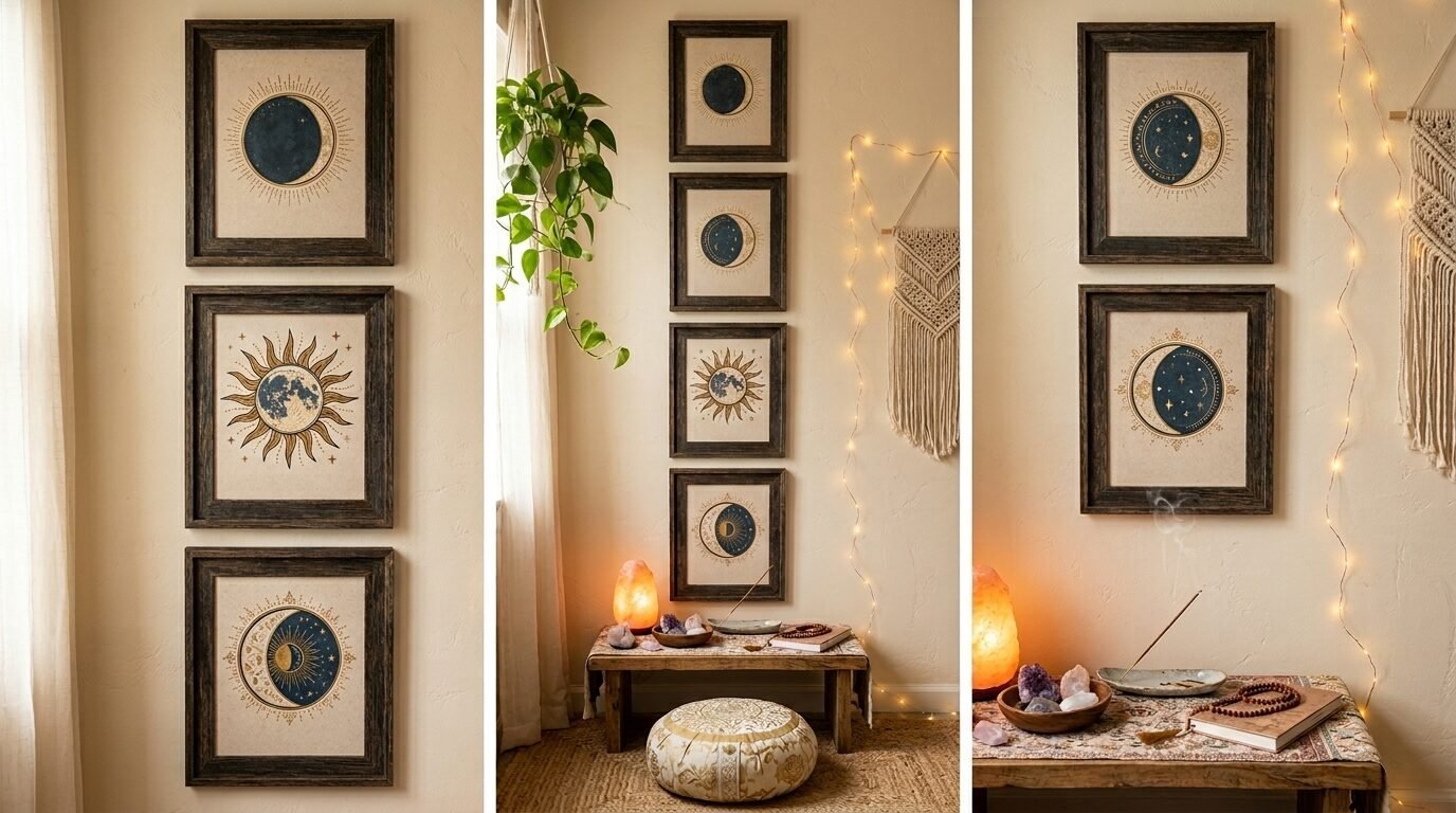
Boho minimalism uses celestial themes. A series of moon phases from new to full looks great. These prints usually have a hand drawn feel.
I suggest a vertical layout for moon phases. It draws the eye upward and makes the ceiling feel higher. These are very popular for a bedroom meditation space. They remind you of the natural cycles of time. Use a dark wood frame for a grounded feel.
14. Minimalist Line City Maps
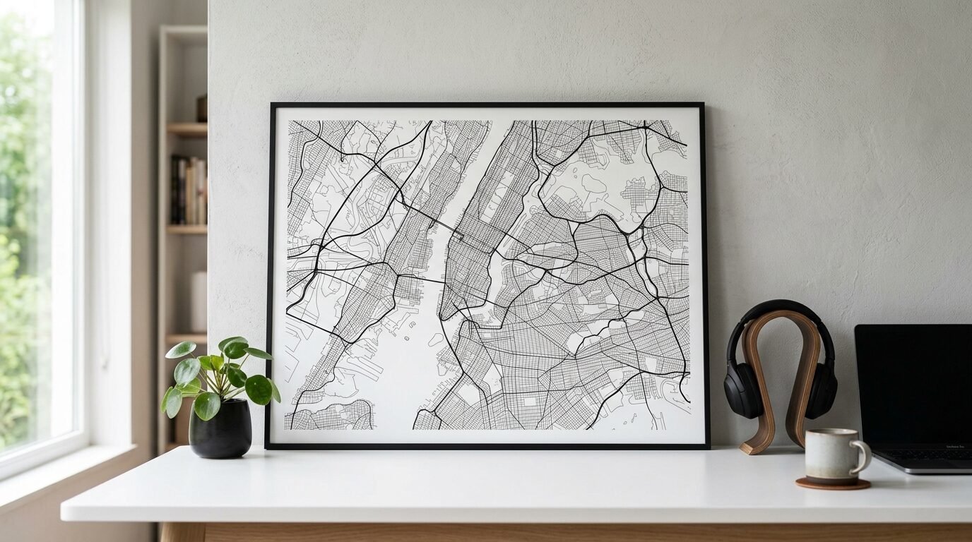
City maps can be very busy. Minimalist versions remove the labels and just show the streets. They look like a web of delicate lines.
I have a map of New York City in my office. People often ask what it is before they realize it is a map. It is a great conversation starter. Print these on a slightly textured paper. It gives the lines a more organic feel.
15. Single Leaf Herbarium
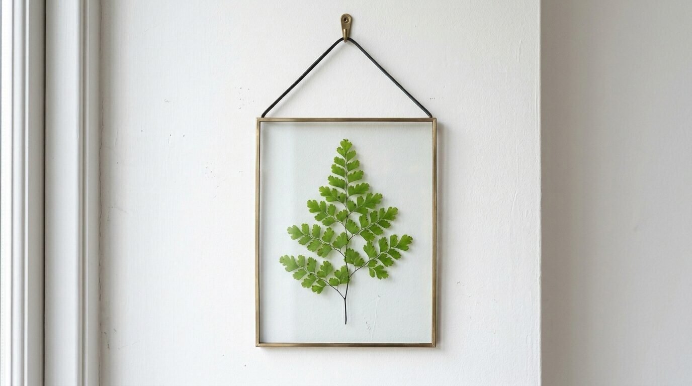
A herbarium print looks like a pressed plant. A single fern or monstera leaf is a classic choice. These bring a botanical vibe without the bright colors of flowers.
I like to swap these out with the seasons. A green leaf for spring and a brown one for fall. It is an easy way to refresh your wall decor printables. Use a glass frame with no backing. This lets your wall color show through the art.
16. Abstract Wave Lines
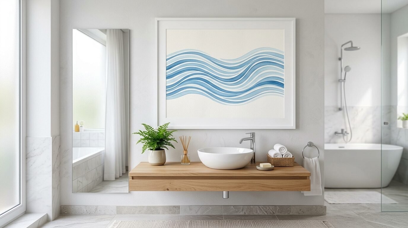
Wave prints use parallel lines to show motion. They feel very fluid and soothing. This is a top choice for a bathroom or a meditation space.
The lines are usually blue or soft grey. I found that these help me relax when I am working. They mimic the rhythm of breathing. Use a white frame to keep the look light and airy.
17. Geometric Animal Portraits
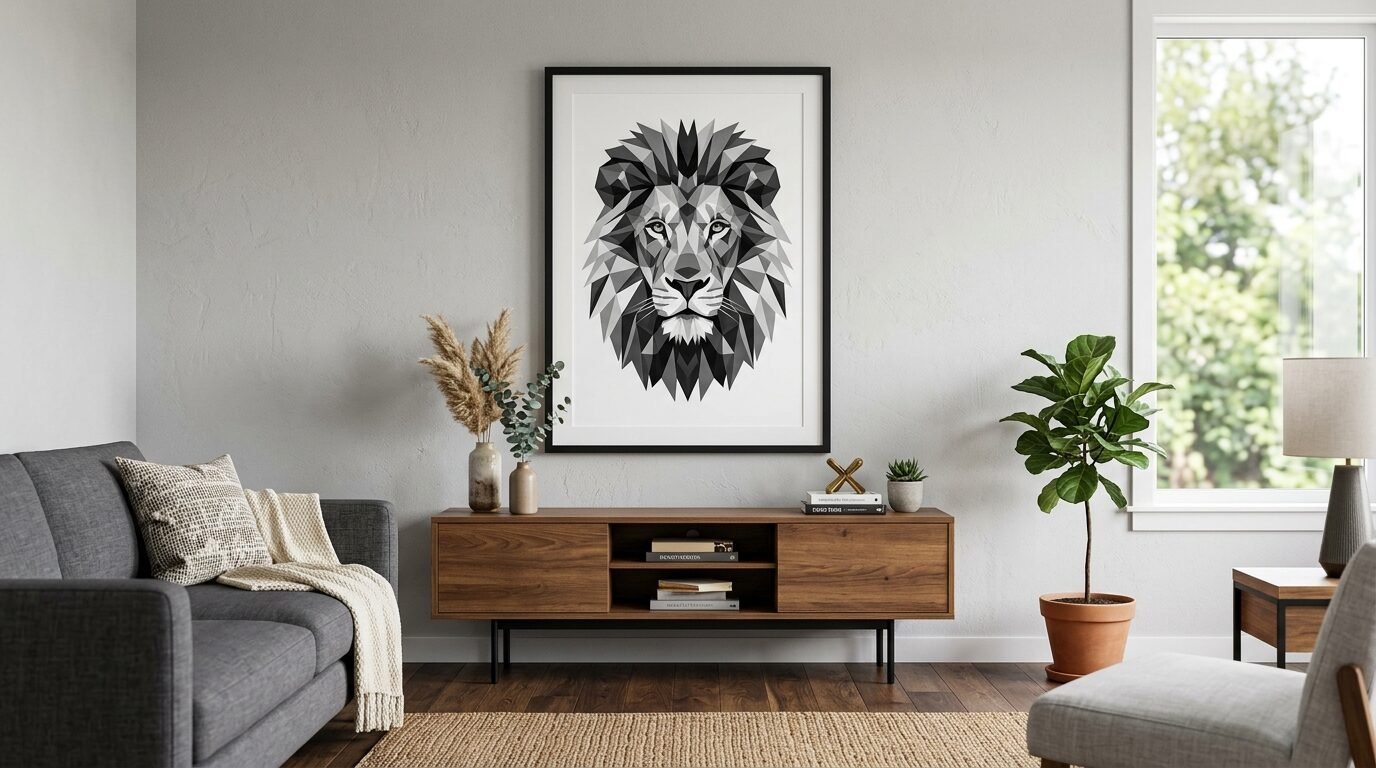
These designs use triangles and lines to form the shape of an animal. A deer or a wolf are common themes. They look modern and edgy.
I put a geometric lion in my office. It feels powerful but stays within the minimalist style. These work best in high contrast black and white. Large prints make a bigger impact here.
18. Minimalist Grid Photography
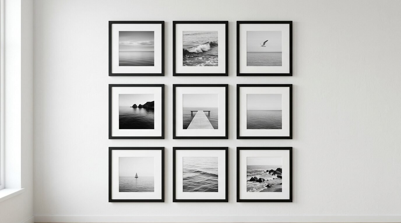
Grid art uses several small photos arranged in a perfect square. The photos should all have the same color palette. Think of nine small shots of the ocean.
I use this for my personal travel photos. I turn them into black and white and print them as a set. It looks like a professional gallery wall. The key is perfect alignment. Use a ruler to make sure the gaps between frames are equal.
19. Soft Gradient Blurs
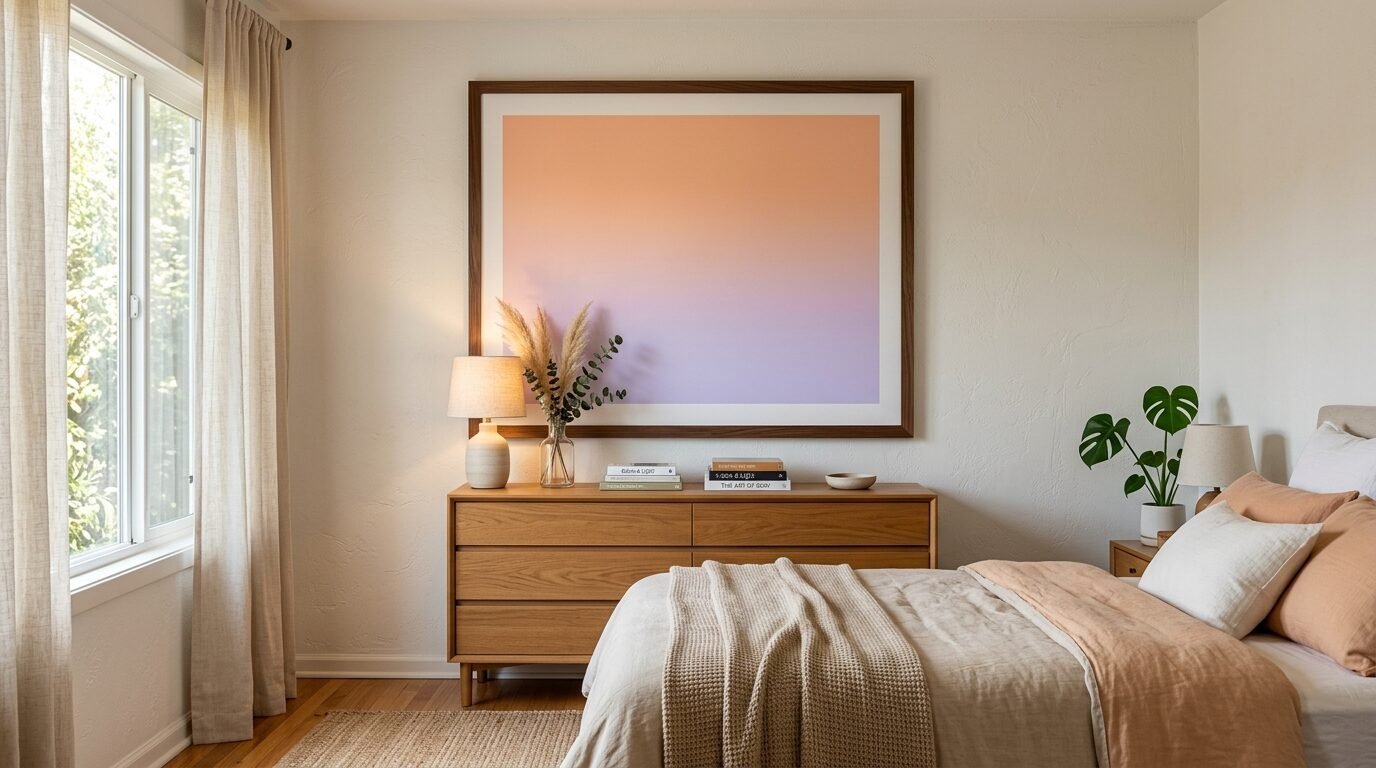
Gradient art has no hard lines. One color fades into the next. It looks like a soft fog or a sunset. This is very popular in modern minimalist homes.
These prints add a sense of atmosphere. They don’t demand your attention but they change the mood of the room. I find them very helpful for a bedroom meditation space. Use a frame with no mat board to let the color fill the whole space.
20. Affirmation Word Art
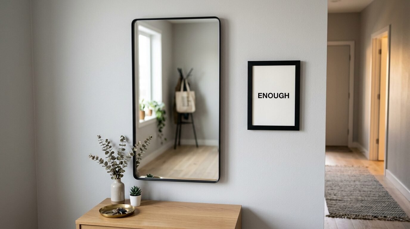
These are similar to quote prints but focus on self growth. Words like Enough or Present serve as daily anchors. These are great for a focus wall near your mirror.
I see these as tools for mental health. A simple reminder can change your whole morning. Keep the font very simple. Sans serif fonts like Helvetica look the most modern.
21. Scandi Style Pine Trees
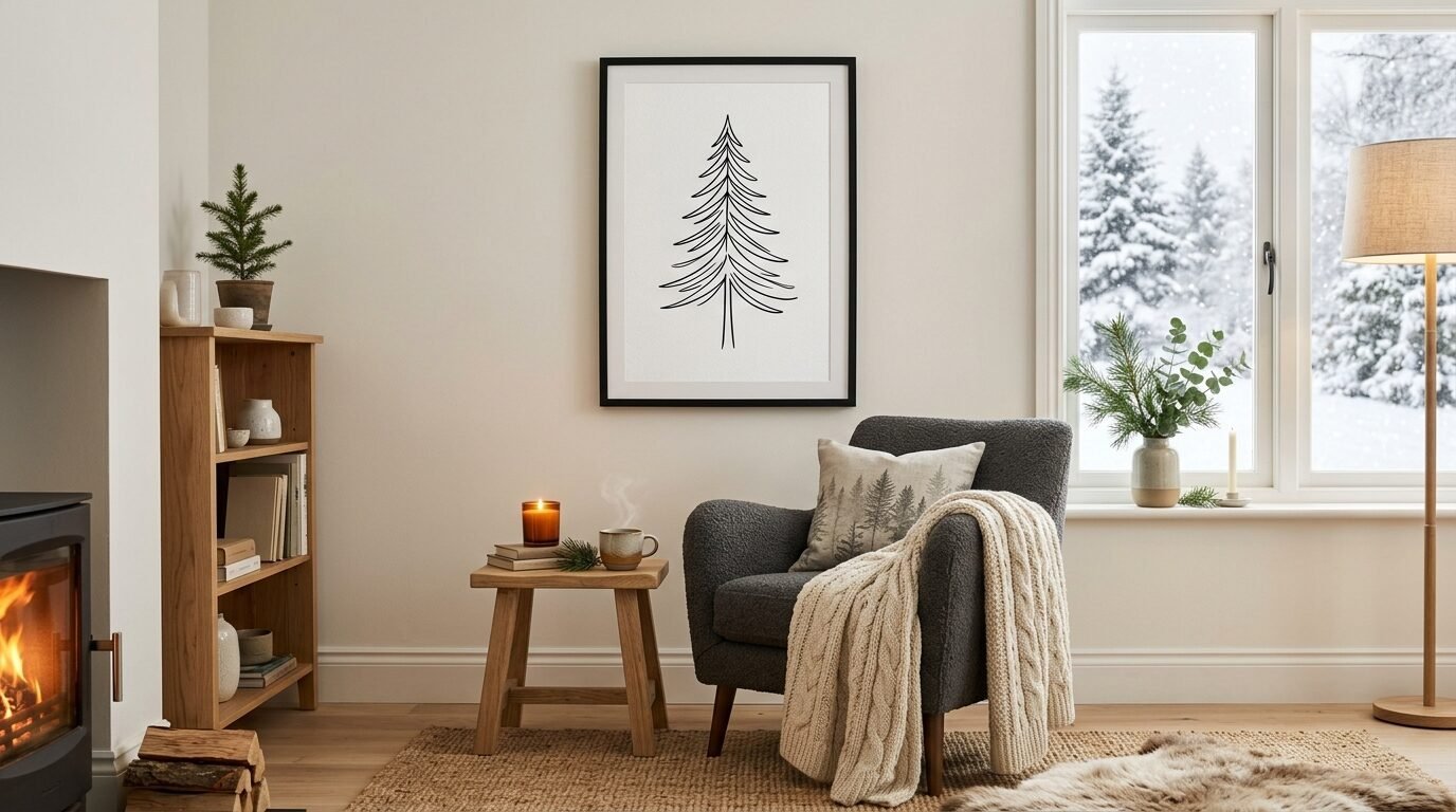
Scandinavian design loves nature. A single pine tree drawn with simple lines is a staple. It looks cold and fresh.
I love these for the winter months. They look great with a thick white mat and a black frame. They add a cozy but clean feel to a living room. These are often sold in wall art sets with other nature themes.
Comparison: Home Printing vs. Professional Services
You have two main choices for your wall art printables. Both have benefits depending on your budget and time.
| Feature | Home Printing | Professional Service |
| Cost | Very Low | Moderate |
| Quality | Good for small sizes | Excellent for large sizes |
| Paper Choice | Limited to your printer | Hundreds of options |
| Speed | Instant | 3 to 7 days |
| Ease | Takes some trial and error | Upload and wait |
In my experience home printing is perfect for 8 by 10 prints. My office printer handles cardstock well. For anything larger than a standard sheet of paper I use a pro shop. Sites like Staples or local photo labs offer wide format printing. They use archival inks that last longer. If you want a focus wall with a massive print go professional.
Pros and Cons of Printable Art
Printables are a great solution for many but there are trade offs.
Pros
- You save a lot of money.
- You get the files immediately.
- You can print the same design multiple times.
- You can choose your own frame style.
- It is easy to change your decor every season.
Cons
- You have to buy your own frames.
- Home printers can run out of ink quickly.
- Large prints require a trip to a print shop.
- Colors on your screen might look different on paper.
I have found that the pros far outweigh the cons. The flexibility is the best part. I once changed my entire bedroom meditation space in one afternoon. I just printed new designs and swapped them into my existing frames.
Frequently Asked Questions
What is the best paper for wall art printables?
Heavy matte cardstock is the industry standard. Look for 200 GSM or higher. This weight feels like a real painting. Avoid glossy paper as it reflects too much light. This makes it hard to see the art from different angles in your room.
How do I choose the right frame size?
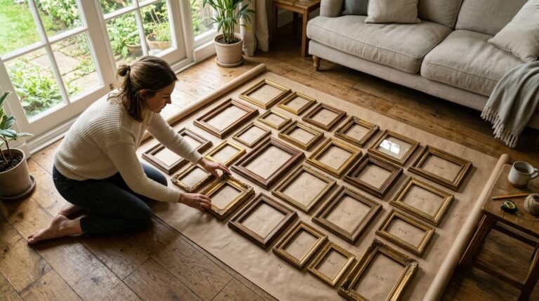
Measure your wall first. A common mistake is buying a frame that is too small. For a large focus wall a 24 by 36 inch frame is ideal. If you have a small desk space an 8 by 10 inch frame works well. Always buy the frame before you print the art to ensure a perfect fit.
Can I resize a digital file?
Most sellers provide files in different ratios. You can usually shrink a large file down without losing quality. However you should not stretch a small file to a large size. It will look blurry or pixelated. Check the file resolution before printing large items.
Where can I find minimalist art files?
Etsy is the most popular place for wall art printables. You can also find free options on sites like Unsplash for photography. Many designers offer freebies on their blogs. Wall art sets are a great value as they give you multiple matching prints for one price.
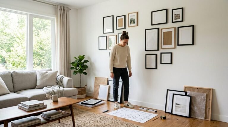
How do I hang a gallery wall straight?
Use a piece of painter tape. Place it on the back of the frame across the hanging holes. Mark the holes on the tape with a pen. Move the tape to the wall and use a level to make it straight. Drill your holes through the marks on the tape.
Final Thoughts on Minimalist Decor
Creating a beautiful home does not require a huge budget. Minimalist wall art allows you to express your style simply. These 21 designs offer a starting point for your journey. Whether you need a calm bedroom meditation space or a sharp living room office these prints work.
I recommend starting with one or two prints. See how they change the light in your room. You will likely find that less is more. A single well placed print often looks better than a wall full of clutter.
Take the time to find high quality paper and solid frames. These small details make your printables look like expensive art. Your home should be a place where you feel at peace. Clean lines and simple reminders are the fastest way to get there.

Anya Castellan is the Founder and Editor-in-Chief of Home Wall Trends. An art history graduate of the Rhode Island School of Design with twelve years of experience writing for leading American design publications, she specializes in composition, gallery wall theory, and the quiet architecture of domestic space. A former contributing editor at Architectural Digest and guest lecturer at Parsons School of Design, Anya personally reads and signs off on every piece before it is published.