Empty walls feel like missed opportunities. You stare at a blank space in your living room and wonder how to make it feel like home. Color trends come and go every season. One year it is sage green. The next year it is burnt orange. If you want a look that stays fresh for decades, black and white is the answer. This classic palette brings order to chaos. It makes mismatched photos look like a curated collection. I have helped dozens of friends design their own walls. Every single time, they tell me the black and white version feels the most high end. It simplifies the visual noise of a busy room. These ideas will help you create a focal point that never goes out of style.
Executive Summary
Creating a gallery wall does not require a degree in interior design. You only need a clear plan and the right tools. This guide covers ten specific ways to use monochrome art. You will see how to handle different frame sizes. We look at the best spacing for a professional finish. I share my favorite brands for affordable frames like IKEA and Target. You will also find a checklist for hanging your art without ruining your drywall. Whether you have a tiny hallway or a massive living room wall, these strategies work. You will learn how to mix personal family photos with modern abstract prints. By the end of this deep dive, you will have the confidence to pick up a hammer and start.
1. The Perfectly Symmetrical Grid
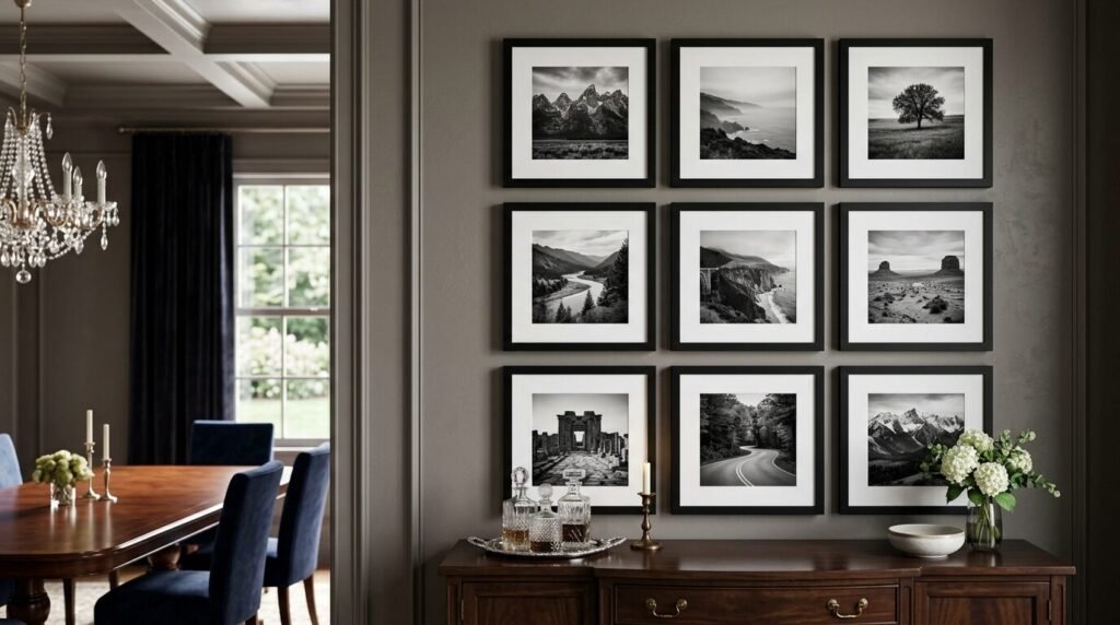
A symmetrical grid is the gold standard for a clean look. It uses identical frames arranged in a precise pattern. I see this work best in formal dining rooms or entryways. It creates a sense of calm and order. You use the same size for every piece of art. The spacing between frames must be exactly the same. Usually, two to three inches of space works perfectly.
In my experience, a 3×3 grid is a showstopper. It fills a large wall without feeling cluttered. I once helped a client install nine black frames from the IKEA Ribba collection. We used black and white travel photos from their honeymoon. The uniform frames made different locations look cohesive. It turned a messy pile of memories into a sophisticated art installation.
For this look, precision is your best friend. Use a laser level to keep your rows straight. If one frame is off by even a quarter inch, the whole grid looks wrong. I suggest using a template. Cut out paper shapes the size of your frames. Tape them to the wall first. This lets you see the layout before you make a single hole. It saves your walls and your sanity.
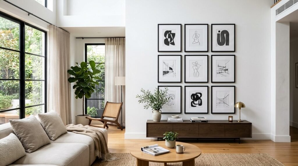
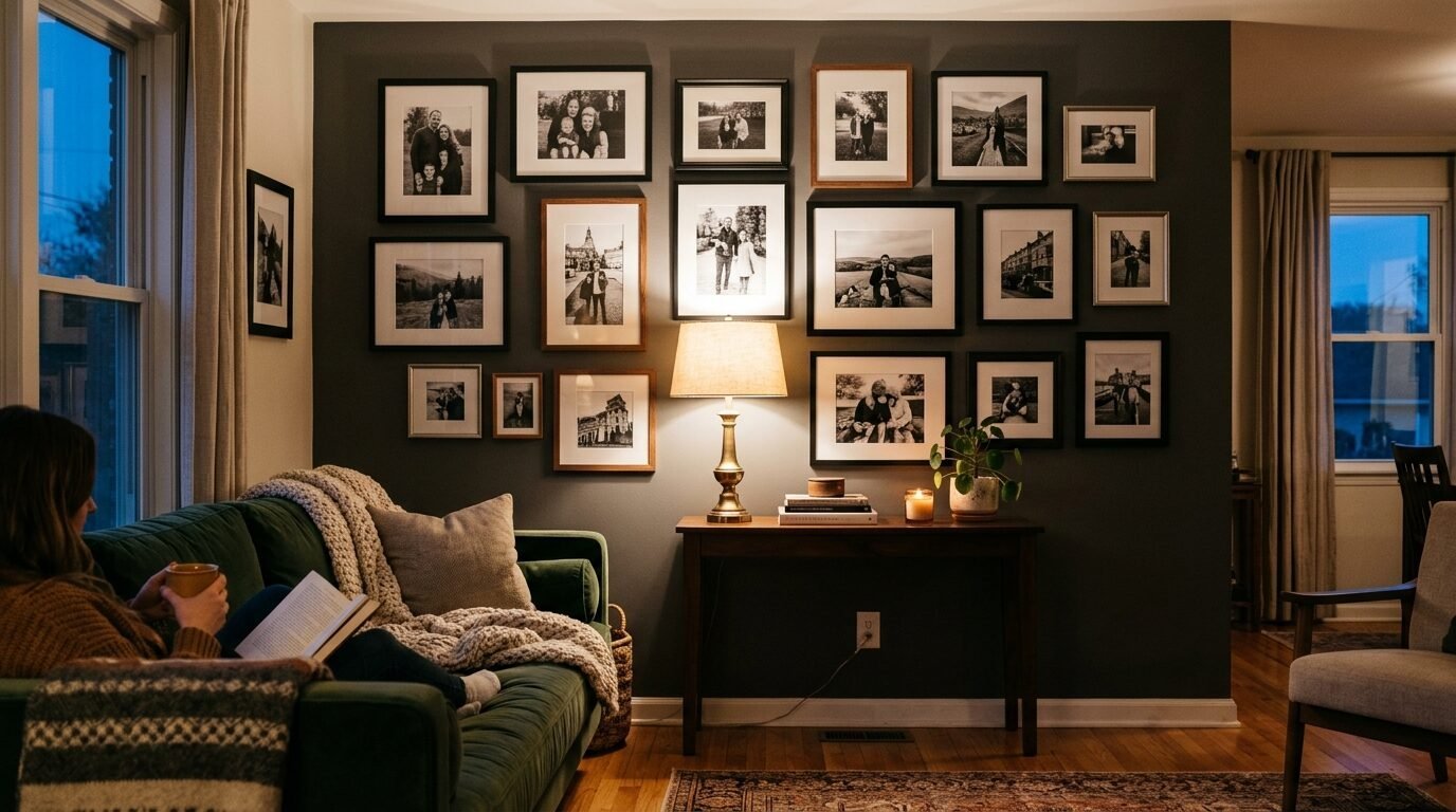
2. The Floor to Ceiling Statement
If you want a bold look, go big. A floor to ceiling gallery wall covers the entire vertical space. It makes a room feel taller. This style works exceptionally well in living rooms with high ceilings. You do not need to fill every inch immediately. You can start in the middle and grow the collection over time.
I tried this in my own hallway three years ago. I used thin black metal frames from Framebridge. I mixed family portraits with architectural sketches. The key to this look is varying the orientation. Mix vertical and horizontal frames. This keeps the eye moving from the floor all the way up.
A floor to ceiling wall tells a story. It feels like a library of your life. Do not be afraid to place frames near the baseboards. It adds an unexpected touch of style. I noticed that guests always linger longer at this wall. They start at the bottom and work their way up. It creates a conversation piece that feels very personal.
3. The Oversized Matting Technique
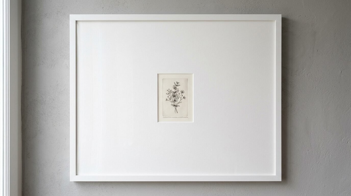
Matting is the cardboard border inside a frame. Most people use a standard one inch mat. If you want a high fashion look, use oversized matting. This means placing a small photo in a very large frame. It creates a lot of white space. This white space draws the eye directly to the art.
I saw this work beautifully in a minimalist loft. The owner used 20×20 frames for 5×7 photos. The result was stunning. It made simple black and white snapshots look like expensive gallery pieces. You can find pre matted frames at stores like West Elm or Pottery Barn.
Oversized matting is a great trick for low resolution photos. If you have an old grainy photo of a grandparent, do not blow it up. Keep it small. Put it in a large frame with a wide mat. The frame gives the photo importance. It protects the image while making it a star. In my experience, this is the easiest way to make a cheap print look like a million dollars.
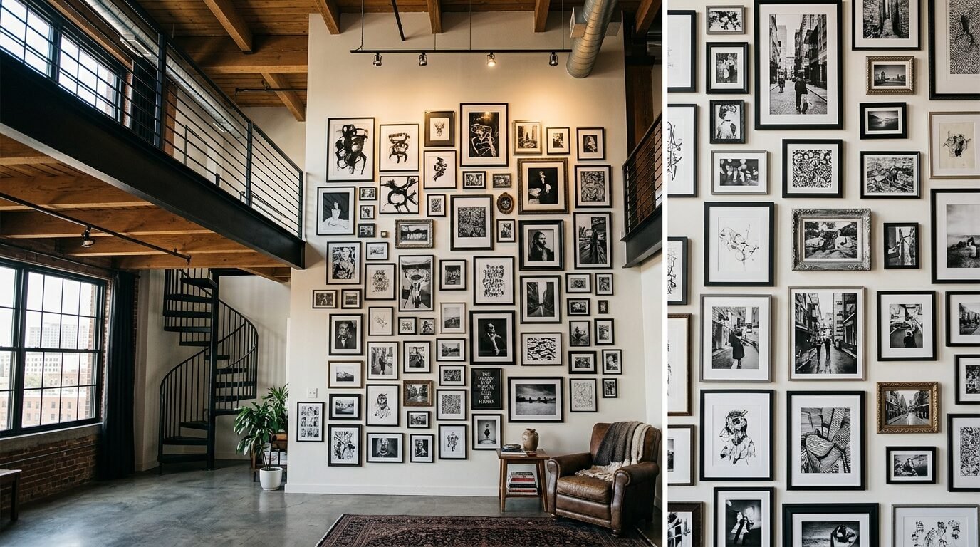
4. The Eclectic Mix of Textures
Black and white does not have to be flat. You can add depth by mixing frame materials. Combine matte black wood with shiny silver metal. Add a few white washed wooden frames into the mix. This creates a textured look that feels collected over time. It avoids the “straight out of a box” look.
I recently worked on a project where we used 12 different frames from Michaels and Hobby Lobby. Some were ornate and vintage. Others were sleek and modern. Because the art was all black and white, the different frame styles did not clash. They complemented each other.
To make this work, find a common thread. Maybe all the frames have the same depth. Or maybe they all have white mats. This subtle consistency keeps the wall from looking messy. It feels like a gallery in a cool boutique hotel. I love this approach for people who enjoy thrifting. You can find unique frames at yard sales and give them a quick coat of black paint.
5. Architectural and Botanical Prints
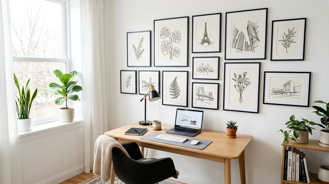
Sometimes you do not want faces on your wall. Architectural and botanical prints are a great alternative. Think of black and white sketches of old buildings or detailed leaves. These images are calming. They work well in bedrooms or home offices where you want to focus.
I often suggest these prints to people who are just starting. You can find high quality digital downloads on Etsy for a few dollars. Print them at home or a local shop. I like to mix one large architectural print with several smaller botanical sketches.
These prints add a sophisticated touch to any living room. They feel timeless because nature and buildings never go out of style. I have seen these look great in thin black frames from Target. The Threshold line often has great options for this. It is a budget friendly way to get a designer look.
6. The Linear Shelf Display
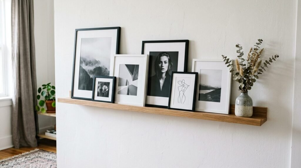
If you hate making holes in your wall, use picture ledges. These are thin shelves designed to hold frames. You can find them at IKEA or Amazon. You mount the shelves in a long line and lean your art against the wall. This allows you to change your photos whenever you want.
I used this method in my home office. I have three long white ledges. I overlap the frames slightly to create layers. It looks effortless and chic. I mix different heights of black frames. Some have photos and some have quotes.
The best part of a shelf display is the flexibility. If you get a new photo, you just slide it in. No measuring required. In my experience, this is the best option for renters. You only have to hang a couple of shelves instead of twenty individual frames. It keeps your walls clean and your decor fresh.
7. Abstract Ink and Charcoal
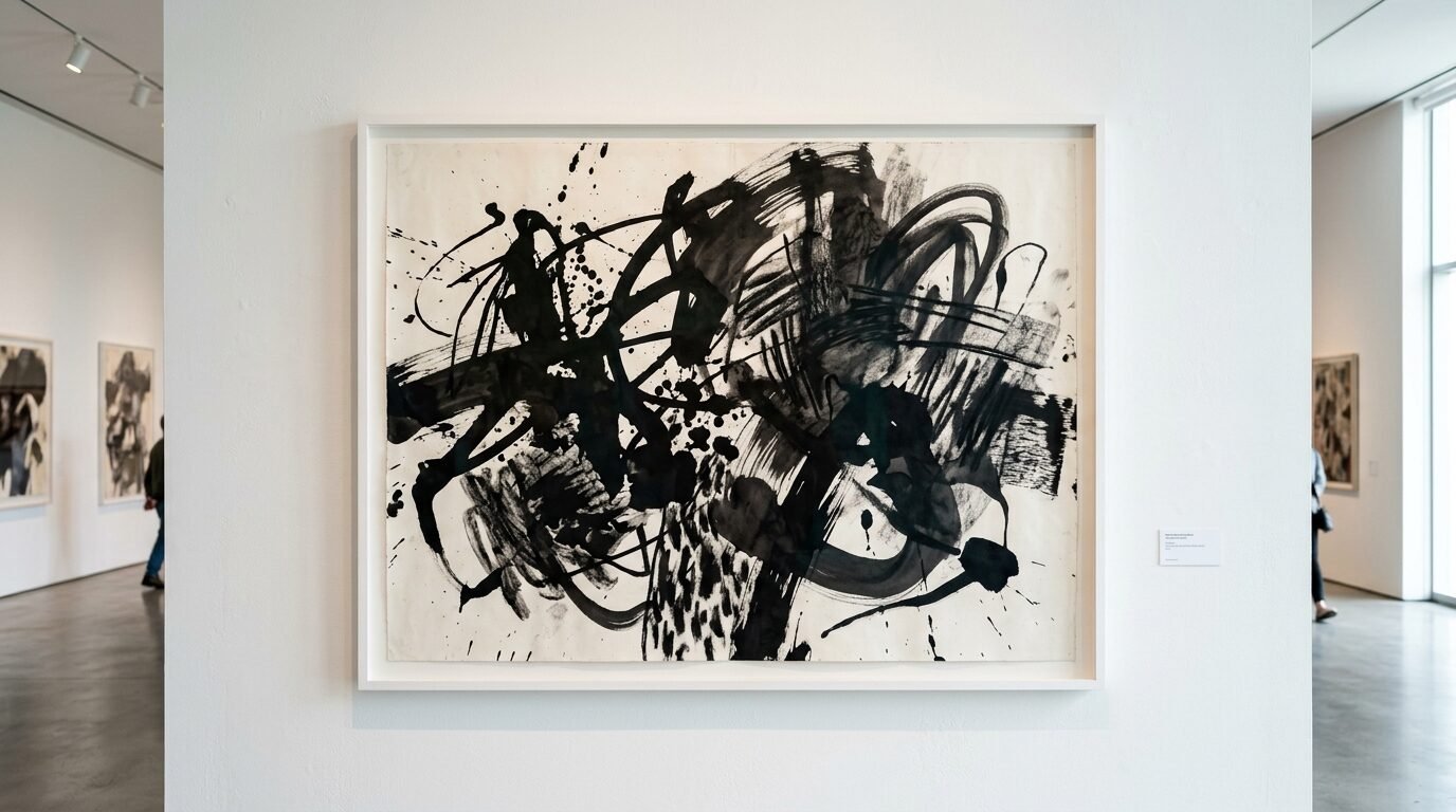
Abstract art is perfect for black and white gallery walls. Strong ink strokes or charcoal sketches add a modern edge. They provide a break from literal photos. An abstract piece acts as a visual resting point for the eye.
I once helped a friend create a wall using only their own drawings. They used thick black markers on white cardstock. We framed them in simple white frames from Artifact Uprising. The contrast was sharp and professional. It turned a hobby into a featured art installation.
You do not need to be an artist to do this. You can find many abstract prints online. Look for high contrast pieces. Bold lines work better than soft greys in a gallery setting. I recommend placing your largest abstract piece slightly off center. This creates a dynamic feeling that draws people in.
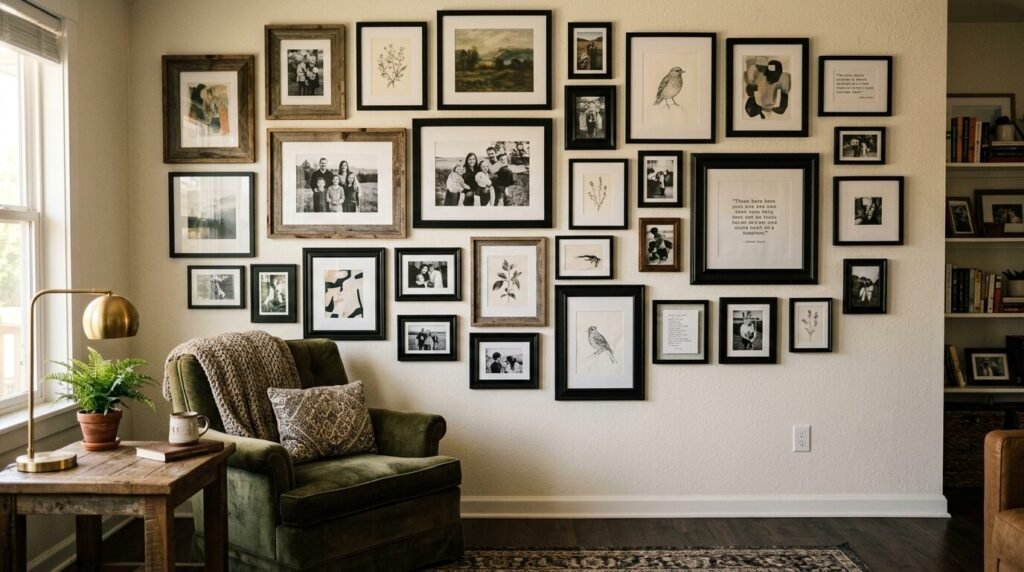
8. The Vintage Family Archive
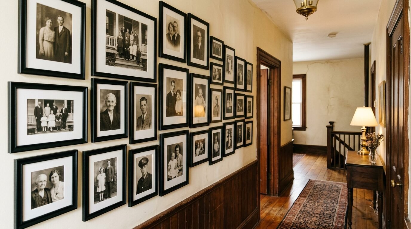
Turn your family history into art. Many old photos are already black and white or sepia. These look incredible when grouped together. It honors your heritage while looking stylish. I suggest scanning old photos and printing them in a consistent size.
I helped a family create an “Ancestry Wall” in their hallway. We used 15 frames of various sizes. We stayed with black frames and white mats to keep it cohesive. It became the most popular spot in their house. Every visitor spent time looking at the old wedding photos and baby pictures.
When working with old photos, watch out for sun damage. Use UV protective glass if the wall gets direct sunlight. I have seen beautiful photos fade to nothing over a few years. It is worth the extra few dollars to protect those memories. Brands like Minted offer high quality framing options that include protective glass.
9. Geometric and Pattern Play
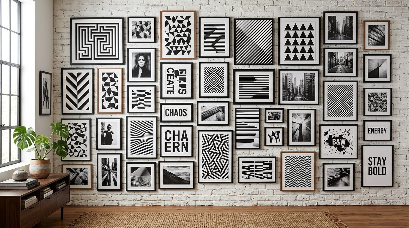
Black and white patterns are visually striking. Think of stripes, chevrons, or geometric shapes. These add energy to a room. They work well in modern or mid century homes. You can use patterned wrapping paper or fabric scraps as art.
I like to use one or two patterned pieces as “fillers” in a larger gallery. They bridge the gap between busy photos and plain walls. I once used a black and white marble pattern paper in a thin gold frame. It added a touch of luxury to a standard gallery wall.
Geometric art is very easy to design your own. You can use a ruler and a black pen. Simple triangles or circles look great when framed well. I’ve noticed this works especially well in children’s rooms or playrooms. It is playful but stays within the timeless color palette.
10. The Corner Wrap Around
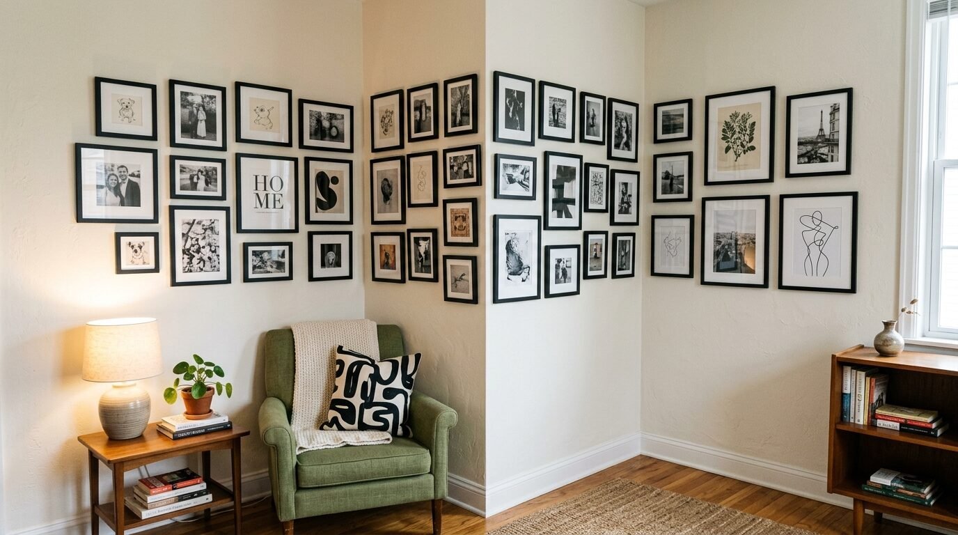
Do not stop at the edge of the wall. A gallery wall that wraps around a corner is a pro designer move. It makes the space feel connected. It turns a boring corner into a feature. This works well in small apartments where wall space is limited.
I saw this in a tiny studio apartment in Chicago. The gallery started on the main wall and continued around to the entry door. It led the eye through the space. The owner used a mix of small square frames.
To pull this off, keep your horizontal lines consistent as you turn the corner. The spacing should stay the same. It creates a seamless flow. I suggest using lightweight frames like the ones from Desenio. They are easy to hang and come in many sizes. This approach feels architectural and intentional.
Comparison of Popular Framing Brands
Selecting the right frame is half the battle. Here is a breakdown of brands I have used and trust.
| Brand | Price Point | Best For | Pros | Cons |
| IKEA | Budget | Grid Walls | Very affordable, consistent sizes | Plastic instead of glass |
| Framebridge | Premium | Custom Art | High quality, ships to you | More expensive |
| Target | Mid Range | Home Decor | Stylish designs, easy to find | Limited large sizes |
| West Elm | High End | Modern Looks | Thick wood, beautiful finishes | Pricey for big walls |
| Artifact Uprising | Premium | Personal Photos | Excellent print quality | Slower shipping |
| Amazon | Budget | Bulk Buying | Fast shipping, huge variety | Quality can vary |
| Michaels | Mid Range | Customizing | Frequent sales, many colors | Stores can be messy |
| Pottery Barn | High End | Traditional | Heavy duty, classic style | Very heavy frames |
Essential Tools for Success
You need the right gear to avoid frustration. I have tried to hang art with just a hammer and a prayer. It never works. These tools make the process smooth.
- Laser Level: This is a game changer. It puts a straight red line on your wall. No more crooked frames.
- Command Strips: These are perfect for renters. They hold a lot of weight and leave no holes.
- Painter’s Tape: Use this to mark your corners before you hammer. It protects the paint.
- Measuring Tape: Do not eyeball it. Measure twice and hang once.
- Kraft Paper: Cut out templates of your frames. Tape them to the wall to test your layout.
- Pencil: Mark your nail spots lightly. You can erase them later.
- Small Hammer: A heavy hammer is overkill for most gallery frames.
Frequently Asked Questions
How high should I hang my gallery wall?
Most people hang art too high. The center of your gallery should be at eye level. This is usually about 57 to 60 inches from the floor. If you are hanging it above a sofa, leave 6 to 8 inches of space above the back of the couch. This keeps the art connected to the furniture.
Should I use all black frames or all white frames?
Both work well. Black frames are bold and modern. They create a strong contrast against white walls. White frames are subtle and airy. They make the art look like it is floating. In my experience, black frames are easier to style because they hide dust and small scratches better.
How do I choose the right spacing?
Consistency is the most important factor. For a tight grid, use 2 inches. For a loose eclectic wall, 3 to 4 inches works well. Use a piece of wood or a spacer tool to keep the gaps even. I often use a small block of wood as a guide. It ensures every frame is the same distance apart.
Can I mix color photos into a black and white wall?
It is possible, but it is hard to get right. If you want a timeless look, stick to monochrome. If you must use color, keep the colors very muted. Bright colors will distract from the rest of the wall. In my experience, converting all your photos to black and white is the safest bet for a professional result.
What if I have a very small wall?
A small wall is perfect for a vertical gallery. Use three or four frames stacked on top of each other. This draws the eye up and makes the wall feel intentional. Do not try to cram too many frames into a small space. Less is often more in tight corners.
Is the gallery wall trend out of style?
No. The gallery wall is a classic design element. While specific styles change, the concept of displaying art remains popular. Using black and white is the best way to ensure your wall does not feel dated in five years. It is a foundational look that survives every trend cycle.
Conclusion
A black and white gallery wall is more than just decor. It is a way to tell your story without saying a word. It brings your favorite moments and beautiful art into your daily life. You do not need a massive budget or a professional installer. Start with a few frames. Pick a layout that fits your personality. Whether you choose a perfect grid or a wild eclectic mix, the monochrome palette will keep it looking sophisticated. I have seen these walls change the entire feel of a home. They add warmth, history, and style. Grab your frames and start creating. Your walls are waiting for their new look.

Anya Castellan is the Founder and Editor-in-Chief of Home Wall Trends. An art history graduate of the Rhode Island School of Design with twelve years of experience writing for leading American design publications, she specializes in composition, gallery wall theory, and the quiet architecture of domestic space. A former contributing editor at Architectural Digest and guest lecturer at Parsons School of Design, Anya personally reads and signs off on every piece before it is published.