I stood in my hallway three years ago holding a ruined vintage frame. Damp air had trapped moisture right behind the artwork and destroyed the backing. That failure forced me to rethink how I decorate spaces. I stopped relying on heavy frames alone. I started pairing flat vinyl stickers with lighter framed pieces. This layout style breathes life into blank spaces. You get depth without risking damage to expensive items. Today we will walk through exactly how to blend these two elements perfectly. You will know what to buy and where to place it.
You will get a complete breakdown of mixing vinyl shapes with framed prints. We will cover specific placement rules. I will share precise spacing measurements I use in my own home. You will read about tools like masking tape and leveling rulers. I will detail my favorite brands like WallPops and Framebridge. We will go over costs. You will see exact examples of what works. We will look at rooms for children and adult spaces. You will have everything you need to finish your room by this weekend.
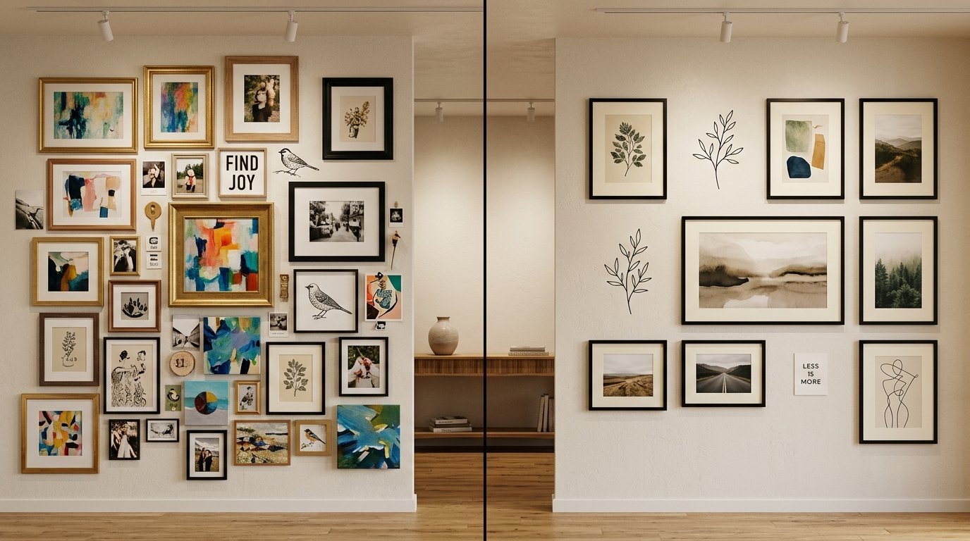
Why Blending Decals With Framed Art Works
Let us talk about visual balance. A flat sticker looks too simple on its own. A solid wood frame feels heavy. When you put them together, magic happens. The flat sticker grounds the frame. The frame gives texture to the flat wall.
I noticed this first in my bedroom. I had a heavy gold framed circle mirror. Water gathered in the bottom crease of the gold frame during cleaning last summer. It was a mess. I replaced it with a lighter metal frame surrounded by botanical vinyl stickers. The moisture issue disappeared. The wall looked much better.
You save money this way. Buying a dozen large prints costs hundreds of dollars. Buying one large print and surrounding it with vinyl shapes costs a fraction of that price.
You save your drywall too. Renters cannot drill a dozen holes. This layout requires maybe two nails. The rest goes straight onto the paint. You get a custom wallpaper look without the massive commitment.
Planning Your Layout Without Wasting Money
Never stick anything without a plan. I found this out the hard way. I ripped paint right off my living room wall in 2021.
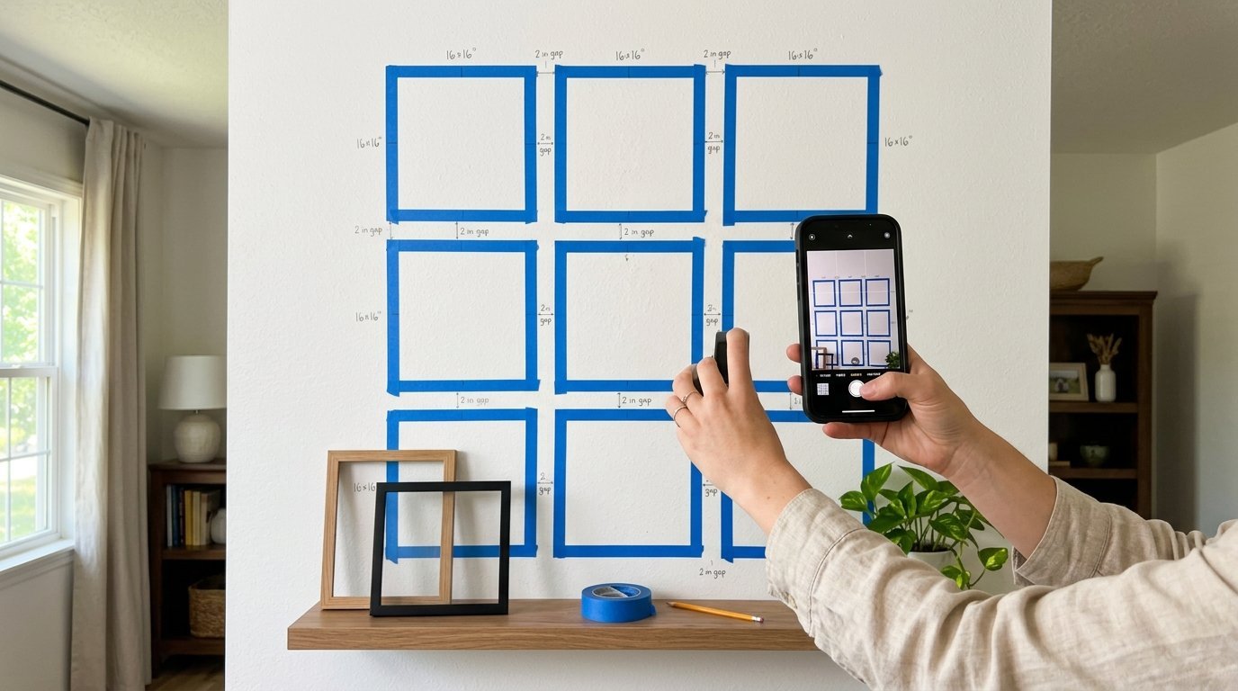
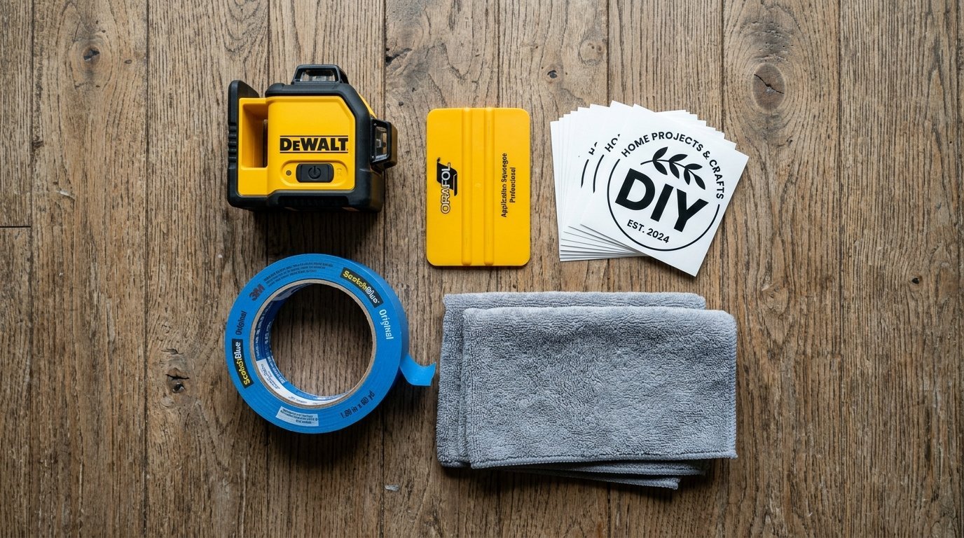
Start with painters tape. I prefer Scotch Blue tape. It removes easily. Map out the exact dimensions of your framed pieces. Place the tape directly on the wall.
Step back and look at the tape. Does the room feel crowded? You want negative space. Negative space gives your eyes a place to rest.
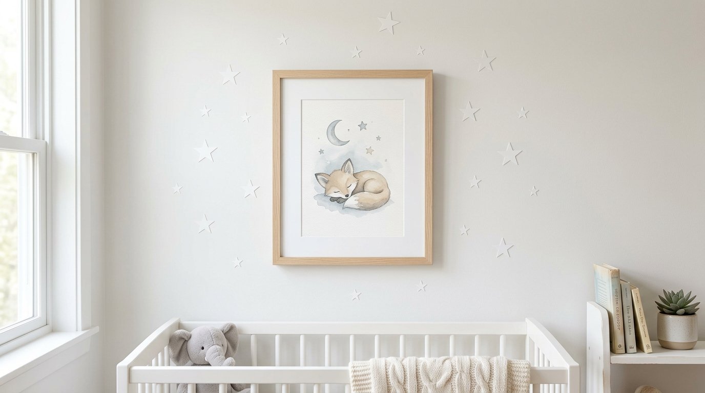
I map out Kids Bedroom Designs this way. I tape off where the crib goes. Then I tape where the main framed picture will hang. Then I plan the stickers around it.
Take a photo of the taped wall. Look at the photo on your phone. Sometimes the screen shows layout mistakes your eyes miss in person. Keep the tape up for two days. Notice how the light hits it. Morning light changes how shadows fall on frames.
Choosing The Right Decals For Your Base
Vinyl quality dictates the entire look. Cheap stickers peel off. They look shiny and fake.
Look for matte finish vinyl. Matte looks like fresh paint. Glossy catches glare from your windows. It looks cheap.
I trust brands like Urban Walls and Chasing Paper. Their products stick well but remove cleanly. They use thick material that hides minor wall bumps.
Sizing makes a massive difference. If your main frame is 18×24 inches, do not use giant stickers. Use smaller shapes. Think polka dots or small stars. This creates contrast.
If you have a small 8×10 frame, use an oversized mural sticker. I recently planned a Daycare Room Design this way. We used a massive mountain sticker. We hung a small wooden sign right over the peak. It looked perfectly balanced.
Color matching is tricky. Do not match the sticker color to the frame exactly. Choose a color from the actual artwork inside the frame. This ties the whole wall together.
Selecting Real Art Pieces That Fit
The frame material dictates the mood. I love farmhouse aesthetics. I tried to craft a farmhouse welcome sign from pine wood three months ago. It did not turn out as intended. But the raw wood texture taught me a lot about contrast.
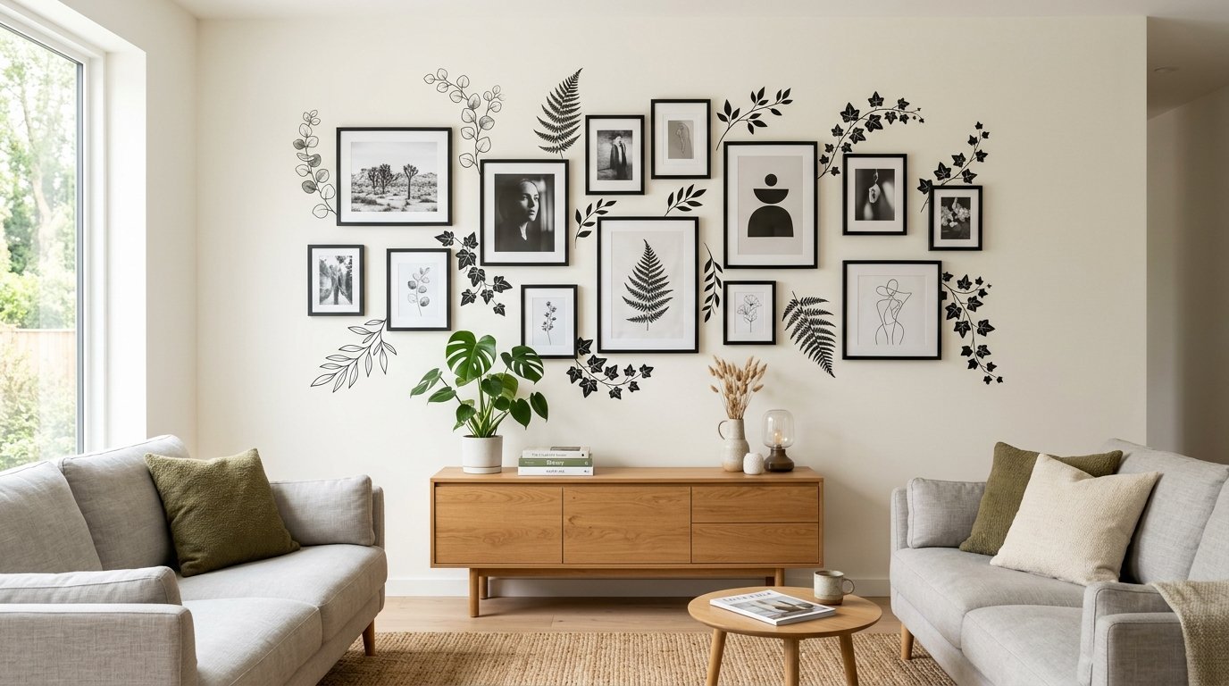
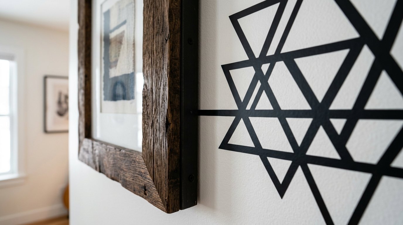
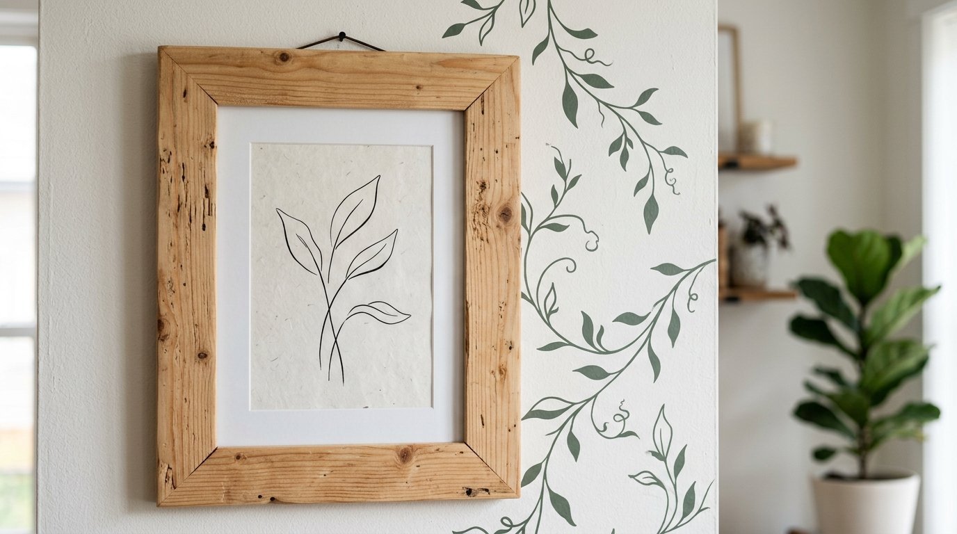
Pair raw wood frames with geometric vinyl shapes. The soft wood balances the sharp lines. Pair sleek metal frames with organic vinyl shapes like vines or flowers.
Always use glass or acrylic covers on your art. It reflects light. I used cheap paper towels last year which ruined the look of my home glass. They left scratches everywhere. I only use microfiber cloths now.
Keep the weight light. Command strips work well for thin frames. If a frame needs heavy anchors, it might overwhelm the delicate vinyl next to it.
Avoid thick mats. A thick white mat inside a frame creates a visual barrier. You want the art to feel close to the surrounding wall stickers.
The Psychology Behind Wall Decor Choices
Why do we hang things on our walls? Bare drywall feels cold. It echoes. It feels temporary. Layering materials changes the acoustics of a room. It softens the hard angles.
When you walk into a layered room, your brain registers safety and comfort. Flat paint feels sterile. Placing dimensional items like raw pine wood next to flat stickers gives your eyes a place to rest.
I noticed this when styling a Boho space last year. The room felt hostile until we applied texture. The mix of flat and raised surfaces tricks the brain into seeing depth.
We crave visual storytelling. A single poster looks like a dorm room. A poster surrounded by curated shapes looks like an intentional home. It tells guests you care about your space.
Step By Step Guide To Creating The Layout
Follow these exact directions. Do not skip steps.
- Wash your walls first.
- Use a damp microfiber cloth with plain water.
- Never use soap because soap leaves a film.
- Wait twenty four hours for the wall to dry completely.
- Place your heaviest or largest framed item first.
- Treat this item as your anchor piece.
- Apply the largest vinyl pieces next.
- Work outward from the frame.
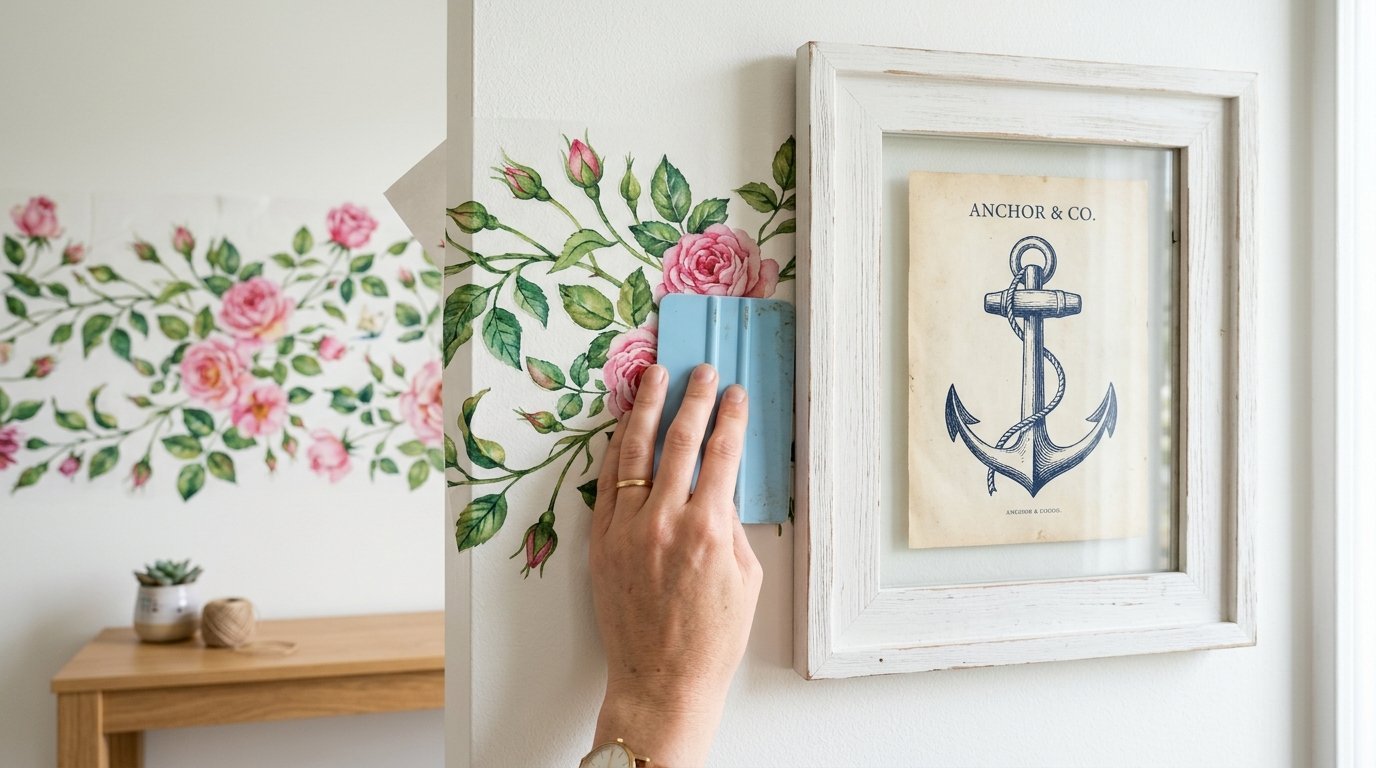
- Tuck vines slightly behind the edge of the frame to create depth.
- Fill empty gaps with medium sized items.
- Step back and go to the doorway to check the balance.
- Sprinkle small stars or dots in the empty pockets.
- Take a plastic smoothing tool and press hard on all vinyl edges.
Fixing Common Mistakes When Mixing Mediums
People group items too tightly. Give your pieces room to breathe. Leave at least three inches between a frame and a large sticker.
People ignore the room scale. A tiny collection on a massive wall looks like a mistake. A massive collection on a tiny wall feels chaotic.
I see contrasting themes constantly. Do not mix outer space stickers with vintage botanical prints. Keep the story cohesive.
Do not hang frames on top of thick vinyl seams. The frame will not sit flush against the drywall. It will cast an awkward shadow.
If a sticker starts peeling, do not use glue. Glue destroys drywall. Heat the sticker gently with a hair dryer. Press it back down. The heat reactivates the adhesive.
Tools And Brands I Trust For This Project
I test dozens of items yearly. I only keep what works. Here is my current list.
Command Picture Hanging Strips handle up to sixteen pounds. They come off clean. Expect to pay about twelve dollars for a large pack.
I use a cheap mini projector from Amazon. It costs around fifty dollars. I project the layout onto the wall before hanging anything.
Buy the Amazon Basics microfiber pack. Twelve dollars gets you twenty four cloths. Never use paper towels on your frames.
Framebridge custom frames anything. Prices start around sixty dollars. The quality beats local craft store frames.
Artifact Uprising prints gorgeous matte photos. Matte finishes avoid window glare perfectly.
RoomMates Decor sells the best cheap stickers. They work great for a quick seasonal swap.
Urban Walls produces high end vinyl. Expect to pay over one hundred dollars for a set. They look exactly like wallpaper.
WallPops offers a great middle tier option. They excel at geometric shapes.
I use a Black and Decker laser level. It costs twenty dollars. It ensures your frames sit perfectly straight.
Any cheap plastic squeegee works. It gets the air bubbles out of the vinyl.
Room By Room Placement Strategies
Different spaces require different energy levels.
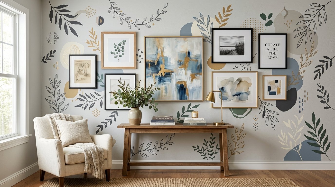
Living rooms handle complex layouts well. You sit on the couch and stare at these walls for hours. Give your eyes something to wander across. Use a large television as your anchor. Frame the television with trailing vine stickers.
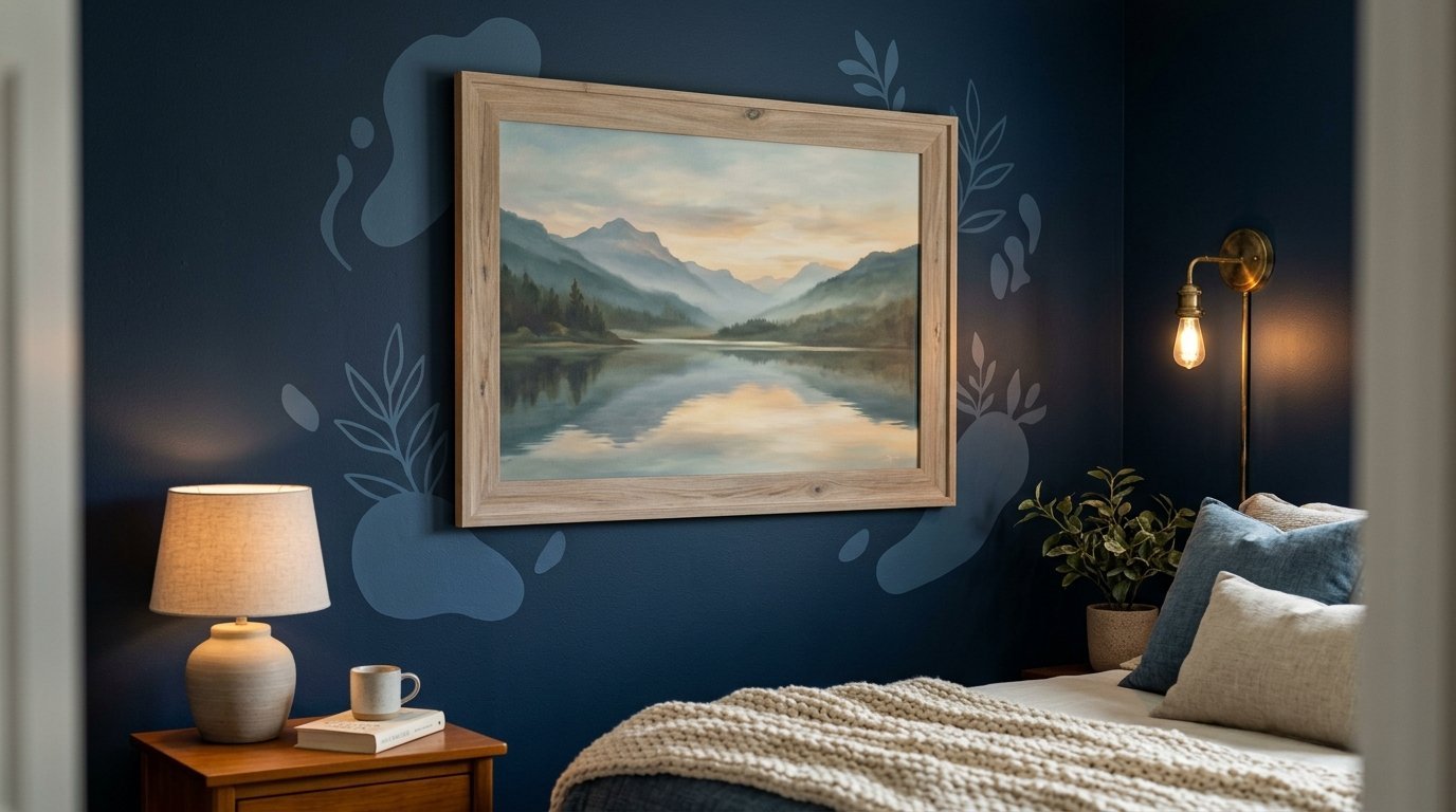
Bedrooms demand peace. Do not use high contrast colors here. Keep the stickers tonal. If the wall is navy blue, use light blue stickers. Hang a single large serene landscape in a washed wood frame.
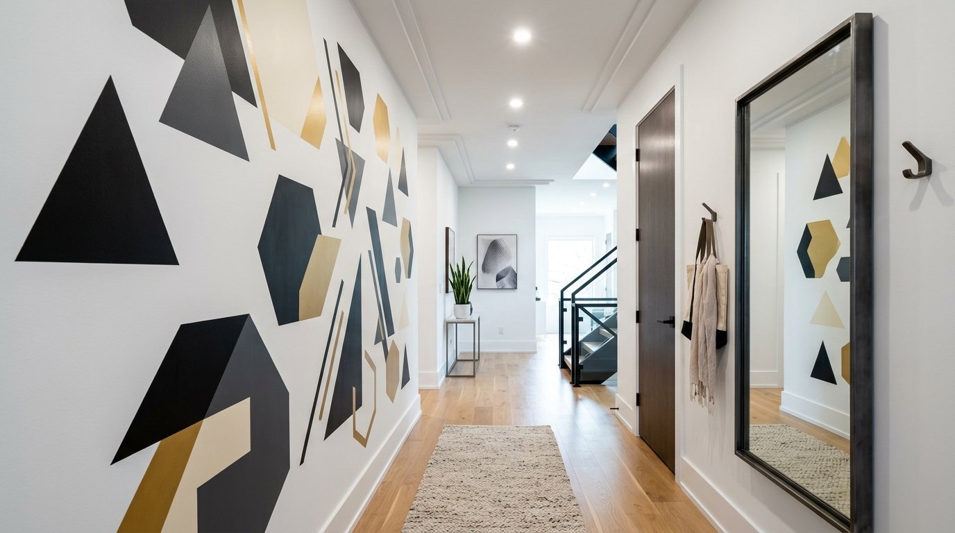
Hallways act as transitional spaces. People walk through them quickly. You want bold graphics here. Large geometric shapes work best. Pair them with long mirrors. Keep items away from exterior drafty walls to prevent moisture damage.
Bathrooms deal with heavy humidity. Vinyl handles humidity well. Real canvas does not. Use stickers for the main design in a bathroom. Hang one small framed piece in a sealed metal frame away from the shower.
Case Studies From Real Rooms
Let us look at three actual spaces. I have documented the items, costs, and time spent on each.
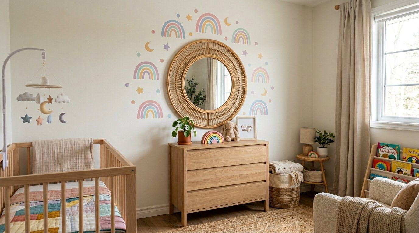
The Boho Nursery needed a soft aesthetic. We used a rattan mirror as the center anchor. We placed earthy rainbow stickers around it. We hung three small wooden frames with simple line drawings. Cost was two hundred dollars. Time spent was three hours. The final room was a calming space.
A client had a blank space above her Farmhouse Kitchen Corner coffee cart. We used a vintage gold frame holding a family recipe. We applied matte black botanical leaves cascading down from the ceiling toward the frame. Cost was eighty dollars. Time spent was one hour. The black vines made the gold frame pop.
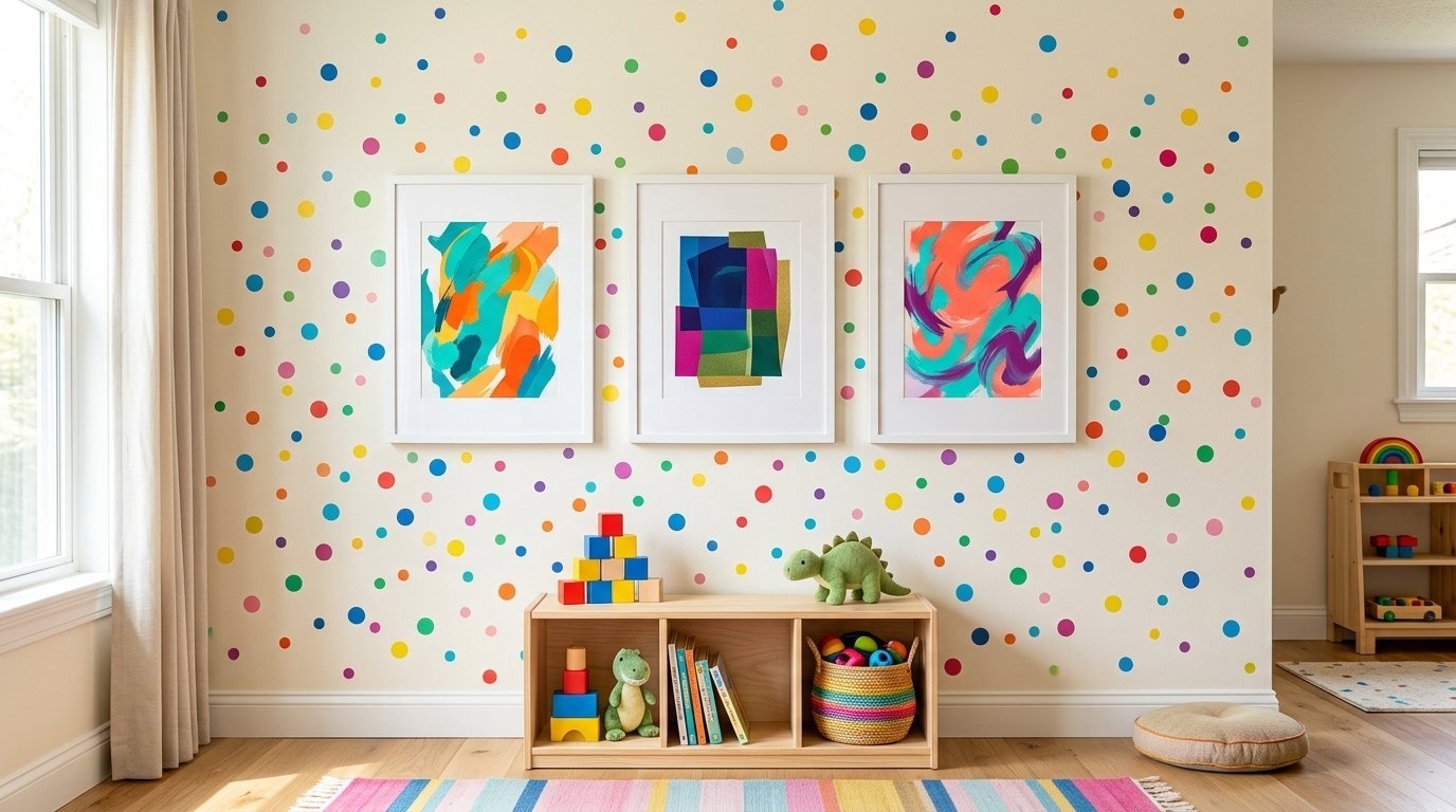
A friend wanted maximum color for a Playroom Gallery. We used cheap white IKEA frames holding bright abstract prints. We covered the entire wall behind the frames in multicolored confetti dot stickers. Cost was one hundred and fifty dollars. Time spent was four hours. It looks like custom wallpaper.
Budget Breakdown For A Layered Wall
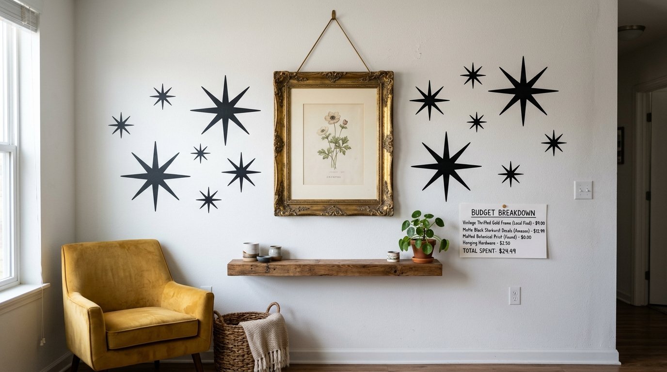
Let us look at exact numbers. You need to know what this costs.
The high end route means you hire a custom framer. You buy designer vinyl. You spend four hundred dollars on the frame. You spend two hundred dollars on the stickers. Your total sits around six hundred dollars.
The middle tier route is my preferred path. You buy a nice frame from Target for fifty dollars. You buy good stickers from WallPops for forty dollars. You spend ten dollars on hanging strips. Your total is one hundred dollars.
The thrift store route works well for tight budgets. You buy an old painting for five dollars. You buy clearance stickers for ten dollars. You spend fifteen dollars total. The final look still feels highly curated because the layout provides the value.
Historical Context Of Gallery Walls
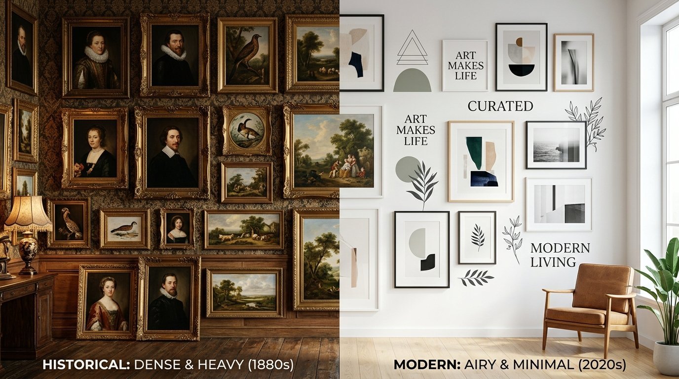
The French salon started the dense wall layout. They hung oil paintings frame to frame. They wanted to display wealth. It felt crowded.
Modern homes cannot handle that visual weight. We evolved to the minimal gallery wall in the early two thousands. People used matching black frames. It felt rigid.
Today we mix mediums. We use vinyl to fill spaces instead of heavy frames. This mirrors the casual nature of modern living. We want our homes to feel curated over time. We do not want them to look like a rigid museum exhibit.
Dealing With Awkward Wall Shapes And Angles
Not every wall is a perfect rectangle.
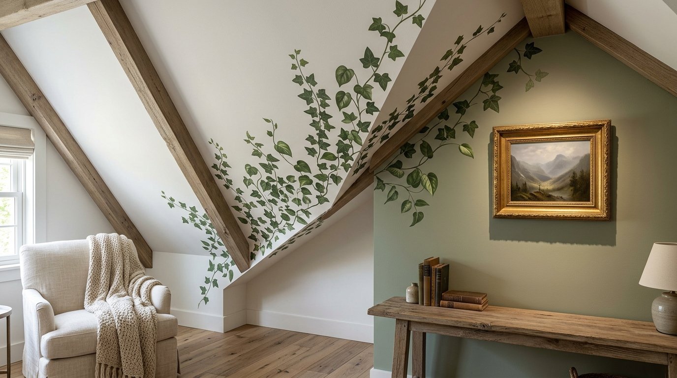
Sloped ceilings present a massive hurdle. Do not fight the slope. Run your stickers up the angle. Hang your frames on the flat vertical section beneath it. It draws the eye upward.
Narrow vertical slivers between windows need love too. Stack three small frames vertically. Run a delicate floral sticker vine weaving between the frames. It turns a weird gap into a focal point.
Corner wrap layouts look incredible. Place a large frame on the left wall near the corner. Run your stickers from the left wall across the corner seam and onto the right wall. It softens the hard architectural line.
Seasonal Swapping Tactics
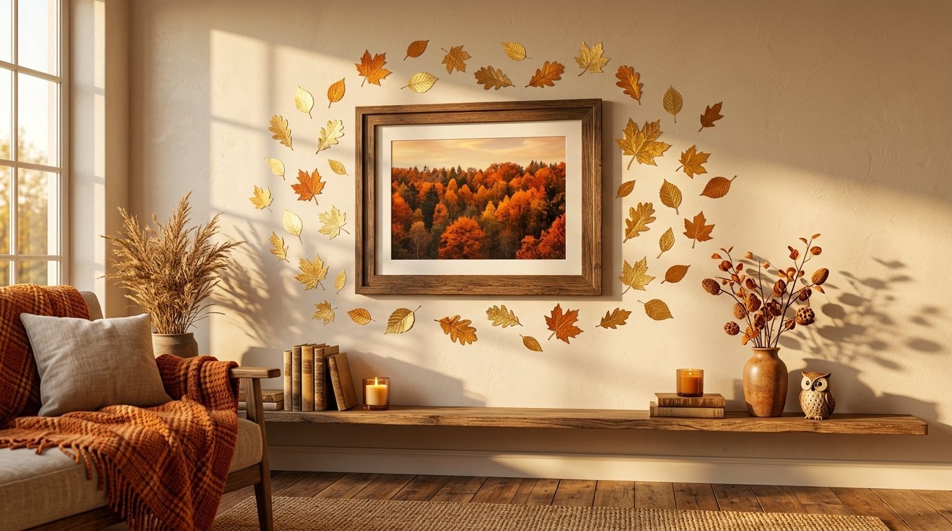
Stickers allow for cheap seasonal shifts. Keep your main framed anchor pieces all year.
In autumn, apply small gold leaf stickers tumbling down around the frames. In winter, swap the leaves for white starbursts. In spring, apply small pastel flowers.
This takes thirty minutes. It costs twenty dollars. Your room feels completely refreshed without putting new holes in your drywall.
Frequently Asked Questions
Can I place a sticker directly over a frame?
No. The vinyl will not adhere well to the frame material. It also ruins the illusion of depth. Place the sticker on the wall so it looks like it sits behind the frame.
Do these layouts work on textured walls?
It depends on the texture. Light orange peel texture is fine. Heavy knockdown texture will show through the sticker. It makes the vinyl look bumpy. Stick to thick canvas art on heavily textured walls.
How long do vinyl stickers last indoors?
High quality indoor vinyl lasts five to seven years. Sunlight fades the colors eventually. Heat from vents can dry out the adhesive. Keep them away from direct heat sources.
Are these safe for a Newborn Room?
Yes. Look for non toxic and chemical free vinyl. Many companies print with water based inks now. They emit zero fumes. They work perfectly for a sensitive space.
Can I move the layout later?
Frames move easily. Most high quality stickers are removable. But they are rarely reusable. Once you peel them off, they stretch. Plan on buying new stickers if you move houses.
Should I mix different colored frames?
Keep it to two frame colors maximum. Black and wood looks great. White and gold works well. Too many frame colors mixed with stickers creates visual clutter.
How do I clean this setup?
Dust the frames lightly with a dry microfiber cloth. Never spray glass cleaner directly onto the frame. It will drip down and ruin the sticker adhesive below it. Spray the cloth first.
What is the rule of thirds in decorating?
Divide your wall into a grid of nine squares. Place your heaviest visual items at the intersections of those lines. Do not place everything dead center. Off center placement feels more natural.
Can I mix glossy and matte finishes?
I advise against it. Glossy frames reflect light. Matte stickers absorb light. Putting them together shows the fact that the stickers are cheap vinyl. Stick to matte frames with matte stickers.
How large should the main focal piece be?
Your anchor piece should take up at least one quarter of the total decorated space. If the anchor is too small, the stickers will swallow it up.
Do I need a laser level for stickers?
Not for organic shapes like clouds or flowers. You absolutely need one for geometric shapes like stripes or grids. A crooked stripe ruins the whole aesthetic.
Can I use wallpaper instead of stickers?
Yes. But wallpaper covers the entire wall. Stickers let the base paint color show through. Stickers are cheaper and require far less labor to install.
How do I use Baby Posters in this design?
Buy minimal wood frames for the prints. Hang them lower on the wall so toddlers can see them. Surround them with simple black and white vinyl shapes for visual contrast.
What are the best Kids Room Inspiration sources?
Pinterest is great. But I prefer looking at vintage children’s books. The illustrations show you exactly how to mix soft painted backgrounds with sharp character outlines.
Can I mix Baby Room Paintings with vinyl quotes?
Yes. Hang a watercolor painting in the center. Place a vinyl quote curving softly over the top of the frame. Keep the quote font simple so it does not fight the painting.
Final Thoughts On Layering Your Walls
You have the rules. You have the step by step guide. You know what tools to buy. Mixing these two mediums takes patience. Taping the layout saves you from ruin. Choosing matte finishes keeps the look expensive. Remember my mistake with the ruined vintage frame. Do not let dampness wreck your art. Use this layered styling to get the custom look without the risk. Grab your painters tape today. Pick your anchor piece tonight. You can have a fully designed room by tomorrow afternoon. Share your before and after photos.

Anya Castellan is the Founder and Editor-in-Chief of Home Wall Trends. An art history graduate of the Rhode Island School of Design with twelve years of experience writing for leading American design publications, she specializes in composition, gallery wall theory, and the quiet architecture of domestic space. A former contributing editor at Architectural Digest and guest lecturer at Parsons School of Design, Anya personally reads and signs off on every piece before it is published.