You stare at your living room. The furniture looks good. The rug fits perfectly. But something feels wrong. The walls feel cold. The room feels bare. You spent money on beautiful pieces. You hung them up. Yet the space still feels unfinished. Three months ago, I threw a fresh piece of pine right into the trash. I tried to craft a farmhouse welcome sign. I thought putting it on a blank wall would fix the room. It did not. The room still felt empty. Blank walls drain the warmth from a house. Bad placement makes good art look cheap. This guide fixes those exact problems.
You will fix your bare rooms today. I will show you exactly where to place your art. You will stop buying the wrong size prints. You will place items at the right height. You will mix textures like a professional. You will fix lighting errors. You will save money by avoiding common traps. I have made these mistakes myself. Now I will show you the exact fixes. Your home will feel warm and complete.
1. Hanging Art Too High on the Wall
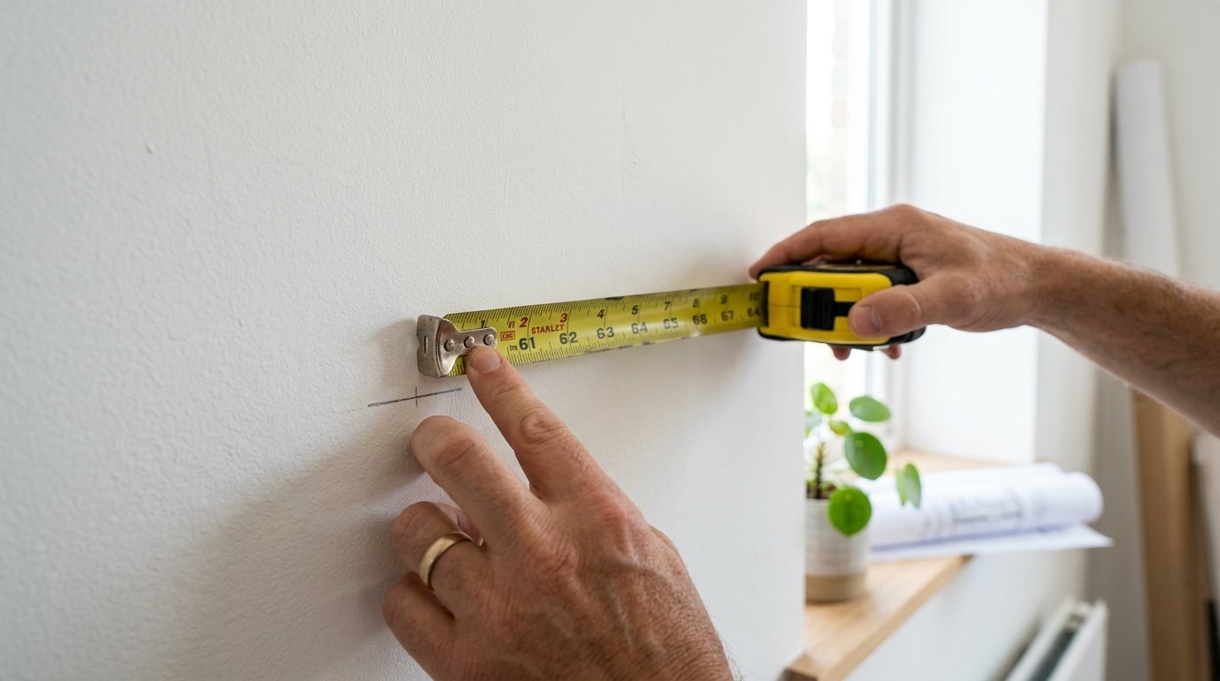
You walk into a room and have to look up. The art floats near the ceiling. The furniture sits far below. This creates a massive gap. The wall still looks empty. I see this happen constantly. People measure from the ceiling down. They should measure from the floor up.
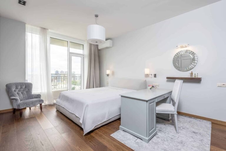
Eye level dictates placement. Professional interior design relies on strict measurements. The center of your art must sit 57 inches from the floor. This measurement matches the average human eye level. Galleries use this exact rule. Museums use this exact rule. It works flawlessly every single time.
When you hang pieces too high, they disconnect from the room. A beautiful painting becomes an isolated island. It floats away from your sofa. It floats away from your console table. You need visual connection. Your pieces must relate directly to your furniture. I visit many homes every year. I walk into living rooms and immediately notice this error. The homeowners feel frustrated. They spent good money on beautiful canvases. Yet the room feels completely cold.
If you hang art above a sofa, leave 8 to 10 inches of space. Measure from the top of the sofa back. Place the bottom edge of the frame there. This anchors the artwork. The wall stops feeling bare. The room suddenly feels cohesive.
Do not guess the height. I have tried eyeballing it. Eyeballing it always fails. You need a measuring tape. You need a pencil. You need painters tape. Mark the 57-inch spot on your wall. Find the center of your canvas. Match those two points perfectly.
People often ask what happens in rooms with high ceilings. The rule stays exactly the same. High ceilings do not change human height. Your eyes stay at the exact same level. Do not drag the art upward to fill the void. Let the upper wall remain completely blank. The lower space holds the visual weight. Taller ceilings just mean you have more empty space above the art. That empty space lets the room breathe naturally.
Lighting plays a huge role here too. Ceiling lights cast harsh shadows on art hung too high. The light hits the top edge of the frame. The bottom half falls into total darkness. Hanging items lower allows ambient light to hit the canvas evenly. The colors show up much better. The details look much sharper.
Take your pieces down today. Measure the space properly. Rehang them at the correct height. You will see an instant change. The room will shrink around you in a good way. The atmosphere becomes incredibly cozy.
Tools you need for this fix:
- Measuring tape
- Pencil
- Bubble level
- Picture hanging wire
- Painters tape
I keep a small kit in my drawer just for this task. I keep a tape measure ready. I keep a small level nearby. I keep spare picture hangers. You should do the exact same thing.
2. Choosing Frames That Are Too Small for the Space
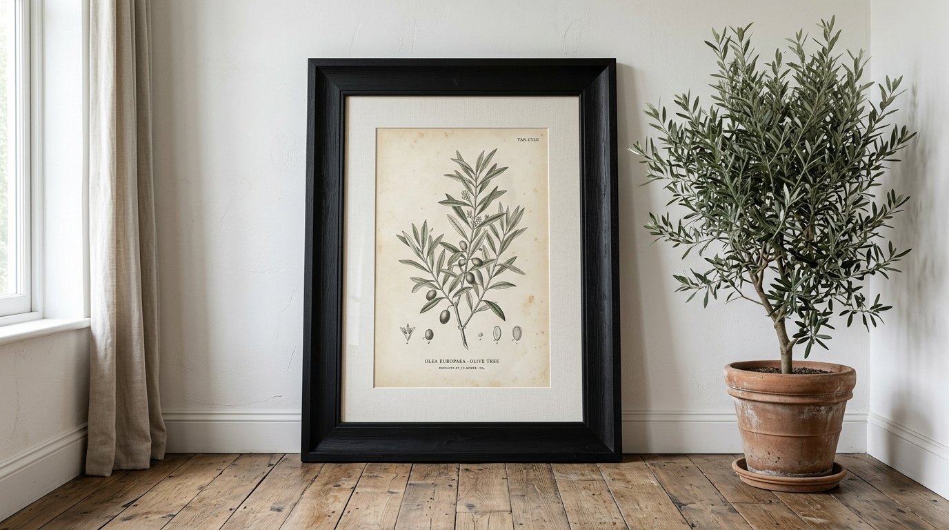
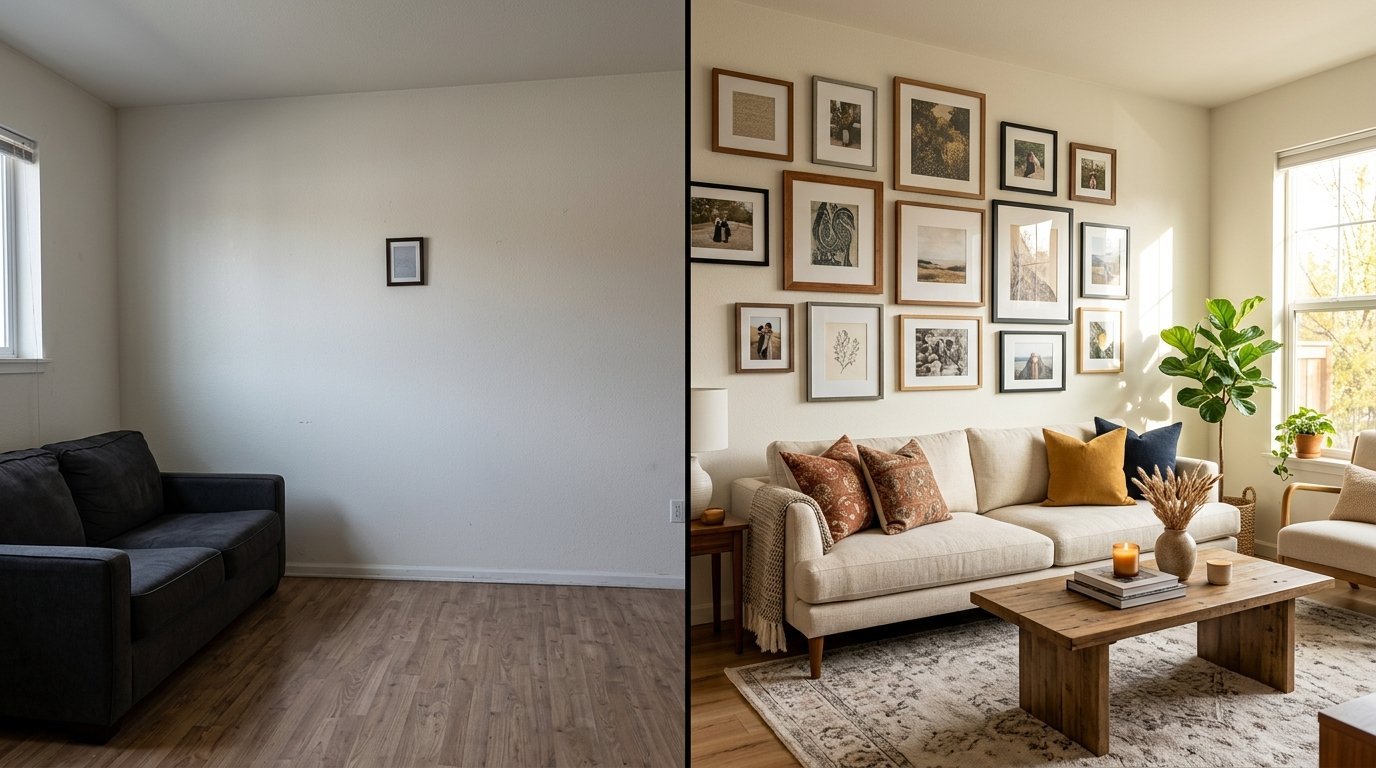
Small art on a massive wall looks like a postage stamp. It draws attention to the empty space. It makes the wall feel even larger. It makes the room feel entirely bare. You might find a beautiful 8×10 print. You love the colors. You buy it. You hang it directly in the middle of a massive living room wall. The piece gets completely lost.
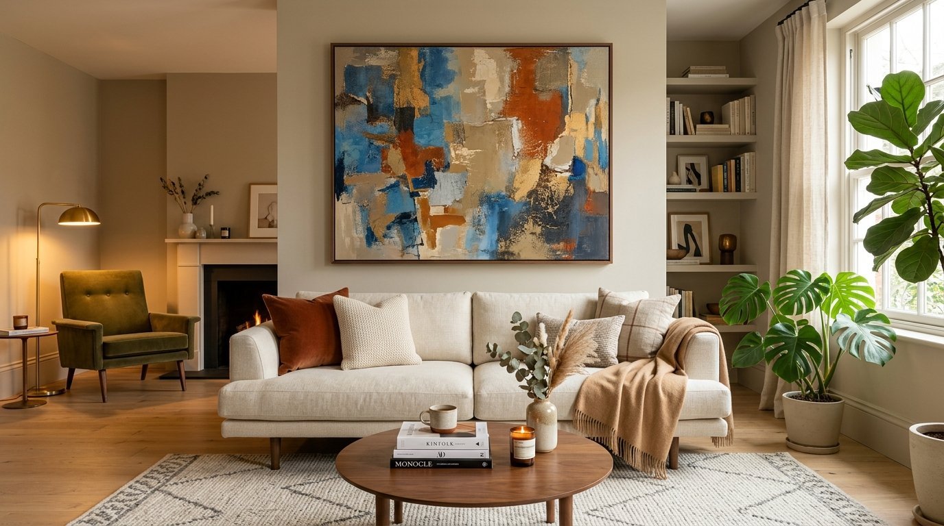
Scale dictates everything in home styling. A large wall demands a large piece. A small wall can handle a small piece. You must match the proportions exactly. A single small frame cannot hold a heavy visual space.
I see people make this mistake because large pieces cost more money. People try to save cash by buying smaller items. This backfires entirely. You end up with a room that feels cheap. You end up with a room that feels completely unfinished.
You have options if you cannot afford massive canvases. You can buy a very large frame for a small print. Use a large white mat. A mat expands the visual footprint. An 8×10 print looks substantial inside a 16×20 frame. The white space gives the art room to breathe visually.
You must measure your wall before you buy anything. Measure the width of your sofa. Your artwork should span roughly two-thirds of the sofa width. If your sofa is 84 inches wide, your art needs to span roughly 56 inches. One tiny frame will never hit that specific mark.
I made this mistake in my own dining room. I hung a tiny mirror on a gigantic wall. The room felt cold. The wall swallowed the mirror completely. I took it down immediately. I replaced it with a piece that spanned 48 inches. The entire room shifted. The space felt full and highly intentional.
You can also group small pieces together. Three 16×20 frames hung in a row create a massive visual footprint. This costs less than one giant canvas. This fills the space effectively. Always think about the total square footage you need to cover.
Here are specific sizing rules to follow:
- Over a king bed: Minimum 60 inches wide
- Over a standard sofa: Minimum 50 inches wide
- Over a fireplace: Match the width of the firebox
- Narrow hallways: Stack small pieces vertically
Do not buy tiny pieces for large walls. Save your money. Wait until you can afford the right size. Or use the matting trick. Your walls will thank you.
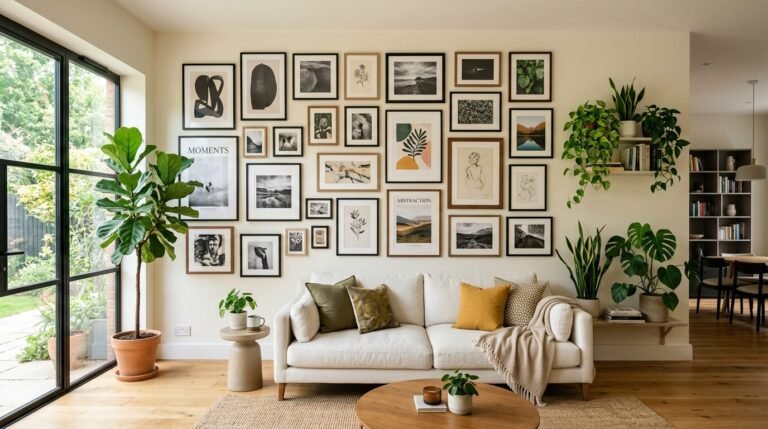
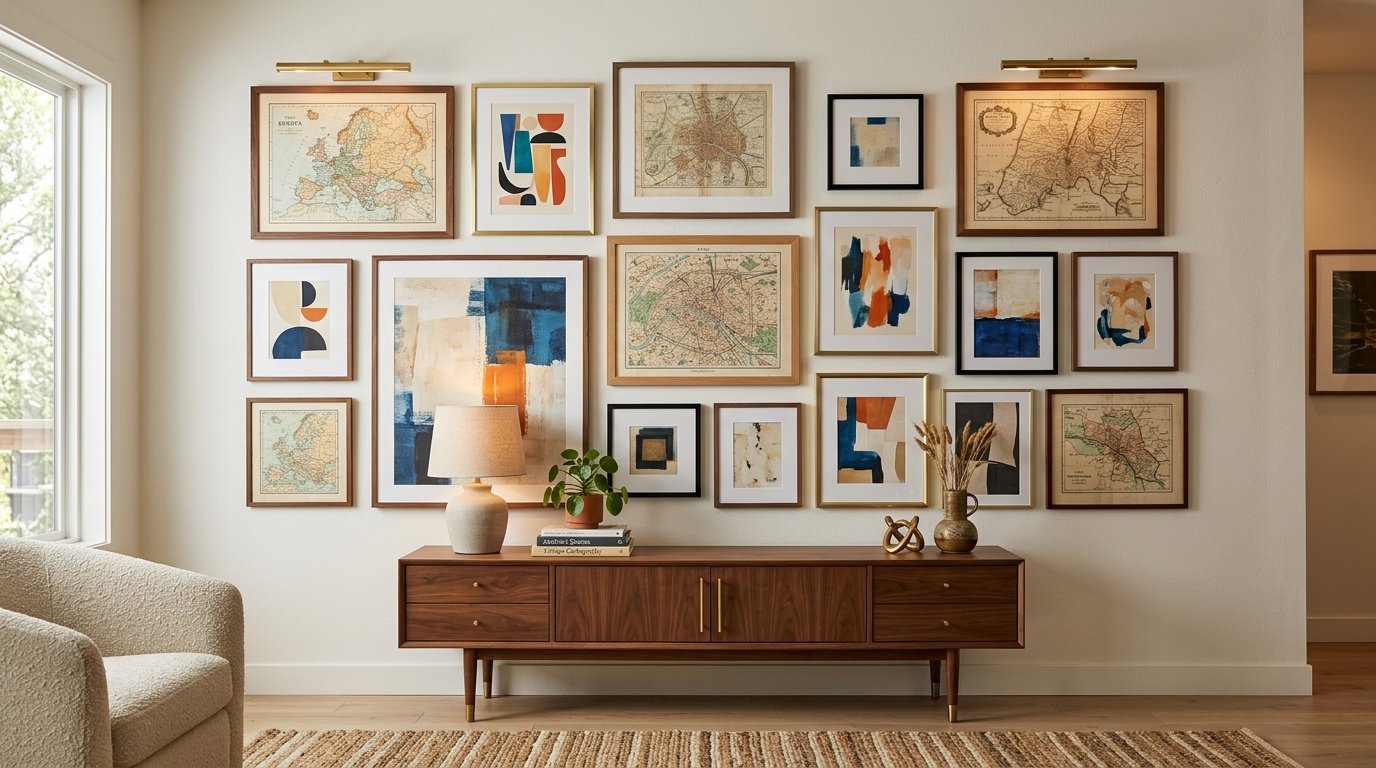
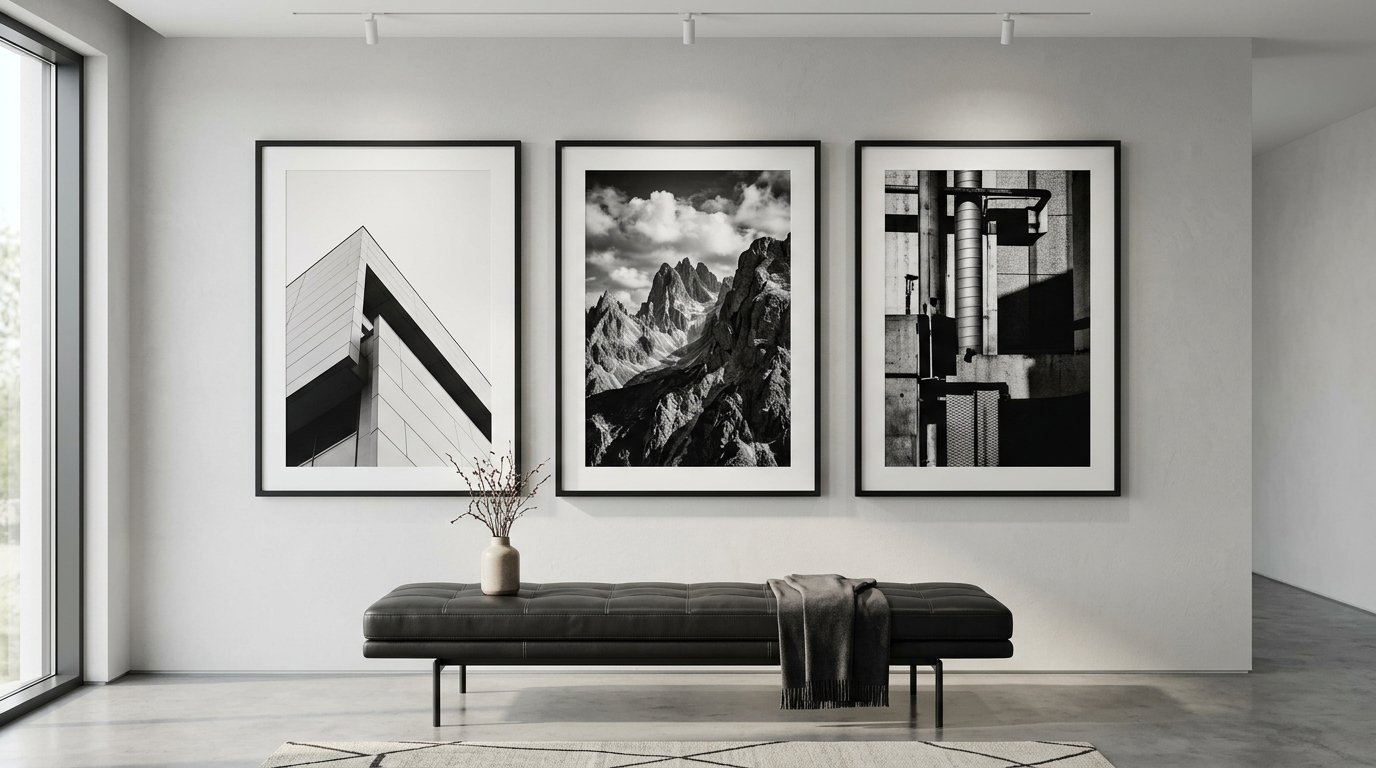
3. Ignoring the Power of a Well-Planned Gallery Wall
A single piece of art sometimes fails to tell a story. An empty hallway begs for multiple pieces. A massive stairwell needs visual movement. A gallery wall fixes these exact problems. It fills dead space brilliantly. It injects personality into cold rooms.
People avoid them because they seem highly difficult. People fear making multiple nail holes. People fear getting the layout wrong. This fear leaves massive walls entirely blank. You miss a massive chance to display your life.
You can mix anything in a cohesive display. You can mix family photos. You can mix vintage home decor pieces. You can include small wooden signs. You can include abstract paintings. The mix creates the real magic.
I have failed at this before. I started nailing things up without a plan. The result looked totally chaotic. The spacing was incredibly uneven. The room felt messy instead of full. You must plan the layout first.
Trace every frame onto craft paper. Cut out the paper shapes. Tape the paper templates to your wall. Move the paper around until the layout looks right. This takes time. This prevents massive headaches later.
Keep the spacing perfectly consistent. Leave exactly two inches between every frame. Use a ruler. Do not guess. Consistent spacing makes a random collection look highly organized. Consistent spacing proves the arrangement was purely intentional.
Start with your largest piece. Place it slightly off-center. Build the rest of the collection around it. Balance heavy dark frames with lighter ones. Balance large pieces with small pieces. Disperse the colors evenly across the entire arrangement.
You do not have to spend a fortune. I find beautiful vintage home decor pieces at thrift stores. Old brass frames look incredibly warm. Worn wooden pieces look highly textured. You can mix old and new effortlessly.
Your collection can grow over time. You can start with five pieces. You can buy more as you find them. The wall evolves with your life. It never feels stagnant. It never feels empty.
A good arrangement anchors a room. It gives guests something to look at. It starts natural conversations. It turns a blank void into a stunning focal point.
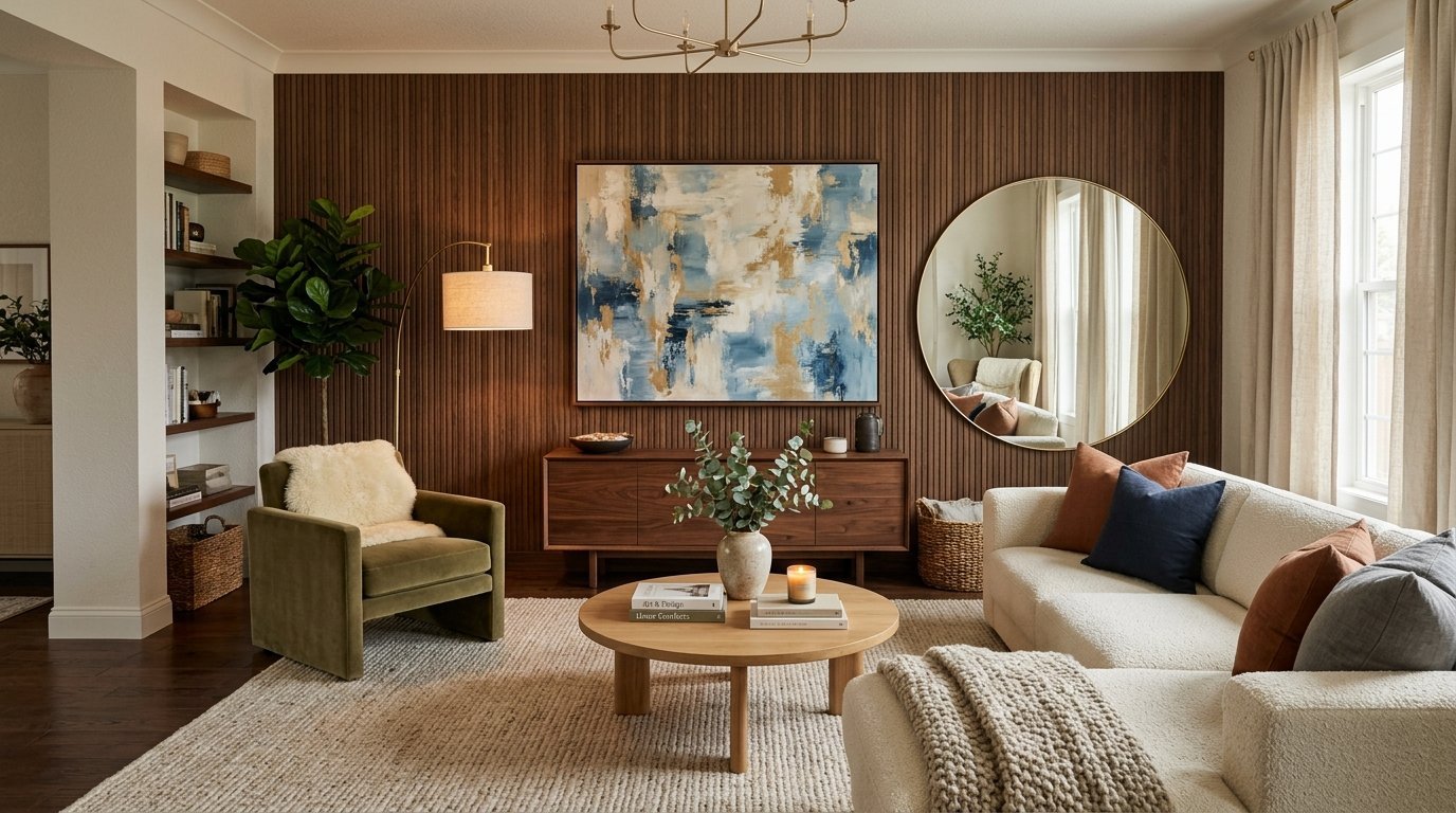
4. Neglecting Wall Panels and Textural Elements
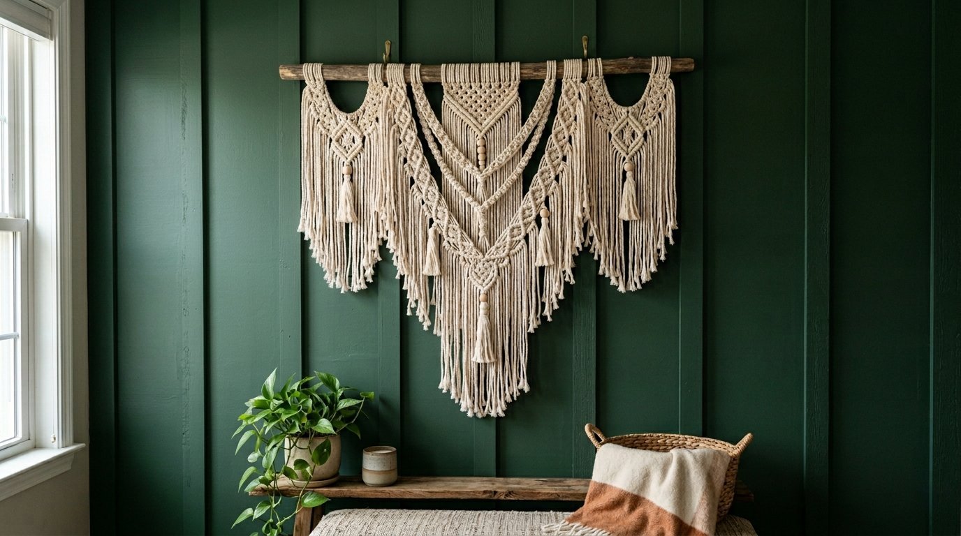
Flat paint on drywall gets incredibly boring. Paint alone cannot always fix an empty room. Rooms need physical texture. Walls need actual dimension. Relying solely on flat canvases leaves a room feeling completely two-dimensional.
Wall panels fix this instantly. Wood paneling looks warm. Board and batten creates deep shadows. Shiplap creates beautiful farmhouse charm. These architectural details make a wall interesting before you even hang a single frame.
I love using physical texture. Bohemian macrame hangings cast beautiful shadows. Woven baskets look natural indoors. Metal sculptures reflect light differently throughout the entire day. These pieces break up the monotony of flat glass and flat canvas.
You can buy lightweight decorative panels. You can attach them very easily. They do not require a professional contractor. They give a custom look for very little money. A textured wall holds heavy visual weight. It needs less art to feel totally complete.
I created a handcrafted piece recently. Three months ago, I threw a fresh piece of pine right into the trash. I tried to craft a farmhouse welcome sign. The first attempt failed miserably. But I tried again. The second attempt looked beautiful. The raw wood texture changed my space. It looked much better than a flat paper poster.
Think about the materials in your room. If you have a leather sofa and a glass table, you need soft textures. Hang a woven tapestry. Hang a fabric banner. The contrast makes the space feel incredibly rich.
If your room feels too soft, use hard textures. Hang a metal geometric piece. Hang carved wood panels. The tension between materials keeps the eye highly interested.
Blank walls scream for dimension. Flat posters just sit there. Textured items reach out into the room. They interact with the natural light. They cast moving shadows. Shadows make a room feel completely alive.
Textural pieces you should buy:
- Woven wall baskets
- Carved wooden mandalas
- Metal geometric grids
- Macrame fiber art
- Acoustic felt panels
- Living plant walls
Stop relying on paper prints. Start mixing your materials. Your rooms will feel entirely different.
5. Overlooking Mirror Placement and Maintenance
Mirrors act as actual windows. They bounce light across the room. They double the visual space. A well-placed mirror cures a dark room. A poorly placed mirror makes everything much worse. A dirty mirror ruins a room entirely.
People hang mirrors facing blank walls. The mirror just reflects more emptiness. This doubles your specific problem. You must place a mirror opposite something beautiful. Reflect a sunny window. Reflect a piece of art. Reflect a beautiful living room chandelier.
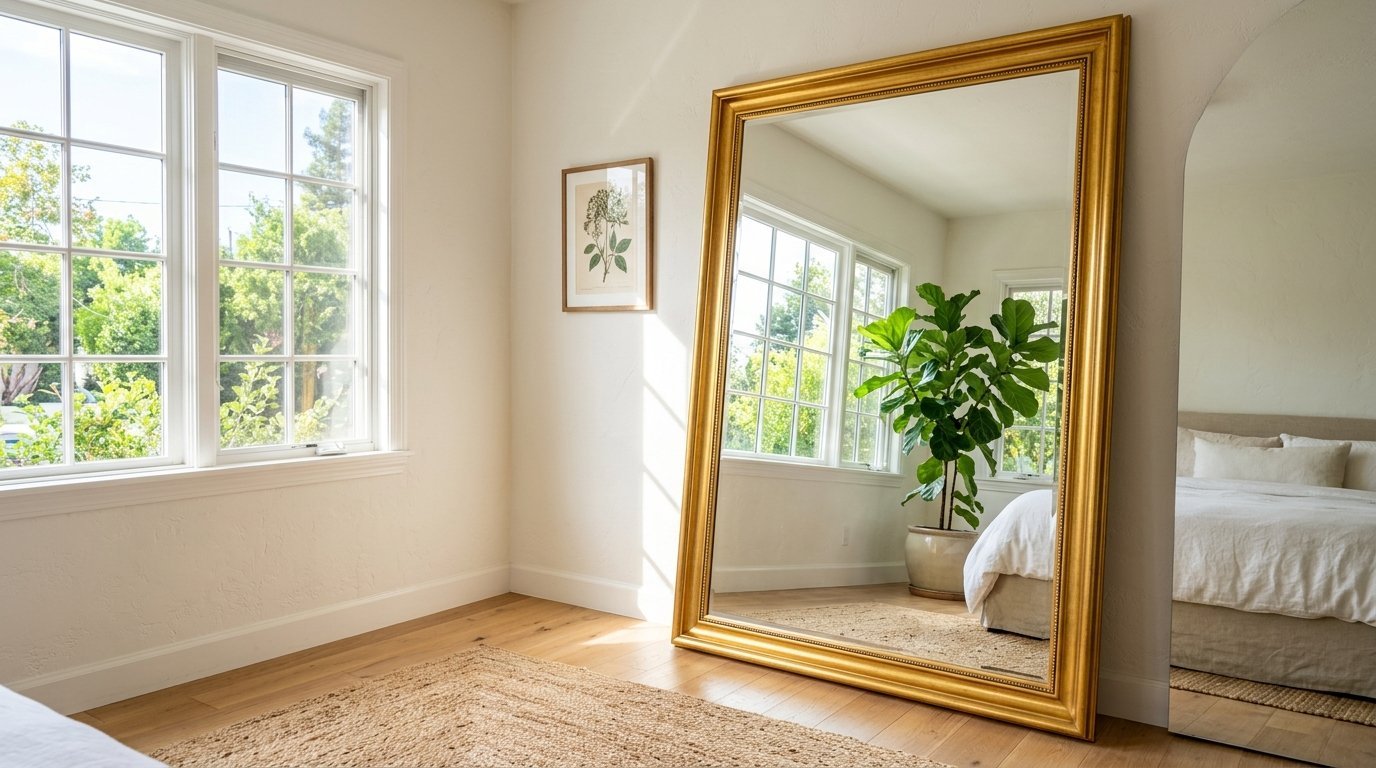
Size matters highly here too. A tiny mirror looks completely silly on a large wall. I prefer oversized floor mirrors. They lean against the wall safely. They fill vertical space beautifully. They make ceilings feel much taller.
Maintenance requires strict attention. I noticed this issue with a gold frame in my Classy Bedroom last summer. The glass got incredibly cloudy. Dust collected heavily in the ornate details. The piece looked absolutely terrible. In my experience, a dusty frame or cloudy glass ruined the feel of my home last year.
You cannot ignore moisture. I saw this destroy a beautiful piece in my hallway three years ago. Black spots formed around the bottom edges. Moisture ate the delicate silver backing. You have to keep the glass completely dry.
I clean them with a 3M microfiber cloth. I use Invisible Glass or Sprayway. I never spray directly onto the glass. Liquid runs down the front. Liquid pools at the bottom edge. This causes permanent black rot. I spray the cloth first. Then I wipe the glass clean.
I prefer Norwex cloths for daily dusting. They trap everything quickly. A clean mirror looks highly expensive. A dirty mirror looks entirely neglected.
You can group mirrors together. A cluster of small vintage mirrors acts like a beautiful gallery. They catch light from completely different angles. They look incredible in dark narrow hallways. They act as highly functional wall decor.
Check your reflection angles immediately. Sit on your sofa. Look closely at the mirror. Make sure it does not reflect a messy kitchen counter. Make sure it does not reflect a bathroom door. Control the exact view. Control the feeling of the entire space.
6. Spacing Decor Pieces Too Far Apart
You buy two beautiful pieces of art. You want to fill a long empty wall. You hang one piece on the far left. You hang the other piece on the far right. A massive gap sits exactly in the middle. The wall still looks completely empty.
Pieces of wall decor must talk to each other. They must visually connect. When you spread them out too far, they become totally isolated. They look like complete mistakes.
Distance creates massive disconnect. If you hang a pair of frames, they must sit very close together. Two to three inches apart works best. They should read as one single large visual unit.
I see this often with large living room layouts. People try to spread their decor thin to cover more area. It never works. It looks incredibly sparse. You are better off leaving part of the wall totally blank. Group your items tightly in one single focal area.
If you have a massive wall, create tight zones. Create a reading zone with a tight cluster of art. Leave total negative space. Then create a console table zone with its own tight grouping. Negative space is not your enemy. Accidental wide gaps are your true enemy.
I apply this to Art Deco pieces constantly. I love the bold strong lines of Art Deco mirrors and sconces. If I flank a mirror with two sconces, I place them very close. If I place them too far away, the arrangement falls apart completely. The light does not hit the mirror correctly. The visual tension vanishes instantly.
Measure the gaps carefully. Trust your metal measuring tape. Do not trust your bare eyes from a tall ladder.
Always group items in odd numbers if you are not doing a symmetric grid. Groups of three work perfectly. Groups of five work perfectly. The human brain likes odd numbers. The brain constantly searches for a visual center.
Keep your collections extremely tight. Let the empty parts of the wall be intentional breathing room. The filled parts will look highly deliberate. The entire room will finally feel finished.
Exact rules for proper spacing:
- Between pieces in a pair: 2 to 3 inches
- Between gallery wall frames: 2 inches exactly
- Above a piece of furniture: 8 to 10 inches max
- Distance from corners: At least 6 inches
Frequently Asked Questions About Wall Decor
How do I decorate a large blank wall on a tight budget?
You do not need to spend thousands of dollars. You can frame cheap vintage maps. You can frame pages from old damaged books. You can hang large woven baskets from local thrift stores. You can paint a bold arch directly onto the drywall. Paint costs very little but makes a massive visual difference. Grouping many cheap items creates a very high-end look.
Should every single wall in a room have something on it?
No. This creates terrible visual clutter. Your eyes need a quiet place to rest. You should pick one or two main focal walls. Decorate those heavily. Leave the other walls entirely blank or very minimal. Negative space makes your decorated walls stand out much more. Filling every inch of space makes a room feel completely chaotic and incredibly small.
What is the absolute best way to hang heavy mirrors without studs?
You must use the exact right hardware. Do not rely on basic small nails. Use heavy-duty metal drywall anchors. Toggle bolts work incredibly well for massive heavy pieces. They expand directly behind the drywall and lock firmly into place. Always weigh your item first. Buy hardware rated for double that exact weight. I prefer using long French cleats for heavy mirrors. They distribute the heavy weight evenly across the entire wall.
How do I choose the exact right color for my frames?
Match the frames directly to other elements in your room. If you have dark wood furniture, use dark wood frames. If you have bright brass light fixtures, use bright brass frames. You can also mix metals beautifully. A mix of flat black and bright gold looks very sophisticated. Black frames look highly modern and very clean. White frames blend into white walls and let the art totally stand out.
Can I mix completely different styles of art in the same room?
Yes. Mixing styles gives a room incredible character. You can hang a modern abstract painting right next to a vintage landscape print. The trick is finding a strong common thread. They should share a specific color palette. Or they should share the exact same frame style. The shared element ties them tightly together. The high contrast keeps the entire room visually interesting.
Conclusion: Making Your Space Feel Complete
You have the power to fix your empty rooms today. You now know exactly what goes wrong. You know how height destroys visual flow. You know how scale dictates massive success. You know the exact strict measurements to use.
Do not leave your walls completely bare another day. Grab your tape measure right now. Look closely at your current setup. Take down the pieces that float entirely too high. Group the isolated small pieces closely together. Clean the dusty mirrors in your dark hallway. Hang fresh textural pieces.
A warm home requires highly intentional choices. Your space should reflect your exact life. Try these easy fixes this coming weekend. The cold empty feeling will vanish entirely. Your home will finally feel finished.

Anya Castellan is the Founder and Editor-in-Chief of Home Wall Trends. An art history graduate of the Rhode Island School of Design with twelve years of experience writing for leading American design publications, she specializes in composition, gallery wall theory, and the quiet architecture of domestic space. A former contributing editor at Architectural Digest and guest lecturer at Parsons School of Design, Anya personally reads and signs off on every piece before it is published.