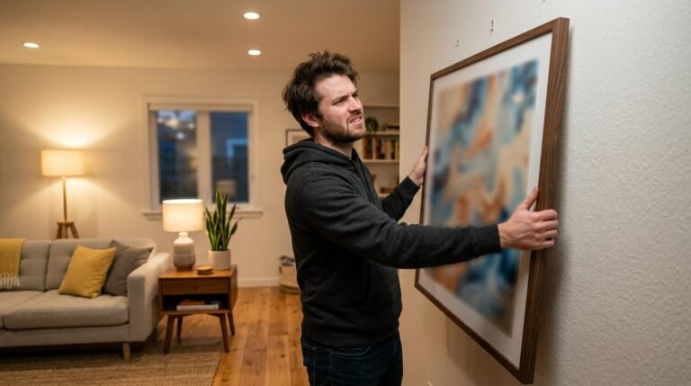
Empty walls often feel like missed chances to tell your family story. I remember staring at my own blank hallway for months. I felt overwhelmed by the thought of hammering a hundred holes into the drywall. Then I found the right system. Many people struggle with the same fear of commitment when it comes to a family photo wall. You want it to look curated but not stiff. You want it to feel personal but not messy. These 21 layouts represent the most saved and shared designs on Pinterest right now. They work because they balance visual weight with emotional connection. Whether you have a tiny entryway or a grand staircase, one of these arrangements will fit your home perfectly.
Strategic Executive Summary

This guide provides 21 proven layouts for creating a professional family gallery wall. You will find specific measurements, frame recommendations, and styling secrets used by interior designers. We cover everything from the classic gallery wall staircase to modern dining room displays. Expect to see cost breakdowns for different budgets and a list of the best tools to avoid wall damage. By the end of this deep dive, you will have a clear plan to transform your space. I have included real life examples of how these layouts changed the feel of a home. We also address common mistakes like improper spacing and wrong frame heights. This is a complete resource for anyone ready to turn digital photos into physical art.
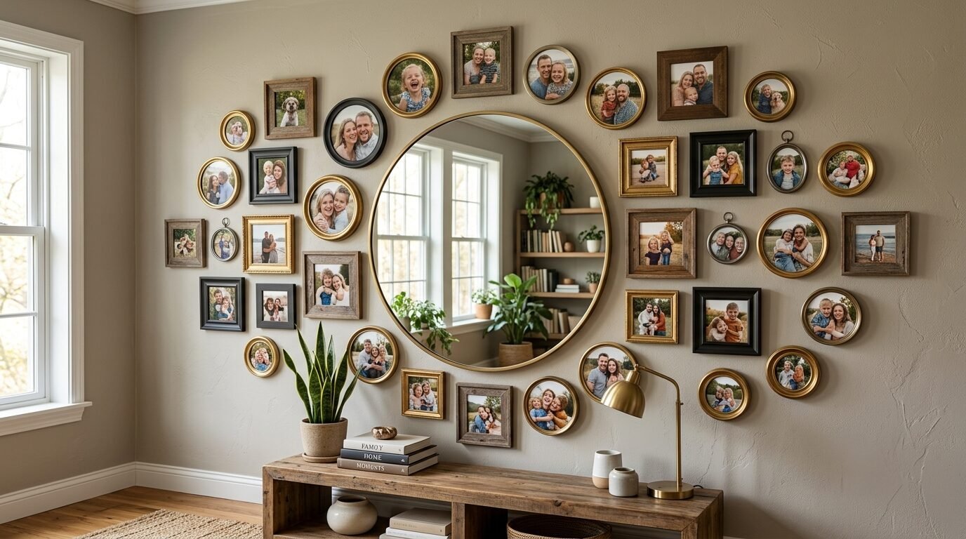
1. The Clean Symmetrical Grid
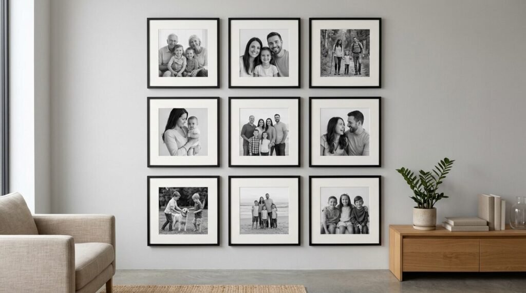
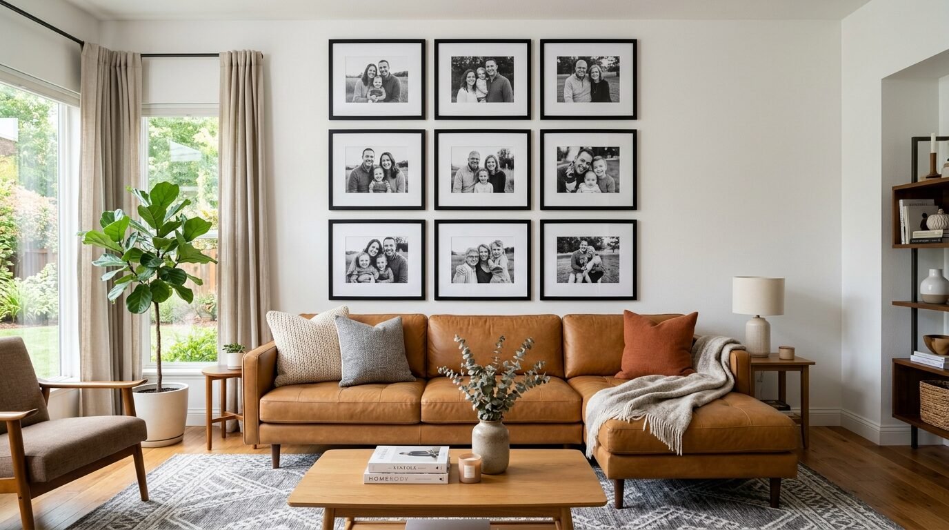
The symmetrical grid is the gold standard for a modern family photo wall. I used this in my own living room last year. It involves using nine or twelve identical frames in a perfect square or rectangle. This layout works best with black and white family pictures on wall surfaces that have plenty of space. It creates a sense of order and calm. You need a level and a ruler for this one. I suggest using the IKEA Ribba frames for a budget friendly version. The uniform look keeps the focus on the faces in the photos rather than the frames. I have found that a two inch gap between every frame is the sweet spot for this design. It feels intentional and high end without the custom price tag.
2. The Cascading Staircase Flow
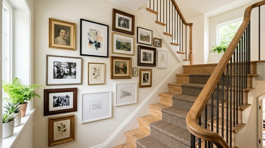
A gallery wall staircase is one of the most requested home decor projects. It is also the hardest to get right. People often make the mistake of following the steps too literally. In my experience, you should follow the angle of the handrail instead. Start by finding a center point about five feet up from each step. This creates a natural eye line. I love mixing different frame sizes here to keep the eye moving. Use larger frames for group shots and smaller ones for candid moments. I once helped a neighbor fix her staircase wall. We used a mix of wood and gold frames. The result was a creative family pictures display that felt like a journey through time as you walked upstairs.
3. The Layered Picture Ledge
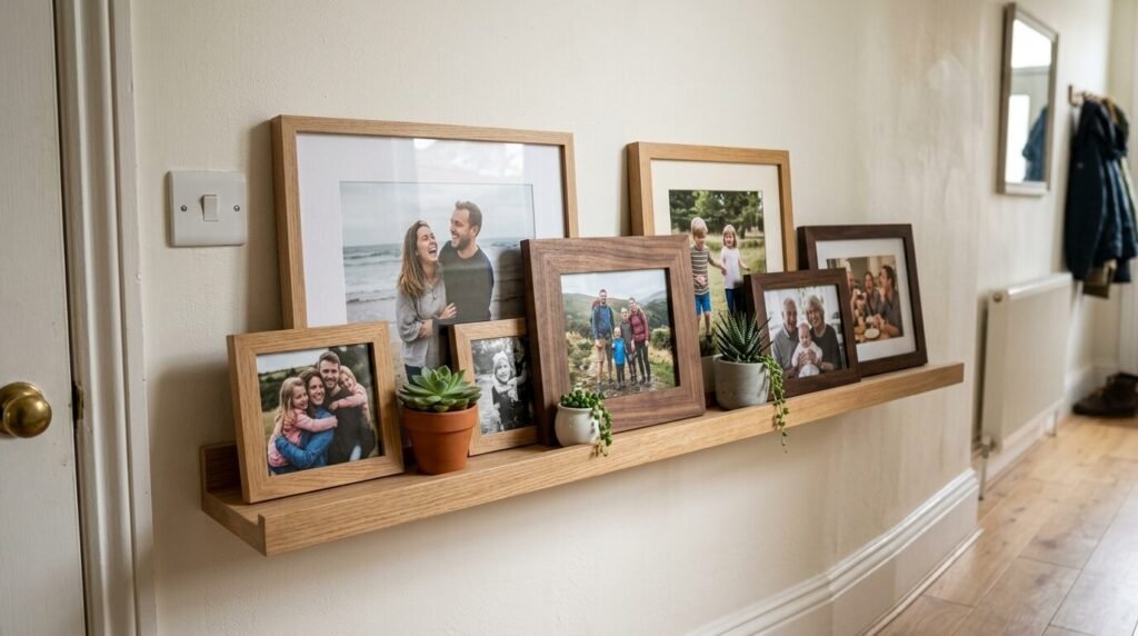
If you hate making holes in the wall, the ledge look is for you. I suggest installing two or three long shelves like the ones from West Elm or Target. You simply lean your unique family photos against the wall. This allows you to swap photos out whenever you want without a hammer. I see this working well in playrooms or hallways. You can overlap the frames to create depth. Put the tallest frames in the back and smaller ones in front. I have noticed this style feels more relaxed and lived in. It is a great way to include family picture collages that might otherwise look cluttered in a traditional frame.
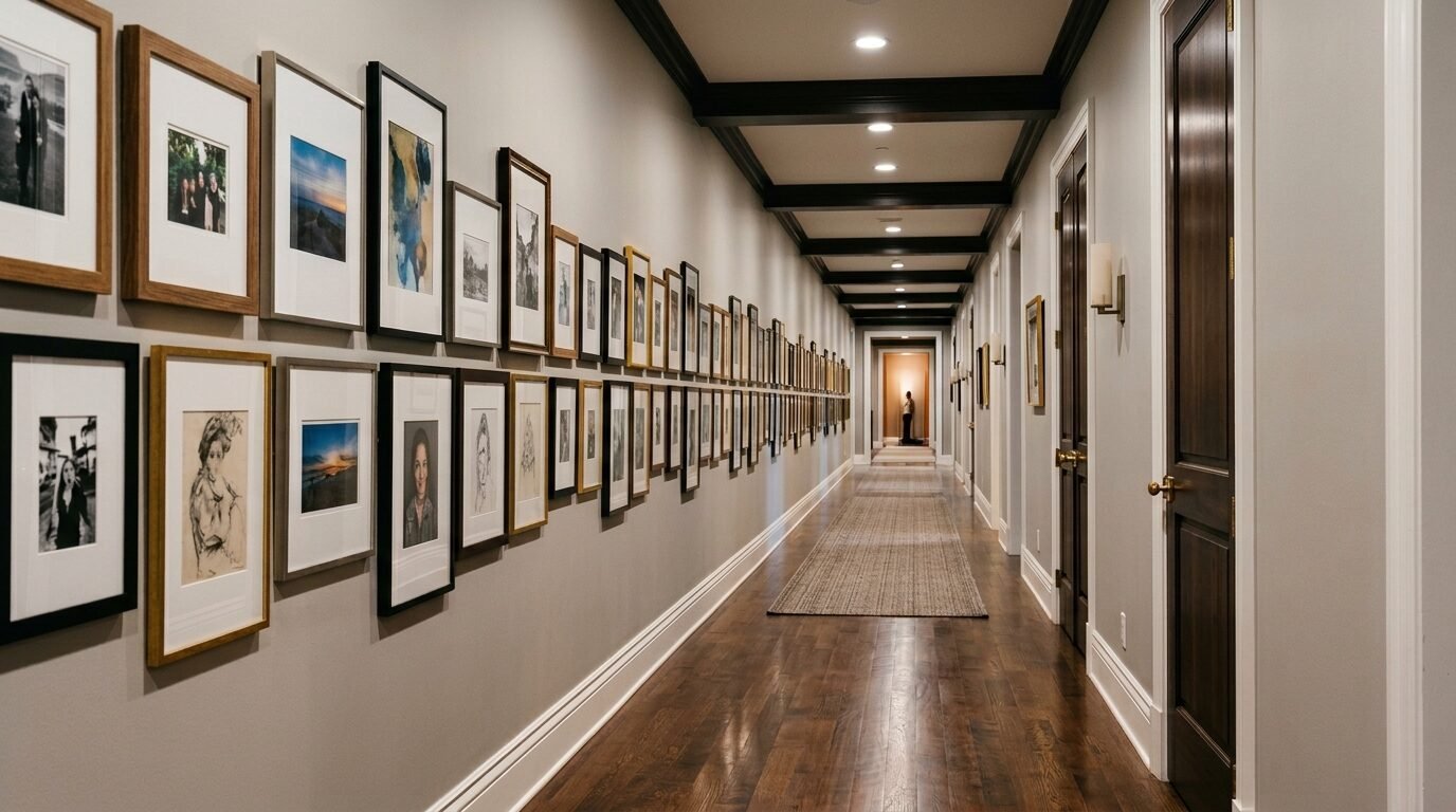
4. The Floor to Ceiling Statement
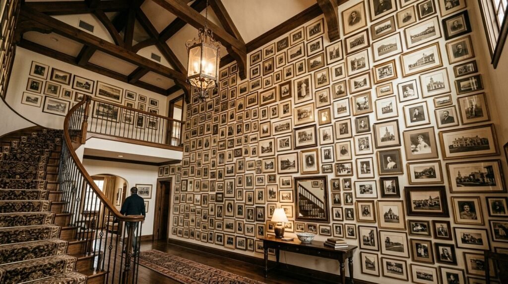
For those with a bold personality, a floor to ceiling family wall collage is a game changer. This layout covers an entire wall from the baseboard to the crown molding. It creates a massive impact in a small room or an entryway. I recommend starting in the middle and working your way out. I have seen this work best when you use a consistent color palette for the photos. Maybe every photo is sepia or has a warm filter. This prevents the wall from feeling chaotic. I once saw a designer do this with over fifty frames. It turned a boring hallway into a private museum of family history.
5. The Mixed Media Storyboard
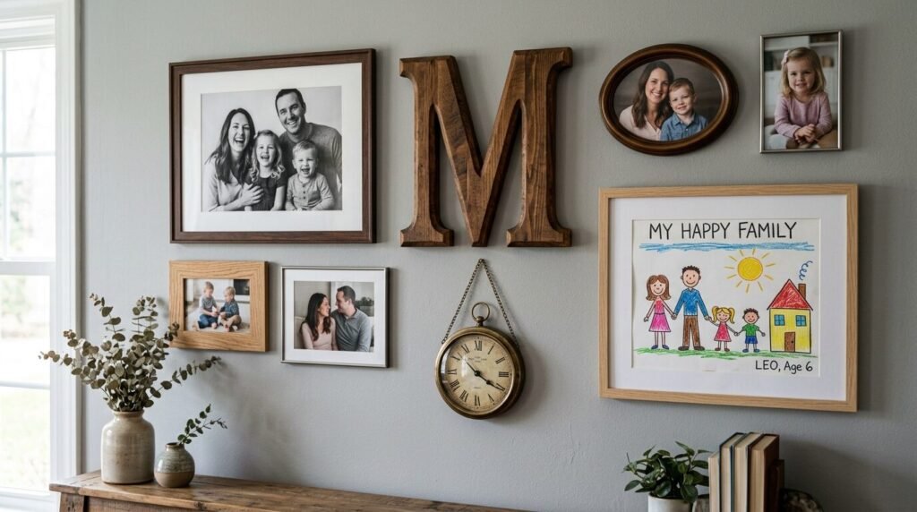
A family gallery wall does not have to be just photos. I love adding three dimensional objects. Think about including a wooden letter of your last name or a small clock. I have seen people include birth announcements or framed handprints. This adds texture and personality. Use a variety of frame materials like metal, wood, and resin. I once included an old key from my first house in a shadow box on my gallery wall. It started a conversation with every guest who visited. This approach creates a unique family photos experience that tells a deeper story than just a single image.
6. The Minimalist Trio
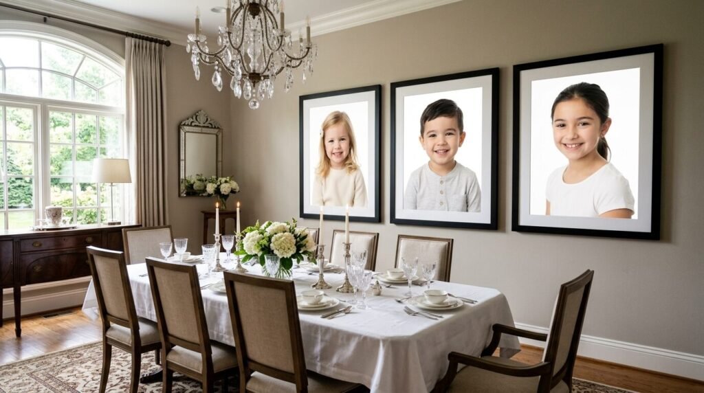
Sometimes less is more. A minimalist trio uses three oversized frames placed side by side. This is perfect for family picture wall ideas dining room settings. It looks sophisticated and clean. I recommend using 16 by 20 inch frames with large mats. The wide white border around the photo makes the image feel like fine art. I have seen this work beautifully in a dining room with three large portraits of children. It creates a focal point that does not compete with your furniture. I suggest using thin black frames for a contemporary vibe or light oak for a Scandinavian feel.
7. The Corner Wrap
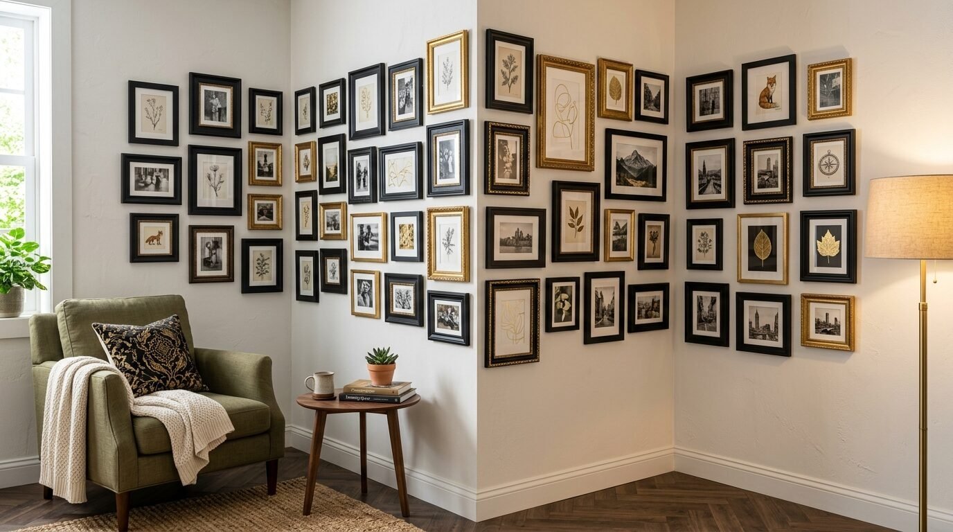
Do not ignore your corners. A corner wrap gallery wall flows from one wall to the next. This is a brilliant way to use awkward spaces in a home. I have seen this work in small apartments where wall space is limited. You can use the corner to separate two different timelines or branches of the family. Use a mix of small and medium frames. I have noticed that this layout makes a room feel larger because it draws the eye into the corners. It creates a cozy nook that feels very intimate and personal.
8. The Monochromatic Modernist
This style is for lovers of black and white photography. Every photo on the wall uses the same high contrast filter. I recommend using black frames with white mats for a classic look. This approach makes even the most random candid shots look like a cohesive collection. I have found that this works exceptionally well for a large family wall collage. It hides the differences in lighting and background from various photo sessions. I once helped a client convert 30 years of color photos into a black and white gallery. The transformation was stunning. It looked like a professional art installation.
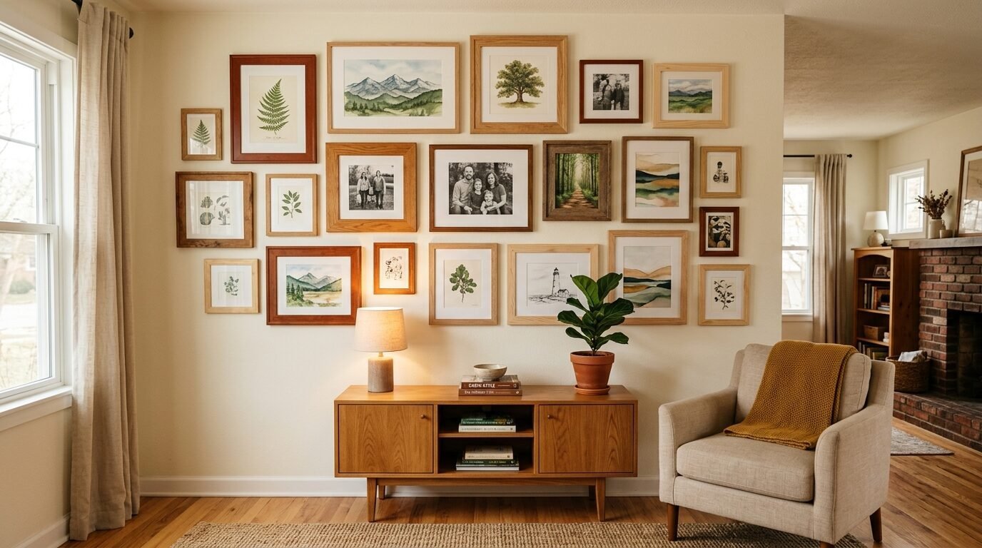
9. The Eclectic Salon Style
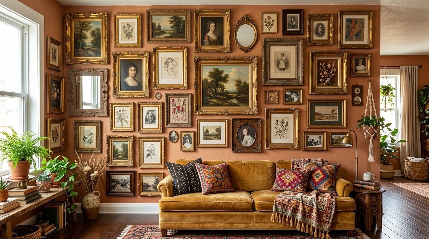
The salon style is all about organized chaos. There are no strict rules for spacing or frame matching. I suggest laying all your frames on the floor first. Move them around until the weight feels balanced. I have seen this work best when you have a variety of art, photos, and mirrors. It is a creative family pictures dream. I once used old flea market frames for a salon wall in a cottage. The mismatched frames added so much character. The key is to keep the gaps between frames relatively consistent, even if the frames themselves are different.
10. The Architectural Arch
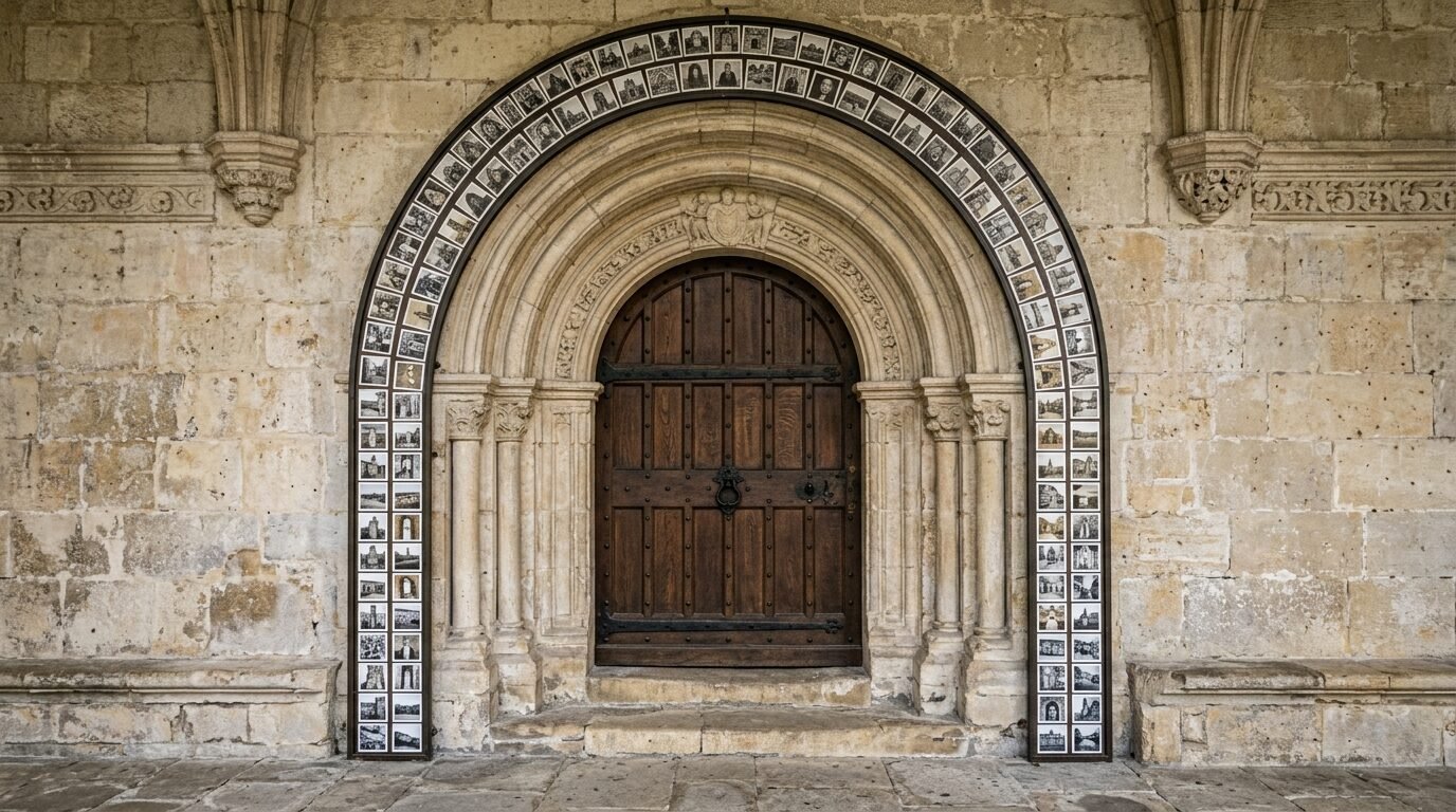
If you have a curved wall or an arched doorway, use it. You can arrange your family pictures on wall surfaces to mimic the curve of the architecture. This feels very custom and high end. I recommend using small, thin frames to follow the line of the arch. I have seen this used to frame a doorway into a kitchen or a nursery. It adds a soft, organic feel to the home. I once saw a homeowner use this layout to frame a circular mirror. It was the most unique family photos display I had ever seen.
11. The Dining Room Gallery Anchor
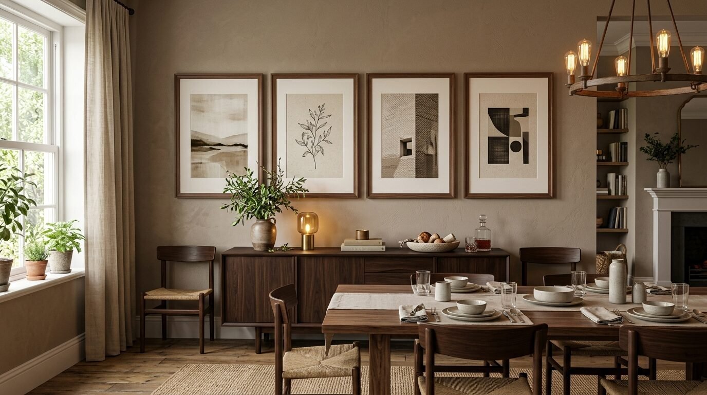
The dining room is often the heart of the home. A family picture wall ideas dining room layout should be grounded. I suggest using a large horizontal arrangement that aligns with the length of your dining table. This anchors the room. I have seen people use four large frames in a row. This creates a sense of stability. I recommend hanging the frames a bit lower than usual so they are at eye level while you are seated. This makes the photos part of the conversation during meals. I once used gold frames in a navy blue dining room. The contrast was beautiful.
12. The Neutral Wood Palette
For a warm and inviting feel, use different shades of natural wood. I recommend mixing oak, walnut, and pine frames. This works well in homes with a farmhouse or boho aesthetic. I have seen this look great against a white or cream wall. The various wood tones add warmth without adding clashing colors. I have noticed that this style feels very approachable and friendly. It is a great way to showcase family photo wall ideas that feel timeless. I often suggest this for people who want a gallery wall that will grow with them over the years.
13. The Floating Glass Display
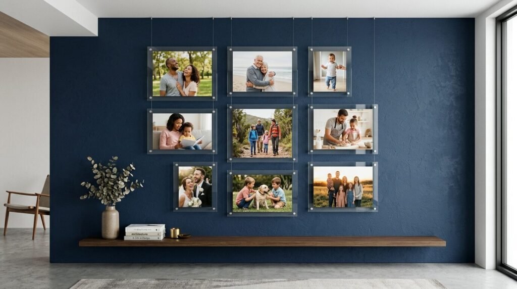
Floating frames are frames where the photo is sandwiched between two pieces of glass. There is no mat and no solid backing. This makes the photo look like it is floating on the wall. I recommend this for a modern family gallery wall. It feels light and airy. This is a great choice if you have a beautiful wallpaper or a bold paint color you want to show through. I have seen this work well with smaller photos or even pressed flowers from a family wedding. I once used floating frames in a sunroom and the light hitting the glass was magical.
14. The Linear Horizon Line
A linear layout uses a single horizontal line as an anchor. All frames either sit on this line or hang from it. This creates a very clean and structured look. I suggest this for long hallways or above a low dresser. I have seen this work with frames of all different heights as long as they share that center line. It feels organized but allows for variety. I have found that this is one of the easiest layouts to install. You just need a single long piece of painter’s tape to mark your horizon line.
15. The Clockwork Circular Arrangement
Imagine your wall as a giant clock face. You place a central piece in the middle and arrange other frames around it in a circle. This is a very creative family pictures layout. I have seen people use a family crest or a large “Home” sign as the center. It draws the eye inward. I recommend using smaller frames for the outer circle. This works well in a foyer or a bedroom. I once saw this done with twelve frames representing the twelve months of a baby’s first year. It was a beautiful way to track growth.
16. The Geometric Hexagon
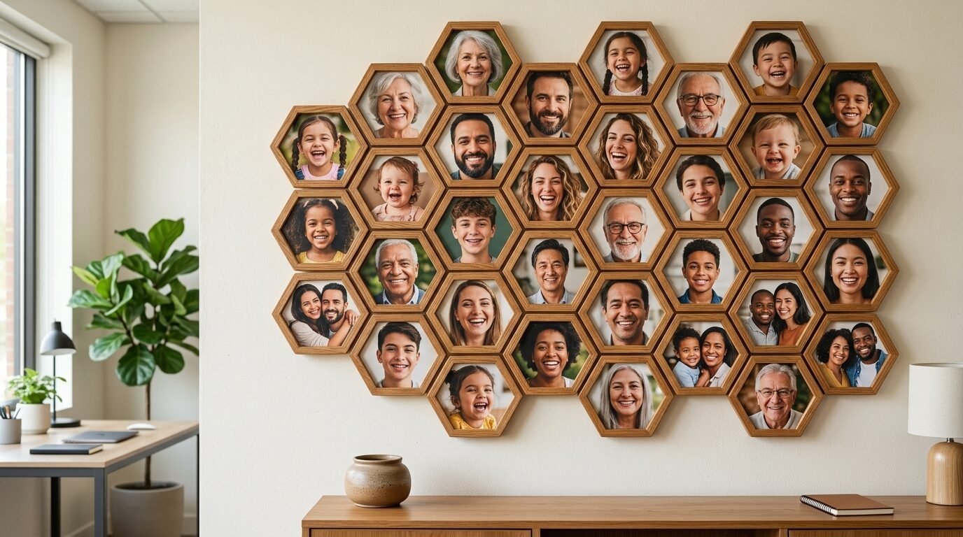
Hexagon frames are trending right now. They fit together like a honeycomb. I recommend this for a small, unique family photos display. You can start with three or four and add more over time. It looks like a piece of geometric art. I have seen this used in modern home offices. The shapes are visually interesting even without the photos. I suggest using a mix of wood and colored frames. This is a fun way to involve kids in the decorating process because they can help decide where the next “cell” goes.
17. The String and Clip Casual Wall
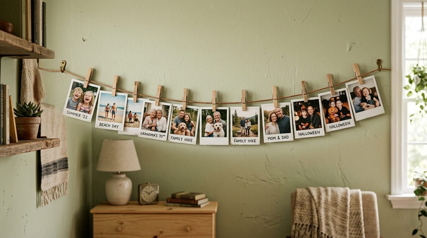
For a more temporary and casual look, use a wire or string with clips. I recommend this for a kid’s bedroom or a dorm room. You can easily swap out photos every week. I have seen people use small wooden clothespins to hold the family picture collages. It feels very personal and low pressure. I once used a copper wire with tiny LED lights for this. It gave the room a warm glow and showcased the photos beautifully at night. This is the most budget friendly option on the list.
18. The Dark and Moody Backdrop
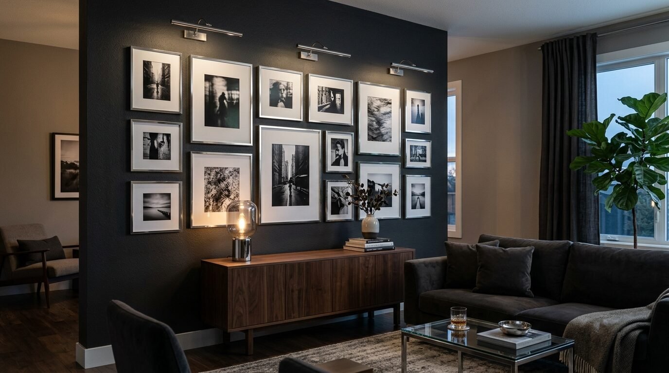
If you have a dark accent wall in charcoal or navy, use it for your gallery. I recommend using bright white mats or metallic frames to make the photos pop. I have seen this look incredibly luxurious. It creates a high contrast look that feels very intentional. I have noticed that black and white photos look particularly good on a dark background. I once saw a gallery wall on a black brick fireplace. It was the focal point of the entire house.
19. The Kids Art Integration
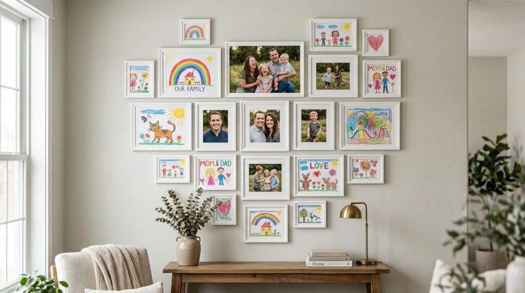
Mix your professional family portraits with your children’s artwork. I recommend using the same style of frame for both. This elevates the kids’ drawings to the status of fine art. I have seen this create a very heart centered family wall collage. It shows that you value their creativity as much as the professional photos. I suggest rotating the artwork every few months. I have found that this makes children feel very proud of their contributions to the home decor.
20. The Seasonal Swap Frames
Some frames are designed for easy opening from the front. I recommend using these for a seasonal family photo wall. You can have photos for Christmas, summer vacations, and birthdays. I have seen this work well in a mudroom or entryway. It keeps the decor fresh and relevant. I have noticed that this helps families engage with their photos more often. Instead of the pictures becoming invisible over time, they become something to look forward to changing.
21. The Oversized Solo with Accents
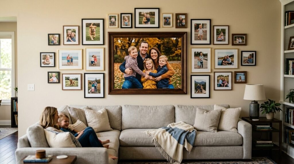
Start with one very large photo as the anchor. I recommend a 24 by 36 inch print. Then surround it with smaller frames of various sizes. This creates a hierarchy on the wall. I have seen this work best above a sofa or a bed. The large photo is usually a group family shot, while the smaller ones are individual portraits. I have found that this layout feels very balanced and professional. It gives the eye a clear place to start and then allows it to wander through the smaller details.
Frame Material and Style Comparison
| Frame Style | Material | Best For | Price Point |
| Modern Gallery | Aluminum / Plastic | Grids / Minimalist | Low |
| Rustic Farmhouse | Distressed Wood | Ledges / Salon | Medium |
| Classic Traditional | Gilded Wood | Staircases / Dining | High |
| Industrial | Steel / Wire | String and Clip | Low |
| Scandinavian | Light Oak | Neutral Palettes | Medium |
I have tested dozens of brands over the years. For budget friendly options, IKEA and Target are hard to beat. If you want something that will last a lifetime, look at Framebridge or West Elm. I have noticed that mixing a few high end frames with cheaper ones can make the whole wall look more expensive. I always recommend checking the weight of the frame before buying. Heavy glass frames need more support than acrylic ones.
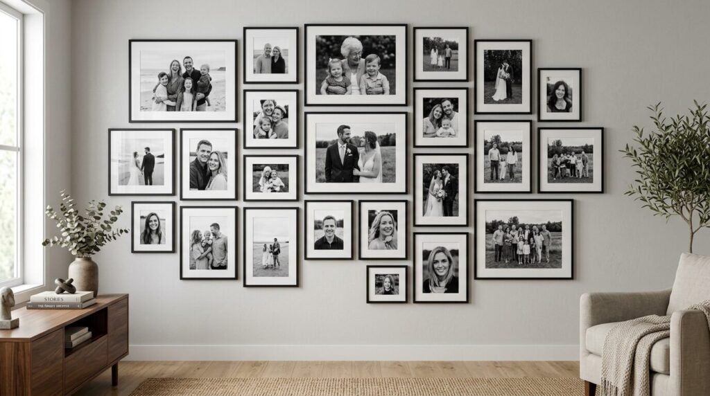
Case Study: The Miller Family Staircase Makeover
The Miller family had a long, dark staircase that felt like a tunnel. They wanted a gallery wall staircase but were afraid it would look cluttered. We decided to use a monochromatic theme. We converted all their photos to a soft sepia tone. We used 15 frames of varying sizes but kept the frames all a consistent matte black.
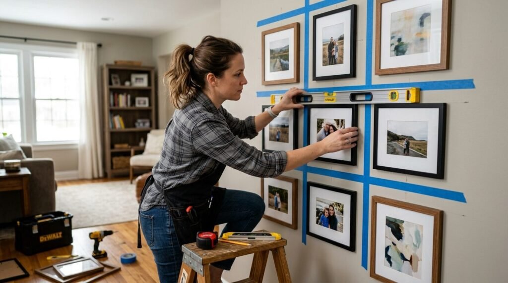
We mapped the wall using kraft paper templates first. This is a trick I learned years ago. You tape the paper shapes to the wall to see how they look before you nail anything. We spent two hours moving the paper around. Once we were happy, we nailed right through the paper. The result was a stunning display of three generations of history. The stairs went from being a transition space to the most talked about area of the home. The project cost less than $300 in total.
Essential Tools for the Perfect Wall
I never start a gallery wall without these specific items. I have seen too many people fail because they tried to eyeball the measurements.
- Laser Level: This is a lifesaver for straight lines.
- Command Strips: Great for renters or those who hate holes.
- Kraft Paper: For making templates of your frames.
- Painter’s Tape: To mark lines without damaging paint.
- Weighted String: For ensuring vertical lines are perfectly straight.
- Small Hammer: A heavy hammer is overkill for most photo frames.
- Measuring Tape: I prefer the stiff metal ones for accuracy.
I have found that taking an extra hour to prep the wall saves three hours of frustration later. I once tried to hang a grid without a level and I ended up with twenty extra holes in my wall. Learn from my mistakes and use the right tools from the start.
Frequently Asked Questions
How far apart should I space my frames?
I recommend a gap of two to three inches between frames. If the frames are very large, you can go up to four inches. If they are very small, stay closer to one or two inches. Consistency is more important than the exact measurement. I have noticed that too much space makes the gallery look disconnected. Too little space makes it look like a single clump.
What is the best height for a gallery wall?
The center of your gallery wall should be roughly at eye level. This is usually about 57 to 60 inches from the floor. If you are hanging it above furniture, leave about 6 to 10 inches of space between the top of the furniture and the bottom of the frames. I have seen people hang photos way too high, which makes the room feel unbalanced.
Should I use glass or acrylic for my frames?
Acrylic is much lighter and safer for high traffic areas like hallways or kids’ rooms. It does not shatter if it falls. However, glass is more resistant to scratching and usually looks clearer. I recommend non-glare glass if the wall is opposite a window. I have seen sunlight ruin the viewing experience of a beautiful gallery wall.
How do I choose which photos to include?
Mix posed portraits with candid shots. I have found that the best walls tell a story. Include a mix of close ups and wide shots. I suggest choosing photos that share a similar color palette or emotional tone. Do not feel like every photo has to be perfect. Sometimes the blurry photo of a laugh is the most important one on the wall.
Can I mix different frame colors?
Yes, you can. I recommend limiting yourself to three different finishes. For example, you could mix black, white, and light wood. Or gold, silver, and black. If you use too many different colors, the wall can start to look like a thrift store display. I have seen this work best when one color is the dominant “anchor” for the wall.
Conclusion
Creating a family photo wall is one of the most rewarding home projects you can do. It turns a house into a home. These 21 layouts offer a starting point for your creativity. I have seen how a well placed gallery can change the entire mood of a room. Whether you choose a perfect grid or a messy salon style, the goal is the same. You are celebrating the people you love. Do not be afraid to start small and add more over time. I still add a new frame to my hallway gallery every year after our family vacation. It is a living, breathing part of our home. Pick your favorite layout and start printing those photos today. Your future self will thank you every time you walk past those memories.

Anya Castellan is the Founder and Editor-in-Chief of Home Wall Trends. An art history graduate of the Rhode Island School of Design with twelve years of experience writing for leading American design publications, she specializes in composition, gallery wall theory, and the quiet architecture of domestic space. A former contributing editor at Architectural Digest and guest lecturer at Parsons School of Design, Anya personally reads and signs off on every piece before it is published.