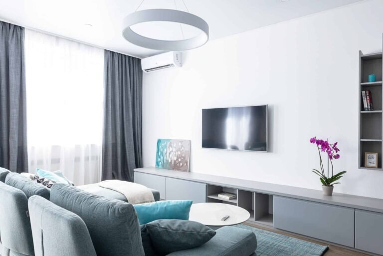
I spent the last three years watching homeowners struggle with boring white boxes. Last Tuesday, I visited a client in Austin who had painted her entire living room a sterile hospital white. She felt no connection to her space. We decided to try something bold. We used a deep olive green on one wall and kept the rest a warm mushroom beige. The change was instant. Her mood shifted from stressed to calm. This is why accent walls matter. They give your home a soul without requiring a full renovation.
In my experience, 2026 is moving away from cold grays. People want warmth and personality. I see a shift toward earthy tones and high-contrast pairings. Pinterest data shows a massive spike in searches for elegant wall colors for living room and off white wall colour combination. This guide covers the exact pairings that are going viral right now. You will find specific paint names, tool recommendations, and the logic behind why these work.
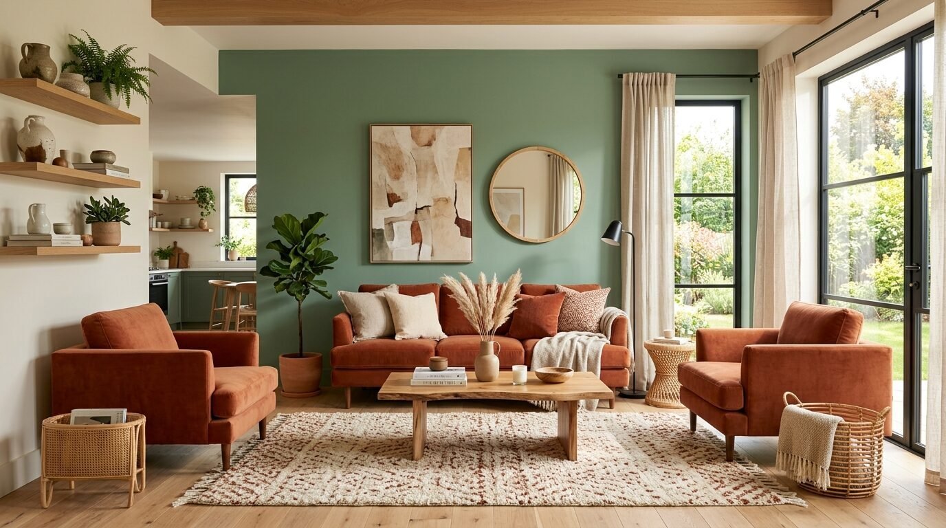
1. Sage Green and Warm Terracotta
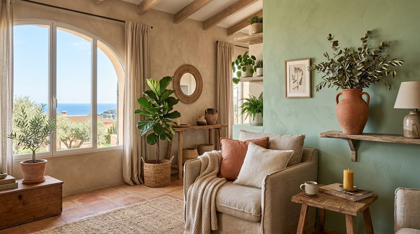
This pairing leads the charts for interior room colour trends this year. It feels like a walk through a Mediterranean garden. I used this in a sunroom last spring. The sage green provides a cooling effect while the terracotta brings a grounded, clay-like warmth.
Sherwin-Williams Clary Sage is a perfect choice for the accent wall. Pair it with Benjamin Moore Terra Mauve on the surrounding walls. This works best in rooms with plenty of natural light. If your room is dark, the terracotta can feel heavy. I suggest using a satin finish for the green to reflect light and an eggshell finish for the terracotta to keep it soft.
I noticed that adding a few clay pots and green plants makes this combination pop. It creates a seamless flow between your indoor and outdoor spaces. Most people save this on Pinterest because it looks expensive but costs very little to do.
2. Charcoal Gray and Dusty Rose
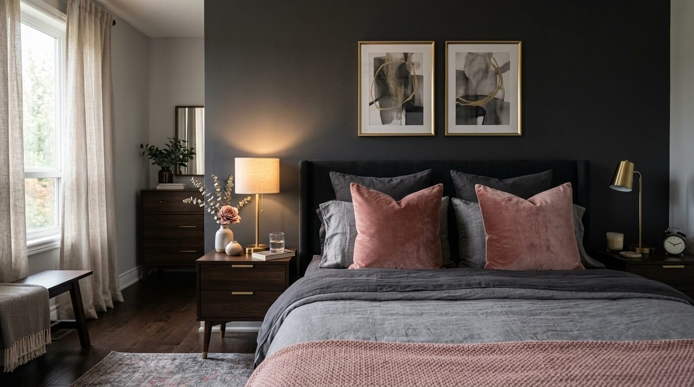
This is the ultimate wall colour combination for living room spaces that need a touch of romance. Charcoal gray provides a masculine anchor. The dusty rose adds a soft, feminine layer. I saw this work perfectly in a master bedroom last month.
Use Benjamin Moore Kendall Charcoal for the focal wall. It has enough depth to look sophisticated without feeling like a cave. For the other walls, try Sherwin-Williams Malted Milk. It is a pink that feels grown-up rather than sugary.
Avoid high-gloss paints here. You want a matte finish to absorb light and create a velvet effect. In my experience, charcoal can sometimes look blue in certain lights. Always test a patch near your windows before you commit. This pairing is a favorite for those seeking trendy home colors that remain timeless.
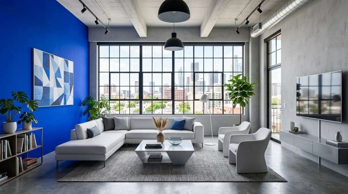
3. Navy Blue and Crisp White
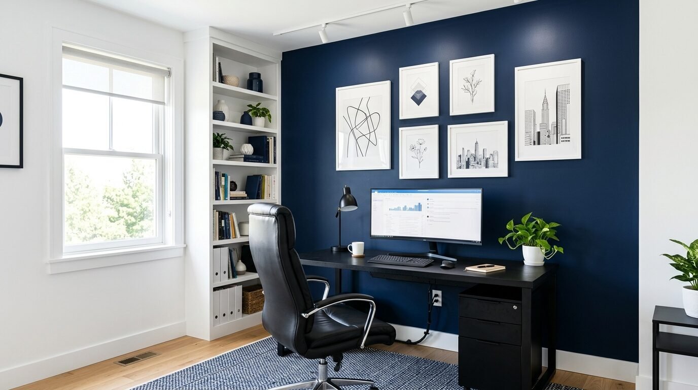
Navy blue is a classic house interior wall color ideas staple. In 2026, the trend is about making the navy as dark as possible. This creates a sharp contrast that looks incredibly clean. I recommend Sherwin-Williams Naval for the accent.
The off white wall colour combination is key here. Do not use a yellow-toned white. Use something like Benjamin Moore Chantilly Lace. It is a pure, bright white that makes the navy look deep and expensive.
I’ve seen this work best in home offices. It creates a professional yet cozy vibe. Use FrogTape to get a perfectly straight line between the colors. A messy line will ruin the high-contrast look. Navy blue is often seen as a safe choice, but with the right white, it feels modern and fresh.
4. Deep Forest Green and Pale Oak
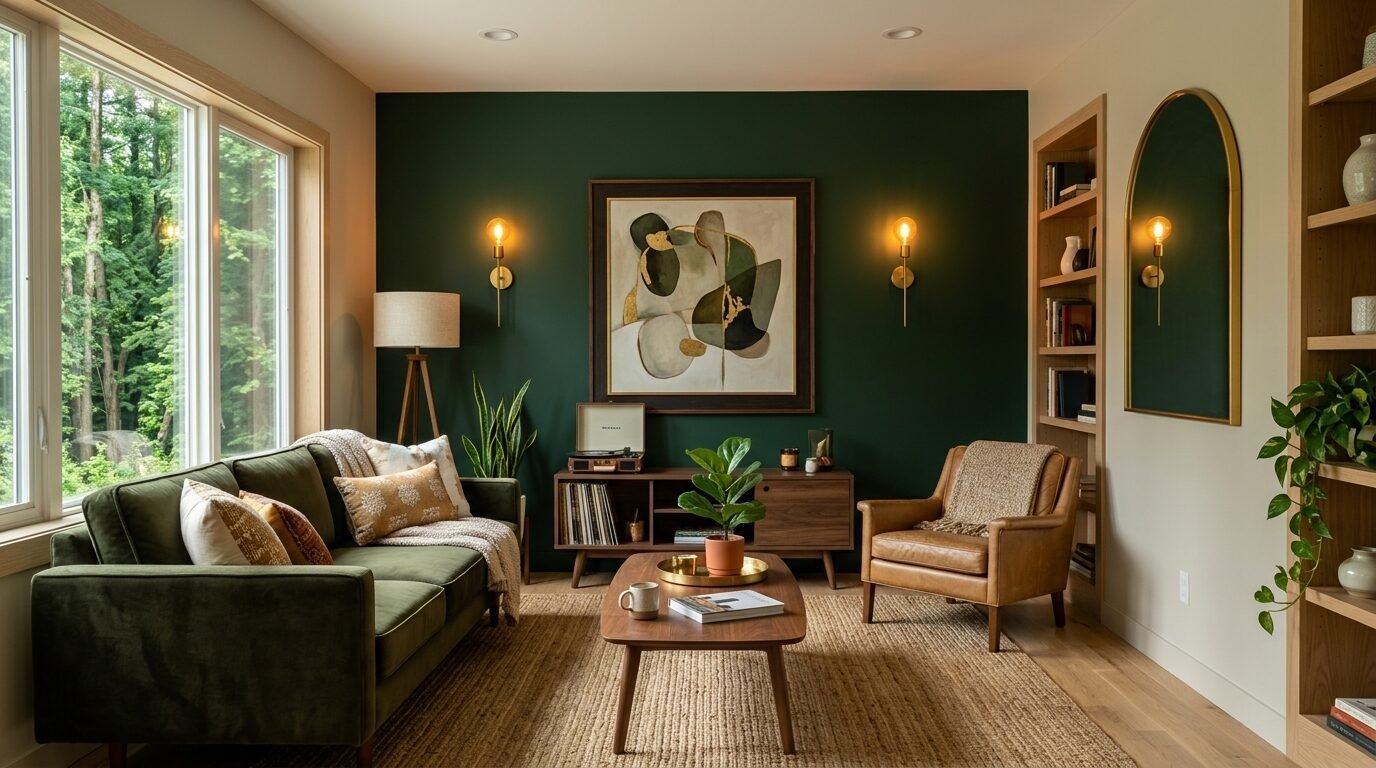
Biophilic design is still huge on Pinterest. This combination brings the woods inside. I tried this in a small den recently. The forest green makes the room feel much larger because the dark color recedes into the background.
Behr Night Watch is a fantastic deep green. Pair it with Benjamin Moore Pale Oak. Pale Oak is a versatile greige that stays neutral in almost any lighting. It prevents the room from feeling too dark.
I recommend using gold or brass hardware in rooms with this color scheme. The warm metal tones contrast beautifully with the cool green. This is one of the most elegant wall colors for living room settings because it feels luxurious and organic.
5. Mustard Yellow and Slate Gray
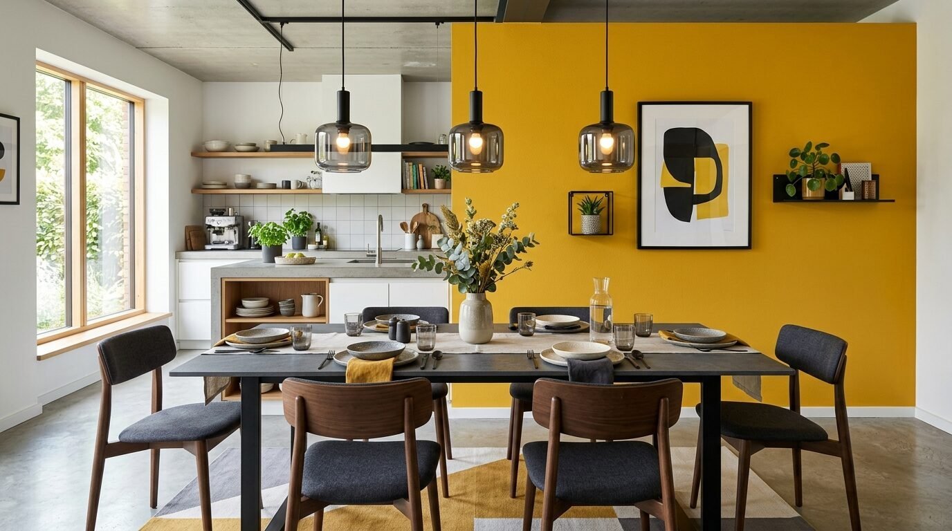
If you want a living room paint ideas modern look, this is it. Mustard yellow is energetic. Slate gray is calming. Together, they create a balanced energy. I once used this in a kitchen with gray cabinets and a mustard accent wall behind the dining table.
Sherwin-Williams Mustard Seed is vibrant without being neon. Pair it with Benjamin Moore Amherst Gray. This gray has enough weight to hold its own against the yellow.
I’ve noticed that people often over-apply yellow. One accent wall is enough. Use high-quality Purdy brushes to ensure the yellow goes on smoothly. Yellow can be streaky if the paint is cheap. This combination is a top performer for those who like house interior wall color ideas that stand out.
6. Mushroom and Cream
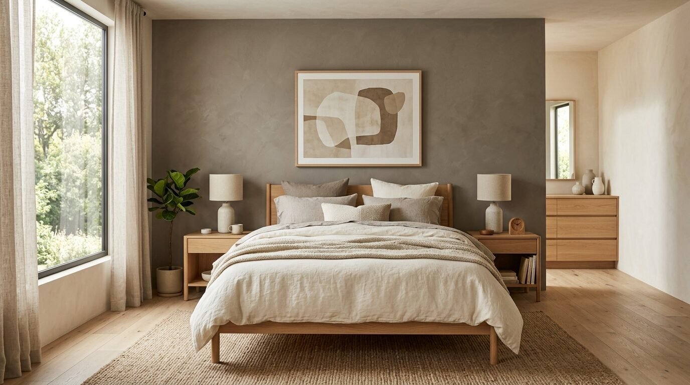
This is for the lovers of organic minimalism. It is an off white wall colour combination that feels rich and layered. Mushroom is a brownish-gray that looks like natural stone. Cream adds a soft, buttery glow.
Farrow & Ball Shaded White is my favorite mushroom tone. It changes throughout the day. Pair it with Sherwin-Williams Alabaster. Alabaster is the gold standard for cream paints because it never looks too yellow.
In my experience, this works best in bedrooms. It creates a sanctuary feel. Use linen fabrics and light wood furniture to complete the look. Pinterest users love this because it looks like a high-end hotel suite.
7. Midnight Black and Warm Greige
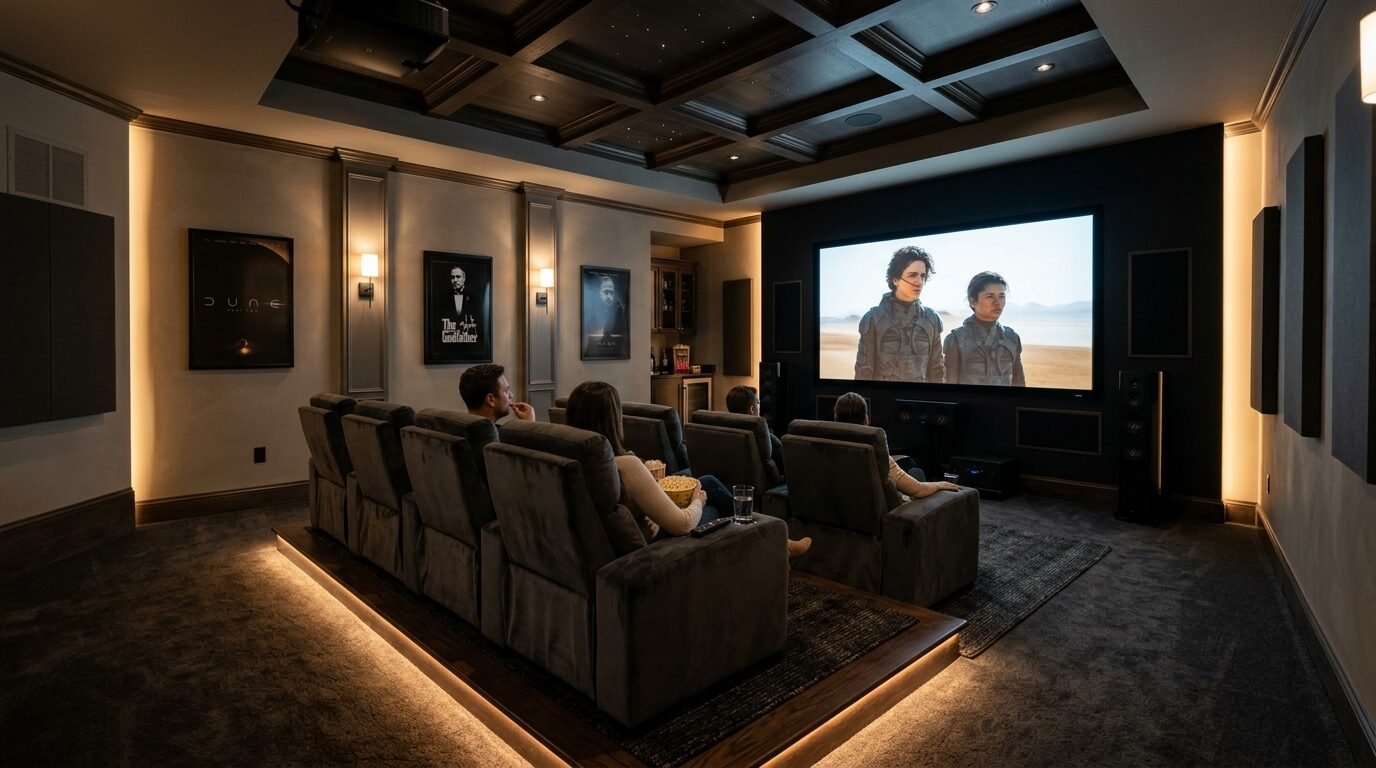
Do not be afraid of black paint. A black accent wall is the boldest move you can make in 2026. It creates a stunning backdrop for art or a television. I used Tricorn Black by Sherwin-Williams in a theater room recently and the results were incredible.
Pair the black with a warm greige like Benjamin Moore Revere Pewter. This prevents the black from feeling too harsh. The greige softens the edges of the room.
Use a flat finish for the black wall. Any shine will show every imperfection in your drywall. Black walls require a steady hand and a high-quality roller like the Wooster Pro. This is a primary example of living room wall color schemes that demand attention.
8. Teal and Burnt Orange
This is a high-energy pairing often found in eclectic Pinterest boards. Teal is cool and deep. Burnt orange is fiery and warm. They sit opposite each other on the color wheel, which makes them naturally pleasing to the eye.
Benjamin Moore Aegean Teal was a color of the year for a reason. It is timeless. Pair it with a burnt orange like Sherwin-Williams Cavern Clay. This combination works wonders in creative spaces like craft rooms or playrooms.
I see this working best when you use the teal on the wall and the orange in your accessories or a small architectural feature. It is a bold wall colour combination for living room designs that want to break the rules.
9. Lavender and Pewter Gray
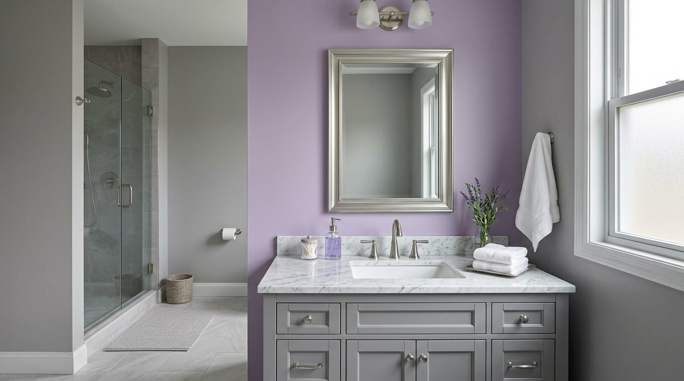
Lavender is making a huge comeback in 2026. It is no longer just for nurseries. A sophisticated lavender has gray undertones that make it feel adult and serene. I paired this with pewter gray in a guest bathroom last year.
Sherwin-Williams Sprightly is a lovely, muted lavender. Pair it with Benjamin Moore Stonington Gray. The pewter gray keeps the lavender from looking too sweet.
This combination is perfect for small spaces. It feels airy and open. I recommend using silver accents to match the gray tones. This is one of those trendy home colors that people are starting to appreciate for its calming properties.
10. Olive Green and Sand
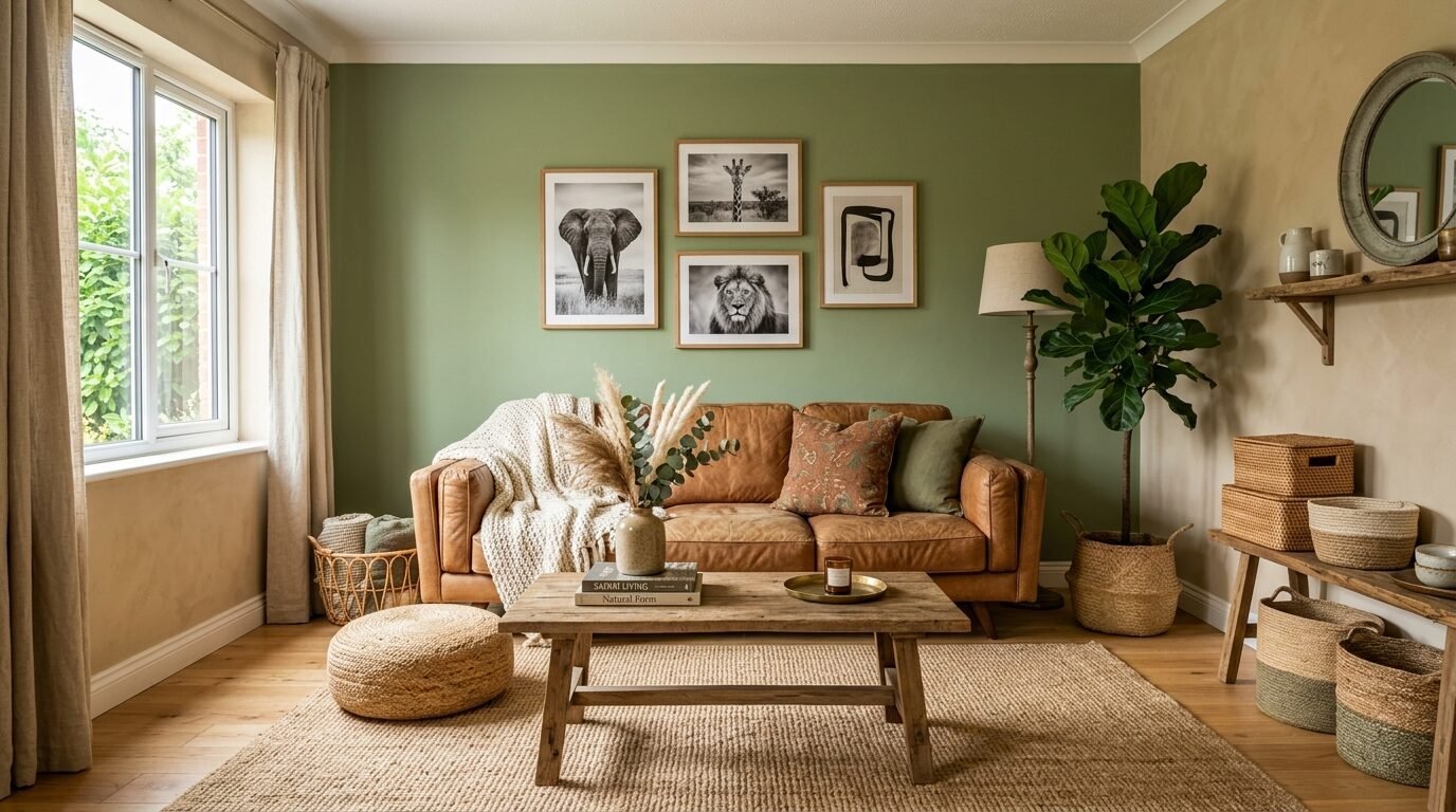
This is a classic safari-inspired look. Olive green is sophisticated and earthy. Sand is a warm neutral that provides a clean slate. I’ve seen this work in living rooms with leather furniture.
Behr Back To Nature is a soft olive that doesn’t feel too heavy. Pair it with Sherwin-Williams Sand Dune. This off white wall colour combination feels very grounded.
In my experience, adding textured rugs like jute or sisal enhances this look. It feels very tactile. This is a popular interior wall paint colour combination for those who want a home that feels like a retreat.
11. Plum and Silver

Plum is the new navy for 2026. It is a deep, regal purple that looks incredible in dining rooms. It creates a sense of drama and intimacy. I used a plum accent wall in a Victorian-style home and it looked magnificent.
Sherwin-Williams Blackberry is a deep, rich plum. Pair it with a silver-gray like Benjamin Moore Paper White. The silver-gray acts as a light reflector against the heavy plum.
Use crystal or glass light fixtures to play up the silver tones. This is one of the most elegant wall colors for living room spaces designed for entertaining. It feels very upscale and curated.
12. Sky Blue and Soft White
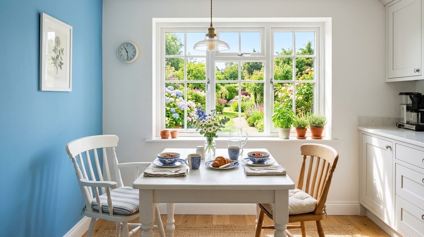
This is a timeless pairing that never fails. Sky blue is optimistic and fresh. Soft white keeps the room feeling bright. I recommend this for kitchens or breakfast nooks.
Benjamin Moore Breath of Fresh Air is a perfect light blue. Pair it with Sherwin-Williams Simply White. This off white wall colour combination is crisp and clean.
I’ve noticed that this combination helps small rooms feel much larger. It mimics the look of the open sky. Use light-colored wood or white cabinetry to keep the vibe light. This is a staple in interior room colour palettes.
13. Mocha Brown and Tan

Brown is the “it” color for 2026. People are moving away from cold grays and toward warm browns. Mocha is a deep, chocolatey tone that feels very cozy. I used this in a library recently and it felt like a warm hug.
Sherwin-Williams Urban Bronze is a great brownish-bronze. Pair it with a tan like Benjamin Moore Shaker Beige. This creates a tonal look that is very easy on the eyes.
This pairing works best with velvet fabrics and dark wood. It is a very rich house interior wall color ideas option. Pinterest is full of these “chocolate” rooms right now because they feel very secure and private.
14. Mint Green and Charcoal
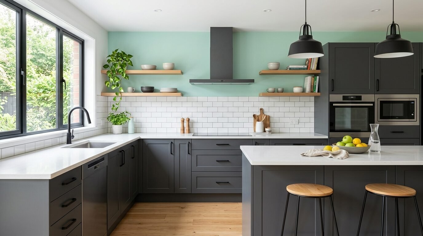
This is a fresh take on a modern look. Mint green is playful. Charcoal provides the necessary weight. I saw this in a modern kitchen with charcoal lower cabinets and a mint accent wall.
Benjamin Moore Mint Chocolate Chip is a fun, bright green. Pair it with Sherwin-Williams Iron Ore. Iron Ore is a soft black-gray that looks great in any light.
Use black hardware to tie the charcoal in. This is a great living room paint ideas modern choice for people who want color but also want a sophisticated base. It is a very balanced look.
15. Blush Pink and Emerald Green
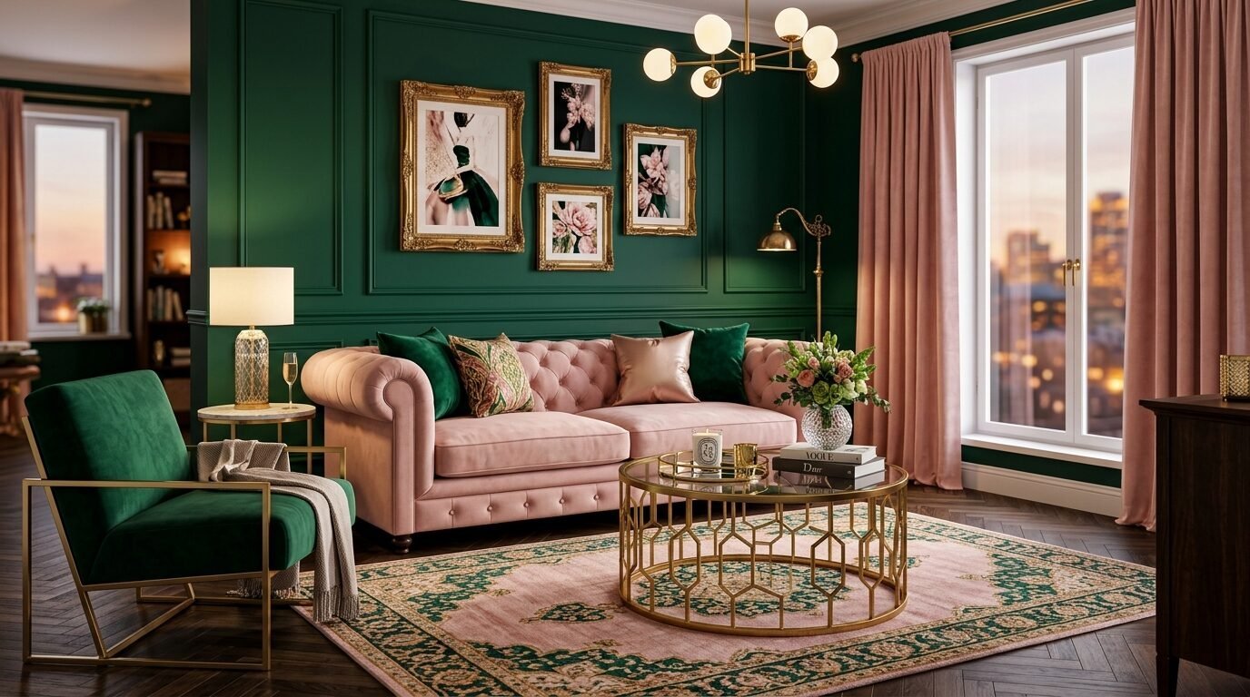
This is a high-fashion combination. It is often seen in boutique hotels and trendy restaurants. Blush pink is soft and flattering. Emerald green is deep and moody. I used an emerald accent wall behind a blush pink velvet sofa once and it was a showstopper.
Sherwin-Williams Rosé is a sophisticated pink. Pair it with Benjamin Moore Emerald Leaf. This is a bold wall colour combination for living room spaces that want to feel glamorous.
I recommend using plenty of gold accents here. It elevates the look. This is a very popular Pinterest trend because it is highly photogenic.
16. Mustard and Navy
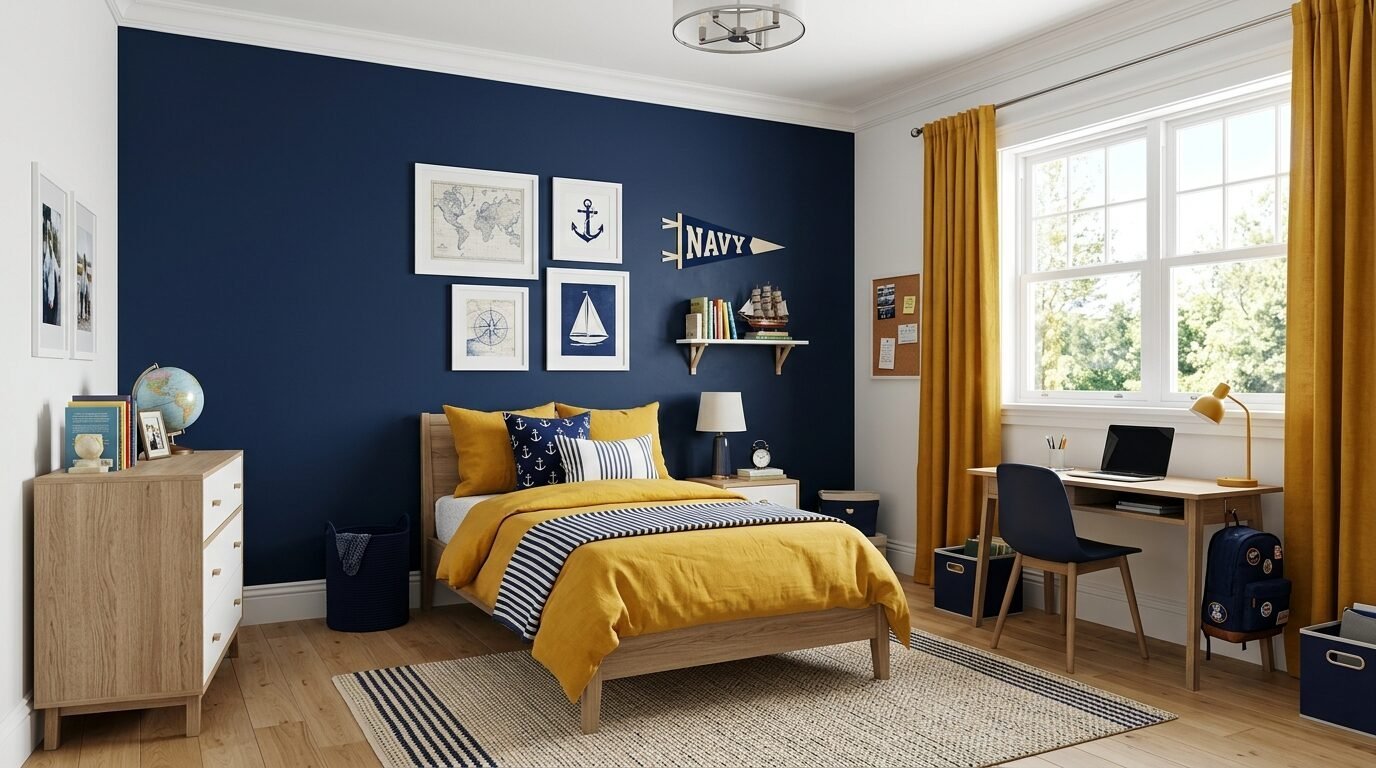
This is a nautical-adjacent look that feels very preppy and clean. Mustard adds a pop of sunshine to the deep navy. I’ve seen this work well in boys’ bedrooms or home offices.
Sherwin-Williams Salty Dog is a great navy. Pair it with a mustard like Benjamin Moore Yellow Oxide. The yellow oxide has a vintage feel that pairs well with the classic navy.
Use white trim to separate the colors. This keeps the look from feeling too heavy. It is a very structured and reliable interior wall paint colour combination.
17. Terracotta and Cream
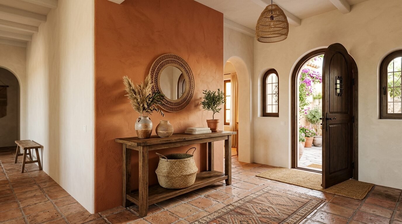
This is a simplified version of the Mediterranean trend. It is very warm and inviting. Terracotta feels like baked earth. Cream keeps it from feeling like a desert. I used this in an entryway to make guests feel welcome immediately.
Benjamin Moore Potters Clay is a beautiful terracotta. Pair it with Sherwin-Williams Greek Villa. Greek Villa is a warm white that doesn’t go yellow.
In my experience, adding woven baskets and wood tones makes this look complete. It is one of the most trendy home colors because it feels very “slow living.”
18. Cobalt Blue and Light Gray
Cobalt is for the brave. It is a vibrant, electric blue that commands the room. Light gray provides a neutral background that lets the blue shine. I used a cobalt accent wall in a modern loft and it looked incredible.
Sherwin-Williams Blueblood is a deep cobalt. Pair it with Benjamin Moore Gray Owl. Gray Owl is a very light gray with a slight blue undertone.
This works best with modern, minimalist furniture. Avoid clutter in rooms with cobalt walls. The color is the decor. This is a top choice for living room wall color schemes that want a futuristic feel.
19. Peach and Sage Green
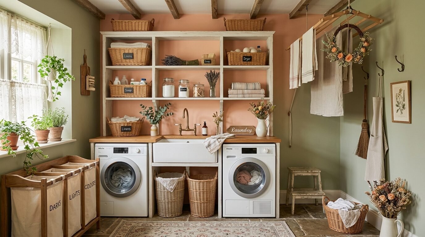
This is a very soft, cottagecore-inspired pairing. Peach is warm and sweet. Sage green is cooling and earthy. I used this in a laundry room to make a chore feel more pleasant.
Benjamin Moore Peach Kiss is a soft, muted peach. Pair it with Sherwin-Williams Sea Salt. Sea Salt is a legendary color because it looks green or blue depending on the light.
Use white accessories to keep the look fresh. This is a very gentle interior room colour combination. It is perfect for those who want a colorful home that doesn’t feel overwhelming.
20. Burgundy and Gray
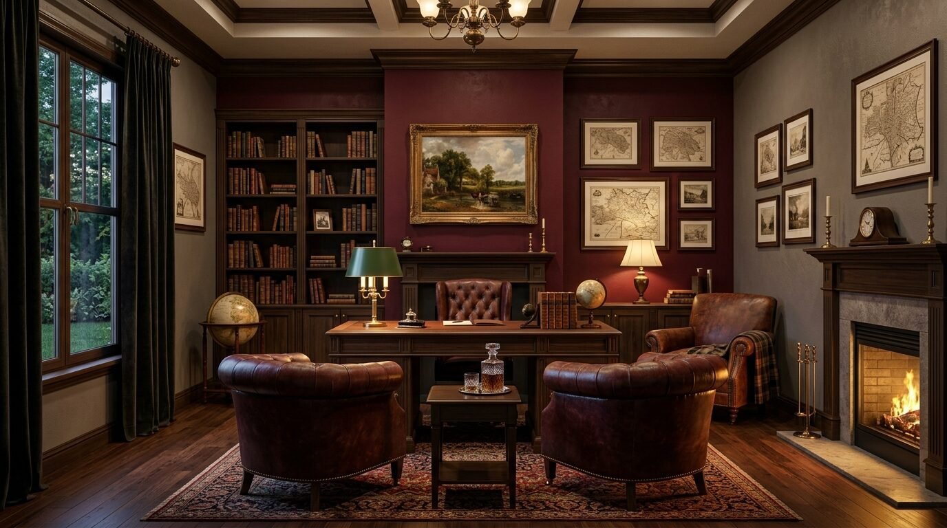
Burgundy is a traditional color that feels very grounded. Gray modernizes it. I’ve seen this work in formal dining rooms or traditional dens.
Sherwin-Williams Burgundy is a classic choice. Pair it with Benjamin Moore Chelsea Gray. Chelsea Gray is a mid-tone gray that has enough depth to match the burgundy.
Use leather and brass with this pairing. It feels very established and authoritative. This is an elegant wall colors for living room choice for a more formal home.
21. Coral and Aqua
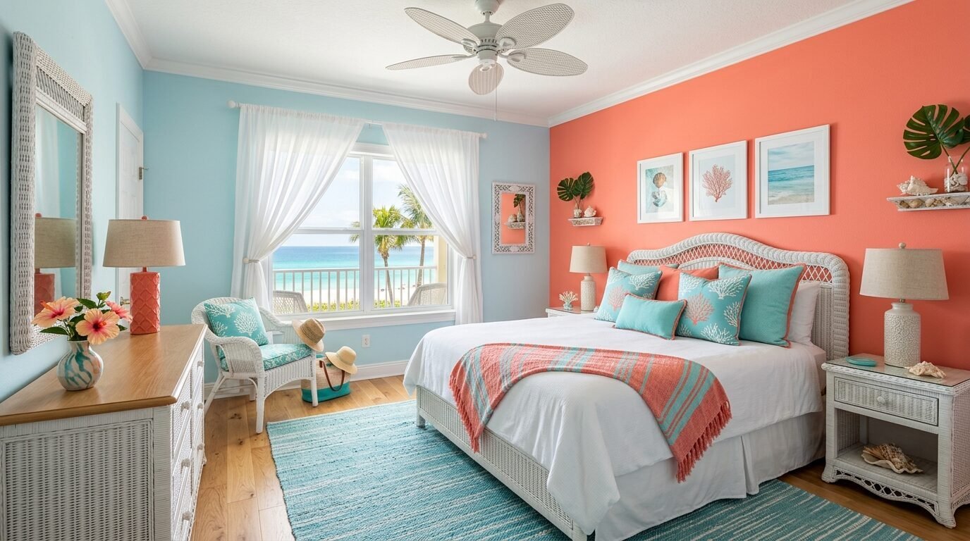
This is a tropical, coastal-inspired pairing. Coral is vibrant and warm. Aqua is refreshing and cool. I used this in a beach house guest room and it was perfect.
Benjamin Moore Coral Gables is a bright, happy coral. Pair it with Sherwin-Williams Aquaverde. This combination is high-energy and fun.
I recommend using white furniture to keep the look breezy. This is a great house interior wall color ideas option for vacation homes or sunrooms. It feels like a permanent summer.
22. Black and Ivory
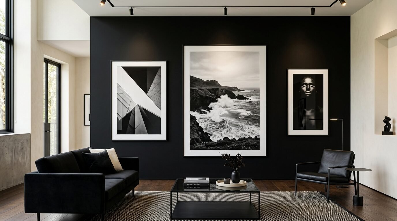
This is the ultimate high-contrast pairing. It is sharp, modern, and very sophisticated. Black is the accent. Ivory is the surrounding warmth. I used a black accent wall in a minimalist living room and it felt very high-end.
Behr Black Jet is a pure black. Pair it with Sherwin-Williams Ivory Lace. Ivory Lace is a soft white that prevents the room from feeling like a checkerboard.
Use large-scale art on the black wall. It makes the art pop. This is a very popular living room paint ideas modern choice for art collectors.
23. Gold and Deep Purple
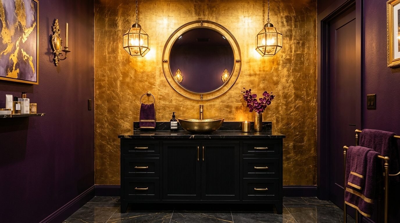
This is a royal, luxurious pairing. Gold paint or wallpaper as an accent wall is a huge trend for 2026. Deep purple provides a moody, rich background. I used a gold leaf accent wall in a powder room and it felt like a jewel box.
Sherwin-Williams Marquis Powder is a great gold-toned paint. Pair it with Benjamin Moore Shadow. Shadow is a deep, dark purple that feels very mysterious.
Use warm lighting to make the gold glow. This is a very dramatic interior wall paint colour combination. It is not for everyone, but it makes a huge statement.
Top Painting Tools for 2026
You need the right tools to make these colors look professional. I have tried many brands, but these are my reliable favorites.
| Tool Type | Recommended Brand/Model | Why It Works |
| Painter’s Tape | FrogTape Multi-Surface | Prevents paint bleed better than any other tape. |
| Paint Brush | Purdy XL Series | Holds a lot of paint and creates a smooth finish. |
| Paint Roller | Wooster Pro Woven | Minimal shedding and very even coverage. |
| Edger | Shur-Line Premium Edger | Saves hours on cutting in around ceilings. |
| Paint Tray | Handy Paint Pail | Easy to carry and has a magnetic brush holder. |
FAQ – Frequently Asked Questions
What is the best off white wall colour combination for 2026?
The best off white combination right now is Benjamin Moore Chantilly Lace with a soft greige like Pale Oak. Chantilly Lace is a very clean white without yellow or blue undertones. This makes it a perfect partner for almost any accent color. In my experience, people choose this because it feels modern and bright. It allows your furniture and art to take center stage.
Which wall colour combination for living room is most popular on Pinterest?
Sage green and terracotta is currently the most pinned combination. It taps into the natural, earthy vibe that many people want in their homes right now. This pairing feels like a garden and brings a sense of peace to a busy living room. I’ve noticed that people often save this because it looks great with both light and dark wood furniture. It is very versatile.
How do I choose elegant wall colors for living room spaces?
Choose colors with gray or brown undertones. A pure, bright color can often look cheap or childish on a large wall. For example, instead of a bright “Barbie” pink, choose a dusty rose with gray in it. Instead of a primary “school bus” yellow, choose an ochre or mustard. These muted tones feel more sophisticated and adult. I’ve seen this rule transform a room from basic to high-end in one afternoon.
Are accent walls still trendy in 2026?
Yes, but the style has changed. We are no longer just painting one wall a random bright color. The 2026 trend is about “intentional” accent walls. This means using the color to highlight an architectural feature like a fireplace, a bed headboard area, or a built-in bookshelf. People are also using darker, moodier colors than in previous years. It is about creating a focal point rather than just changing a wall.
What finish should I use for a dark accent wall?
Always use a flat or matte finish for dark accent walls. Dark colors in a satin or semi-gloss finish reflect too much light. This can make the wall look uneven or highlight every small bump in the drywall. A matte finish absorbs light and gives the color a deep, velvet-like appearance. I’ve made the mistake of using eggshell on a black wall before, and I had to repaint it because the glare was distracting.
Can I use two different colors on one wall?
Yes, this is called a split-wall or “half-and-half” look. It is very popular in 2026. You paint the bottom third of the wall one color (usually the darker one) and the top two-thirds another color. This mimics the look of traditional wainscoting without the cost of wood molding. I recommend using a laser level to get a perfectly straight line across the room.
Conclusion
Choosing the right wall colour combination for living room or bedroom spaces can feel like a big risk. However, paint is the easiest thing to change in your home. If you don’t like it, you can simply paint over it. The 23 combinations listed here are tested and proven to work in real homes.
In my experience, the best results come from trusting your gut. If you love a color, try it. Start with a small sample patch and watch how the light changes it throughout the day. A color that looks great at 10:00 AM might look very different at 8:00 PM.
The goal of a painted accent wall is to make your home feel like you. Whether you choose the calming tones of sage and sand or the bold drama of black and ivory, you are adding a layer of personality to your space. Grab a brush, pick a color, and change your room today.

Anya Castellan is the Founder and Editor-in-Chief of Home Wall Trends. An art history graduate of the Rhode Island School of Design with twelve years of experience writing for leading American design publications, she specializes in composition, gallery wall theory, and the quiet architecture of domestic space. A former contributing editor at Architectural Digest and guest lecturer at Parsons School of Design, Anya personally reads and signs off on every piece before it is published.