You stand in your bedroom with a gallon of deep navy paint. You spent sixty dollars on this Sherwin Williams Emerald tin. You spent three hours taping the edges with FrogTape. You finish the job and step back. Instead of the cozy retreat you imagined, the room feels like a tiny dark box. The walls feel like they are moving toward you. This is a common heartbreak for many DIY decorators. I have seen this happen dozens of times.
An accent wall should add depth and character. It should not make you feel trapped. Most people think a dark color is the problem. In my experience, the color is rarely the sole culprit. The mistake usually lies in the placement, the finish, or the lighting. Painting a small room requires a different strategy than painting a large living area. You have to work with the sightlines. You have to respect the natural light.
I remember helping a friend in her five hundred square foot apartment. She wanted a bold charcoal wall behind her bed. We chose the short wall at the end of a narrow room. Within minutes of finishing, we realized the error. The room looked half its original length. We had to repaint it the next day. That lesson stayed with me. This guide will help you avoid that same exhaustion and waste of money.
Summary
This article breaks down the six biggest errors people make when adding accent walls to small spaces. You will see how choosing the wrong wall can shrink your floor plan. We look at why window walls are a risky choice for dark colors. We also cover the technical side of paint sheens and how they affect your perception of space. You will find a detailed comparison of popular paint brands like Benjamin Moore and Behr. We also include a troubleshooting guide for lighting issues. By the end of this post, you will know exactly how to use color to make your room feel twice as large. We focus on practical steps you can take today. No complex theories. Just real world advice that works.
1. Choosing the Shortest Wall in a Rectangular Room
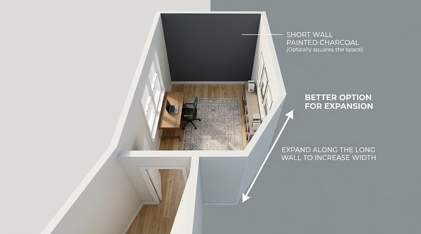
The most frequent mistake I see is painting the short wall of a narrow room. If your room is long and skinny, painting the far short wall makes it jump forward. This is a basic rule of color science. Dark or warm colors advance while light or cool colors recede. When that short wall advances, it cuts off the length of the space. The room suddenly looks like a square box instead of a long airy space.
I once consulted on a home office that felt like a hallway. The owner painted the end wall a deep terracotta. The desk felt crowded immediately. In my experience, you should always pick the longest wall for your accent. This draws the eye along the widest part of the room. It emphasizes the length and makes the walls feel further apart.
If you must use a short wall, keep the color light. Use a soft sage green or a pale blue. These colors have a high Light Reflectance Value or LRV. We will discuss LRV more in the tools section. For now, remember that a dark short wall is a recipe for a cramped feeling. Always walk into the room and identify the longest stretch of drywall first. That is your prime real estate for a bold color.
2. Painting the Wall with the Only Window
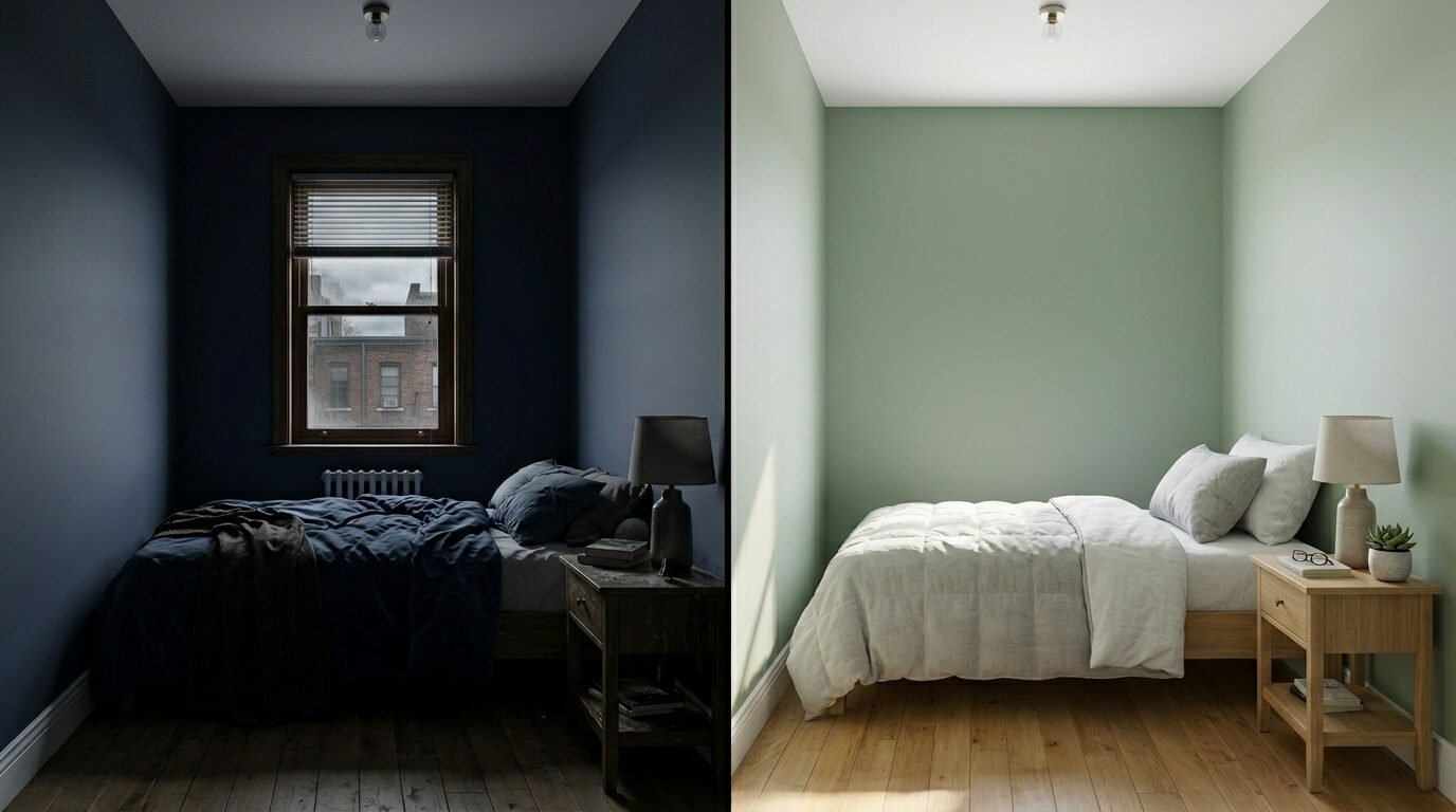
It is tempting to paint the window wall. You think the natural light will show off the color. I have seen this backfire more than any other tactic. When you paint a window wall a dark color, you create a silhouette effect. The light coming through the window is so bright that the wall itself stays in deep shadow. Your beautiful forest green will just look like a muddy black.
This creates a heavy visual weight at the source of light. It makes the room feel closed off from the outside world. I tried this in a guest bedroom with a north facing window. The room felt cold and damp even on sunny days. The contrast between the bright window and the dark wall was too harsh for the eyes to process comfortably.
Instead, paint the wall opposite the window. This allows the sunlight to hit the color directly. The light will bounce off the accent wall and fill the rest of the room. This makes the space feel vibrant and open. If you want to use a dark color like Benjamin Moore Hale Navy, it needs that direct light to reveal its blue undertones. Without it, you are just living in a shadow.
3. Creating a High Contrast Gap at the Ceiling
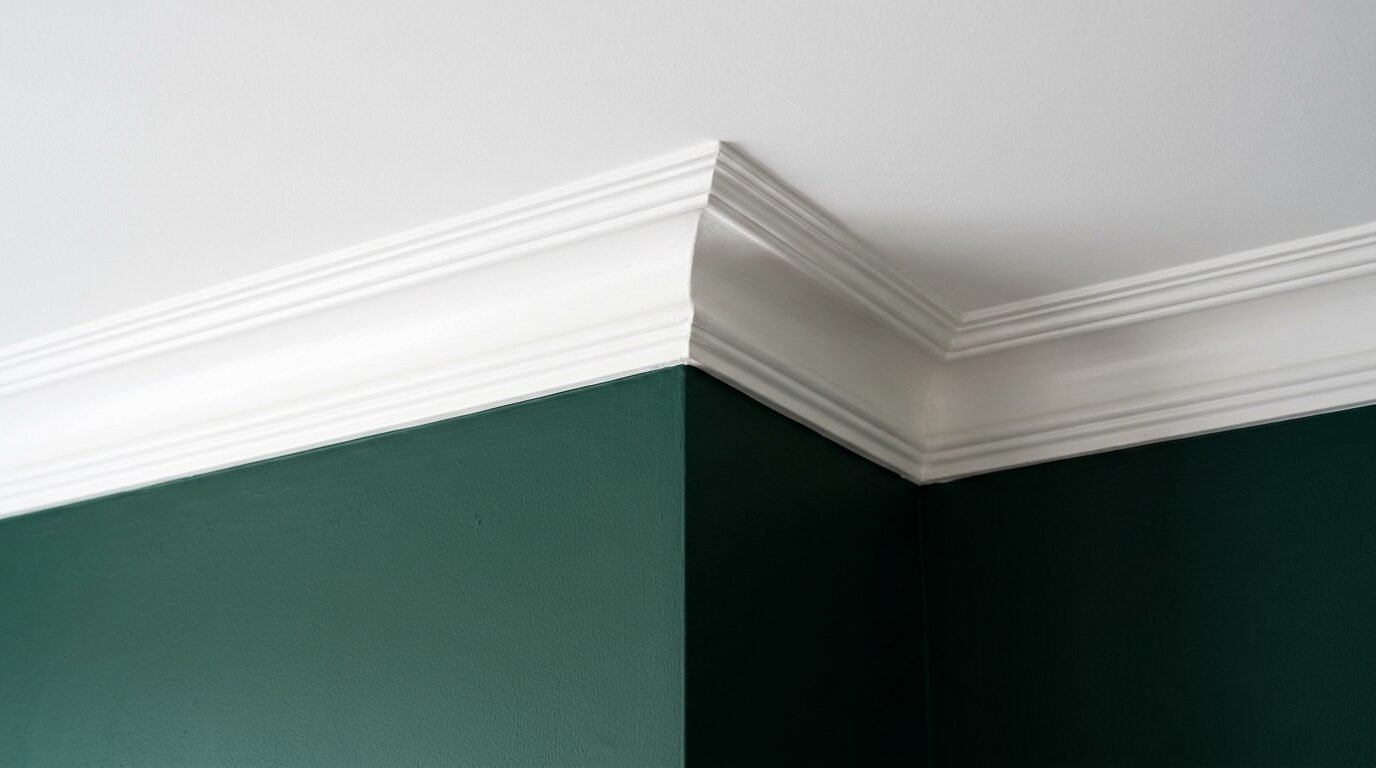
Many DIY painters leave a small white strip of crown molding or a white ceiling against a very dark accent wall. While this looks crisp, it creates a hard horizontal line. In a small room, this line acts like a lid. It tells your brain exactly where the wall ends. This makes the ceiling feel lower than it actually is.
In my experience, the best way to avoid this is to paint your trim the same color as the accent wall. This is called color drenching. When the baseboards and the ceiling line match the wall, the boundaries disappear. Your eyes do not stop at the floor or the ceiling. They keep moving. This creates an illusion of height.
I once used this trick in a tiny powder room. We painted the walls, the door, and the baseboards a deep plum. Because there were no white lines to break up the space, the room felt much larger. It felt like an intentional design choice rather than a cramped closet. If you are afraid of painting the ceiling, at least paint the baseboards. Eliminating that bottom white line will make the wall feel taller instantly.
4. Using Large Scale Patterns in Tight Corners
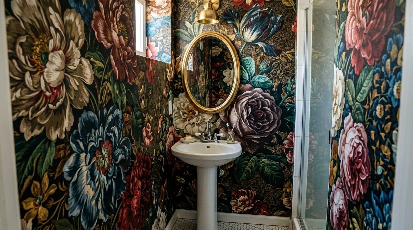
Wallpaper is a popular choice for accent walls. However, the scale of the pattern is vital. I have seen homeowners pick a massive floral print for a tiny bathroom. The large flowers overwhelm the small fixtures. It makes the walls feel like they are leaning in. In a small room, your brain needs “white space” or quiet areas to rest.
When a pattern is too big, it dominates the room. It leaves no room for the architecture to breathe. I noticed this in a small nursery where the parents used a giant mountain mural. The crib looked tiny and the room felt cluttered even when it was clean.
If you love patterns, go for something small or geometric. A delicate herringbone or a subtle stripe works wonders. These patterns provide texture without the visual weight. If you want a mural, choose one with a lot of depth. A landscape with a distant horizon can actually make a wall feel like it is miles away. Avoid flat, heavy patterns that sit right on the surface of the wall.
5. Picking a Matte Finish for Darker Tones
The sheen of your paint matters just as much as the color. Most people choose a flat or matte finish for accent walls. They want to hide imperfections in the drywall. This is a mistake in a small room. Matte paint absorbs light. It does not reflect anything back. In a small space, you need every bit of light you can get.
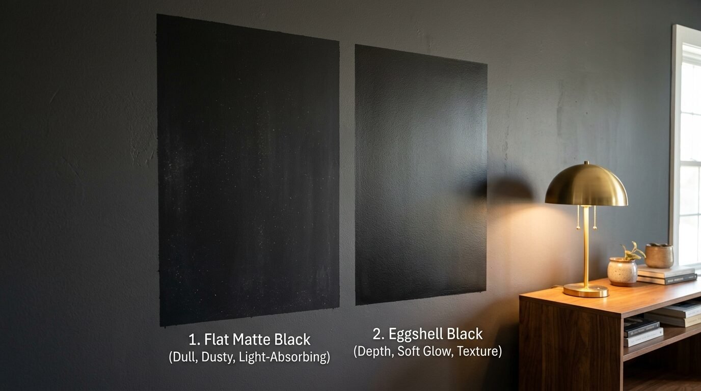
A dark matte wall acts like a sponge. It soaks up the lamps and the overhead lights. This makes the corners of the room feel dark and dusty. I prefer an eggshell or a satin finish for small accents. These finishes have a slight glow. They catch the light and create a soft reflection. This reflection adds a sense of “air” to the wall.
I have seen this work perfectly with Behr Marquee paint in an eggshell finish. The subtle sheen makes the color look expensive and multidimensional. It prevents the wall from looking like a flat piece of construction paper. If your walls are very bumpy, use a high quality primer like Zinsser Bulls Eye 1-2-3 first. This will smooth out the surface so you can use a higher sheen without showing every dent.
6. Ignoring the Impact of Artificial Lighting
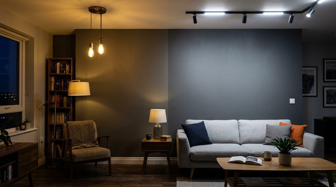
You might choose a color in the store under bright fluorescent lights. You get home and put it on the wall, and it looks completely different. In my experience, people forget how their lamps affect color. Most home LED bulbs have a warm yellow tint. This can make a blue accent wall look green or a grey wall look beige.
In a small room, these yellow tones can make the space feel dingy. If your accent wall looks “off,” it is likely your bulbs. I always recommend using “Daylight” or “Cool White” bulbs for rooms with dark accents. These bulbs have a color temperature of 3000K to 4000K. They keep the colors true and bright.
I once helped a client who hated her new charcoal wall. It looked like mud at night. We swapped her old incandescent bulbs for Philips Hue smart bulbs. We set them to a crisp white light. The charcoal immediately looked modern and sharp. The room felt cleaner and more open. Never judge your accent wall until you have optimized your light bulbs.
Tools and Supplies for the Perfect Accent Wall
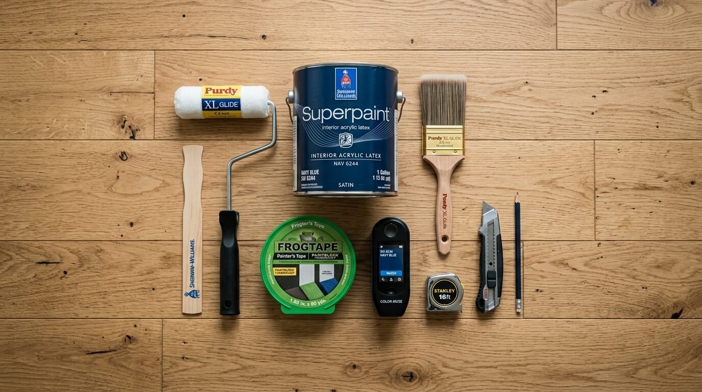
Choosing the right products can save you from a second coat of paint. It can also make the application process much faster. I have tested many brands over the years. Here is my honest assessment of what works for small rooms.
| Tool or Brand | Use Case | My Honest Take |
| Sherwin Williams Emerald | High traffic areas | Best coverage I have seen. It is expensive but worth it for dark colors. |
| Benjamin Moore Aura | Deep, rich colors | Excellent color depth. It dries very fast so you have to work quickly. |
| Behr Marquee | Budget friendly DIY | Great one coat coverage. Can be a bit thick to work with for beginners. |
| FrogTape Green | Crisp lines | Much better than standard blue tape. It prevents paint bleed. |
| Purdy XL Brushes | Cutting in edges | These hold their shape for years. Do not buy cheap brushes. |
| Wooster Pro Rollers | Large wall surfaces | Provides a very smooth finish. Minimal lint. |
| Zinsser Bulls Eye 1-2-3 | Priming dark walls | Essential if you are painting a light color over an old dark wall. |
| Datacolor ColorReader | Matching existing colors | A lifesaver if you want to match your accent wall to a piece of furniture. |
In my experience, the Datacolor ColorReader is a hidden gem. You just hold it against a fabric or a pillow. It tells you the exact paint color match on your phone. This takes the guesswork out of color coordination. Also, always use a high quality roller frame. A cheap frame will flex and give you uneven pressure. This leads to streaks in your accent wall.
Case Studies: Real Life Room Transformations
I want to share three specific examples of how these changes worked for real people. These are not professional photoshoots. These are real homes with real problems.
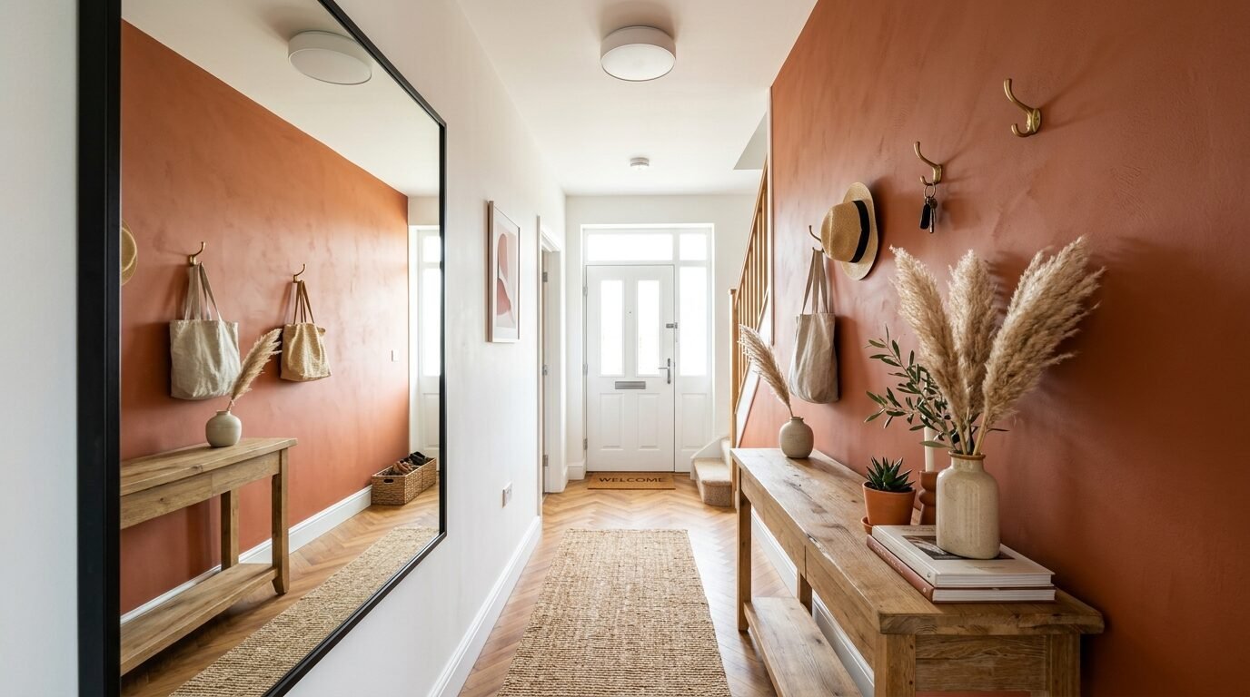
The Narrow Entryway Fix
A client had a long, narrow entry. She painted the end wall a dark burnt orange. The hallway felt like a tunnel. We repainted the end wall the same white as the other walls. Then, we painted the longest side wall a soft terracotta. The hallway instantly felt wider. The orange didn’t feel like a barrier anymore. It felt like an invitation.
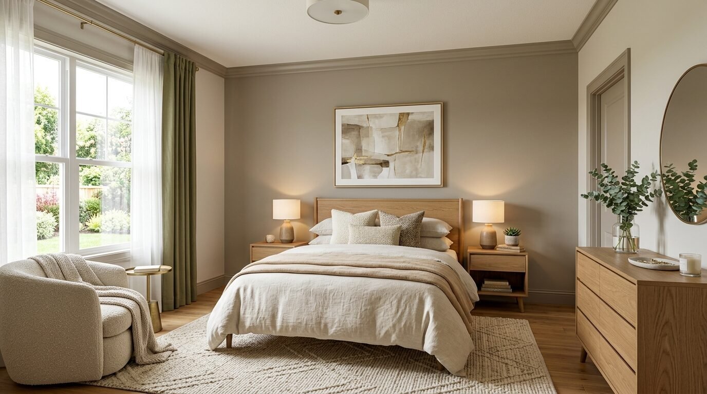
The North Facing Bedroom
In a bedroom with very little light, the owner used a matte navy on the window wall. It was depressing. We moved the navy to the wall opposite the window. We also switched to an eggshell finish. We added two mirrors on the side walls to bounce the light. The room went from a cave to a sophisticated suite in one weekend. The total cost was under one hundred dollars for the paint and the mirrors.
The Low Ceiling Basement
A basement living room felt cramped. The owner had a dark grey accent wall with white baseboards and a white ceiling. We painted the baseboards and the ceiling trim the same dark grey as the wall. This removed the “lid” effect. The basement suddenly felt two feet taller. It is a simple trick that costs nothing extra but changes everything.
Frequently Asked Questions
Does a dark accent wall make a room smaller?
Not necessarily. If you put a dark color on the longest wall, it can add depth. It makes that wall feel like it is receding. However, if you put it on a short wall or a wall with no light, it will shrink the space. The key is placement and lighting.
Which wall should be the accent wall?
In most cases, pick the longest wall or the wall behind the main piece of furniture. This is usually the bed in a bedroom or the sofa in a living room. This creates a natural focal point. Avoid walls with lots of doors or windows. These “broken” walls make the room feel cluttered.
Can I have an accent wall in a tiny bedroom?
Yes. You just need to be careful. Use a color with a medium LRV. Avoid very dark blacks or browns unless you have massive windows. A soft blue or a warm tan can make a tiny bedroom feel intentional and curated.
Should the ceiling match the accent wall?
If you want the room to feel taller, painting the ceiling trim or the ceiling itself can help. This is a bold move. If you are not ready for a dark ceiling, at least paint your baseboards to match the wall. This removes the horizontal lines that shrink your height.
What is the best paint finish for small rooms?
I always recommend eggshell or satin. Flat paint absorbs too much light. High gloss shows too many bumps. Eggshell is the perfect middle ground. It reflects just enough light to keep the room feeling airy.
How do I choose the right color?
Start with the items you already own. Look at your rug or your pillows. Use a tool like the ColorSnap app to find the undertones in those items. Always buy a small sample can first. Paint a large square on the wall and look at it at different times of the day.
Is wallpaper better than paint for accents?
Wallpaper adds texture which can make a room feel cozy. However, it is harder to change. If you are a beginner, stick to paint. If you use wallpaper, pick a pattern with a small scale. Large patterns will overwhelm a small room quickly.
Does painting the baseboards help?
Yes. White baseboards against a dark wall create a “frame.” This frame tells your eyes exactly where the floor is. If you paint the baseboards the same color as the wall, the wall feels like it continues forever. This makes the room feel much larger.
How do I fix a room that feels too small?
First, check your lighting. Switch to cooler bulbs. Second, look at your furniture. Is it blocking your accent wall? Move large pieces away from the wall to let the color breathe. Finally, consider adding a mirror to the wall opposite your accent color.
Should I use a glossy or matte finish?
Avoid matte in small rooms. It makes the wall look flat and heavy. A slight gloss or satin finish adds dimension. It helps define the edges of the room without making it feel like a cave.
How does lighting affect wall color?
Warm light makes colors look more yellow or red. Cool light makes them look blue or grey. If your room feels small and dingy, your lights are likely too warm. Switch to 3500K bulbs for a cleaner look.
Can two accent walls work in one room?
I do not recommend this for small spaces. Two accent walls create too many competing focal points. It makes the room feel chaotic and smaller. Stick to one bold wall and keep the others neutral.
Conclusion
Creating a beautiful accent wall is about more than just picking a color you love. It is about understanding how light and space interact. I have seen so many people give up on color because of one bad experience. Do not let a small room scare you away from bold choices. Remember to pick the long wall. Use a finish with a bit of shine. Match your trim to the wall color to gain height.
I have spent years testing these methods in my own homes and for clients. These small shifts in strategy make the difference between a cramped room and a cozy one. If you are currently staring at a paint swatch, take a moment to look at your windows and your ceiling height. Use the tools I mentioned to find the right match. You can do this. Your room has more potential than you think. What wall are you planning to paint first?

Anya Castellan is the Founder and Editor-in-Chief of Home Wall Trends. An art history graduate of the Rhode Island School of Design with twelve years of experience writing for leading American design publications, she specializes in composition, gallery wall theory, and the quiet architecture of domestic space. A former contributing editor at Architectural Digest and guest lecturer at Parsons School of Design, Anya personally reads and signs off on every piece before it is published.