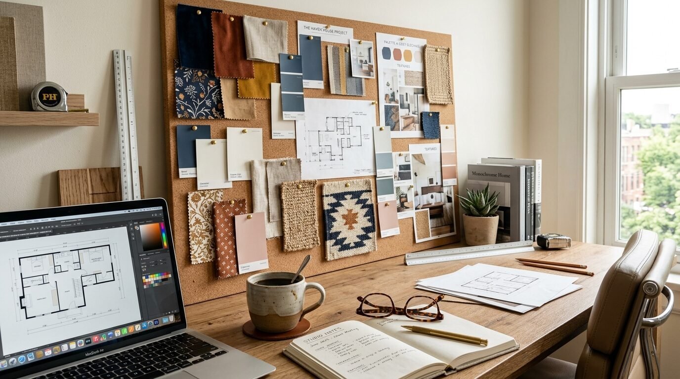
Last year I helped a friend fix a room that felt like a cold hospital wing. The walls were a flat sterile white. The bed had a single thin sheet. It felt empty even though it was full of furniture. This is the most common mistake people make. They pick a color but forget the feel. A room is not just a photo. It is a place where your skin touches fabric and your eyes rest on walls. You need a mix of visual interest and physical comfort. Pairing a Bedroom Color Combination with the right materials changes everything. It turns a sleeping space into a sanctuary. I have spent years designing urban lofts and family homes. I noticed that the most successful rooms always balance hard and soft. They balance light and dark. This guide shows you how to do it without stress. You will learn to pick a Wall Color Combination that works. You will see how to layer rugs and pillows. You will finally understand why your room feels off. Let us fix your space together.
1. Why Texture Matters More Than Color
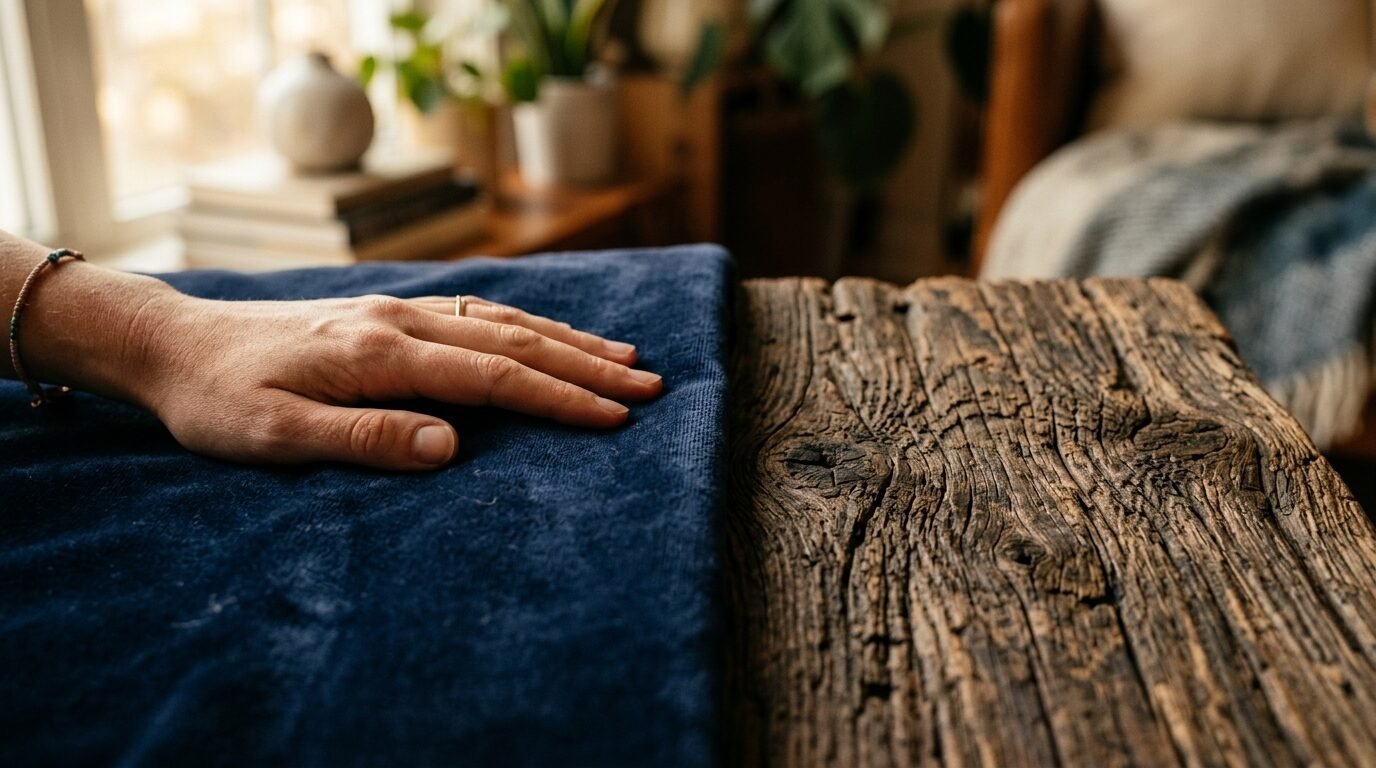
Most people start with a paint swatches. They stare at a hundred shades of blue. This is backwards. You should think about how the room feels under your hand first. A flat blue wall looks different next to a velvet headboard than it does next to a metal one. Texture adds shadows. Shadows create depth. Without depth a room feels two dimensional. In my experience a lack of texture is why expensive rooms often feel cheap.
I once worked on a project where the client wanted a total grey look. We used grey paint and grey carpet. It looked terrible at first. It was flat and boring. We added a chunky wool throw. We swapped the plastic blinds for linen curtains. We brought in a reclaimed wood nightstand. The room instantly felt warm. The color did not change. The textures did. This is the secret to high end design. It is the hidden layer of every Easy Room Decor plan.
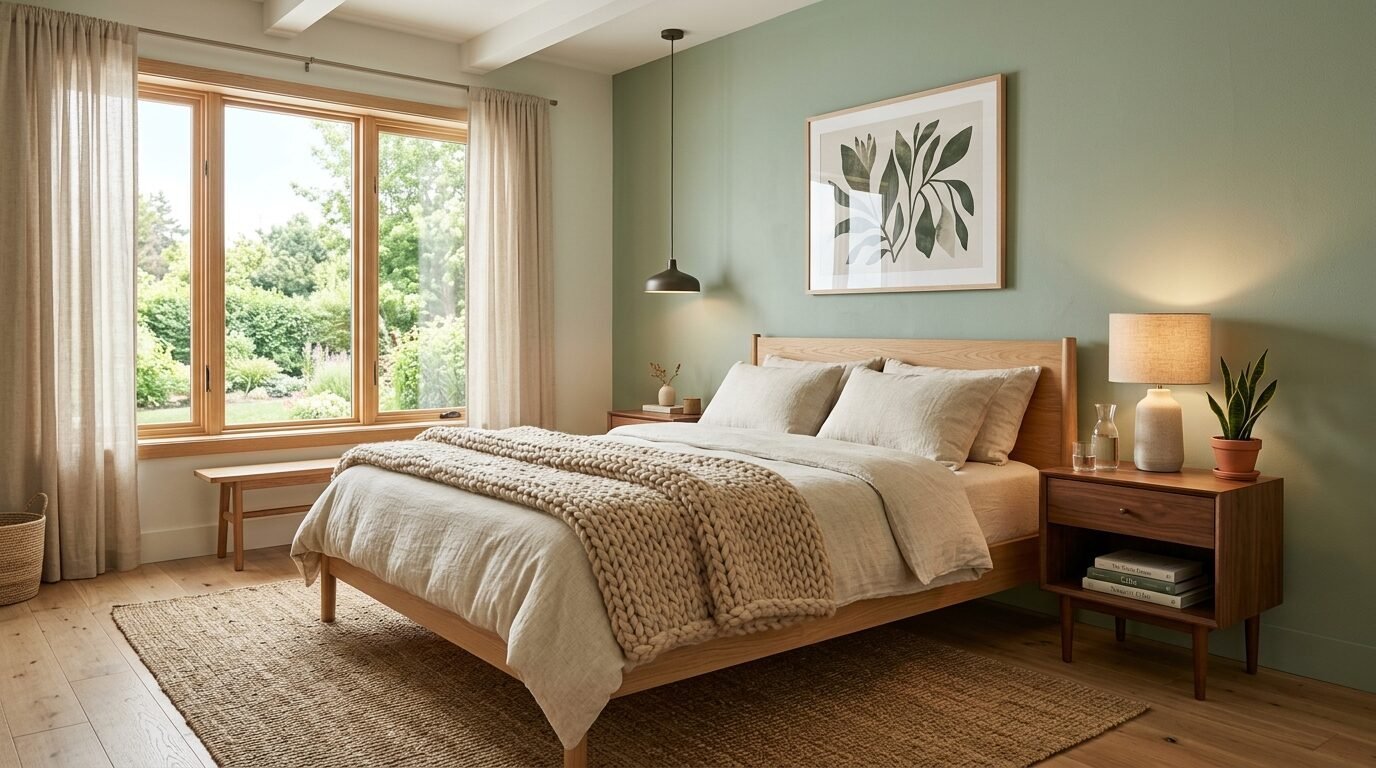
2. Understanding Your Bedroom Wall Colors
Your walls are the largest surface in the room. They set the mood. Light colors make a small room feel airy. Dark colors make it feel cozy. You must consider the natural light. A north facing room gets blue light. This makes cool colors look cold. A south facing room gets golden light. This makes warm colors look yellow. I always tell people to paint a large square on the wall. Watch it at noon. Watch it at sunset.
Many homeowners fear dark paint. They think it makes a room tiny. This is a myth. Dark walls can make boundaries disappear. It creates a cocoon effect. I saw this work perfectly in a small guest room. We painted the walls a deep forest green. We added light oak furniture. The contrast made the room feel expensive and intentional. It no longer felt like a small box. It felt like a deliberate choice.
3. The Rule of Three in Color Combinations Home
Consistency is the enemy of good design. You do not want everything to match. You want things to coordinate. The best way to do this is the 60 30 10 rule. Use your primary Home Wall Colour for 60 percent of the space. Use a secondary color for 30 percent. Use an accent color for the final 10 percent. This creates a visual hierarchy. It prevents the eye from getting overwhelmed.
Think about a classic spa. The walls are soft beige. That is your 60 percent. The bedding is crisp white. That is your 30 percent. The plants and wood accents are your 10 percent. It feels balanced. It feels professional. You can apply this to any style. Whether you like modern industrial or warm minimalism the math stays the same. Use this rule to stay on track.
4. Pairing Wood Tones with Bedroom Wall Paint
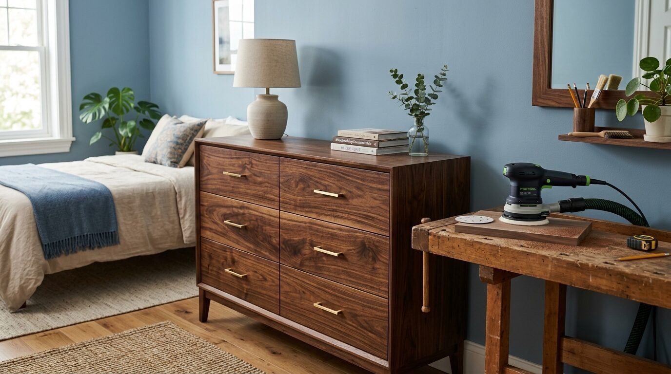
Wood is a texture and a color. People often forget this. If you have walnut floors you need to pick a paint that complements that warmth. I prefer using Festool sanders to prep wood surfaces for a perfect finish. It makes the grain pop. When the wood grain is visible it acts as a pattern. A busy wood grain needs a calm wall color.
I once saw a room with heavy red oak floors and bright yellow walls. It felt chaotic. The colors were fighting for attention. We changed the walls to a soft sage green. Green and red are opposites on the color wheel. They balance each other out. The room immediately felt grounded. Always look at your furniture before you buy paint. Your bed frame and dresser are the anchors of your room.
5. Case Study The East London Loft
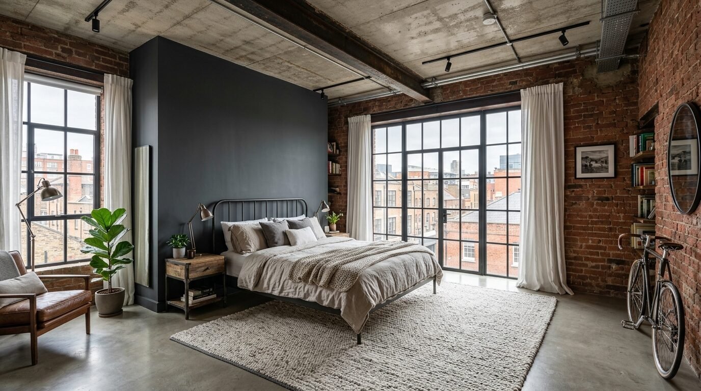
A few months ago I designed a loft in East London. The space had exposed brick and concrete ceilings. It was very industrial. The client wanted it to feel like a home not a factory. We started with a Bedroom Wall Colour Combination of charcoal and warm white. The charcoal went on the feature wall behind the bed.
We layered in soft textures to fight the hard surfaces. We used a velvet headboard in a deep rust color. We added linen bedding. We placed a thick jute rug over the concrete floor. The result was a perfect balance. The hard brick and concrete provided the edge. The velvet and linen provided the comfort. This project taught me that any space can feel warm. You just need to lean into contrast.
6. How to Use Performance Fabrics
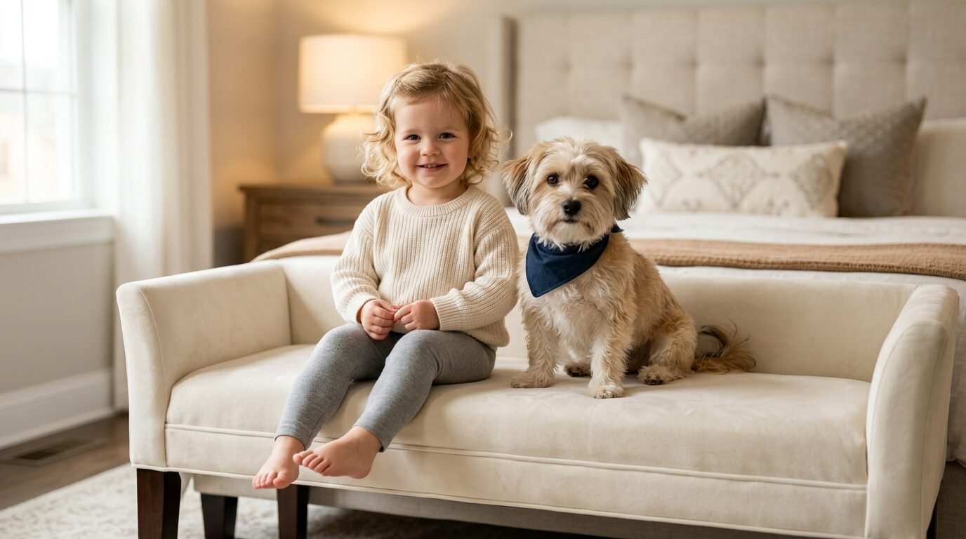
Life is messy. I have a toddler and two dogs. I cannot have delicate fabrics in my main living spaces. This is where performance fabrics come in. Brands like Crypton or Sunbrella offer beautiful textures that are easy to clean. You can have a white linen look without the fear of stains. This is a game changer for Easy Room Decor.
I suggest using performance fabrics for headboards and benches. These items get touched the most. They collect oils from your hair and skin. A performance fabric stays looking new for years. I have used these in dozens of homes. Parents always thank me later. You do not have to sacrifice style for function. You can have both.
7. The Impact of Lighting on Colour Combinations Interior
Lighting is the final texture. It is the invisible layer. A room with only one overhead light will always look flat. You need layers. Use floor lamps for height. Use bedside lamps for task lighting. Use wall sconces for mood. Each light source creates new shadows on your textures.
I love using warm white bulbs. They mimic the glow of a candle. Avoid cool blue bulbs in the bedroom. They disrupt sleep and make colors look sterile. I once visited a client who complained her blue walls looked purple. We swapped her 5000K bulbs for 2700K bulbs. The purple disappeared. The blue returned. Light is the most powerful tool in your kit. Use it wisely.
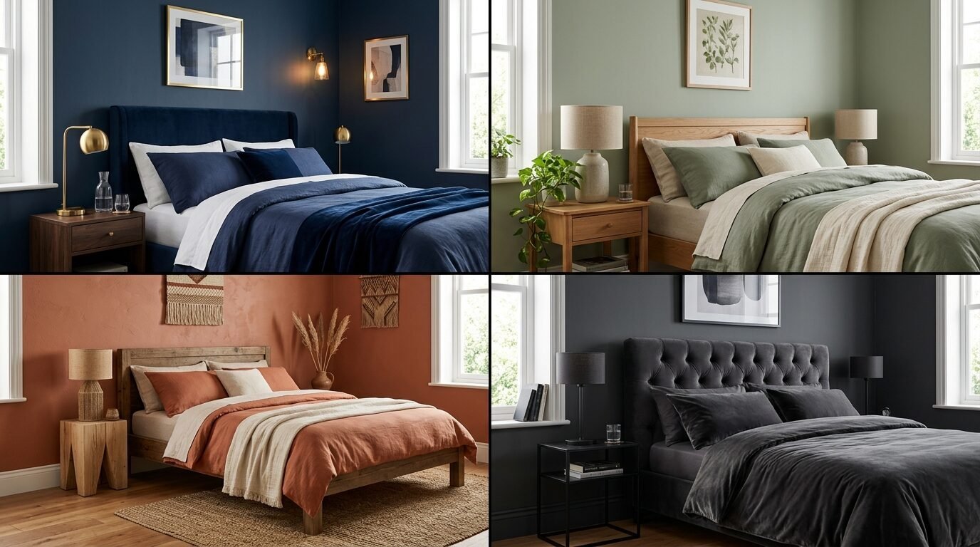
8. 12 Specific Bedroom Color Combination Ideas
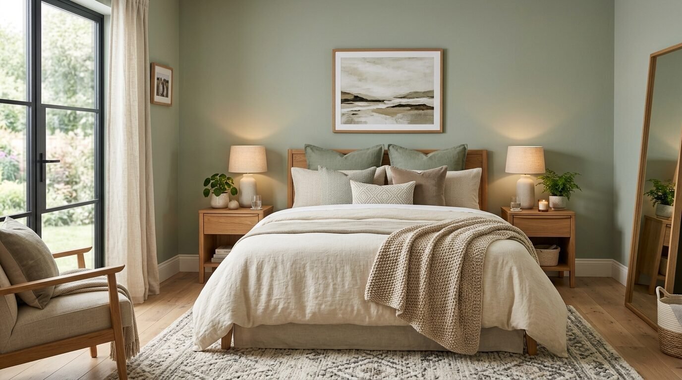
1. Sage Green and Distressed Wood
This is the ultimate biophilic pair. Sage green mimics nature. Distressed wood adds history. It feels like a cabin in the woods. Use a flat paint for the walls. Use a matte wax for the wood furniture.
2. Navy Blue and Brushed Brass
This is a classic high end look. Navy is a neutral in the design world. The brass adds a touch of light. It works best with white bedding. The contrast is sharp and clean.
3. Terracotta and Woven Jute
This pair is earthy and warm. Terracotta brings a Mediterranean feel. Jute adds a rough natural texture. It is perfect for a sunny room. Keep the furniture light to avoid a heavy feeling.
4. Charcoal Grey and Velvet
This is moody and luxurious. Charcoal creates a deep backdrop. Velvet catches the light in different ways. It feels like a high end hotel suite. Use silver accents to keep it from feeling too dark.
5. Soft Cream and Light Oak
This is the heart of warm minimalism. It is bright and airy. The light oak provides just enough warmth to keep the cream from looking cold. This is perfect for small bedrooms.
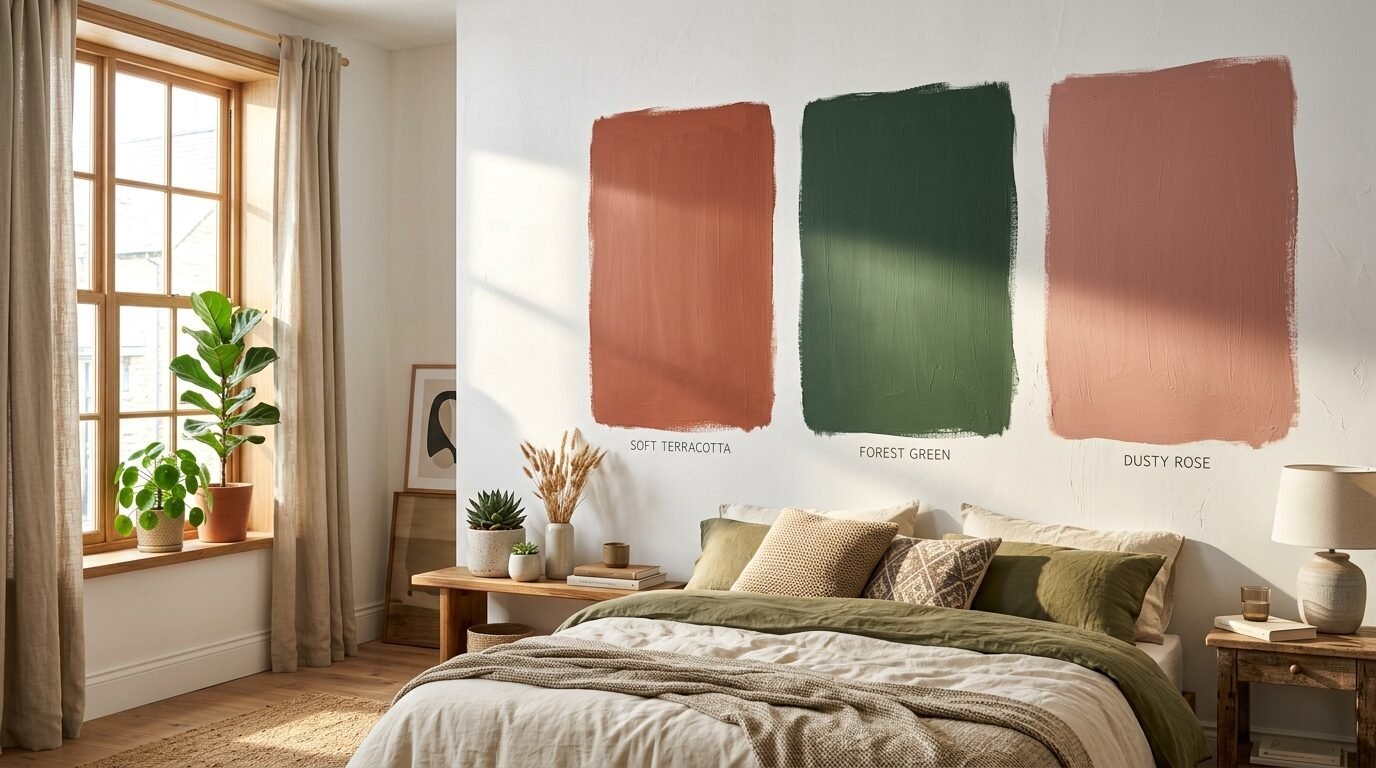
6. Dusty Rose and Hammered Copper
This is soft and romantic. The rose is subtle. The copper adds a metallic edge. It feels modern but feminine. Use white linen to keep the look fresh.
7. Forest Green and Cognac Leather
This is a masculine classic. The green is rich. The leather adds a smooth organic texture. It feels like a private library. Use brass lamps to complete the look.
8. Sky Blue and White Linen
This is the coastal dream. It is light and breezy. The linen texture is essential here. It should look slightly wrinkled and lived in. This combination lowers the heart rate.
9. Mustard Yellow and Dark Walnut
This is a mid century modern staple. The yellow is energetic. The walnut is grounded and dark. It is a bold choice that pays off in personality.
10. Lavender and Silver Silk
This is calm and sophisticated. Lavender is a soothing color. Silk adds a shimmering texture that feels expensive. It works well in rooms with lots of natural light.
11. Greige and Wrought Iron
This is the modern farmhouse favorite. Greige is the perfect neutral. Wrought iron adds a hard graphic line. It is simple and timeless.
12. Peach and Blonde Maple
This is cheerful and bright. Peach adds a soft glow to the skin. Blonde maple keeps it looking modern. It is a great choice for a guest room or a nursery.
9. Tools and Brands for Your Project
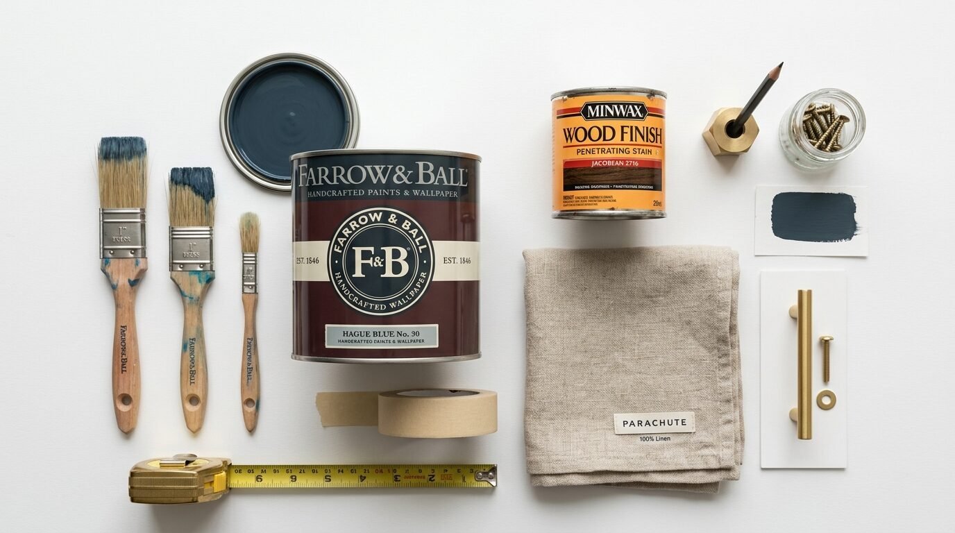
Choosing the right products makes the work easier. I have tested many brands over the years. Here are the ones I trust for consistent results.
- Farrow & Ball: Their paint has a high pigment content. The colors look deep and rich in any light.
- Sherwin Williams: Their Emerald line is very durable. It is great for homes with kids.
- Benjamin Moore: I love their Aura line for ceiling paint. It covers well with fewer coats.
- Festool: I use their sanders for all my custom wood projects. The dust collection is incredible.
- Minwax: Their Weathered Oak stain is my go to for a modern look.
- Titebond: I use Titebond III for furniture repairs. It is strong and waterproof.
- Parachute Home: Their linen bedding is the best in the industry. It gets softer with every wash.
- West Elm: A great source for mid century furniture with good wood tones.
- Pottery Barn: Their performance fabrics are worth the investment.
- Lutron: Their dimmer switches are essential for controlling your light layers.
10. Common Mistakes in Interior Wall Colors
One big mistake is ignoring the ceiling. Most people leave it stark white. This creates a harsh line where the wall meets the top. I often paint the ceiling a very light version of the wall color. This softens the room. It makes the ceiling feel higher.
Another mistake is matching all the woods. If your floor is oak your furniture does not have to be oak. In fact it shouldn’t be. Mix a dark wood with a light wood. This makes the room feel like it grew over time. It feels collected rather than bought from a catalog. I have seen many rooms fail because they were too perfect. A little bit of mismatch is a good thing.
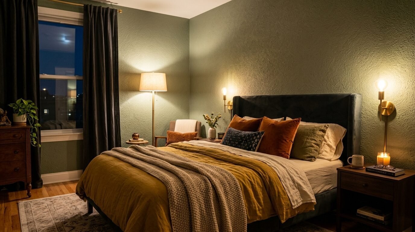
11. Case Study The Toddler Proof Master
I recently updated my own bedroom. I wanted it to be beautiful but I have a toddler. I chose a Room Color Ideas Bedroom theme based on warm greys and blues. I painted the walls a soft charcoal. I used a performance velvet for the headboard.
The rug is a washable Ruggable. The bedding is a durable cotton weave. It looks like a luxury hotel. But I can wash everything. My dog can jump on the bed. My toddler can spill juice. The room stays beautiful because the materials are smart. This is the secret to a happy home. Design for the life you have. Not the life you see on social media.
12. Troubleshooting Color Combinations Paint
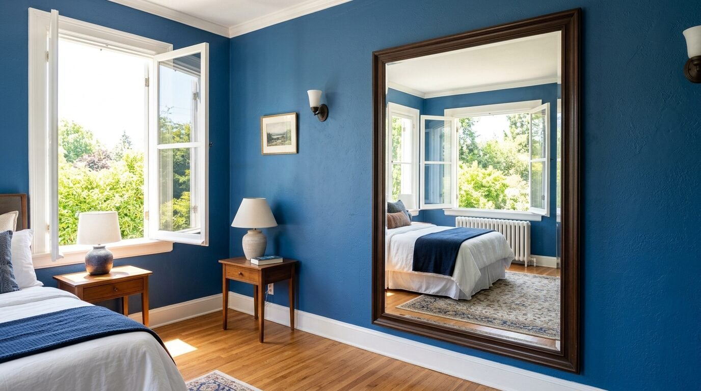
If your room feels too cold add something orange or red. Even a small copper bowl can fix a cold blue room. If your room feels too small use a large mirror. Place it opposite the window. It will double the light and the color.
If the paint looks different than the swatch do not panic. Paint usually looks darker on the wall than on the card. Give it two days to dry completely. The color will settle. If you still hate it remember it is just paint. It is the cheapest thing to change in a room. I have repainted rooms three times to get it right. It is part of the process.
13. Frequently Asked Questions
What is the best color for a small bedroom?
Light neutrals like cream or light sage work best. They reflect light. This makes the walls feel further away. Avoid high contrast in small spaces. Keep the wall color and furniture tones close together. This creates a seamless look.
How do I mix different wood tones?
Keep the undertones the same. If your floor has a warm red undertone pick furniture with warm tones. Do not mix a cool grey wood with a warm orange wood. They will clash. Use a rug to separate the wood furniture from the wood floor.
Should my curtains match my walls?
They do not have to match exactly. I prefer curtains that are one shade lighter or darker than the walls. This provides enough contrast to be interesting. It also keeps the room feeling cohesive. Linen is always a safe choice for texture.
How many textures should I have in one room?
Aim for at least five. Think about wood metal fabric glass and stone. Each one adds a different layer of interest. A room with only one texture feels flat and boring. Even a small ceramic vase counts as a texture.
Is an accent wall still in style?
Yes but do it with texture. Instead of just a different paint color try wood slats or wallpaper. A textured accent wall has more staying power than just a bold color. It adds physical depth to the room. Use it behind the headboard for the best impact.
How do I choose a rug size?
Your rug should be large enough for the bed and the nightstands to sit on it. Or at least the bottom two thirds of the bed. A rug that is too small makes the room look disjointed. It should act as a frame for your furniture.
Can I use dark colors in a dark room?
Yes. Sometimes leaning into the darkness is better. A dark room painted white often looks grey and muddy. A dark room painted a deep navy looks intentional and cozy. Add plenty of lamps to create a warm glow. This is my favorite trick for basement bedrooms.
What is the easiest way to add texture?
Throw blankets and pillows are the fastest way. Pick a chunky knit or a faux fur. These items are easy to swap out with the seasons. They provide instant comfort and visual weight. It is the most cost effective way to change a room.
Conclusion
Pick one corner of your room today. Add a new texture. Change a light bulb. See how the color reacts. You do not need a full renovation to see a difference. Small steps lead to a beautiful home. Your bedroom is the most personal space you own. Make it reflect who you are.

Anya Castellan is the Founder and Editor-in-Chief of Home Wall Trends. An art history graduate of the Rhode Island School of Design with twelve years of experience writing for leading American design publications, she specializes in composition, gallery wall theory, and the quiet architecture of domestic space. A former contributing editor at Architectural Digest and guest lecturer at Parsons School of Design, Anya personally reads and signs off on every piece before it is published.