Your living room feels quiet. You stare at that big blank space above the sofa. It needs soul. It needs a story. Last year, we saw perfectly spaced grids everywhere. This year, everything is different. People want walls that feel like a warm hug. They want layers. They want memories that don’t look like a catalog.
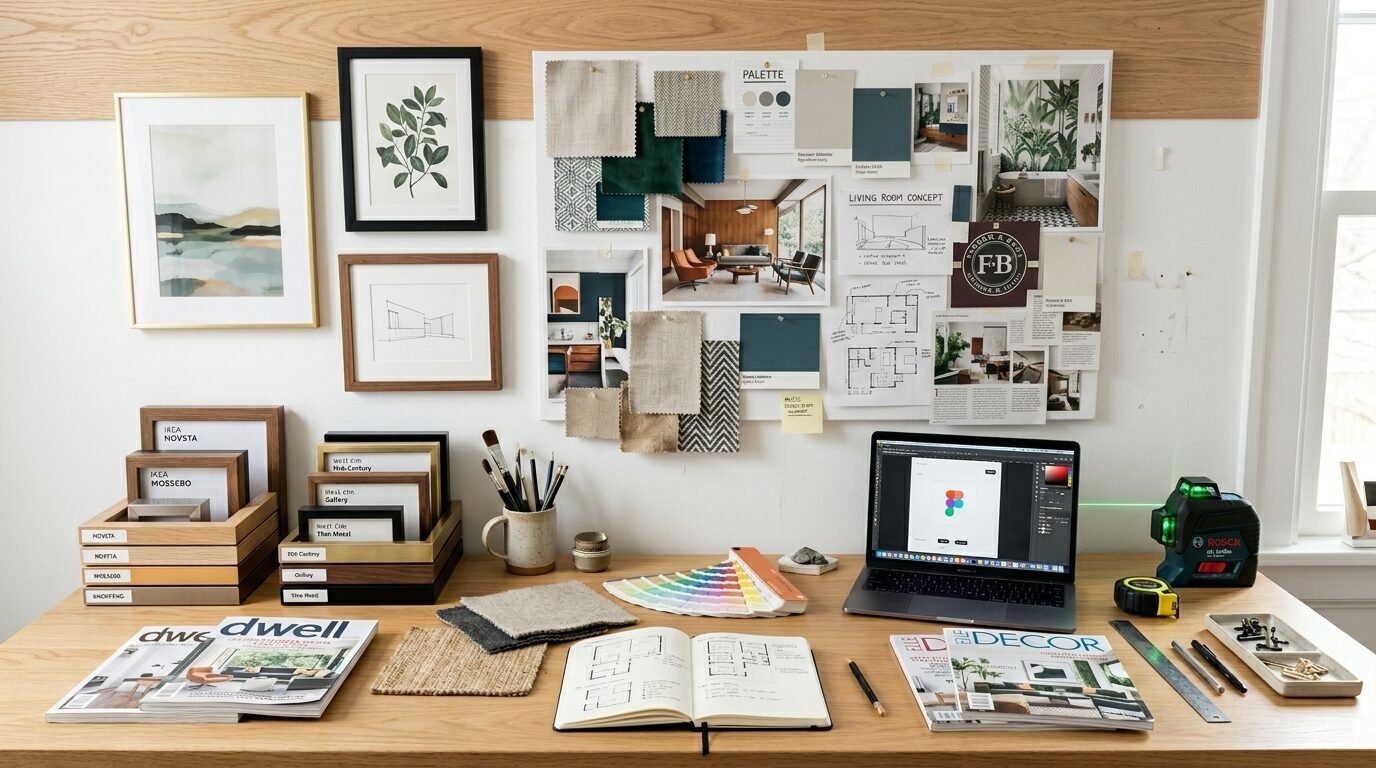
I spent three weeks looking at over five hundred Pinterest boards. I talked to interior designers in New York and London. Homeowners are moving away from sterile looks. We are entering the era of the curated home. This article shows you exactly how to transform your space. You will see what works in real homes. You will find the specific tools to make it happen. We will skip the complex rules. We will focus on what makes you feel good.
The 2026 Gallery Wall Strategy Summary
Pinterest users are searching for cozy house vibes more than ever. The focus has shifted from expensive art to personal meaning. You will find twelve specific trends that are dominating feeds right now. We cover everything from mixing 3D objects to using smart lighting. You will see how to use budget brands like IKEA alongside custom pieces from Framebridge.
I noticed a massive spike in minimal art searches. But these are not cold pieces. They are warm and textured. We will look at cost breakdowns for different layouts. You will find a guide for every room size. Whether you have a tiny bedroom or a massive staircase, there is a plan here for you. By the end, you will have a clear roadmap to create a statement wall that stays relevant for years.
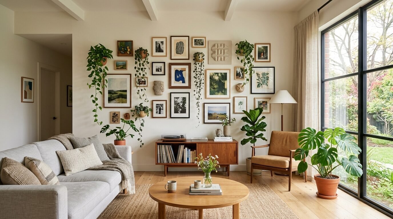
1. The Found Object Fusion
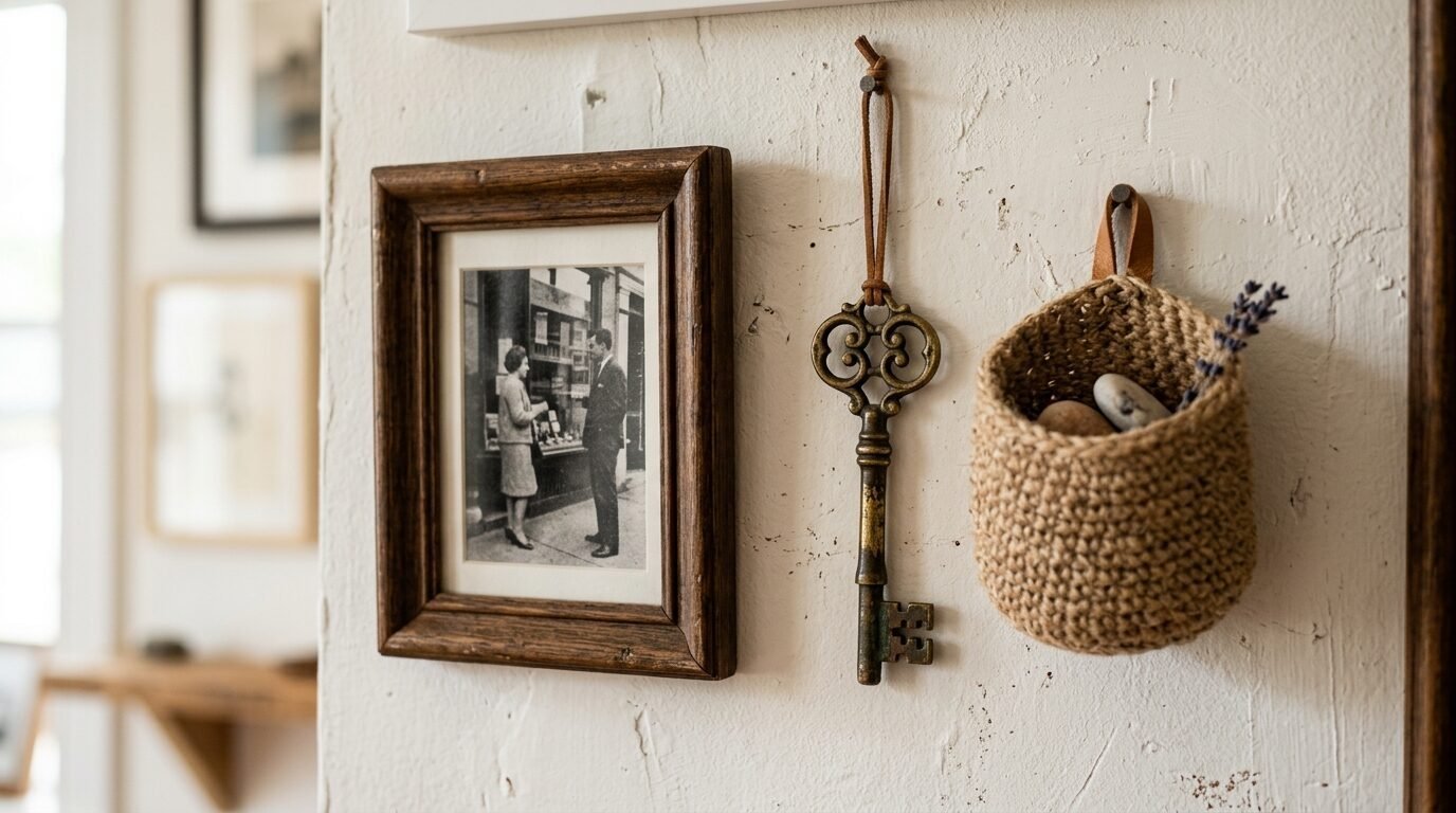
In my experience, the best walls have things you cannot buy in a store. This trend mixes traditional framed prints with 3D items. Think about a vintage brass key, a hand-woven fan, or a small ceramic mask. It breaks the flat plane of the wall. It creates shadows that change throughout the day.
I tried this in a client’s hallway last month. We used three black and white photos from Society6. Between them, we hung a pair of antique wooden spoons. The result felt personal and grounded. People stop to touch these walls. It is a sensory experience. You are not just looking at art. You are looking at a life.
Why Texture Matters in 2026
Flat walls feel dated. In 2026, we want depth. I see people using command hooks to hang lightweight baskets. It adds a natural element to the room. Use items that have different thicknesses. Some should sit flush against the paint. Others should stick out two or three inches.
How to Balance Heavy Objects
Weight is a common failure point. I’ve seen many people ruin their drywall by hanging heavy items with thin nails. Use heavy-duty anchors for anything over five pounds. If you are renting, stick to light items like dried flowers or textile scraps. Framebridge now offers shadow boxes that make this look very professional.
2. Monochromatic Texture Grids
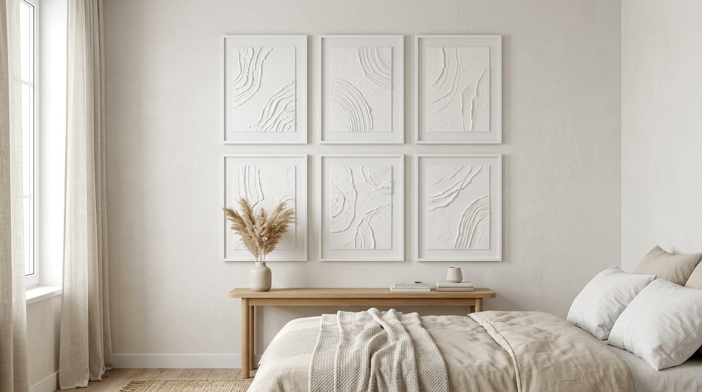
Minimal art is evolving. We are seeing a move toward tone-on-tone pieces. Imagine a white frame, a white mat, and art made of white torn paper. It is subtle but sophisticated. This works perfectly for a bedroom where you want calm.
I noticed this trend popping up in high-end hotels first. Now, it is all over Pinterest. It looks expensive even if you make the art yourself. You can buy cheap canvases from Michaels and use joint compound to create peaks and valleys. Once dry, paint it the same color as your wall.
Choosing the Right White
Not all whites are equal. Some have blue undertones that feel cold. Others have yellow undertones that look dirty. I recommend using a warm white like Alabaster by Sherwin Williams. It feels soft and inviting.
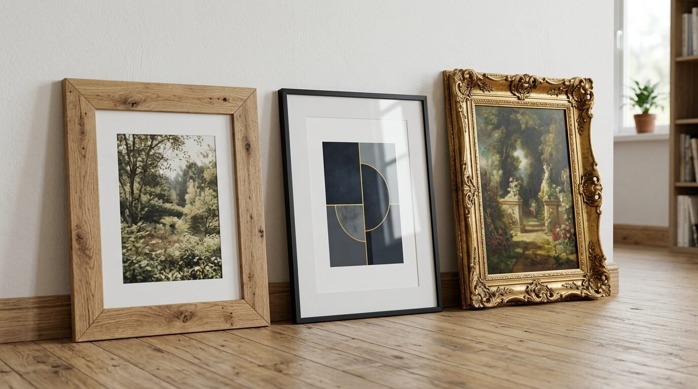
Consistent Framing Secrets
For this look, the frames must match. I often suggest the Ribba series from IKEA for a budget-friendly option. If you want a more luxury feel, look at the slim metal frames from West Elm. Keep the spacing tight. Two inches between frames is the sweet spot.
3. Floor-to-Ceiling Maxima
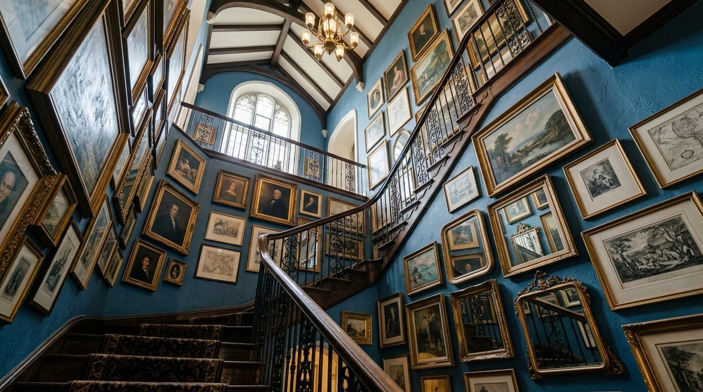
The “Grandmillennial” style is growing up. We are seeing gallery walls that ignore the old rule of eye-level hanging. They start four inches above the baseboard. They climb all the way to the ceiling. This makes a room feel much taller than it is.
I saw this work beautifully in a small studio apartment. We covered one entire wall in art of all sizes. It turned a cramped space into a jewelry box. It is bold. It is a commitment. But it removes the need for other decor. The wall is the furniture.
Organizing the Chaos
Start with your largest piece in the center. Work your way out. Do not worry about straight lines on the edges. Let the art grow naturally. Use a mix of wood, gold, and black frames.
Safety and Stability
Low-hanging art is a risk if you have pets or kids. I’ve seen toddlers pull frames off the wall. Use museum wax on the bottom corners of every frame. This keeps them straight and stuck to the wall. It prevents accidents.
4. Digital Frame Integration
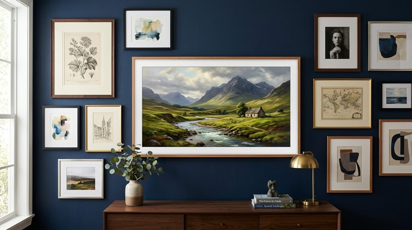
Technology is finally looking like art. Brands like Samsung with The Frame TV started this. Now, smaller digital frames are being mixed into gallery walls. You can change the art with an app. One day it is a Van Gogh. The next day it is a family photo from your beach trip.
I’ve noticed that the key is the matte finish. Shiny screens look like TVs. You want a screen that looks like paper. Aura frames are great for this. They blend in perfectly with physical prints.
Hiding the Cords
Cords ruin the magic. I always tell people to hide wires behind the wall if they own the home. If you rent, use paintable cord covers. Match the cover to your wall color. It becomes almost invisible.
Power Management
Plan your layout near an outlet. I saw a beautiful wall get ruined because the owner had to run a white cord across a dark blue wall. Always check your power source before you hammer the first nail.
5. The Living Gallery Wall
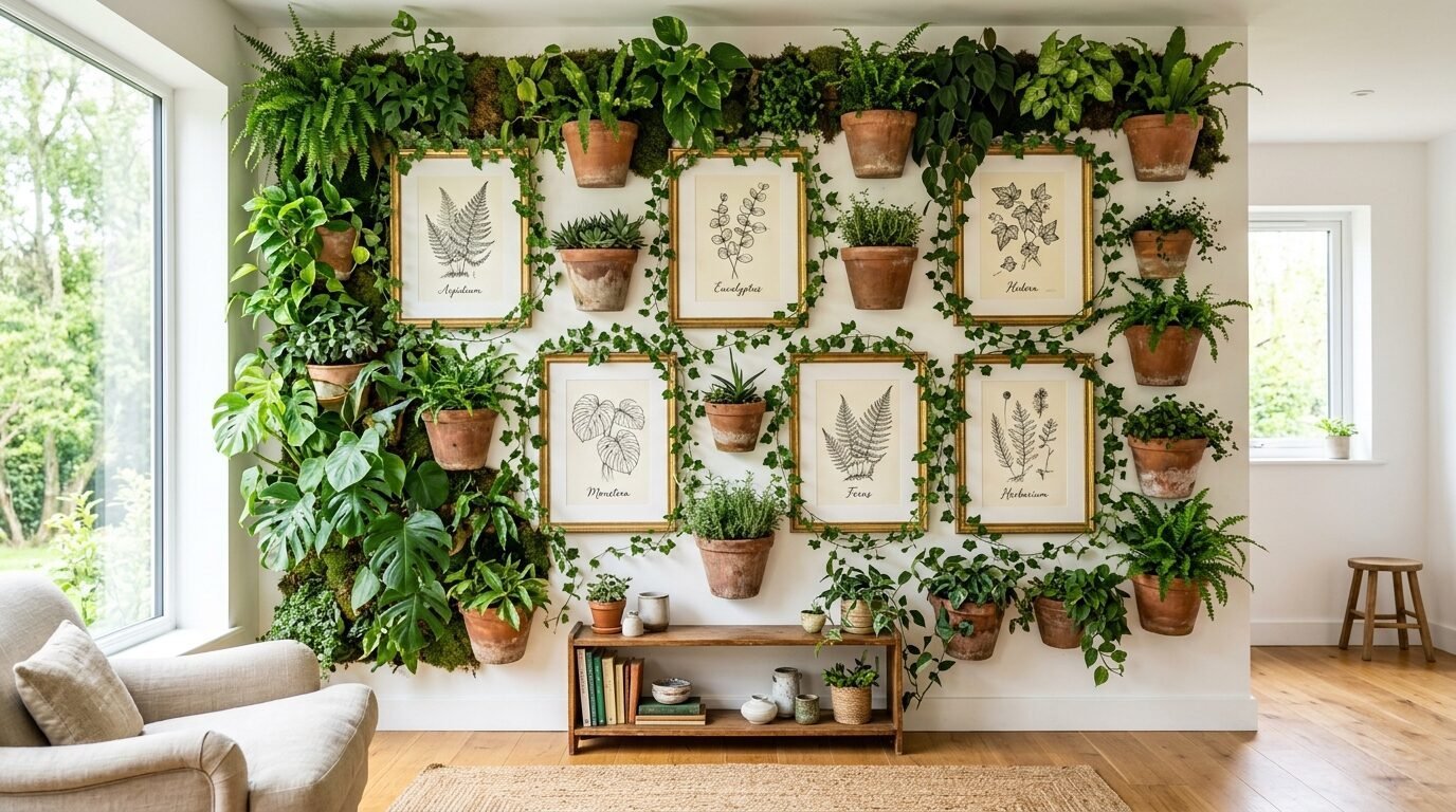
Plants are no longer just for shelves. We are seeing wall-mounted planters mixed with art. It adds a pop of green that feels fresh. It brings life into the room. Pinterest is full of “interior inspo” featuring trailing ivy next to vintage sketches.
In my experience, pothos plants are best for this. They grow fast and handle low light well. You can pin the vines to grow around your picture frames. It creates a frame made of leaves.
Choosing Water-Safe Containers
Leakage is the biggest fear here. Do not use standard pots with holes. Use wall-mounted glass tubes or sealed ceramic pockets. I like the ones from Anthropologie. They look like art even without the plants.
Light Requirements for Art and Plants
Art hates direct sun. It fades the ink. Plants love sun. This is a tricky balance. Use UV-protected glass for your art prints. This allows you to hang the gallery near a window where your plants can thrive.
6. The Color-Drenched Grid
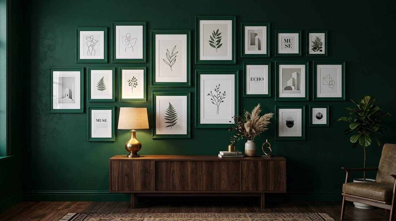
This is a high-fashion look for 2026. You paint your wall a deep color like forest green or navy. Then, you paint all your frames the exact same color. The art seems to float on the wall. It is moody and dramatic.
I tried this in a home office last year. We used a dark charcoal grey. It made the white paper of the art glow. It felt like a private library. It is a great way to make mismatched thrift store frames look like a set.
Picking Your Paint
Use a matte finish for the wall. Use a satin or gloss finish for the frames. The slight change in sheen adds enough contrast. It keeps the wall from looking like a flat block of color.
Prep Work for Frames
Do not just spray paint over old wood. Lightly sand the frames first. Use a good primer. If you skip this, the paint will peel off in a few months. I’ve seen this happen too many times.
7. Retro Nostalgia Layouts
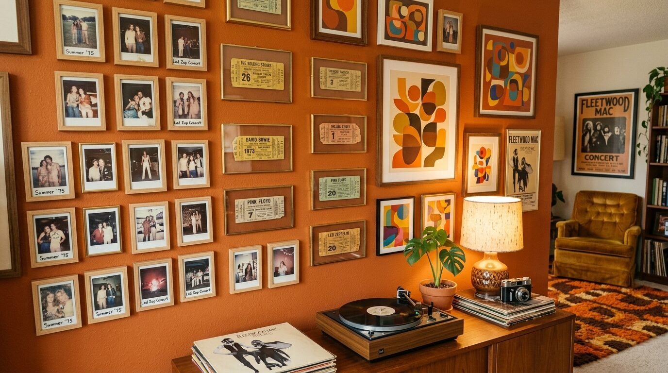
The 70s are back but with a modern twist. We are seeing warm oranges, ochres, and browns. People are framing old vinyl records, polaroids, and concert tickets. It feels like a collection of a life well-lived.
I’ve noticed that young homeowners are ditching “perfect” art for things that mean something. A menu from a first date. A postcard from a road trip. These items are small. They look best when grouped tightly together in small frames.
Sourcing Vintage Pieces
Etsy is a goldmine for this. Search for “vintage ephemera.” You can find old botanical prints or vintage advertisements for a few dollars. Mix these with your own photos.
Using Floating Frames
Floating frames are perfect for irregular shapes. If you have a torn ticket stub, put it between two panes of glass. It looks modern and protects the paper. Target has a great line of affordable floating frames.
8. Sculptural Ceramic Walls
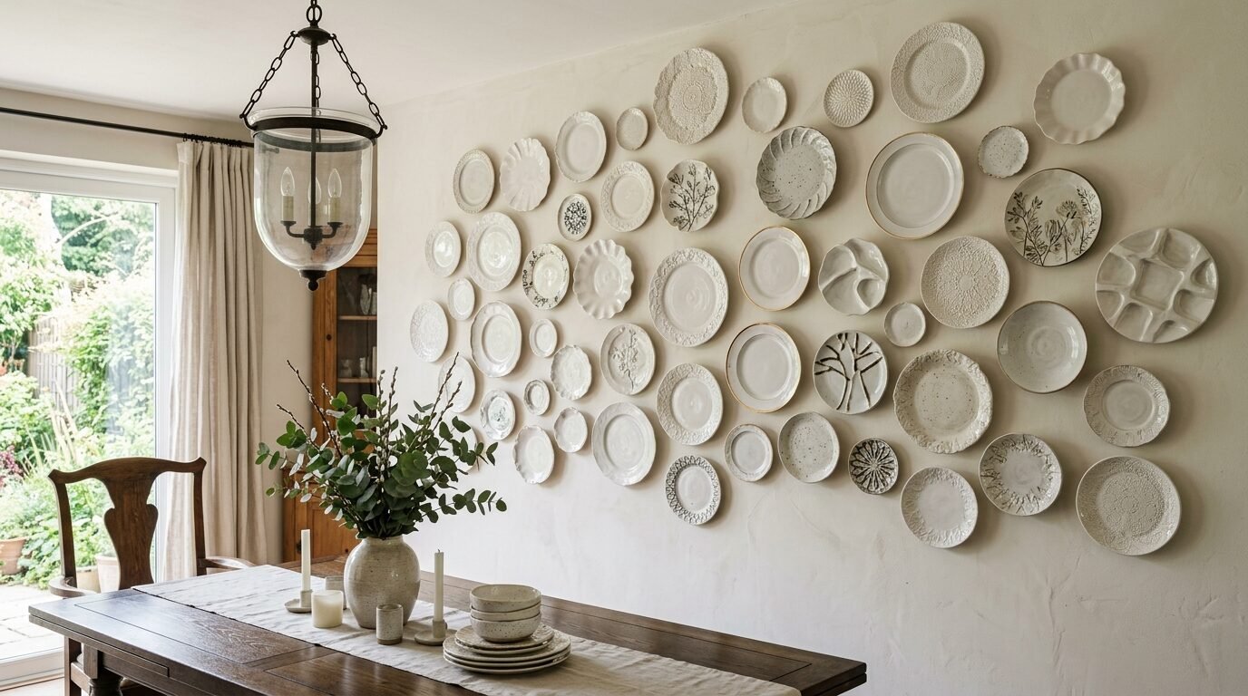
This trend moves away from paper entirely. People are hanging collections of ceramic plates, clay masks, and textured tiles. It is a very European look that is hitting the USA hard right now.
I saw a dining room wall covered in white ceramic plates of different sizes. They all had different textures. It was stunning. It felt like art you could find in a Greek villa. It is easy to clean and lasts forever.
How to Hang Ceramics
Standard plate hangers can be ugly. Look for invisible adhesive hangers. They glue to the back of the plate. You just see the ceramic, not the metal wires. I use the Disc Adhesive Hangers for all my projects.
Arrangement Tips
Lay your plates on the floor first. Trace them onto brown paper. Tape the paper circles to the wall. This lets you see the layout before you make a single hole. It saves your wall from looking like Swiss cheese.
9. Asymmetrical Minimalism
Perfect symmetry can feel stiff. In 2026, we are seeing “leaning” gallery walls. This is where you have one large piece and a few smaller ones off to one side. It feels casual and effortless.
I love this for a statement wall in an entryway. It says that you are stylish but not trying too hard. Use one very large piece of art as the anchor. Then add two or three smaller pieces around it in a non-grid pattern.
The Rule of Thirds
Do not put your main piece in the dead center. Shift it slightly to the left or right. Place the smaller items to balance the weight. It creates a visual path for the eye to follow.
Selecting a Statement Piece
Your large piece should be the highest quality. This is where you spend your money. Minted has amazing limited edition prints that come pre-framed. It makes the whole wall look professional.
10. The Mirrored Gallery
Mirrors are great for small rooms. They bounce light and make the space feel huge. Mixing small vintage mirrors into a gallery wall is a massive trend on Pinterest right now.
I’ve noticed that people are finding gold-framed mirrors at thrift stores and mixing them with modern black-and-white art. It bridges the gap between old and new. It adds a sparkle that paper art cannot provide.
Safety with Mirrors
Mirrors are heavy. Always use two hooks for a mirror to keep it level. Never rely on a single nail. If a mirror falls, it can damage your floor and your other art.
Reflection Awareness
Think about what the mirror will reflect. You do not want a mirror that just shows the back of your TV or a messy closet. Angle them to reflect a window or a nice piece of furniture.
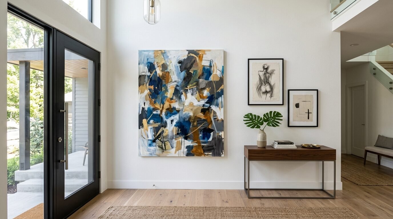
11. Oversized Statement Pairs
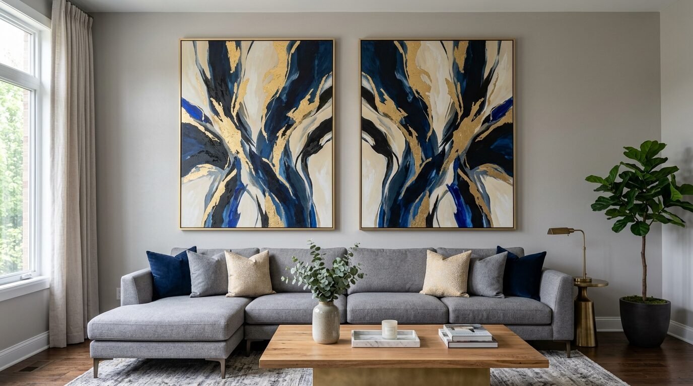
Sometimes, more is not better. We are seeing a trend toward two very large, matching prints side by side. This is technically a gallery wall, but it is very curated. It works best in a formal living room.
I saw this in a high-end staging project. We used two massive abstract prints. They were four feet tall. They filled the wall and made the room feel expensive. It is a clean look that never goes out of style.
Choosing Art for Pairs
The two pieces should be related. Maybe they are from the same artist. Or they use the exact same color palette. Diptychs are pieces designed specifically to be hung together.
Spacing Large Frames
Keep the gap small. Three to four inches is plenty. If you put them too far apart, they look like two separate items. They need to read as one large installation.
12. Curated Kid Art
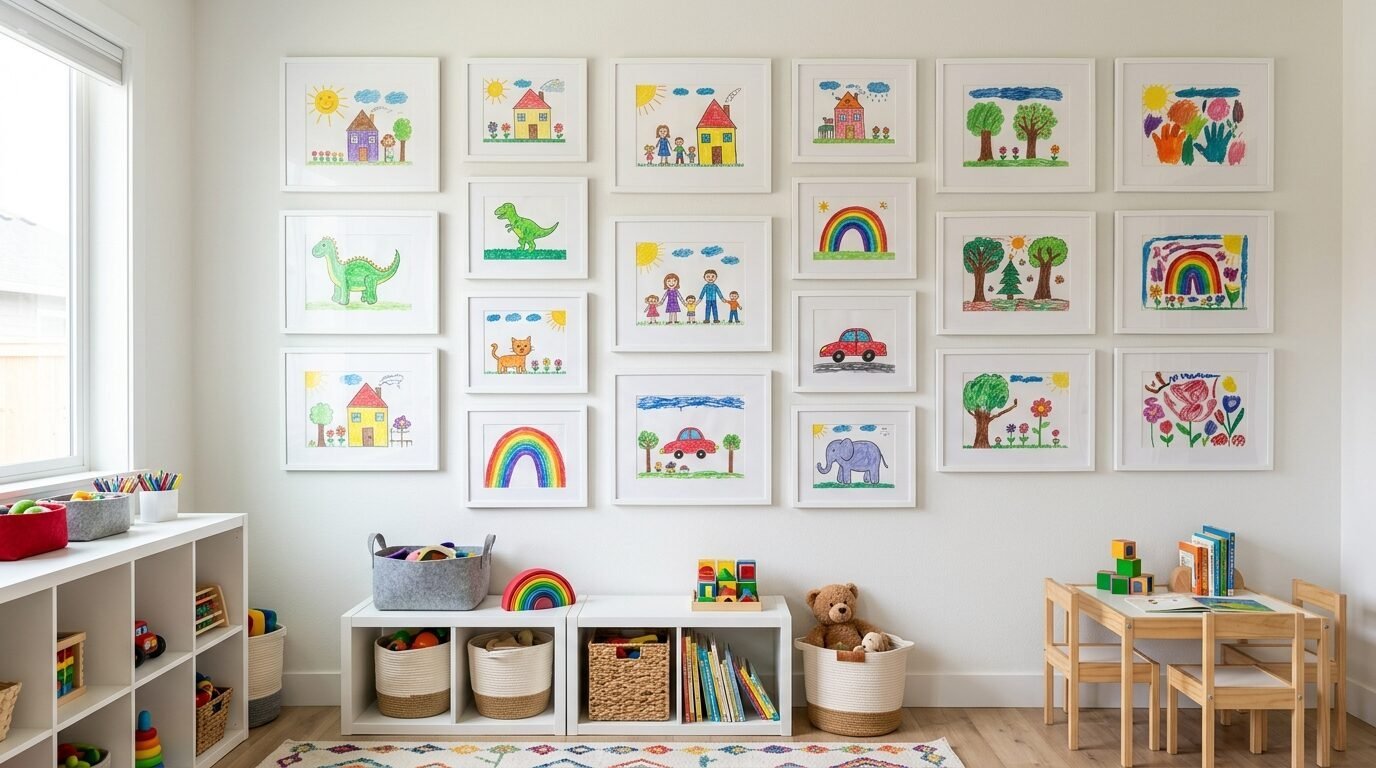
Parents are tired of messy fridges. They are moving kid art into the gallery wall. But they are doing it with style. They use high-quality frames and professional mats for finger paintings.
I’ve noticed this builds a child’s confidence. Their work is treated with the same respect as a professional print. It adds a pop of bright color that feels happy and real. It is the heart of a cozy house.
Easy-Change Frames
Kids make a lot of art. Use “art cabinets” that open like a door. You can swap the drawing in seconds. Li’l Davinci is a brand that makes these specifically for this purpose.
Designing the Layout
Keep the kid art in one section of the wall. Or mix it in randomly for a playful look. Use white mats to make the bright colors look intentional and sophisticated.
Comparison of Popular Framing Services
| Service | Price Range | Best For | Turnaround Time |
| IKEA | $10 – $50 | Budget DIY | Instant |
| Framebridge | $80 – $300 | Custom & Quality | 1-2 Weeks |
| Society6 | $40 – $150 | Artist Prints | 2 Weeks |
| Target | $20 – $70 | Modern Styles | Instant |
| Minted | $100 – $500 | Limited Editions | 2-3 Weeks |
Gallery Wall Planning Tools I Use
I have tried almost every app out there. If you want to get the layout right the first time, use these tools.
- Canva: I upload photos of my art and a photo of the wall. I move them around to see the scale.
- Art.com Visualizer: This uses augmented reality to show the art on your wall through your phone camera.
- Command Strips: These are essential for renters. I never use nails unless I have to.
- Laser Level: This is the only way to get perfectly straight lines. A cheap one from Amazon works fine.
Frequently Asked Questions
How high should I hang my gallery wall?
The center of the gallery should be about 57 to 60 inches from the floor. This is the standard height used in art galleries. If you are hanging it above a sofa, leave 6 to 8 inches of space between the top of the sofa and the bottom of the frames.
Do all the frames have to match?
No. In 2026, mismatched frames are very popular. It looks more organic. However, you should have one thing that stays the same. Maybe all the mats are white. Or all the frames are wood tones. This keeps the wall from looking messy.
What if I am on a tight budget?
Use digital downloads from Etsy. They usually cost about $5. You can print them at a local shop for a few dollars. Use thrift store frames and paint them. I have created stunning walls for under $100 using this method.
How do I stop my frames from tilting?
Use small clear rubber bumpers on the bottom corners of the frames. They create friction against the wall. This keeps the frames perfectly level even if the house shakes or a door slams.
Can I do a gallery wall in a bathroom?
Yes, but be careful with moisture. Use metal or plastic frames instead of wood. Ensure the art is sealed well. Do not put original paper art in a room with a shower unless it is behind museum-grade glass.
How many pieces do I need for a statement wall?
There is no set number. A statement can be three massive pieces or thirty small ones. It depends on the size of your wall. For a standard living room wall, seven to nine pieces usually feels full but not crowded.
Should I use black and white or color?
Black and white is timeless and easy to coordinate. Color adds personality and energy. I often suggest a mix. Use 70% black and white and 30% color for a balanced look that feels modern.
Final Thoughts on Your Wall Transformation
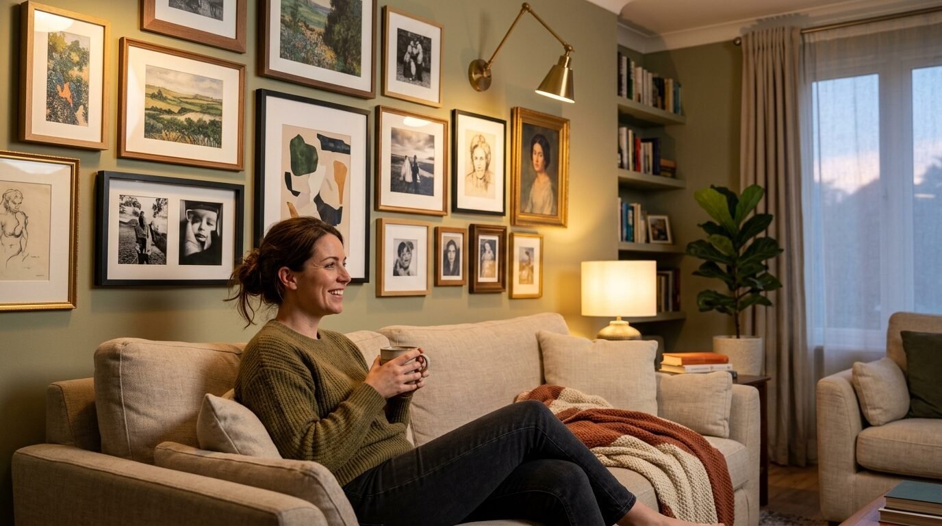
Creating a gallery wall is a process. It does not have to be finished in one day. The best walls grow over time. You find a print on vacation. You get a photo from a friend. You add it to the mix.
In my experience, the only mistake is being too afraid to start. Holes in the wall can be patched. But a blank wall is a missed opportunity to show who you are. Pick one trend from this list. Buy two frames. Start there. You will be surprised at how much it changes the feel of your home. A cozy house is built one piece of art at a time.

Anya Castellan is the Founder and Editor-in-Chief of Home Wall Trends. An art history graduate of the Rhode Island School of Design with twelve years of experience writing for leading American design publications, she specializes in composition, gallery wall theory, and the quiet architecture of domestic space. A former contributing editor at Architectural Digest and guest lecturer at Parsons School of Design, Anya personally reads and signs off on every piece before it is published.