You stand in your living room staring at a blank space. You hold a rustic wooden sign in one hand. You hold an ornate gold frame in the other. Both pieces belong on that wall. Blending aesthetics feels impossible right now. I have faced this exact frustration in my own space. Merging farmhouse utility with classic elegance creates a stunning visual balance. This guide shares exact steps I use to fuse these two distinct aesthetics. We will go over exact placement rules for your dream house interior.
You will see specific brand pricing for hanging hardware. Expect realistic timeframes for installing trim. The budget ranges from $50 for basic hardware to $500 for curated gallery pieces. I will share my exact rules for preventing visual clutter. I have spent three years refining this exact layout plan. You will get clear rules for mixing metals and wood tones gracefully. We will cover everything from kitchen styling to bedroom trim.
What Makes These Two Decor Styles Work Together
Contrast creates the magic here. Classic styling relies on symmetry, dark woods, and ornate detailing. Farmhouse depends on matte finishes, distressed textures, and bright white space. Putting them side by side forces the eye to pause. I recall styling a South Indian House last spring. The client owned deeply carved rosewood panels. We placed them against a crisp shiplap background. The visual tension worked perfectly. The carved wood felt grounded. The white shiplap kept the room feeling airy.
Finding the Middle Ground
Start with a neutral paint color. Benjamin Moore White Dove works exceptionally well. It softens the starkness of pure white. It still provides a clean backdrop for both aesthetics. I always paint walls flat or eggshell. Glossy paint fights with rustic textures. A matte wall lets a polished frame shine. You need this blank canvas to make mismatched items look cohesive.
The Role of Texture and Patina
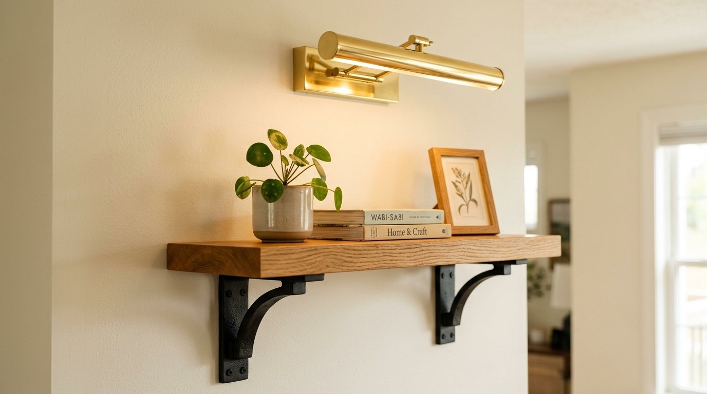
Texture bridges the gap between polished and rough items. Pair a smooth gilded frame with a woven wall hanging. The eye accepts the pairing because the textures contrast so strongly. I buy vintage brass sconces from Etsy for about $85 each. I mount them next to raw pine shelving. The shiny brass elevates the cheap pine. The pine keeps the brass from feeling too formal.
Selecting the Right Scale
Scale matters more than style. A tiny classic painting gets lost next to a giant barn wood clock. Match the physical size of your pieces. Pair a 24-inch landscape painting with a 24-inch metal star. The equal sizing tricks the brain. It makes the pairing look planned. I learned this after hanging a tiny vintage silhouette next to a massive typography sign. The wall looked incredibly lopsided.
How Do You Balance Wood Tones and Metal Finishes
Never match wood tones perfectly. Mismatched wood looks intentional. Match undertones instead. Warm cherry wood pairs nicely with warm honey oak. Cool walnut pairs well with weathered gray barn wood. I learned this after trying to stain new pine to match an 1800s mahogany clock. It looked terrible.
Mixing Iron, Brass, and Silver Safely
Pick one dominant metal. Make it 70 percent of the wall hardware. Use a second metal for the remaining 30 percent. Matte black iron screams farmhouse. Polished brass whispers classic elegance. I use black iron curtain rods from Target. I use brass picture lights from Visual Comfort. The mix looks completely intentional.
Distressed Versus Polished Surfaces
Balance rough surfaces with smooth ones. Hang a distressed window frame next to a glossy ceramic plate. The glossy plate reflects light. The distressed wood absorbs light. This creates depth on flat drywall. I constantly pair chipped paint frames with crisp white matting. The fresh matting makes the damaged frame look like expensive art.
Using Hardware as a Bridge
Screws and nails matter. Use decorative nails for hanging items. I use solid brass hooks to hang rustic chalkboards. The fancy hardware upgrades the casual board. I use hammered iron nails to hang delicate oil paintings. The rough iron grounds the fancy canvas. This tiny swap changes the entire vibe of the piece.
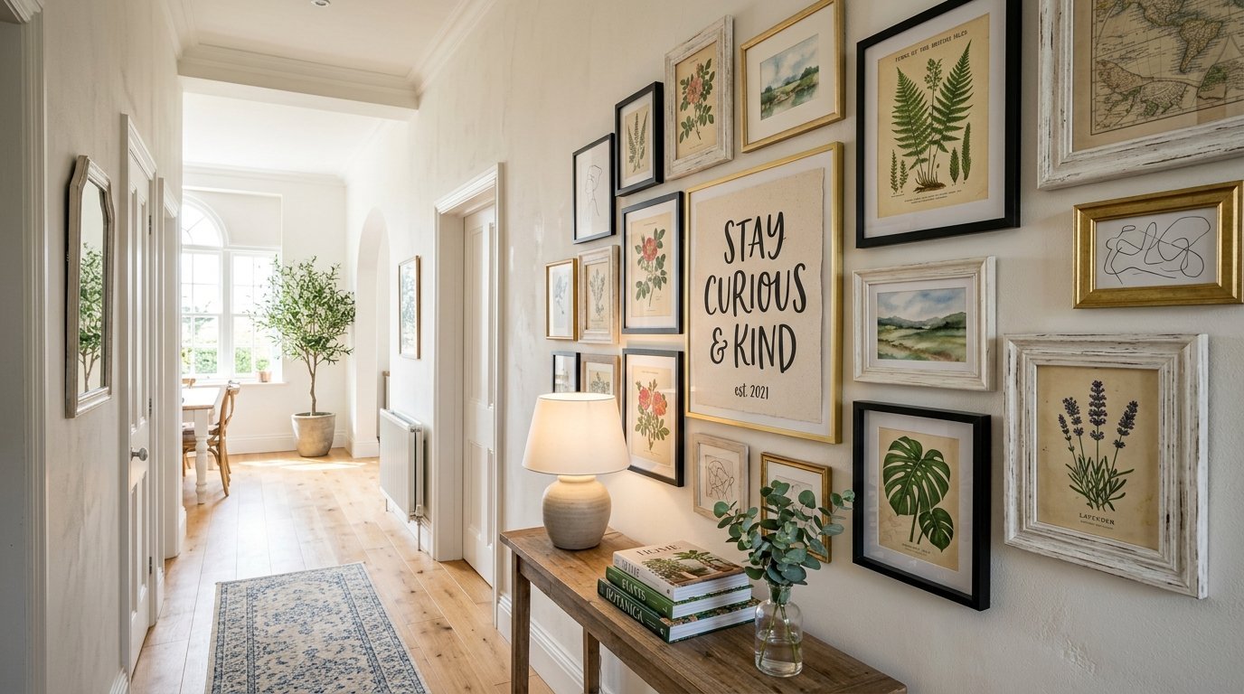
Which Wall Decor Pieces Bridge the Gap Best
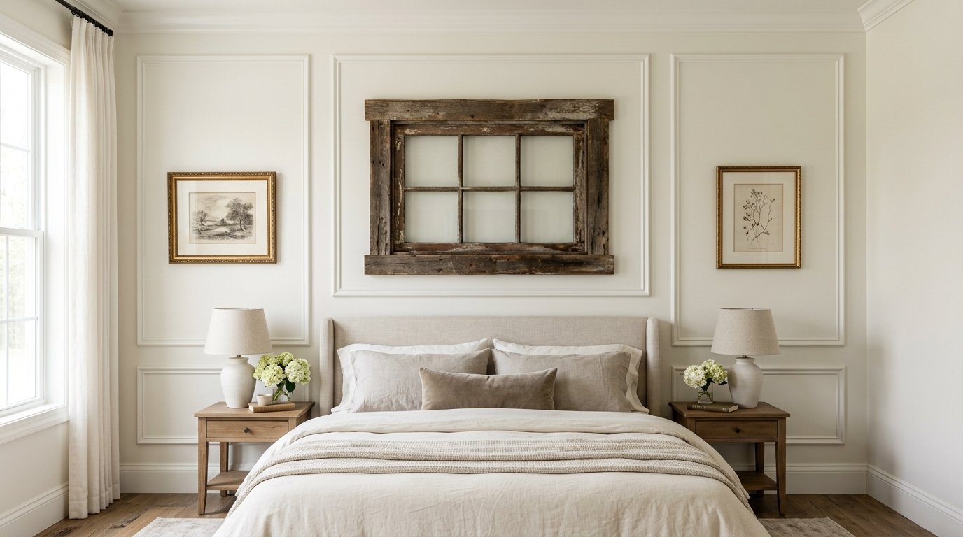
Wall molding instantly gives a room classic bones. Picture frame molding costs about $150 in materials per room. It takes one weekend to install. I developed a beginner guide on bedroom wall decor featuring wall molding. It provides a structured background. You can hang casual farmhouse pieces inside the formal trim boxes. The juxtaposition feels very intentional.
Antique Mirrors and Proper Maintenance
Mirrors anchor a mixed wall beautifully. An ornate vintage mirror instantly elevates a rustic console table. I highly prioritize the meticulous maintenance of high-end mirrors and antique frames. You must prevent silver rot on glass surfaces. Silver rot happens when moisture seeps behind the glass. I strictly use distilled water and a clean microfiber cloth. Never spray liquid directly onto the glass. Spray the cloth first. This small step saves antique pieces from permanent damage. I have seen countless ruined mirrors because of improper cleaning.
Botanical Prints and Nature Elements
Botanical art works in both aesthetics. Classic homes use pressed ferns in gold frames. Farmhouse homes use sketched leaves in raw wood frames. Hang a mix of both. I buy vintage botanical book pages from eBay for $10. I frame them in sleek black metal. They look expensive but cost very little. Nature elements always calm down a busy gallery space.
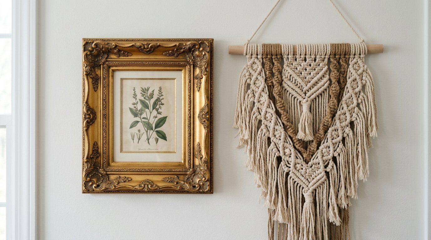
Woven Textiles and Wall Hangings
Fabric softens hard edges. A large macrame wall hanging above a tufted classic couch looks amazing. I compiled a curated list of macrame wall hangings under $40 on Amazon. They soften the formality of the tufted fabric. Keep the color palette strictly neutral here. Ivory yarn blends perfectly with beige linen.
Can You Mix Typography Signs With Classic Fine Art
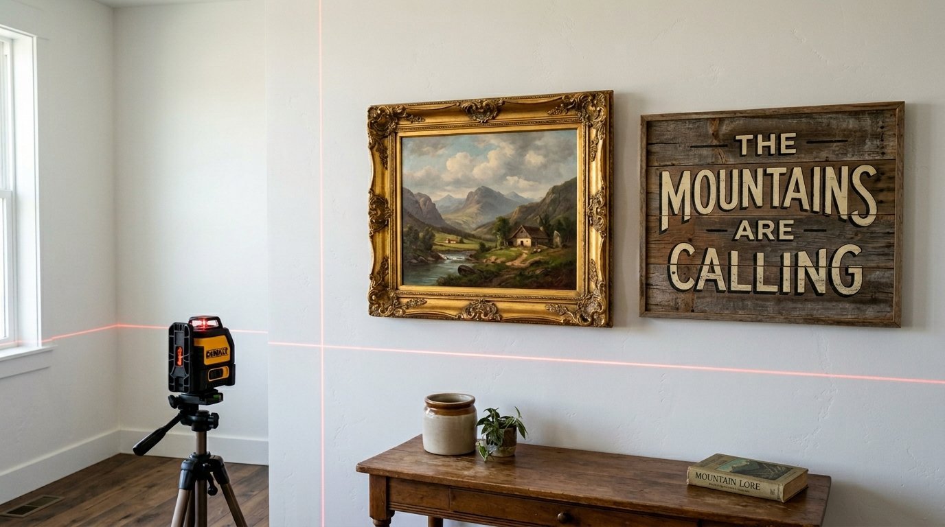
Yes, you can mix typography with oil paintings. The secret lies in the spacing. Maintain exactly two inches between every frame. Use a laser level like the Bosch Quigo. Hang the most formal piece in the center. Surround it with less formal pieces.
Framing Differences That Matter
Frame consistency matters deeply. Put a rustic sign in a sleek black frame. Put a classic oil painting in a distressed wood frame. Swapping the expected frame styles immediately blends the two aesthetics. Framebridge offers excellent custom options starting at $85. I have sent them dozens of vintage canvases.
Limiting the Word Count
Too many words ruin a wall. Restrict yourself to one typography sign per room. A quote about family loses its charm if surrounded by five other word signs. Let a single painted quote act as the casual element. Surround it with silent, beautiful art. I once styled a room with four word signs. It felt like reading a textbook.
Creating Symmetrical Asymmetry
Hang different items in a symmetrical grid. Place a round classic clock on the left. Place a round rustic wreath on the right. The shapes match. The styles differ. This grid calms the eye. I tape newspaper cutouts to the wall first. I measure the gaps obsessively. Perfect spacing forgives mismatched styles.
How Do You Style Specific Rooms for This Look
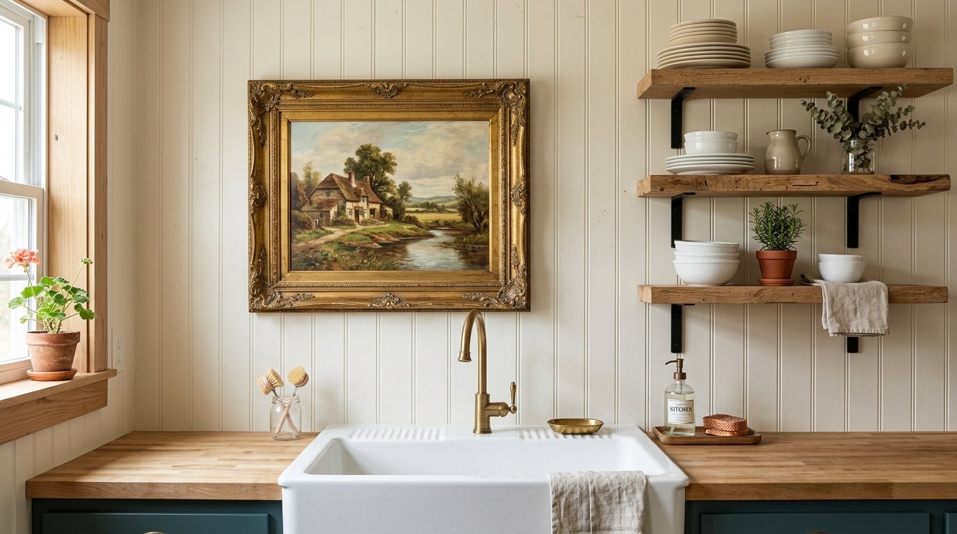
The kitchen offers great styling space. I recently created a list of farmhouse kitchen wall decor ideas specifically for the areas surrounding the stove and sink. Hang a vintage landscape painting in a gold frame above the sink. Install floating raw wood shelves beside the stove. Display classic white ironstone plates on the rustic wood. The contrast feels very authentic.
Bedroom Styling for a Dream Life House
Bedrooms need a calmer blend. Use a traditional tufted headboard. Hang a large macrame wall hanging above it. Keep the color palette strictly neutral here. Flank the bed with matte black iron sconces. Hang ornate gold mirrors above cheap rustic nightstands. The mix creates perfect house goals.
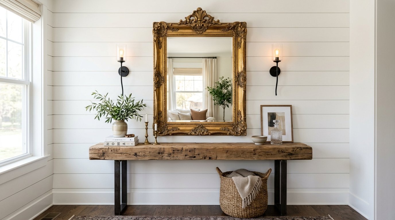
Entryway First Impressions
The entryway sets the tone immediately. Place a heavy mahogany table against the wall. Hang a distressed white window pane above it. Add a polished silver tray for keys. The visitor immediately grasps your dual aesthetic. I spend the most time planning entryways. They dictate the flow for the rest of the dream house rooms.
Living Room Anchor Pieces
The living room needs one massive anchor piece. I use oversized vintage maps. A six-foot canvas map of Paris looks classic. Pinning it between two raw wood dowels makes it rustic. Hang this behind the main sofa. It commands attention without overwhelming the space.
What Tools and Brands Make Wall Styling Easier

Traditional decor weighs more. Solid wood frames and heavy mirrors require serious hardware. I exclusively use OOK picture hangers. The 50-pound rated hooks cost $4 at Home Depot. They leave tiny pinholes. They hold massive weight securely.
Trusted Decor Brands for House Goals
I shop specific stores for each aesthetic.
- Pottery Barn provides excellent transitional pieces.
- Antique stores offer the best classic art.
- Target Hearth and Hand supplies great matte black accents.
- Etsy connects you with makers of custom rustic shelving.
- Antique farm equipment shows up cheaply at local estate sales.
Using Museum Wax for Stability
Crooked frames ruin a gallery wall instantly. I use Quakehold Museum Wax. A tiny ball of wax behind the bottom corners keeps frames perfectly straight. It costs $10. It saves hours of frustration. I have used this trick for five years. My frames never shift when doors slam.
Laser Levels for Perfect Grids
A tape measure fails when walls are uneven. I trust cross-line laser levels. They cast a bright red grid across your entire wall. You match your frames to the laser line. It guarantees perfectly straight rows. I bought mine for $45. It paid for itself during my first gallery installation.
Troubleshooting Common Blending Mistakes

Too many small items create clutter. A wall with fifteen tiny pieces feels chaotic. Group smaller items together. Ground them with one massive anchor piece. A 40-inch mirror balances a cluster of five small plates.
Preventing Visual Imbalance on Large Walls
Large walls expose bad placement instantly. I use Kraft paper to test layouts. Trace your frames onto the paper. Cut them out. Tape them to the wall using painter tape. Live with the paper layout for two days. Move them around until the visual weight feels equal on both sides.
Avoiding the Yard Sale Look
Mismatched items can look cheap. Cohesion requires repetition. Repeat one color three times across the wall. If you use a blue classic plate, add a blue rustic sign. Then add a blue frame. The eye connects the three blue items. The styles fade into the background. The color becomes the focal point.
Dealing with Competing Textures
Never put two heavily textured items right next to each other. A chunky knitted hanging placed beside a heavily carved wood panel feels heavy. Put a smooth glass mirror between them. The glass gives the eye a place to rest. I separate rough items with glossy ones intentionally.
Decor Item Comparison Table
| Decor Item | Traditional Trait | Farmhouse Trait | Blending Rule |
| Wall Mirrors | Heavy gold leaf frames | Distressed white wood | Hang gold mirrors above raw wood tables |
| Art Frames | Ornate carved plaster | Sleek matte black iron | Put casual sketches in carved plaster |
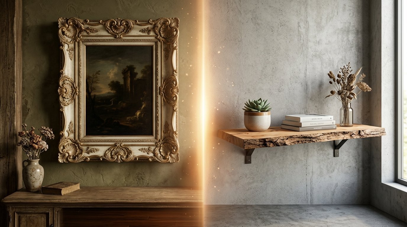
| Shelving | Polished mahogany | Raw live-edge pine | Use fancy brass brackets under raw pine |
| Wall Sconces | Crystal drops, brass | Galvanized steel | Use brass sconces with Edison bulbs |
| Signage | Scripted metal letters | Painted wooden planks | Frame wooden planks with sleek metal |
| Botanicals | Symmetrical oil paintings | Loose pencil sketches | Hang sketches in strict symmetrical grids |
Frequently Asked Questions
What paint colors work best for mixed style walls?
Benjamin Moore White Dove and Sherwin Williams Alabaster perform perfectly. They offer a warm undertone that complements dark woods. They remain bright enough to showcase matte black iron items.
Can I mix silver and gold frames together?
Yes, but you must add black. Black acts as a neutral grounding color. A wall with just silver and gold looks accidental. A wall with silver, gold, and black looks planned.
How do I hang heavy vintage mirrors on drywall?
I use French cleats for pieces over 40 pounds. The metal bracket distributes the weight across a wider area. You must anchor at least one side into a wooden wall stud.
Should my curtain rods match my picture frames?
No, they do not need to match exactly. I prefer matching curtain rods to the door hardware. Then I mix the picture frame finishes independently. This creates a layered aesthetic.
How much space should sit between gallery wall items?
Maintain exactly two inches between every frame. This strict spacing creates a formal grid. The formal grid allows you to use highly mismatched items without looking messy.
What is the cheapest way to add classic style to a room?
Install picture frame molding. The materials cost very little. You just need a miter box and finish nails. It immediately elevates a plain drywall box.
How do I clean my antique wall mirrors safely?
Never spray glass cleaner directly onto the mirror. The liquid runs down and ruins the silver backing. Spray distilled water onto a microfiber cloth first. Wipe gently.
Can I use family photos in this mixed aesthetic?
Absolutely. Print them in black and white. Put them in matching oversized gallery frames with large white mats. This turns casual snapshots into formal art pieces.
What do I do with empty corners?
Leave them empty. Negative space gives your decor room to breathe. Cramming items into every corner creates visual anxiety. Blank walls act as a resting place.
Where is the best place to buy authentic farmhouse items?
Check local estate sales and architectural salvage yards. New stores sell fake distressing. Authentic age looks much better next to formal classic pieces.
How do I light a dark gallery wall?
Install battery-operated brass picture lights above your largest frames. They cost about $40 on Amazon. They require no hardwiring. They add instant classic charm to the space.
Can I mix modern geometric patterns with these styles?
Keep patterns very subtle. A heavily geometric rug fights with ornate classic frames. Stick to neutral, solid textiles when your wall decor features mixed styles.
How high should I hang my main anchor piece?
The center of your main piece should sit 57 inches from the floor. This matches the eye level of an average adult. Museums use this exact measurement for hanging art.
What is the biggest mistake people make mixing styles?
They use too many small pieces. They buy dozens of tiny items instead of three large, high-quality pieces. Always save your budget for larger anchor items.
Final Thoughts on Your Beautiful Home
Your walls reflect your life story. A perfectly matched catalog room feels cold. A room holding inherited classics and modern finds feels warm. Trust your eye when pairing these distinct pieces. Keep your spacing rigid. Mix your metals intentionally. Protect your antique mirrors from moisture. Use simple Kraft paper to test layouts before making holes. You have the exact plan needed to merge these aesthetics beautifully. Please share your own gallery wall layouts in the comments below.

Anya Castellan is the Founder and Editor-in-Chief of Home Wall Trends. An art history graduate of the Rhode Island School of Design with twelve years of experience writing for leading American design publications, she specializes in composition, gallery wall theory, and the quiet architecture of domestic space. A former contributing editor at Architectural Digest and guest lecturer at Parsons School of Design, Anya personally reads and signs off on every piece before it is published.