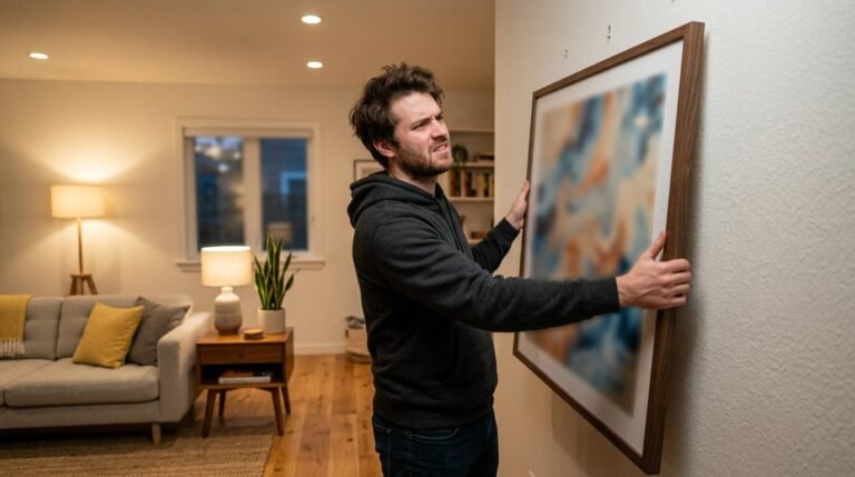
I remember the first time I tried to hang a wall frame collage in my living room. I had five beautiful thrifted frames and a brand-new hammer. I thought I could eyeball the placement. Two hours later, my wall looked like a shooting range. I had twelve unnecessary holes and a crooked mess. That was the day I realized that the secret to a professional look is not a steady hand. The secret is paper.
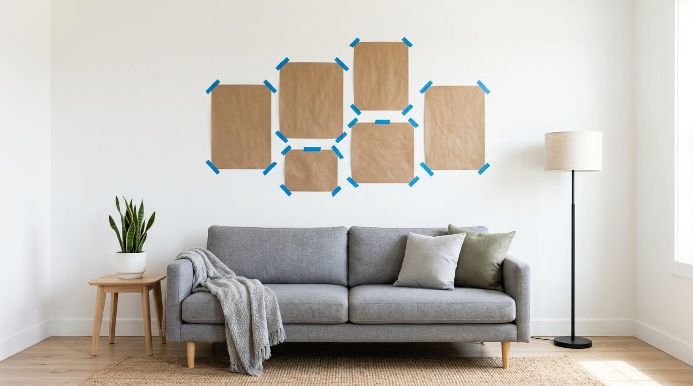
Using a paper template for your gallery wall layout is the only way to avoid what I call Swiss cheese walls. It allows you to move things around without commitment. You can see how the Gallery Wall Template With Sizes looks in your actual light. You can walk past it for a few days before you ever pick up a nail. In my experience, this extra hour of prep saves five hours of frustration.
If you want a home that feels curated and high-end, you need a plan. Most people skip the planning phase because they want instant results. I have seen this work for experts, but for most of us, it leads to lopsided art. This guide will show you exactly how to map out your Wall Art Placement Layout with zero stress.
Why You Need a Paper Template Before Your First Nail
The biggest mistake people make is starting with the center piece and working outward on the wall. Gravity and measurement errors always win. When you use paper, you remove the risk. I once spent an entire Saturday moving a single 16×20 frame because the 2-inch gap I thought I wanted looked way too tight. If I had used paper, I would have known that in thirty seconds.
A template acts as a dress rehearsal for your art. It helps you visualize the Wall Art Placement in your specific room. Walls have different lighting at different times of the day. A dark frame might look heavy in a corner during the morning but perfect in the evening. Paper lets you test these variables. I have noticed that people who use templates are 90% more satisfied with their final result.
What Materials Do You Need for a Wall Frame Collage?
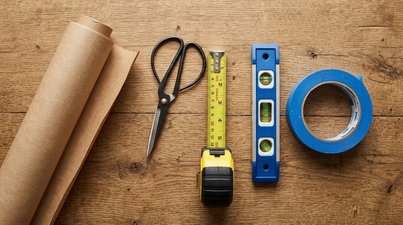
You do not need expensive designer tools to get this right. I usually raid my recycling bin or my craft closet. Here is what I keep in my toolkit for every project.
- Kraft paper or old grocery bags. I prefer Kraft paper rolls because they are cheap and sturdy.
- A pencil or a thick marker.
- Scissors that can handle thick paper.
- Scotch Blue Painter’s Tape. This is non-negotiable. Other tapes can peel your paint. I learned that the hard way in a rental.
- A spirit level. I use a 24-inch Stabila level, but a small torpedo level works too.
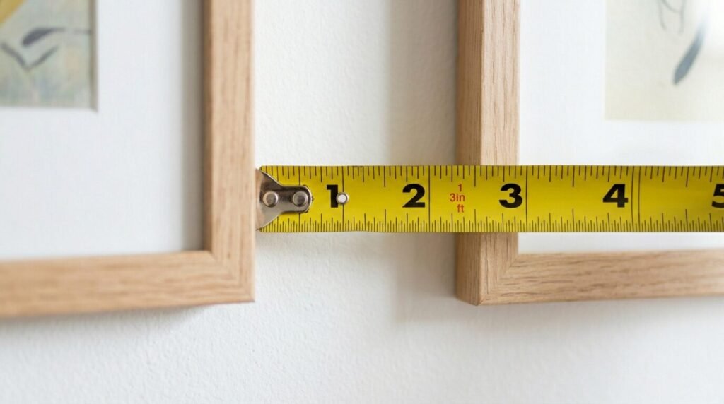
- A tape measure. The Stanley PowerLock is a classic for a reason.
- Your actual frames.
I have tried using newspaper before. It works, but the ink can smudge on light-colored walls. If you have white walls, stick to Kraft paper or even wrapping paper with a grid on the back. That grid makes the Gallery Wall Layout With Sizes much easier to manage.
How to Create a Gallery Wall Layout With Sizes
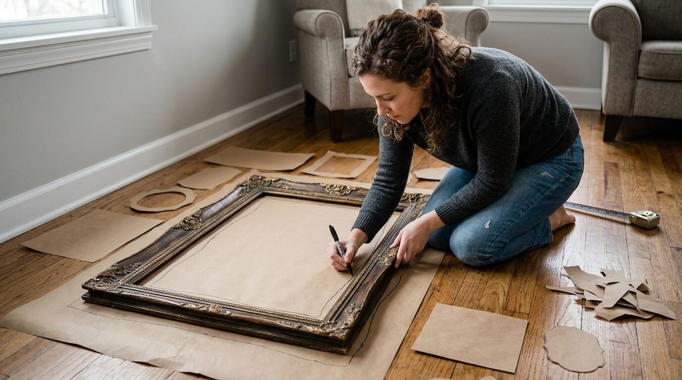
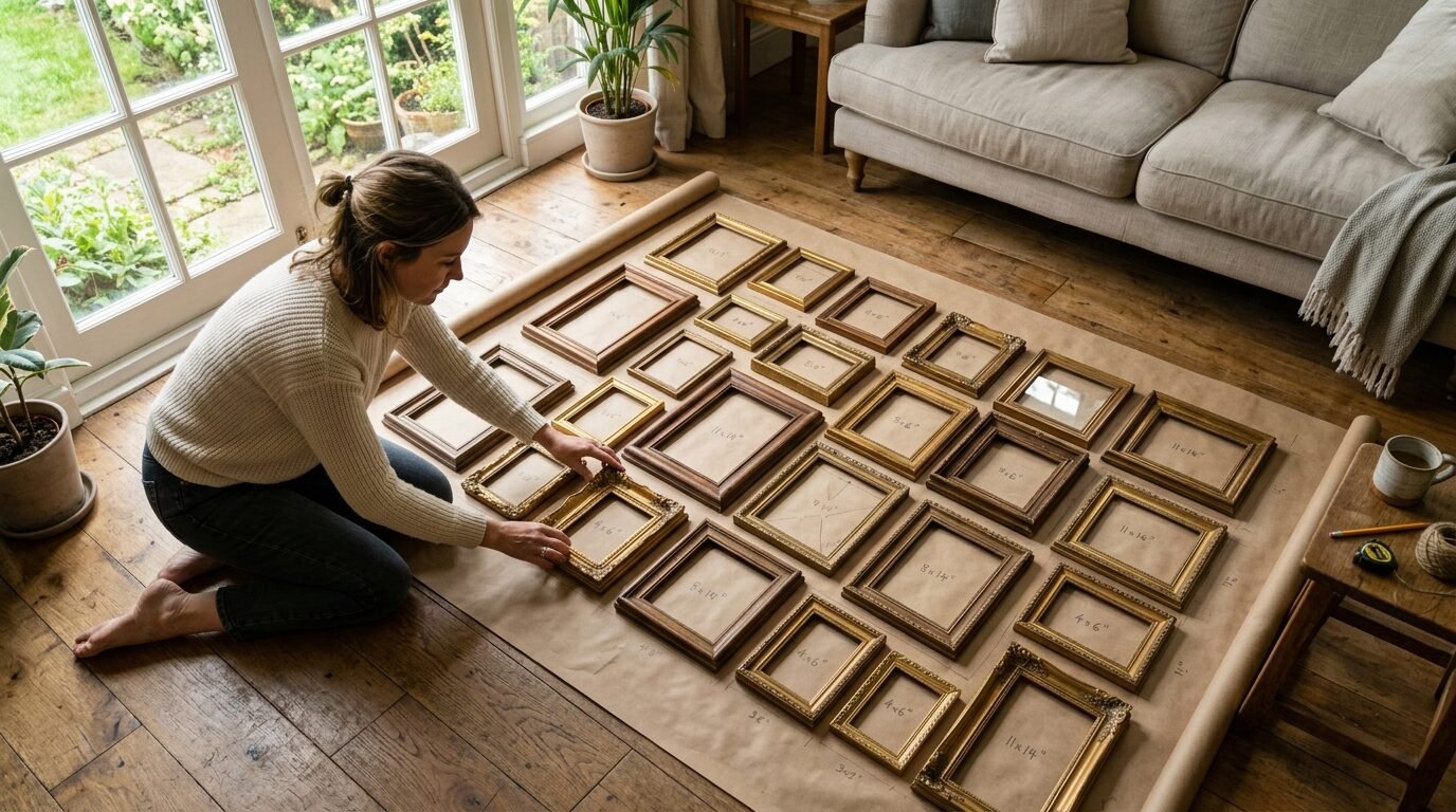
The first step is measuring your frames. You want to trace each frame onto your paper. Do not just measure the glass. Measure the outer edges of the frame. I suggest labeling each paper cutout with the name of the art or the frame size. I once cut out ten rectangles and forgot which was which. It was a puzzle I did not want to solve.
Once you have your cutouts, it is time to find a floor. Clear a space that is roughly the same size as your wall area. This is where you will play with your Gallery Wall Template With Sizes. In my experience, starting on the floor is much easier on your back and your brain. You can swap pieces out and see how the colors interact.
I like to start with the largest piece. This is usually your anchor. Place it slightly off-center for a modern look or dead center for a traditional feel. Then, build around it. Keep your gaps consistent. I usually aim for 2 to 3 inches between frames. If the gaps vary too much, the wall feels cluttered rather than curated.
Vintage Gallery Wall Ideas for a Timeless Home
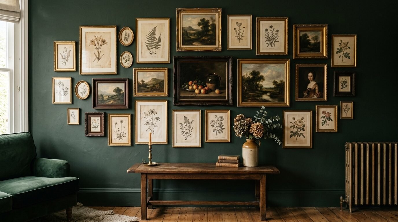
If you love a home with soul, vintage frames are the way to go. I spend a lot of time at local flea markets looking for gold leaf frames and old wood. The challenge with a vintage Wall Frame Collage is that the sizes are rarely standard. You might have an 11×13 frame next to a 5×9 frame. This is why paper templates are your best friend.
For Vintage Gallery Wall Ideas, I suggest mixing textures. Try a heavy ornate frame next to a simple thin black frame. This creates a collected-over-time vibe. I have seen this work beautifully when you keep the art theme consistent. Maybe all the art is botanical prints or black and white family photos. This keeps the eclectic frames from looking chaotic.
One trick I use for vintage pieces is to check the weight. Older frames can be heavy. When you are making your paper templates, note the weight on the paper. This helps you choose the right hanging hardware later. You do not want a heavy vintage mirror falling because you used a small nail.
Wall Art Placement Hacks That Professional Designers Use
Designers often talk about the 57-inch rule. This means the center of your gallery should be 57 inches from the floor. This is the average human eye level. I find this rule works in almost every room, from hallways to living rooms. If you are hanging art above a sofa, leave about 6 to 8 inches of space between the top of the sofa and the bottom of the frames.
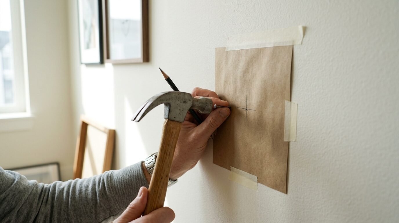
Another hack for Wall Art Placement Layout is the nail-through-paper trick. Once you have your paper templates taped to the wall, you do not need to measure again. Find the hanging wire or hook on the back of your frame. Measure the distance from the top of the frame to that hook. Mark that spot on your paper template. Drive your nail right through the paper. Then, just rip the paper away. It is perfect every time.
I have noticed that most people hang their art too high. If you feel like you have to look up to see your art, it is probably too high. Lowering your gallery by just 3 inches can make a room feel more intimate and grounded.
Examples of Gallery Walls That Work Every Time
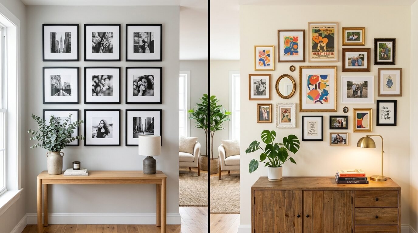
There are two main styles I see people love on Pinterest. The first is the Grid Layout. This is very symmetrical. All frames are the same size and color. It looks very clean and professional. It is great for a modern office or a dining room. For this, your Gallery Wall Layout With Sizes must be exact. Even a quarter-inch mistake will show.
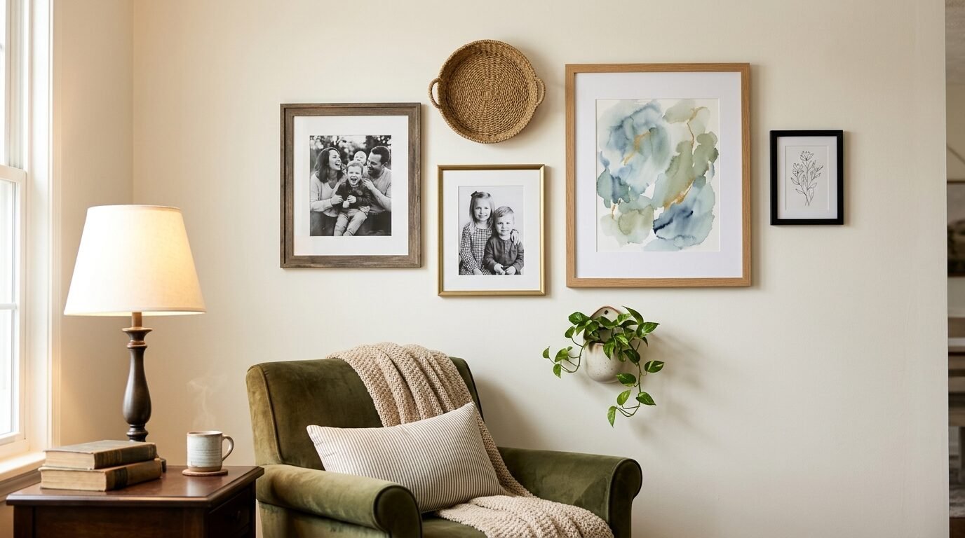
The second is the Eclectic Cloud. This is where frames of different sizes and styles form a loose shape on the wall. It feels more relaxed. I think this is easier for beginners because it is more forgiving. If one frame is slightly off, it just looks like part of the charm. I have used this style in my bedroom to display travel photos and concert tickets.
I have seen people use a corner for their gallery too. This is a great way to use a small space. You can wrap the art around the corner to lead the eye into another room. It creates a very immersive feeling.
Why Spacing Is the Most Important Part of Your Layout
If your frames are too close, they look like a single blob. If they are too far apart, they look like they are floating away from each other. In my experience, 2.5 inches is the sweet spot. It provides enough breathing room for each piece to be seen, but they still feel like a cohesive unit.
When you are taping your paper templates to the wall, use a spacer. I often cut a small 2.5-inch block of wood or even a piece of cardboard. I hold that between the templates as I tape them. This ensures the gaps are identical across the entire wall. This small step makes a DIY project look like a professional installation.
I have also tried using 4-inch gaps for very large pieces of art. If your frames are 24×36 or larger, they need more space. Think of the gap as a frame for the frames. It should be proportional to the size of the art.
How to Choose the Right Art for a Wall Frame Collage
The best gallery walls tell a story. Do not just buy a “gallery wall set” from a big box store. Those often feel cold and generic. I suggest mixing personal photos with art prints and even 3D objects. I once added a small brass key and a dried flower crown to a gallery wall. It added so much depth.
When looking for Examples of Gallery Walls, notice how they balance color. If you have a very colorful painting, balance it with a few neutral sketches. If every piece is bright and loud, the eye does not know where to rest. I like to pick one or two “hero” pieces and let the others be the supporting cast.
I have seen that people often forget about the mats. Mats are the cardboard borders inside the frame. Using a wide mat can make a small piece of art look very expensive. If you have a small 4×6 photo, put it in an 8×10 frame with a wide white mat. It instantly looks like a gallery piece.
Moving from Paper Templates to Final Hanging
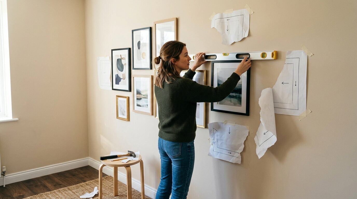
This is the moment of truth. You have your paper templates taped up. You have walked past them for a day. You love the arrangement. Now, grab your level. Even if the paper looks straight, check it with the tool. Houses settle, and floors are rarely perfectly flat. Your eyes might play tricks on you.
I always start hanging from the center and move out. This helps maintain the balance. If you start from one side, you might find that you have drifted upward or downward by the time you reach the other side. Check each frame with the level as you go.
I have tried using those tiny nails that come with most frames. They are usually useless. I prefer using 20-pound or 30-pound picture hangers. They have a slanted nail that grips the drywall much better. For very heavy pieces, find a stud or use a heavy-duty toggle bolt. Safety is more important than aesthetics.
Maintaining Your Gallery Wall Over Time
Walls are not static. You might find a new piece of art next month that you love. The beauty of a Wall Art Placement Layout that you built yourself is that it can grow. If you leave a little room on the edges, you can add more pieces over time.
I have noticed that frames can shift when people walk by or when doors slam. I use a tiny bit of museum wax or a small piece of double-sided tape on the bottom corners of each frame. This keeps them perfectly level forever. It is a small detail that saves you from constantly straightening your art.
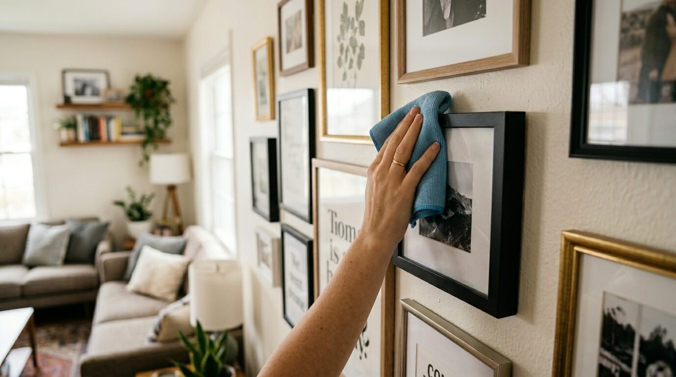
Cleaning is also something to think about. Dust builds up on the tops of frames quickly. I use a microfiber cloth once a month. Avoid spraying glass cleaner directly on the frames. The liquid can seep under the glass and ruin your art. Spray the cloth first, then wipe.
Frequently Asked Questions About Paper Templates
How do I know which size paper to use for my Gallery Wall Template With Sizes?
You should use paper that is at least as wide as your largest frame. Kraft paper rolls usually come in 30-inch widths, which is perfect for most home art. If you have a massive piece, you can tape two pieces of paper together. Just make sure the paper is flat so your measurements stay accurate.
What if my wall is textured and tape will not stick?
This is a common issue with plaster or heavy orange peel textures. I suggest using a stronger painter’s tape or even small bits of poster putty. Avoid duct tape or masking tape. Those will leave a sticky residue or pull off your texture. I have seen people use tiny map pins to hold the paper if the tape fails.
Can I create a gallery wall in a rental without holes?
Yes. Use your paper templates to plan the layout first. Then, instead of nails, use Command Picture Hanging Strips. They work like velcro. You still get the benefit of the paper layout, but you save your security deposit. Just make sure to follow the weight limits on the package.
How do I handle a gallery wall on a staircase?
Staircases are tricky because the floor is diagonal. The rule here is to follow the angle of the stairs. Measure up from each step to keep the bottom of your Gallery Wall Layout With Sizes consistent. It should mimic the “flow” of the stairs. I recommend having a friend help you hold the paper for this one.
Should all my frames be the same color?
Not necessarily. A mix of black, wood, and gold can look very high-end. The key is to repeat each color at least twice. If you have one gold frame and ten black ones, the gold one will look like an accident. If you have three of each, it looks intentional. In my experience, a limited color palette of two or three finishes works best.
What is the best way to hang heavy vintage frames?
Always check the back of vintage frames for sturdy hanging points. Many old frames have brittle wire. I usually replace the wire with new, coated picture wire. For anything over 10 pounds, I use a French cleat or two separate hooks to distribute the weight. This also keeps the frame from tilting.
Final Tips for Your Wall Art Placement Layout
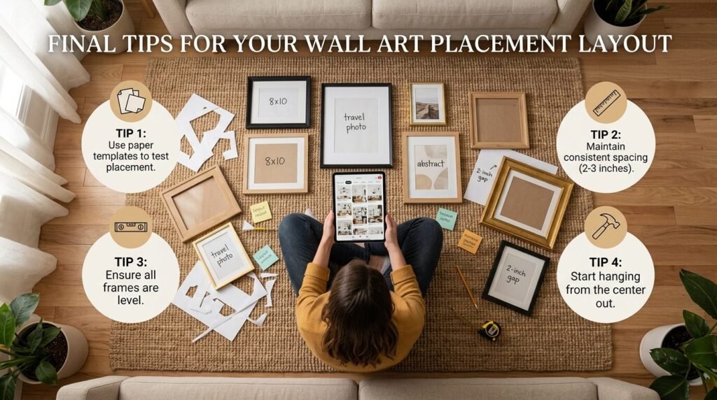
Creating a gallery wall should be fun, not a chore. The paper template method takes the “math anxiety” out of the process. It allows you to be creative and experimental. I have seen people try five different layouts before landing on the perfect one. That is the beauty of paper. It is cheap, and it is replaceable.
Remember to step back often. Look at your paper layout from the doorway and from where you sit on the couch. You want the wall to look good from every angle. Once it feels right in your gut, then you reach for the hammer.
If you are feeling stuck, look at Examples of Gallery Walls in magazines or on social media. Save the ones that make you feel calm and happy. Mimic their spacing and their frame choices. Your home is a reflection of you, so make sure the art you choose means something to you.
Why a Gallery Wall Changes the Energy of a Room
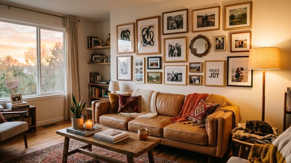
A blank wall can feel cold and unfinished. A gallery wall adds warmth and personality. It tells your guests what you care about and where you have been. Whether it is a Wall Frame Collage of family memories or a collection of Vintage Gallery Wall Ideas, it makes a house feel like a home.
I have noticed that once people finish their first gallery wall, they want to do another one. It is addictive. The confidence you get from a successful, hole-free installation is a great feeling. You stop being afraid of your walls and start seeing them as a canvas.
Take your time. Enjoy the process of finding the frames and the art. The paper template is just the tool that helps you get there. With a little bit of Kraft paper and some blue tape, you are well on your way to a professional-grade gallery wall that you can be proud of for years.

Anya Castellan is the Founder and Editor-in-Chief of Home Wall Trends. An art history graduate of the Rhode Island School of Design with twelve years of experience writing for leading American design publications, she specializes in composition, gallery wall theory, and the quiet architecture of domestic space. A former contributing editor at Architectural Digest and guest lecturer at Parsons School of Design, Anya personally reads and signs off on every piece before it is published.