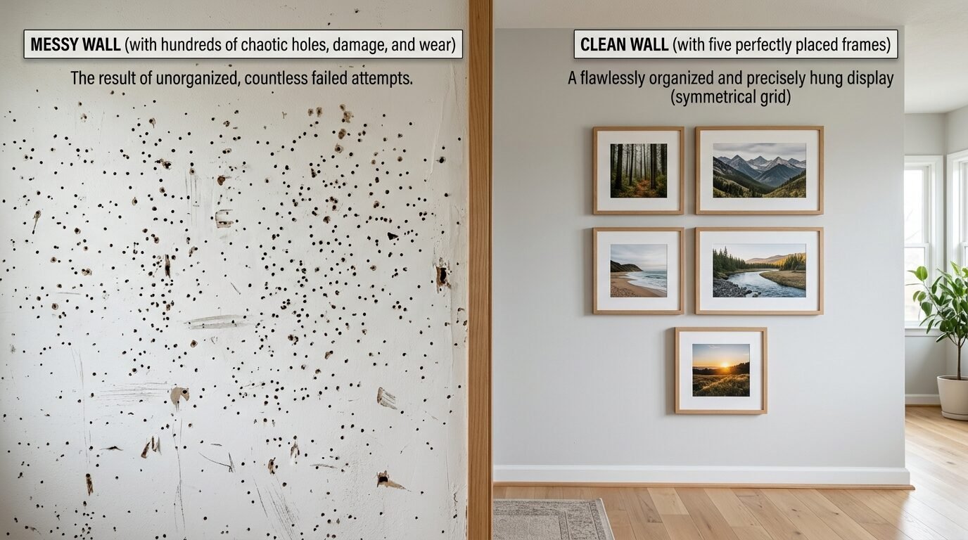
A blank wall feels like a heavy weight. You look at that empty space in your living room or bedroom and feel stuck. You want that Pinterest look but the thought of a dozen holes in your drywall stops you. I know that feeling well. Last year I stood in my hallway with a hammer and a box of random photos. I felt overwhelmed. I worried about the spacing. I worried about the height. I worried the whole thing would look messy.
The secret to beating that fear is starting small. You do not need twenty pieces of art to make a statement. You only need five frames. Five is the magic number for beginners. It is enough to create a focal point but small enough to manage in one afternoon. This guide shows you exactly how to turn those five frames into a professional display. You will see that wall decor layout ideas are simpler than they look.
Why starting small with five frames works for every home
Starting with five frames is a smart move for three reasons. First, it costs less. Buying ten or fifteen high quality frames gets expensive fast. With five frames you can spend more on the art you actually love. Second, it fits anywhere. A five frame set works in a small bedroom or a large living room. Third, it is easy to fix if you make a mistake.
In my experience five frames create a natural balance that the human eye loves. It allows for one central piece and four supporting pieces. I saw this work perfectly in a rental apartment I decorated for a friend. We had very little space above a small desk. A large gallery would have felt crowded. Five thin black frames made the area feel intentional and calm. You get the Art Wall Arrangements look without the stress of a massive project.
Five frames also let you mix sizes without losing the plot. You can use two large frames and three small ones. Or use one massive horizontal frame with four small squares. This variety keeps the wall interesting. It stops the room from looking like a boring office. When you keep the count low you stay in control of the design.
The linear layout for hallways and narrow walls
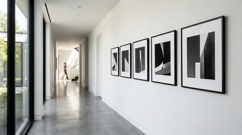
The linear layout is the easiest way to start. You hang your five frames in a straight line. This works best for narrow hallways or behind a long sofa. It creates a sense of order and rhythm. I often recommend this for beginners who want a clean modern look. It takes the guesswork out of spacing because every frame sits on the same horizontal axis.
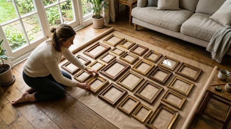
To do this right you need a level. I use a simple bubble level from a local hardware store. You pick a center point on your wall at eye level. This is usually about 60 inches from the floor. Draw a light pencil line. Place your frames along this line with exactly three inches of space between them. I noticed that three inches is the sweet spot for spacing. Anything more feels disconnected. Anything less feels cramped.
I tried this in my own narrow entryway using black and white family photos. The straight line made the hallway feel longer and more expensive. If you have mismatched frames paint them all one color to keep the line looking sharp. This is one of those Wall Decor Arrangement Ideas that never goes out of style.
The staggered layout for stairs and bedrooms
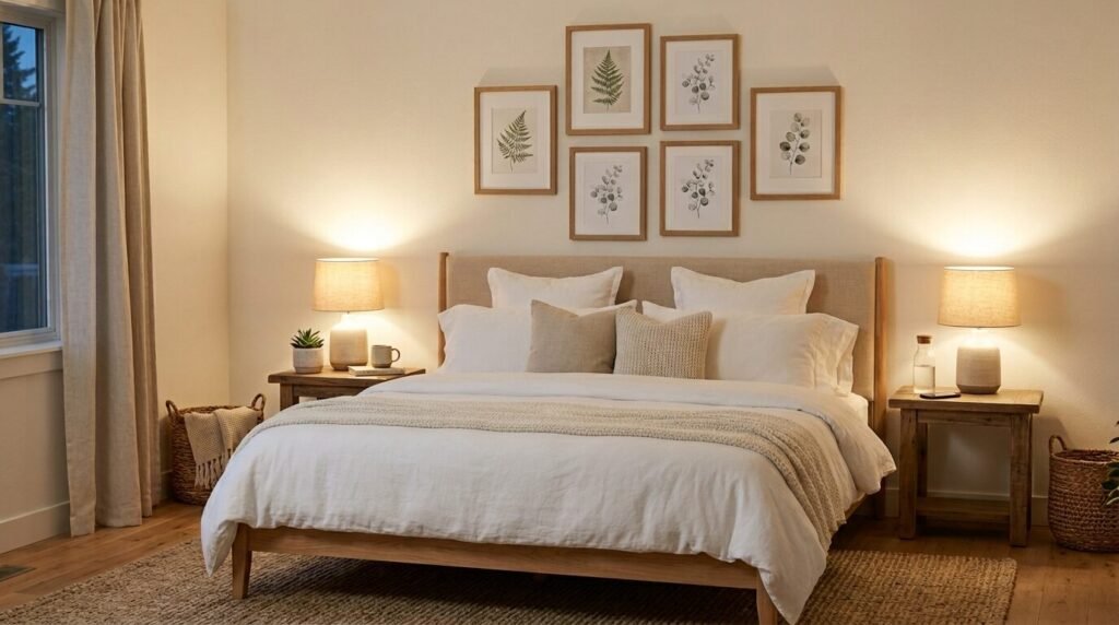
A staggered layout feels more relaxed and playful. Instead of a straight line you place frames at different heights. This is the best choice for a Bedroom Ideas Picture Wall. It feels cozy rather than formal. You can tuck this layout into a corner or center it over a headboard. The goal is to create a soft cloud of art rather than a rigid grid.
When I create a staggered look I start with the largest frame. I place it slightly off center. Then I tuck the smaller frames around it. Imagine the frames are hugging each other. You want the gaps between the frames to stay consistent even if the heights change. I once helped a neighbor do this with five vintage botanical prints. We didn’t use a ruler for the heights. We just moved the paper templates until the vibe felt right.
This style is great if your frames are different styles. You can mix a gold ornate frame with a simple wooden one. The staggered positions make the variety look like a choice rather than a mistake. It gives your room a human touch that feels lived in and warm.
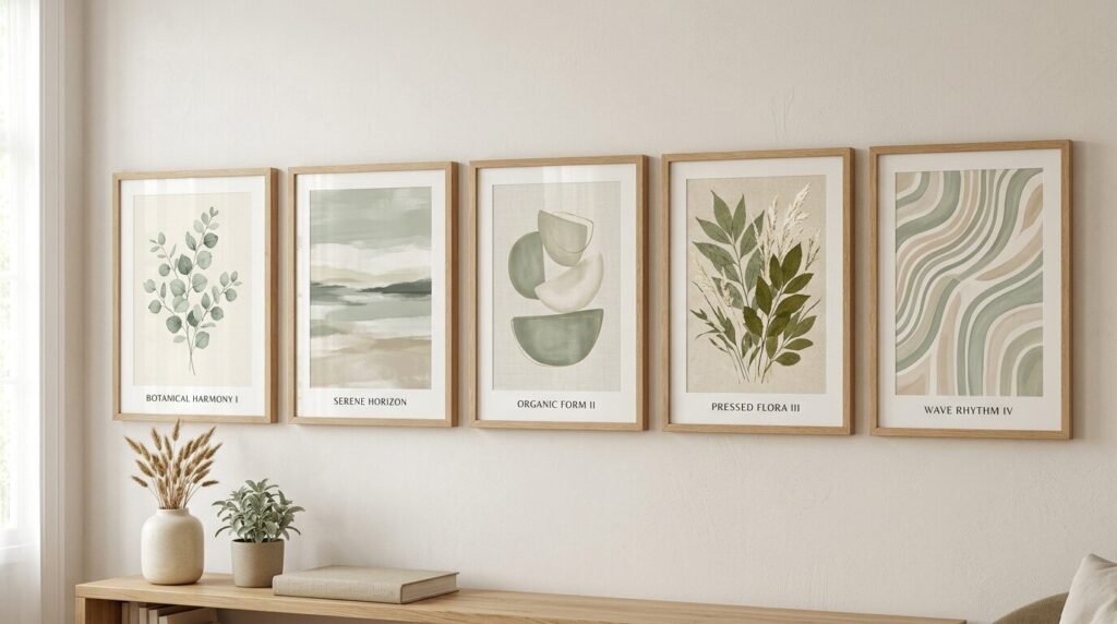
The grid layout for a clean and modern look
The grid is for the perfectionists. It requires five frames of the exact same size and color. Usually people do grids of four or nine but five works as a single row or a specific T shape. For a five frame grid I suggest a single horizontal row. This looks incredible in a dining room or above a long bench.
A grid looks best when the art follows a theme. Think of five different leaves or five architectural sketches. I used this method for a client who had five black and white travel photos from Italy. We used identical white frames with thick mats. The result looked like a high end art gallery. It was simple but felt very high end.
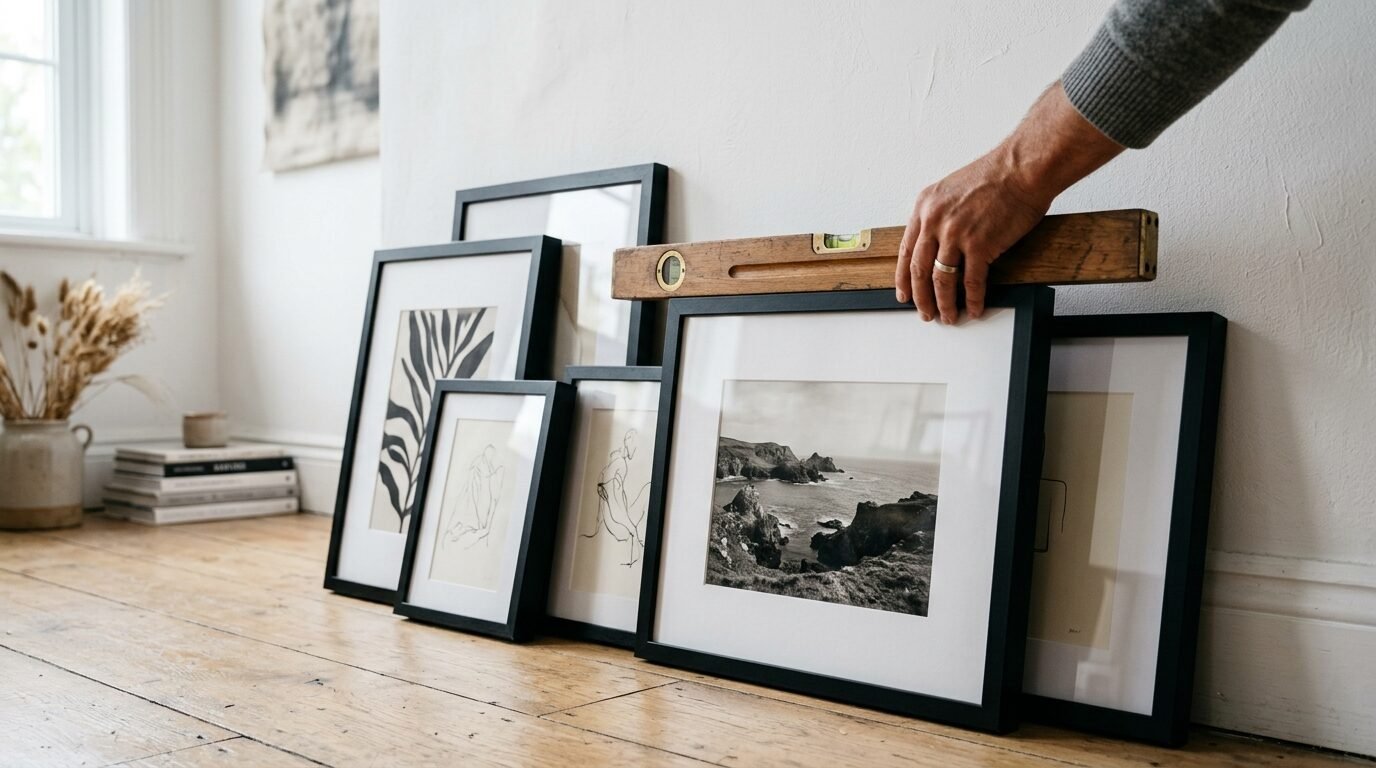
The key here is precision. You cannot eyeball a grid. You must measure the distance from the top of the frame to the hanging wire. Every single nail must be perfect. If one frame is a quarter inch off the whole wall looks broken. I use a piece of painters tape on the wall to mark the exact line for the nails. This saves your drywall from extra holes.
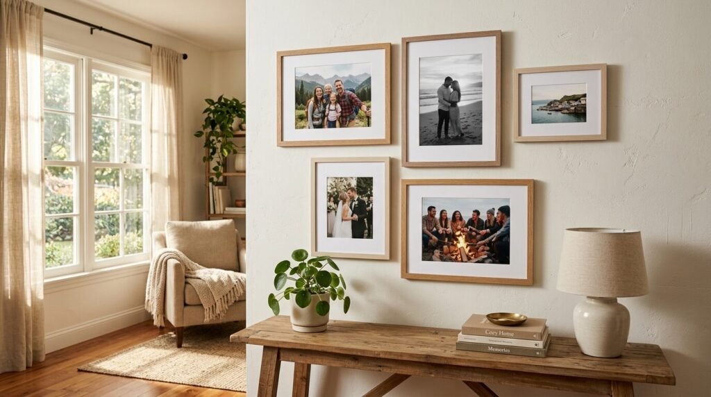
The organic cluster for a cozy living room vibe
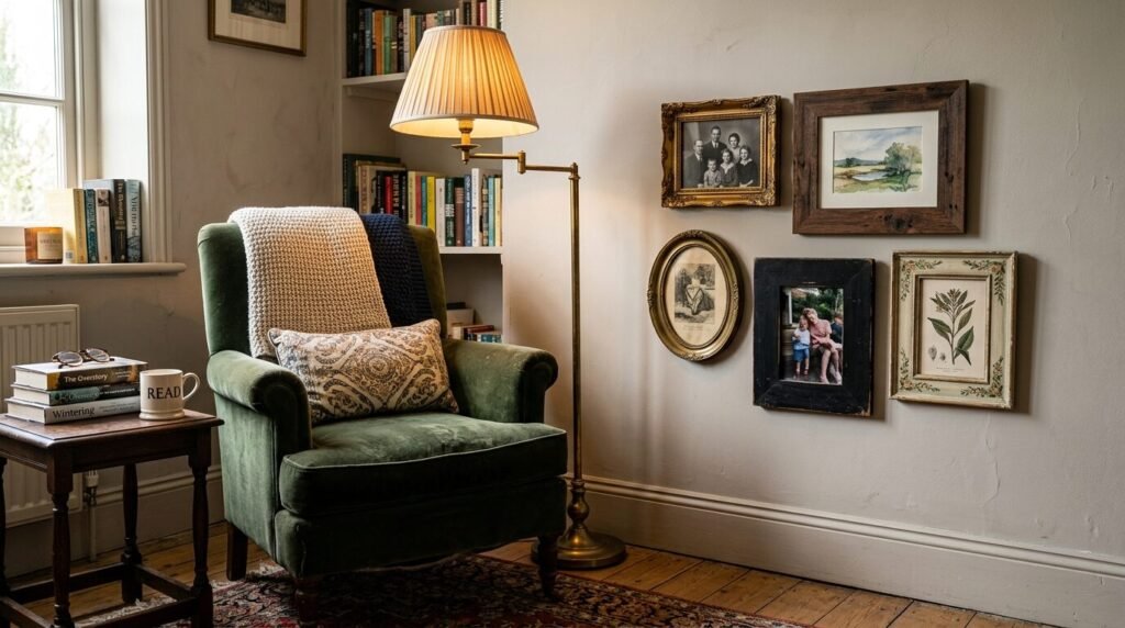
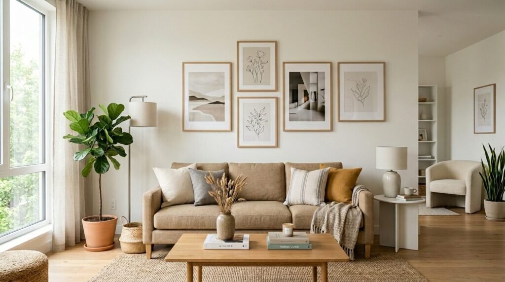
The organic cluster is the most popular Pinterest style. It looks like the wall grew naturally over time. You group your five frames in a tight bunch. There is no clear top or bottom line. This Photo Wall Arrangement Ideas strategy works best in living rooms near a comfy chair or a fireplace. It draws the eye in and makes people want to look closer.
To start an organic cluster find your “anchor” piece. This should be your favorite or largest frame. Put it near the middle of your space. Then place the other four frames around it. One might go high on the left. Another might sit low on the right. Keep the distances between frames tight. I like to keep them about two inches apart for a cluster.
I have seen this work wonders with a mix of photos and small objects. Maybe four frames and one small wooden hanging sign. It breaks the rules in a way that feels creative. In my experience this is the layout people save most on their mood boards. It feels personal and tells a story about who lives in the home.
The vertical stack for tall ceilings and thin corners
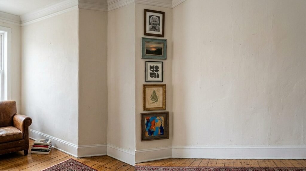
If you have a narrow strip of wall a vertical stack is your best friend. This means hanging all five frames in a tall column. It draws the eye upward and makes your ceilings feel much higher. This is a pro trick for small apartments or corners that feel empty. It turns a “dead” space into a vertical gallery.
I used a vertical stack in a tiny bathroom once. We had a thin wall next to the mirror. We hung five small square frames with colorful abstract art. It took the room from boring to designer in twenty minutes. For a vertical stack keep the spacing very tight. One inch between frames works best here. It makes the five frames look like one long piece of art.
Make sure the middle frame sits at eye level. This ensures the bottom frame isn’t hitting the floor and the top one isn’t lost near the ceiling. A vertical stack is a bold move that shows you know how to use your space. It is one of the most effective Living Room Wall Frames Layout options for awkward spots.
Best tools for hanging your five frame gallery
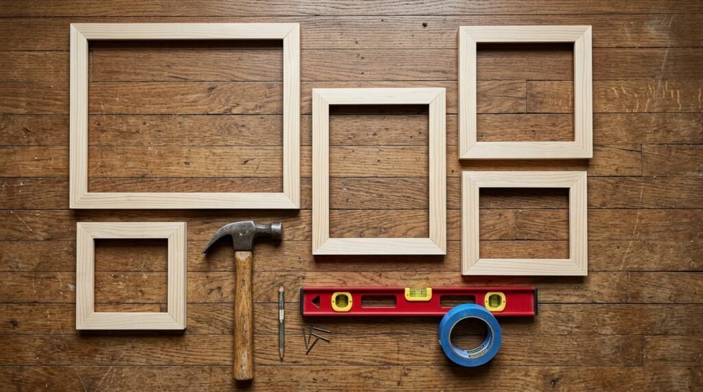
You do not need a massive toolbox to hang five frames. But having the right items makes the job much faster. I have tried every gadget on the market. Some are worth the money and some are junk. Here are the tools I actually use when I build a gallery wall.
First is the hammer. A small lightweight hammer is better for small frames. Second is a level. Do not trust your eyes alone. A 12 inch level is perfect for this project. Third is a pencil. Always mark your spots before you hit the wall. I also love using a laser level for long linear layouts. It projects a red line across the wall so you never miss your mark.
For the hanging hardware I have strong opinions. I use Command Strips for lightweight frames in rentals. They leave no holes and are very easy to move. For heavier frames I use Gorilla Hooks. You just push them into the drywall with your thumb. They hold a lot of weight and leave a tiny hole. I also keep a roll of painters tape nearby. I use it to map out the frames before I even touch a nail.
- Command Large Picture Hanging Strips: Best for rentals.
- Gorilla Grade Wall Hooks: Best for heavy frames without a drill.
- Black and Decker Laser Level: Perfect for straight lines.
- Stanley 12-Inch Level: A classic for a reason.
- FrogTape Painters Tape: Does not peel the paint off.
- IKEA Ribba Frames: The gold standard for affordable gallery walls.
- Target Threshold Frames: Great for a more wooden natural look.
- Michaels Belmont Frames: Good for bulk buying when on sale.
How to choose your art themes without overthinking
The biggest hurdle for beginners is picking the art. People worry their photos do not match. They worry the colors clash. My advice is to pick a single “thread” that connects all five pieces. This could be a color a subject or a texture. If you have a common thread the wall will look cohesive.
I once saw a beautiful five frame set that only used black and white family photos. Even though the photos were from different years the lack of color tied them together. Another great idea is a nature theme. You could use five different flower prints or five beach landscapes. I often use Canva to edit my personal photos before printing. I apply the same filter to all five photos so they look like a professional set.
Do not be afraid of empty space inside the frame. Large white mats make cheap art look expensive. I have seen people frame pieces of wrapping paper or old maps with thick mats. It looks incredible. Your five frames should feel like a collection. Think about what makes you happy when you walk into the room. If the art means something to you the layout will feel right.
My bedroom transformation case study
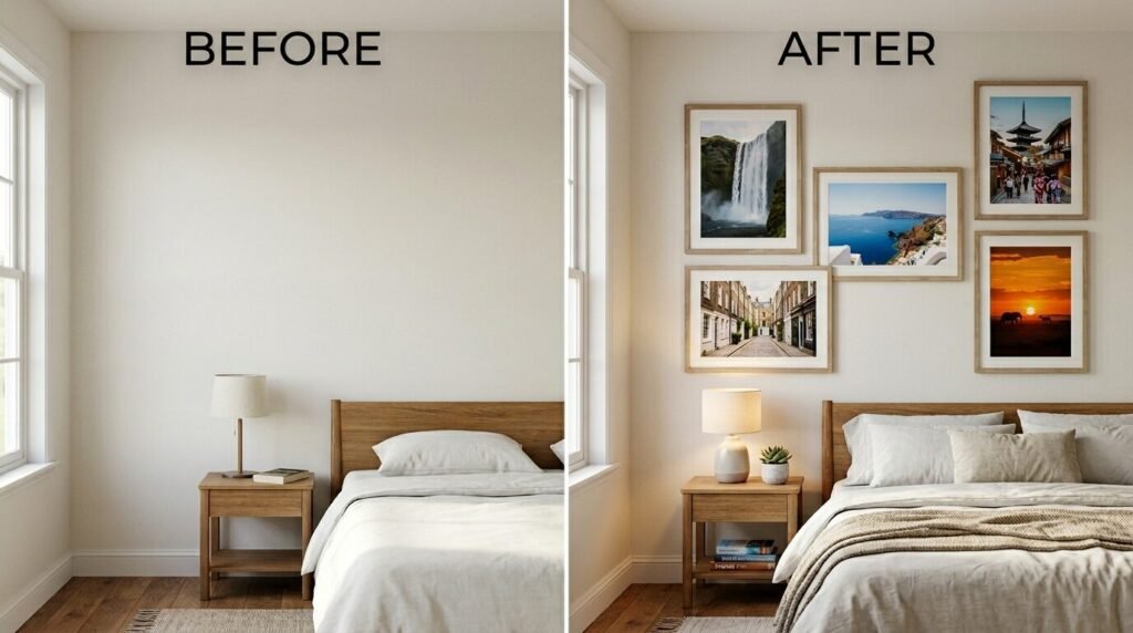
I want to share a real example of how five frames changed a room. I had a guest bedroom that felt cold and empty. The wall above the bed was a giant white void. I didn’t want to spend hundreds of dollars on a huge piece of art. I decided to try a five frame staggered layout.
I went to a local thrift store and found five frames in different sizes. I painted them all a soft matte black. For the art I printed five photos from a trip to the mountains. I used a sepia filter on all of them. I spent about forty dollars total. I used the paper template method to find the right spots on the wall.
The transformation was instant. The room went from “storage closet” to “boutique hotel” in one hour. My guests always comment on that wall first. It proves that you do not need a huge budget or twenty frames. You just need a plan and a few hours of time. That simple project gave me the confidence to try bigger walls later.
Expert tips for perfect frame spacing
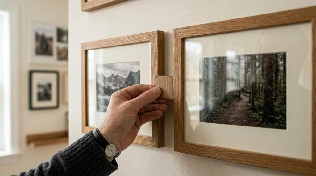
Spacing is where most people get frustrated. If the frames are too far apart the wall looks messy. If they are too close they look cluttered. The general rule for a five frame gallery is two to three inches of space between each frame. This is the gap that feels most natural to the eye.
In my experience using a physical spacer helps. I often cut a piece of cardboard to exactly two and a half inches. I hold it between the frames as I mark the wall. This keeps the distance identical across the whole layout. If you are doing a cluster you can vary the spacing slightly but try to keep it consistent.
Another tip is to consider the furniture. If your gallery wall is above a sofa it should be about six to eight inches above the back of the couch. If it is too high it looks like it is floating away. If it is too low people will hit their heads when they sit down. Always step back and look at the whole room before you hammer that first nail. The context of the room matters as much as the frames themselves.
Avoiding the most common gallery wall fails
I have seen many gallery walls go wrong. The most common mistake is hanging the art too high. People often hang things at the height of their own eyes but forget that most people see the wall while sitting down. Aim for the center of the grouping to be about 57 to 60 inches from the floor. This is the standard height used in museums.
Another fail is using tiny frames on a massive wall. If you have a huge wall five small frames will look like postage stamps. In that case use larger mats or bigger frames. Or group the five frames closer together to create one larger visual unit. I once saw a person try to fill a twenty foot wall with five 4×6 frames. It looked lost. Scale is your friend.
Finally avoid the “random nail” method. Do not just start hammering. Use the paper template trick. Trace your frames onto brown craft paper and tape them to the wall. Move them around until you love the look. Only then should you put a hole in the wall. This simple step prevents a lot of stress and extra patching later.
Frequently Asked Questions
What size frames should I use for a five frame gallery?
I find that a mix works best for beginners. Try one 11×14 frame as your center piece. Add two 8×10 frames and two 5×7 frames. This gives you a nice variety without being too hard to balance. If you want a grid use five 8×10 frames for a classic look.
How do I choose the right wall for my first gallery?
Look for a wall that feels like a “hole” in your room. This is usually the space above a sofa a bed or a desk. Hallways are also great for your first try. Avoid walls with lots of light switches or thermostats as they break up the visual flow.
Can I mix wood and metal frames?
Yes but keep the colors simple. If you mix materials try to keep the art style the same. For example five different frames all holding black and white sketches looks very cool. It feels collected and intentional rather than messy.
How much does a five frame gallery wall cost?
You can do this for under fifty dollars if you shop at places like IKEA or thrift stores. If you go to a high end store like West Elm you might spend two hundred dollars. The art is often the cheapest part if you print your own photos or use free public domain images.
What if my wall is textured?
Textured walls make Command Strips harder to use. If your wall has a heavy “orange peel” or knockdown texture I suggest using nails or Gorilla Hooks. They sit deeper in the wall and are more secure. Always check the weight rating on your hooks.
How long does it take to hang five frames?
If you use the paper template method it takes about an hour. Thirty minutes to trace and tape the paper. Thirty minutes to hammer and hang. It is a perfect Saturday morning project.
Should I use mats in my frames?
I always suggest mats. A white or cream mat makes any photo look more professional. It adds “breathing room” for the eye. Most cheap frames come with a paper mat included. Use them to give your gallery a high end feel.
Is five frames enough for a large living room?
Yes if the frames are large enough. If you have a big space use 16×20 frames. This creates a massive impact without needing dozens of pieces. Five large frames can fill a wall just as well as twenty small ones.
How do I keep the frames straight?
I use a tiny bit of poster tack on the bottom corners of each frame. This keeps them from shifting when people walk by or slam a door. It is a cheap trick that keeps your gallery looking perfect for years.
Can I include a clock or a mirror in my five pieces?
Absolutely. Replacing one frame with a small round mirror is a great way to add depth. It breaks up the square lines and adds light to the room. Just make sure the mirror is about the same scale as your largest frame.
What art is best for a bedroom?
For bedrooms I suggest calm images. Think of landscapes soft abstracts or personal travel photos. Avoid high energy or loud colors if you want a restful space. Soft blues greens and neutrals work wonders.
Where can I find free art to print?
I use sites like Unsplash or the Smithsonian Open Access. You can find thousands of high resolution images for free. You just download them and print them at a local shop. This is how I fill my galleries without spending a fortune on prints.
Moving forward with your wall decor
Now you have a plan. You know that starting with five frames is the best way to gain confidence. You have the layouts the tools and the expert tips to make it happen. Do not let the fear of a blank wall stop you anymore. Go pick five photos that make you smile. Find five frames that fit your style.
In my experience the hardest part is just the first nail. Once that is in the rest falls into place. Your home should reflect your life and your stories. A gallery wall is the best way to show those stories to the world. Start small. Keep it simple. You will be amazed at how much five simple frames can change your daily mood. Happy hanging.

Anya Castellan is the Founder and Editor-in-Chief of Home Wall Trends. An art history graduate of the Rhode Island School of Design with twelve years of experience writing for leading American design publications, she specializes in composition, gallery wall theory, and the quiet architecture of domestic space. A former contributing editor at Architectural Digest and guest lecturer at Parsons School of Design, Anya personally reads and signs off on every piece before it is published.