Most people buy too many things when styling a home. You buy pillows. You buy blankets. You buy rugs. The space quickly feels tight. You trip over furniture. Your eyes cannot rest. You want a Beige Aesthetic. You want a calm space. You end up with a messy room instead. I see this mistake happen every single day. People buy items without thinking about how they feel to the touch. Let me show you exactly what to do. You will get my exact rules for mixing materials. You will keep your space clean and quiet. You will stop wasting money on the wrong decor.
You will read exact rules for mixing fabrics without creating a mess. You will get my personal cleaning recipe for styling mirrors. You will read why my pine wood sign project failed completely three months ago. You will see exactly how to map out an Interior Design Mood Board. You will save money. You will stop buying the wrong things. You will craft a calm Minimalism Interior that feels warm and lived in.
What Layering Actually Means In Room Styling
Layering is not about putting more items into a room. Layering is about putting the right surfaces next to each other. You want your eyes to travel around the room smoothly. When everything has the exact same surface the room looks flat.
When you place a smooth item next to a rough item your eyes wake up. This is how you make a space feel rich. You do not need twenty items on a shelf. You only need three items with completely different surface feelings.
The Visual Weight Rule
Every single item in your house carries visual weight. Dark colors feel heavy. Light colors feel light. Smooth glass feels light. Rough wood feels heavy.
You must balance these items carefully. Put heavy items close to the ground. Put light items higher up on the walls. This keeps your room from feeling top heavy. Your eyes will move freely around the space. In my experience putting a visually heavy dark wood frame high on a light wall makes the whole room feel tilted.
Minimalism Interior Versus Messy Rooms
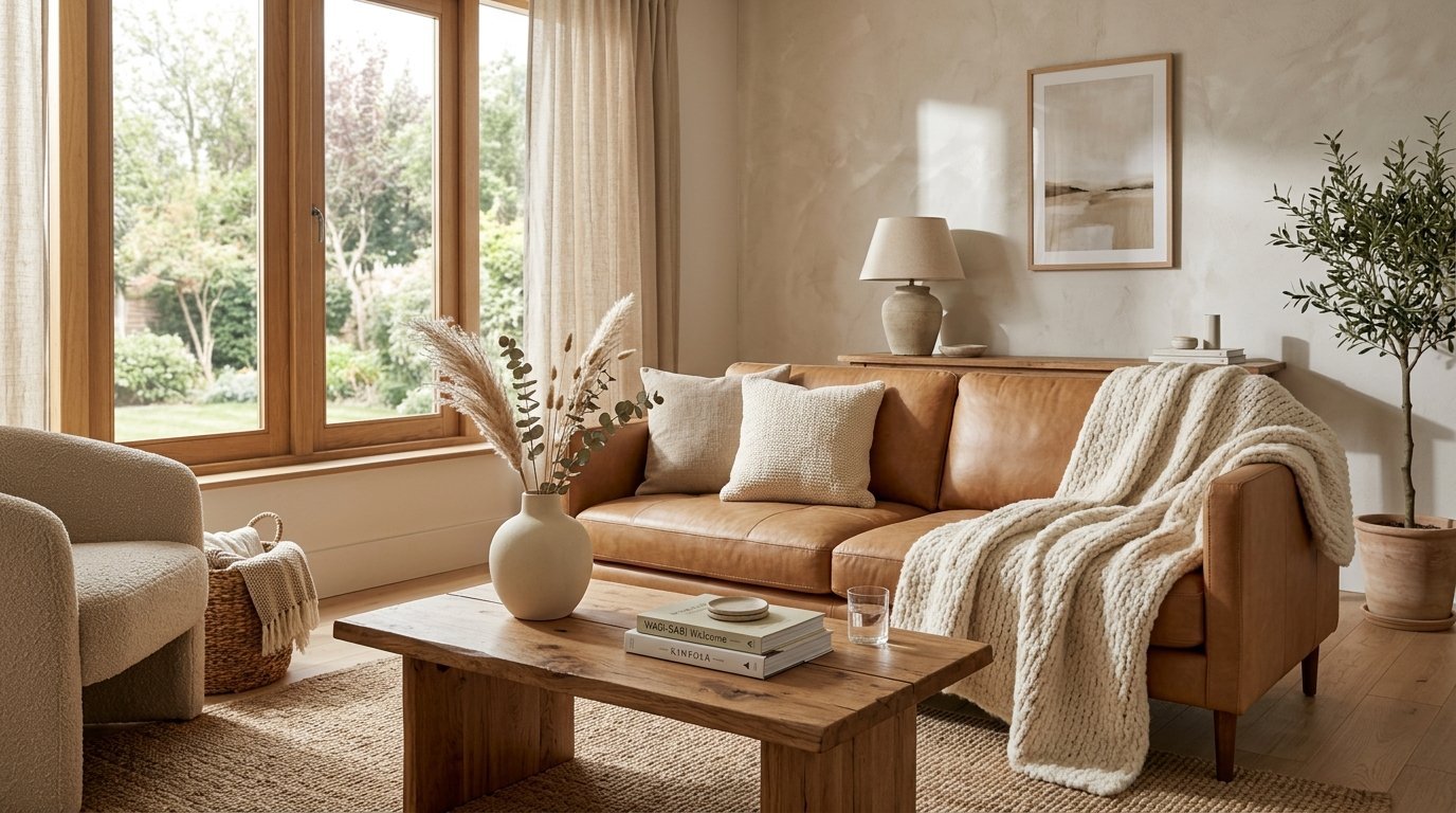
Many people confuse minimalism with empty spaces. An empty room feels cold and sterile. A true Minimalism Interior feels warm and lived in.
You get warmth through surface mixing. You pair soft wool with smooth leather. You place clear glass next to rough linen. You only need a few items. Those items must feel completely different from each other. This creates tension. Tension creates beauty.
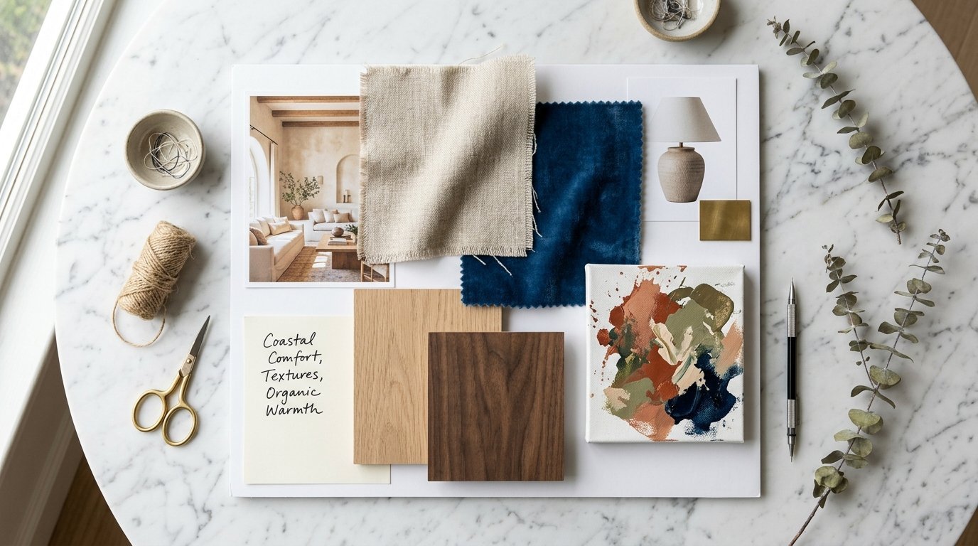
Starting With An Interior Design Mood Board
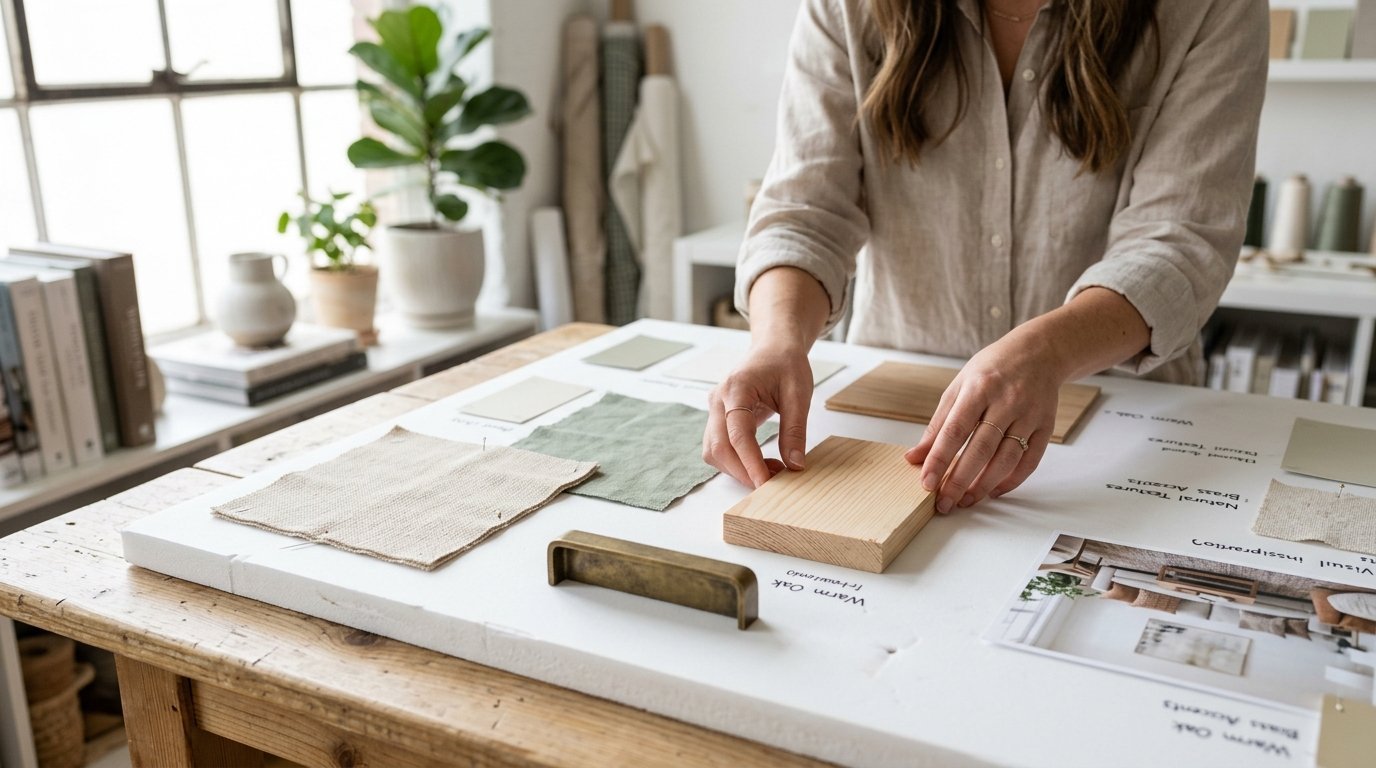
You must plan your space before you spend money. Mood Board Design stops you from buying bad matches. You put pictures of your items together on a screen first.
You look at the colors next to each other. If they clash on the screen they will clash in your house. Planning saves you hundreds of dollars. You never have to guess if a rug will match a sofa again.
Digital Boards Versus Physical Boards
You can map out a board on your computer using apps like Canva. You can also make a physical board with real materials. I prefer physical boards for texture planning.
You can touch the fabric samples directly. You can feel the wood grain with your fingers. You see exactly how the light hits each surface. You can take the board into the actual room. You can see how the morning light changes the colors.
The Danger Of Skipping The Planning Phase
Three months ago I threw a fresh piece of pine right into the trash. I tried to craft a farmhouse welcome sign. I did not plan my surfaces beforehand.
The raw pine looked terrible next to my smooth painted walls. The colors clashed completely. The rough wood looked cheap next to the sleek paint. I wasted my time and my money. Always plan first. I learned this lesson the hard way.
Choosing The Right Fabric Foundation
Start with your biggest furniture piece. Your sofa is usually cotton or polyester. Put a linen pillow right on it.
Linen has a loose weave. It looks relaxed and casual. Then drape a chunky wool blanket over the armrest. Wool has a tight thick weave. The eye loves this contrast.
Mixing Linens Cottons And Wools
You need a strict formula for fabrics. Never put two of the same fabrics next to each other. Do not put a cotton pillow on a cotton sofa. The pieces will blend together entirely.
- Put rough linen on smooth leather.
- Put thick wool on crisp cotton.
- Put smooth silk on rough velvet.
This breaks up the solid blocks of color. It gives the room depth.
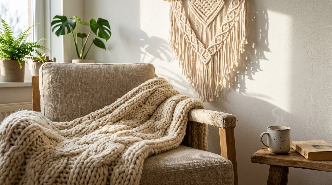
Using Macrame For Wall Texture
Walls need texture just like sofas do. Flat paint looks boring alone. I hang macrame wall art to break up flat spaces.
The knotted cotton cord catches the sunlight. It throws soft shadows against the paint. This fits perfectly in a boho or farmhouse room. It stays quiet but gives the eyes something to trace.
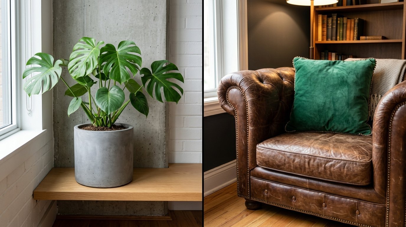
Using Hard Materials For Visual Contrast
Never match all your wood furniture perfectly. Matching sets look like a cheap hotel room. Pair light oak with dark walnut instead.
The tension between the woods gives the room life. Just keep the undertones similar. Pair warm woods with warm woods. Pair cool woods with cool woods.
Wood Tones And Finishes
You must look at the grain of the wood. Pine has a very loud and busy grain. Walnut has a smooth and quiet grain.
Do not put two busy wood grains right next to each other. The pieces will fight for your attention. Put a quiet wood next to a busy wood. This lets one piece act as the star.
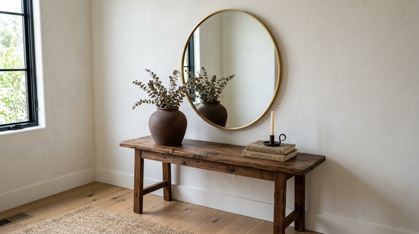
Glass And Mirror Placements
Mirrors reflect light around the room. They make a small space feel huge. But they need careful care. I saw moisture destroy a beautiful piece in my hallway three years ago.
The damp air got behind the frame and caused black spots. You must keep them totally dry. You must place them away from humid areas.
Frame Selection And Water Issues
Pay attention to the frame shape always. I noticed an issue with a gold frame in my bedroom last summer. Every time I wiped the glass water gathered at the absolute bottom curve.
The water sat there and ruined the finish over time. Always dry the edges completely with a dry cloth. Never let liquid sit on metal frames.
Preparing Mirrors For Backgrounds And Selfies
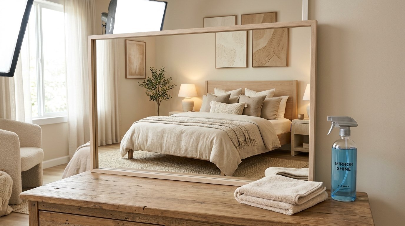
You need perfect mirrors for a styling background. Standard glass cleaners leave terrible streaks. Brands like Windex leave a strange blue residue. Zep commercial glass cleaner streaks too much for photography.
They ruin photos entirely. I mix distilled water with high purity isopropyl alcohol. The alcohol makes the water dry instantly. You get a perfect glass surface every single time.
The Exact Cleaning Recipe
Mix one cup of distilled water with one cup of high purity isopropyl alcohol. Put it in a spray bottle.
Never use tap water. Tap water has minerals. Minerals leave white spots on the glass. The high purity alcohol cuts through grease instantly.
The Right Cloth Matters Most
Paper towels leave tiny white flakes everywhere. Cheap rags leave oily streaks. You need specific microfiber to finish the job.
I exclusively use Norwex or 3M cloths. They pull the dust right off the glass. They leave zero streaks behind. This makes your mirror background flawless. I have seen this work better than any store bought cleaner.
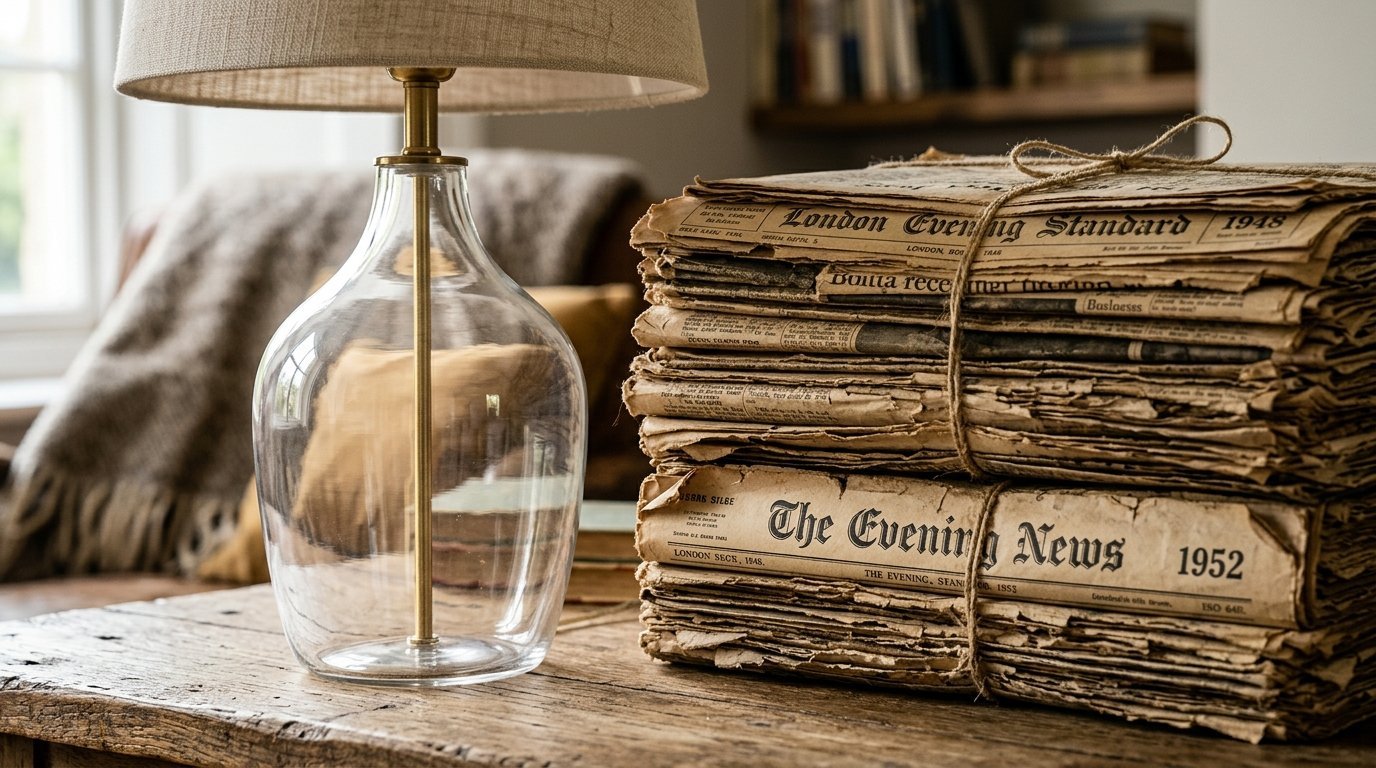
Incorporating Paper And Canvas Elements
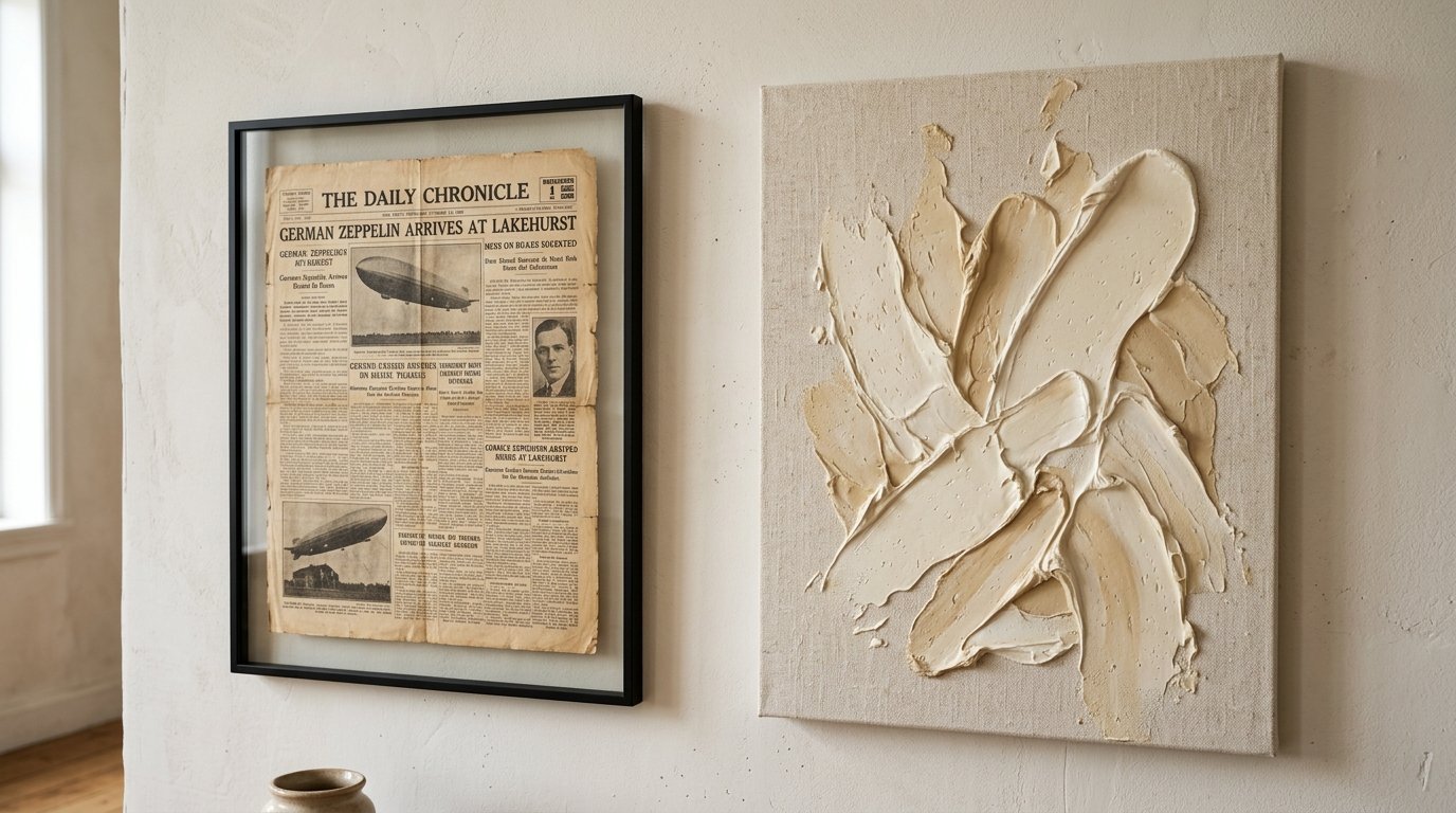
Old paper brings instant history to a blank room. Vintage Newspaper has a rough dry texture. The yellowed pages look beautiful framed behind clear glass.
You get the rough paper texture and the smooth glass texture together. This pairing catches attention without being loud.
Styling With Vintage Newspaper
You can find authentic vintage paper on Etsy. You can also find it at local antique malls. Frame it in a simple black frame.
Hang it in a bright hallway. The sunlight makes the yellow paper glow. It gives the space a library feeling. It keeps the Beige Aesthetic going perfectly.
Subtle Paint Splash Art
You do not need loud art prints. A simple Paint Splash canvas works perfectly. You can buy blank canvases and heavy acrylic paint from Michaels craft store.
The raised acrylic paint creates a bumpy surface. When the sun hits the canvas you see the shadows of the paint strokes. It stays quiet but feels rich and deep.
The Step By Step Layering Formula
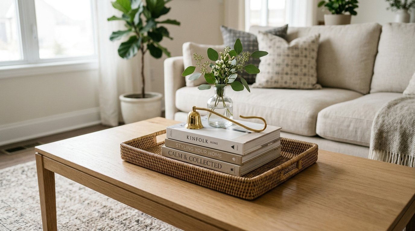
You need a reliable routine to build your room. If you do things out of order the room will feel heavy. Follow these exact steps.
Do not skip ahead. Do not buy small items before you buy your large items.
Step One The Base Layer
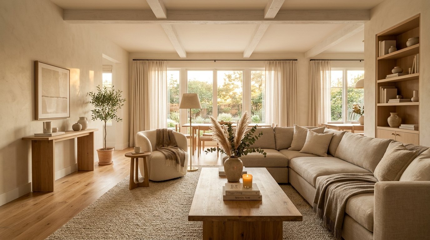
Start with your rug and your large furniture. Choose neutral colors for these pieces. A Beige Aesthetic works perfectly here.
The base must remain quiet. Do not buy a loud patterned sofa. You will get sick of it in one year. Keep the big pieces simple.
Step Two The Middle Layer
Place your pillows and your soft blankets. Choose two completely different fabrics. If your sofa is smooth choose rough pillows.
This is where you bring in your colors. Choose rusty oranges or deep greens. You can change these items easily when the seasons change.
Step Three The Top Layer
Place your small decor items on flat surfaces. Use a mix of shiny and matte items. Put a shiny brass candle next to a matte clay pot.
The light will bounce off the brass. The light will stop on the clay. This makes the arrangement look professionally styled.
Comparing Room Styles And Textures
You must compare materials before you buy them. I use a strict matching system. This stops me from making mistakes.
Here is exactly how I pair items in a room.
Material Matchups List
- Pair clear glass with heavy wool.
- Pair raw wood with soft linen.
- Pair shiny metal with matte cotton.
- Pair smooth ceramic with worn leather.
- Pair concrete with soft velvet.
- Pair rough brick with clear acrylic.
Keeping Colors Tight
Keep your colors restricted. If you use many textures you must use fewer colors. If you use many colors you must use fewer textures.
You cannot do both at the same time. The room will just look like a mess. Pick three colors total. Stick to them strictly.
Fixing Common Styling Mistakes
Most people make the exact same mistakes. I have made them too. I have tried putting everything against the walls. It makes the room feel like a waiting area.
Pull your sofa away from the wall. Even three inches makes a massive difference.
Pushing Furniture Against Walls
When you pull furniture forward shadows can fall behind it. Shadows create depth. Depth makes the room feel larger.
Use Command hooks to manage the wires behind the sofa. This keeps the space looking clean even when pulled forward.
Buying Everything From One Store
Never buy your whole room from one catalog. The room will lack history. Mix vintage items with brand new pieces.
Mix cheap finds with expensive anchors. Put a thrift store lamp on a high end wood table. This tension makes the room interesting.
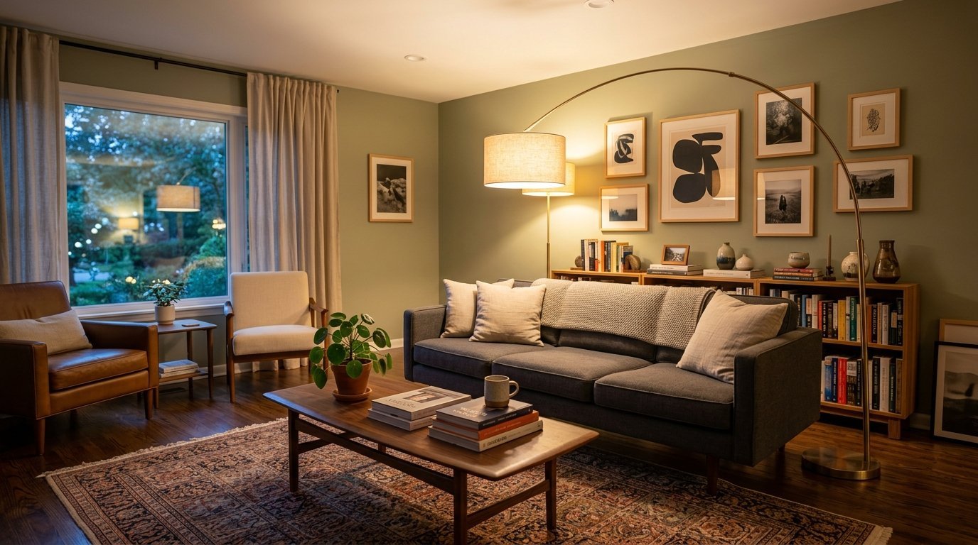
How Lighting Changes Surface Textures
Lighting completely changes how a room feels. Bright overhead lights flatten out all your textures. The room will look like a hospital.
You must use lamps. You must put lights at different heights.
Overhead Lighting Versus Lamps
Turn off your ceiling lights. Buy three lamps for your living room. Put one on a side table. Put one on the floor. Put one on a bookshelf.
This creates pools of light. The light hits the textures from the side. This makes the textures cast shadows. The shadows make the textures visible.
Choosing The Right Bulbs
Never buy cool white bulbs for a living space. They make beige walls look grey. Buy warm white bulbs. Look for bulbs marked 2700K on the box.
These bulbs mimic firelight. They make wood tones look incredibly rich. They make the room feel instantly cozy.
Incorporating Plants As Natural Texture
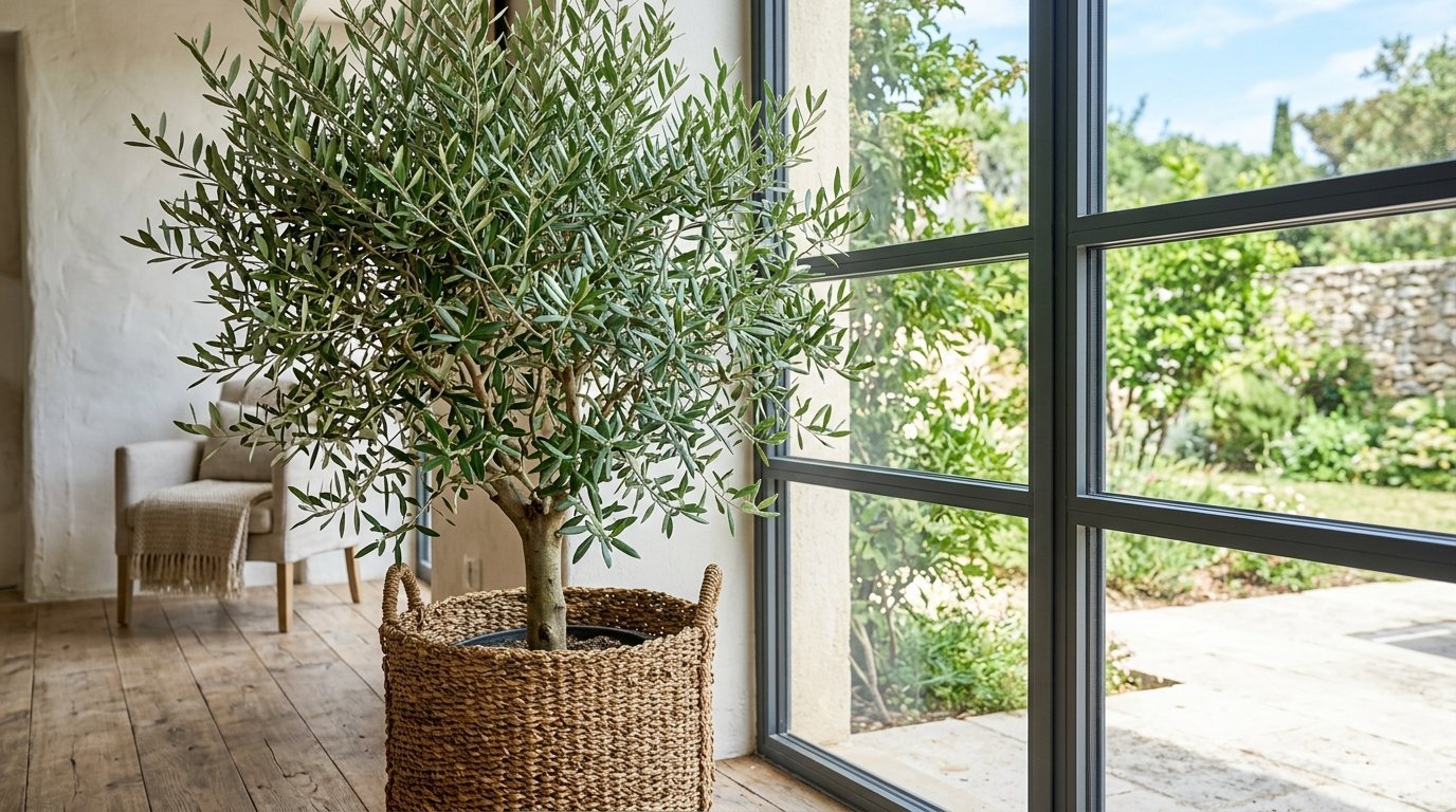
Plants bring a completely different texture to a room. They bring life. The leaves provide a delicate organic shape.
Hard furniture has straight lines. Plants break up those straight lines.
Real Plants Versus Fake Plants
I always choose real plants. Fake plants collect dust immediately. Real plants clean the air.
Put a large green plant in a woven basket. You get the smooth texture of the leaves. You get the rough texture of the basket. This is perfect layering.
Using Dried Stems
If you kill real plants use dried stems instead. Dried pampas grass fits the Beige Aesthetic perfectly.
Put tall dried stems in a clear glass vase. The fluffy grass contrasts with the hard glass. It requires zero water. It looks beautiful year round.
Maintaining A Layered Home
A layered home needs daily maintenance. If you leave clothes on a chair the layering looks like a mess.
You must keep flat surfaces clean. The textures cannot shine if they are covered in junk.
The Ten Minute Tidy
Walk through your room every night. Put away anything that does not belong. Fold the throw blankets. Fluff the throw pillows.
This takes ten minutes. You will wake up to a beautiful room every morning.
Seasonal Texture Swaps
Change your middle layers when the weather changes. In the summer use light linen blankets. In the winter use heavy wool blankets.
This changes the entire feeling of the room. You do not have to buy new furniture. You just swap the textures.
Frequently Asked Questions
How do I mix wood tones in a small room?
You must pick one dominant wood tone first. Make your largest piece of furniture this tone. Then pick an accent wood tone. Make your small side tables this accent tone. Keep the undertones the same. Warm woods go with warm woods. Cool woods go with cool woods. In my experience mixing a warm cherry wood with a cool grey wood looks terrible. Stick to the temperature rule and your room will look grounded.
What is the right way to clean a gold frame mirror?
You must never spray cleaner directly onto the glass. The liquid runs down the glass immediately. It pools at the bottom edge. I noticed this issue with a gold frame in my bedroom last summer. Every time I wiped the glass water gathered at the absolute bottom curve. The water sat there and ruined the finish. Always spray your 3M cloth first. Then wipe the glass. This keeps the frame completely dry.
How many throw pillows should go on a sofa?
You should use odd numbers. Three pillows work perfectly for a standard sofa. Five pillows work for a large sectional. Even numbers look too stiff and formal. You want a relaxed Beige Aesthetic. Mix your fabrics. Use one linen pillow. Use one velvet pillow. Use one wool pillow. This gives you texture without making the sofa unusable. You still need room to sit down.
Can I mix farmhouse style with a Beige Aesthetic?
Yes you can mix them easily. Farmhouse style uses lots of rough wood and metal. A Beige Aesthetic uses soft warm neutrals. Put rough farmhouse wood against a soft beige wall. The contrast works beautifully. Just keep your lines clean. Do not use words painted on signs. Keep the art simple. A subtle Paint Splash canvas bridges the gap between the two styles perfectly.
How do I keep a Minimalism Interior from feeling cold?
You must rely entirely on texture. Empty rooms feel cold because sound bounces off hard walls. You need soft items to absorb the sound and the light. Place a thick wool rug on the floor. Drape a heavy cotton blanket on a leather chair. The room remains uncluttered but the soft materials make it feel warm. I have seen this work in countless stark apartments.
Where is the best place to find Vintage Newspaper?
You should check local estate sales first. People keep old newspapers in attics for decades. You can find them for pennies. If you cannot find local sales check Etsy. Many sellers sell authentic historical papers. Look for papers with heavily yellowed edges. The yellow color brings warmth to your walls. Frame them in simple modern frames to keep the look fresh.
How do I stop macrame from collecting dust?
Macrame acts like a giant dust magnet. You cannot wash it in a machine. The cords will tangle and shrink. You must take the wall hanging outside once a month. Shake it vigorously. Then use a sticky lint roller over the flat sections. If it smells stale lightly spray it with plain distilled water. Never use harsh chemicals on the natural cotton cord.
What is the rule of three in room styling?
The rule of three states that items look better in odd groups. Human brains find odd numbers visually interesting. When you style a coffee table group three items together. Put down a stack of books. Put a tall vase next to it. Put a small candle in front. You get a tall item a flat item and a small item. This works on every surface in your house.
How do I make a digital Interior Design Mood Board?
You should use Canva for your digital boards. It is completely free. Take screenshots of the furniture you want to buy. Use the background remover tool in Canva. This cuts out the background of the store image. Push the images together on a blank white canvas. You will see immediately if the wood tones clash. You will see if the fabrics match.
What is the biggest mistake with layer styling?
The biggest mistake is buying items all at once. When you buy everything in one weekend the room looks like a furniture showroom. It looks fake. You must buy your base layer first. Live with it for a month. Then buy your pillows. Live with them for a month. Let the room grow slowly. A beautiful room takes time to put together.
How do I fix water spots on old glass?
Old glass holds onto hard water stains stubbornly. Regular cleaner will not touch them. You must mix equal parts white vinegar and distilled water. The acid in the vinegar eats the mineral spots. Spray it on your Norwex cloth first. Rub the spots firmly. Then wipe the area completely dry with a second clean cloth. This restores the glass beautifully.
Can I use real branches for texture?
Yes real branches provide incredible architectural texture. Go outside and cut a large branch with interesting bends. Let it dry out completely. Strip the dead leaves off. Put the bare branch in a heavy floor vase. The bare wood looks striking against a plain white wall. It gives you height and drama for absolutely zero money.
How high should I hang my textured wall art?
Most people hang their art way too high. You must hang art at eye level. The center of the canvas should sit sixty inches from the floor. If you hang art over a sofa leave six inches of space between the sofa and the frame. If you hang it too high the art floats away from the furniture. It looks completely disconnected.
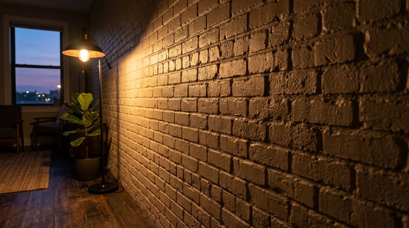
Does lighting really change how textures look?
Lighting dictates everything. If you point a light straight at a wall the wall looks totally flat. If you place a lamp near the wall the light grazes the surface. Grazing light catches every tiny bump. It makes a plain brick wall look incredibly deep and rich. You must use side lighting to make your textures visible.
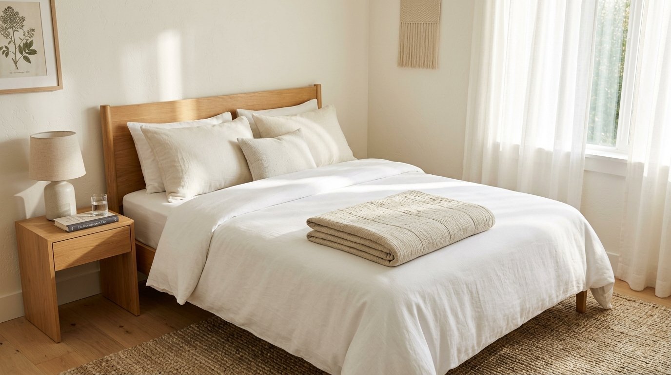
How do I style a bed with multiple blankets?
Start with crisp white cotton sheets. Pull your duvet all the way up. Fold the top third of the duvet back down. This exposes the sheets. Take a thin linen quilt and lay it across the middle of the bed. Take a thick chunky knit blanket and fold it at the absolute foot of the bed. You get three visible layers instantly.
Wrapping Up Your Room Design
You now know exactly how to mix your surfaces. You know how to balance heavy woods with light glass. You know why planning saves you money and time. You know how to keep your mirrors perfectly clear. Stop buying random items on impulse. Start planning your spaces intentionally. Look around your room right now. Pick one corner. Apply these rules to that one corner today. Watch how quickly the space transforms into a calm sanctuary.

Anya Castellan is the Founder and Editor-in-Chief of Home Wall Trends. An art history graduate of the Rhode Island School of Design with twelve years of experience writing for leading American design publications, she specializes in composition, gallery wall theory, and the quiet architecture of domestic space. A former contributing editor at Architectural Digest and guest lecturer at Parsons School of Design, Anya personally reads and signs off on every piece before it is published.